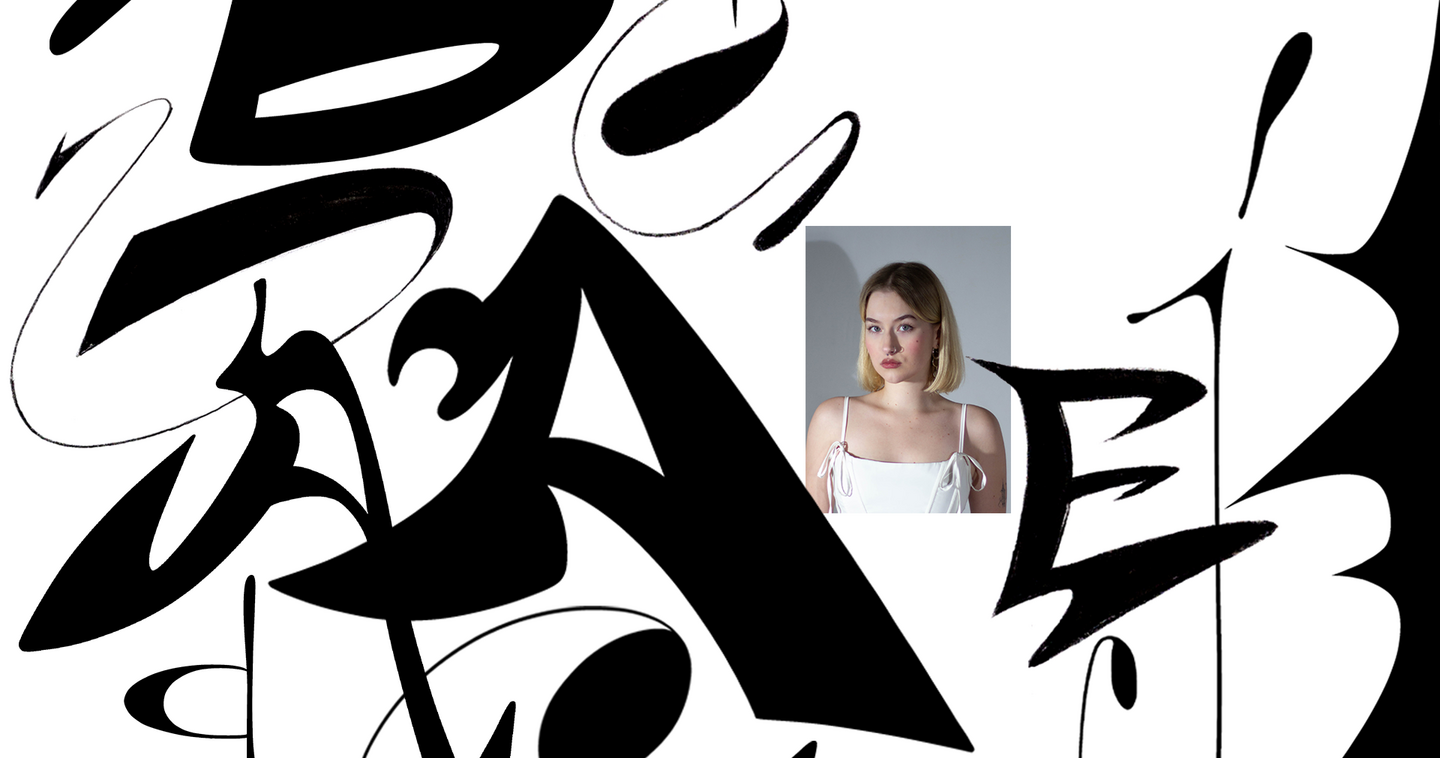
Alisa Orlovtseva
Communication Designer · Saint Petersburg
Design that works for your business, not just looks good.
I collaborate with businesses and institutions across the cultural, social impact, fashion, and creative sectors, providing thoughtful design solutions tailored to their needs.
My work spans the entire design process—combining brand strategy, marketing insight, and visual communication to build distinctive identities and present businesses with clarity and confidence.
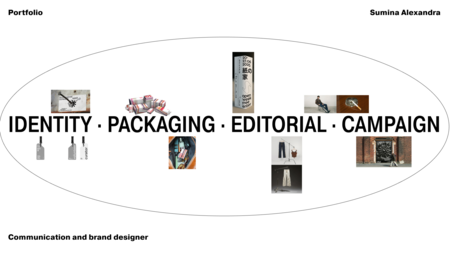
I develop brand identities, corporate design systems, packaging, merchandise, print materials, social media assets, and presentations. Each project is tailored to help organizations communicate their value, promote their services, bring their initiatives to life, and demonstrate their impact.
Tools: Adobe Creative Cloud, Figma, Blender, Procreate, Fontlab
Scroll to see cases from different fields.
Case (01)
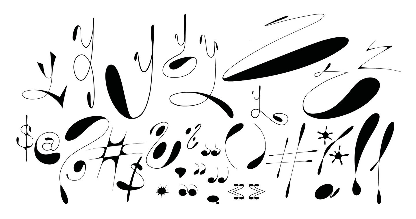
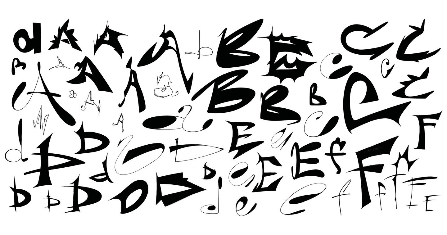
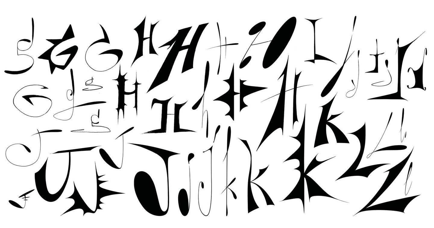
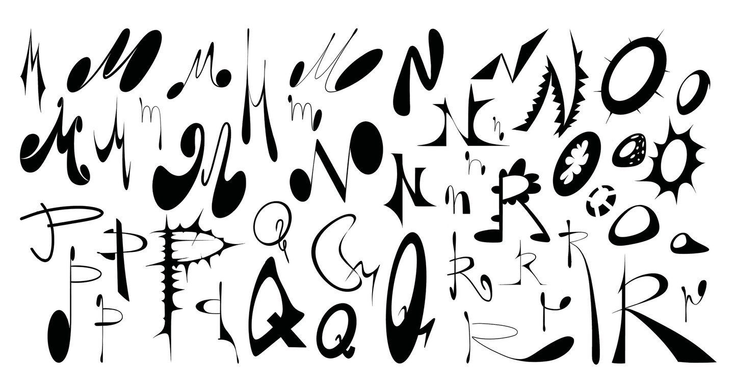
A Typeface of Its Own
A bold and unconventional alphabet where every letter possesses its own personality. Playful, rebellious, and deliberately imperfect, the typeface breaks from traditional typography, embracing irregular shapes, unexpected details, and a fearless visual expression.Each character is unique, combining to create a distinctive and expressive typographic language.
Case (02)
Typographic Calendar for the Hermitage
Problem The Hermitage’s rich collection of art and historical artifacts is often experienced only within the museum.Idea Bring the museum’s cultural heritage into everyday life through a calendar.
Solution Create a typographic calendar featuring artifacts from the Hermitage collection, blending art, modern typography, and graphic design.
Case (03)
Typesetting a Play by Samuel Beckett
Problem Samuel Beckett’s play Happy Days presents a complex theatrical text that requires thoughtful typography and layout to preserve its structure, rhythm, and readability.Idea Create a meticulously designed edition that reflects the play’s distinctive atmosphere while making the text comfortable and engaging to read.
Solution Develop an editorial layout for Happy Days, combining expressive typography, clear text hierarchy, and a consistent grid system to balance readability with the dramatic character of the original work.
Case (04)
Visual Identity for a Contemporary Art Festival
Problem The festival required a distinctive visual identity that would reflect the diversity of contemporary creative practices and stand out in a crowded cultural landscape.Idea Create a flexible visual language that captures the experimental spirit of contemporary art while uniting different creative disciplines under a single identity.
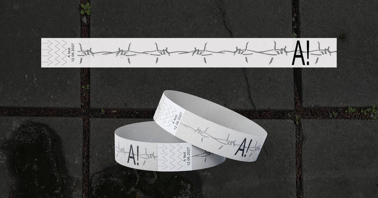
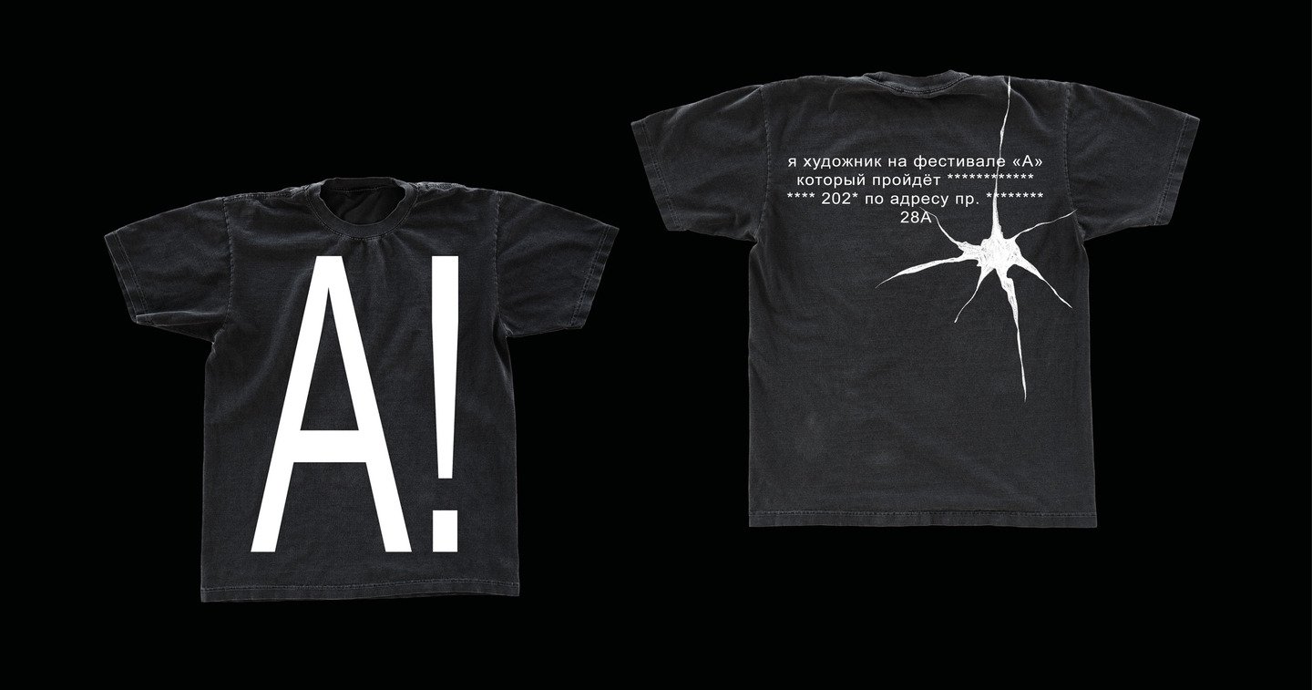
Solution Develop a cohesive visual identity for the festival, combining expressive typography, bold graphic elements, and a versatile design system adaptable across promotional materials, digital platforms, and event graphics.
Whether you need a brand identity, a campaign, or a presentation—let’s work together.
Let’s collaborate!