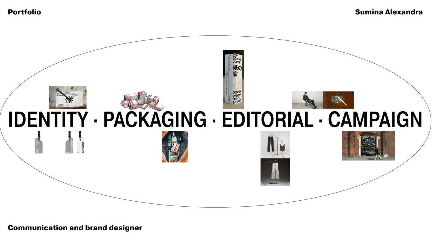
Welcome to the page, let’s take a look
☺
How I Work
Meaning → Image → Form → Detail
To ensure that a design provides not just information but also pleasure, I prefer to create imagery that reveals more of itself with each subsequent viewing. A literal approach brings a project to a definitive conclusion, whereas a multi-layered one continues to foster loyalty long after the initial objective has been met. The most effective contrasts are those that emerge gradually—a subtle detail or a nuanced touch that shifts the meaning of everything around it.
Selected Work
Sampa
packaging for cotton goods and cleaning supplies
[2024] · concept, identity, packaging
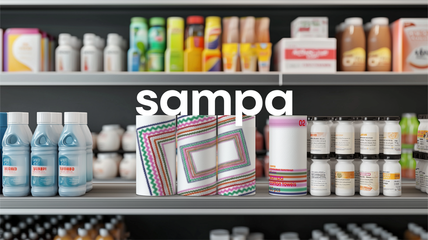
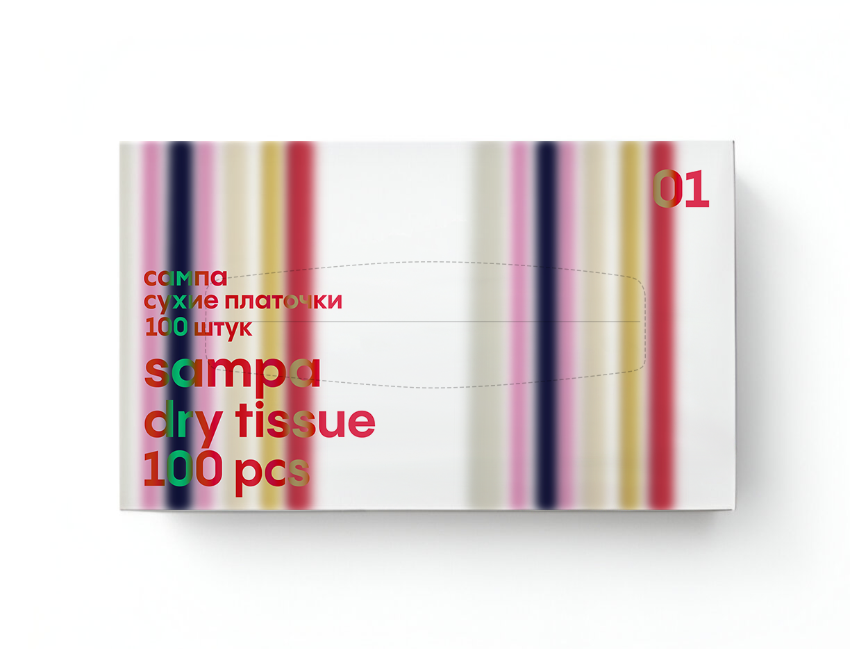
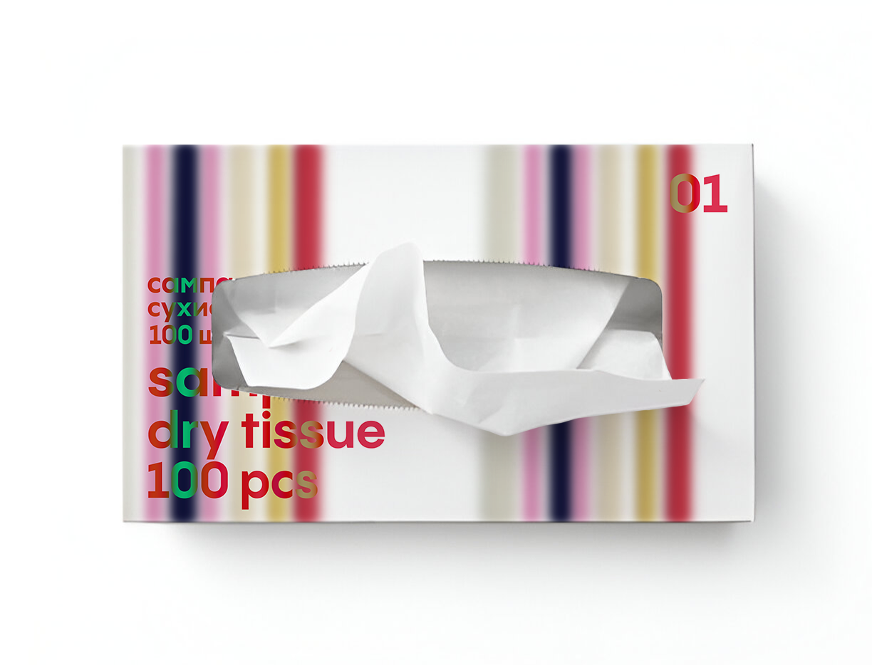
The Brief & The ConstraintsI started from a simple annoyance: I couldn’t find napkins that were cool and stylish enough to carry around. Everything on the market was either aimed at an eco-conscious audience, or at sensitive skin and children, or fell into that abstract organic Art Nouveau niche. An adult who just wanted a good-looking napkin had nothing to buy. The pack is soft, so the only structural line I had was one edge—and it had to accommodate two lines: one for personal use and one for home.
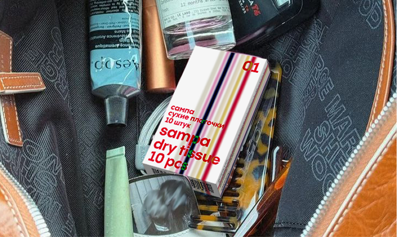
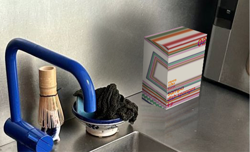
01—for daily use, 02—for home duties
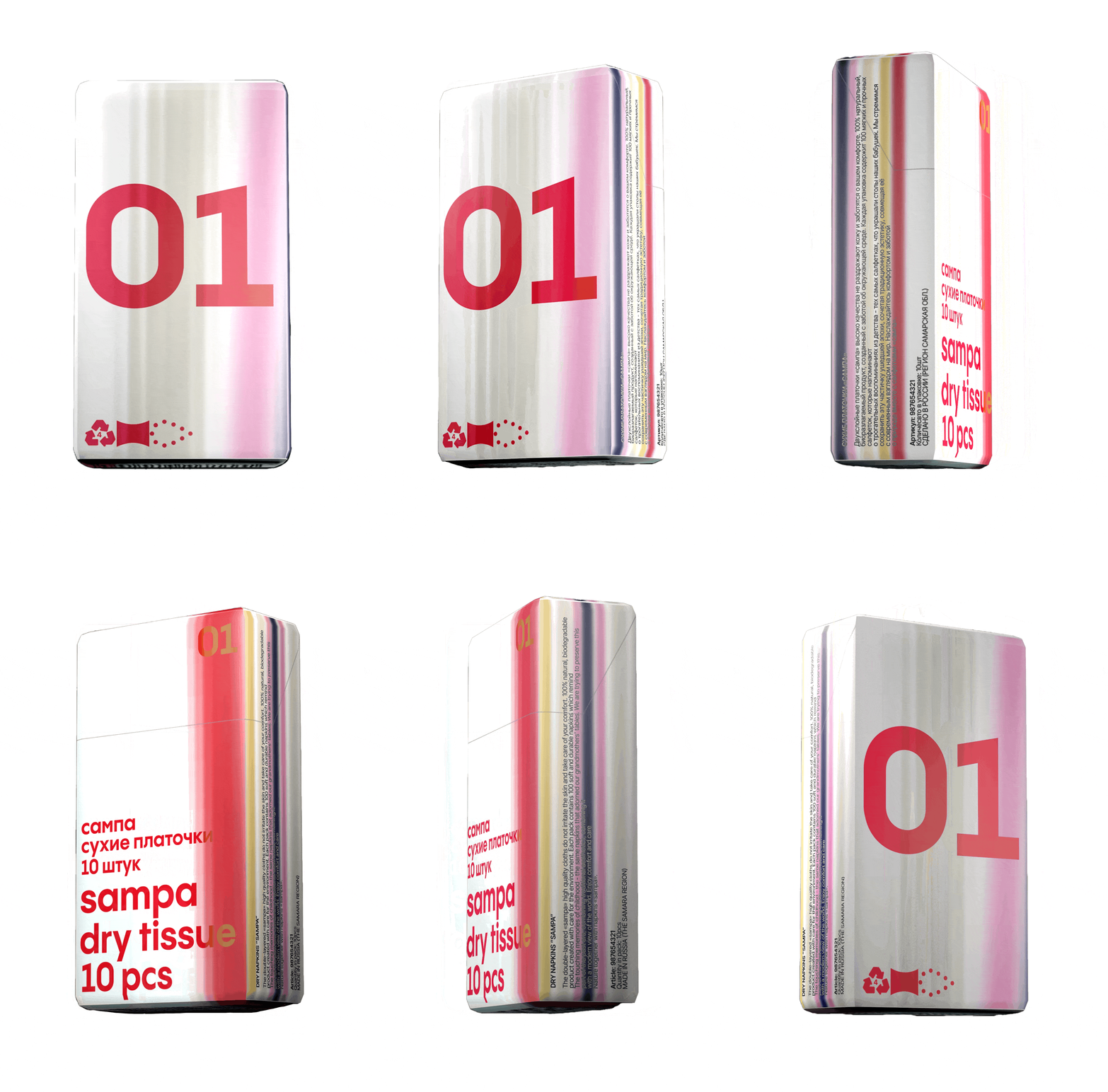
The TurnThe concept stems from the idea that a product must evolve with its user over time. For a child, the focus is on the gentle way a napkin touches the skin; for an adult, it becomes integrated into daily life—but it shouldn’t lose its inherent qualities or become mundane. So, I designed a napkin that appears charming and stylish now yet still evokes childhood: the Ric-rac ribbons our grandmothers used for decorative embroidery remain on one side, while the opposing sides feature a texture that appears to lag and stretch into a colorful, iridescent gradient. Childhood has passed; abstract memories endure.
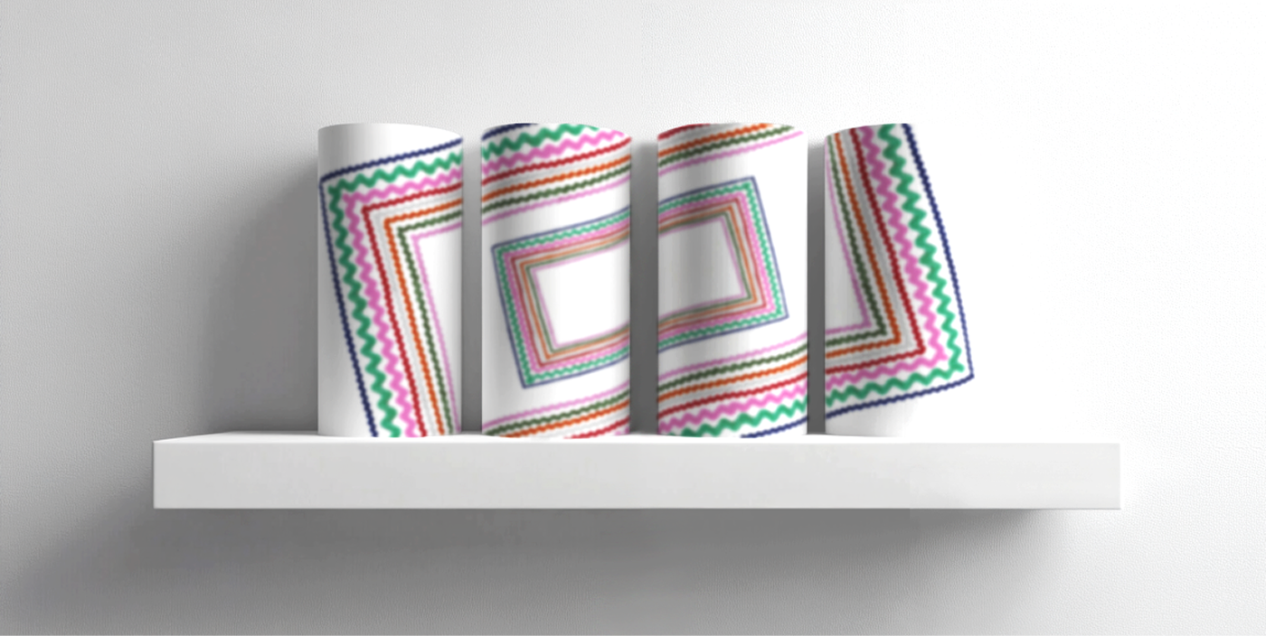
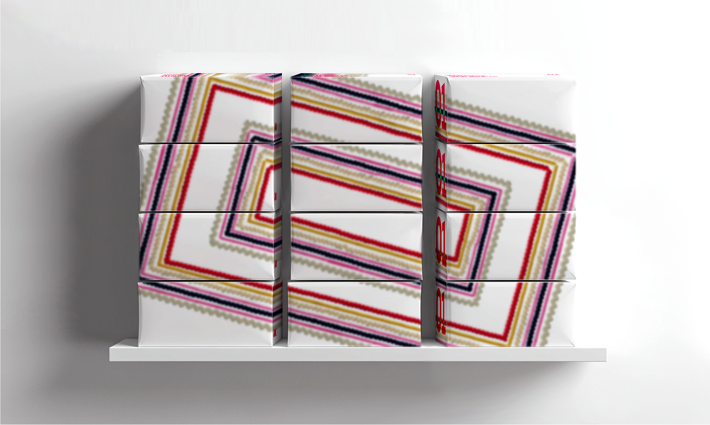
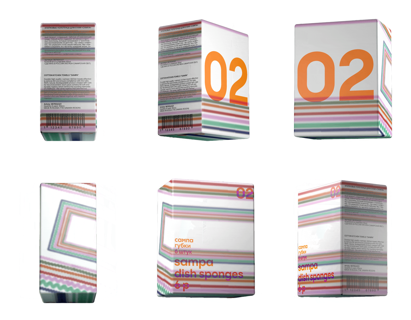
The Detail That Flips ItA fragment of the ric-rac ribbon is distinctive on only one side. Flip the package, and the same texture is already slipping out of place, stretching and lagging. What reads as a decorative border turns out to be a memory caught in the act of departure.
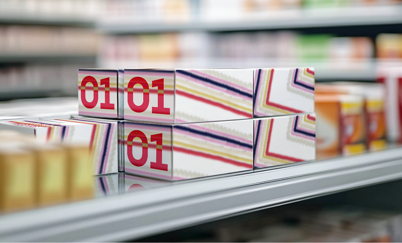
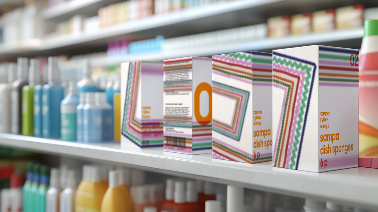
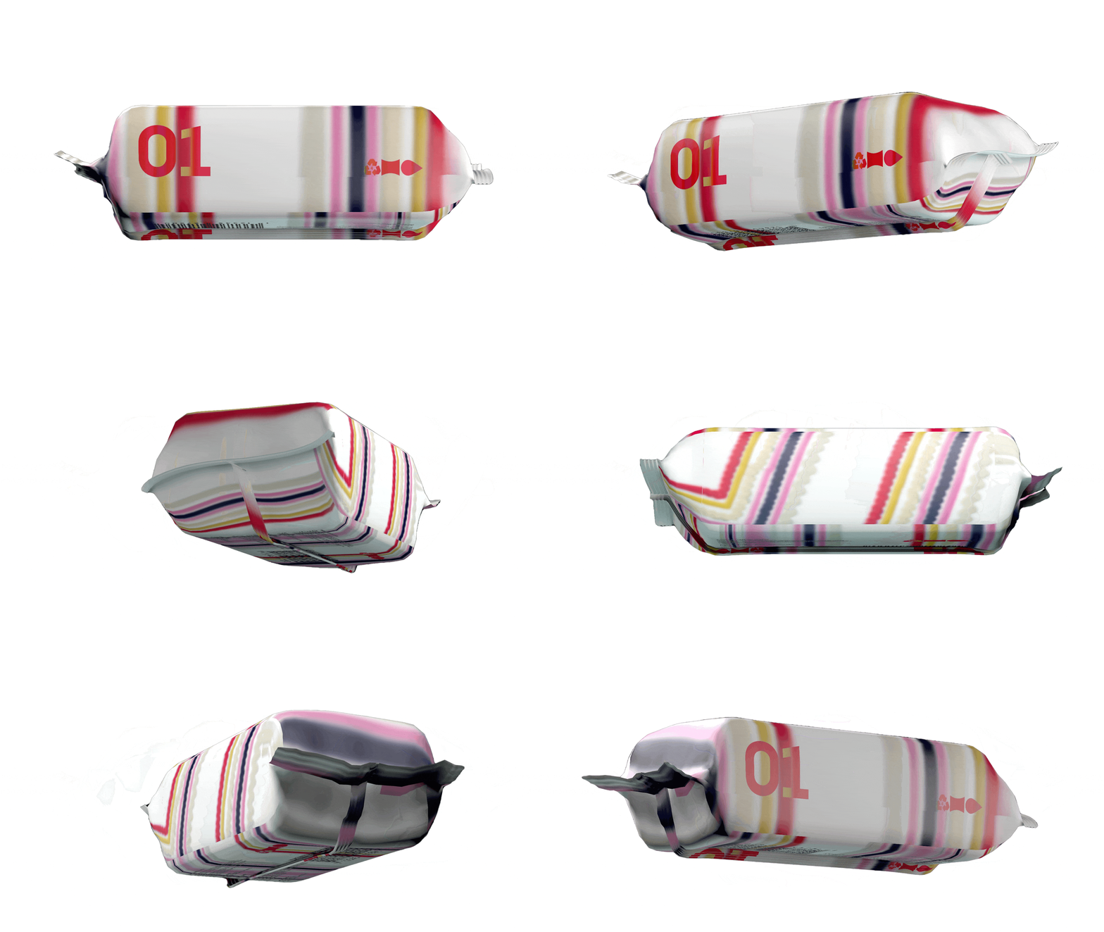
What it doesCute and stylish pack at first glance, slightly melancholic upon second viewing. The Line 01 / Line 02 split handles the rest: one surface for two rooms—no second design is needed.
Connection [stsepka]
Identity for a multidisciplinary industrial workshop
[2026] · concept, identity, typography
The Brief & The Constraints
Stsepka is a space where artists can collaborate with craftsmen and bring their wildest ideas to life. The problem it addresses is concrete: artists constantly face technical challenges—sourcing materials, installing objects, coding interactive elements—while brands continuously increase their need for campaigns, pop-ups, and one-off themed installations and decor. Quickly finding a technical or engineering specialist, selecting raw materials, and managing the production process is difficult. In an ideal world, Stsepka would take these processes and streamline production within the art industry. The identity needed to speak to both sides without appearing corporate or factory-like, so it borrows the language of industrial equipment and raw materials.
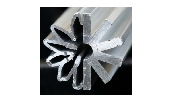
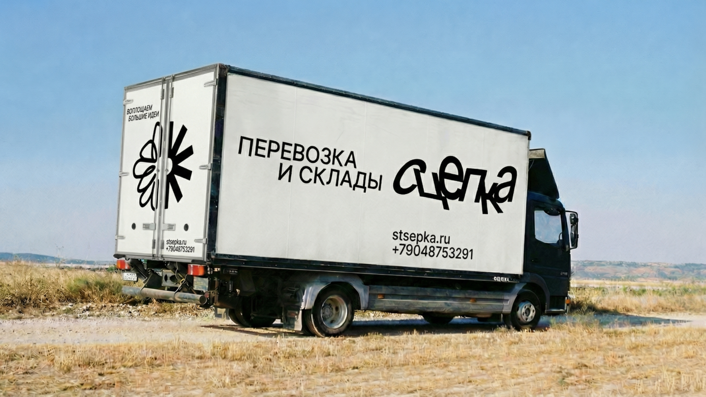
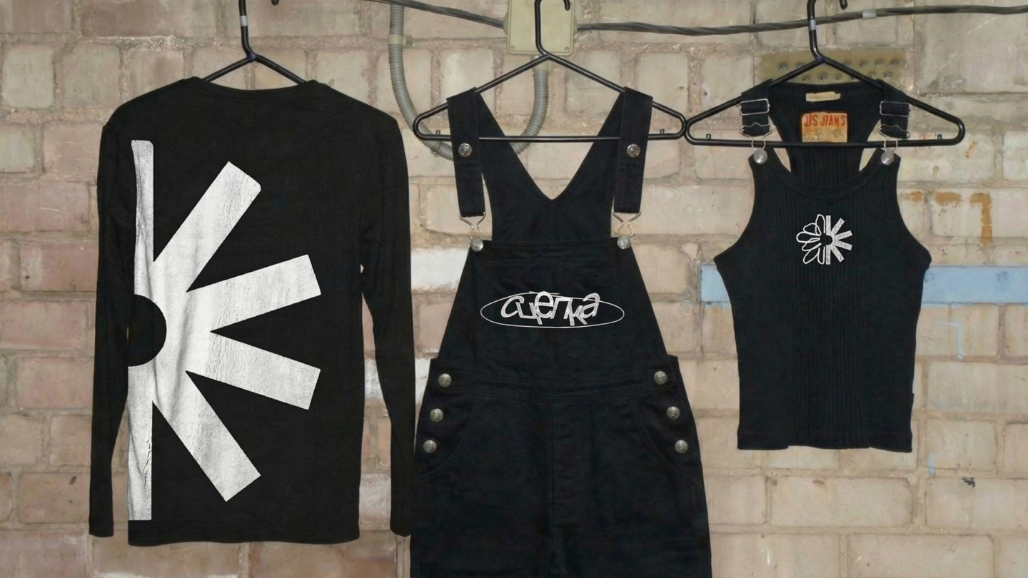
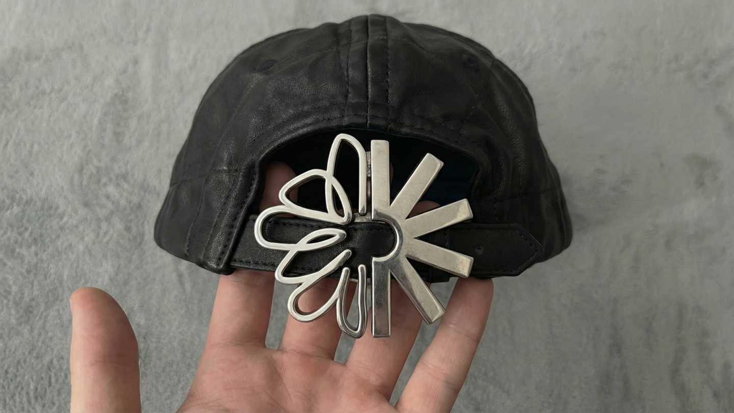
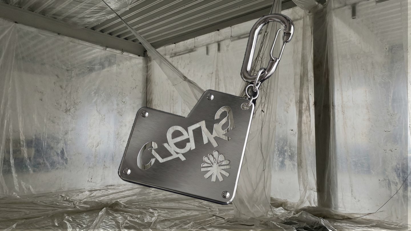
The TurnThe logo is not a flower; it is a coupling. Ten petals, composed of two parts: one sketched by hand for the artists, and one technical asterisk—the footnote symbol—for the craftsmen. They interlock, and only then do they form a flower. It also happens to resemble the head of a nail.
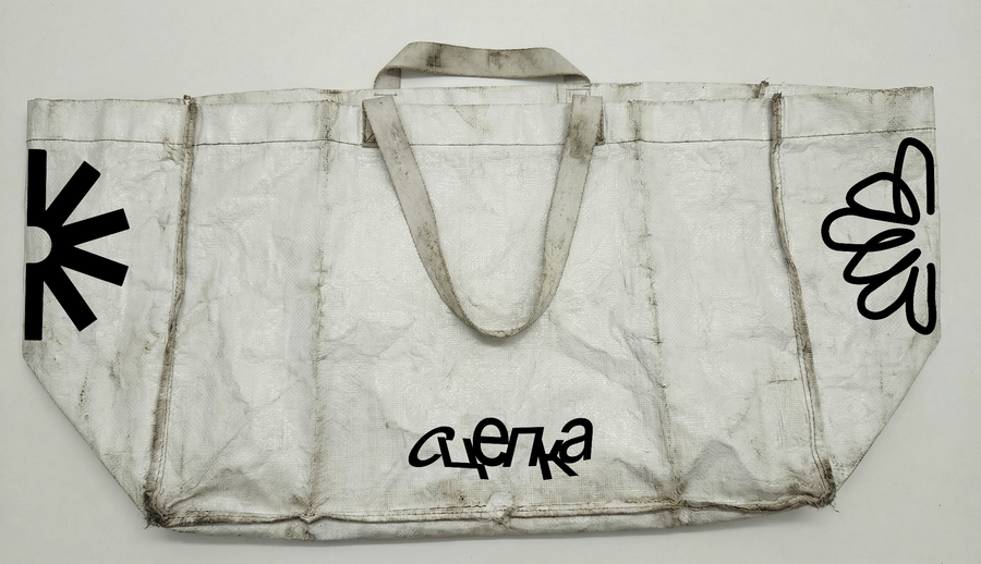
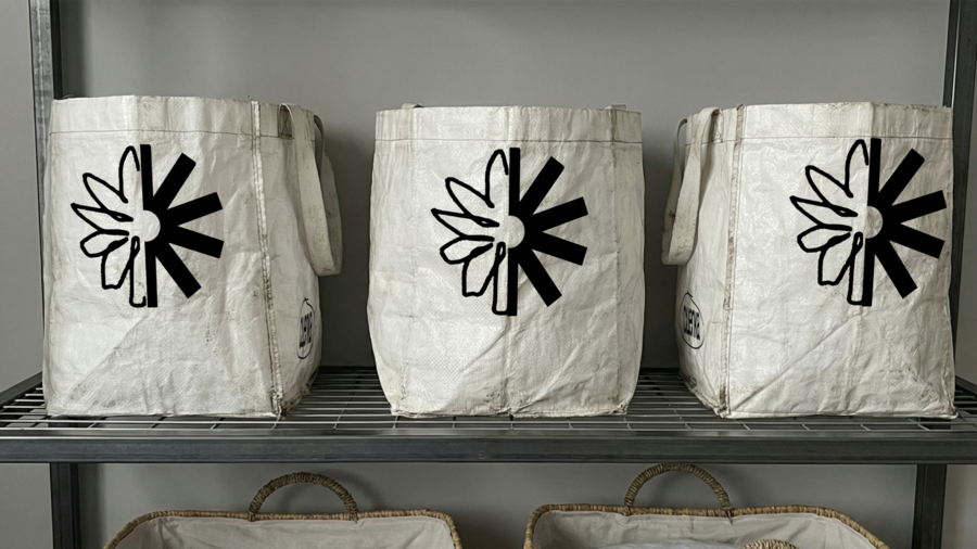
The Detail That Makes All the DifferenceThe asterisk. On a page, it signals that «there is more below this line.» In the mark, it is load-bearing: remove it, and the flower unravels. Wherever the logo appears, it metaphorically functions as a small but essential screw, fastening the work of different fields together so that something truly remarkable can be created.
In the systemThe typography mimics the stamping found in branding for industrial equipment and raw materials; the lines between text blocks move like the grooves of a factory machine.


What it doesIt offers production capability without claiming to be a studio, and grants both the workshop and the artist the same recognition.
Maison Montage
Identity for a fashion house that thinks in edits
[2026] · concept, identity, photo style