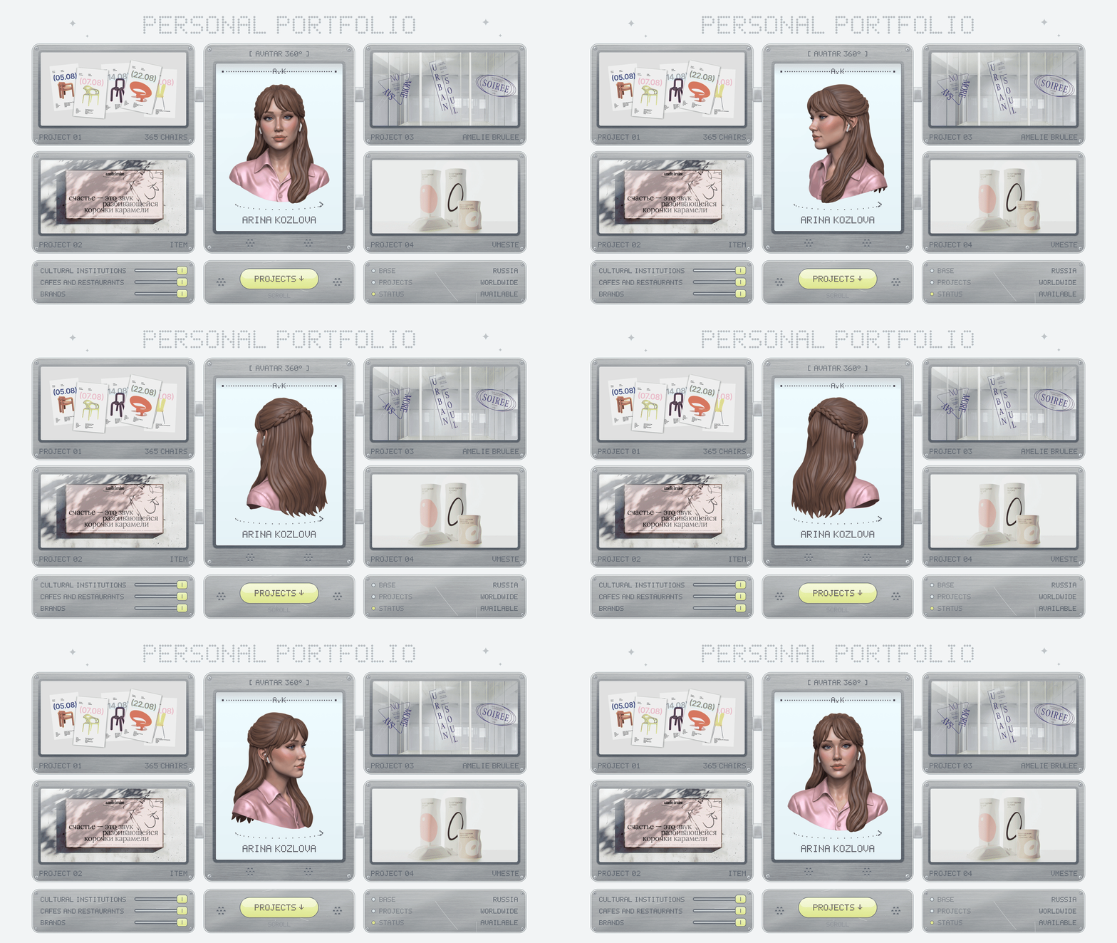
Hi, I’m Arina Kozlova. I design brand identities, packaging, and typefaces for museums, cafés, and design brands.
Below are seven of my projects—from a metal museum to a dairy and my own typeface. Each one grew from one simple idea.
About me
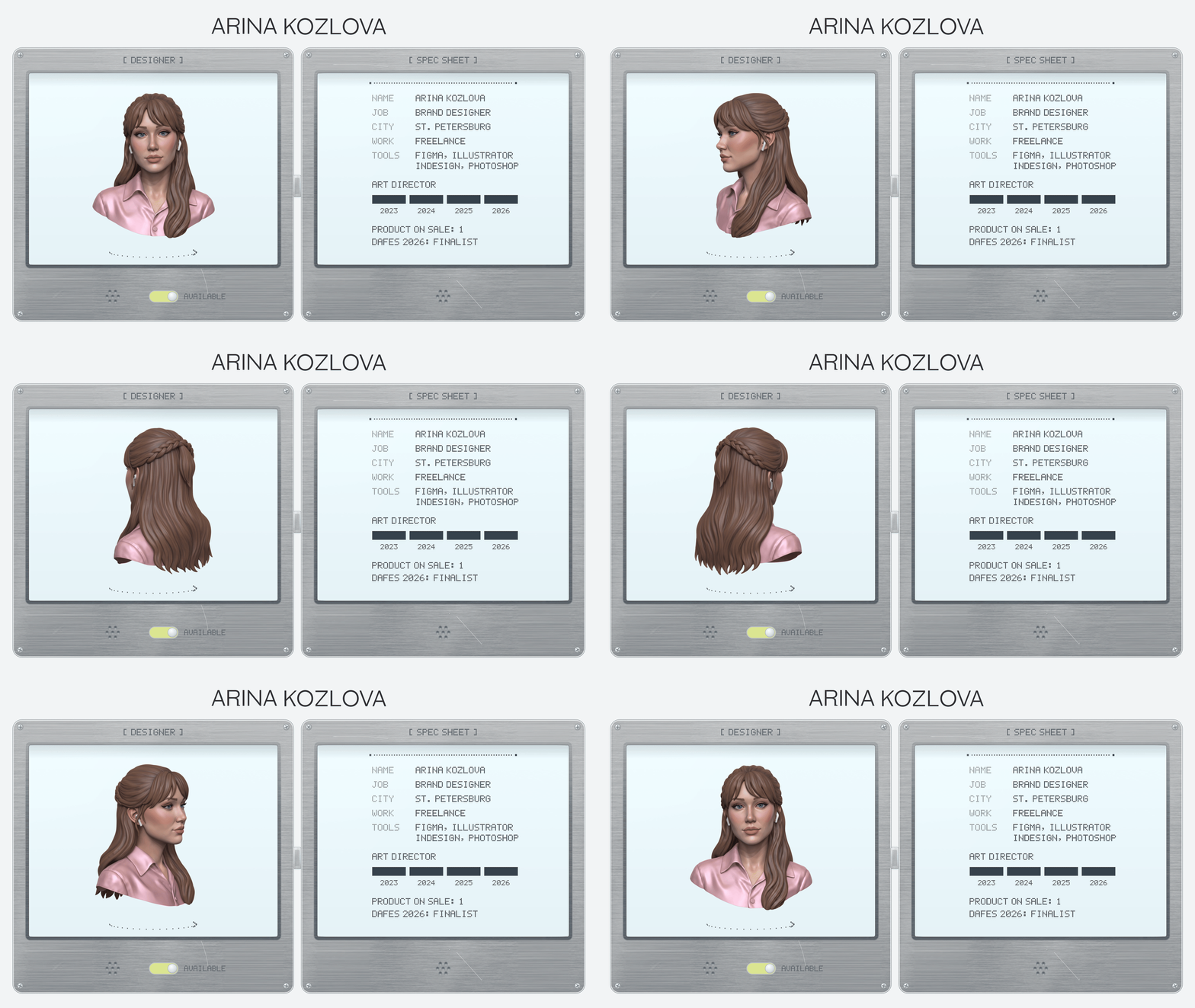
From 2023 to 2026, I served as Art Director at Zerkalo Design Studio in St. Petersburg, leading brand and packaging projects for Eburet Studio, Amélie Brûlée, Splav, and the dairy brand «O».
Currently, I take on freelance projects for clients both in Russia and internationally. I also design my own typefaces.
Education: B.A. in Design, HSE Art and Design School.
How I Work
Projects
I completed all seven projects independently. Under each one, you will find a detailed breakdown of my contributions.
01. 365 Chairs: a tear-off calendar for Eburet Studio
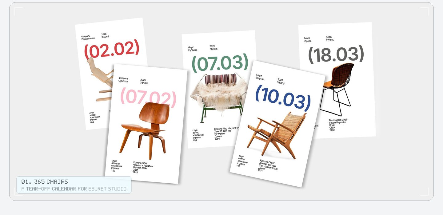
The calendar is a concise history of the chair. It opens with the Vienna chair and concludes with pieces from Eburet Studio, positioning the young brand immediately following the classics.
The round brackets surrounding each date became the signature element of the entire calendar. You find them on every page and on the box, where even the year is enclosed within them: (2026).
Each page utilizes a single grid: a prominent date in round brackets, the chair, and five brief facts about it. These brackets are the unifying motif of the calendar. Even the year displayed on the box is contained within them.
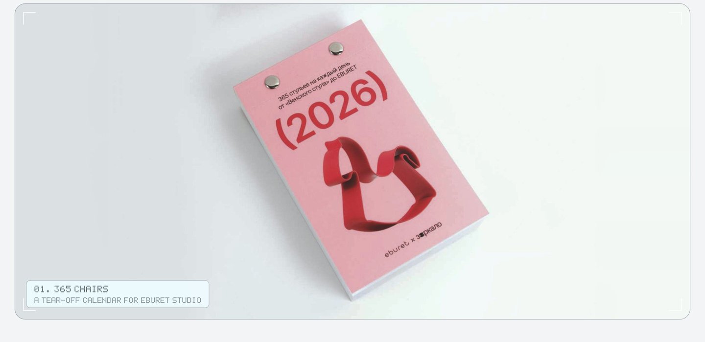
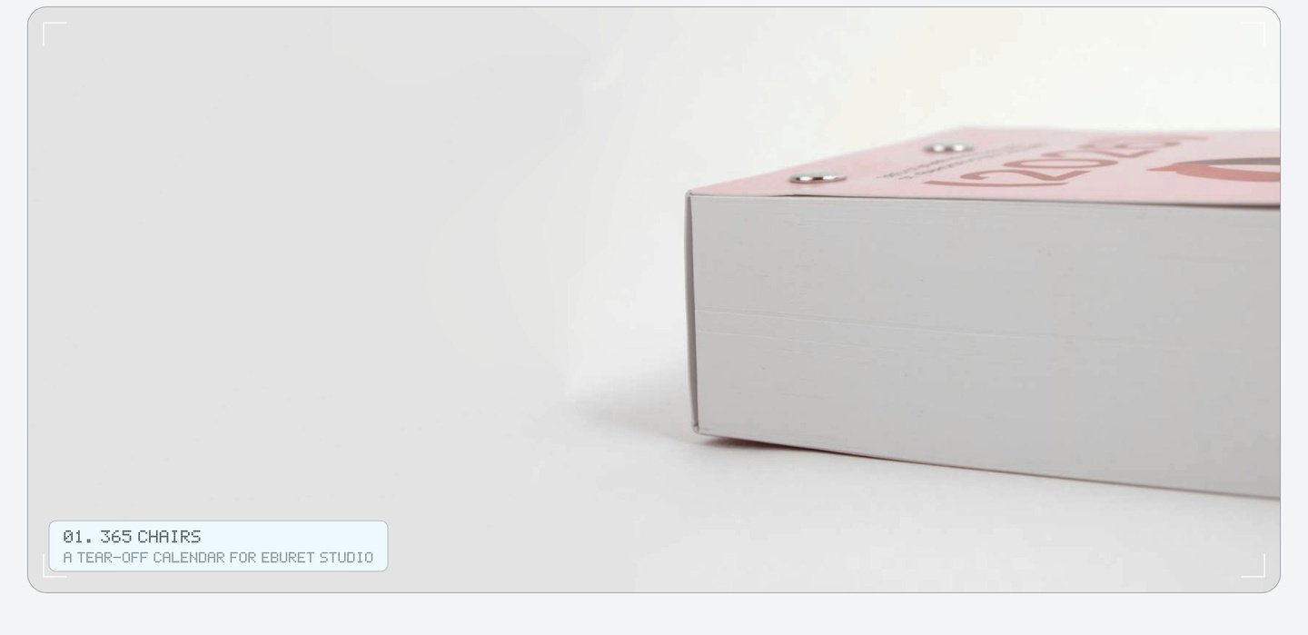
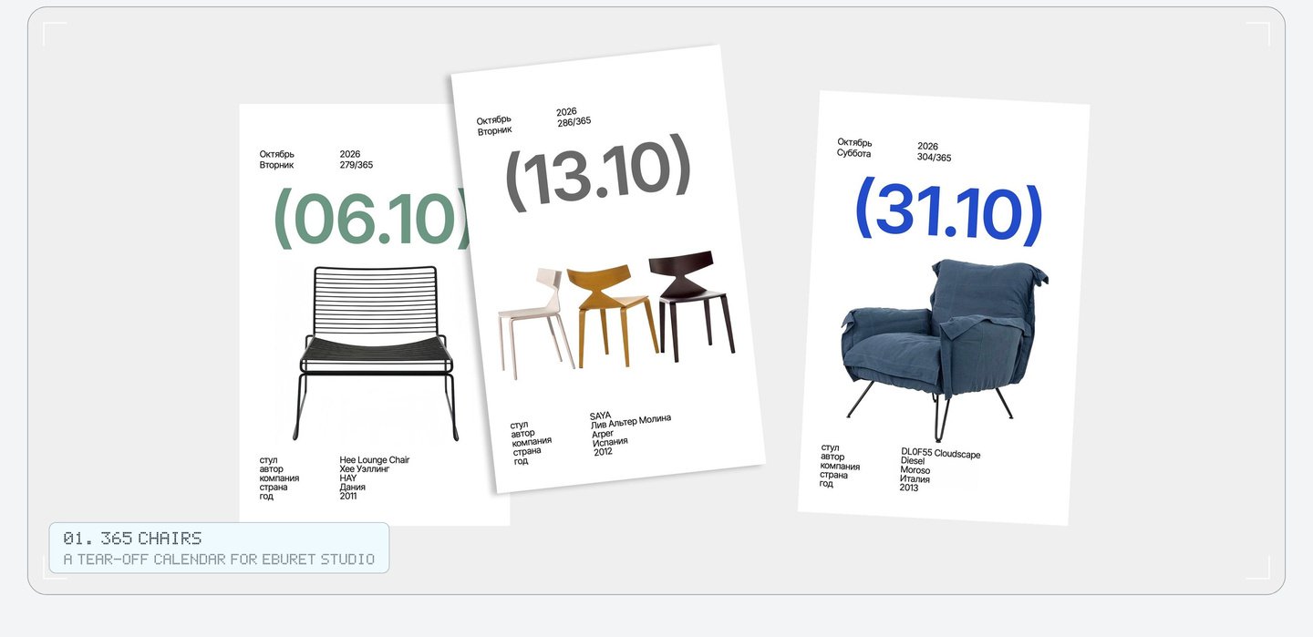
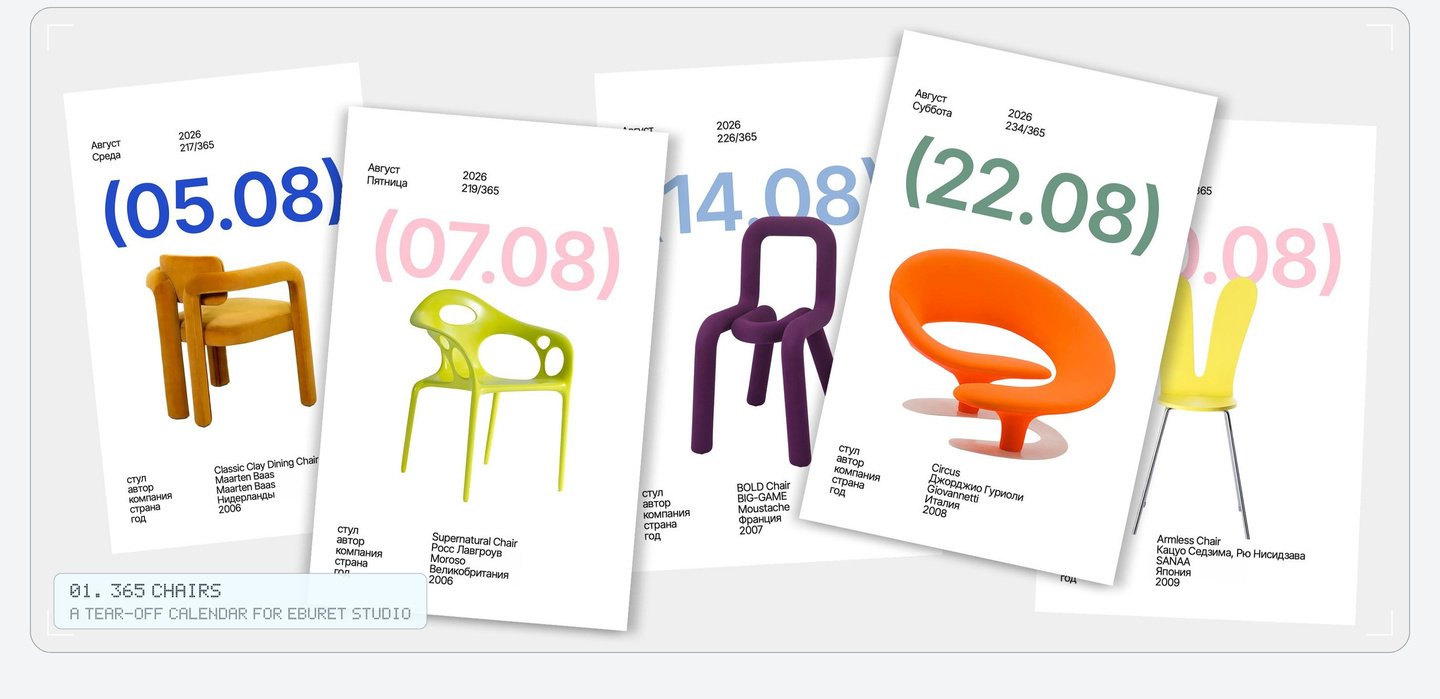
The calendar went on sale in the Eburet Studio online shop. My role: product ideation and art direction.
02. Item: Branding for a pop-up store featuring Russian brands, Nizhny Novgorod
At the entrance, every guest of Item receives a small passport. Each purchase earns a stamp from that brand. Talks and parties also have their own stamps, and a full passport can be traded in for gifts.
The stamps are also the aesthetic of the store—from the shop window to the tape on a box. Only the Cyrillic logo remains unchanged.
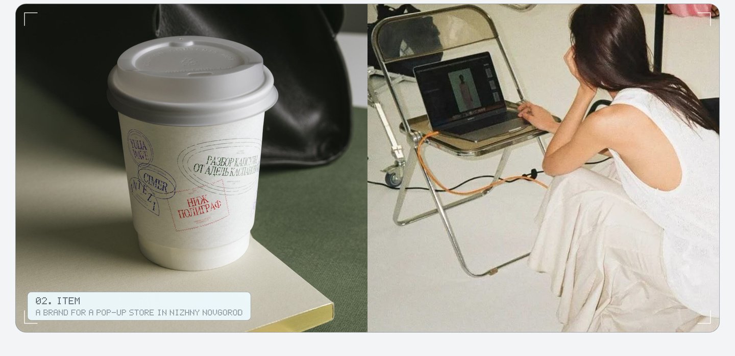
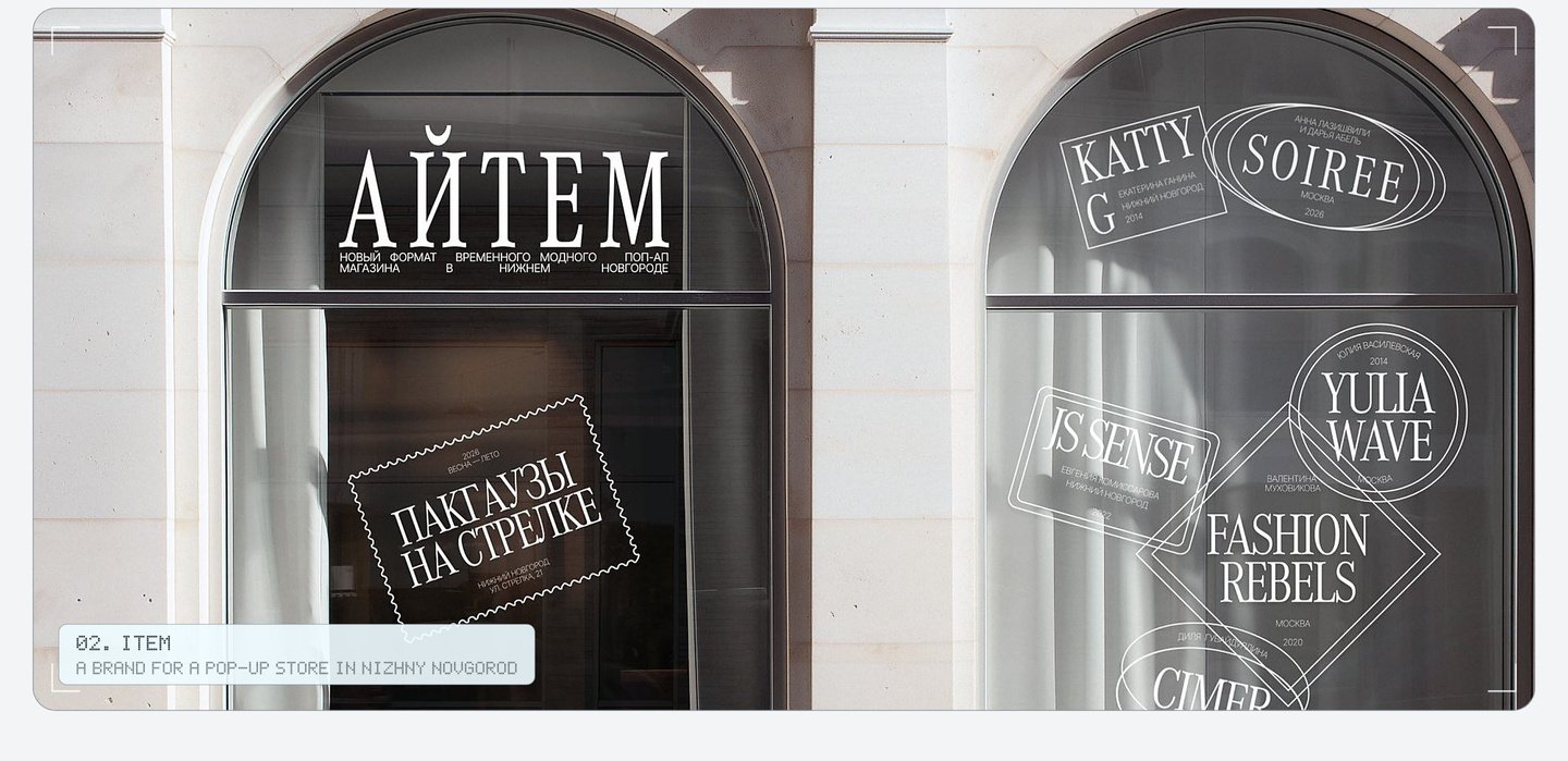
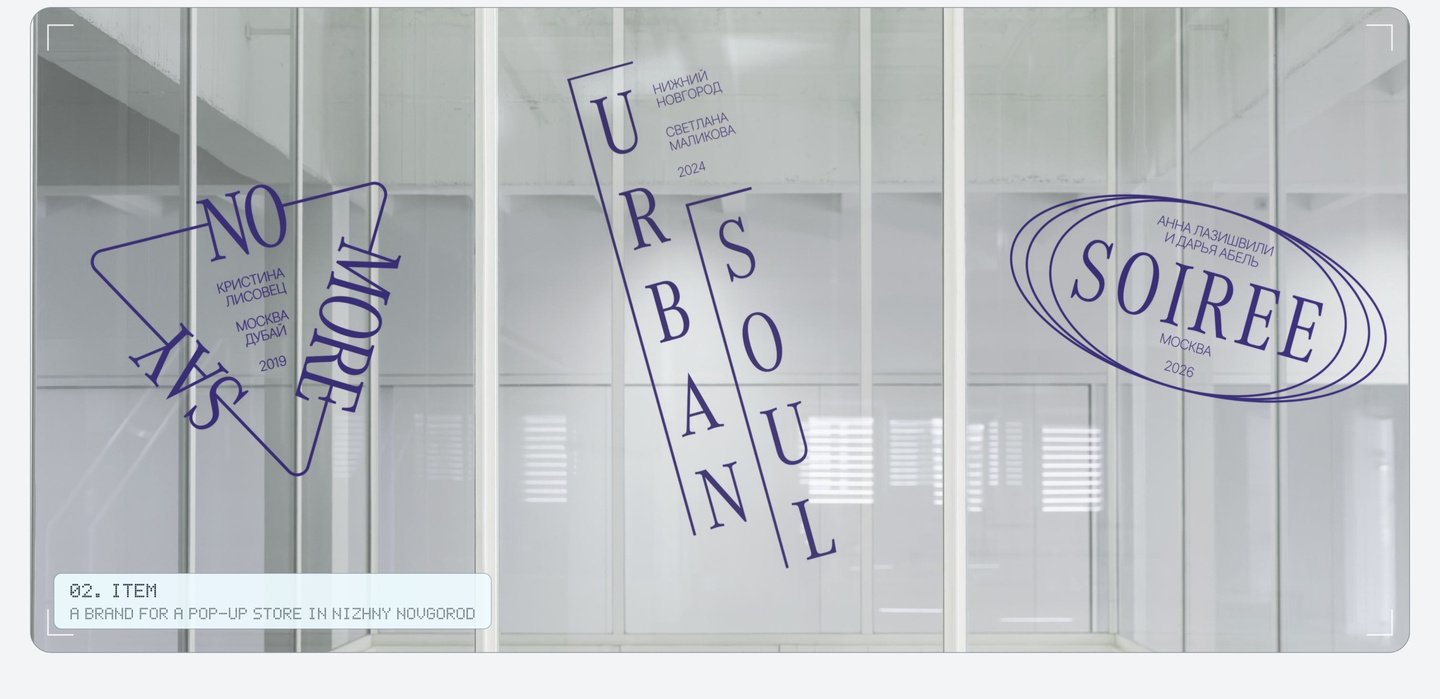
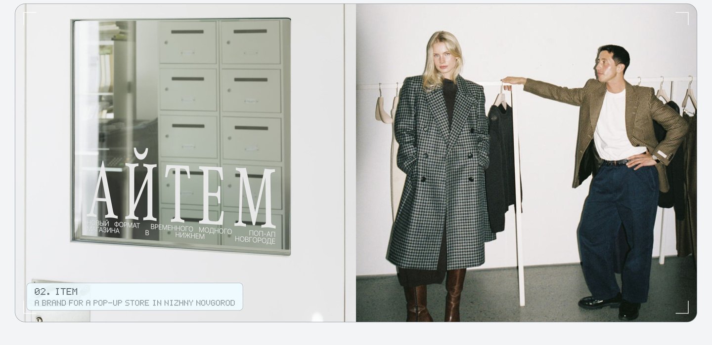
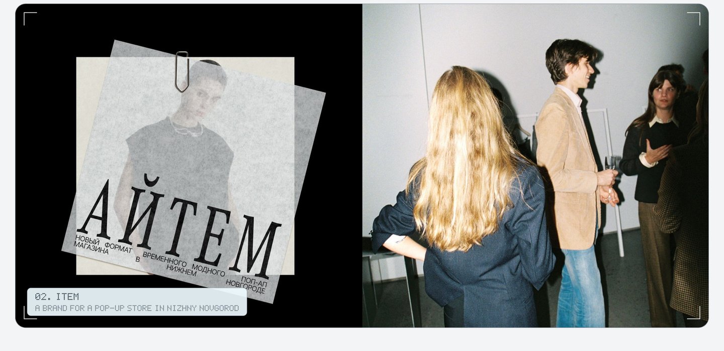
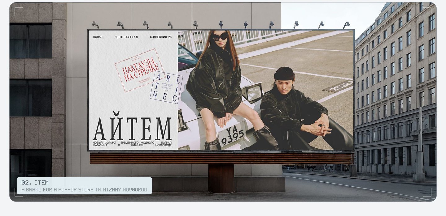
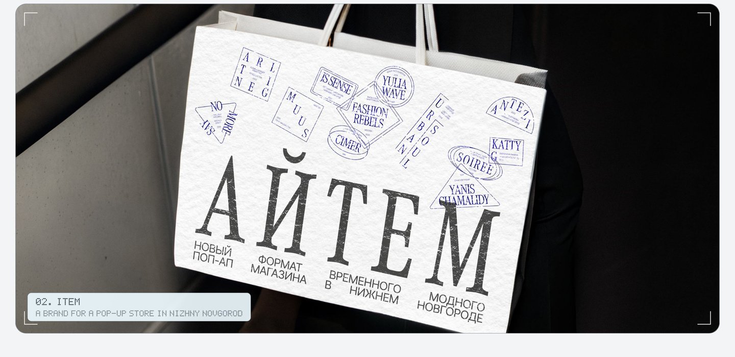
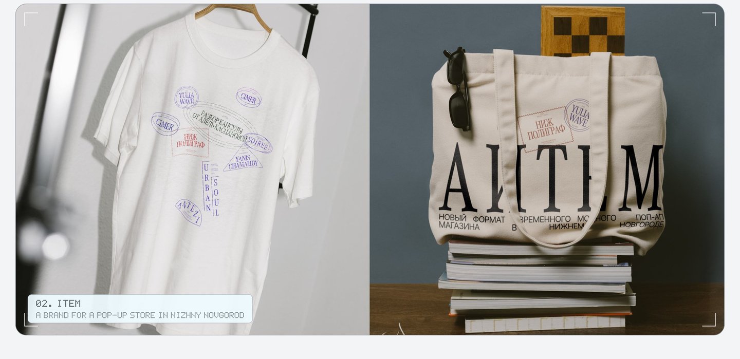
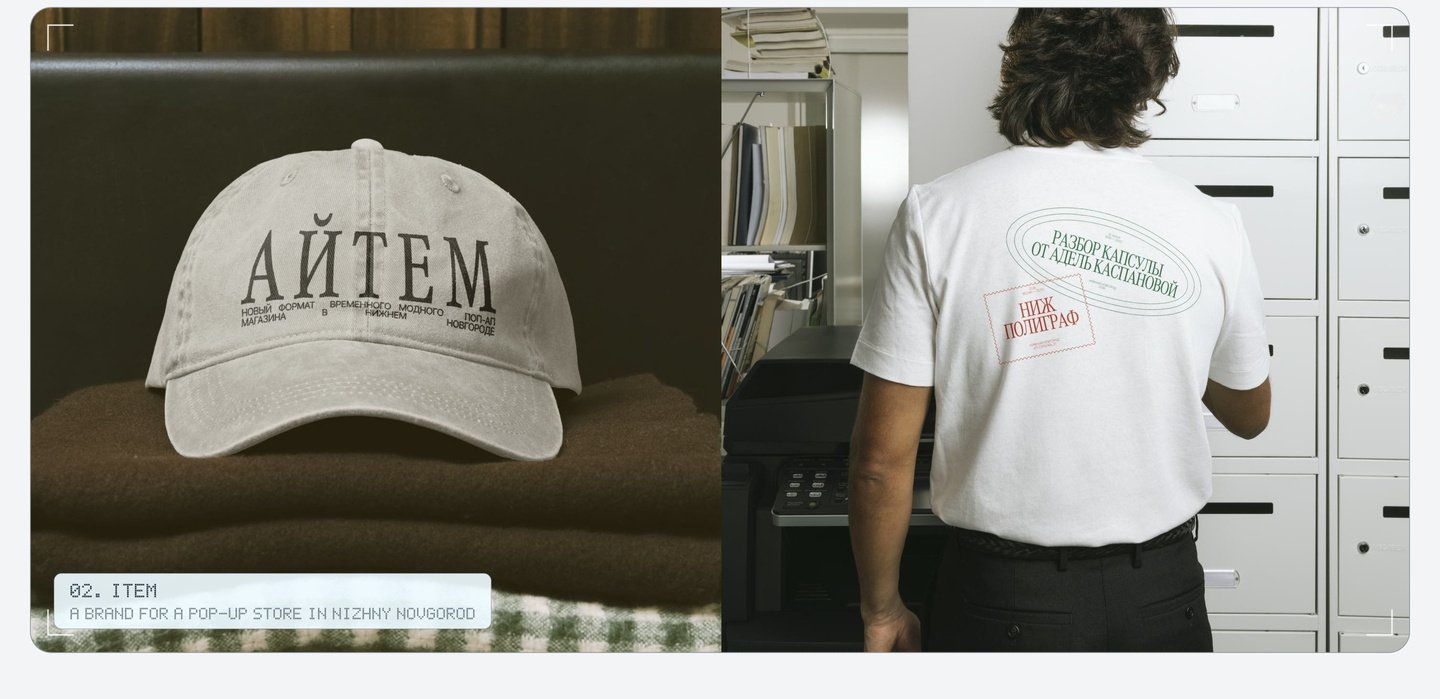
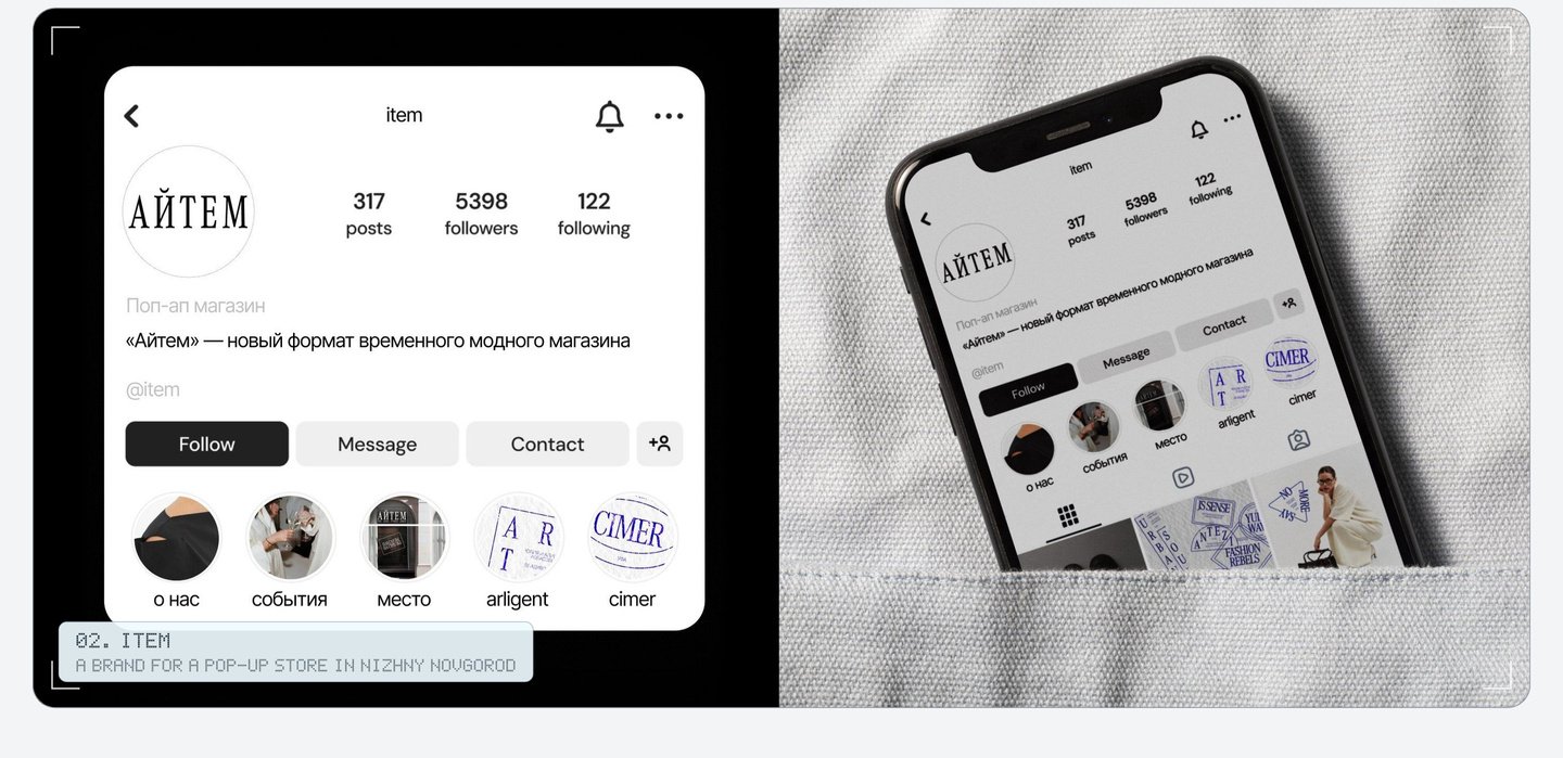
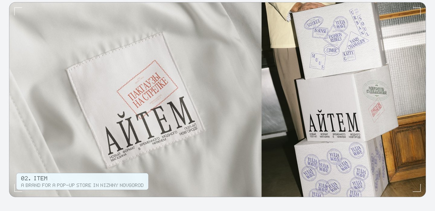
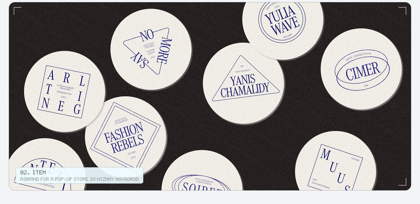
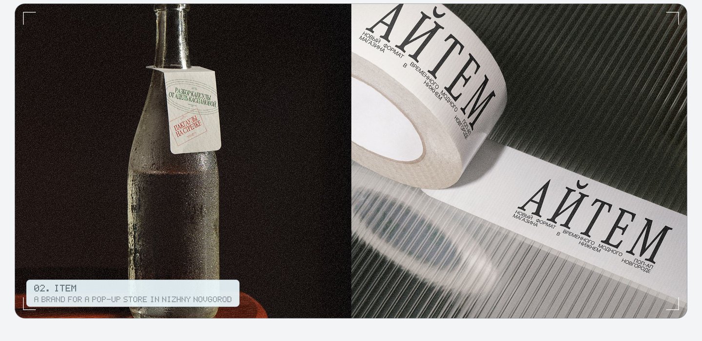
A new brand joins the store with a new stamp. My role: developing the passport concept, designing the Cyrillic logo, creating the entire set of stamps, and determining how they integrate onto bags, cups, windows, and social media.
03. Amélie Brûlée: branding and packaging for a café and bakery in St. Petersburg
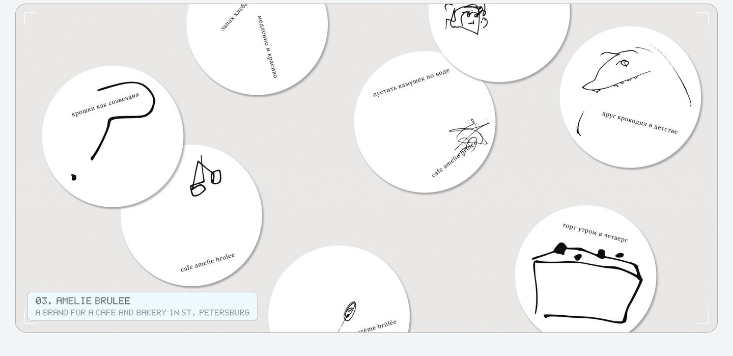
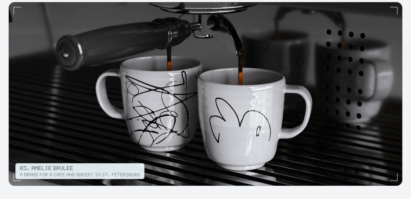
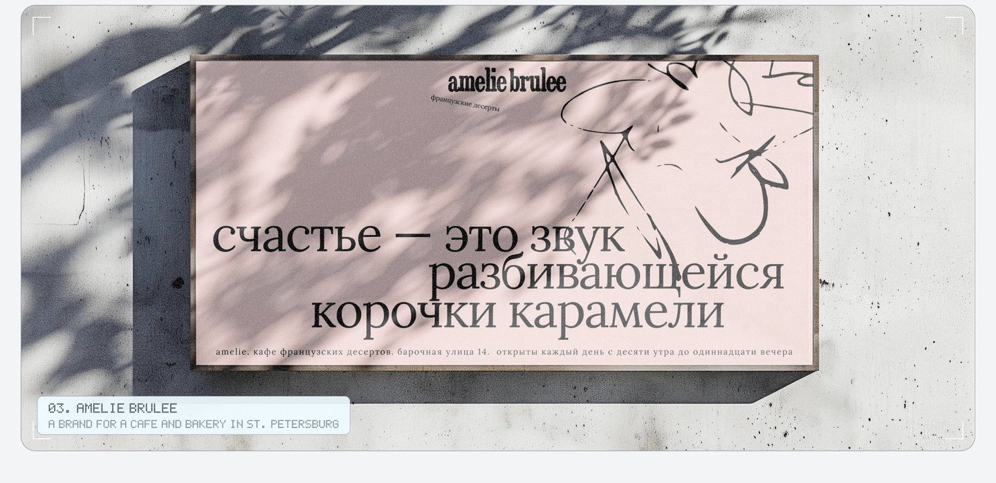
I drew every picture by hand—quickly and a little messily, like scribbled notes in a diary’s margins. The boxes and bags feature vintage French patterns: soft stripes and large polka dots. Short phrases about small joys run across the totes and boxes, such as «Happiness is the sound of a cracking caramel crust.»
Three principles tie it together: hand-drawn illustration, a dynamically shifting line of text, and a French pattern.
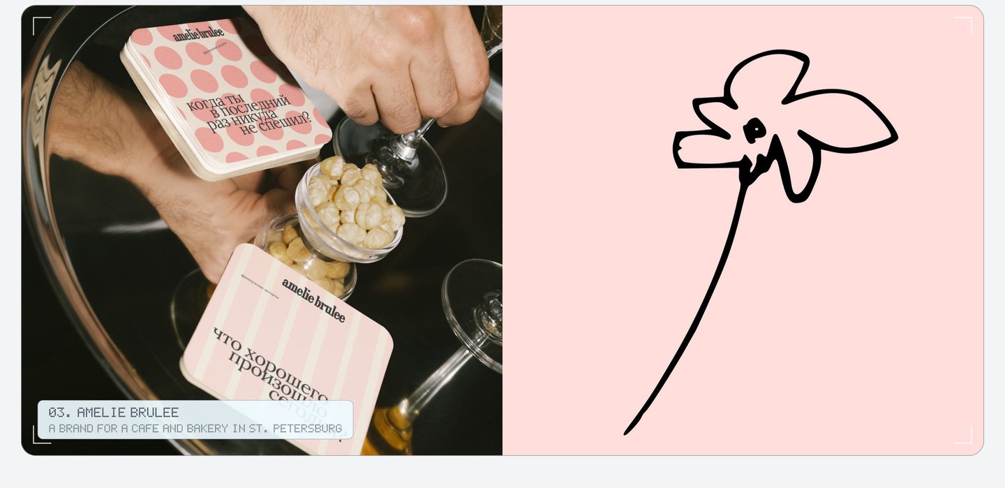
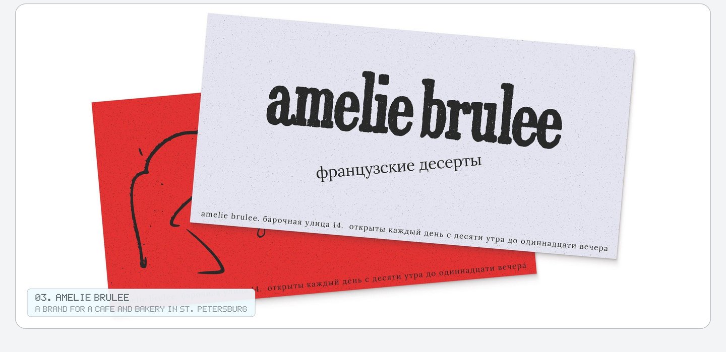
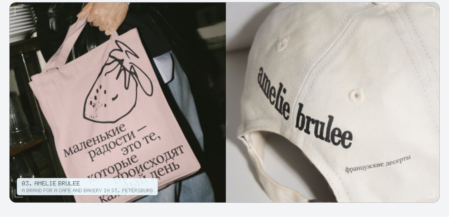
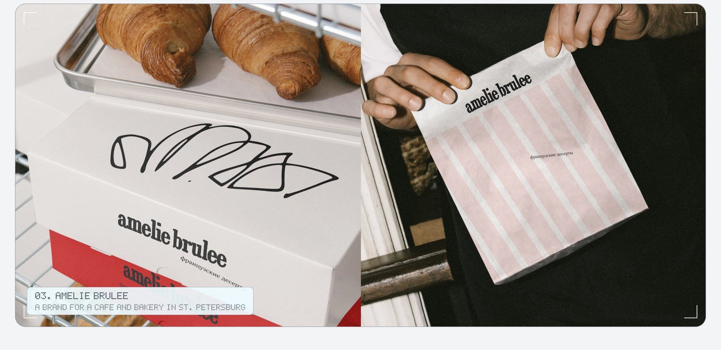
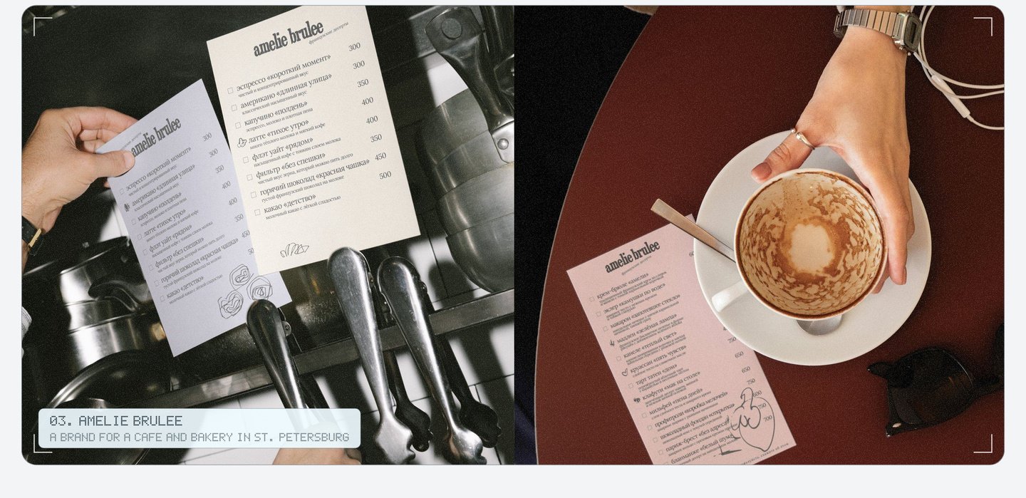
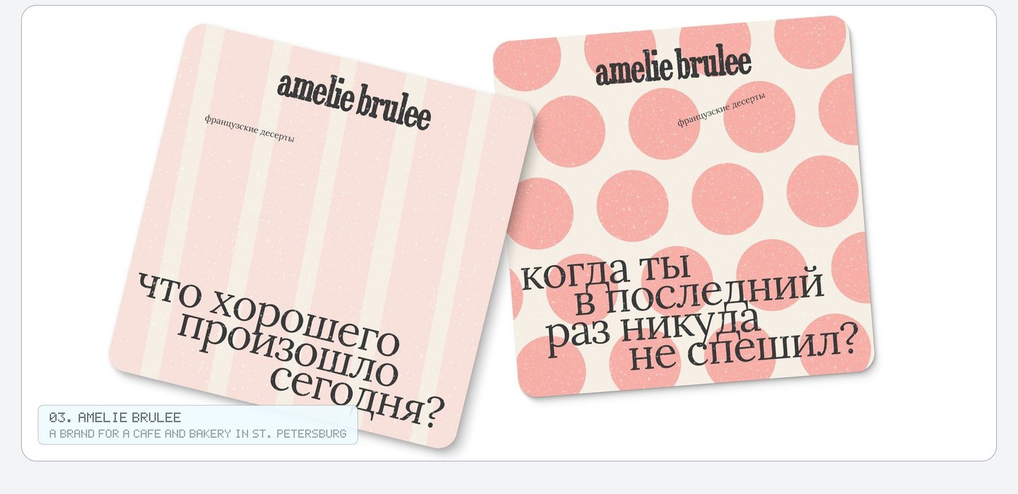
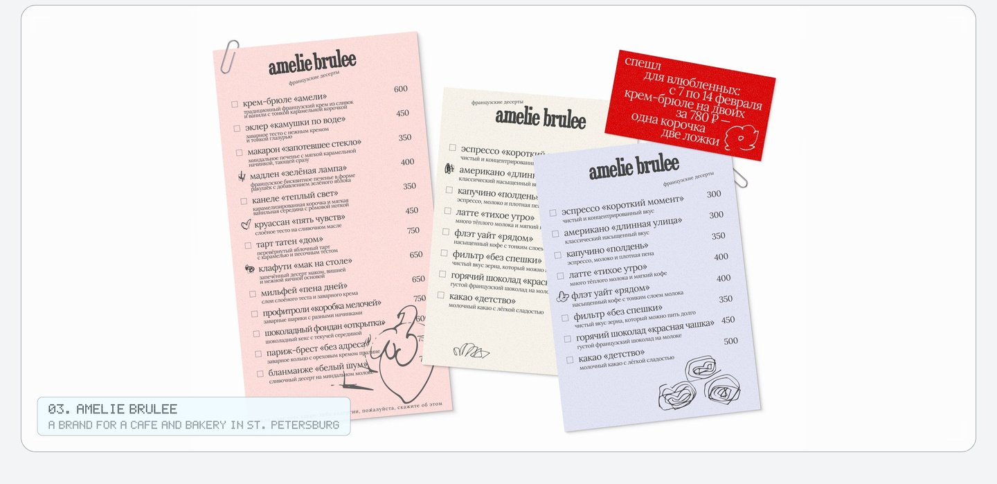
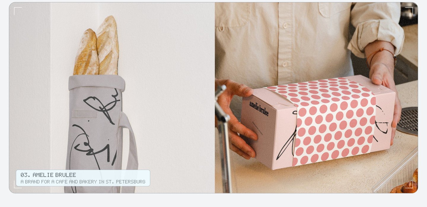
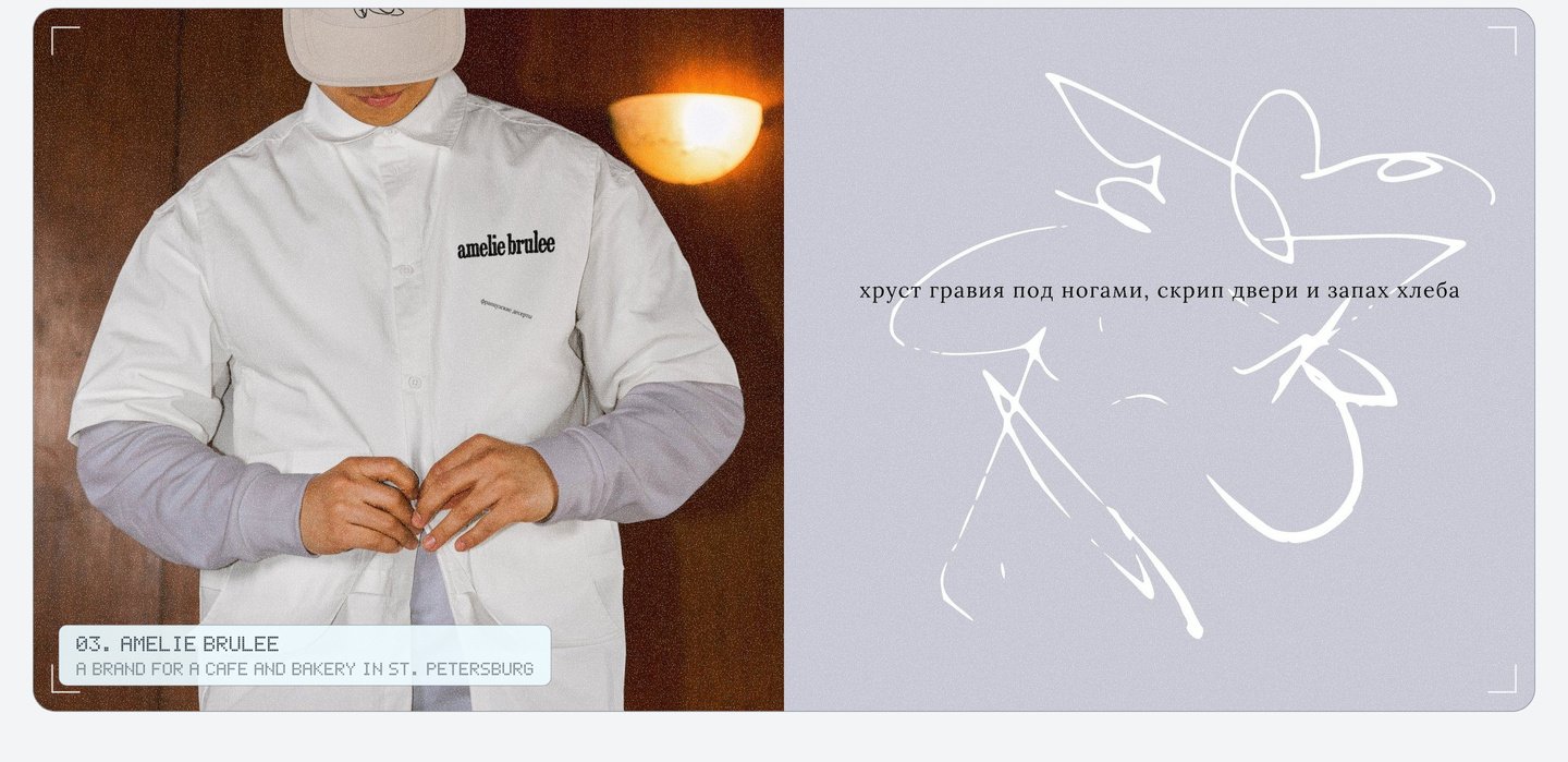
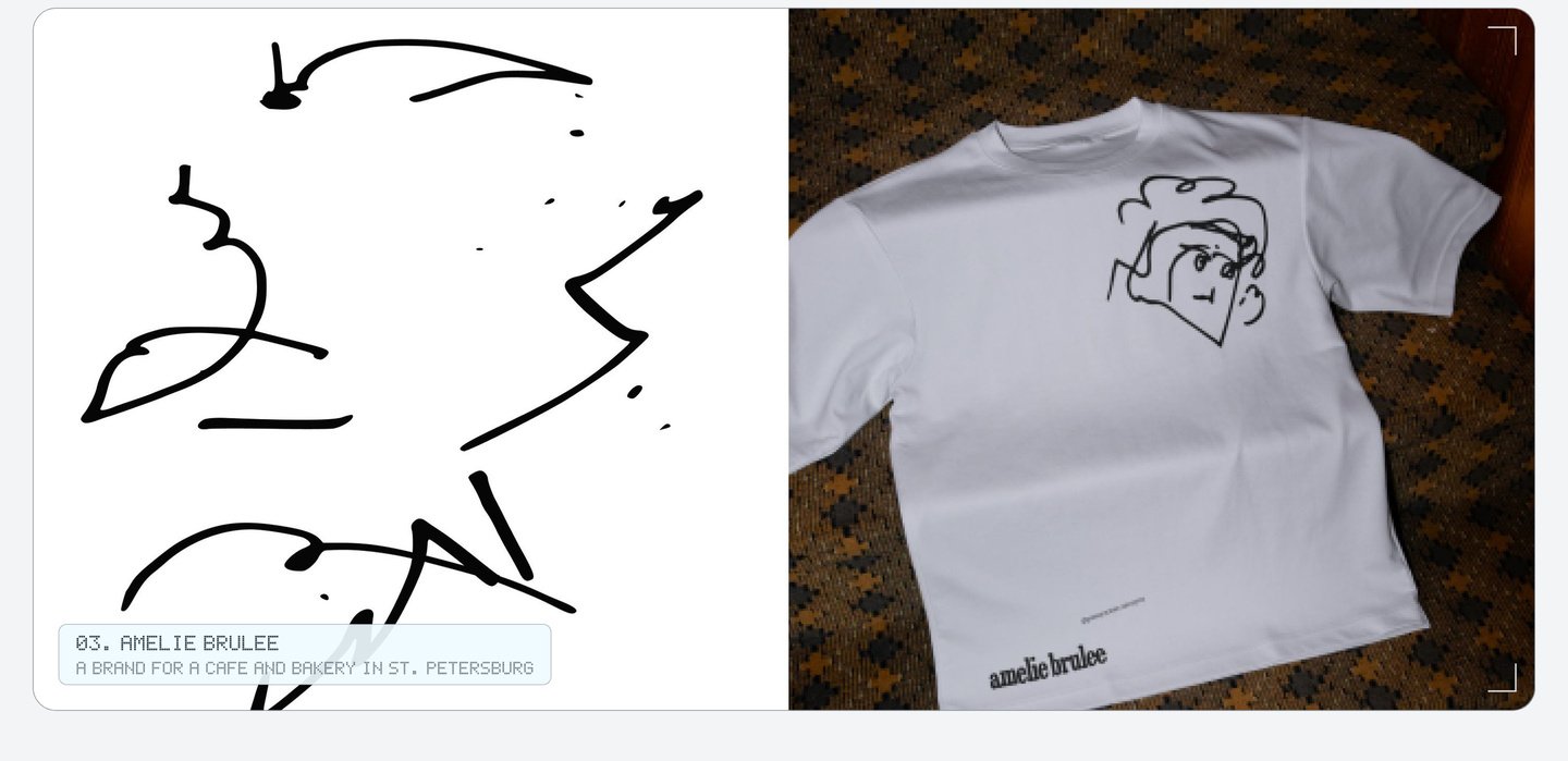
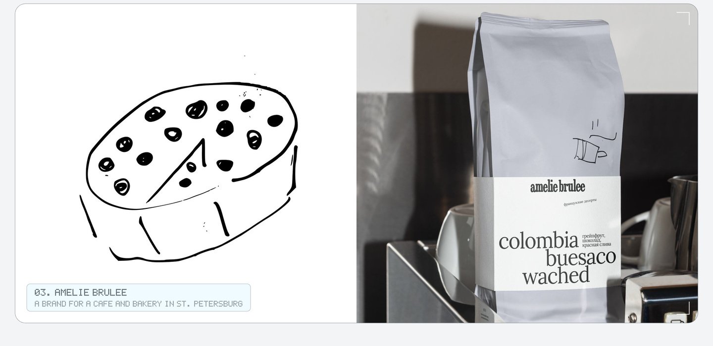
With these guidelines, the team can develop a new cup, menu, or bag, and it will still evoke the spirit of Amélie Brûlée. My role involves generating the core idea, all the illustrations, the logo, the patterns, the slogans, and the packaging design.
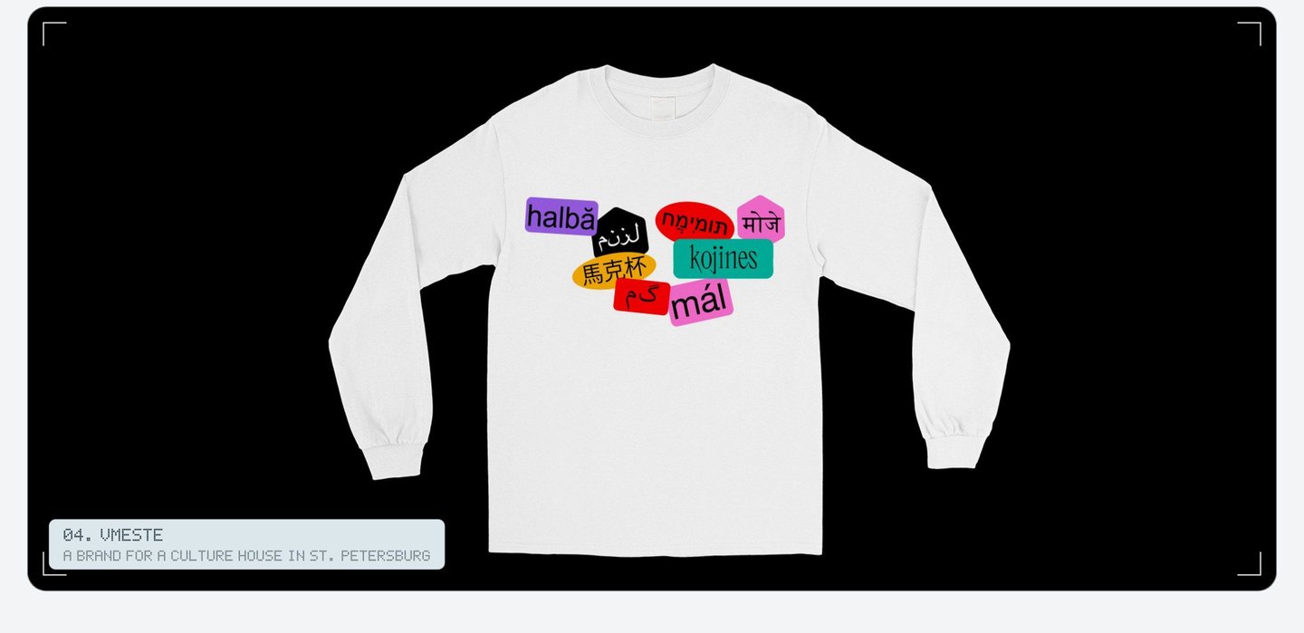
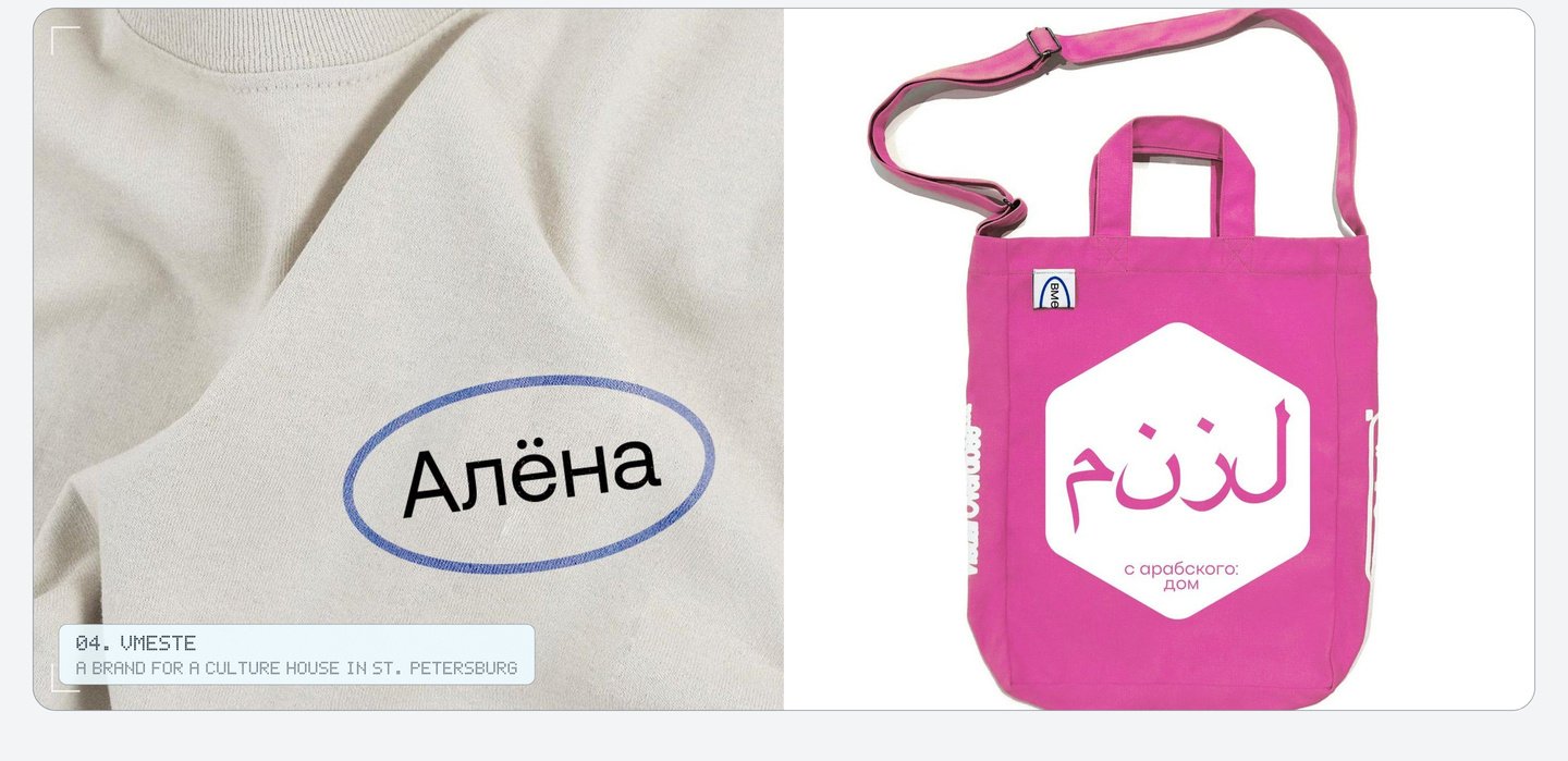
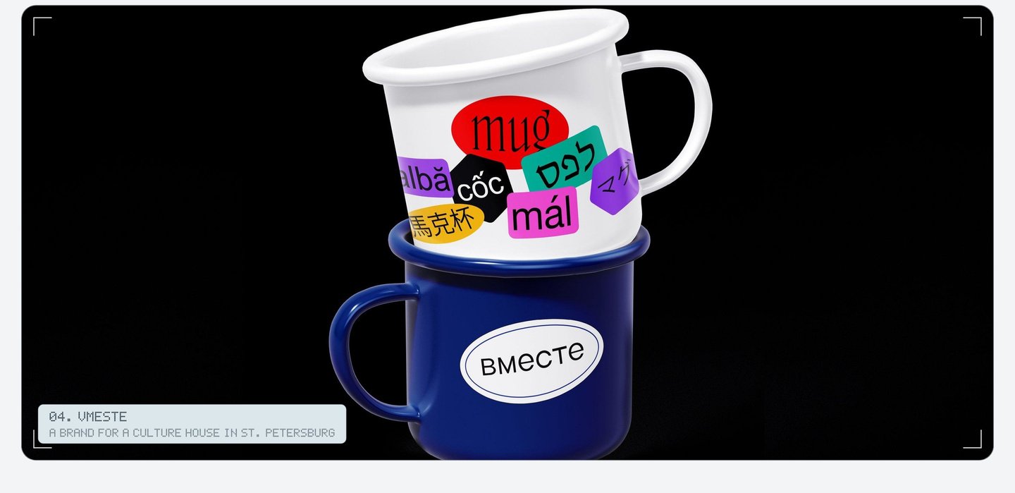
04. Together: Branding for a cultural center in St. Petersburg
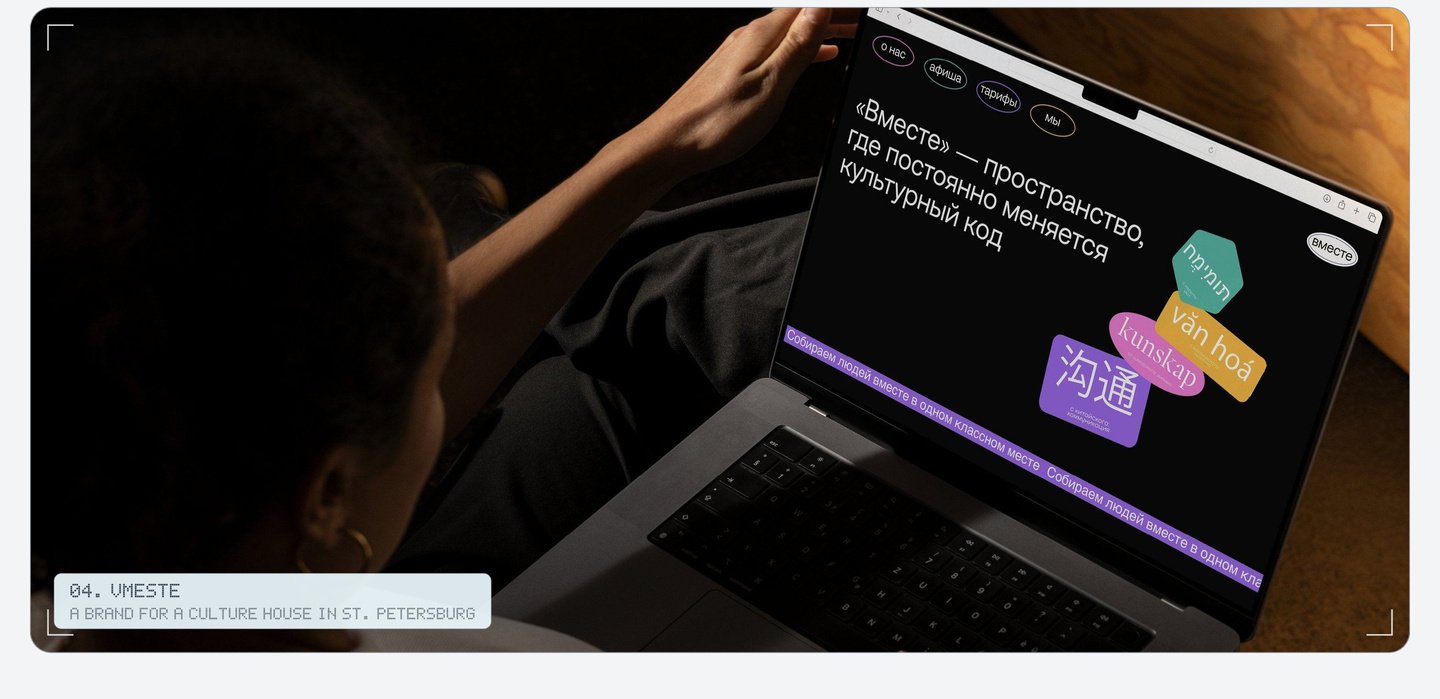
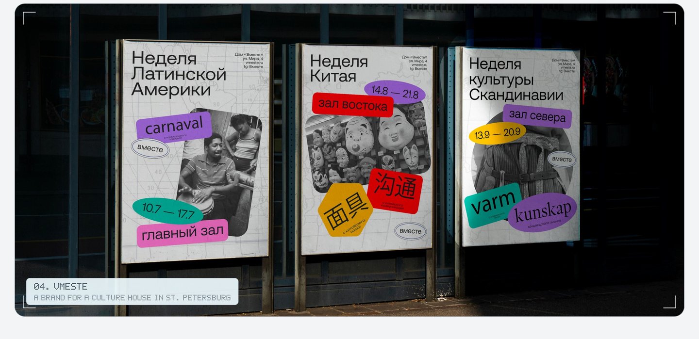
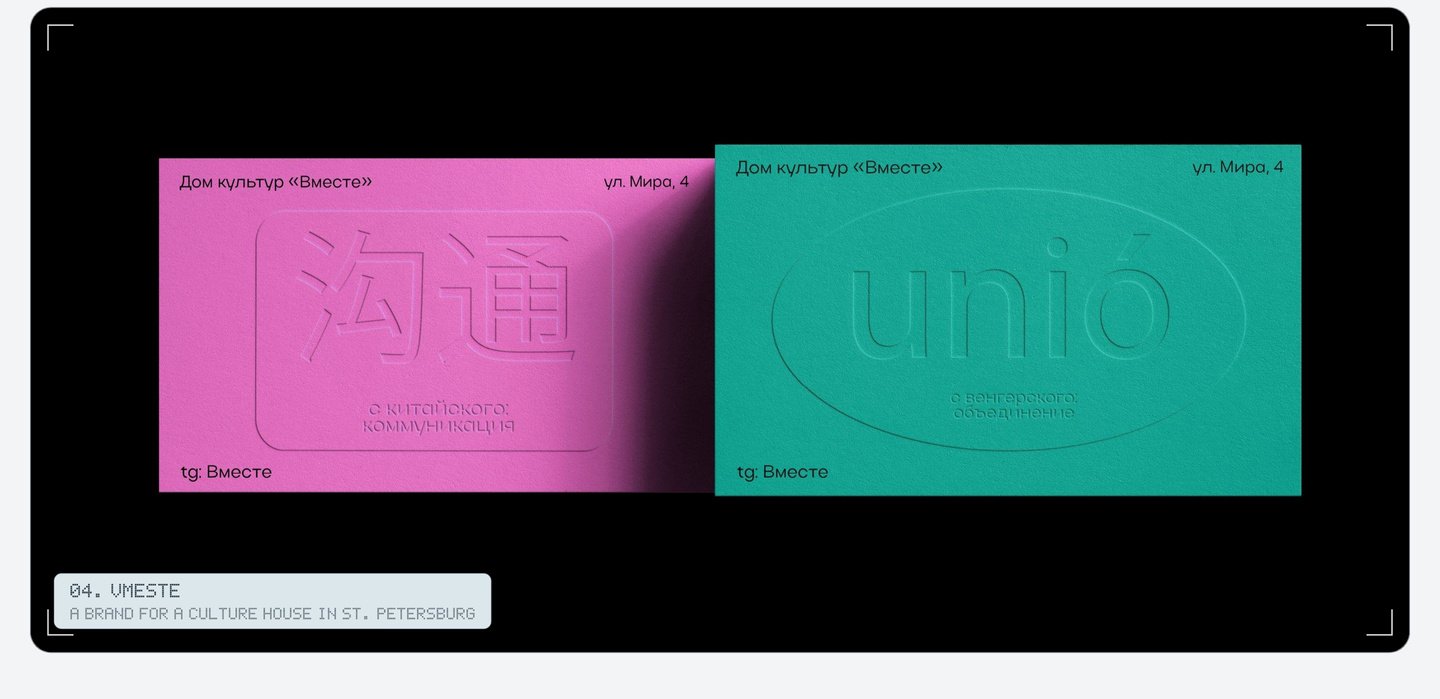
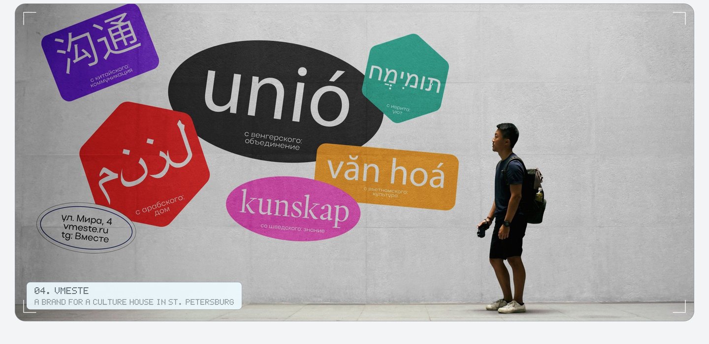
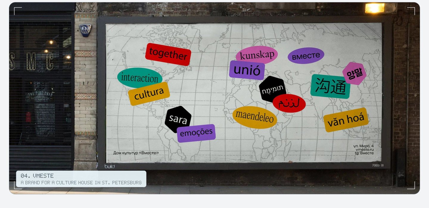
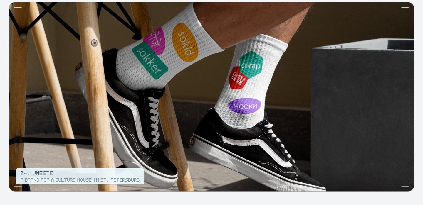
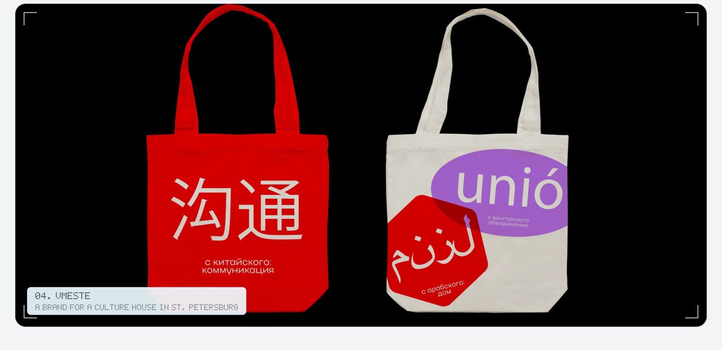
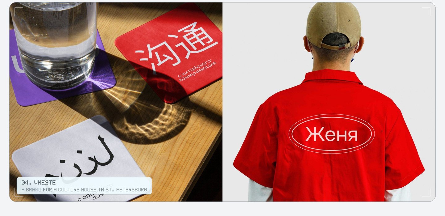
Vmeste («Together») dedicates each week to a different culture—Latin America, China, Scandinavia, and more. The logo remains constant; atop it, we place stickers featuring words from that culture on posters, billboards, totes, mugs, socks, and the website.
Every object is labeled in multiple languages, meaning even a mug can teach you a new word. The staff also wear name stickers.