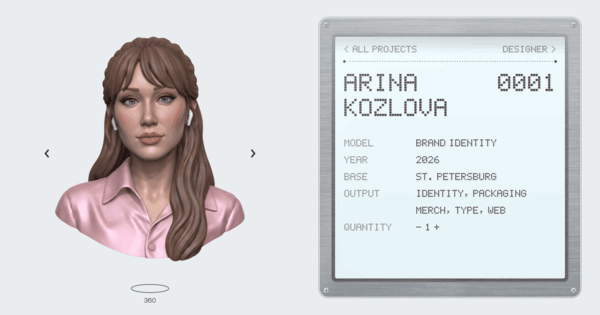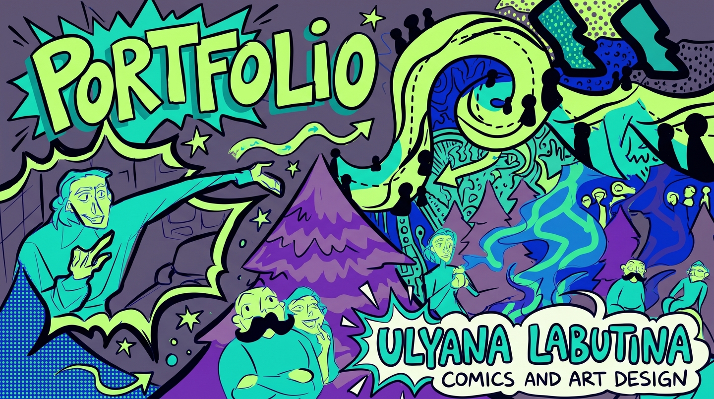
BRAND IDENTITY & GRAPHIC DESIGNERI don’t just design logos—I build living visual worlds.Hi! I’m Ulyana Labutina, a 21-year-old graphic and brand identity designer from HSE Art and Design School. I craft concept-driven brand identities, expressive illustrations, and tactile objects that transform businesses and communities into unforgettable ecosystems.Scroll down to see how deep research, character storytelling, and systemic design solve real brand challenges.
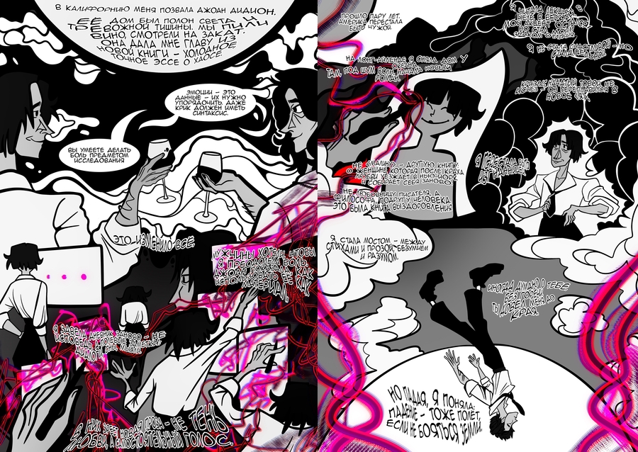
✦ MEET YOUR GUIDE
«A strong brand has a thousand faces, yet one unmistakable soul.»
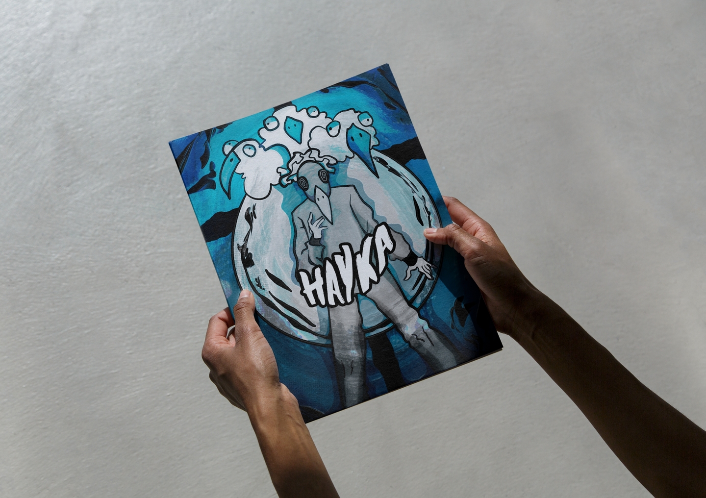
I am Kira, the Thousand-Faced Spirit — born on the cover of Ulyana’s flagship project. Think of me as the living pulse of a brand identity. As you scroll through this longread, I will shift shapes—from urban coffee steam to forest trails and ancient cosmos—showing you how Ulyana adapts visual systems across any medium.
ABOUT ME / 21 Y.O. SPECIALISTWhere structural logic meets raw human emotion.At 21, my practice bridges brand identity, visual research, and graphic storytelling. Whether I am designing a community identity, a ceramic teacup pair, or a complex mythological universe, I treat every brand as a holistic system where even the smallest detail reflects the bigger world.✦ Kira notes: «Ulyana never starts with templates. She starts by observing real people, their habits, and cultural codes.»
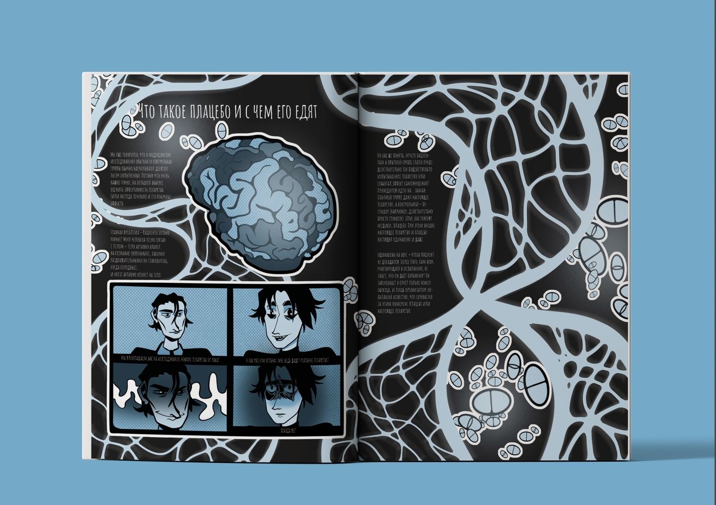
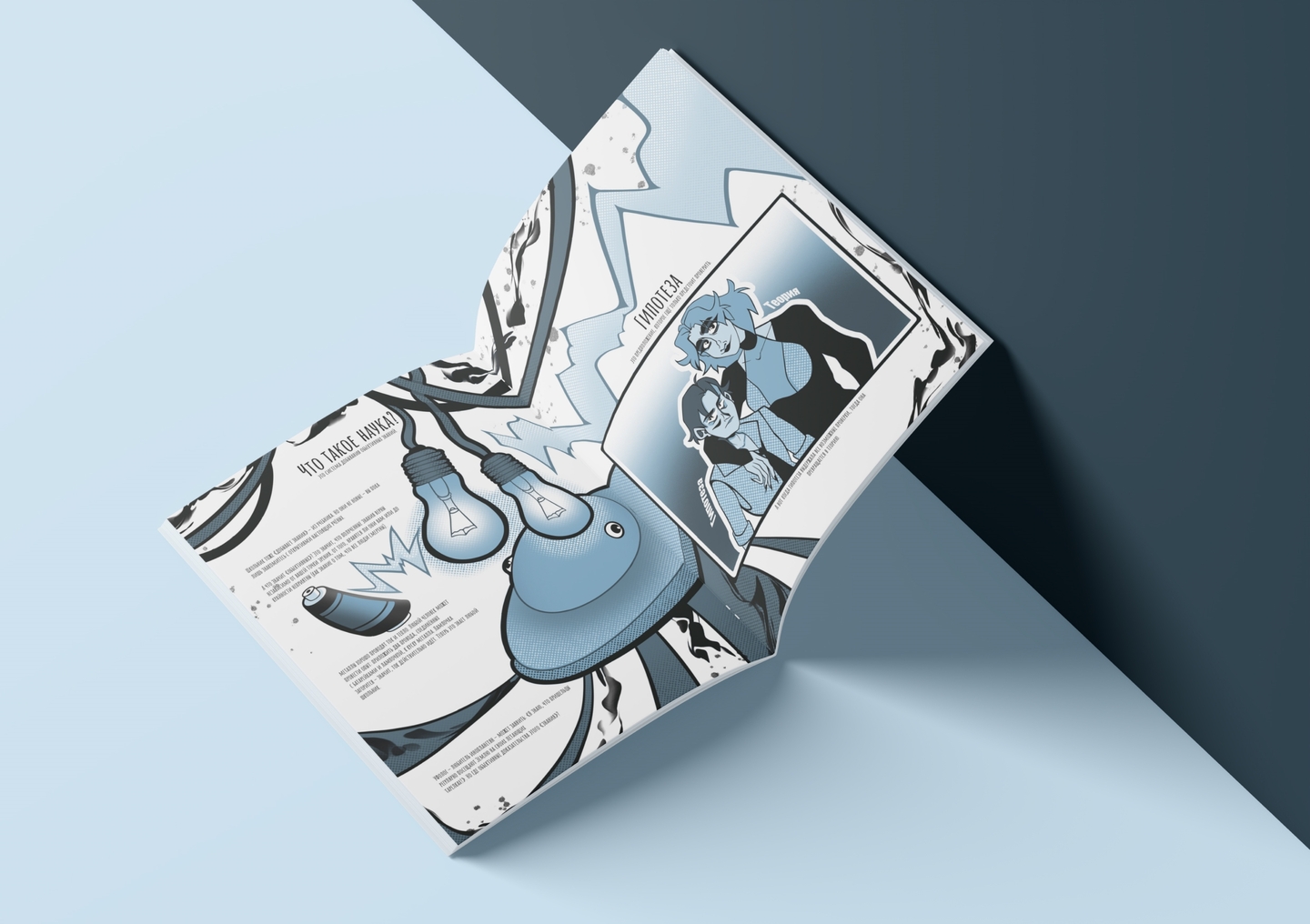
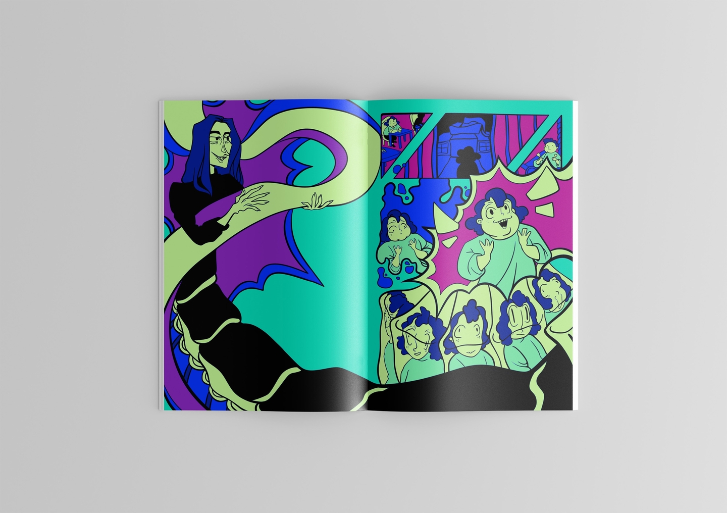
ㅤㅤㅤㅤㅤㅤㅤㅤㅤㅤㅤㅤㅤㅤㅤㅤ
THE MARKET PROBLEMWhy do so many brands feel cold and forgettable?Today’s visual landscape is flooded with sterile, copy-paste minimalism. Brands often rely on lifeless geometric logos that fail to spark human connection, or they use chaotic illustrations that fall apart when scaled to physical merchandise and packaging. Without a living narrative, a brand is merely visual noise.People don’t fall in love with grids alone — they connect with character, atmosphere, and tactile rituals.
MY APPROACH & METHODOLOGYHow I turn brand values into living visual systems:01 / Field Research & Interviews — I dive into real human stories and cultural contexts before sketching.02 / Distinct Graphic Language — I develop custom linework, color codes, and metaphors that cannot be confused with competitors.03 / Micro-to-Macro Architecture — Every stroke, wrinkle, or ornament functions as part of a unified modular universe.04 / Tactile & Spatial Extension — Translating flat graphics into ceramics, print, merch, and urban touchpoints.Result: A cohesive identity that breathes, adapts, and stays in memory.
WHO I WORK WITH & WHAT I DELIVERFor bold businesses, creative studios, and cultural projectsI collaborate with hospitality & coffee brands, urban communities, lifestyle startups, and design agencies seeking a designer with a strong conceptual and illustrative voice.Core Services:Full Brand Identity Brand Mascots & Character Systems Packaging & Tactile Merchandise Editorial & Visual ResearchAvailable for B2B commercial commissions, P2P creative collaborations, and studio roles.
ㅤㅤㅤㅤㅤㅤㅤㅤㅤㅤㅤㅤㅤㅤㅤㅤ
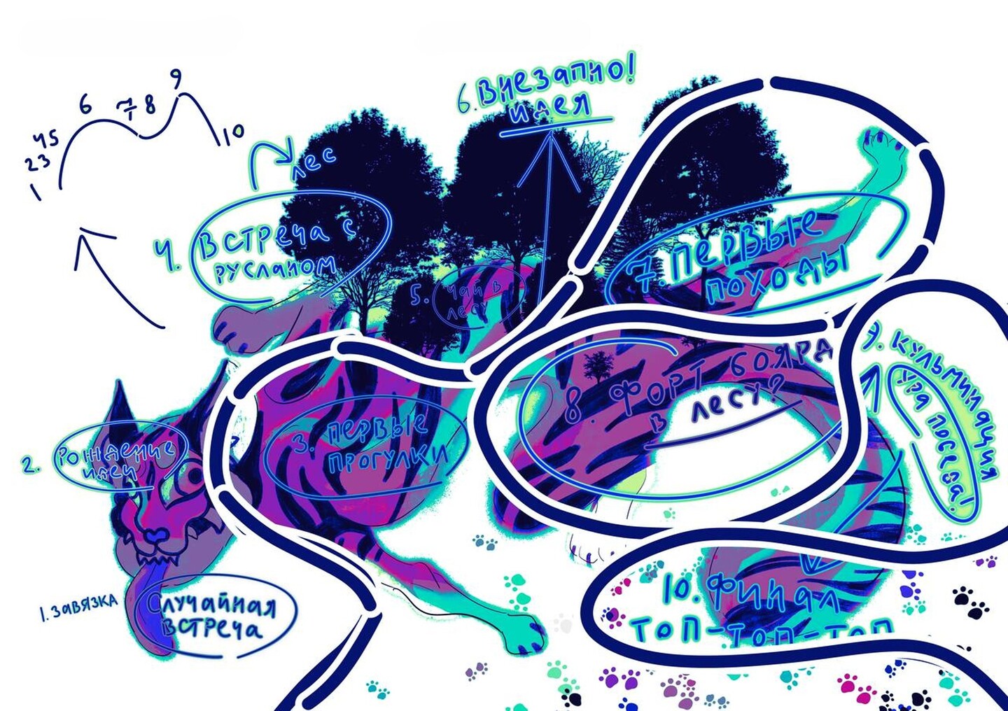
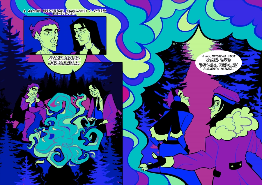
FLAGSHIP CASE 01 / COMMUNITY IDENTITY & STORYTELLINGTHOUSAND-FACED DEVELOPMENT — Reviving Urban LifeThe Challenge: Modern city dwellers often experience routine isolation and digital fatigue. How can you develop a visual identity and narrative system for a growing outdoor movement where casual walks, sports, quests, and forest hikes become a catalyst for genuine human connection?We needed a visual language that avoided cliché «sporty» templates, instead capturing the mystical energy where nature intersects with the city.
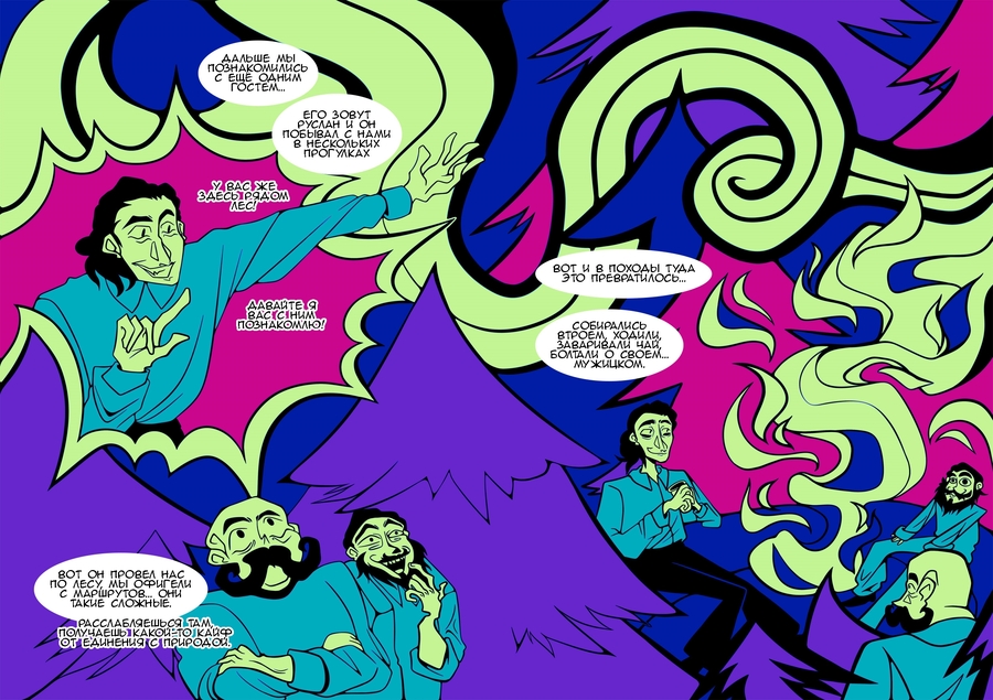
CASE 01 / THE CONCEPTFrom a real interview to a living brand mythThe Idea: The project is grounded in an in-depth interview with Rasim Mukhametshin, a barista and forest hike instructor. Through his story, I uncovered the core insight of the identity: a simple action—a walk, a conversation, tea by the campfire—can make people feel truly alive again.I envisioned the community as a living, multifaceted system where every participant becomes the hero of their own journey, connecting with people, nature, and themselves.
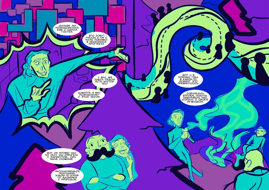
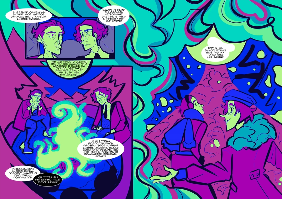
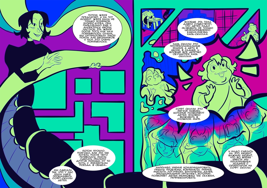
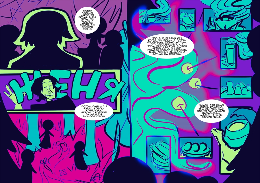
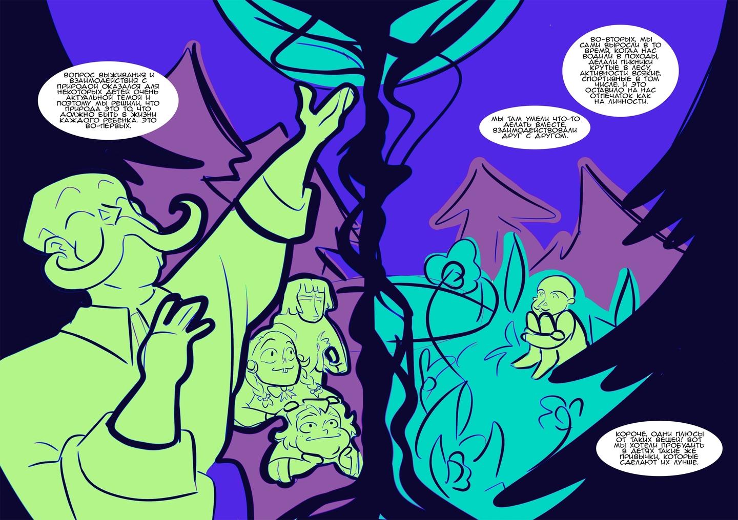
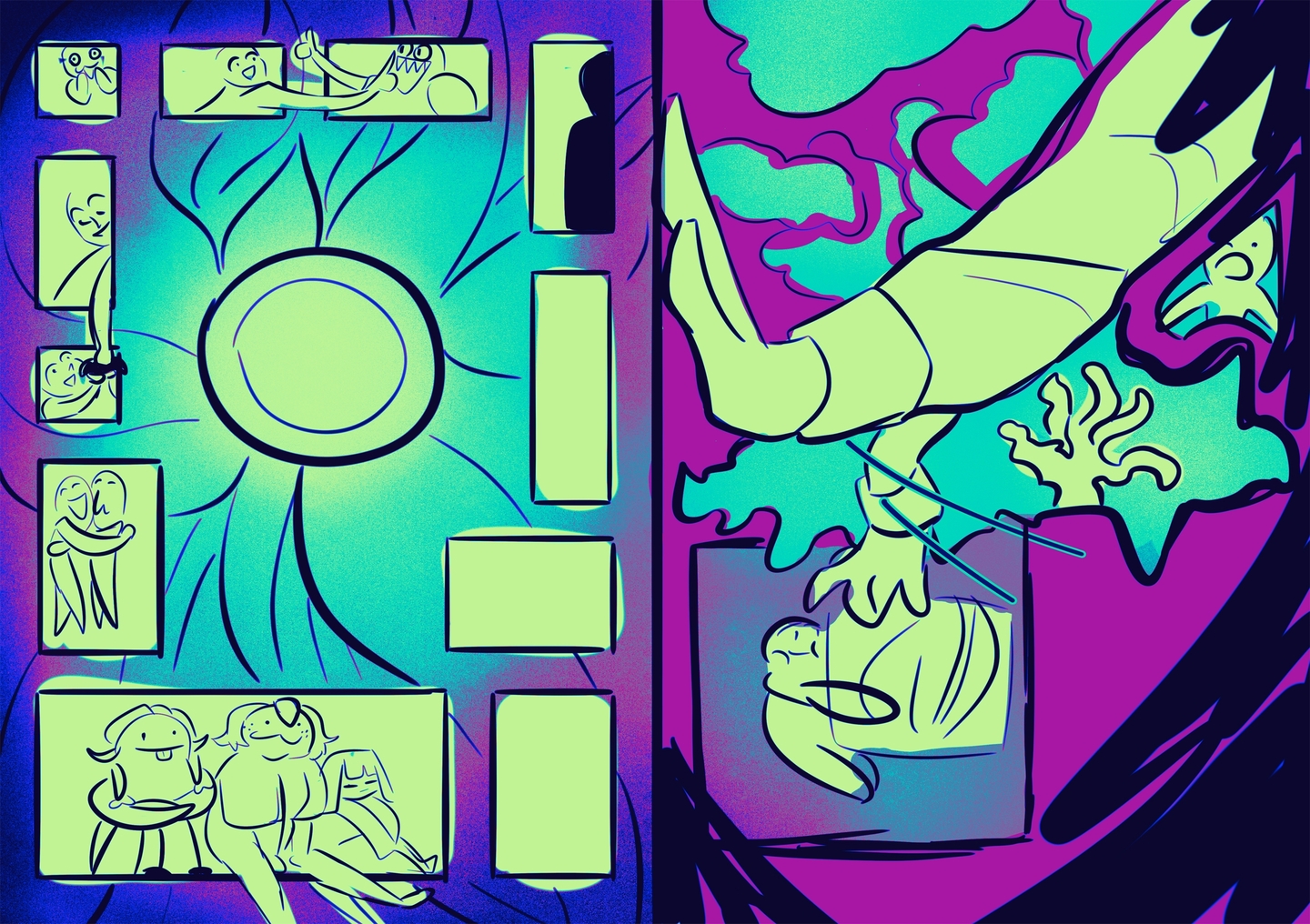
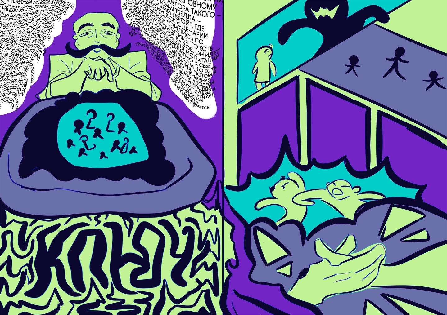
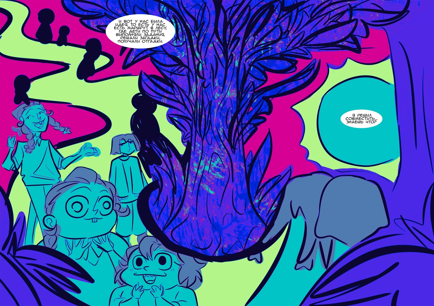
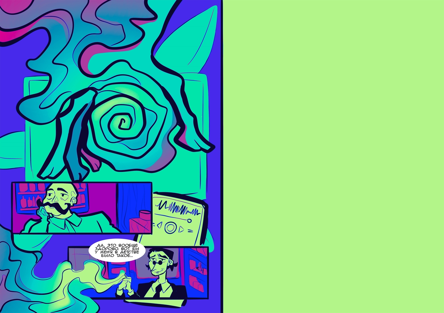
CASE 01 / THE SOLUTION & RESULTElectric neon meets organic movement• Visual Metaphor: A glowing, shape-shifting spirit-beast that embodies the untamed energy of forest trails breaking through concrete city blocks.• Color & Rhythm: High-contrast electric cyan, deep cobalt, and vibrant neon create an instant visual hook across digital media and print.• Systemic Outcome: A scalable graphic narrative that transforms an informal hiking club into a recognizable youth movement and cultural brand.✦ Kira says: «This is where I was born! Now watch how Rasim’s barista story inspired a completely different tactile project.»
ㅤㅤㅤㅤㅤㅤㅤㅤㅤㅤㅤㅤㅤㅤㅤㅤ
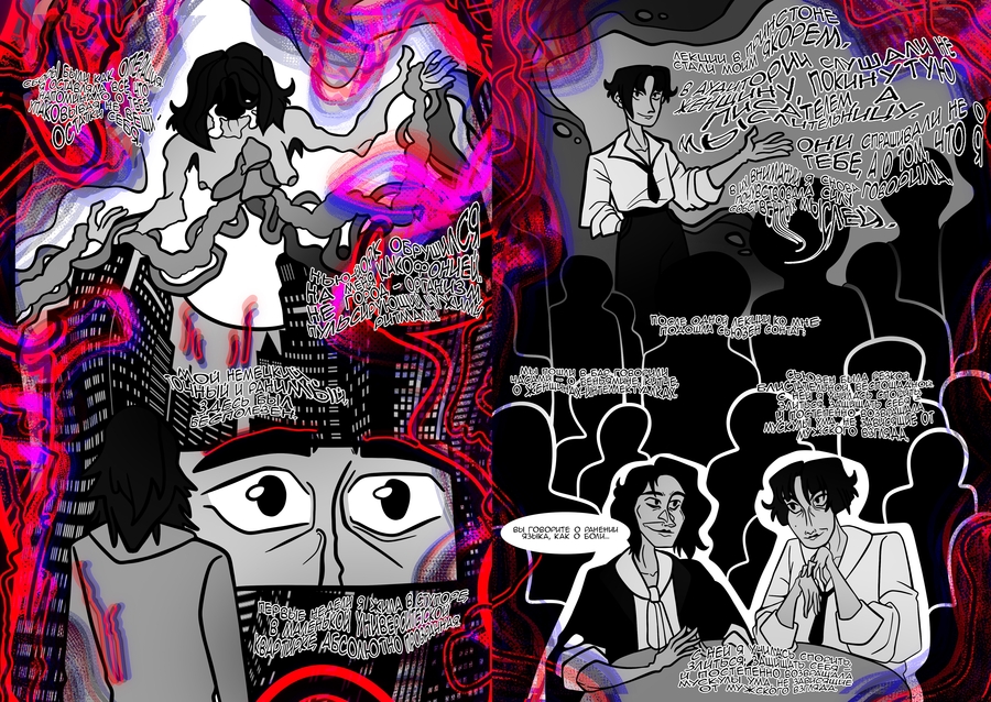
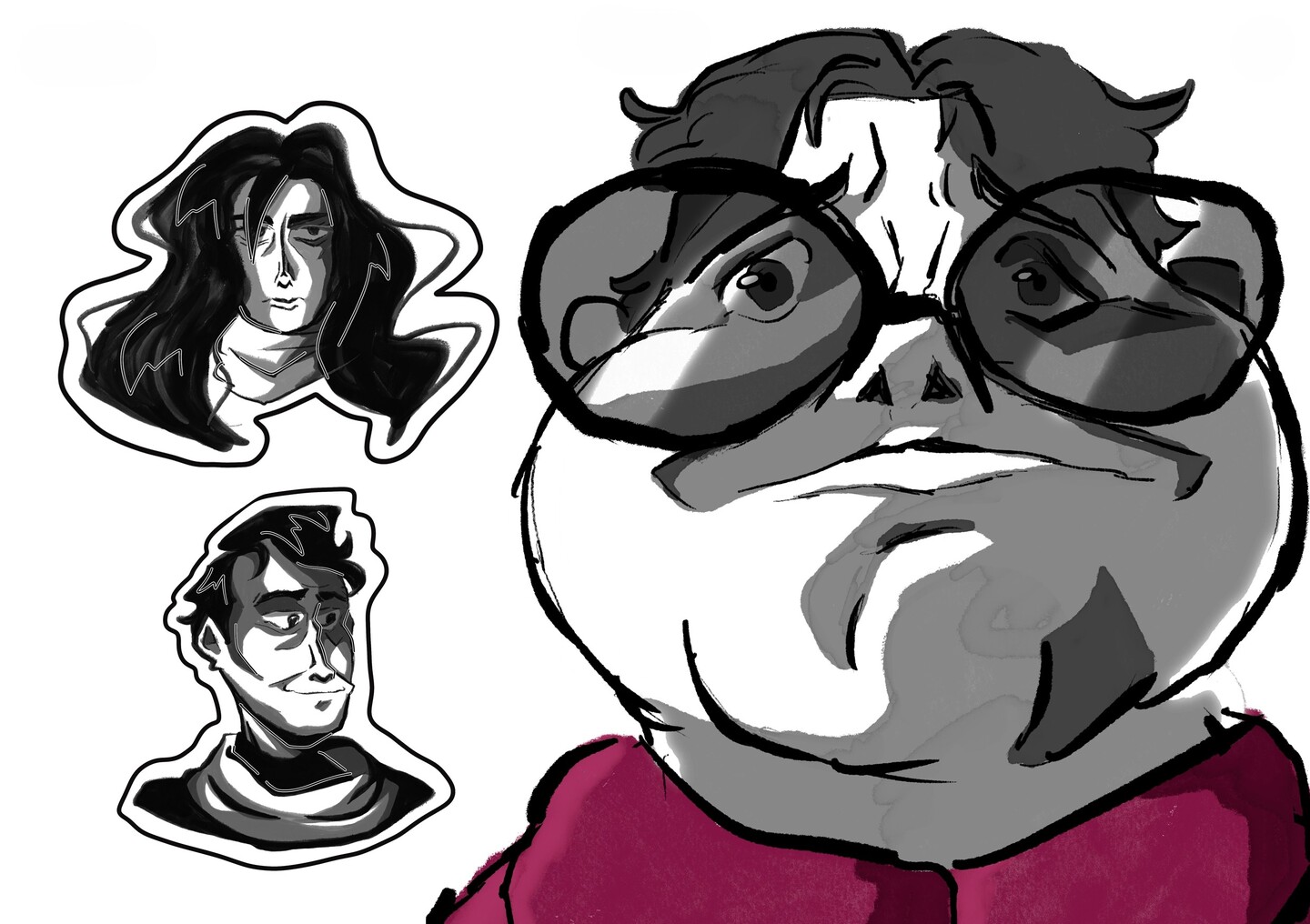
SELECTED CASE 02 / ILLUSTRATION & PRODUCT IDENTITYSTEAM OF FACES («ПAR LICE») — The Ornament of Coffee CultureThe Challenge: Coffee shop branding is overcrowded with generic cup icons and stock patterns. How can we create an authentic graphic and product system rooted in the real atmosphere of morning coffee rituals?The Idea: Every morning, a barista pours not only coffee, but also glances. Portraits become a collection of fleeting moments settling in warm steam, glass reflections, and milk foam.By observing café guests, I explored how tiny details—posture, a wrinkle, the look in the eyes—weave together into the living ornament of city life.
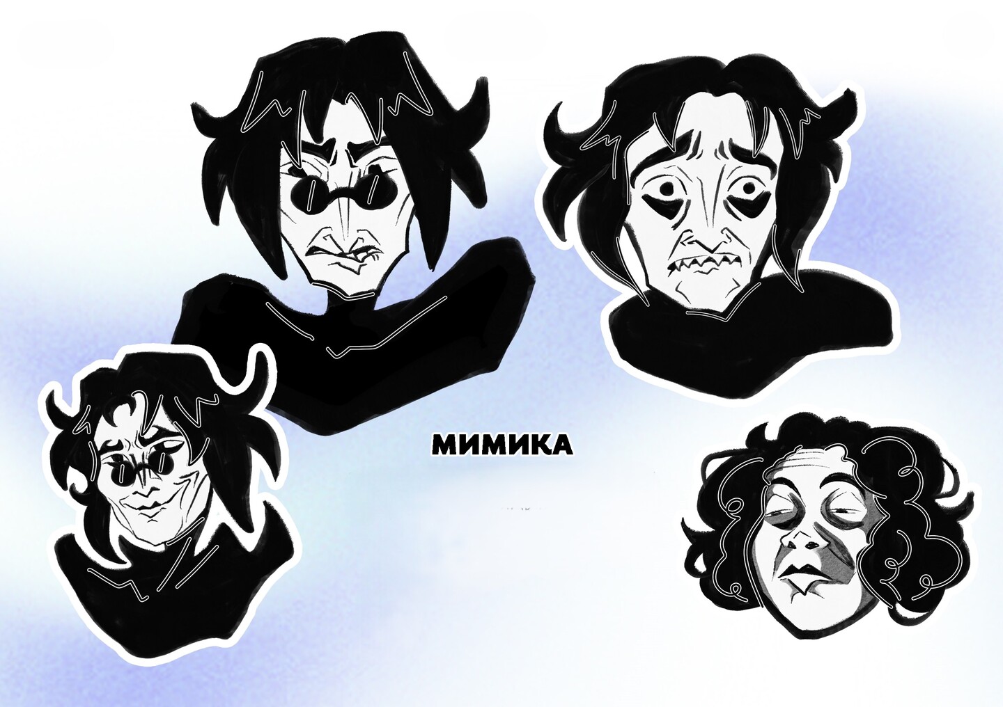
CASE 02 / GRAPHIC LANGUAGE & OBJECT DESIGNFrom sculptural linework to a physical teacup pair• Volumetric Linear Drawings: I developed a signature linear technique that maps facial volume as if it were a sculpted doll overlaid with living skin—eerie, bold, and magnetic.• Hyper-Expressive Mimicry: Contrasting black-and-white character studies where folds and wrinkles amplify raw human emotion.• Tactile Brand Object (The Tea Pair): Connecting this study to my comic about the barista, I translated the 2D graphic language into 3D product design—crafting a custom teacup and saucer set as the ultimate brand touchpoint.This case demonstrates how custom illustration can seamlessly evolve into signature café tableware and branded merchandise.
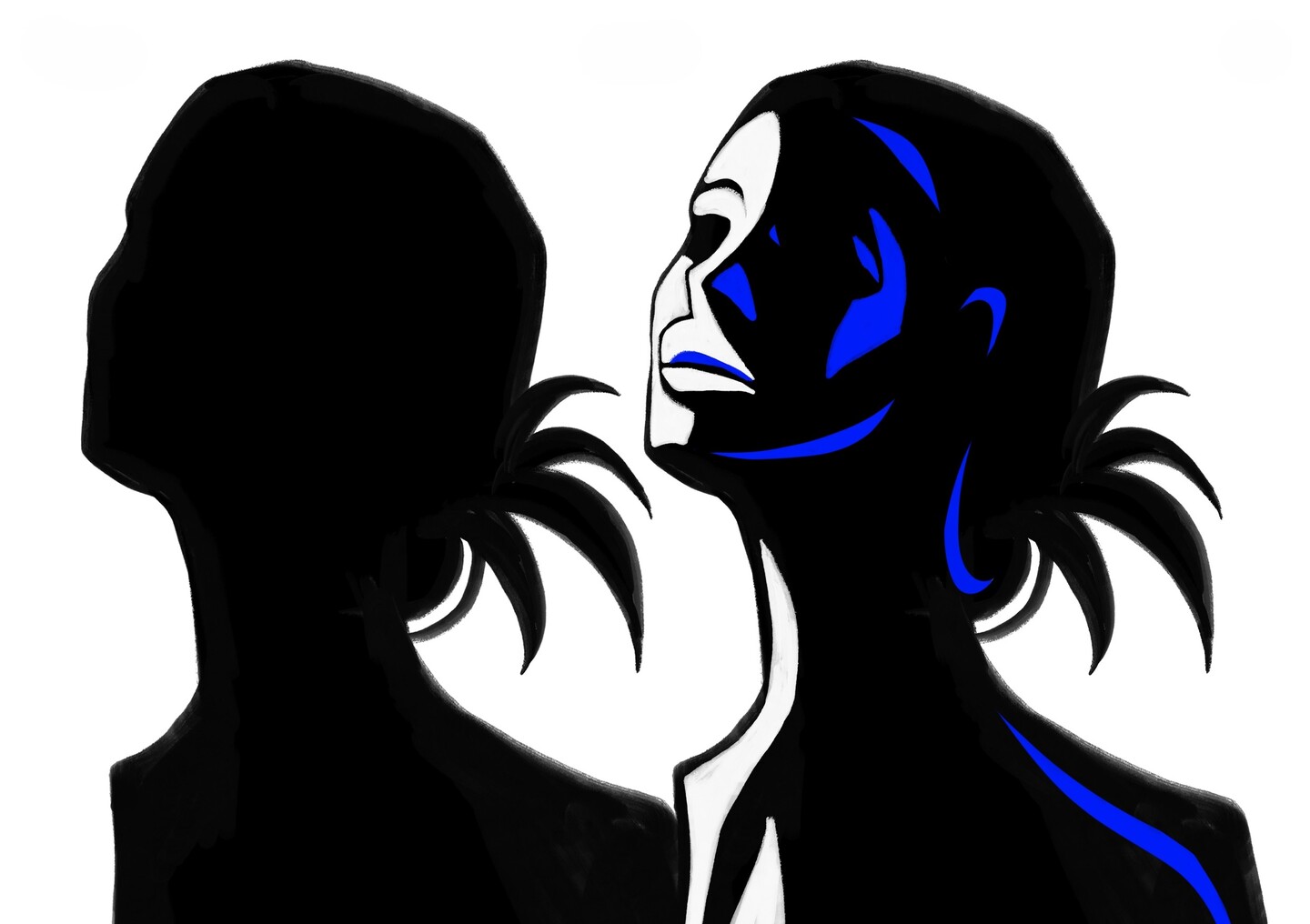
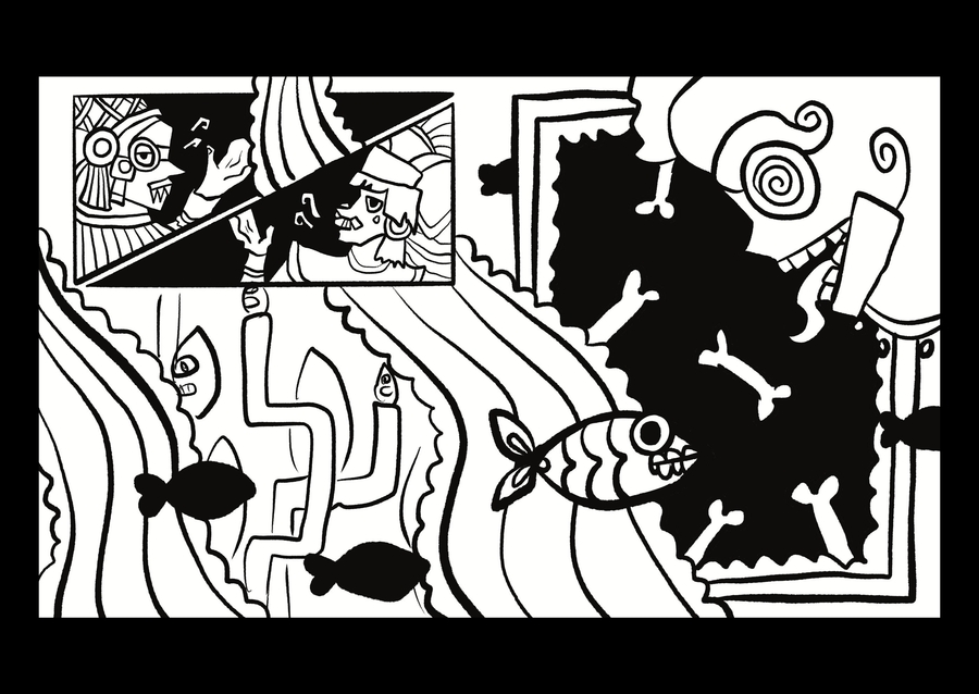
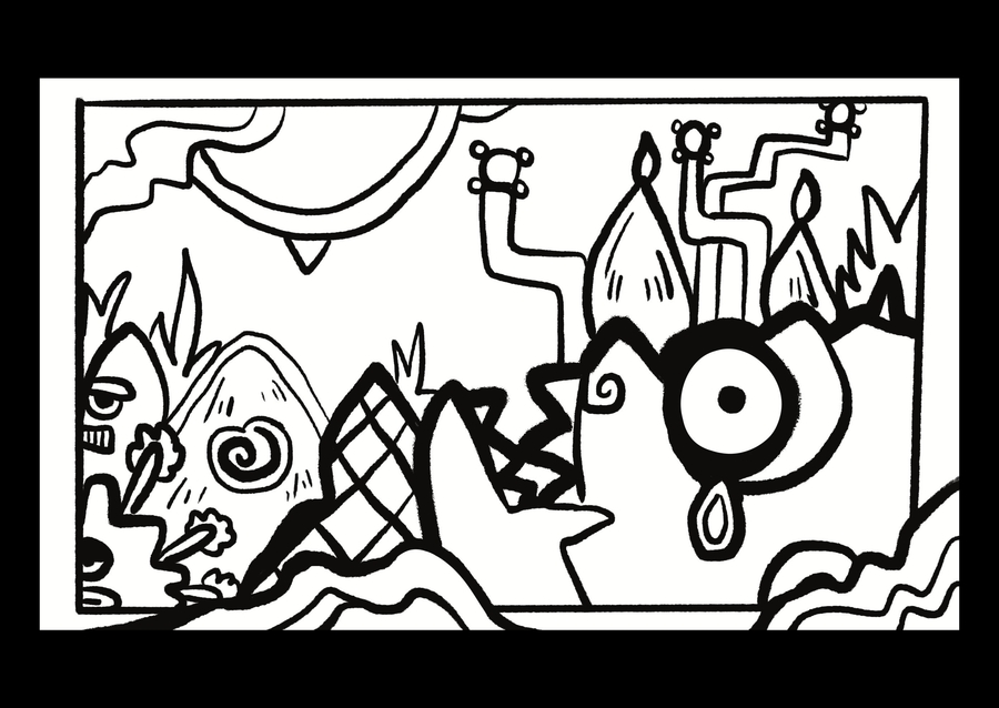
SELECTED CASE 03 / VISUAL RESEARCH & SYSTEM ARCHITECTUREARCHITECTURE & FLESH OF THE AZTEC COSMOSThe Challenge: How do you decode an ancient, multi-layered mythological culture and translate it into a cohesive, modern graphic language without resorting to superficial historical clichés?The Idea: Developed as the visual foundation for my graduation comic on the Myth of the Five Suns, this research explores a world built on creative instability—where the universe is born, reaches its limit, and collapses to give way to a new order.In this worldview, deities, natural forces, architecture, artifacts, and the human body function as components of a single, indivisible design system.