My name is Vasilisa Matveeva, and I am a communication designer specializing in branding.
In my work, I am drawn to exploring the stories and ideas behind things. I look for unexpected connections and details that can become the starting point for a design concept.I enjoy experimenting with typography, composition, color, and materials, exploring how they can work together to create a meaningful visual language.For me, graphic design is a way to give ideas a visual form. This portfolio brings together projects that reflect my curiosity and approach to design.I enjoy bringing ideas to life through graphic design.
How should I approach projects?
Research I explore the project’s context, background, key features, and target audience. I identify the main challenges and look for details that can serve as the genesis for a visual concept. ↓ Concept I develop the core idea and define its visual direction. I seek connections between the project’s purpose, its narrative, and the emotions it needs to convey. ↓ Development I experiment with typography, color, graphic elements, materials, and composition. I explore various visual approaches to discover the language that best expresses the concept. ↓ Implementation I integrate all elements into a cohesive visual identity and examine how it functions across different formats and applications. ↓ It is essential for me to understand the rationale behind every design choice. I believe that a strong visual solution must not only be aesthetically appealing but also communicate the original idea and establish a clear identity for it.
Pop-up shop branding
[1] Thing
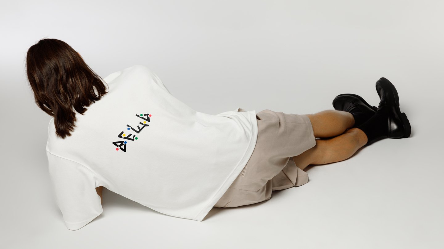
Problem: As an unfamiliar and temporary retail format, a pop-up shop struggles to articulate its concept, build customer loyalty, and balance an exclusive designer selection with accessibility to a broader audience.Concept: «VESHCH» is a pop-up shop in Nizhny Novgorod that features designer clothing, footwear, and accessories from Russian brands, while also hosting lectures and events.Result: VESHCH transcends a mere retail space—it establishes a cultural platform for contemporary Russian design. By integrating curated brands with lectures and social gatherings, the project makes designer fashion more approachable, fosters community engagement, and builds a lasting connection with its audience beyond the limited lifespan of the pop-up.
Calendar design
[2] The Jazz Age. 100 Years Calendar
Problem: Traditional calendars are purely functional and rarely offer an emotional or cultural experience. They lack the storytelling and visual identity needed to bring a historical era to life and engage the audience beyond simply tracking dates.Concept: 2026 marks the centenary of the Jazz Age—the 1920s, when jazz evolved from a regional music genre into a global cultural phenomenon. The calendar transcends being a simple time tracker; it becomes a journey into an era of cultural revolution, where jazz symbolized freedom, glamour, and artistic innovation.Result: A calendar that captures the spirit of the Jazz Age, transforming an everyday object into a cultural experience. Through its visual concept, it immerses the audience in the era’s atmosphere, celebrating jazz as a symbol of freedom, elegance, and creative expression.
Packaging design
[3] Ogni Severa
Problem: Most lighting brands focus primarily on functionality, offering little emotional or atmospheric value. However, lighting possesses the power to transform a space and evoke a specific mood. There is an opportunity to introduce the magic of natural phenomena into everyday interiors through more expressive and distinctive lighting design.Concept: A lighting brand inspired by the Northern Lights and the atmosphere of Russia’s northern cities. Its colorful lamps create iridescent illumination reminiscent of auroras, starry skies, sunrises, and sunsets. Each piece brings the beauty of northern landscapes into contemporary interiors. Result: A collection of colorful lamps that transforms ordinary lighting into an immersive visual experience. Their shifting hues and iridescent glow evoke the Northern Lights and the ever-changing northern sky. The brand imbues everyday spaces with a sense of wonder and the unique atmosphere of Russia’s northern cities.
Product design
[4] Masquerade
Problem: The porcelain market is segmented between mass-produced, impersonal tableware and traditional decorative porcelain featuring elaborate patterns, gilding, and Baroque forms. The former lacks character, whereas the latter often feels antiquated and overdone. Themed dinnerware also tends to rely on flat surface graphics, offering minimal tactile or visual depth.Concept: A porcelain collection where Venetian carnival intersects with Scandinavian minimalism. Each piece integrates a mask into its relief rather than merely painting it on. Animals are reimagined through sculptural detail: a lion’s mane transforms into a lace-like collar, an elephant’s trunk forms a curved mask, and a giraffe’s spots become teardrop motifs. Rendered entirely in white porcelain, the collection explores light, shadow, and texture.Result: Instead of applied patterns, the collection utilizes sculptural relief, seamlessly merging animals and Venetian masks into the porcelain body. Light and shadow animate each piece, fostering a tactile experience. The monochrome, subdued aesthetic balances carnival-inspired elements with Scandinavian minimalism, resulting in a collection suitable for contemporary interiors.