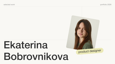
Hi—I’m Alina, a graphic designer.
I study at HSE Art and Design School and work on brand identity, custom typography, and visual systems.
My projects so far have been academic—but they are quite diverse: a typeface, a city identity, a charity flea market, and a jewelry brand.
The process is consistent every time: define the objective, establish the rules, build the system, and test its resilience.Here are four of them, following the same structure.
Task $\rightarrow$ Approach $\rightarrow$ Solution $\rightarrow$ Result.
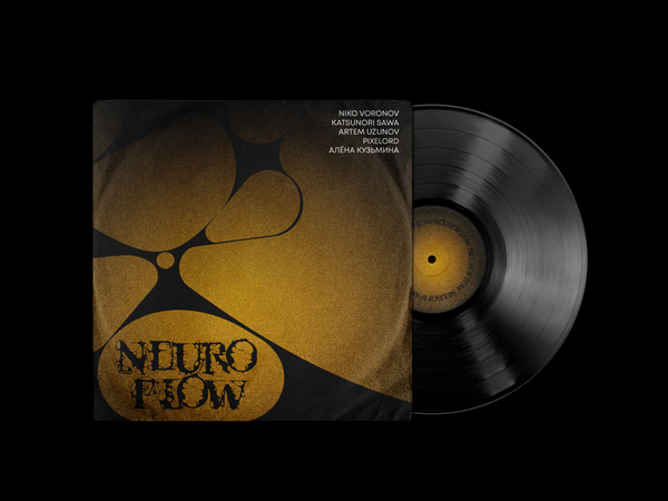
01 — Neuro Graph
An accidental typeface born from a drawing method, not a predefined style.
1/2
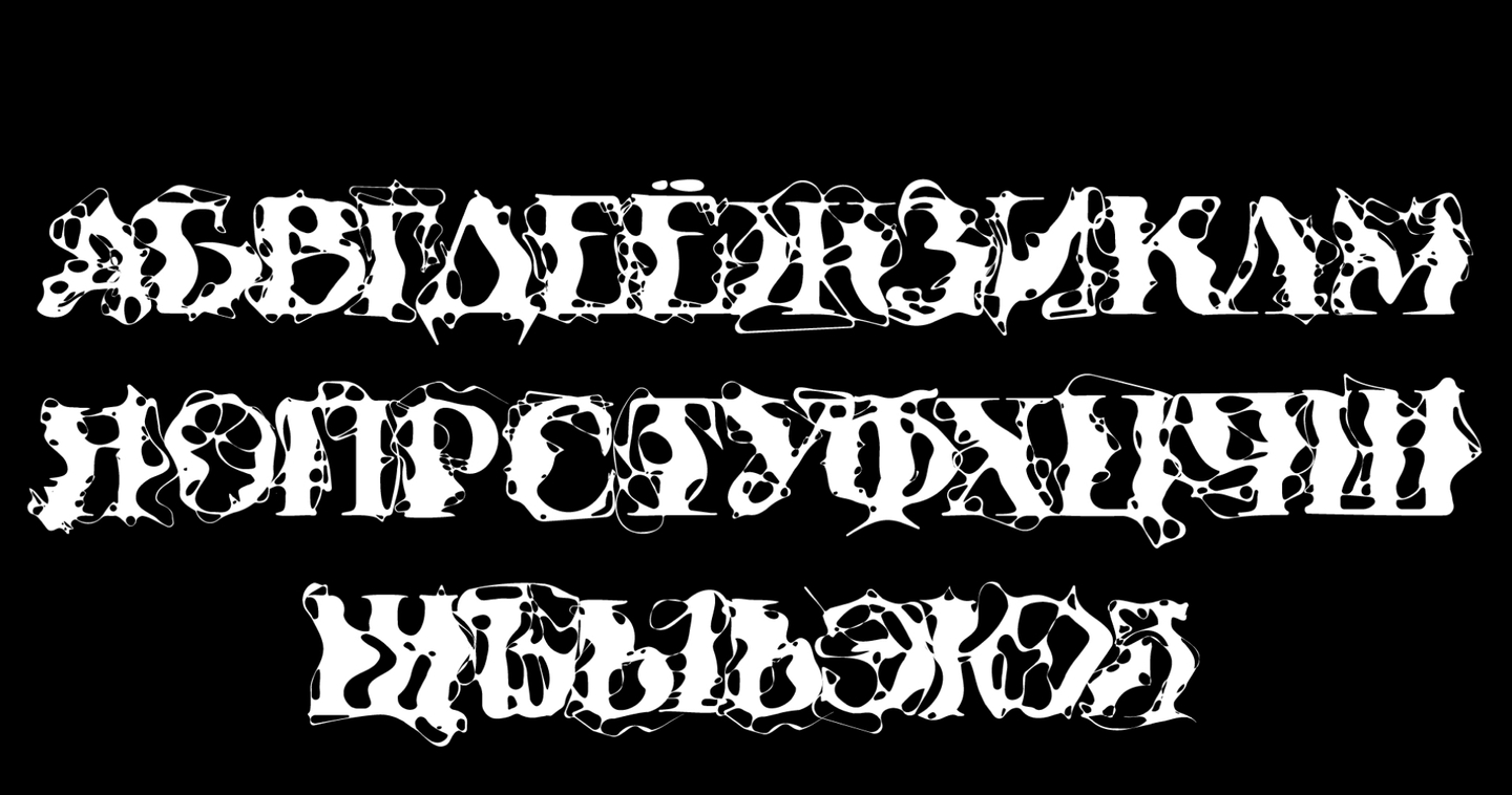
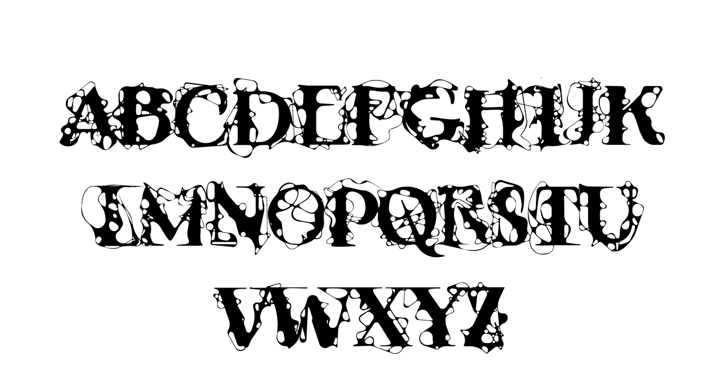
latin/cyrillic
Task: The starting point wasn’t a font style—it was a drawing method. Neurographics is an art-therapy technique: you draw one continuous line, then fill in the sharp corners. The task was to transform that method into a functional typeface.
Approach: I adopted the method’s rules as the type’s rules: one line, filled corners, no extraneous shapes. Then, I had to ensure that logic held across an entire alphabet—keeping the letters legible while still clearly adhering to the original method.
Original size 1920x1010
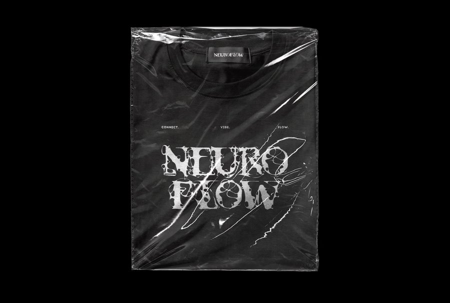
Solution: An accidental typeface where every letter is built from the same line-and-fill logic. The specimen displays the alphabet, numbers, and how it functions in real settings—headlines, short text, and detail crops where the method is visible.
Original size 1920x1080
Result: A typeface that reads as a single system, and a method that holds up beyond a single drawing. It also changed how I start projects: I look for the rule first, then I draw.
02 — Yuryevets
A visual identity for a small town that previously lacked one.
Original size 2848x1498
Task: Yuryevets is a small town on the Volga—8 km², home to about 8,000 people, founded in 1225. It has a strong history and a clear image connected to the river, but absolutely no visual identity. The objective was to give the town a cohesive system it could actually utilize.
Approach: I started from the town’s own context—the Volga, the history, the scale. A small town doesn’t need a loud logo; it needs something simple and repeatable that works on signs, merchandise, and city materials. I looked at how the town lives and built the visual language around that.
Original size 3307x2480
Solution: An identity built around a simplified coat of arms. The system includes the logo, typography, color, and a set of applications—signage, merchandise, and city materials.
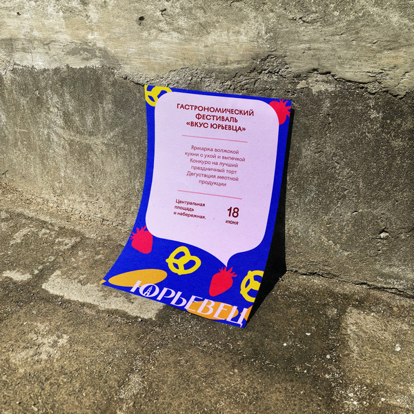
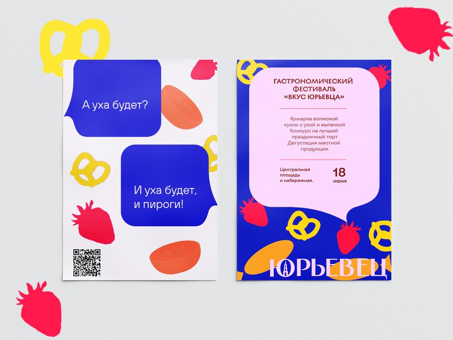
Result: A working identity system for a town that had none—simple enough to be used, specific enough to be recognized. It also taught me how to design for a real place, not just for a brief on paper.
03 — Charity Flea Market
An identity where letters connect like people.
Original size 2730x1536
Original size 1920x1010
Task: The charity fund «Vremya RASsveta» was launching a flea market—a stylish event where fashion meets philanthropy. Premium items and local brands get a second life, and the money goes to support children with autism spectrum disorder. The task was to make the event feel stylish, open, and inviting.
Original size 1920x1080