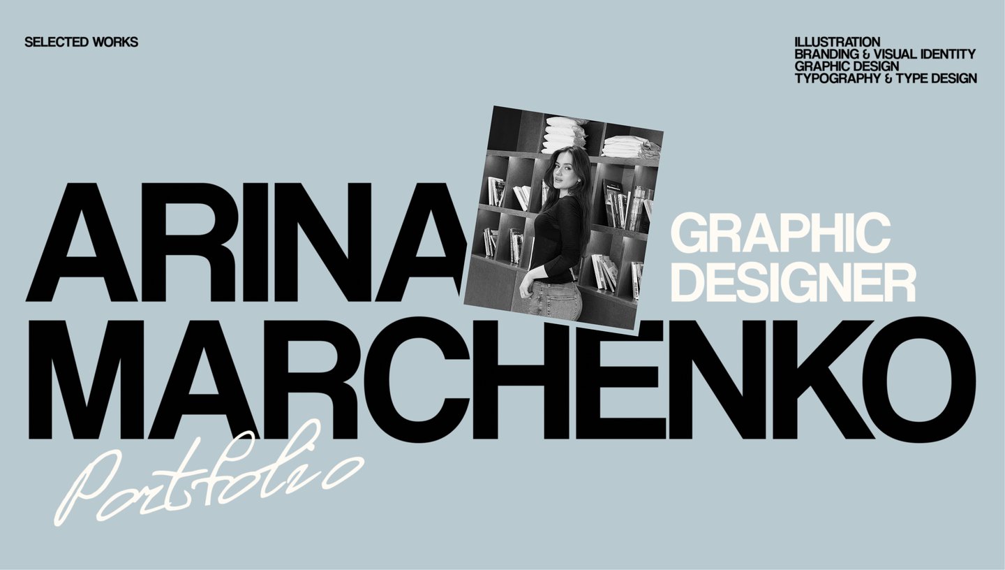
About Me
From painting to graphic design.
Hi, I’m Arina Marchenko, a Moscow-based graphic designer currently studying at the HSE Art and Design School.My background is in academic painting. It provided me with a strong foundation in color, composition, and form, shaping the way I approach visual work today. Transitioning into graphic design opened up new possibilities. I enjoy combining the freedom of artistic expression with the structure of visual communication, exploring how ideas can develop through different techniques and mediums. I am particularly interested in the details that give a project its unique character. I enjoy experimenting, trying unexpected combinations, and gradually bringing individual elements together into a thoughtful, cohesive outcome.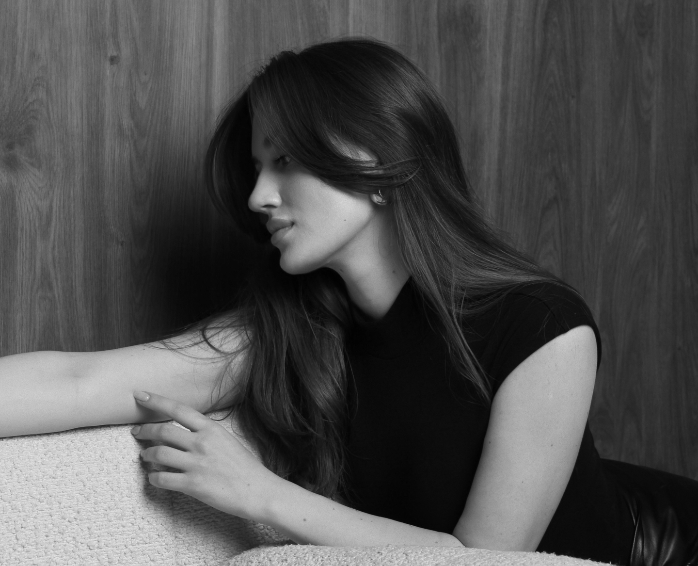
What I Do
I work across various formats, merging visual thinking with a deep interest in imagery, typography, and form.○ Illustration ○ Branding & Visual Identity ○ Graphic Design ○ Typography & Type Design
My Work
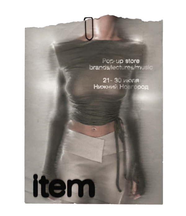
Item
Selected by hand.
ITEM is a pop-up store that brings together a carefully curated selection of designers and brands.The visual identity is built around a simple idea: every piece is chosen by a person, not an algorithm.Every object goes through an imaginary scan—a moment of close observation, consideration, and choice. The scanning effect captures this moment, as if an item has just been noticed and selected from many others. Handwritten notes and markings reflect the personal touch of a curator.Together, these elements create a distinctive, tactile visual language that extends across posters, packaging, labels, and digital communication.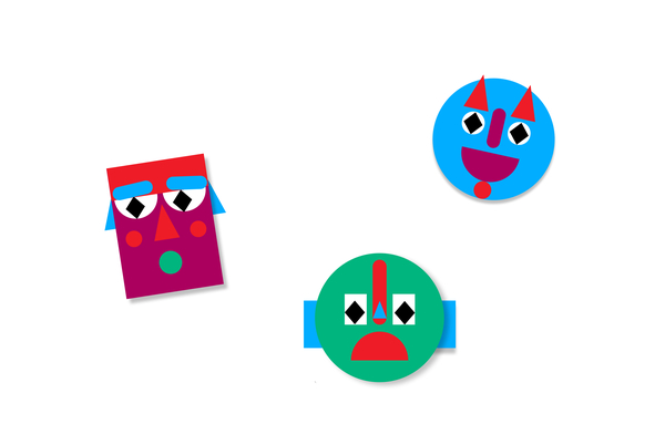
I.T.D. Theatre Workshop
Made of Many Parts.
I.T.D. is a theatre workshop for teens, built around the idea that creativity helps people discover different sides of themselves.The concept views the workshop as a space where emotions, thoughts, and interests gradually come together—much like individual parts forming a complete construction.A custom typeface was developed specifically for this project. Its letters are assembled from geometric shapes, reflecting the central idea of building something whole from separate elements. The expressive typography, bold colors, and modular graphics form a flexible visual identity that extends across posters, merchandise, digital media, and spatial design.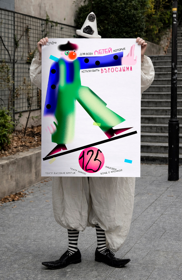
Karandash fest
For the Kids in All of Us.
KARANDASH FEST is a festival celebrating the art of clowning. I created a series of three posters inspired by the idea that clowning is not about wearing a mask, but about the freedom to play and be yourself.
The concept is built around the phrase «For all the kids who are tired of being grown-ups.» Through playful characters, exaggerated proportions, bright colors, and unexpected combinations, each poster becomes a little stage where the performance has already begun. Typography becomes part of the action — moving across the composition, breaking the grid, and interacting with the characters. The visual language extends beyond the posters into festival merchandise and event passes.
1st Place Poster Design Competition
Illustration
The Sound Of Suits
Four Suits, Four Musical Worlds.
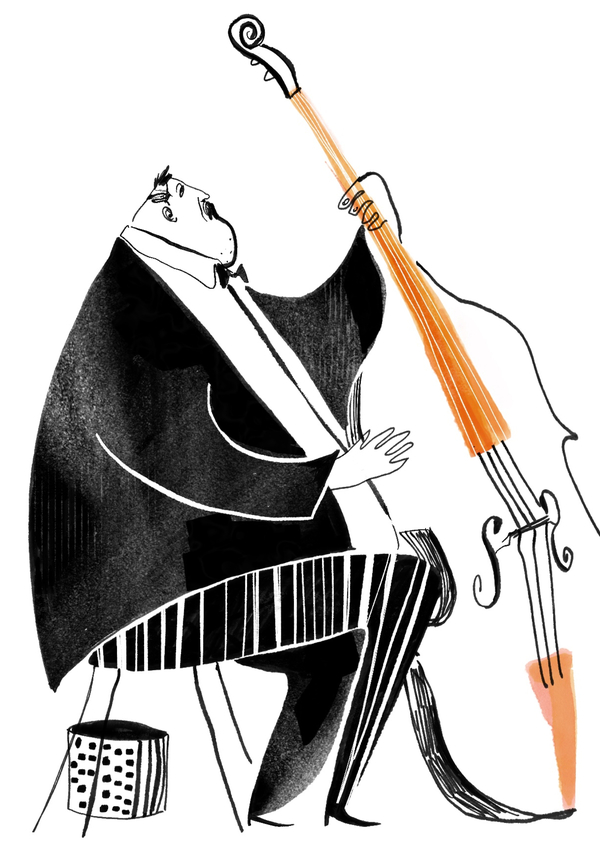
The Sound of Suits is an illustrated playing card deck that connects four musical genres—classical music, jazz, country, and flamenco—with the four suits.
I aimed to capture the personality of each genre through my own illustration style, using elongated silhouettes, expressive gestures, playful exaggeration, and lively hand-drawn lines to convey rhythm and movement.I illustrated musicians and performers for the face cards, giving each character a distinct personality. The numbered cards feature instruments and objects associated with each musical genre. Black-and-white graphics unify the deck, while carefully placed color accents give each suit its own identity.
The result is a cohesive collection with a distinctive, recognizable illustration style.