My name is Elizaveta, and I am a communication designer crafting specialized solutions at the intersection of design, content, and business.
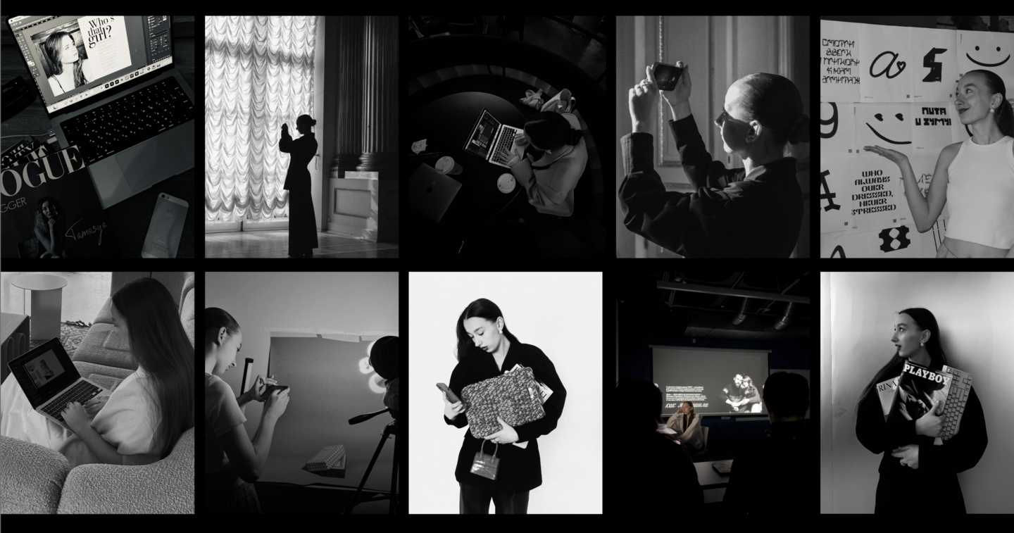
For over five years, I have partnered with brands and creative projects spanning fashion, beauty, food, and culture.
My clients include Gazprom, the music group GROT, Azbuka Krasoty, and Rina Shnei.
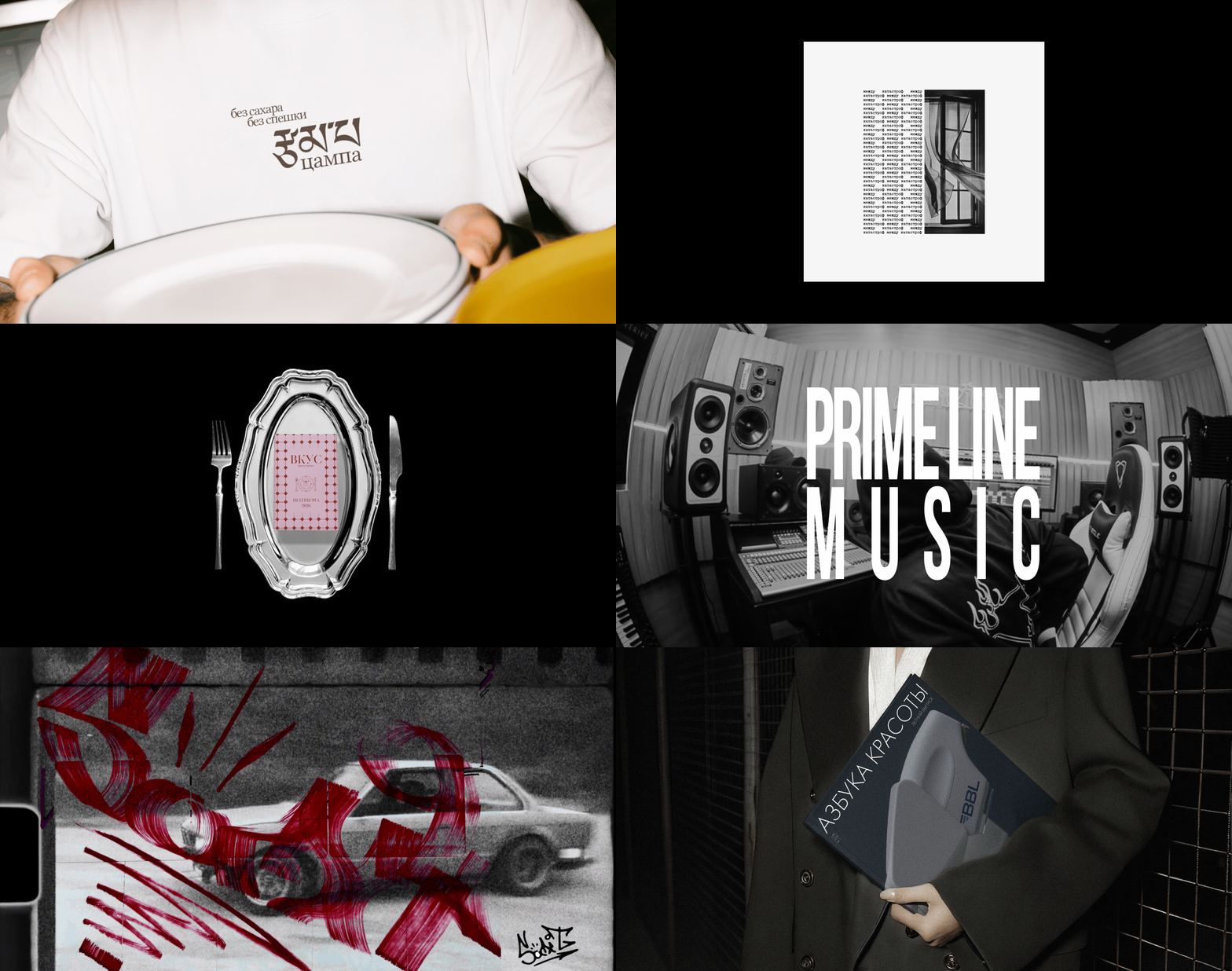
For two years, I co-founded and served as Creative Director and Content Producer at the creative agency Zerkalo.
This experience taught me to view brands holistically: to grasp business objectives, align visual solutions with communication strategies, and consider how design and content can drive a brand’s growth.
SELECTED PROJECTS
ITEM
2026
Branding · Typography
Task
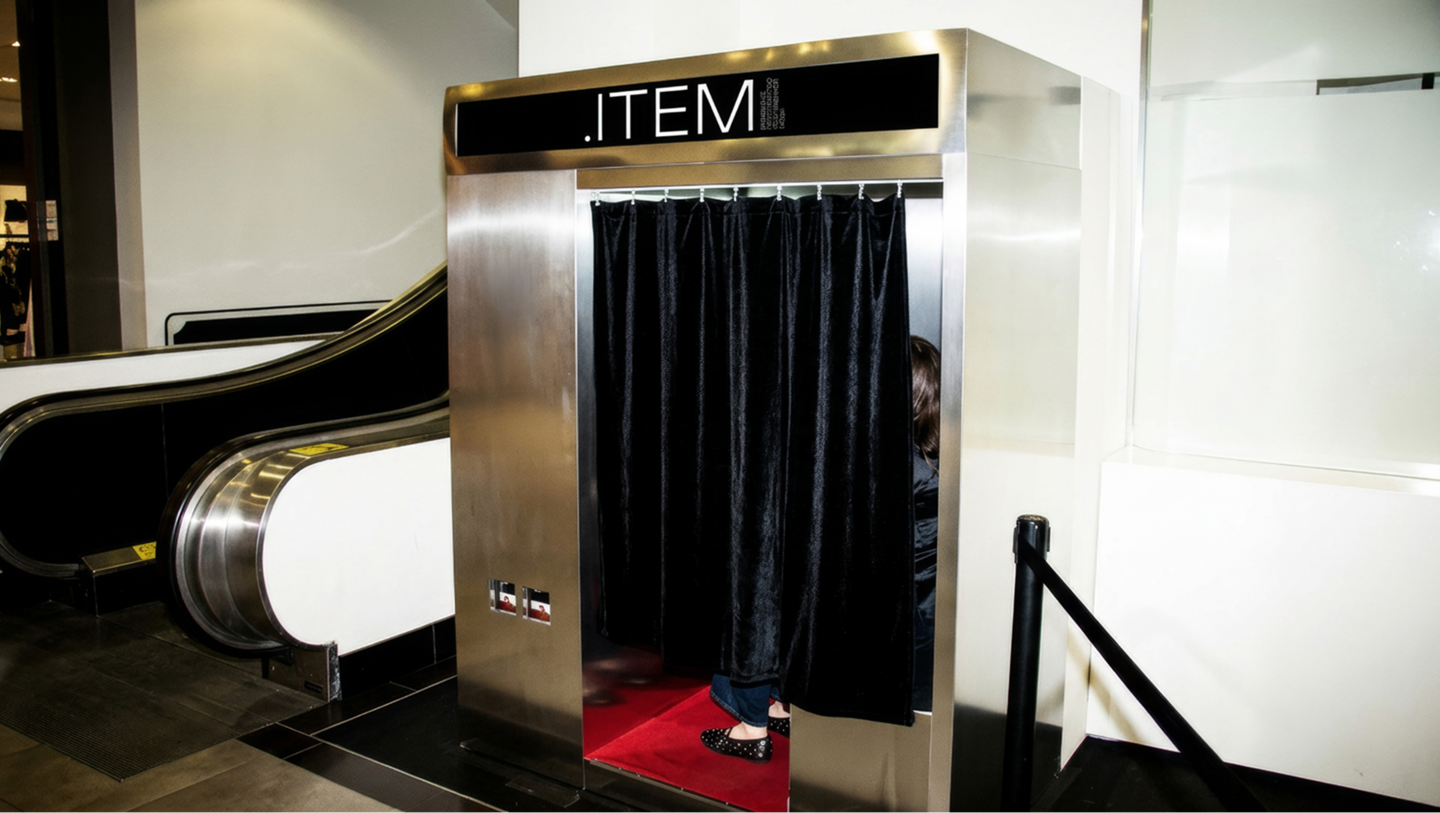
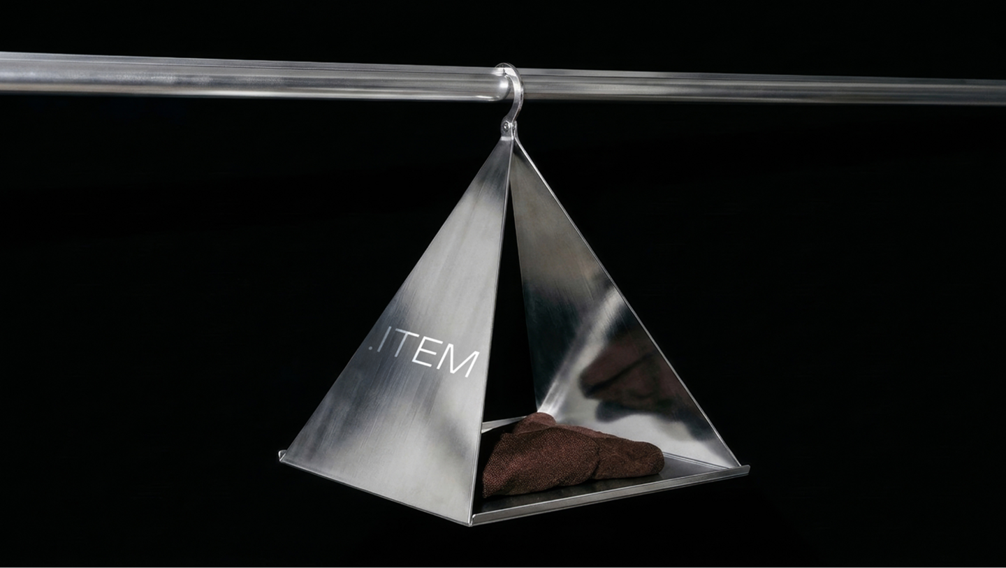
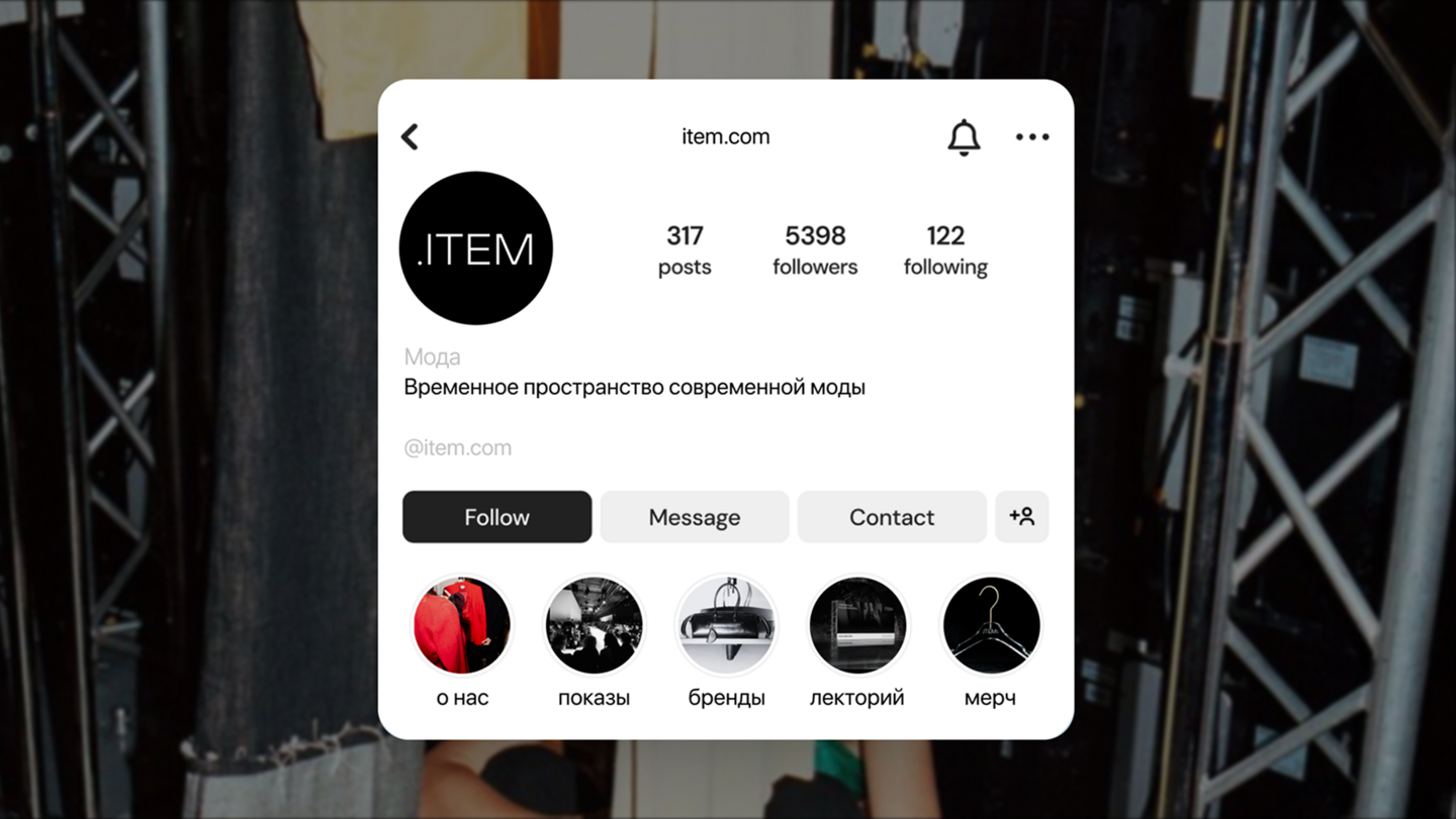
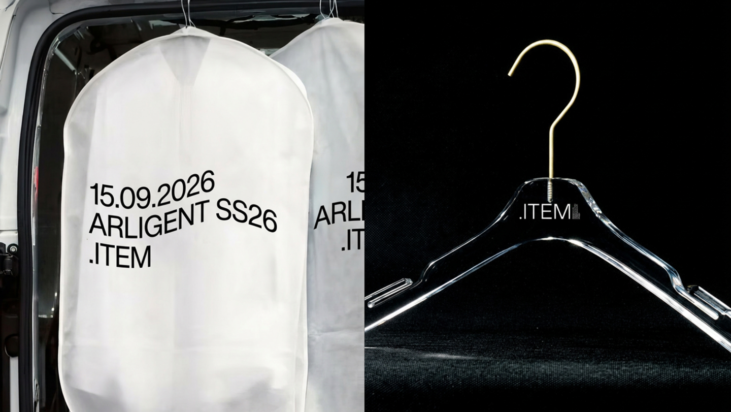
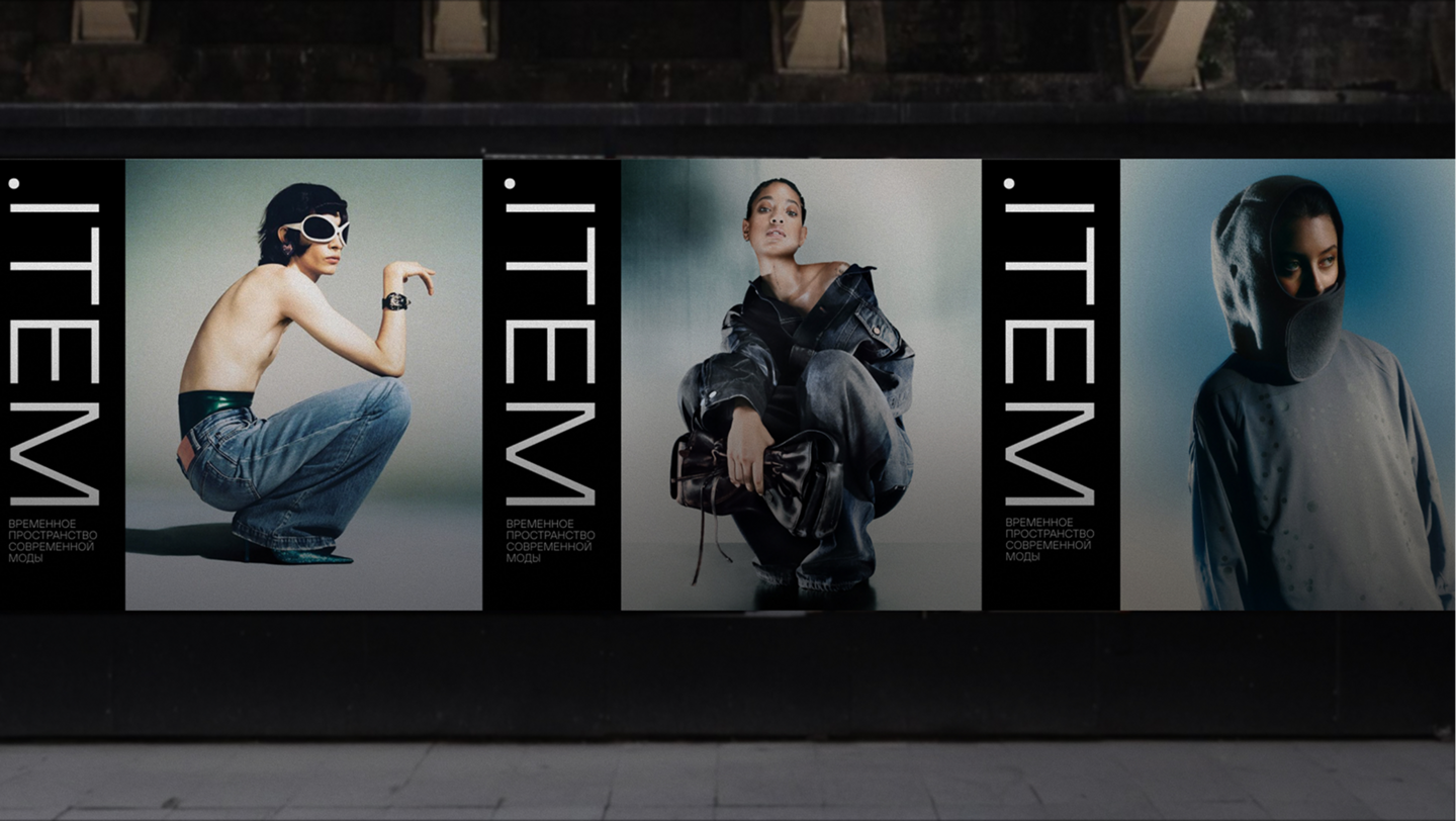
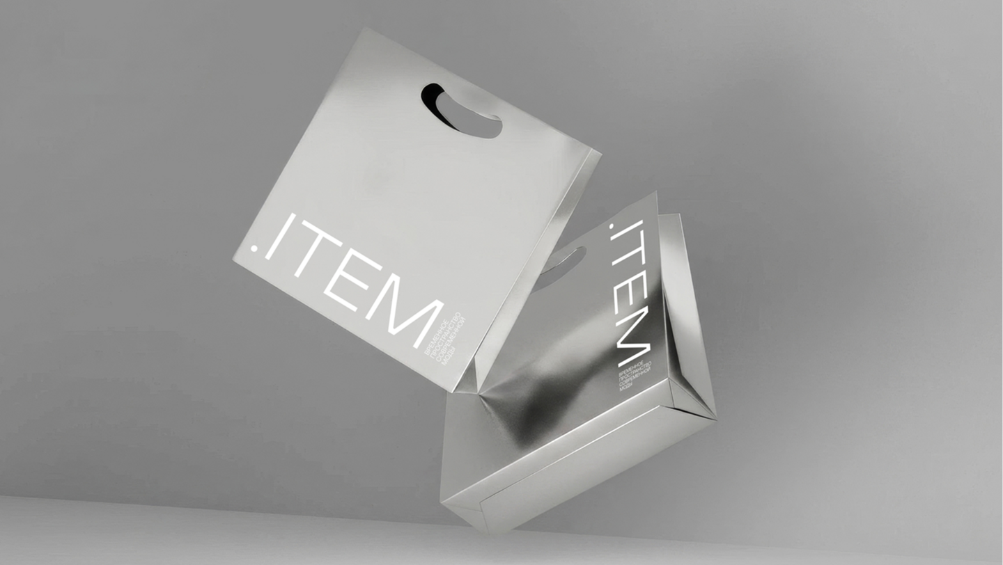
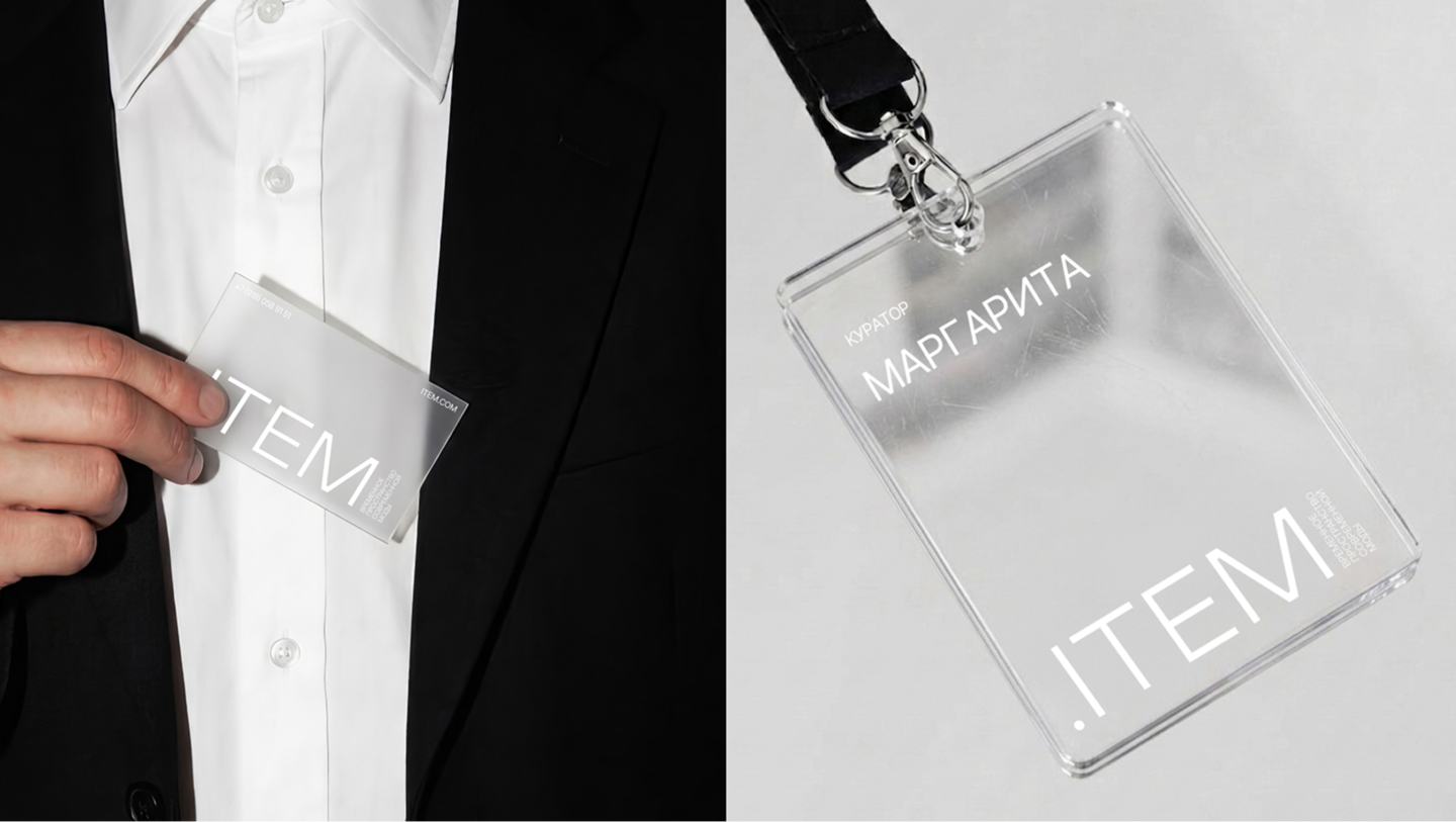
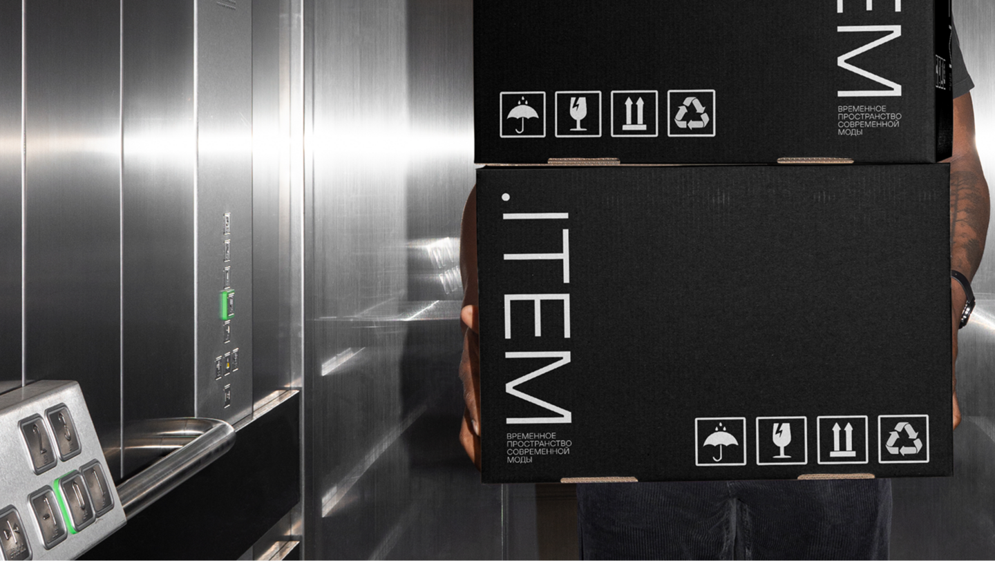
Create a brand identity for a pop-up space in Nizhny Novgorod that brings people and brands together through fashion, a marketplace, lectures, and runway shows. Develop a versatile visual system that is not tied to a particular style or season and allows different brands to retain their own identities.
Solution
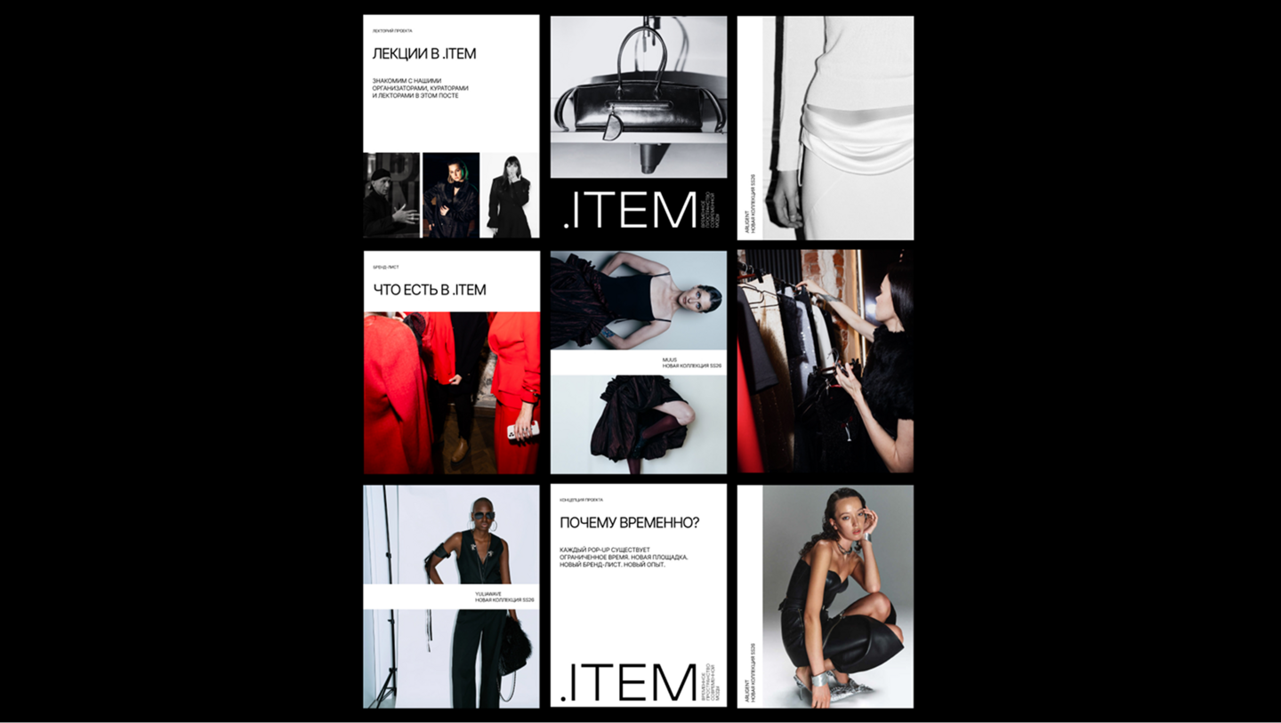
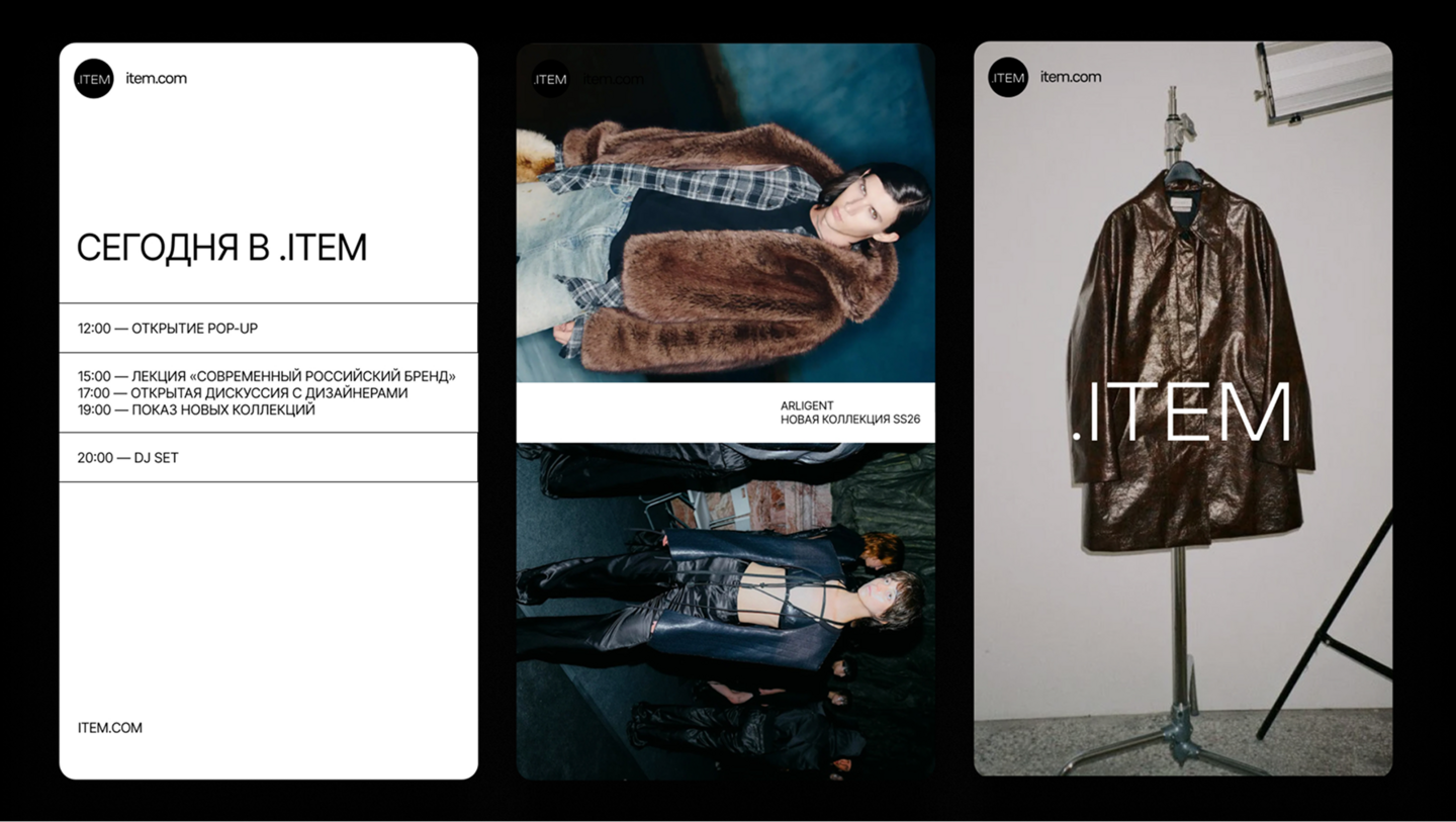
The visual identity draws on the aesthetic of working materials used in the fashion industry. A monochrome palette, sans-serif typography, and strict composition create a concise system that does not compete with the brands on display. The dot serves as the space’s visual symbol, representing a meeting point for people and brands.
Process
The visual system was developed using materials from the fashion industry as a starting point. Their organizational principles informed the grid and typography. The photographic style draws on documentary fashion photography, preserving the feeling of a live event while keeping the focus on the collections on display.
A Taste of Petersburg Weekends
2025
Concept · Identity · Editorial
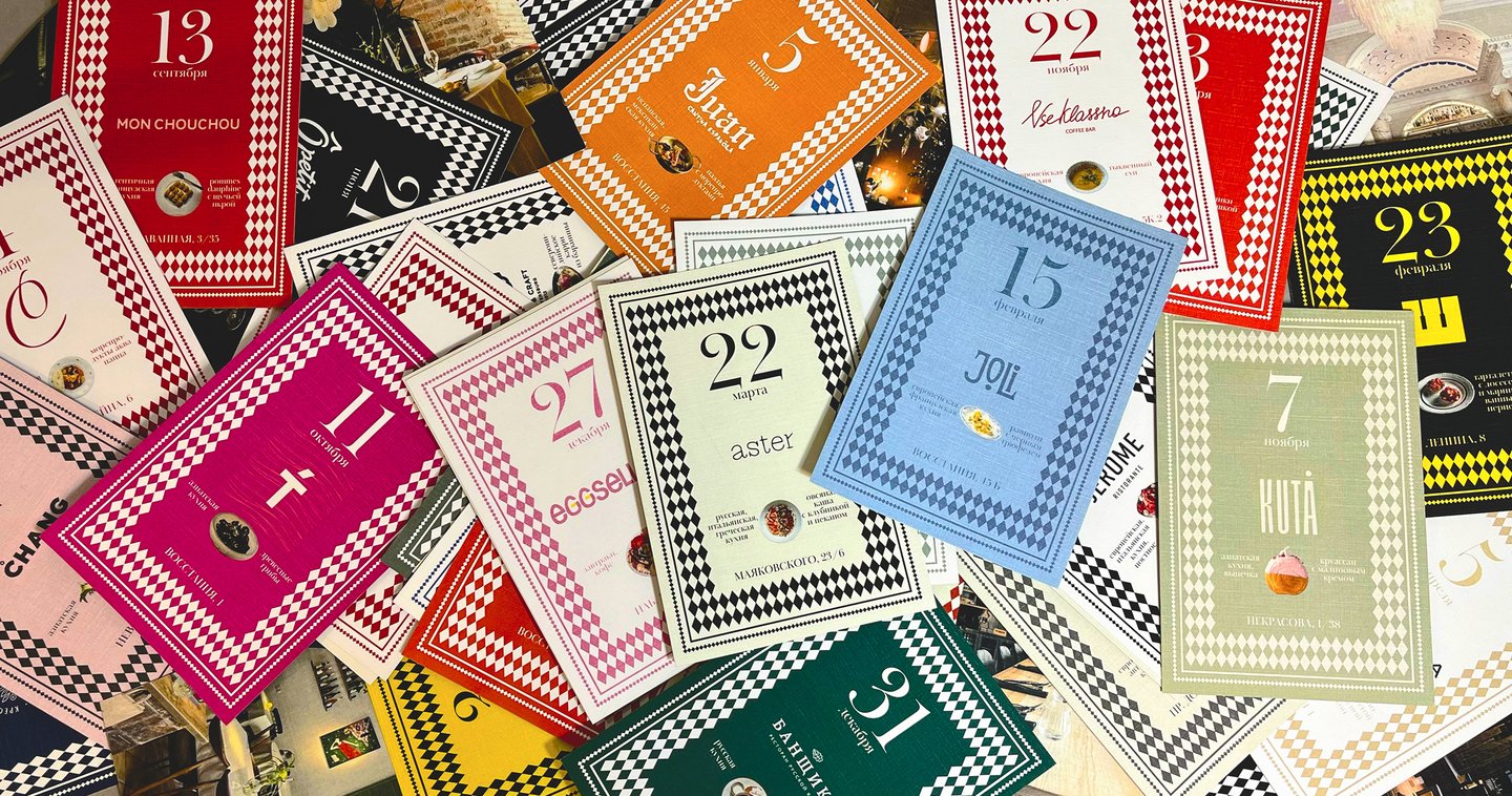
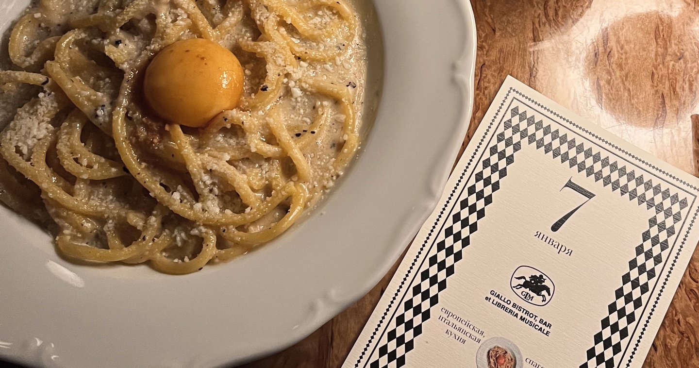
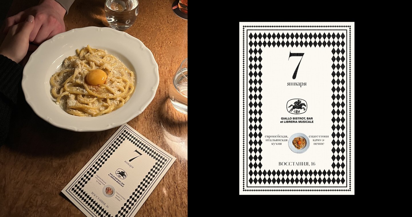
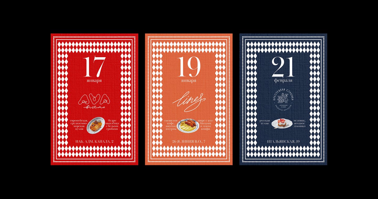
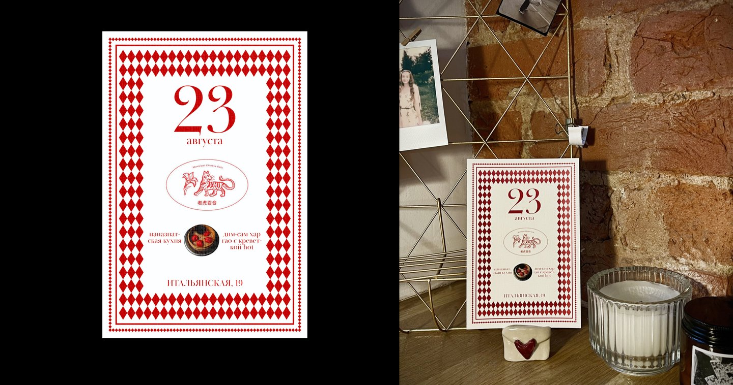
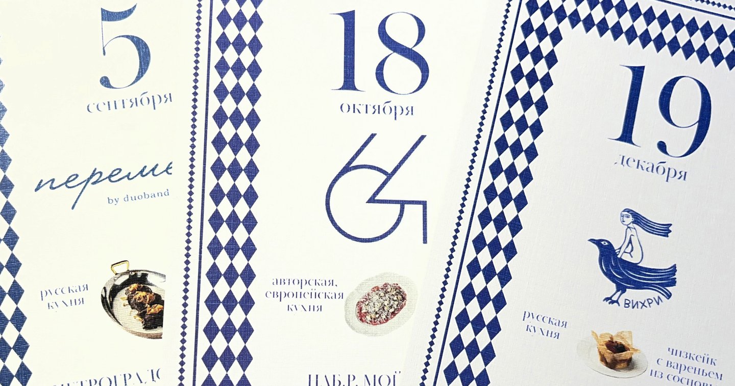
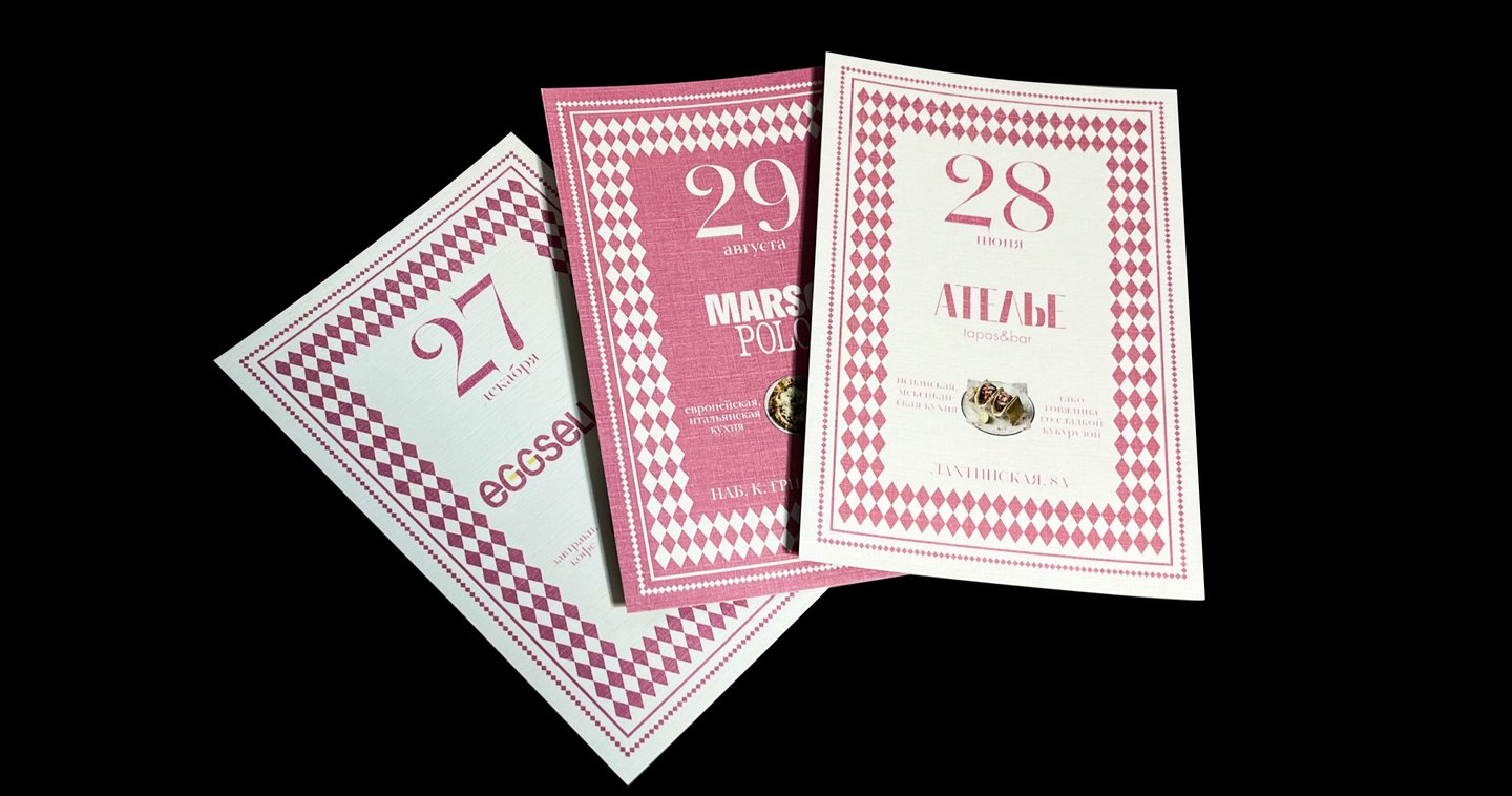
Task — create a card-based calendar featuring 119 weekends and public holidays in St Petersburg, bringing the city’s venues together in a single functional product. Develop a system that preserves the individuality of each place within a unified visual structure.
Solution
The calendar is envisioned as a collection of city spots, with each card dedicated to a different venue. The visual foundation is a reinterpretation of checkerboard tiles—a distinctive motif found in St. Petersburg establishments. The cards are adapted to each venue’s brand colors and feature its logo, cuisine type, signature dish, address, date, and an interior photograph. A consistent grid and typographic system unify them into a cohesive product.
Process
I developed this project independently—from the initial concept and research into St. Petersburg’s food scene to data collection and the creation of the visual system. I selected the venues, gathered information for all 119 cards, and leveraged my research to develop a universal layout system and guidelines for adapting color palettes, images, and logos. This approach allowed each venue to retain its individuality while fitting within the overall system. The project was conceived as a commercial product and is open to realization with a partner or investor.
Prime Line
2026
Branding · Typography
Task
Develop a brand identity for a record label that serves as an entry point for emerging artists who take their music seriously. Create a visual system that communicates freedom, structure, and technological sophistication while emphasizing the label’s selective approach.