Stand out. Stay in mind.

I’m Liza Naydenova, a brand designer crafting identity, packaging, and print graphics that make your brand impossible to ignore.I build cohesive visual systems that solve real business challenges. Recognized by the industry, I am a finalist and prize winner in various design competitions.
My Approach
Meaning First. I begin with your brand’s core idea, not just the visuals. Strong concepts drive strong design.Bold Over Boring. I develop unconventional solutions that make people stop and look. Standing out is more powerful than blending in.Every Detail Matters. From logo to print—everything functions as a unified system. Intelligent details elevate good design into great design.Made to Be Remembered. I don’t design for aesthetics. I design for brands that resonate in people’s minds.
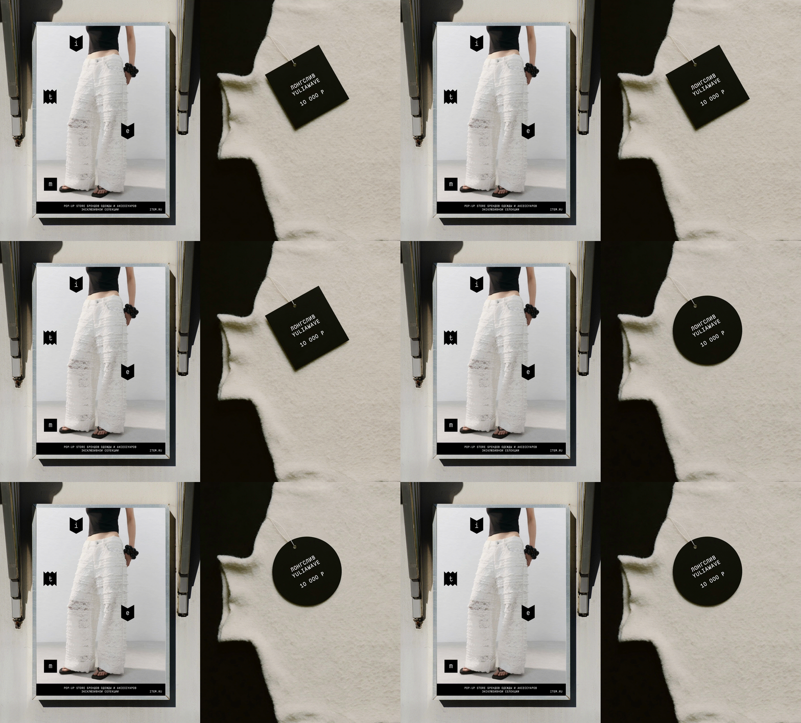
Identity and Branding: item pop-up store
The challenge: Create a timeless identity for a mobile pop-up that unites diverse fashion brands, without competing with the apparel.The idea: Deconstruction. The word «item» is treated as a set of independent geometric building blocks, where each shape functions as a separate «item» within the shared space.The solution: A modular logo system that can freely assemble or disperse, reflecting the pop-up’s ephemeral nature. Monochrome palette and strict typography keep the focus entirely on the products.
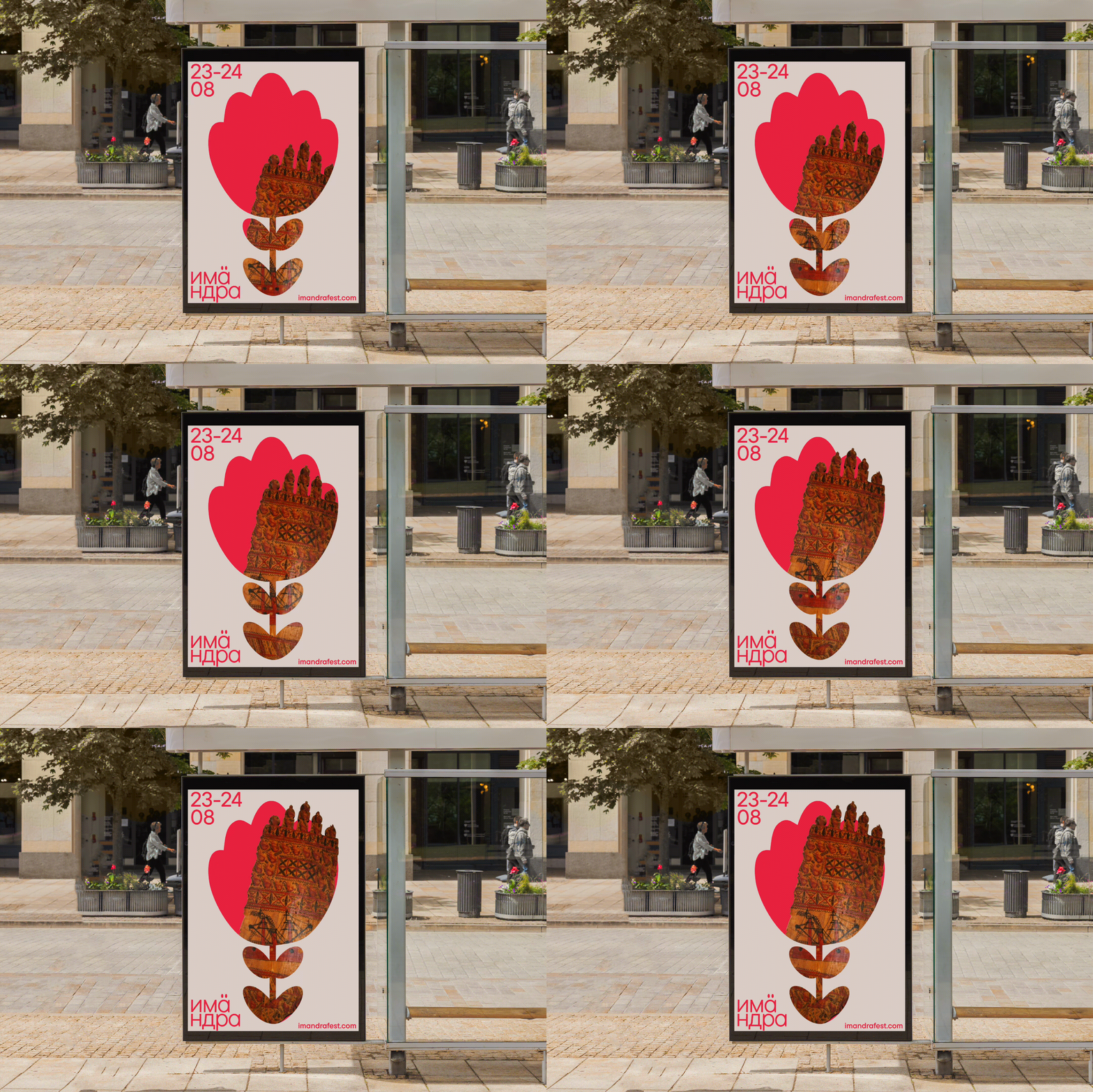
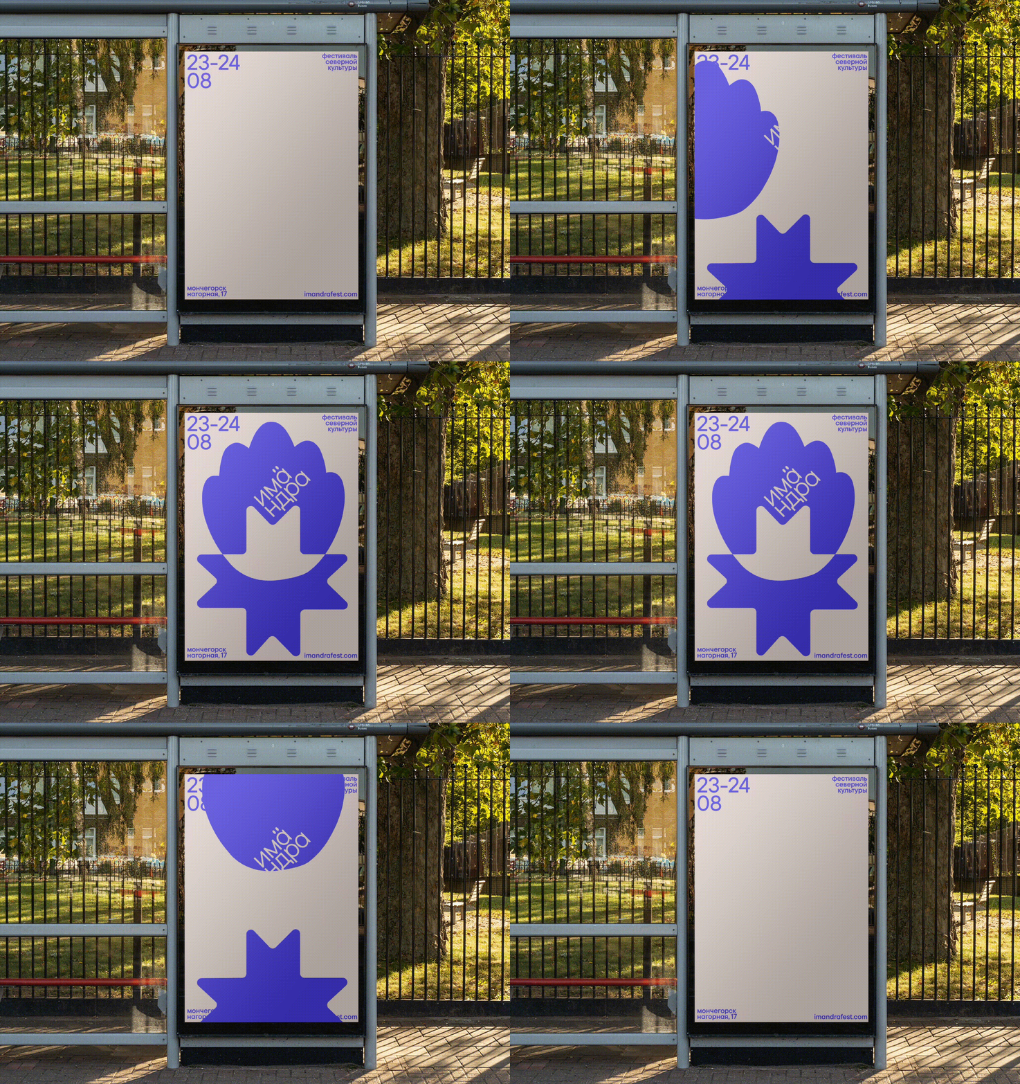
Identity and Branding: imändra fest
The Challenge: The festival expanded to incorporate indigenous Northern cultures. The old, overly detailed Viking branding had become outdated.The Idea: To replace literal Viking symbols with a modern visual language. Traditional Northern ornaments are distilled into clean, geometric shapes.The Solution: A flexible identity system built upon geometric Northern embroidery patterns. This system unites both Viking and indigenous themes across all festival formats.
Identity and Branding: DAFES-typography
The challenge: Create a unique identity for the «DAFES Typography» festival that moves beyond standard decorative fonts.The idea: To frame typography as a structural element, not merely decoration. The letters are reimagined as industrial constructions built upon pure logic.The solution: A custom, AI-generated typeface forms the core of the visual system. This modular, industrial-style typography creates a bold and highly adaptable festival identity.
Print and Graphics: the book about the Russian North
The Challenge: To capture the complex aesthetic of the Russian North in a single publication without resorting to visual clichés.The Concept: The region as a holistic visual system, where every detail carries a profound cultural code.The Execution: A 148-page structured visual research book that decodes the region’s stringent yet poetic aesthetic through three thematic sections.
Print and Graphics: calendar for AVTOVAZ