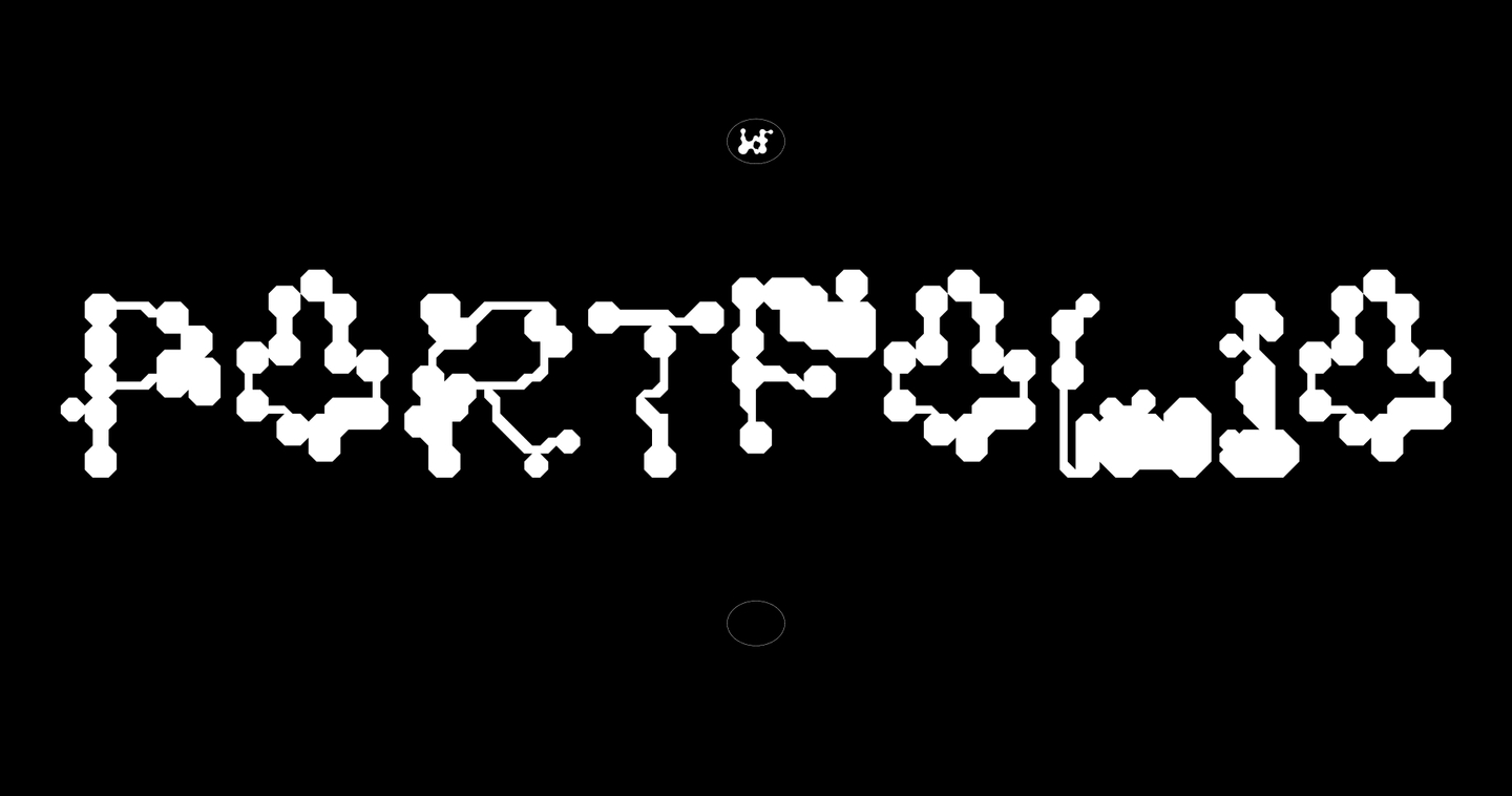
A portfolio exploring the intersection of artificial intelligence, biomorphic design, and emerging technologies. Through five projects spanning generative identity, typography, editorial design, spatial objects, and moving images, I investigate how organic principles can evolve into experimental visual systems.


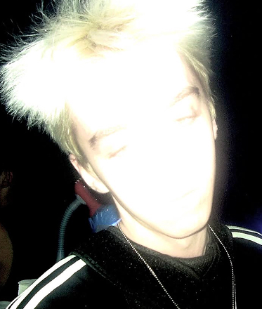
My name is Kola Fomenko. I work at the intersection of artificial intelligence, biomorphic form, and experimental design.I am interested in how structures grow, transform, connect, and attain meaning through design.Across visual identity, editorial systems, typography, objects, and moving images, I explore the relationship between natural processes and technological form.
01/ KAWARGA_SKETCHES
identity and visuals
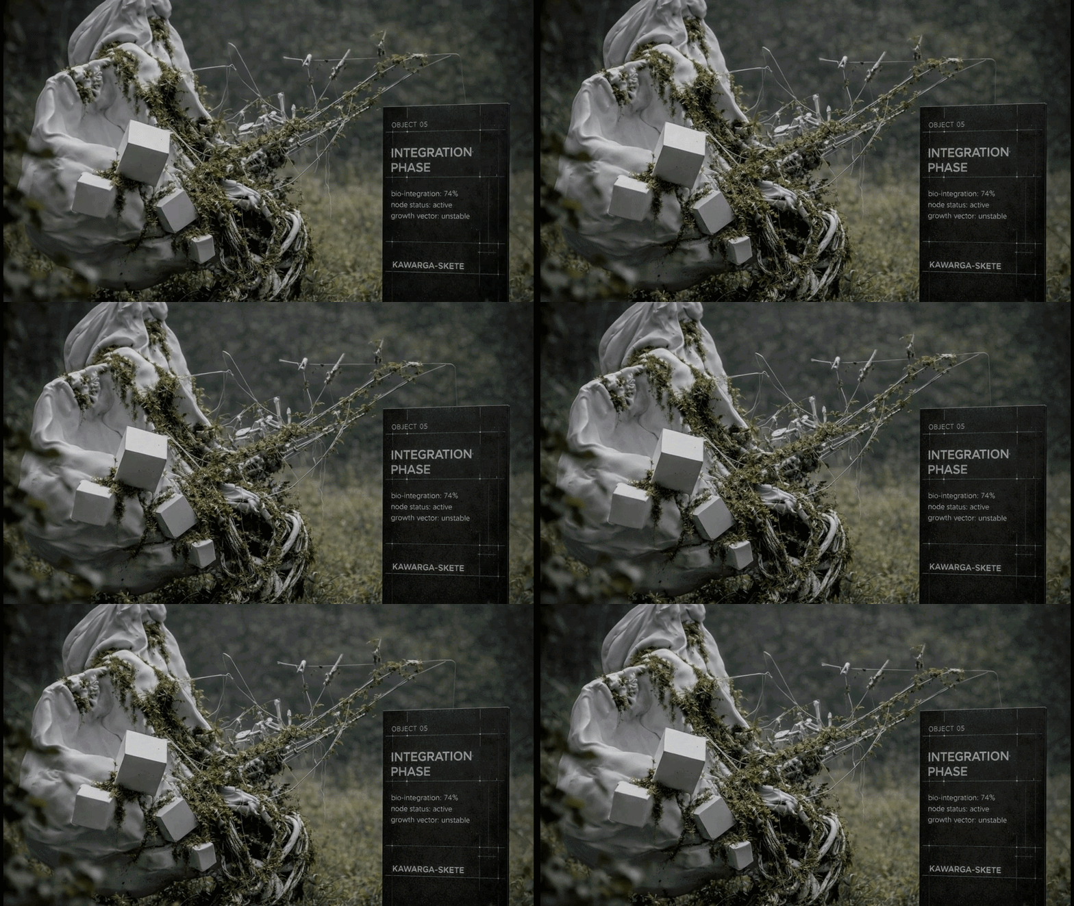
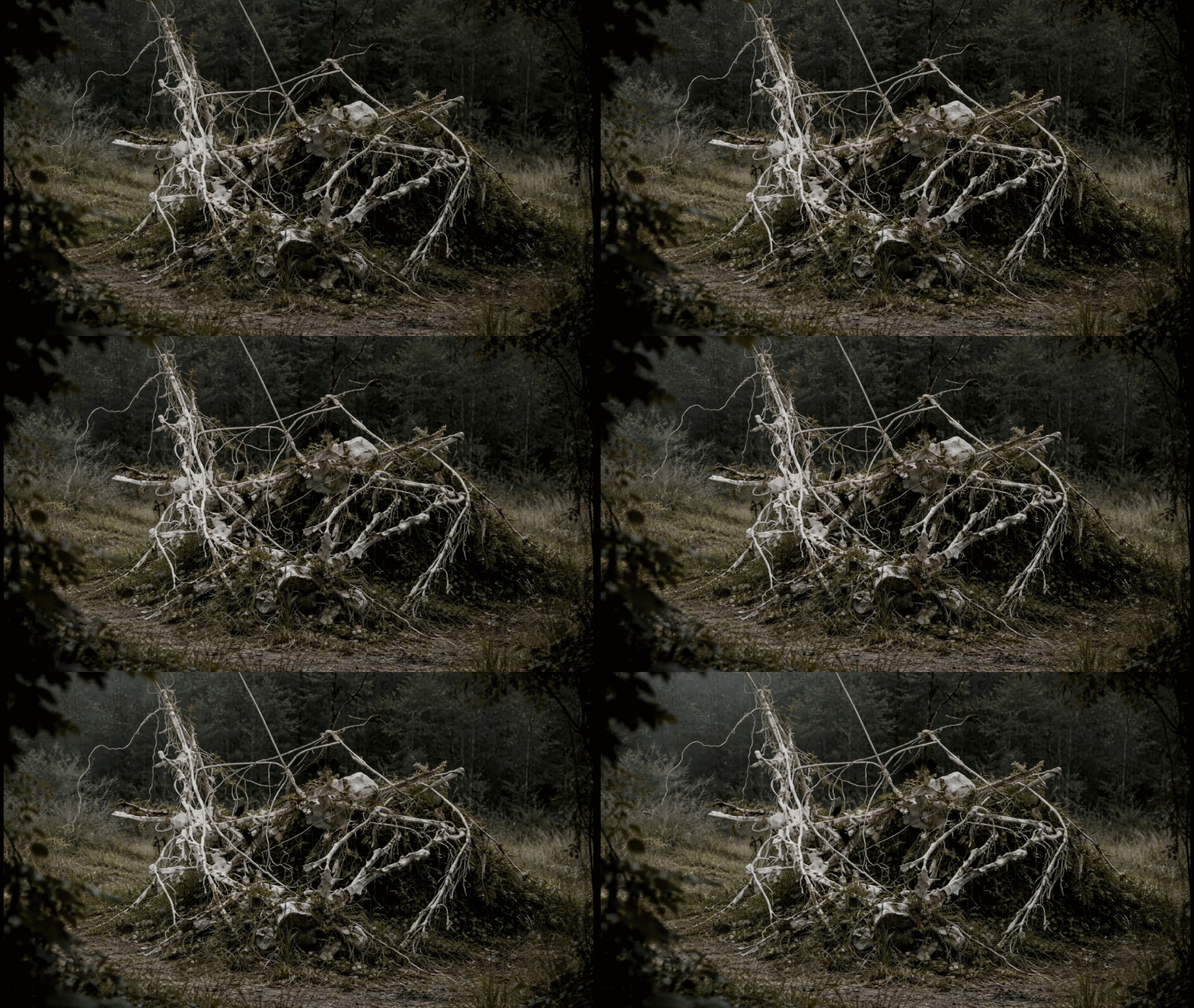
KAWARGA-SKETE is an art park by Dmitry Kawarga, where biomorphic sculptures gradually become part of the natural landscape.This environment is defined by transformation. Sculptures interact with vegetation, their surroundings change over time, and the boundary between artificial and natural structures becomes increasingly unstable.The project served as an experiment to determine if generative AI could develop a coherent visual identity for such an unpredictable environment.
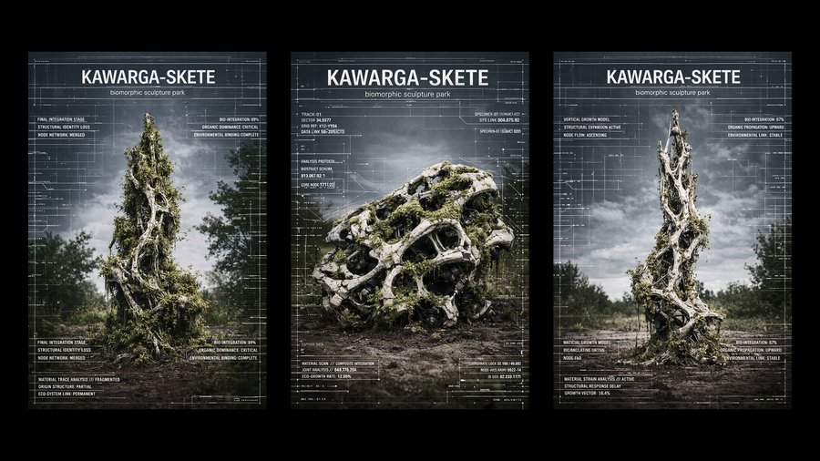
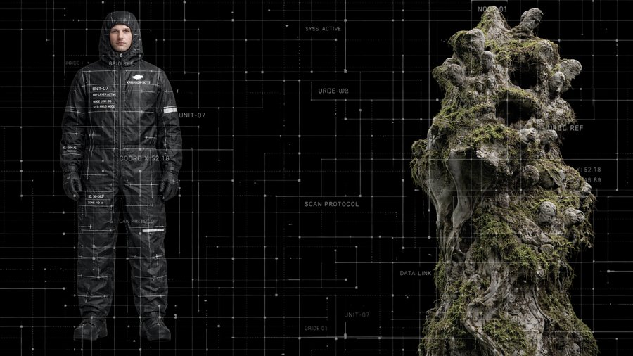
The central concept was to approach the park as a living research environment, with its identity functioning as a system of observation.
Rather than merely replicating organic forms, the visual language contrasts natural complexity with analytical precision.
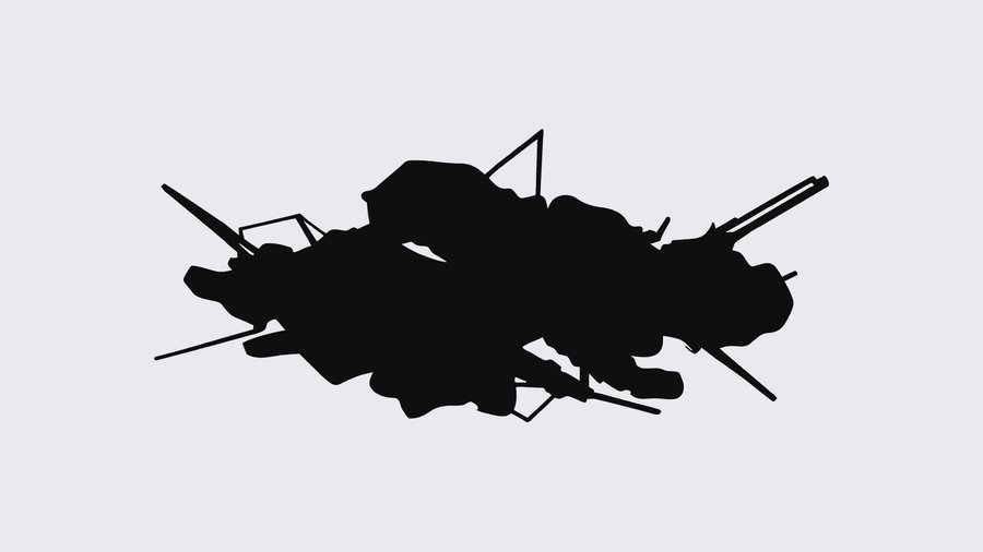
The AI-generated identity incorporates a biomorphic symbol, monochrome graphics, technical typography, grids, and interface-like elements.


02/ «BIRTHDAY BABI YAGA»
book
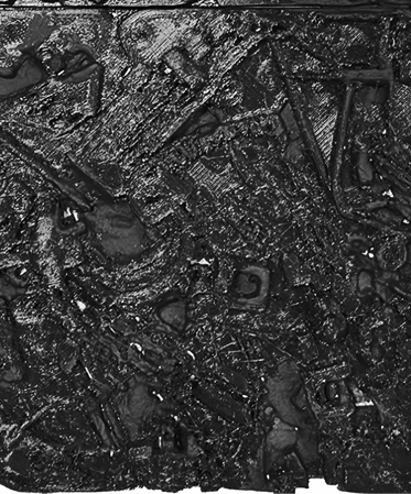
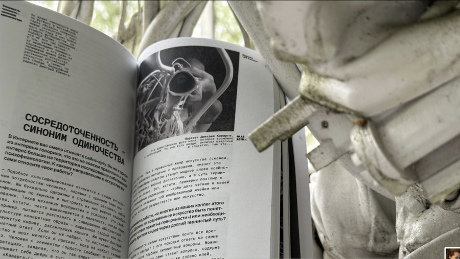
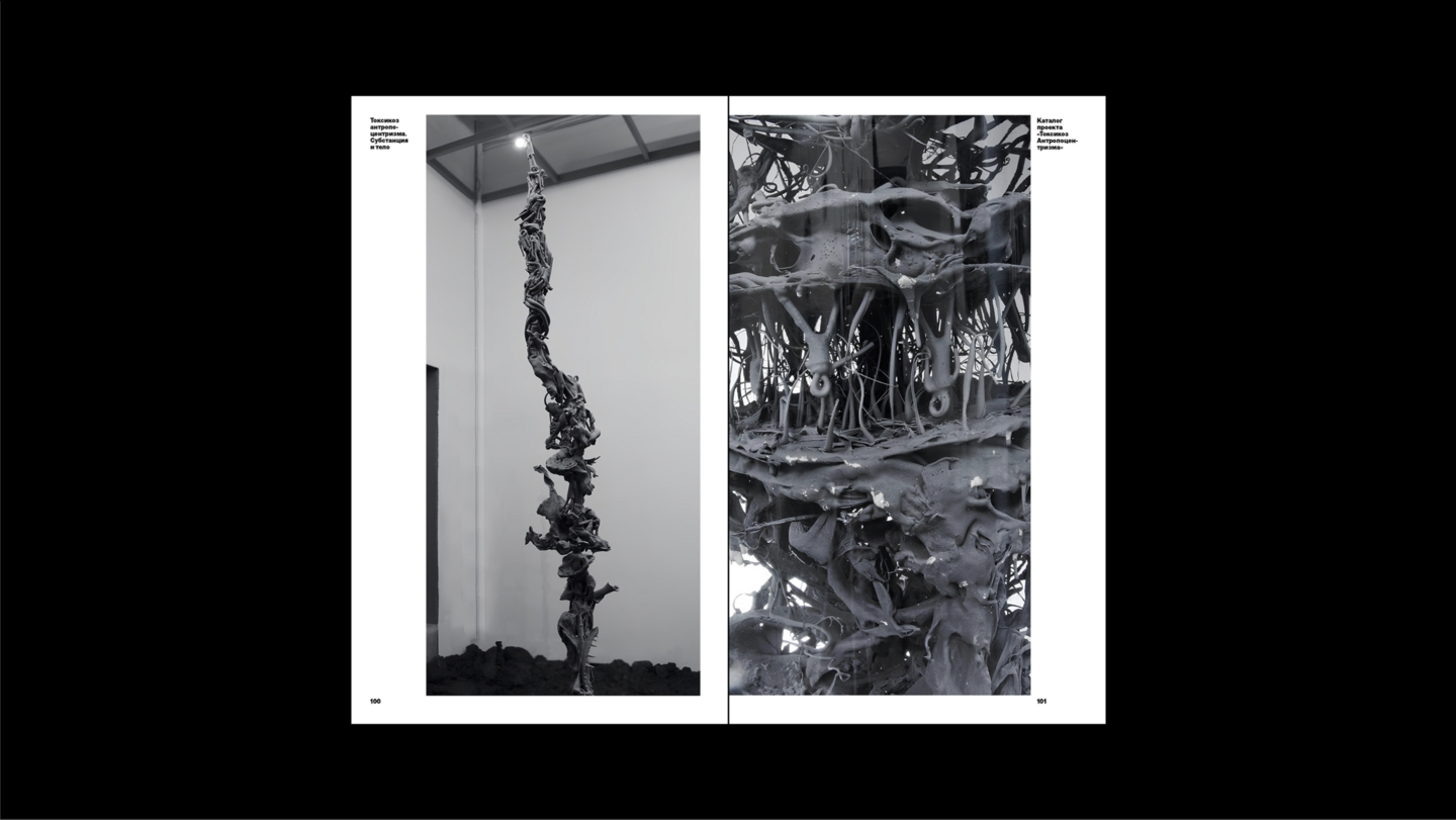
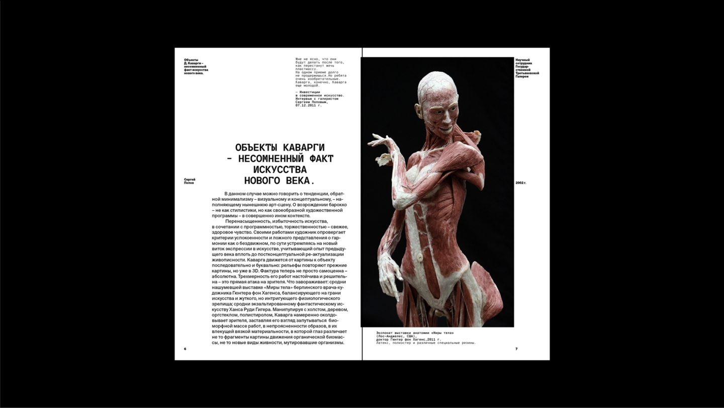
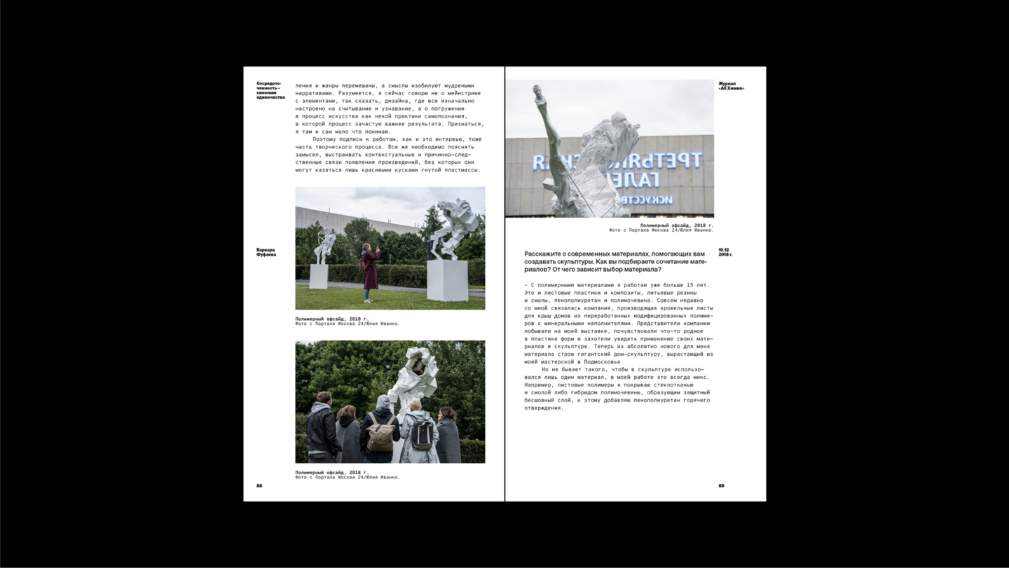
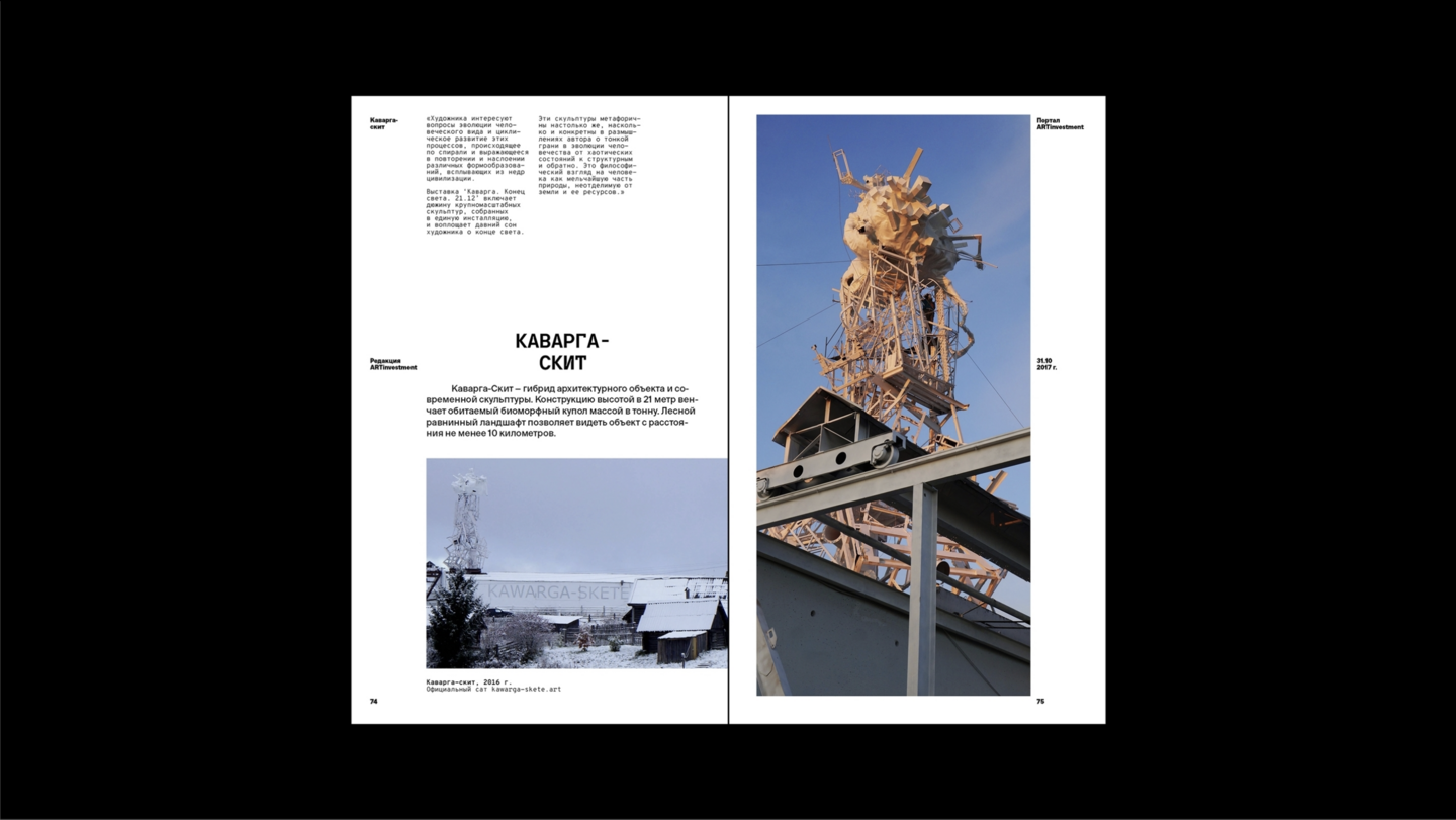
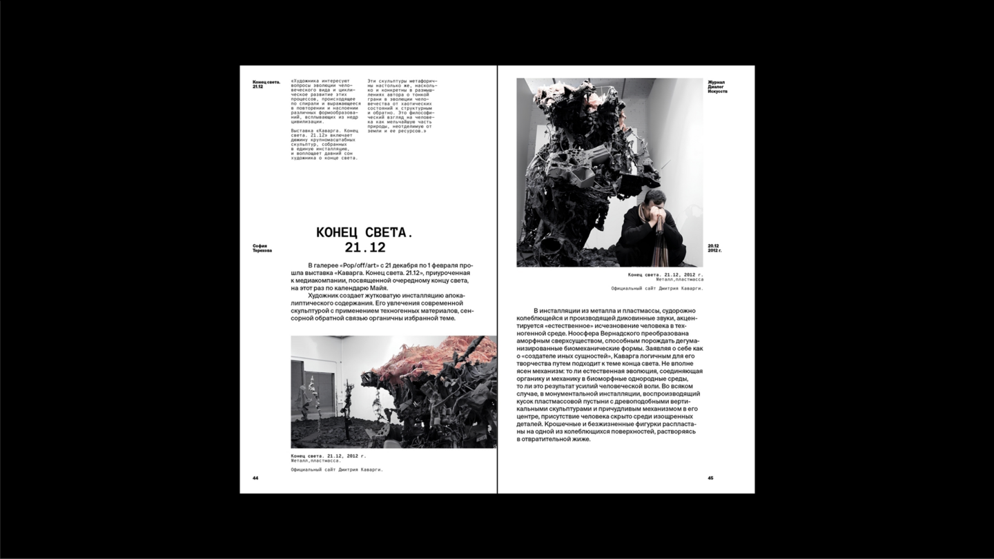
This project is a chronological compilation of existing materials concerning Dmitry Kawarga’s practice.The book does not focus primarily on the artist’s own statements. Rather, it examines how Kawarga is represented within the cultural sphere—through reviews, articles, interviews, critical responses, viewer commentary, and social media publications.The design challenge was therefore as much editorial as it was visual.How do you organize a book where the central subject is not just the artwork itself, but the way it is discussed, interpreted, and publicly understood?

03/.ORGATECH TEXTURE
font
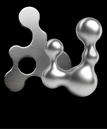
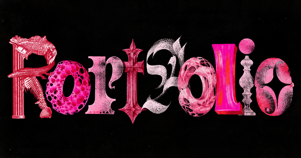
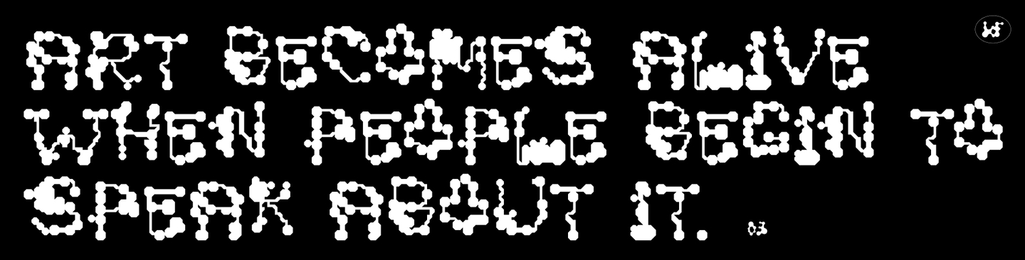
For the streetwear brand .solutions, I designed an experimental display typeface based on techno-organic forms. The project started with a contradiction.Organic structures are fluid, irregular, and mutable. Typography demands recognizable characters and internal consistency.