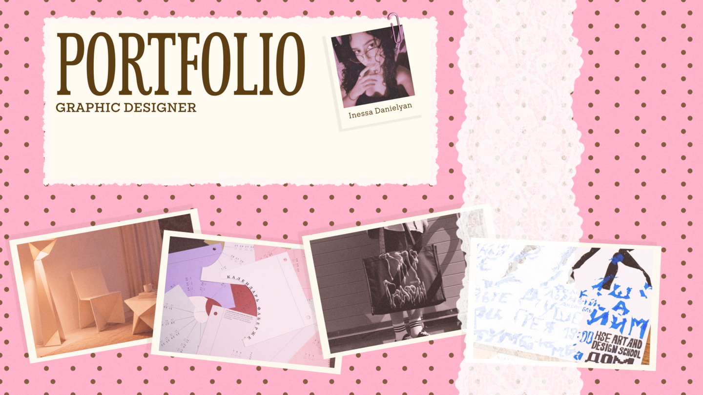
I translate ideas and feelings into visual metaphors, working across typography, graphic identities, and object design.
About Me
I’m Inessa Danielyan, a graphic and object design student at HSE Art and Design School. I’m interested in how a project can communicate a feeling before its idea is fully explained. I search for visual metaphors that can evolve into typography, color, composition, or an object’s form.I am looking for an internship at a multidisciplinary design studio where I can contribute to projects and develop my practice through feedback.
My Approach
I pay particular attention to the character of a project: what it suggests, how it feels, and what makes it memorable. A metaphor helps me connect that impression with a design decision.In the selected work, this manifests as the opening of a calendar, the melting of a letterform, and the fold of a furniture concept.
Selected Work
Fabergé Calendar Editorial design and paper construction DAFES Experimental identity and AI-generated typography ORI Sketch-led, AI-assisted furniture concept AKUSTNIK Handmade festival posterFabergé Calendar
Editorial design and paper-object studies My role: concept and design
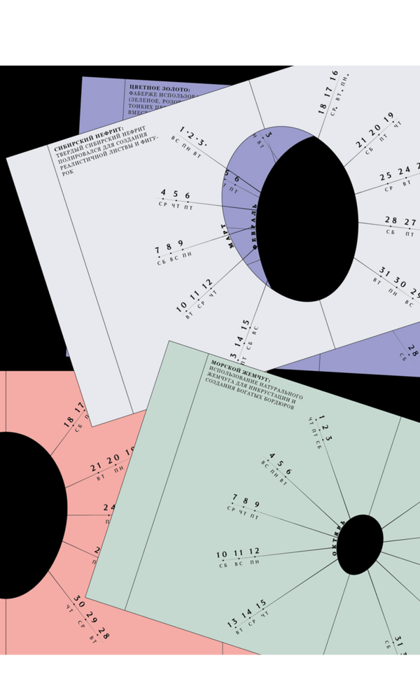
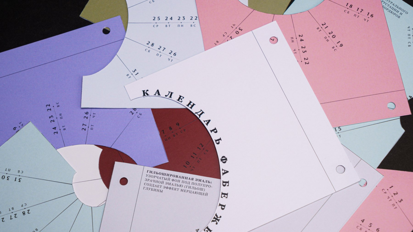
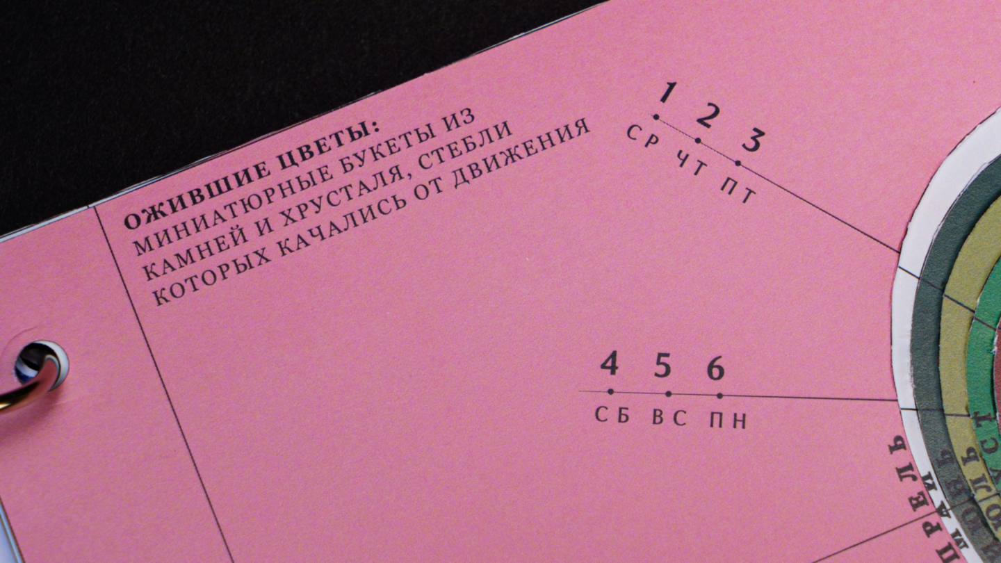
Brief: This student project translates the concept of a Fabergé egg into a calendar. The challenge was to integrate the object’s reference point into its function, while ensuring the dates remained organized and the months were easily recognizable. I intended for the connection to the subject matter to be evident in both the structure and the graphics.Idea: I focused on the act of unveiling. Each new month becomes a small reveal, incorporating two flaps that evoke the anticipation of discovering what is inside an egg. This metaphor connects the calendar’s subject matter to an everyday action, lending the object a more personal character. Solution: The two flaps and the egg-shaped cutout define how the calendar opens. The date layout follows a circular structure, and each month utilizes a color combination associated with a different Fabergé egg. Short texts about the craft add another layer of depth to the calendar.
DAFES
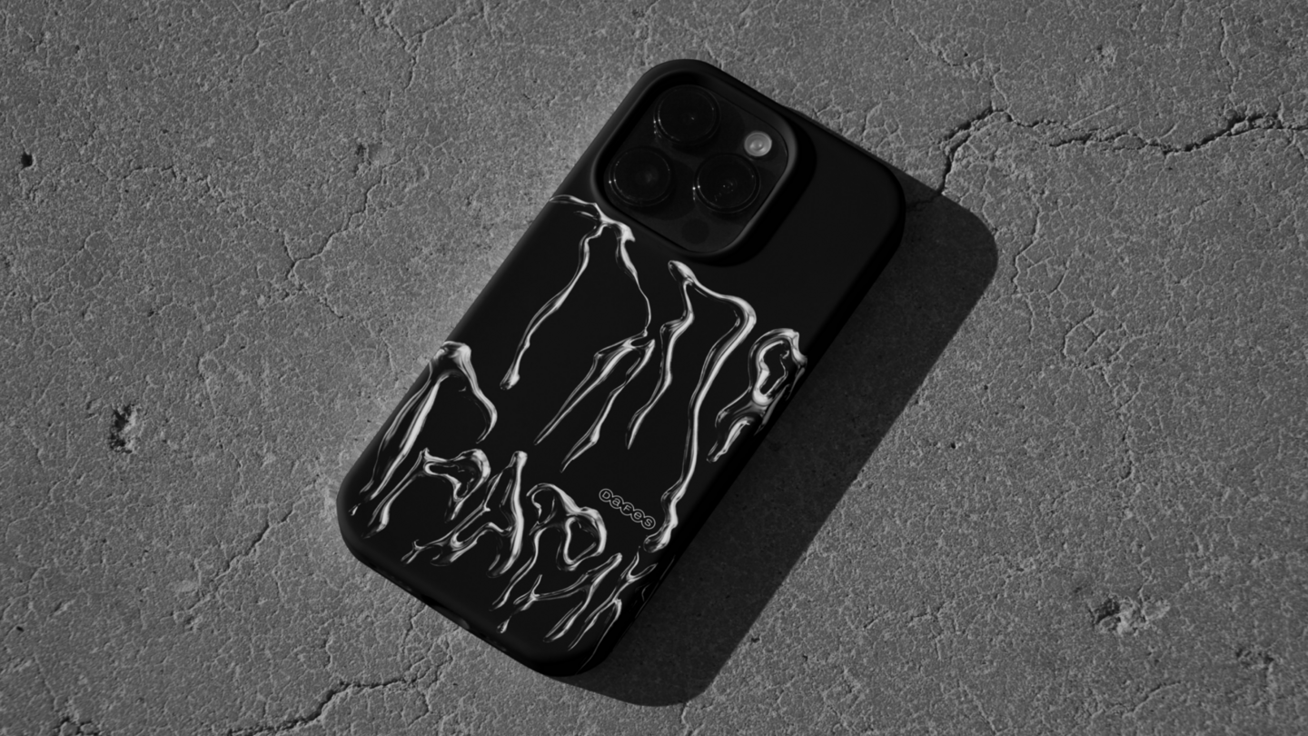
Experimental Identity Study My Role: Concept Development, AI Direction, and Graphic Application Letterforms generated with AI; applications presented as mockups
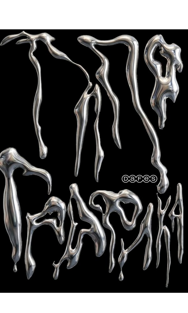
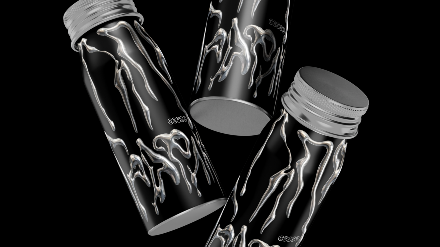
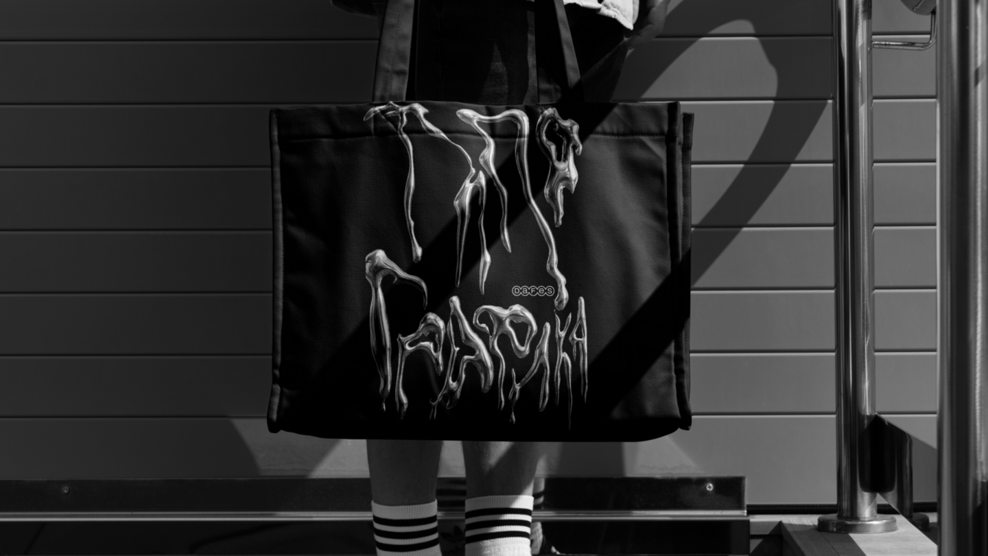
Brief: This identity study was based on an assignment where I created an alphabet using AI. My task was to develop a concept for the letterforms and then apply the result to various graphic designs. The core challenge was to maintain a unified character throughout the study, ensuring that the letters and their applications felt intrinsically connected. Idea: I chose melting chrome as a metaphor for transformation. The letters appear to exist between two states: they retain recognizable structural elements, yet their outlines become fluid and unstable. The reflective surface binds the forms together with a consistent material character, imbuing the identity with a sense of movement.Solution: The alphabet unifies irregular contours, reflective surfaces, and a cohesive material treatment. I carried these characteristics into the graphic applications, using the letterforms as the primary visual element. Adjustments in scale and composition allow the same visual language to function effectively across diverse presentation formats.
Outcome: The result is an identity study that connects an experimental alphabet with graphic applications. The mockups show how the visual language could extend across formats. My contribution combines conceptual direction, work with AI-generated material, and the development of applications around a shared visual idea.
ORI
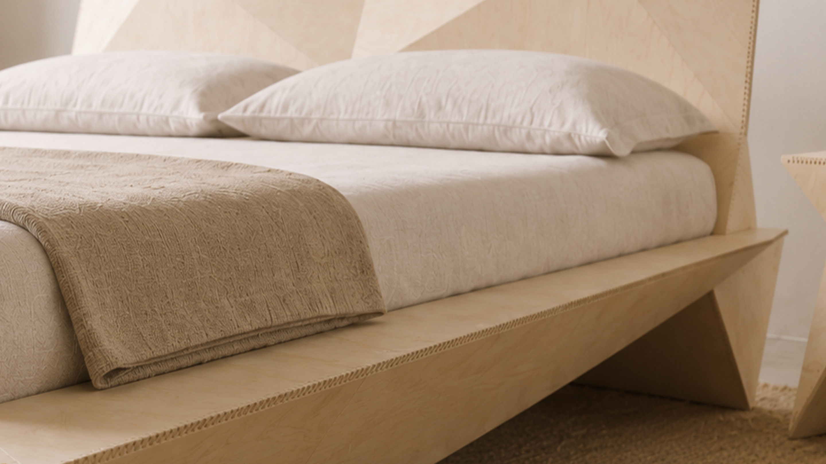
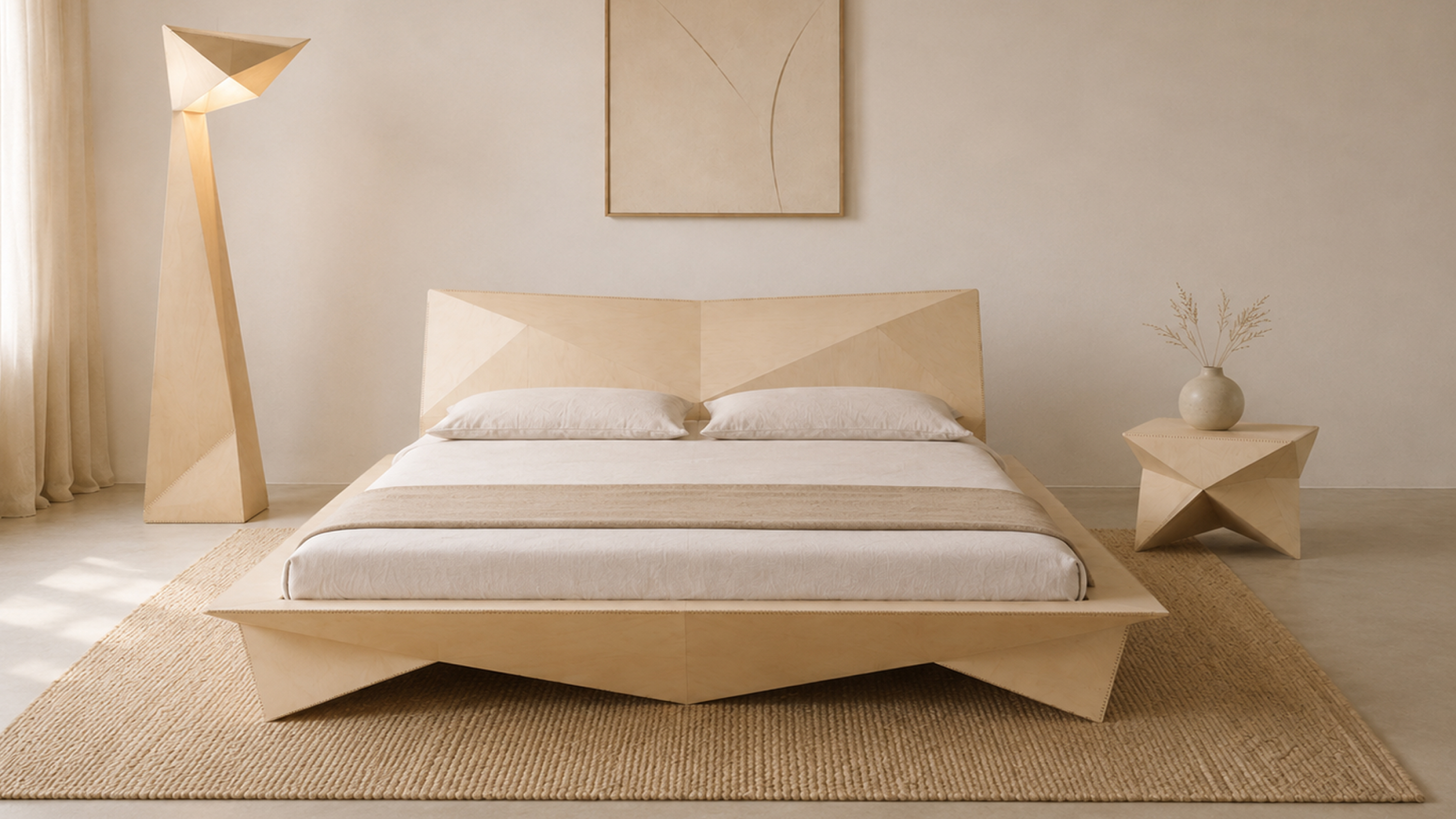
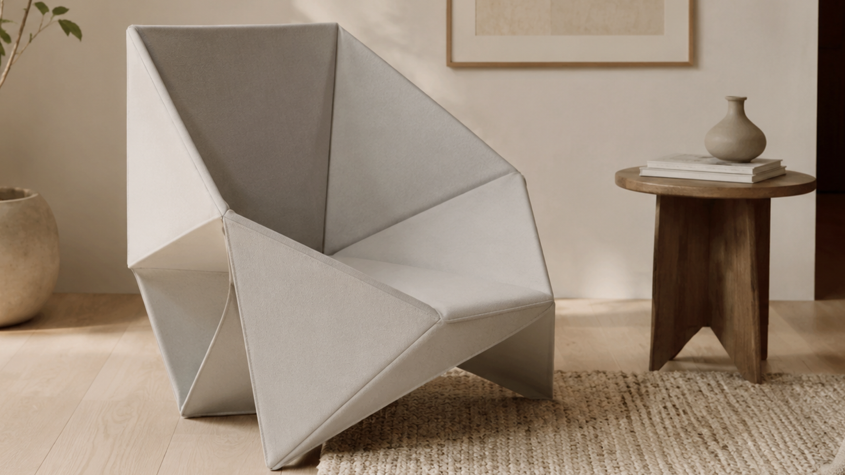
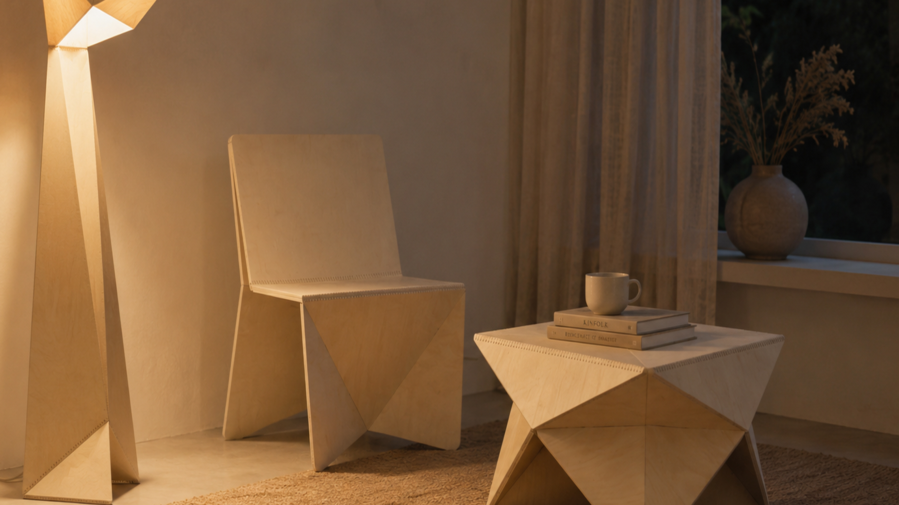
Furniture and Lighting Concept My role: original sketches and AI-assisted design exploration Concept visualizations; no physical prototype
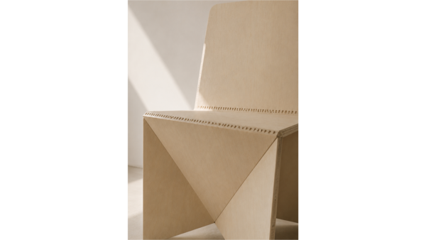
Brief: ORI is a conceptual collection of furniture and lighting. I aimed to explore how a single formal idea could unify diverse objects while permitting each piece to retain its own unique function and proportion. The core challenge was to establish a shared character through geometry rather than through repetitive ornamentation. Idea: The collection originates from the concept of the fold. A flat plane implies volume through a change in direction—an edge or a facet. I employed this concept as a common vocabulary for the chair, table, bed, and light, tying the collection together through its inherent geometry.Solution: I utilized my initial sketches as the foundation for AI-assisted design exploration. The resulting visualizations develop the folded geometry across both the furniture and the lighting, enabling a direct comparison of the collection’s shapes and proportions within an interior space. Shared facets and edges carry the core idea from one object to the next.
Outcome: The outcome is a concept collection presented through AI-assisted visualizations. No physical prototype was created. The project demonstrates an approach to form and atmosphere, while construction, materials, and ergonomics remain questions for further development and testing.
What can I bring to a studio?
The selected projects illustrate how I integrate visual ideas with typography, layout, and form. I am eager to contribute to visual research, concept development, and the presentation of graphic and object projects.
I am interested in a studio environment where I can apply these skills, learn from feedback, and develop my approach through collaborative teamwork.