01. About Me
Visual Identity Designer for Culture-Driven Brands Brand identity, packaging, and campaign visuals rooted in cultural heritage. Research-based. Culture-driven. Built for brands. I transform folklore, archives, and historical references into a contemporary visual language that a brand can inhabit. Available for project commissions, agency subcontracting, and long-term collaborations. — Software Proficiency: Adobe Illustrator, Adobe Photoshop, Adobe InDesign, Adobe After Effects, Figma, AI tools — Education: HSE University, 2023–2027 Bachelor’s degree: «Design»
02. Field of Work
Brand visuals, from research to application.
I collaborate with brand briefs, archives, and visual references to build identities that feel specific rather than generic. I help founders, marketing teams, and agencies translate a brand’s story, craft, or heritage into its logo, color palette, typography, packaging, and campaign visuals.
- VISUAL RESEARCH & CONCEPT — Brand and audience analysis, cultural and historical references, moodboards, and concept directions.
- BRAND IDENTITY — Logo or mark, color, typography, graphic language, and usage guidelines.
- PACKAGING DESIGN — Packaging systems for cosmetics, craft goods, and jewelry.
- CAMPAIGN VISUALS & POSTERS — Poster series and key visuals that convey a brand’s narrative.
03. My Approach
Heritage is not decoration. It is a language.
My process begins with research: folklore, ornament, archives, objects, old print. I seek the codes that make a culture recognizable and translate them into color, type, composition, and material that resonate for a modern brand and its audience. I am interested in the moment a historical detail becomes a brand signal—where a pattern, a stone, or a label can convey what a brand’s name cannot.
From Brief to Final Identity or HOW I WORK?
Understand the brand → Research the heritage → Find the code → Build the system → Apply and present.
Every brand requires a unique balance of research, concept development, and production design. The scope of work is defined according to the brand’s specific needs.
04. Selected Cases
- IDENTITY / PACKAGING: SHUYA SOAP — A folklore-based rebranding.
- CAMPAIGN / POSTERS: POSIÉ — A poster series for a jewelry brand, inspired by the jewels of Russian empresses.
05. Case Study No. 1 — Shuya Soap: «Soap is Grey, Yet It Washes White»
FOLKLORE-BASED REBRANDING · IDENTITY & PACKAGING
The Challenge How can a heritage soap brand appear contemporary while remaining true to its origins? The brand’s heritage surpassed its visual identity: it was an everyday product steeped in a rich local history, yet its presentation failed to convey that narrative. The Research Shuya folklore, Russian-style graphics, historical soap labels, and packaging. I investigated the ornamentation and motifs of Russian folk art, studied vintage soap wrappers and labels, and explored the local saying that inspired the project’s title. The Idea Folklore as the brand’s voice. Instead of merely applying a «Russian style» decorative layer to the packaging, I used the visual codes of the local culture as the foundational framework for the entire system.
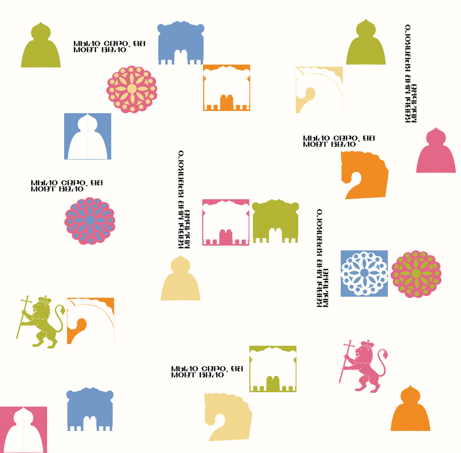
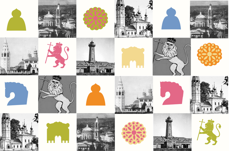
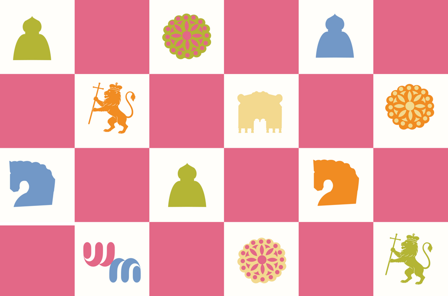
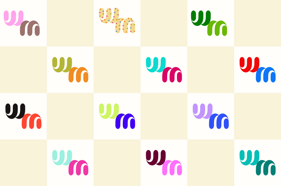
The Solution A visual identity built around a hand-drawn sign, a restrained palette of soap greys and warm whites accented by a single folk element, expressive lettering, and ornamental patterns, all applied to the packaging. In Use Mockups of the soap bar and wrapper
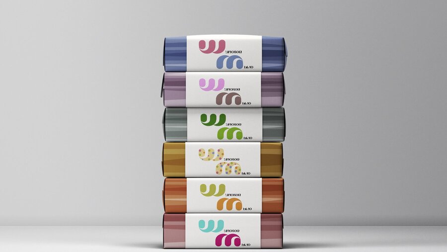
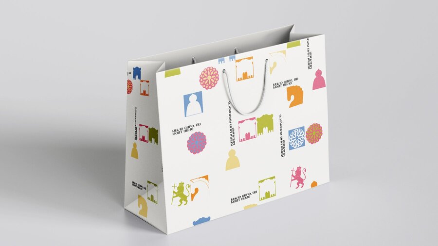
PROJECT DEMONSTRATES
Brand identity · Cultural research · Packaging system · Translating heritage into a contemporary look
06. Case Study #2 — POSIÉ: The Jewellery Box of Russian Empresses
POSTER SERIES FOR A JEWELRY BRAND · CAMPAIGN VISUALS
The Challenge How can a jewelry brand communicate value and history without resorting to clichés? The Research A visual study of the jewelry of Russian empresses: forms, stones, settings, portraits, and archival imagery. I analyzed portraits, museum collections, and archival images of imperial jewelry—tiaras, brooches, pearl sets, and gemstone settings.
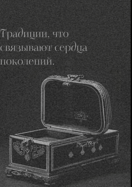
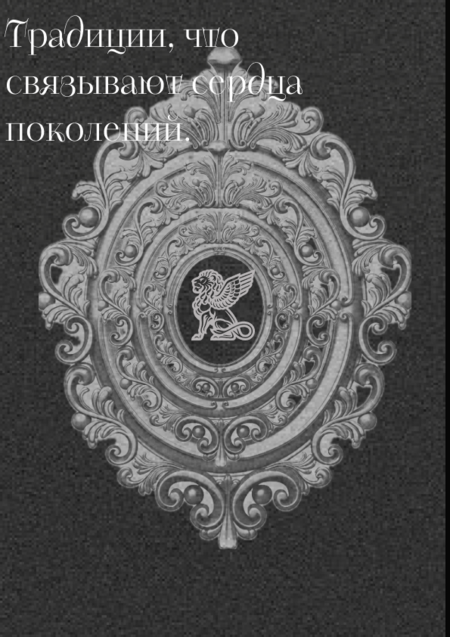
The Concept Jewels as the brand’s visual alphabet. The research informs the entire brand communication, moving beyond mere mood referencing. The Design A cohesive poster series featuring a recurring composition built around a single jewel, color palette drawn from the stones, refined display typography, and a unified frame. In Context Mockups of the poster series displayed in urban and interior environments, illustrating the campaign’s impact across various scales.