Do you remember the first design project you ever did?
The one where your grandmother’s approval was the ultimate measure of commercial success, and the composition was built on a radical pursuit of «prettiness»?
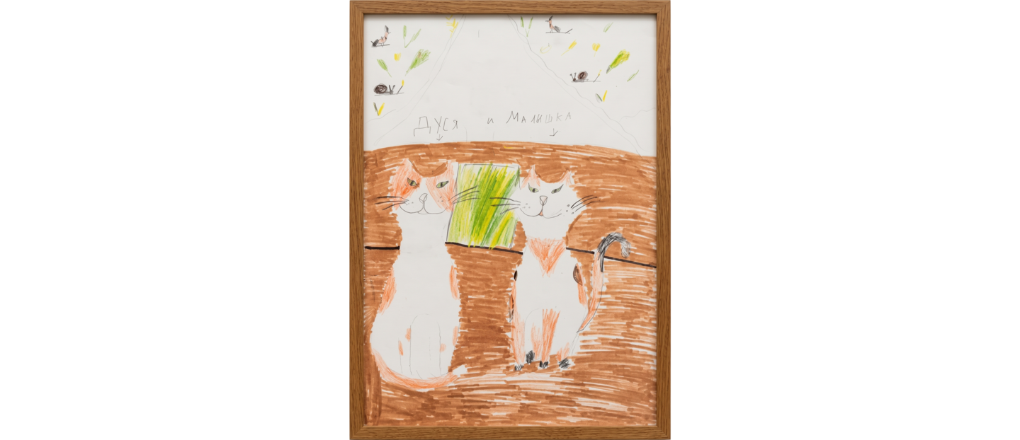
Katya, age 7
The creative director (aka grandma) approved it without a single revision. The main KPI? Placement in the living room, with viral reach across the entire extended family.
Back then, I thought the designer’s job was just to make the world more beautiful. I thought that was enough.
But it wasn’t.
The first real brief, and the first competition, showed me this: beauty gets a nod. An idea gets chosen.
AI made forms accessible—anyone can generate a beautiful image. Pinterest promotes similar patterns. Everyone copies everyone.
The result: a sea of pretty visuals that say nothing.
No idea. No solution. No sale.
So I chose a different path. Meaning first. Form follows.

I’m Ekaterina Kochkina, a fourth-year design student and brand identity designer based in Moscow. Before university, I completed a secondary specialized degree in design and teaching. Currently, I am interning at Kaspersky as a designer.
My practice is grounded in research. I analyze the cultural, historical, and social context of a brand, and from this analysis, I derive a central metaphor.
This metaphor becomes the foundation of the entire identity. Typography, color, imagery, and composition are not chosen for aesthetics alone—each element must serve the core idea. The visual system is therefore a consequence of the concept, not its starting point.
Every decision must be explained and defended.
Identity for a porcelain collection
Brief
As part of an open call initiated by the tableware brand Antikhrupkost and the real estate developer Strana Development, the task was to develop a concept for a porcelain collection reflecting the identity of Moscow’s Presnensky district.Research
I decided to explore the question: What adorns the rooftops of Presnya? In the Presnensky district, one can find many unique weathervanes, spires, towers, and rooftop sculptures. This reflects the heterogeneity of the district, where every era has left its mark in the form of distinct details.Idea & Metaphor:
Presnya is remarkably diverse and eclectic. The visual fragmentation of the district—where historic estates collide with austere Soviet constructivism and the mirrored towers of the City—is its unique identity.Form
And collage is its language. That is why the technique here is not accidental; the fragmentation logically led me to it. Watercolor, scissors, crayons. The collage brings together what the district brings together: different eras, different materials, different details.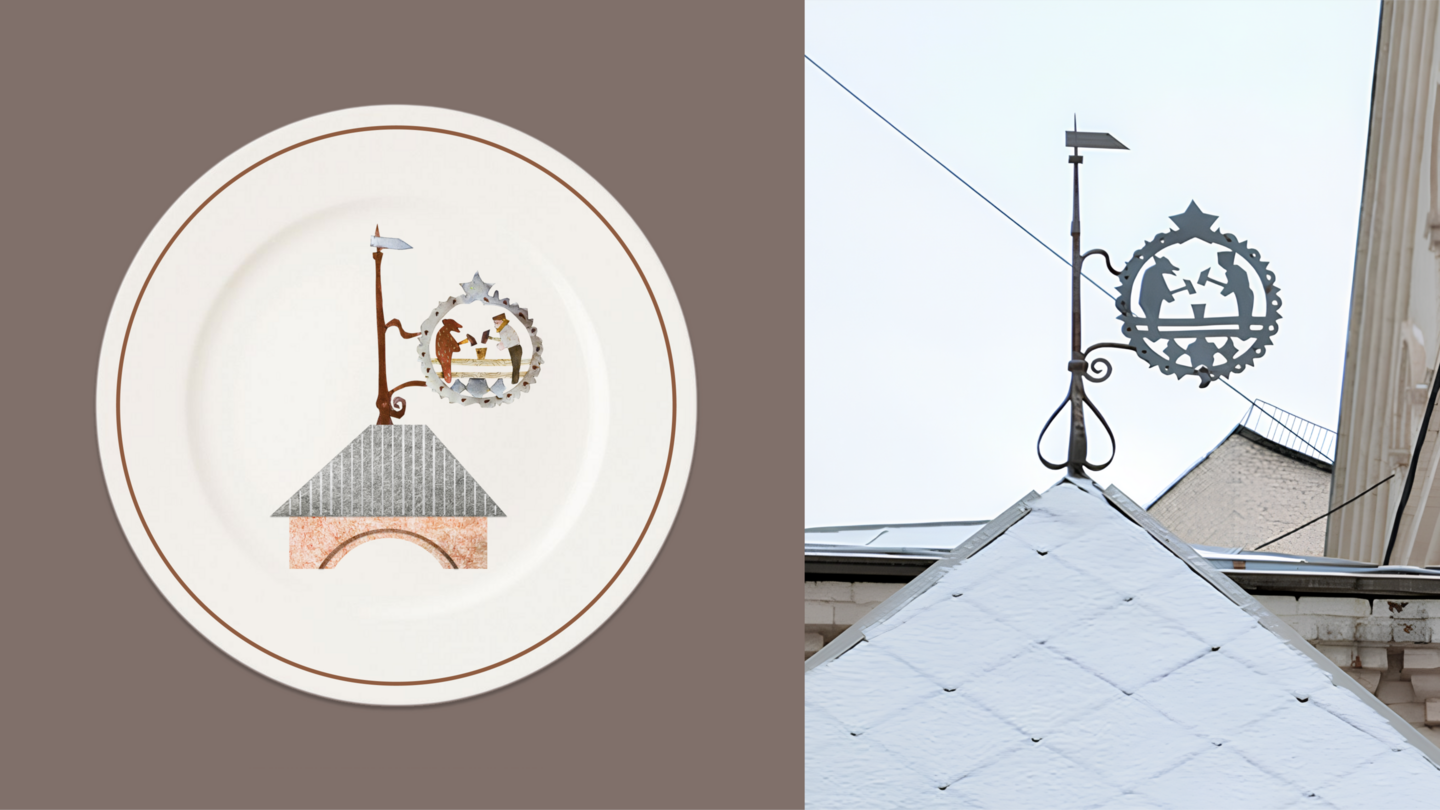
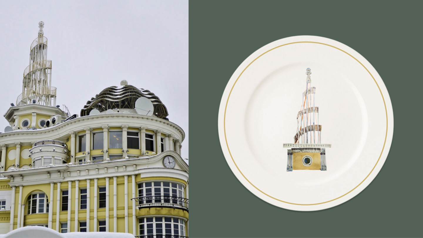
Shortlisted — the top 11 out of 129 submissions from around the world.
Identity for Japanese Confections