I draw and design for print
I’m a graphic designer and illustrator. I create posters, festival identities, zines, and original illustrations.I take a project from the initial sketch all the way through to the final print-ready files. I generate the concept, draw the illustrations, and build the layout.Most of my projects blend graphic design with hand-drawn illustration. Beyond posters and identity work, I’ve also designed a typeface, merchandise, a night light, and Snapchat filters.Tools: Adobe Illustrator, Photoshop, InDesign, Figma, Procreate, Blender. Selected projects below
Posters
[Case 01] Explanation for Everything. Poster series for Gábor Reisz’s film · METU × HSE Art and Design School
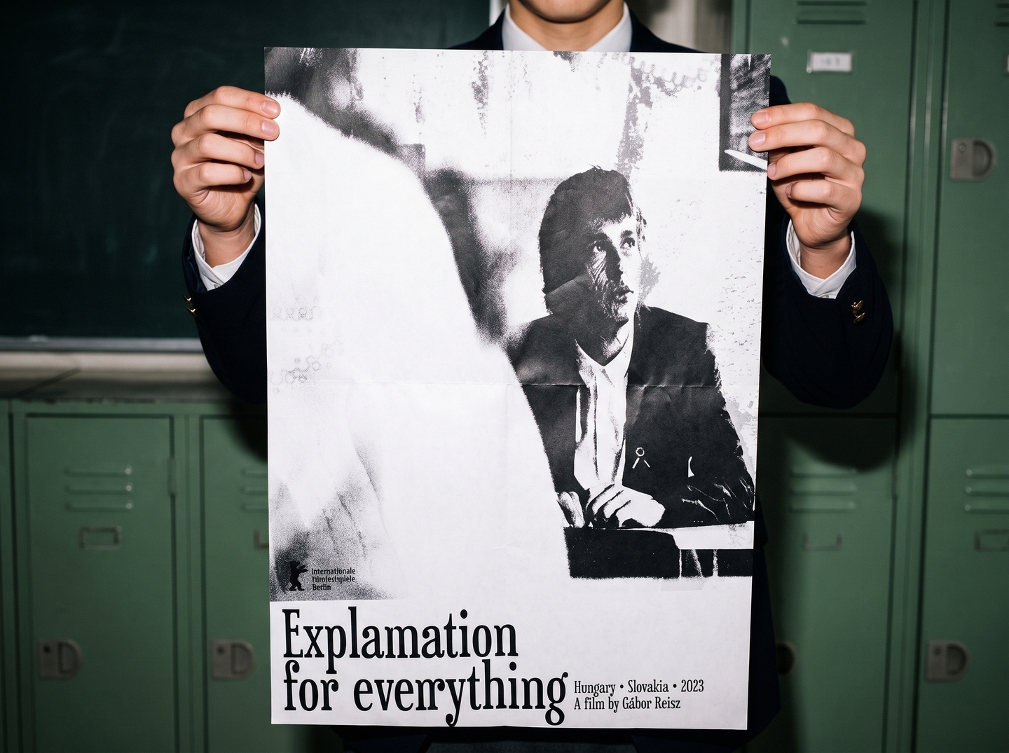
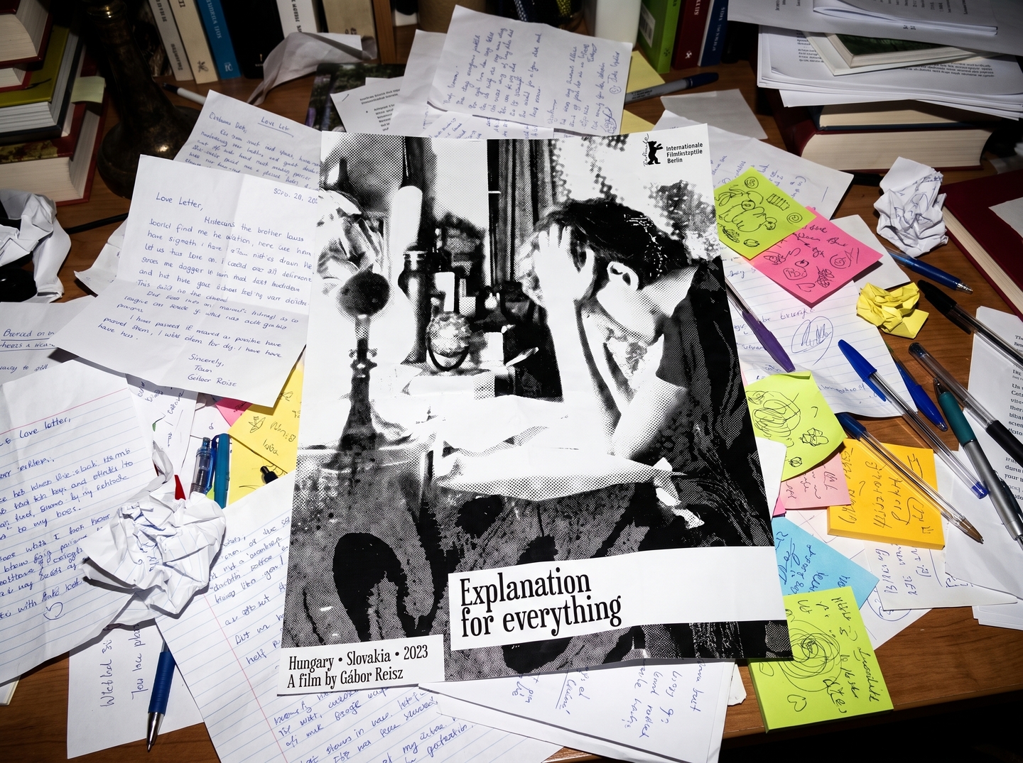
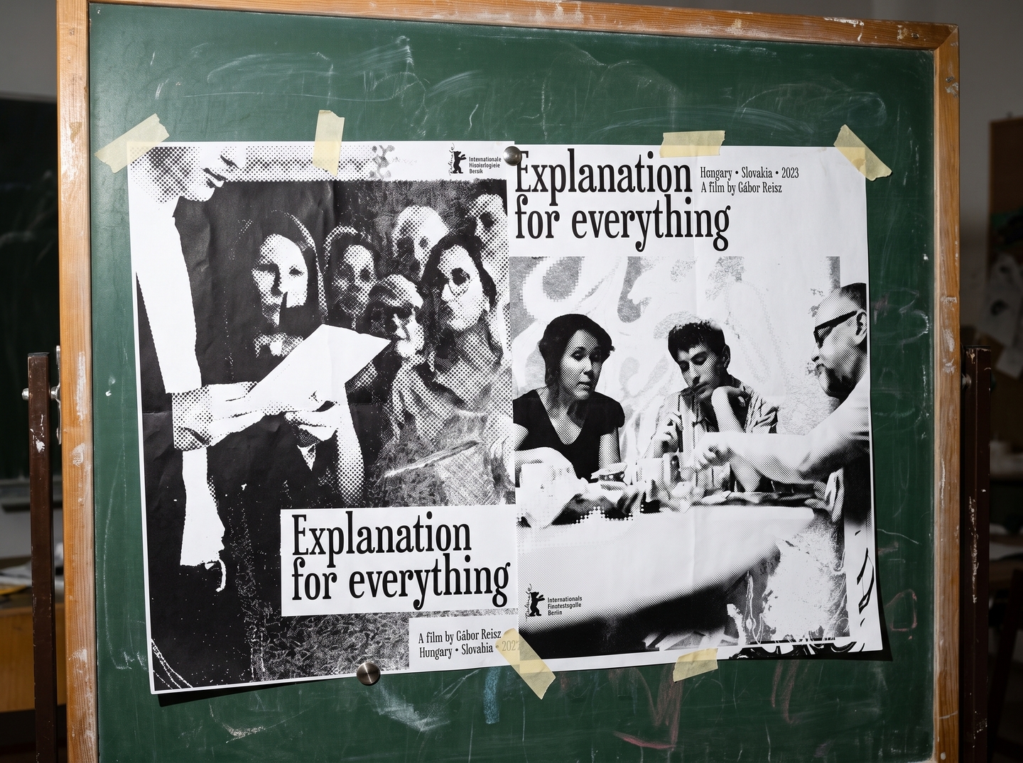
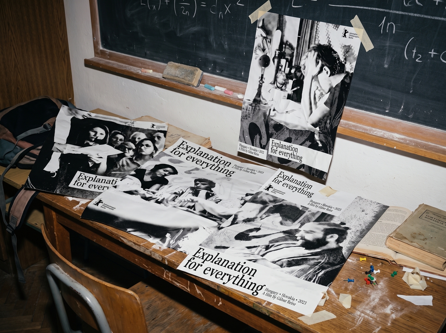
Explanation for Everything is a 2023 film by Gábor Reisz. A student fails his history exam, and the story spirals into a political scandal. This poster series was created at METU × HSE Art and Design School.
DESIGN SOLUTION: The graphics visualize what occurs within the protagonist before and during the exam: irritation, mental noise, unrequited love, disagreement, and confusion. The printed paper texture evokes newspapers and study notes. Each poster depicts a specific moment from his life, and collage techniques channel his internal emotions.
[Case 02] Larry
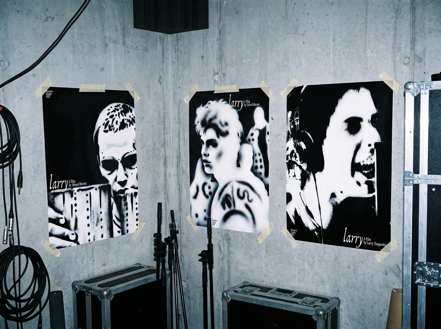
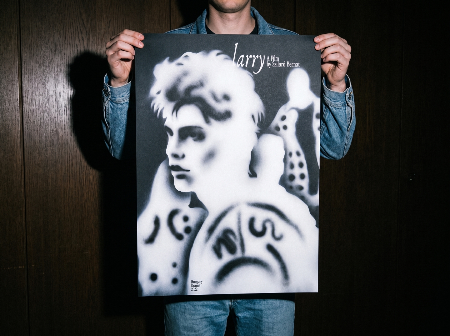
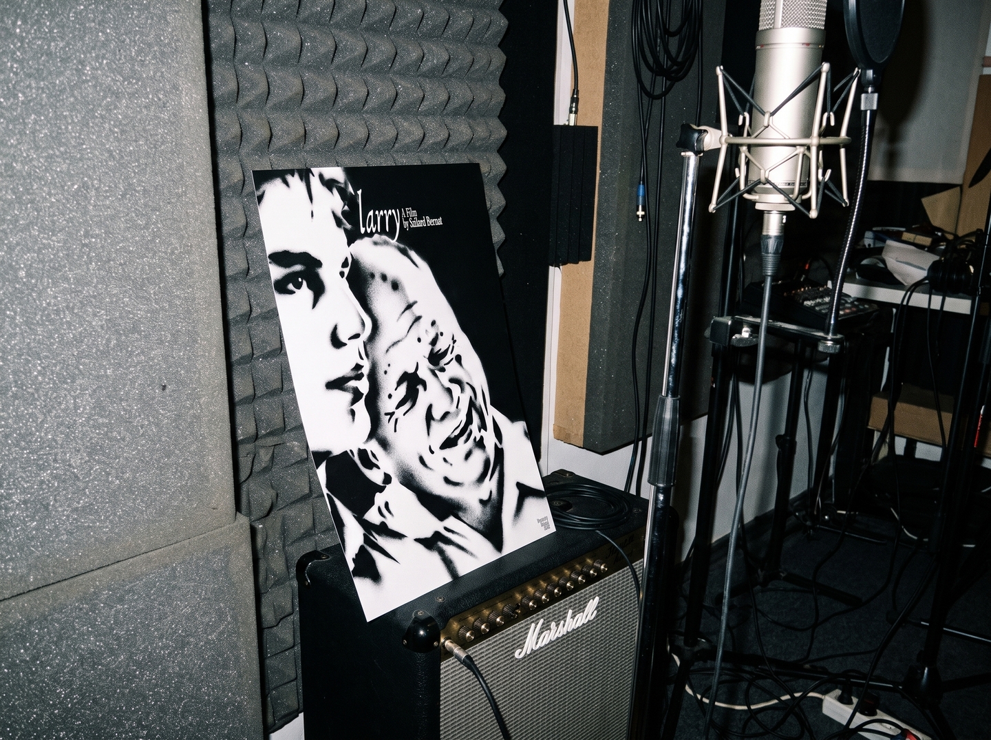
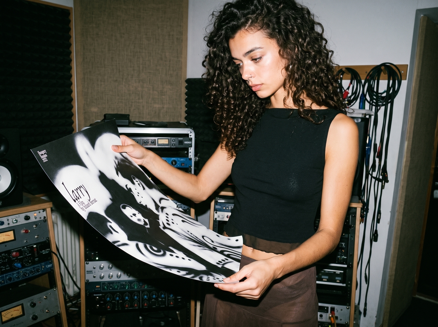
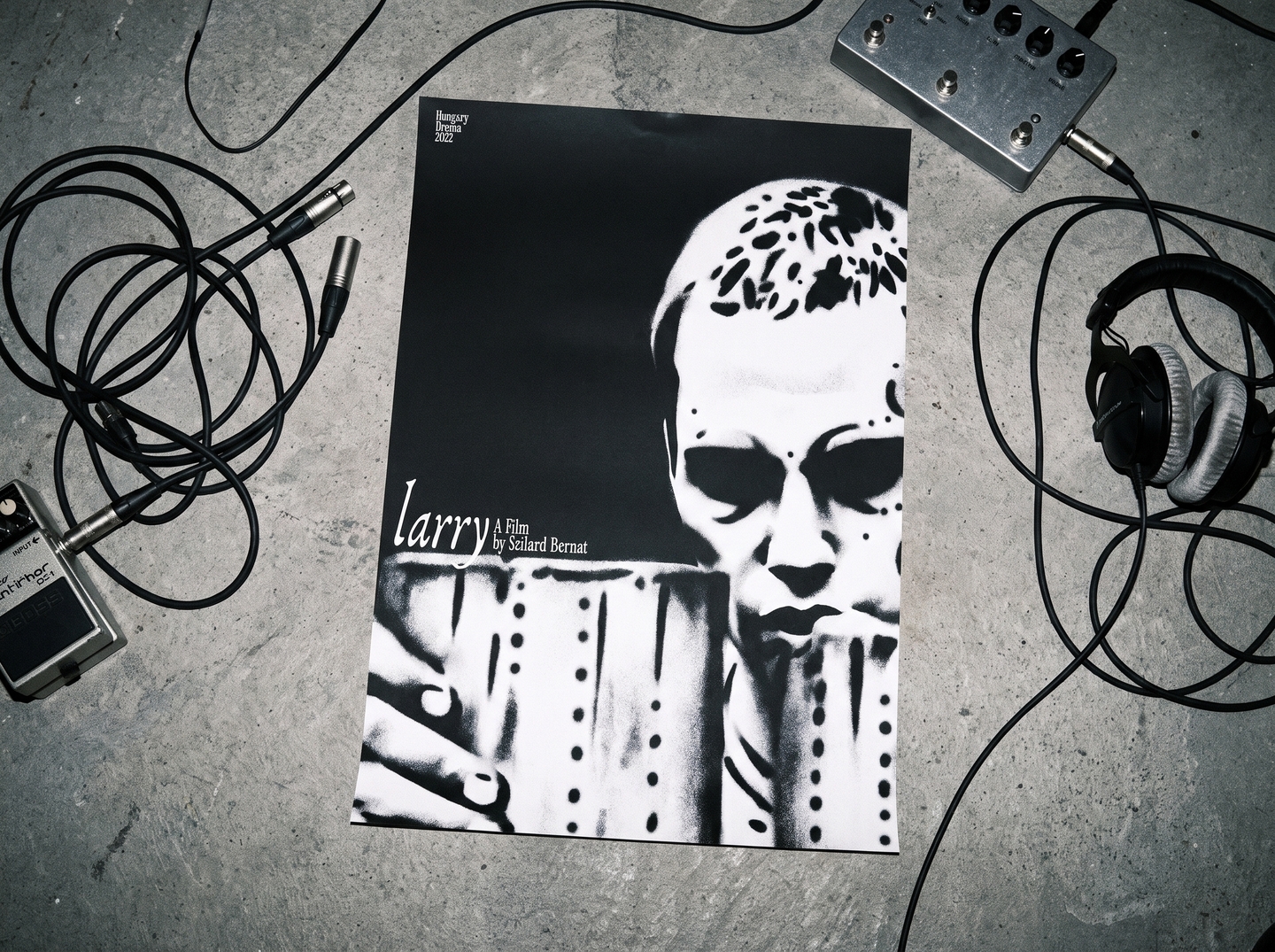
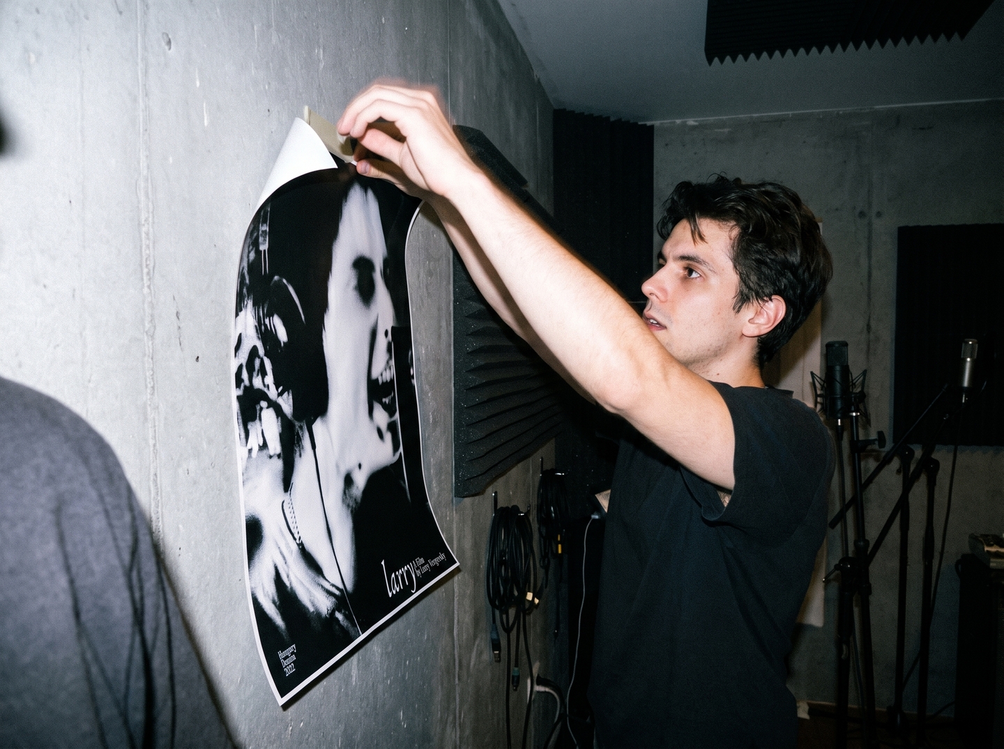
Larry is a 2022 film by Szilárd Bernáth. This is a series of five posters created through a collaboration between METU and the HSE Art and Design School.DESIGN CONCEPT: I deliberately chose black and white; color would betray the narrative here. Larry exists on the outskirts—on a farm and in an underground scene—a space defined by the tension between silence and voice, humiliation and dignity. His white face pushes through dense black, mirroring someone striving to be seen and heard. The rhythm of dots and spots represents rap: a pulse, a beat. I intentionally disrupted this rhythm. The dots are arranged in even columns, only to break apart, much like his stutter. Consequently, the spots function both as music and as a scar. The patterns on his head and body allude to the farm and sheep, while the spray paint texture references graffiti and hip-hop culture.
[Case 03] Cultural Code: Pskov
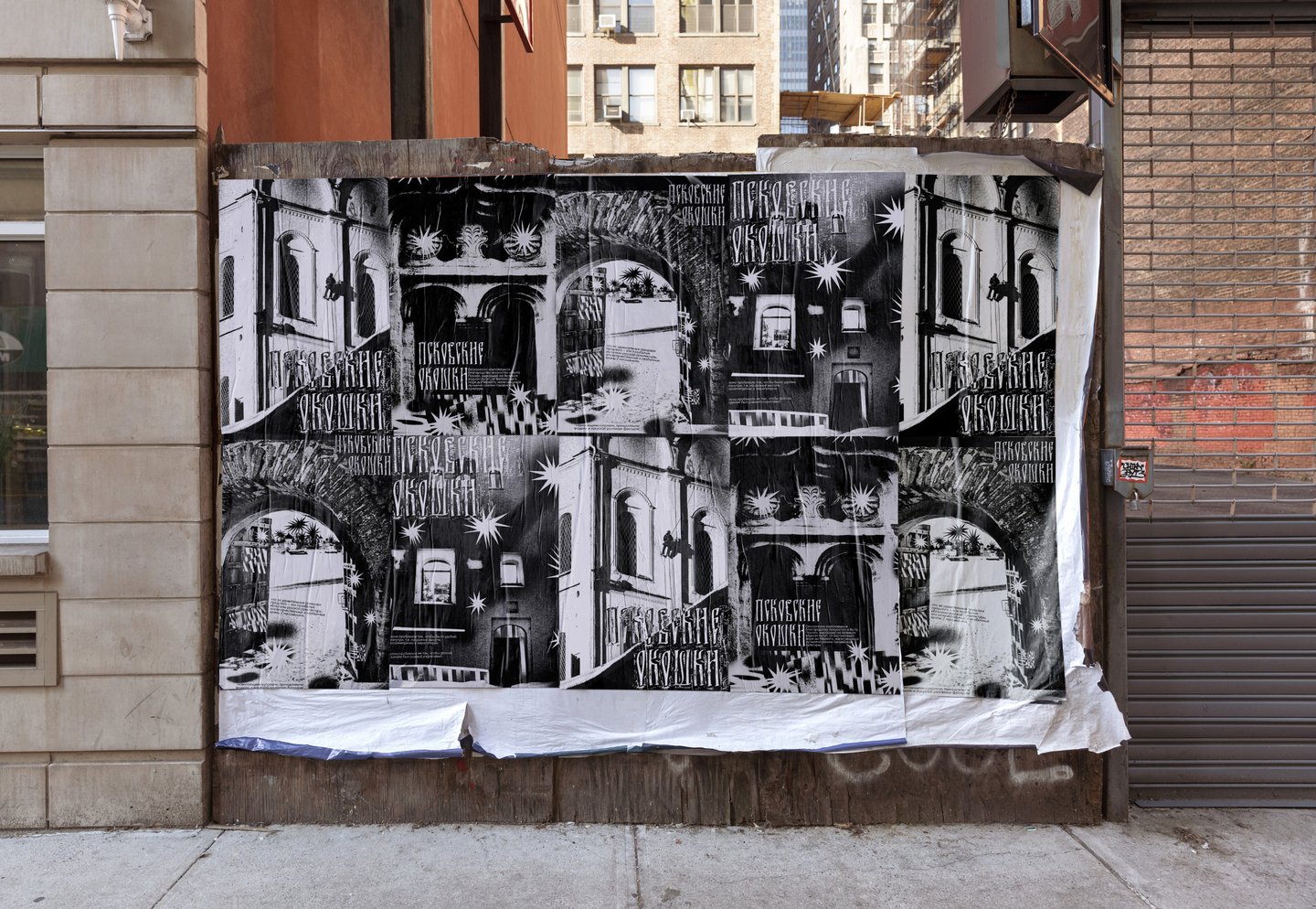
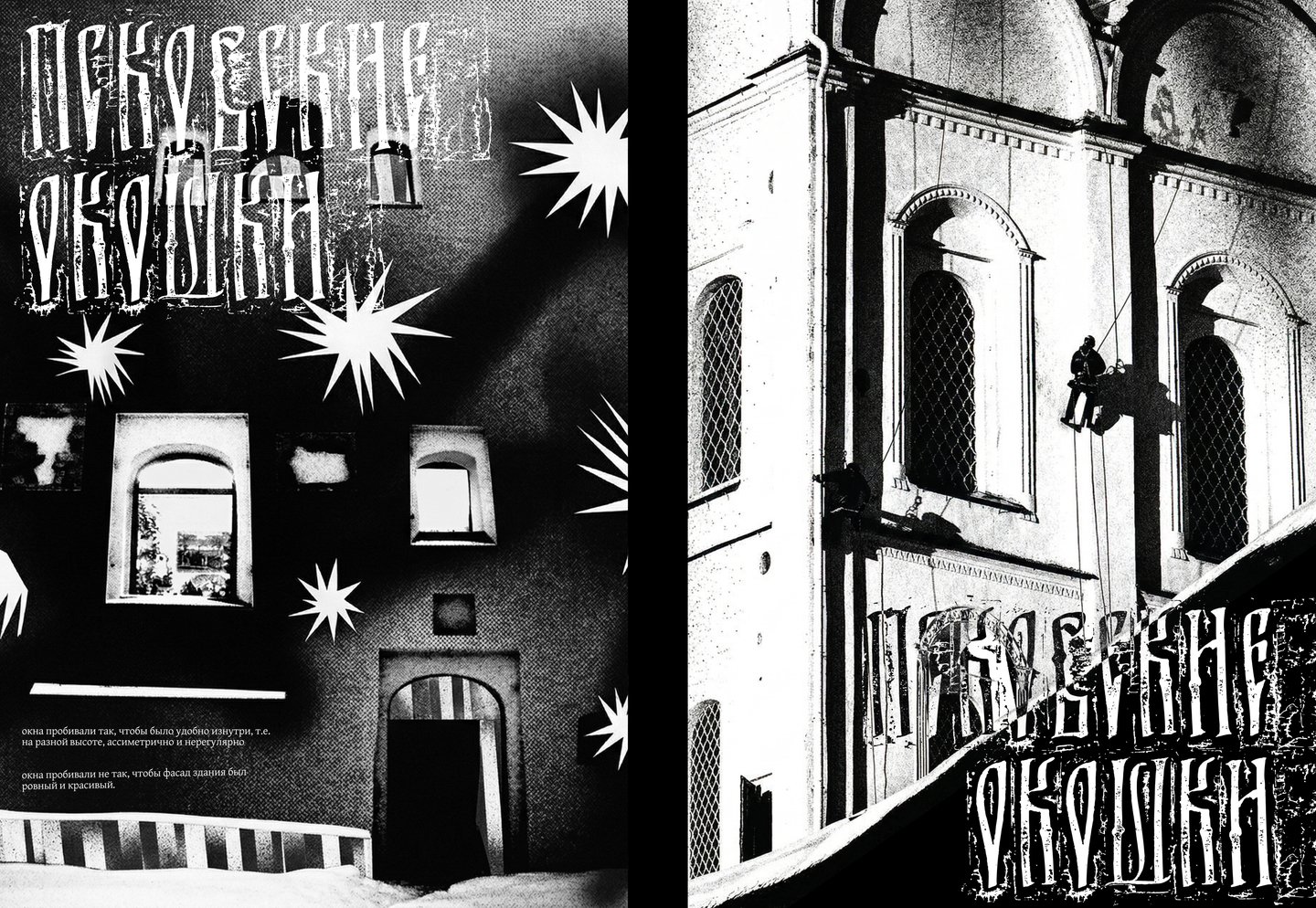
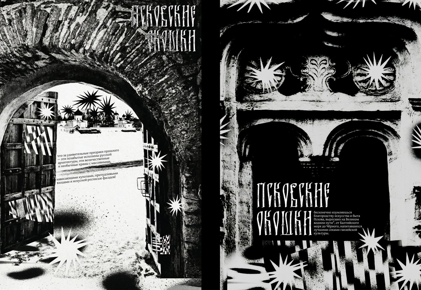
Cultural Code: Pskov is a poster series for the Golden Bee competition.DESIGN SOLUTION: These posters explore the architecture of Pskov, my home region. I wanted them to convey the age, eclecticism, and mystery of its old houses.
Branding
[Case 04] Flower Power
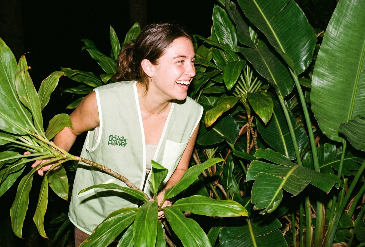
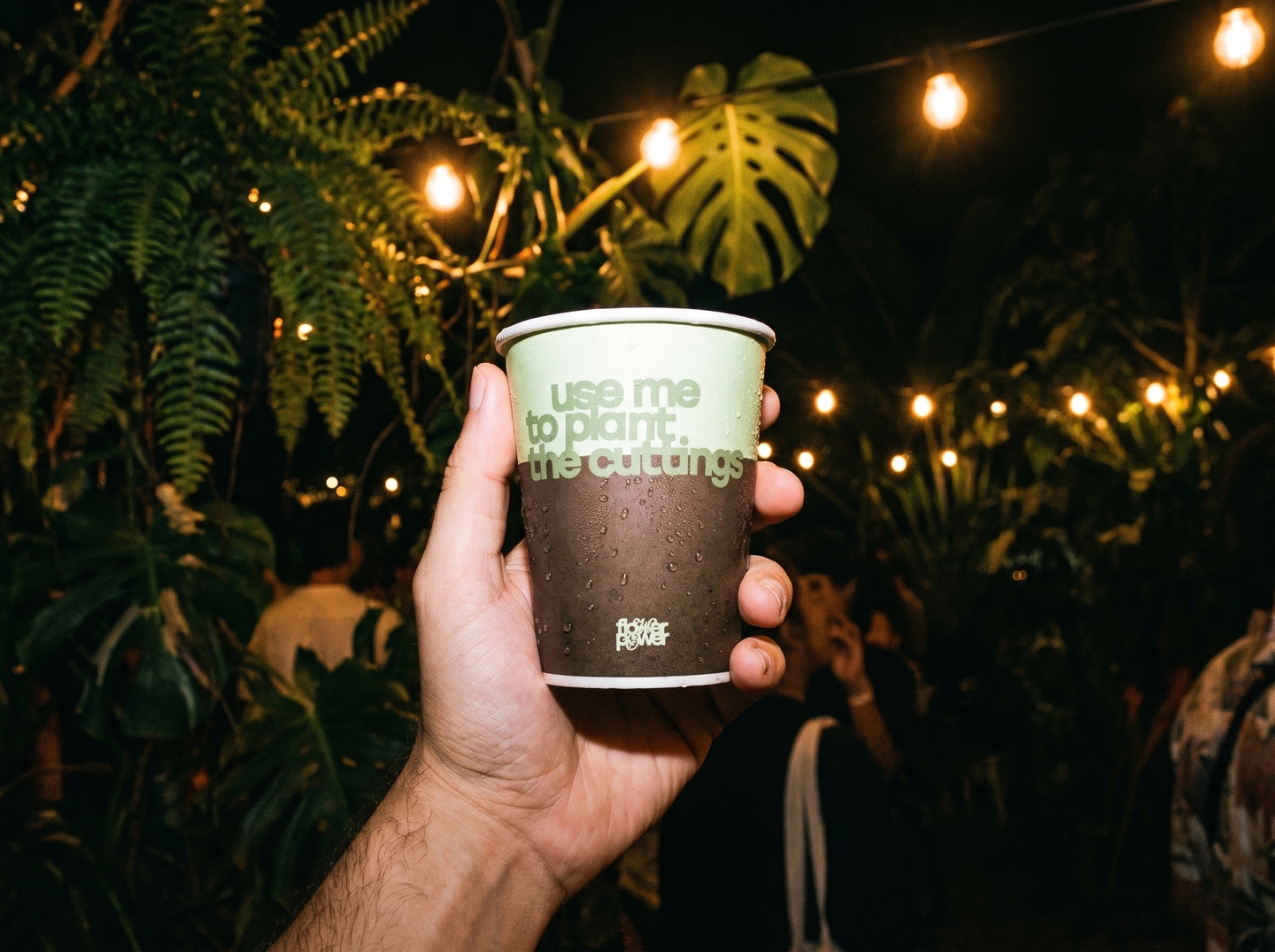
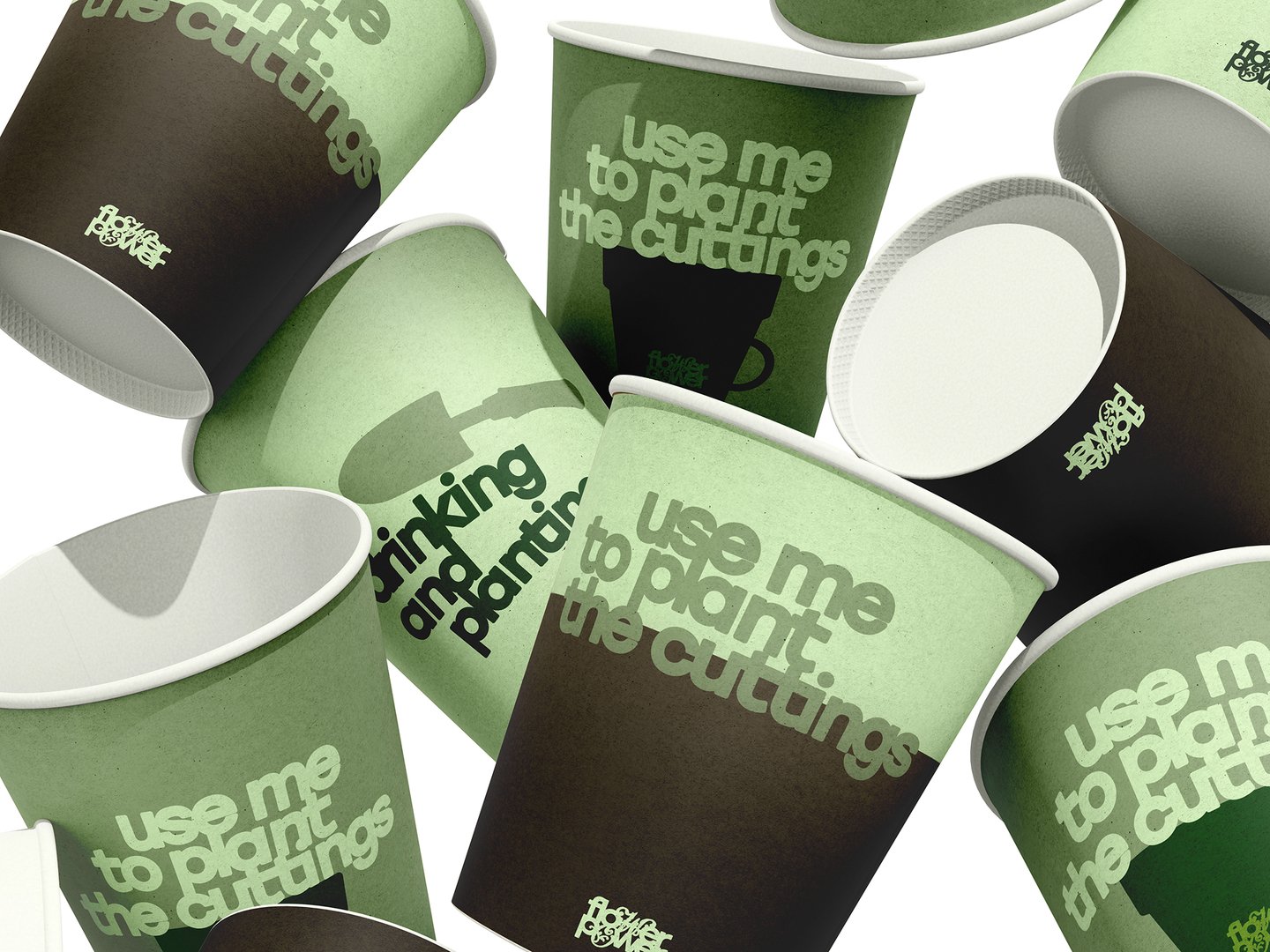
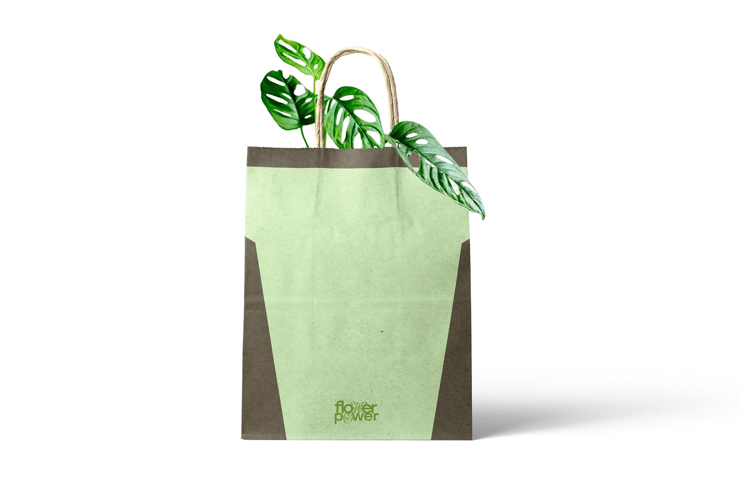
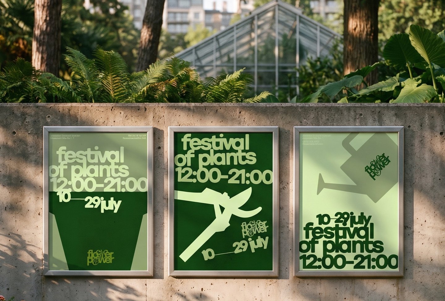
Flower Power is a youth festival for those who want to bring more greenery into their surroundings, meet like-minded people, and learn how to care for plants. It takes place in the Jerusalem Botanical Garden. I designed the festival’s visual identity.
DESIGN SOLUTION: In the logo, the letter «w» transforms into curly script that grows like leaves and stems from a simple sans-serif typeface. The palette uses shades of green, ranging from deep leaf tones to pale sage, set against a paper texture. Large silhouettes of garden tools—pruning shears, a flower pot, and a watering can—unify the posters. I applied the identity across a poster series, a wayfinding sign, and volunteer vests.
[Case 05] Age Boundary
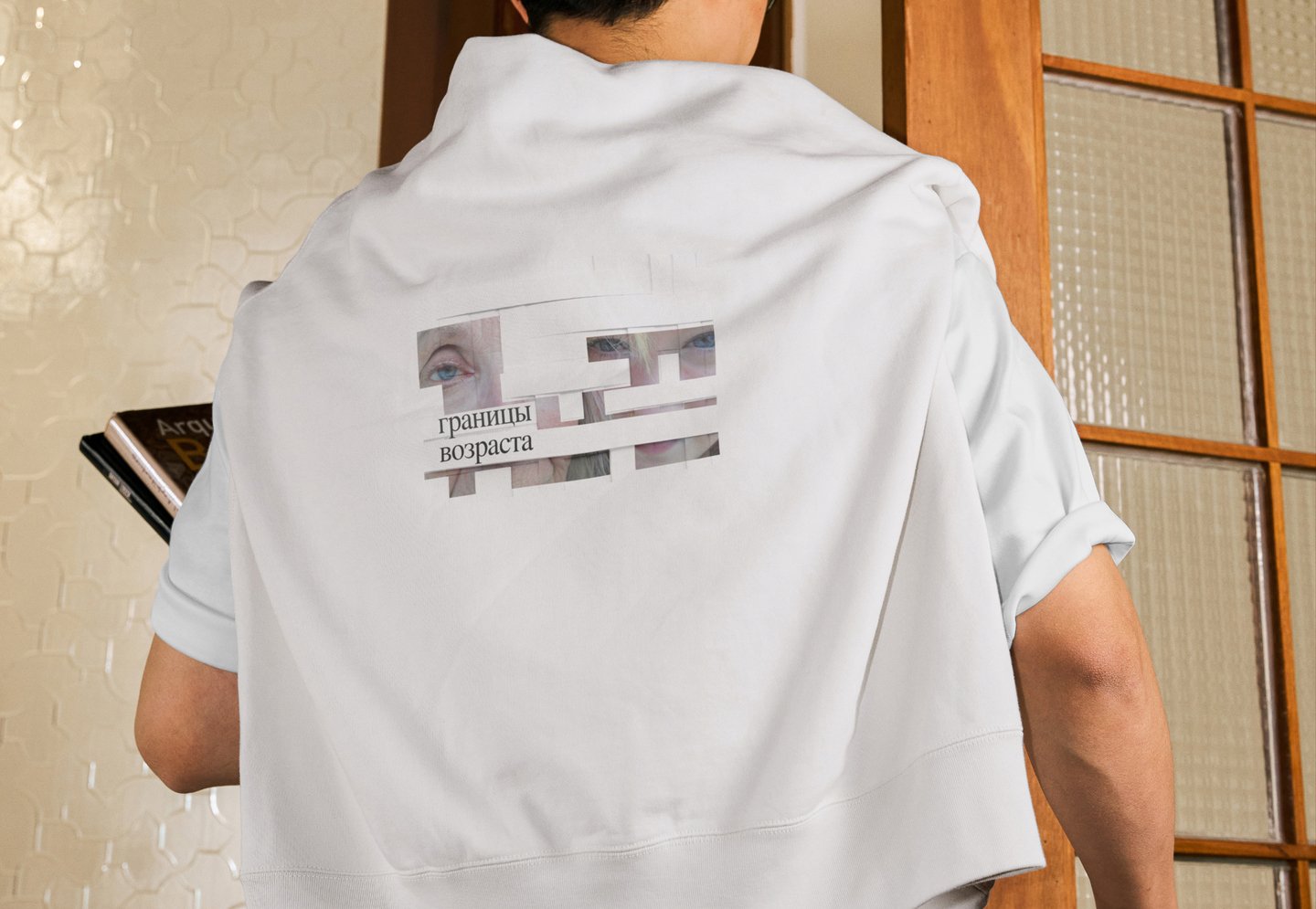
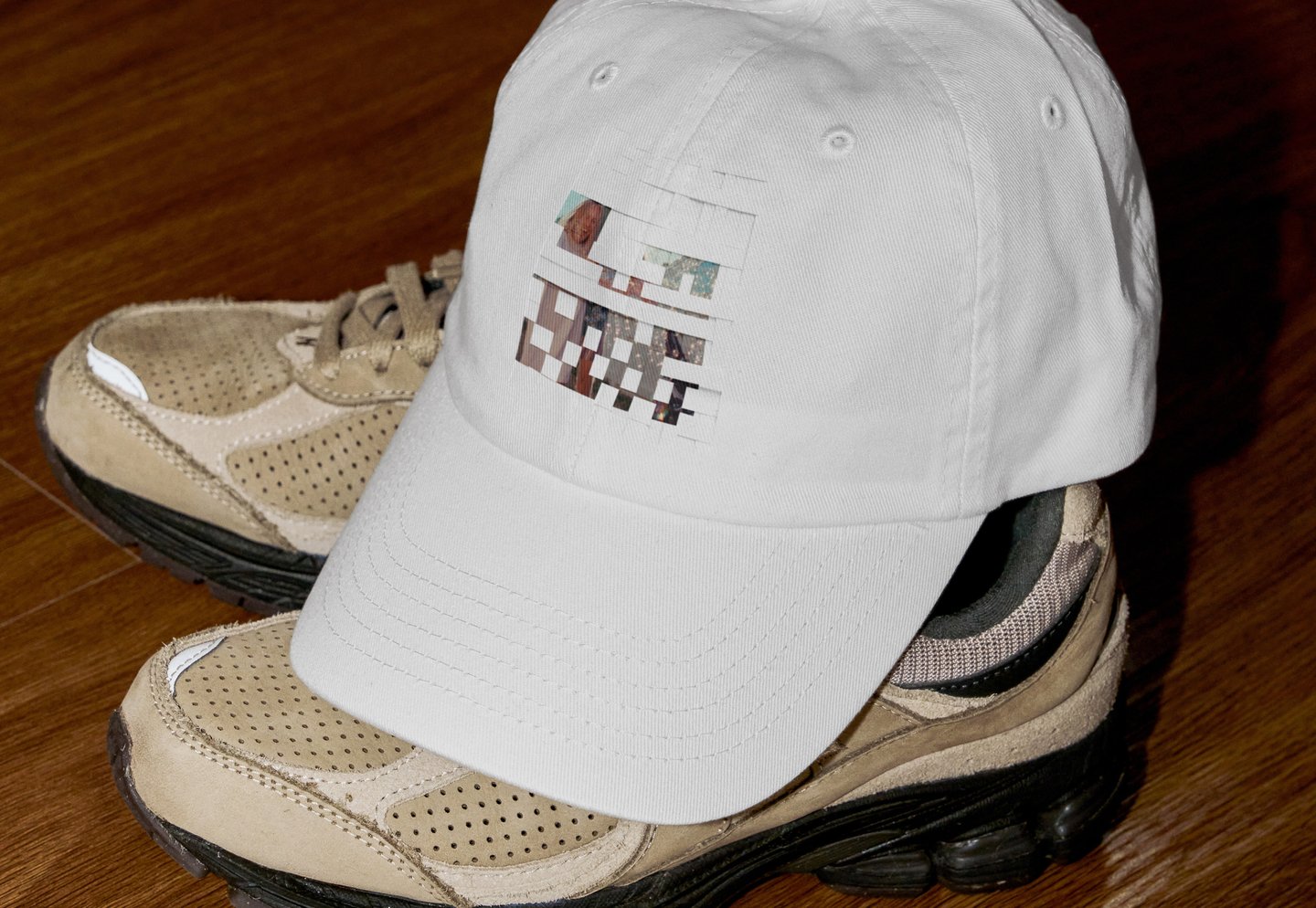
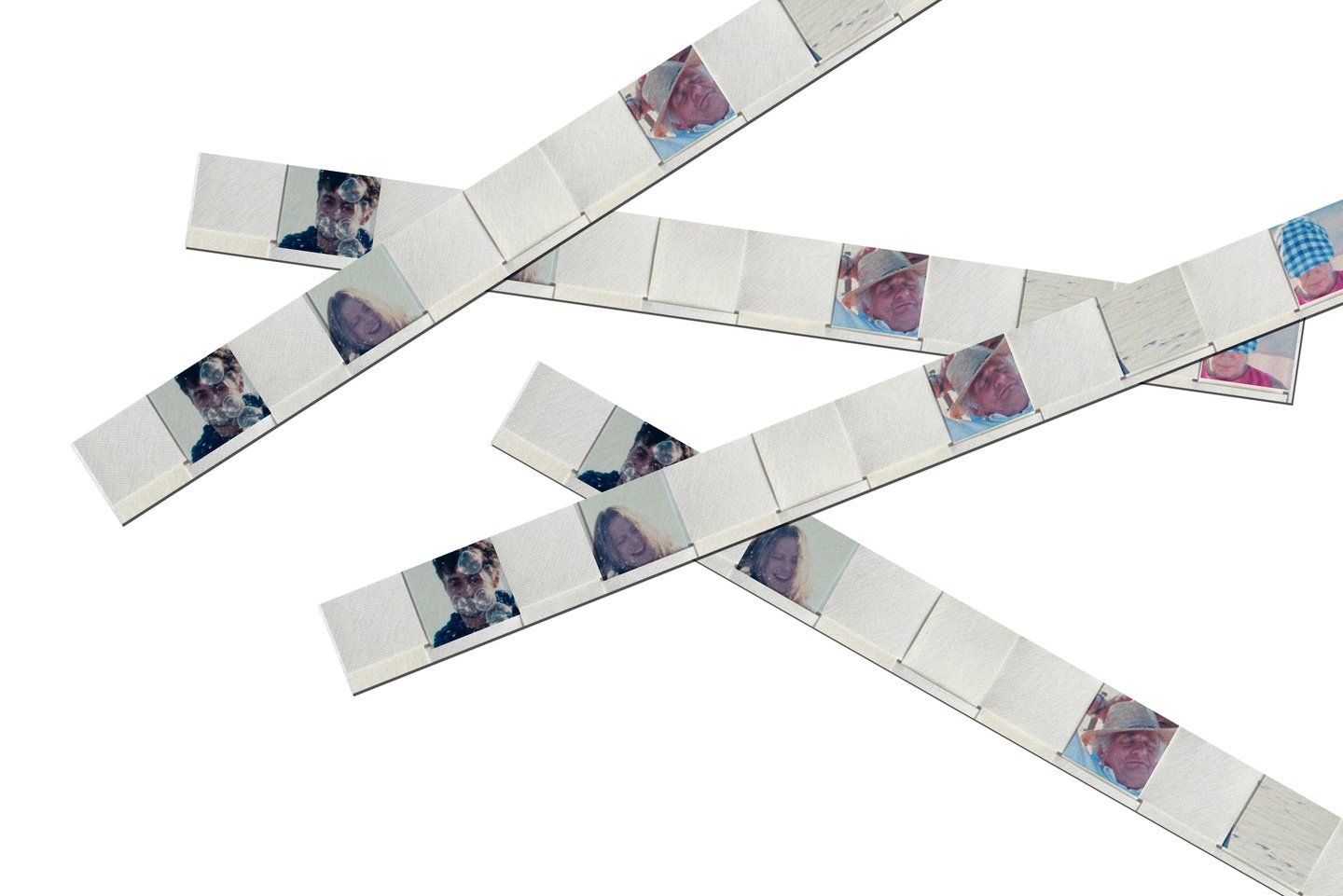
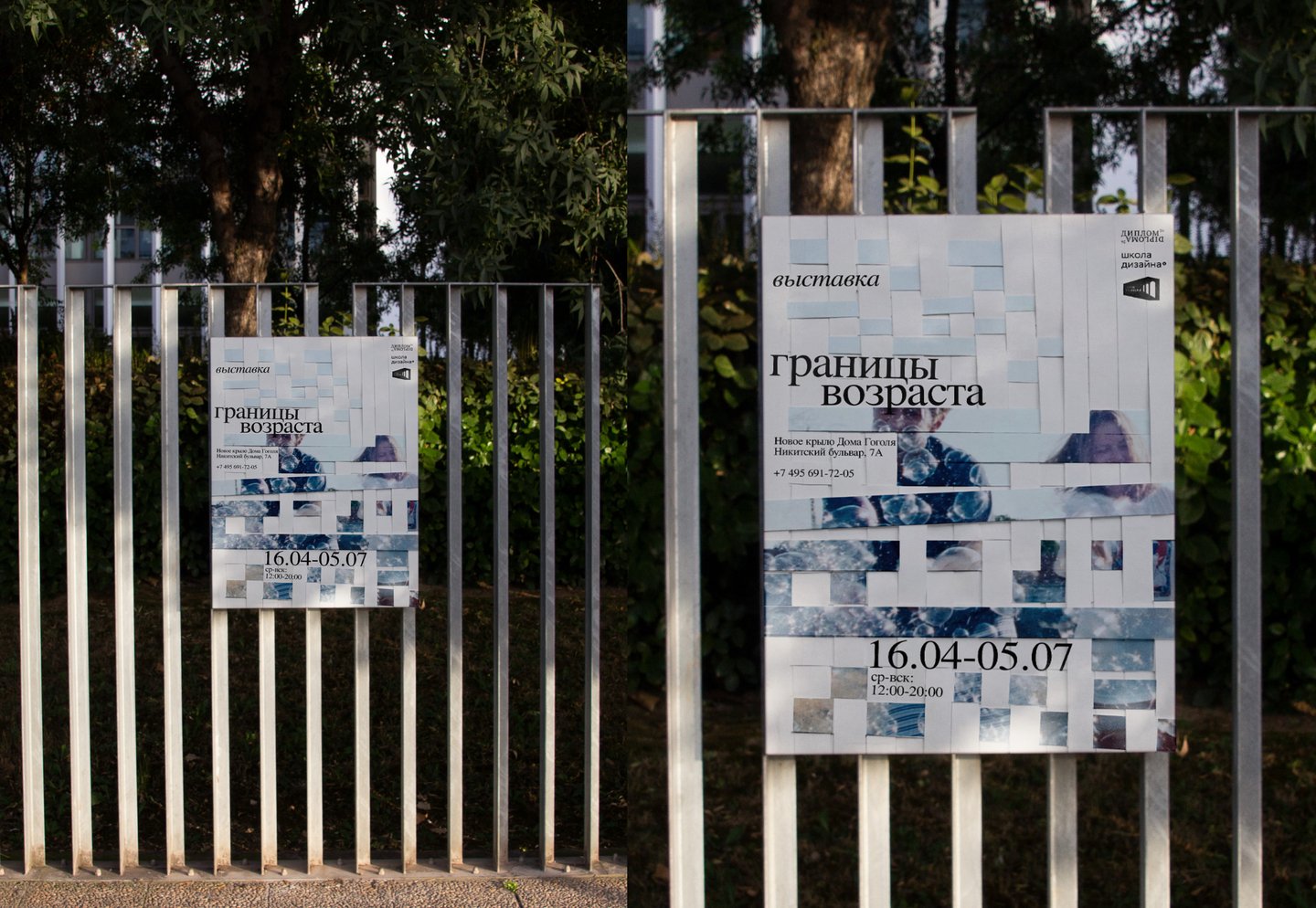
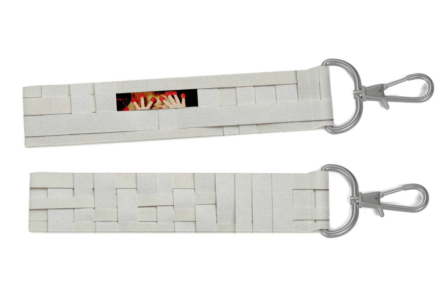
Age Boundary is a group exhibition exploring how individuals transform across life stages, navigating spatial and hierarchical boundaries. It examines the interplay between how people submit to power or wield it, and how these dynamics intersect with physical space. I was responsible for designing the exhibition’s visual identity and merchandise.
DESIGN SOLUTION: Paper strips symbolize these boundaries. They weave together portraits of a single person at various ages, with the same eyes visible in each depiction. Although the strips remain made of paper—suggesting that while boundaries constrain a person, they are ultimately fragile and can be torn.
Zine
[Case 06] By a Child’s Hand