About Me
Hi, I’m Varya, a communication designer from Saint Petersburg. I create visual identities for brands, wayfinding systems, and typographic projects.
My approach combines research, concept development, and thoughtful design—from the initial idea to the final detail.
My approach
Human-centered first. I begin by listening to your audience, not just your brief. Great design solves real problems and builds trust.Clarity over complexity. I strip away the noise to reveal the core message. Simple doesn’t mean plain—it means every element serves a purpose.Consistency as confidence. From digital to physical touchpoints, the system feels familiar and reliable. Consistency builds credibility.Built to evolve. I don’t design for a single moment—I create flexible foundations that grow with your brand over time.
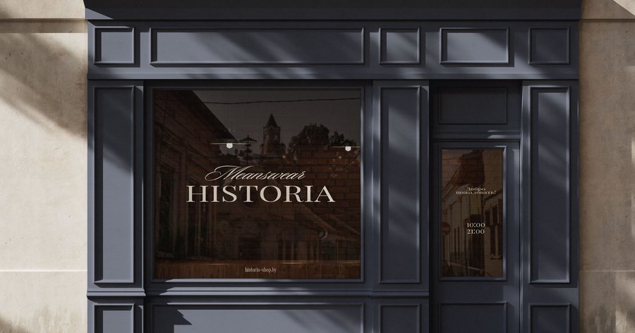
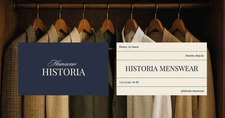
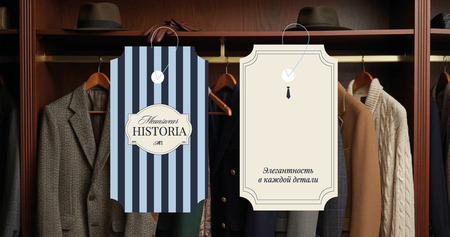
Branding: men’s apparel brand
The challenge: Translate tailoring precision into graphic language. Reflect craft and fit through a structured, deliberate visual system.The idea: The geometry of construction. Treat stripe and diamond as blueprint lines that organize layouts and create order.The solution: A minimal wordmark with a small geometric accent. A modular grid inspired by menswear proportions. Deep neutrals paired with one muted accent. Patterns used as subtle edge treatments.
Please provide the Russian text you would like me to translate.
Branding: children’s hospice
The challenge: Translate the feeling of a child’s sketchbook into a visual system: spontaneous, full of life, slightly messy, but deeply personal. Make the identity feel like it was drawn by the kids themselves.The idea: The core visual is the «child’s mark»: a simple scribble, a wobbly line, a clumsy star. This mark becomes the logo and the pattern—not polished, but honest—setting the tone for an identity that values imperfection as a form of truth.The solution: The hand-drawn logo subtly shifts across applications to maintain its handmade soul, while cheerful doodle patterns frame cards, envelopes, and website sections. A mix of rounded sans and handwritten typography echoes a child’s voice, and asymmetrical layouts featuring pinned-style elements reinforce the scrapbook intimacy. This language flows into merchandise—T-shirts, mugs, notebooks—turning everyday objects into gentle tokens of care, all carrying a consistent tone of warmth and empathy.
Please provide the Russian text you would like me to translate.
Navigation: The Palace Farm in Gatchina
The Challenge: Design a navigation system that respects the palace-park heritage without visually competing with the architecture.The Concept: Replace literal agrarian imagery with a refined visual vocabulary. Traditional ornaments and shapes are distilled into clean, subtle forms.The Solution: A restrained identity built on geometric interpretations of historic park motifs. The soft curves of Comfortaa balance the strict geometry, while warm directional accents maintain readability. This unifies both the palace and farm themes across all signage formats.
Please provide the Russian text you would like me to translate.
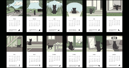
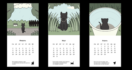
Typography: a calendar of superstitions
The challenge: To make superstitions feel like a natural part of everyday life—not frightening, but evoking a gentle, understanding smile. To transform them into small, manageable habits that people can adopt without unnecessary drama.The idea: Each month features a calm, everyday scene where a black cat serves as a quiet observer. The cat doesn’t «perform» the superstition; it simply notices it—spilled salt, a cracked mirror, a ladder positioned above a head—and unobtrusively frames that moment.The solution: The concept is divided into two parts: an illustration in the upper half, and a clear calendar grid with three compact text blocks in the lower half: «Superstition, ” „Origin, ” and „A Gentle Way to Improve the Situation“ (a simple, unrelated action). The tone maintains respect for folklore while adding a touch of warmth and irony.
Please provide the Russian text you would like me to translate.
Let’s create something together!