Good design begins with the question «why, ” not „how.“ It is born at the intersection of aesthetics and logic, creating not just an image, but a working tool. Its true beauty lies in its flawless functionality.
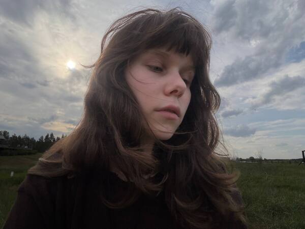
Nice to meet you! I am Krytsina Anastasiia
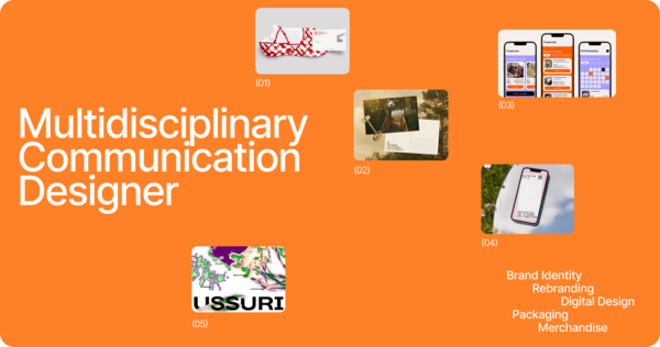
I am a multidisciplinary designer specializing in communication design, and I am here to help you find the right visual solution for your needs.
I have been developing my graphic design skills for five years, studying under the guidance of leading industry experts at the HSE Art and Design School.
AREAS OF PRACTICE
Branding and Identity | Social Media Design | Books, Zines, and Printmaking | Typeface Design | Presentation Design |PRINCIPLES OF WORK
1 The purpose behind every decision Every visual element—color, form, typeface—is selected to serve the communication objective. Elements that do not contribute to the message are excluded from the final solution.2 Deadlines are part of the brief Projects are structured into clear stages with the presentation of interim results, allowing time for revisions within the agreed schedule. Any risks to the timeline are communicated promptly.3 Open to change, clear about rationale I treat feedback as an integral part of the process and adapt efficiently when priorities shift. Each design decision is supported by a clear rationale, ensuring that changes are made deliberately.4 Communication as key—teamwork over solo work Brand development involves strategists, copywriters, developers, and clients. I maintain transparent communication, take other perspectives into account, and ensure my work integrates seamlessly into the overall project.IDENTITY AND BRANDING
ITEM | pop-up store
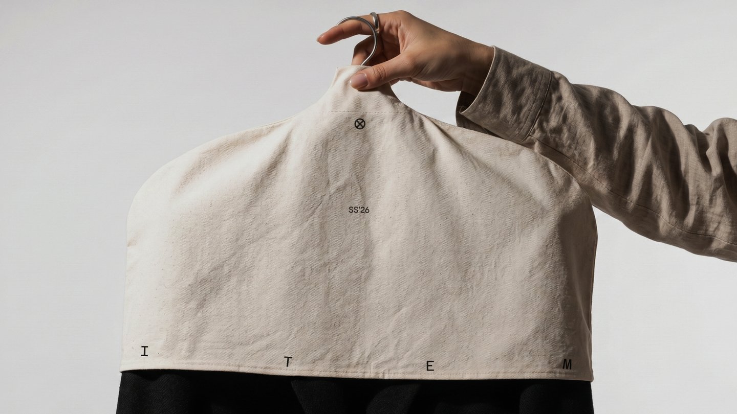
What is ITEM?
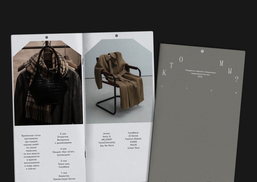
ITEM is a next-generation pop-up fashion store format that opens briefly several times a year at iconic locations throughout the city. The project features events hosted by fashion industry professionals.
The market showcases local and national brands; every item offered for sale is thoroughly vetted by the organizers before being invited to participate.
The Issue
The brand needs a visual identity system that will allow prospective customers to understand its selective working methods—the qualities that set it apart from other events in the fashion industry.↓
The Solution
The identity will be built around the concept of neatly hung clothes on a rail, where every item occupies its own distinct, significant place.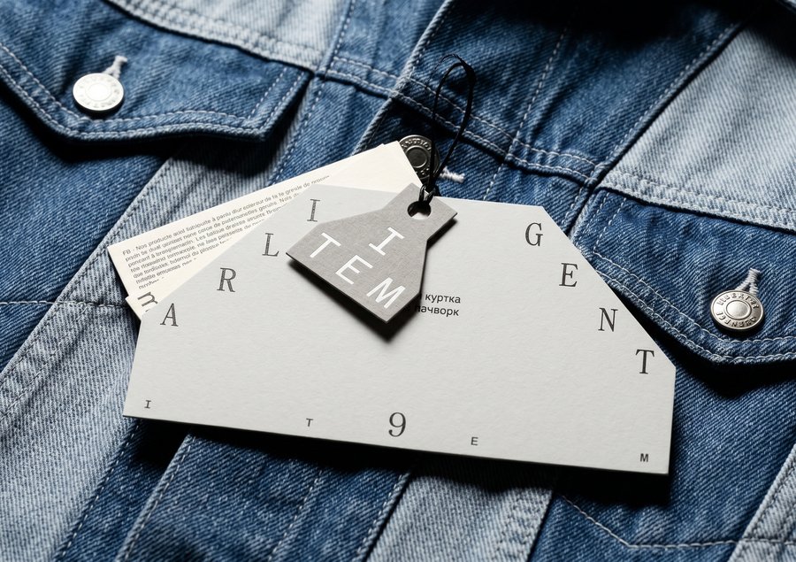
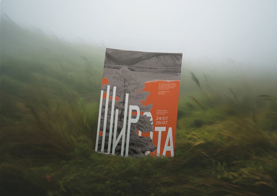
SHIROTA | The Festival of Siberian Ethno-Music
What is SHIROTA?
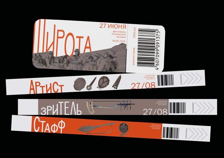
SHIROTA is a festival of ethnic music for those who have grown weary of mainstream pop culture and wish to rediscover their mysterious roots. At this festival, visitors can listen to local experimental bands, participate in creative workshops, and attend events dedicated to a contemporary reinterpretation of Siberian culture.Round dances, rituals, tambourine beats, and throat singing will help you immerse yourself in the mysticism of the Siberian peoples.
The Issue
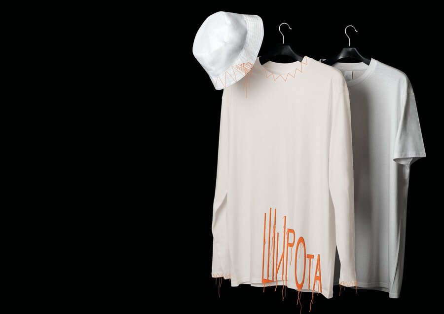
On one hand, the organization seeks to present itself as a new wave of alternative art; on the other, it aims to preserve the local context and historical foundation that unifies all the artists featured at the festival.↓
The Solution
To build an identity that embraces the contradiction between vivid color and ethnic photostyle, thereby preserving the festival’s duality. The logotype functions as a wave, shifting its intensity just as the volume of the instruments changes.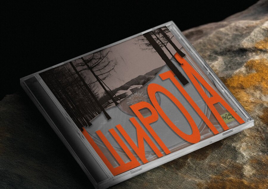
E.T.C. | Theater Workshop
What is E.T.C.?
E.T.C. is a contemporary theatre studio for teens, based at the Moscow Museum’s Children’s Centre.
The studio aims to be not just a learning base, but also a «third place» for young people who are finding their way in life. Here, they bring their ideas to life, try their hand at theatre, and get to know the contemporary cultural landscape.
The Issue
The organization needs to emphasize its identity as a professional, established studio for experienced teens while preserving the concept of it being an open space for creative expression.↓