Hello and welcome to my portfolio! My name is Veronika. I am a graphic designer.
I am passionate about systems and believe that design should be practical, human-centered, and purposeful.
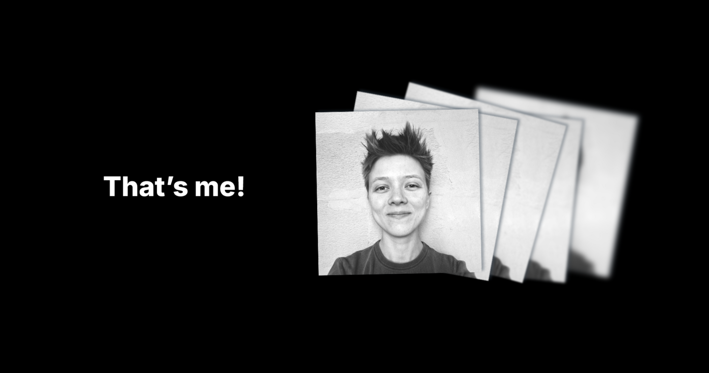
I value variety: I can approach design with irony or gravitas, adherence to strict rules or experimentation. Regardless of the style, my primary goal remains functionality: I am always conscious of the specific problem to ensure my work offers an applicable solution.
I can help you with:
— brand identity
— packaging design
— type design (text and display fonts)
— presentations
Here is a selection of my most relevant and recent work in these fields.
Section A — Brand Identity

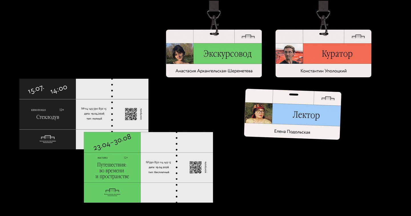
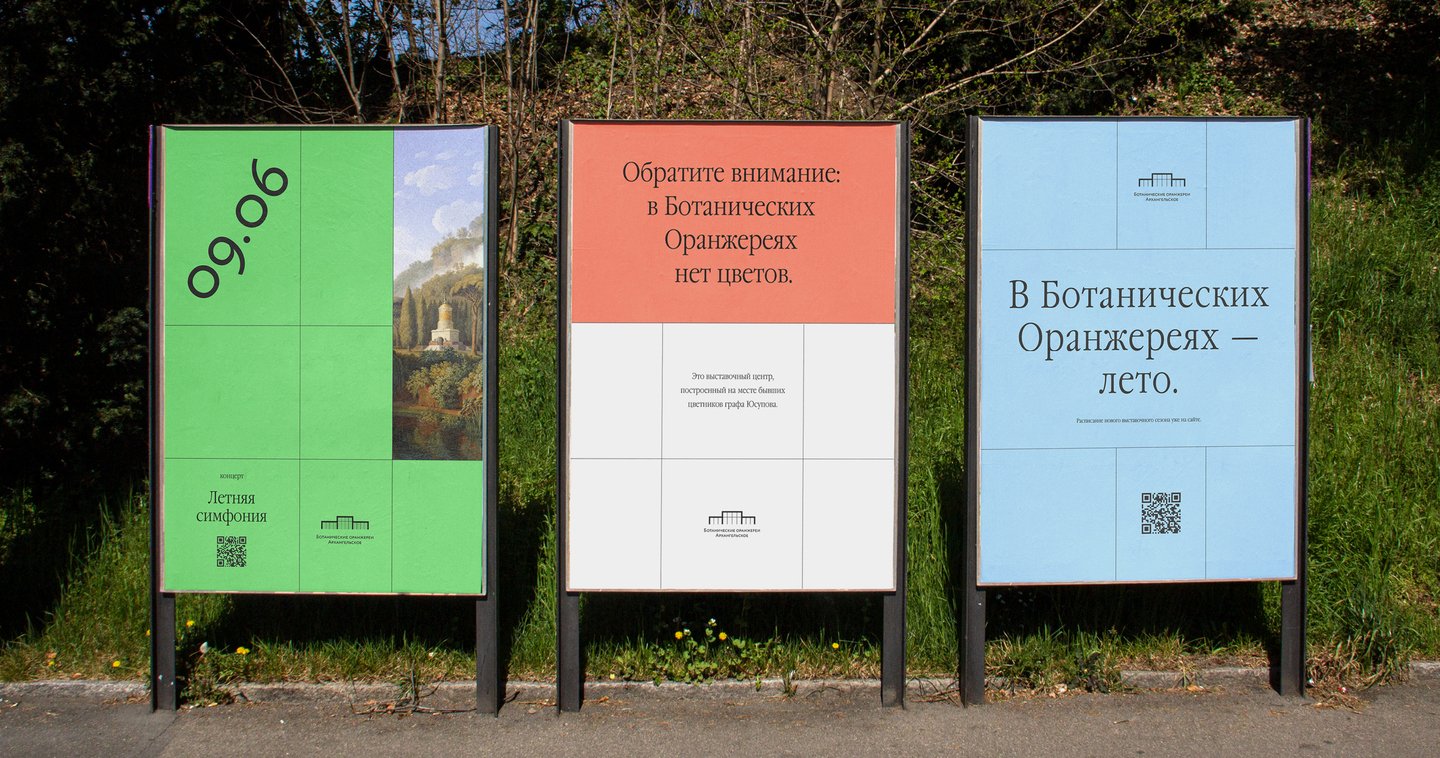
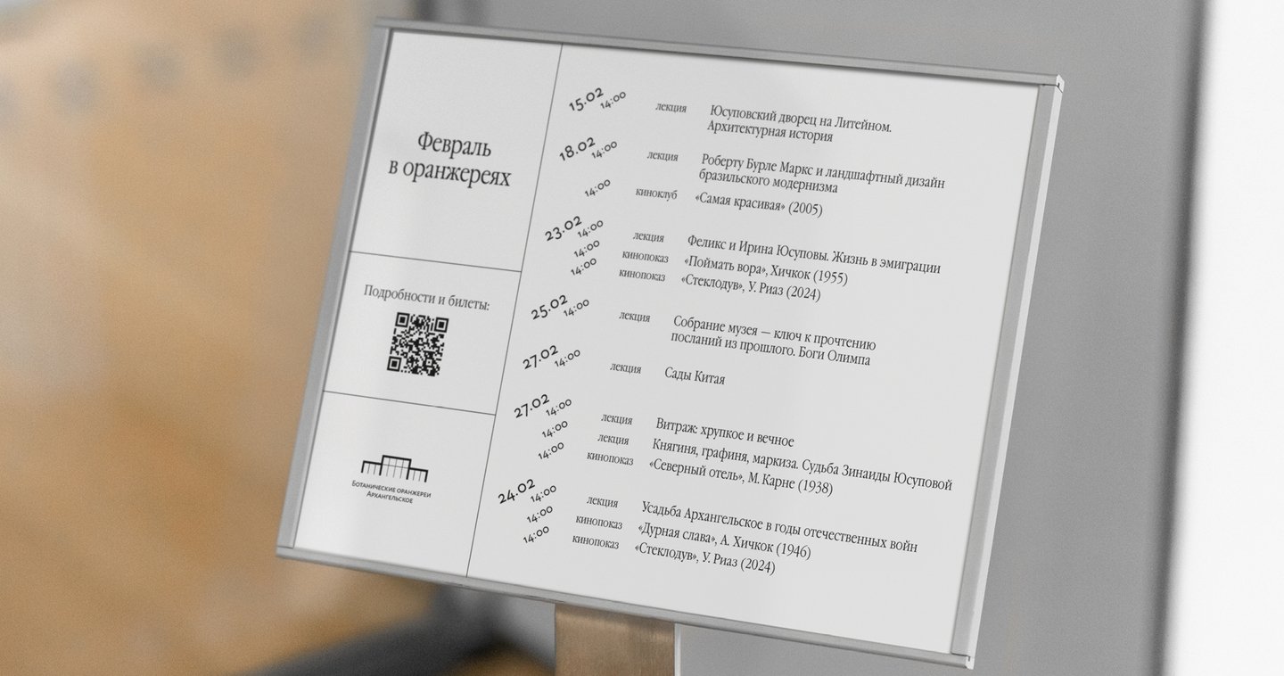
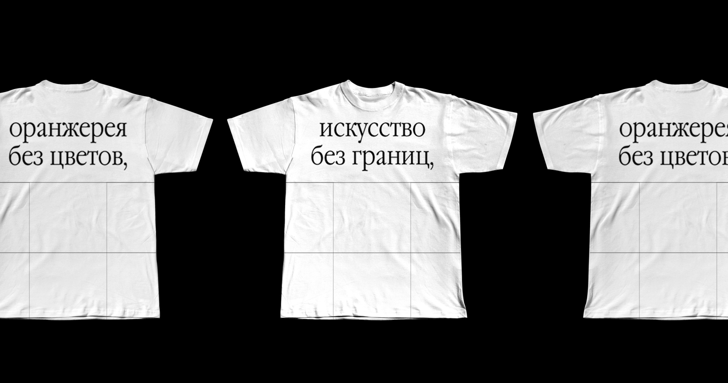
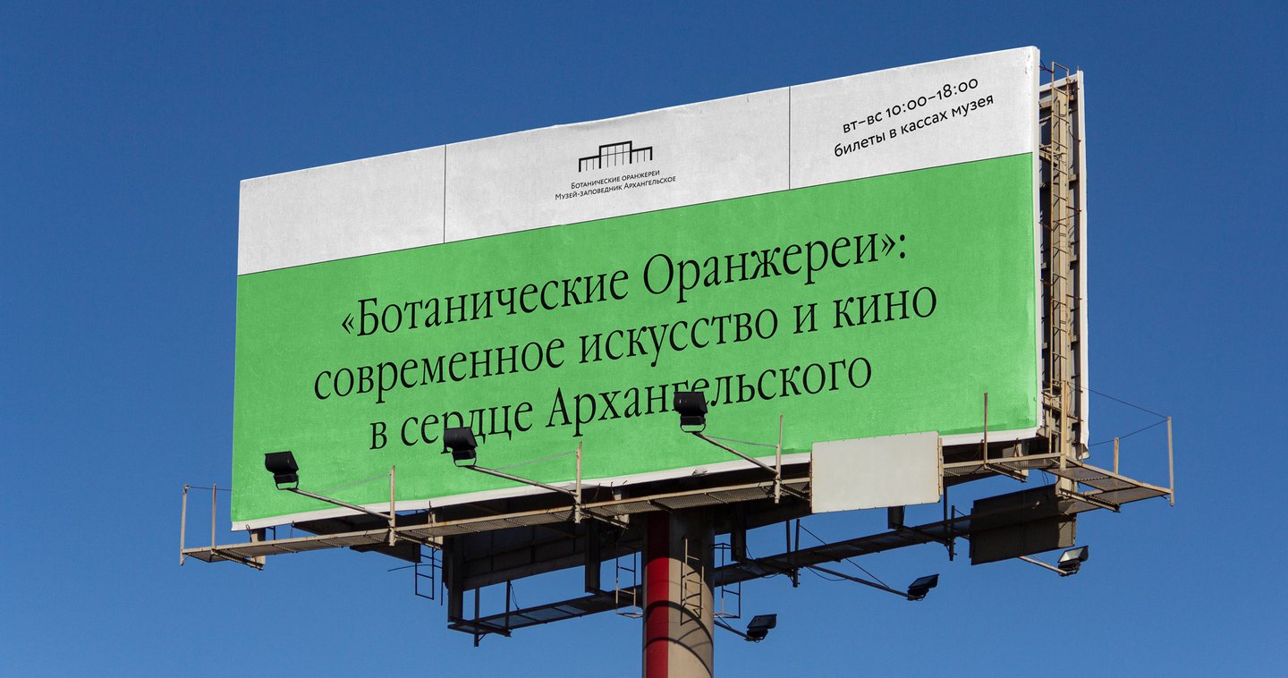
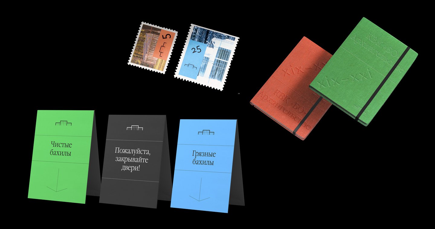
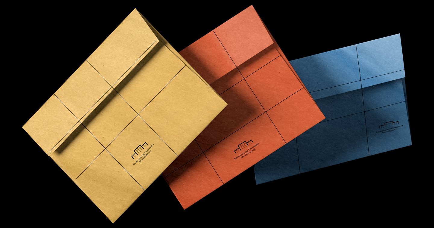
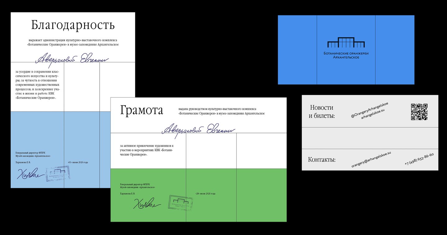
«Botanical Orangeries» concert hall and exhibition complex
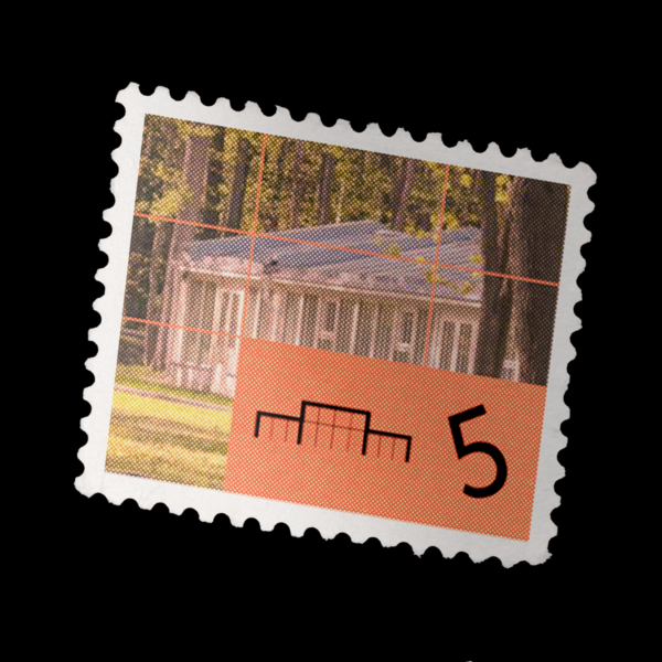
(2026)An art center located on the grounds of the Arkhangelskoye estate, named after the historic greenhouses that once stood there.Problem: — Unintuitive and misleading name. — The current design mimics the museum the complex is part of, failing to distinguish itself from similar institutions or attract a broader audience.Request: The existing logo and name must remain unchanged.My Solution: — The asymmetrical 2×2×3 grid ratio is based on the building’s actual measurements. — The grid mimics the glass facade of the «orangeries.» — Bold, vibrant colors attract a wider audience drawn to modern art museum-like visuals.
White Sea–Baltic Canal Museum

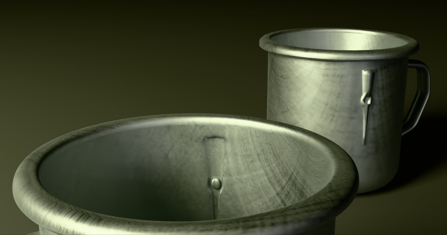
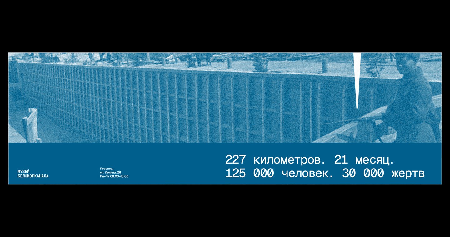
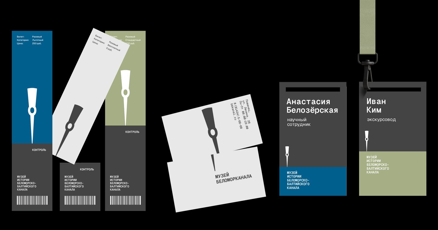
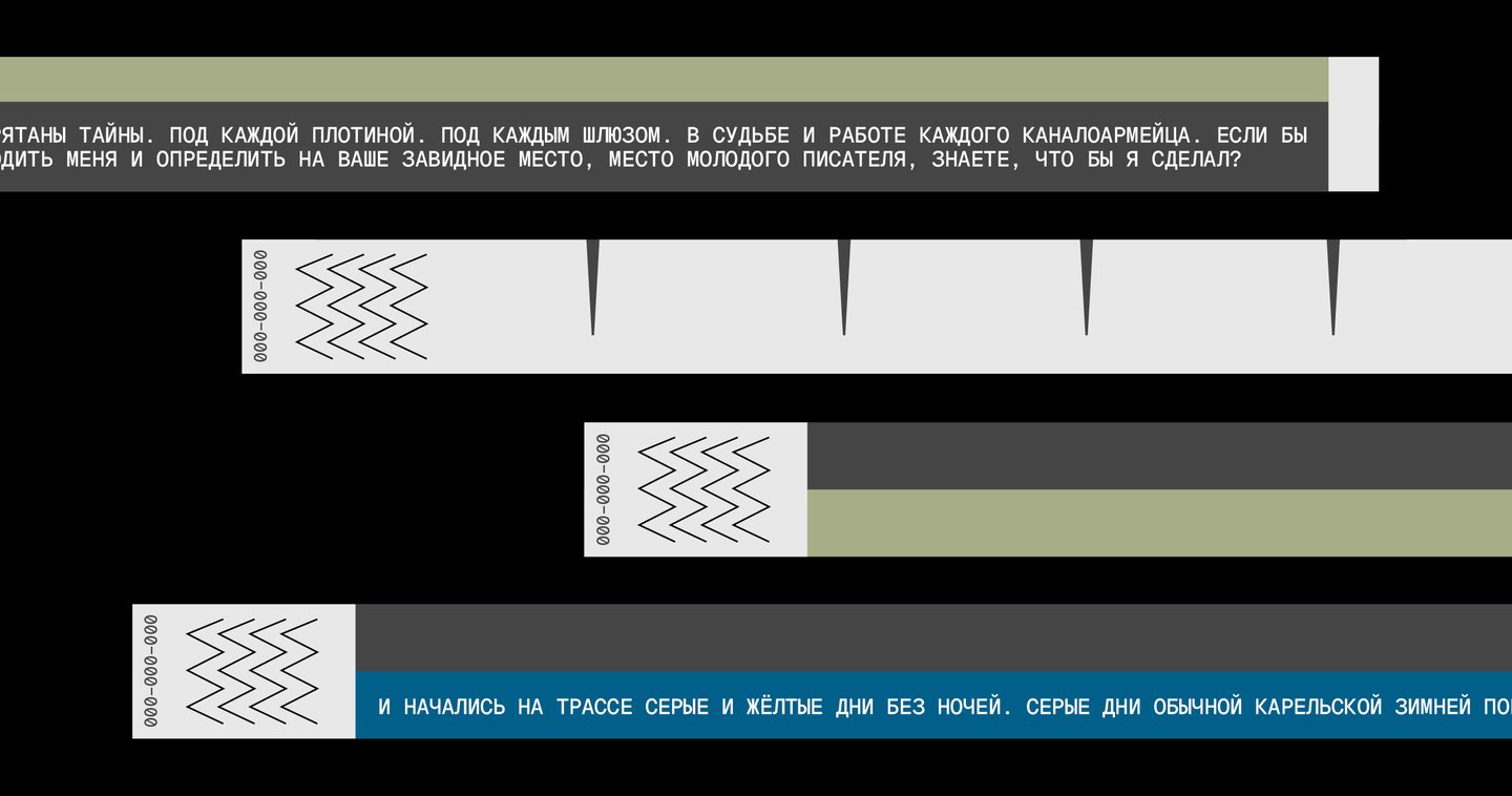
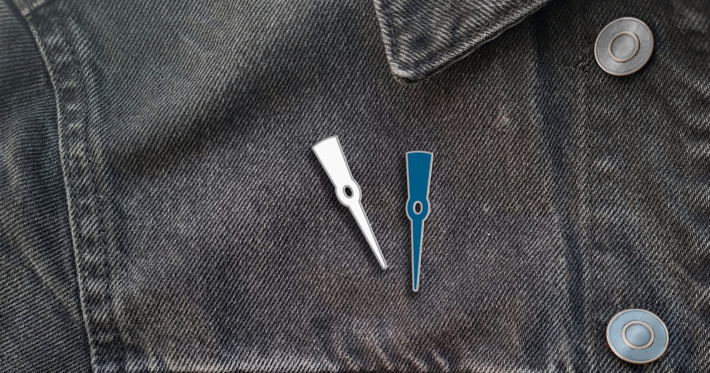
(2025) A concept for a potential museum of the White Sea–Baltic Canal in Karelia, Russia.Challenge: — Museums dedicated to the canal’s history are scattered throughout the region, and none possess a unified visual identity. Visitors are poorly informed and infrequent.Deliverables: — Must include a complete brand guideline book.My Approach: — The arrow-like logo is inspired by the head of a pickaxe, a tool used by Gulag inmates during the canal’s construction. It symbolizes both arduous forced labor and human capacity to overcome monumental obstacles. — The varying heights of the colored blocks allude to the canal’s complex lock system.
Section B — Packaging
Aquarium Brewery

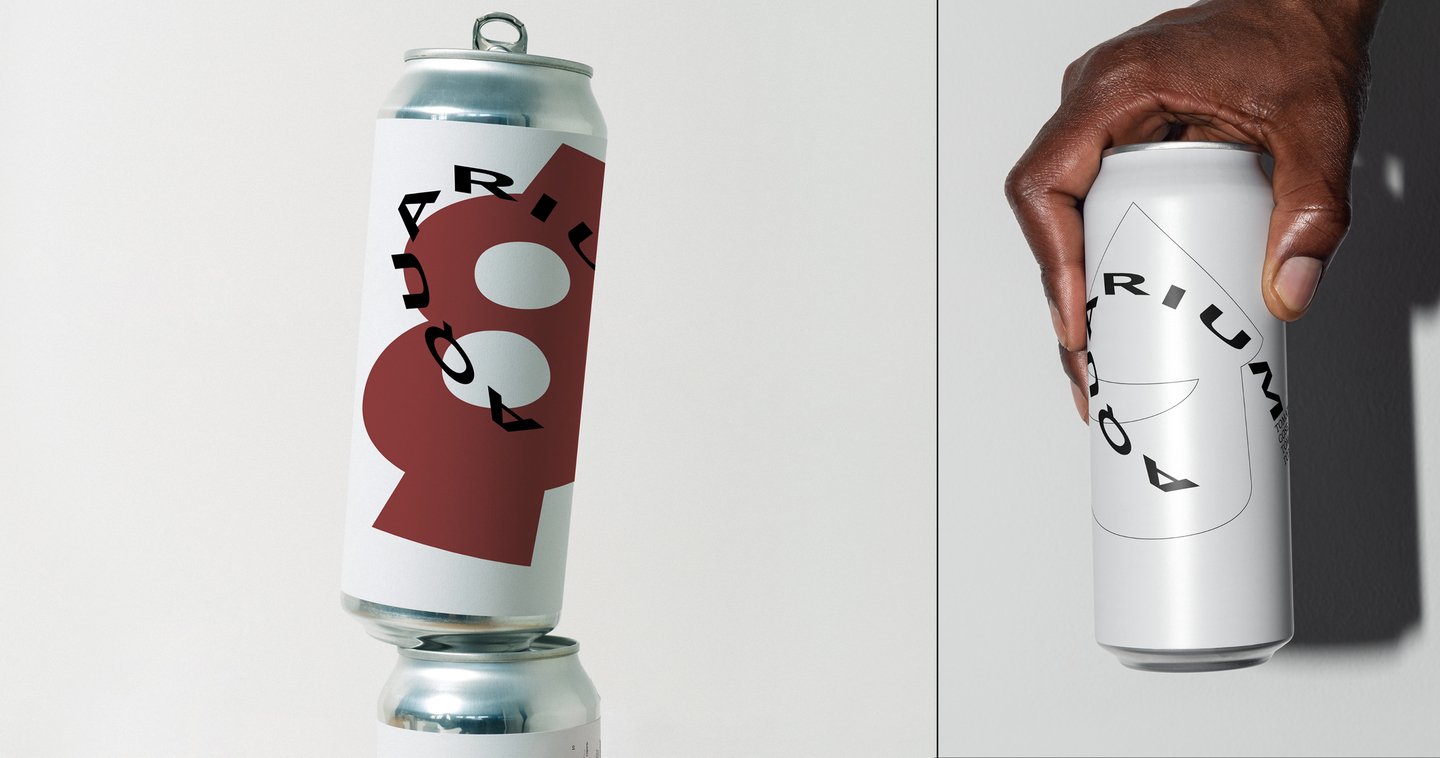
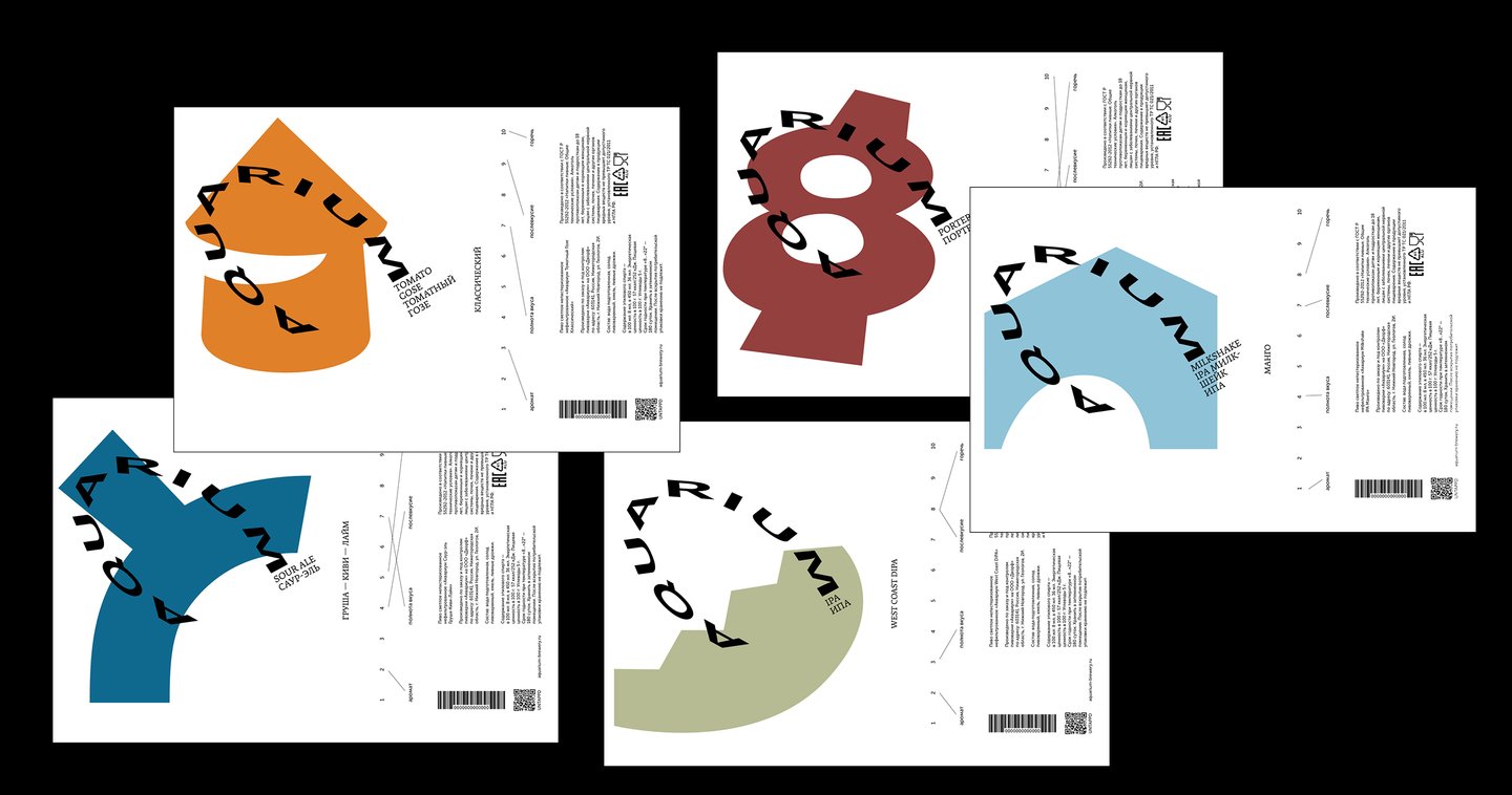
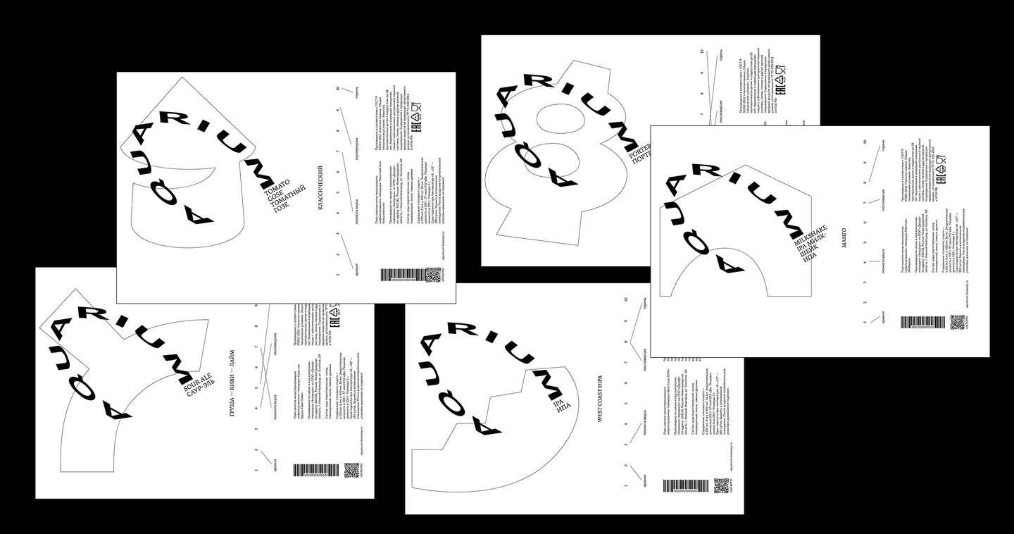
(2026) An emerging canned beer manufacturer from Nizhny Novgorod, Russia.Problem: — Lack of beer brands that focus on promoting local identity. — Low noticeability of current packaging. — Lack of sophistication in current design.Request: Flexible, high-contrast monochrome design options.My Solution: — Graphics: simplified, color-coded landmarks appealing to the target audience (local upper-middle class aged 18–35). — Typography: wordmark distortion mimics the shape of the Volga River, the city’s waterway. — Infographics: minimal and contrasting with the bold main graphics.
Section C — Type
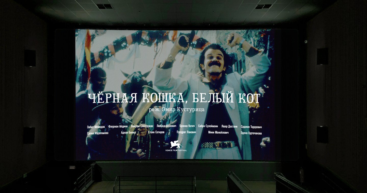
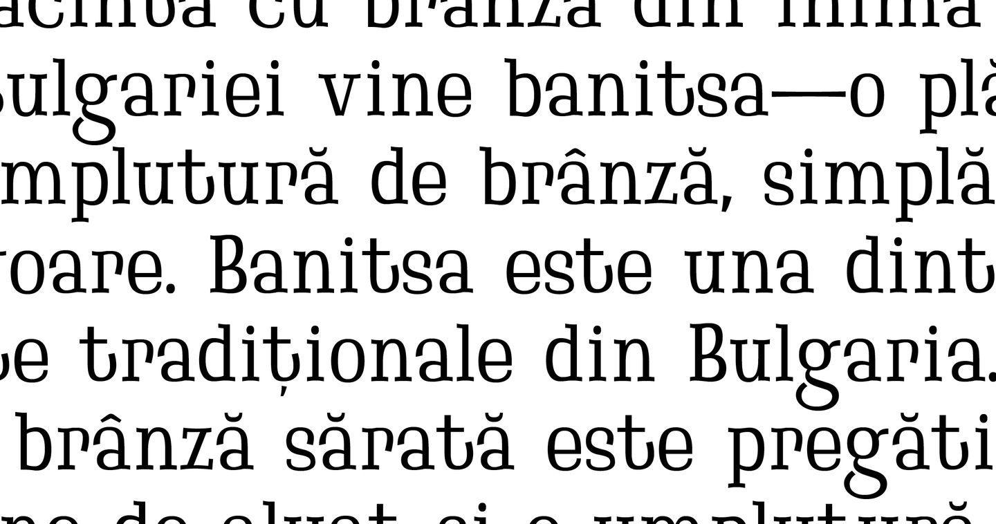
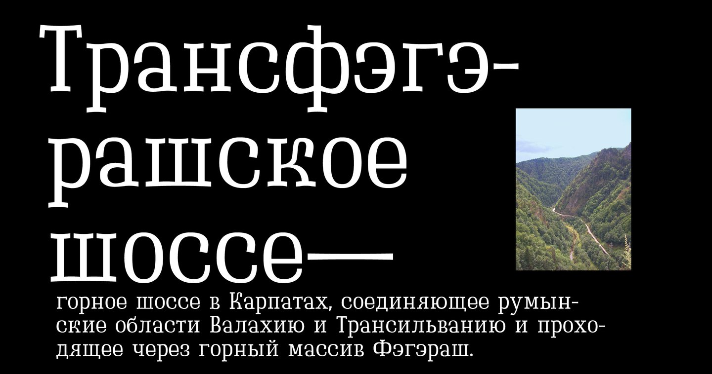
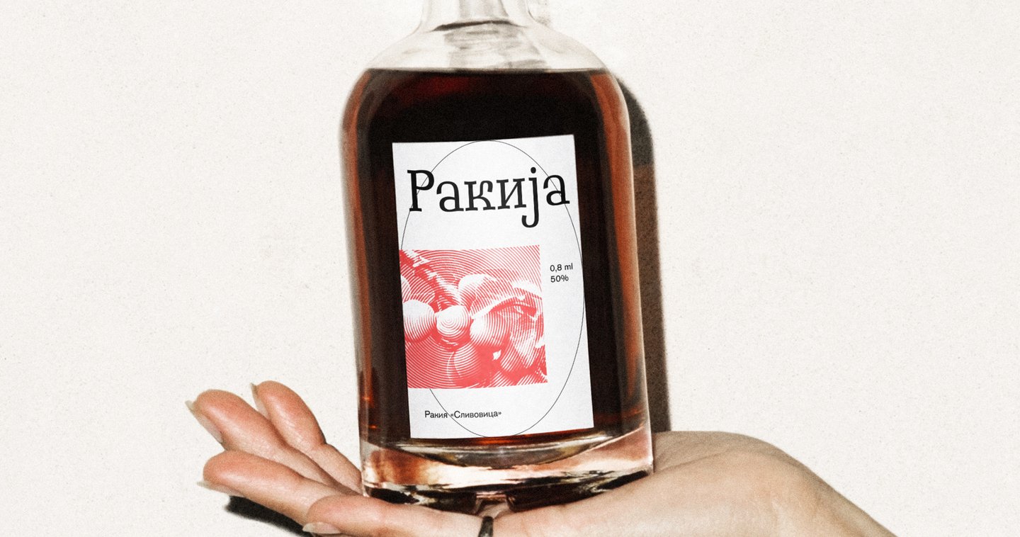
Bryndza

(2025) This display slab-serif is inspired by the uneven lines of sliced Bryndza (Brânză), a crumbly Balkan cheese.Challenge: — My skills and portfolio lacked type design experience, so I decided to learn by creating a font myself.Goal: The objective was to create an appealing, friendly, and dynamic font with a unique character.My Solution: — Introducing curved serifs and adjusting the proportions of upper and lower horizontal strokes. — Swapping the proportions of the upper and lower bowls. — Exaggerating the terminals in rounded strokes.