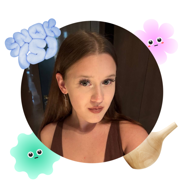
Hello! I’m Viola Iosifova, a product designer based in Moscow.
I create websites and mobile applications for businesses, educational initiatives, and nonprofit organizations, combining thoughtful design with a clear understanding of users' needs.
Commercial experience in digital and visual design. I currently work as a designer at EGE Nalegke, an online education company. My previous projects include collaborations with the Miloserdie Foundation and Ethnosphere, where I worked on digital interfaces, educational materials, websites, and editorial design.Over 30 academic and commercial projects. My experience spans UX/UI design, branding, digital products, visual communication, and website development.I am a fourth-year student at HSE Art and Design School, studying Digital Product Design and Promotion. My education combines creative practice, user research, and digital product development.I work with Figma, FigJam, and Adobe Creative Cloud. I develop interactive prototypes, design systems, reusable components, and visual concepts. I also build websites using Tilda and work with 3D and motion design tools.
I approach every project by understanding its purpose, audience, and challenges.
Research helps me identify priorities, while continuous communication and feedback allow me to refine ideas into functional, visually consistent solutions.
01 / Ethnosphere ~ Website Redesign
[CONTEXT]Ethnosphere is a Moscow-based nonprofit organization supporting children and adults with migration experiences, including refugees. Through educational and cultural initiatives, it helps people adapt to life in Russia and integrate into local communities.The website redesign project took place between January and June 2026. Our team focused on improving the site’s structure, user experience, and visual identity. The process involved audience research, competitor analysis, interface design, and preparing the website for publication using Tilda.
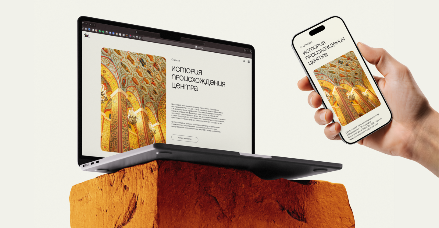
Responsive Website Layouts
[PROBLEM]The organization needed a digital platform that could more clearly communicate its mission, engage visitors, and build trust.The previous website lacked a consistent visual approach and an intuitive content structure. As a result, visitors struggled to understand the organization’s activities and locate information relevant to them.
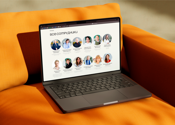
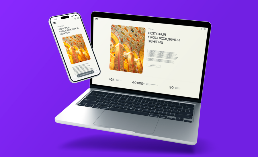
Responsive Website Layouts
[SOLUTION]The redesign began with an analysis of the existing website, its audience, and comparable nonprofit platforms. These insights informed a new information architecture organized into eight key sections: About, History, Team, Projects, News, Collaboration, Partners, and Shop.We reconsidered the navigation and user journeys, developed responsive layouts, and created interactive prototypes in Figma to communicate the proposed experience.
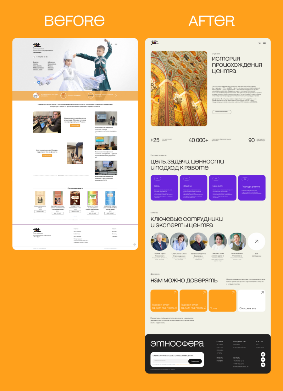
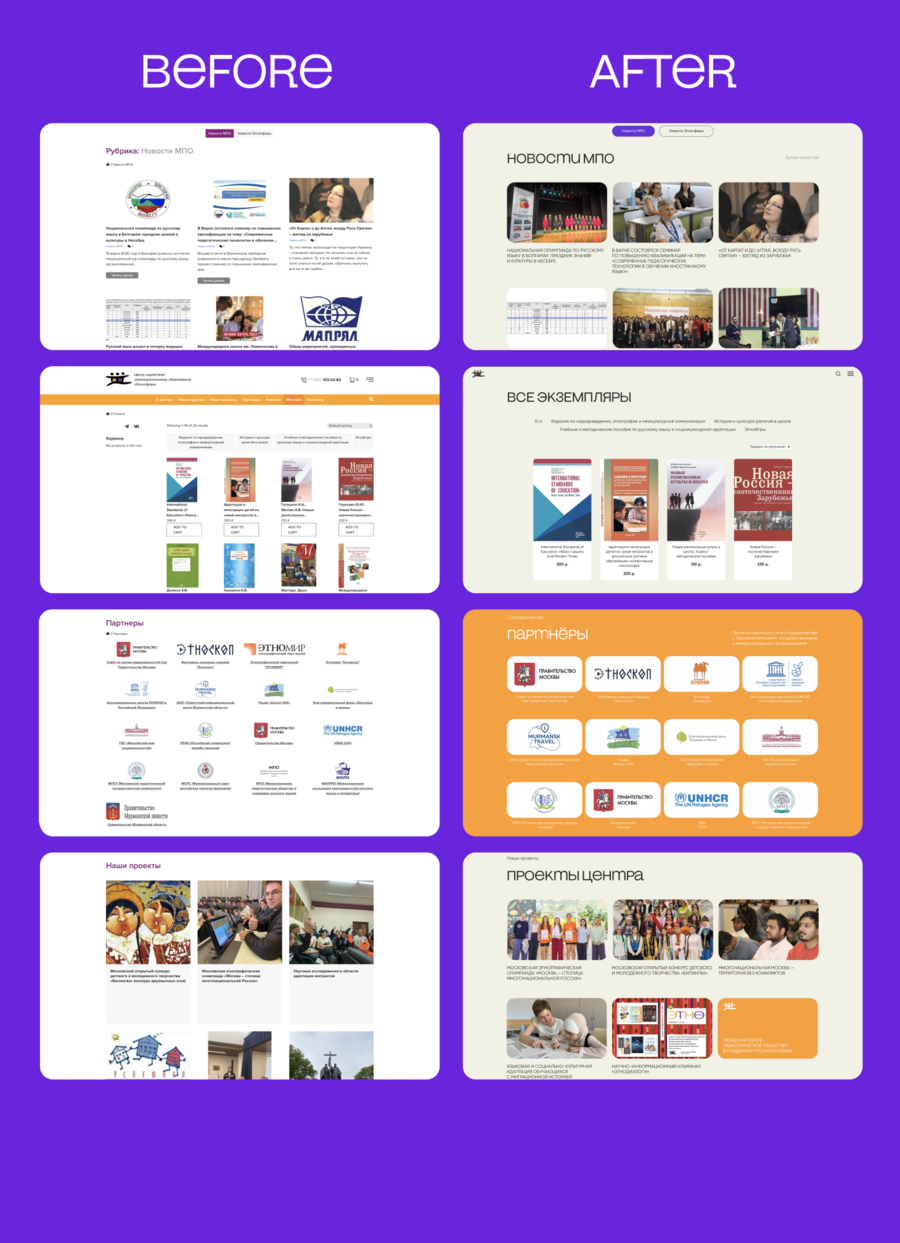
Before & After
The visual identity was also refined through a more balanced use of the organization’s brand colors, typography, and interface elements.
The project then moved into implementation in Tilda, including layout adjustments and final revisions. The redesigned website incorporates an email newsletter and an online shop, allowing visitors to engage with the organization and purchase its products.
Visual Identity
Website Design
[RESULT]The redesigned Ethnosphere website was launched with clearer information architecture, adaptable layouts, and a cohesive visual language.The updated platform provides visitors with more accessible information about the organization’s work, while the newsletter and integrated shop create additional opportunities for communication and engagement.
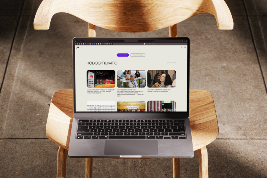
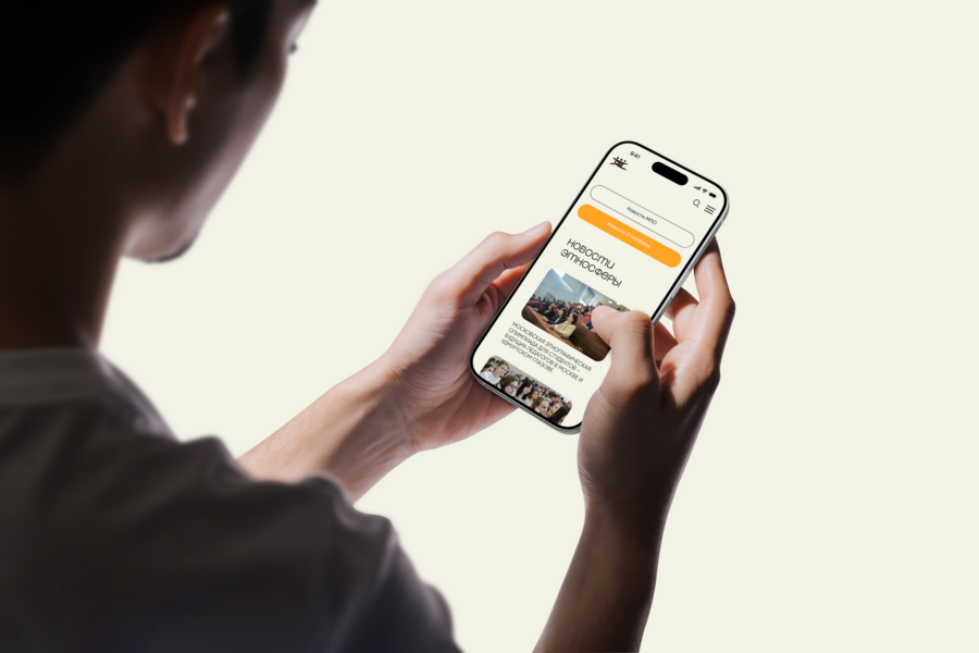
Responsive Website Layouts
02 / SNOK (S) ~ Media Website Design
[CONTEXT]SNOK (S) is a digital media project focused on sleep and dreams. It is designed for individuals who want to gain a deeper understanding of their sleep patterns, enhance their rest, and explore dreaming as a tool for self-reflection.Over nine months, our team developed the project from a core idea into a complete website design ready for development. This process integrated audience research, competitor analysis, information architecture, interface design, and brand identity.My primary contribution was establishing the project’s visual identity and defining its overarching visual direction. I concentrated on creating a cohesive design language across the website and all supplementary visual materials, helping to build a recognizable identity for SNOK (S).
Visual Identity
[PROBLEM]Sleep-related challenges are common, but reliable information is not always easy to understand or access.Advice is often spread across multiple platforms or presented using complicated terminology, making it difficult for readers to find useful answers.Our objective was to create a single, accessible digital space where people could explore sleep and dreams through clear content and interactive experiences.
Editorial Website Design
[SOLUTION]We developed a media platform that brings together articles, interactive tests, and quizzes to encourage visitors to explore different aspects of sleep and dreaming.The website’s structure was designed to make editorial content accessible and easy to navigate, while its visual identity creates a recognizable atmosphere across all pages.An integrated online shop extends the project beyond digital content through a collection of branded merchandise.A reusable component-based design system supports visual consistency and allows the interface to evolve without losing its overall structure.
Test, article, and shop pages
Editorial Website Design
Social media content
[RESULT]The nine-month project resulted in a website concept prepared for development, featuring over 80 screens and 500 reusable components.Research included a survey of 102 participants, providing insights into the audience’s habits, expectations, and interests.The completed design combines educational content, interactive features, and a distinct visual identity, offering several ways to engage with the subject of sleep and dreams.
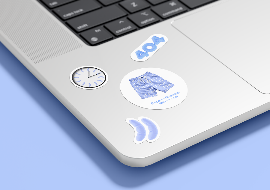
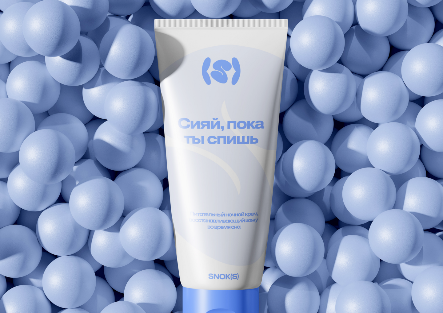
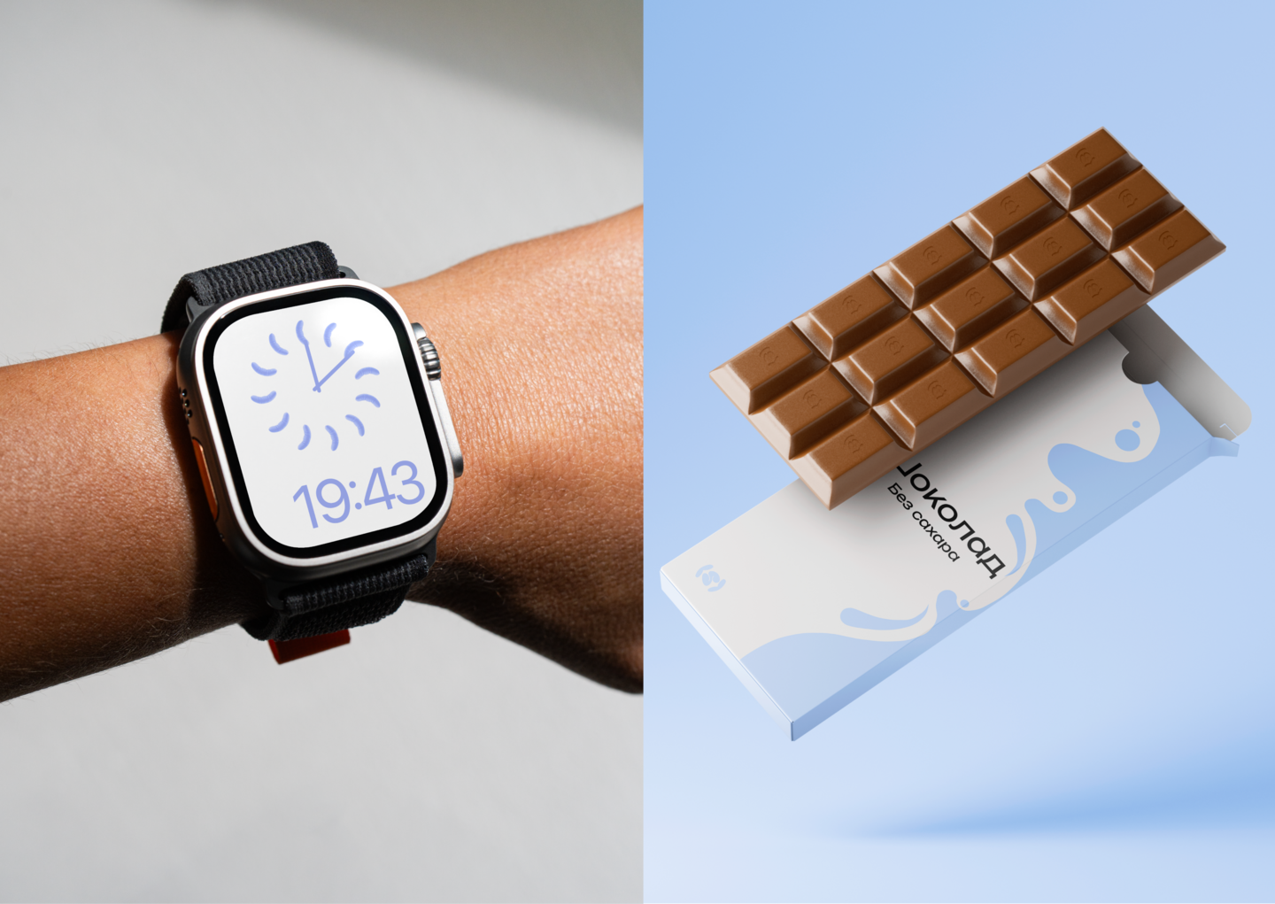
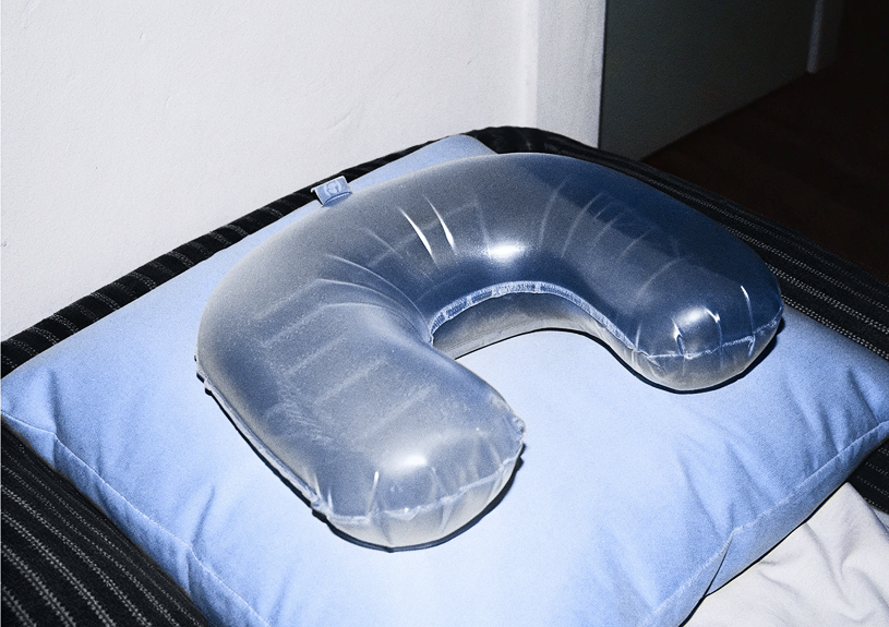
Branded merchandise
03 / Lino ~ Mobile App Design