CASE STUDY 01 // EXHIBITION IDENTITY & MERCHANDISE SYSTEM
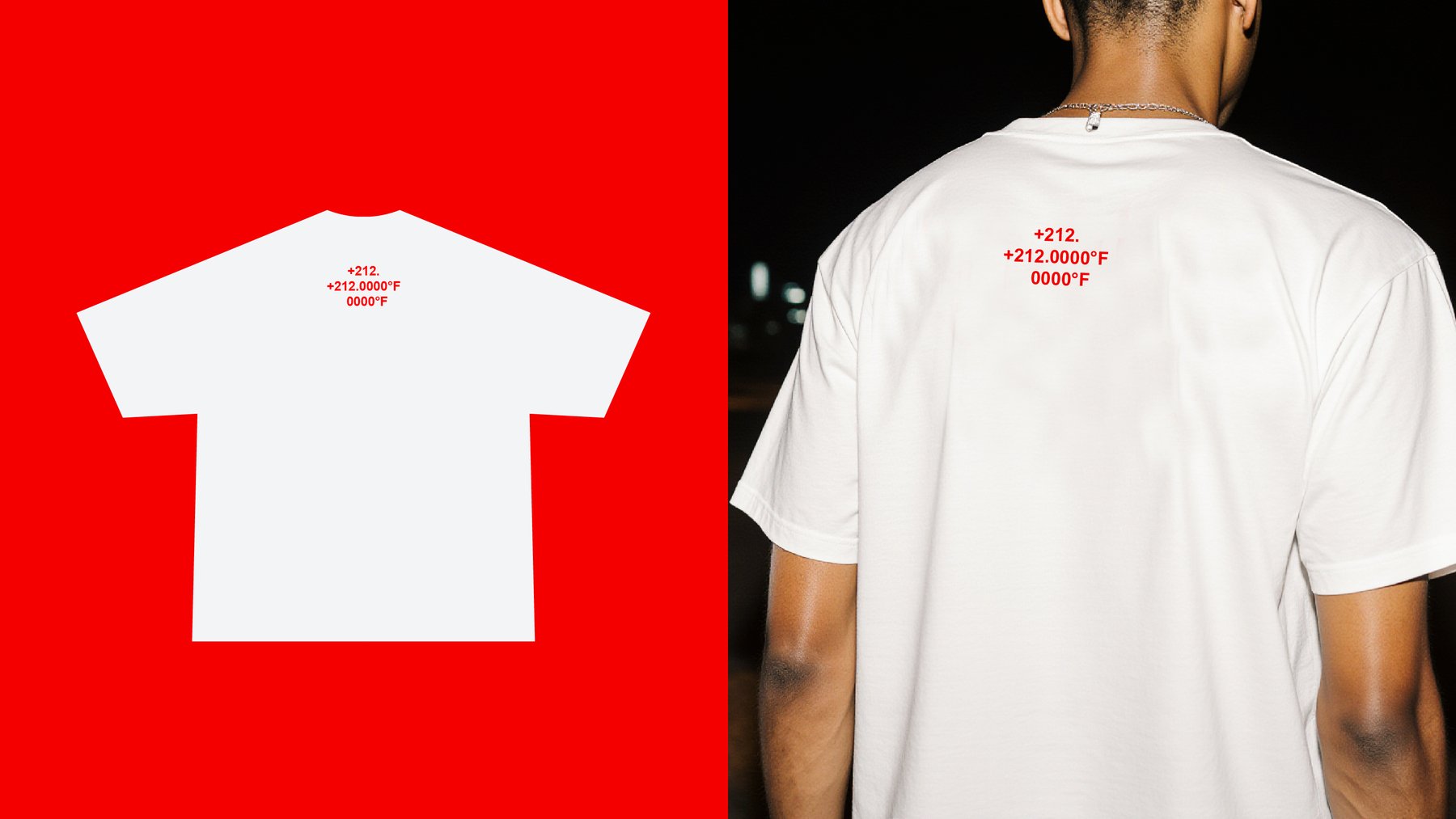
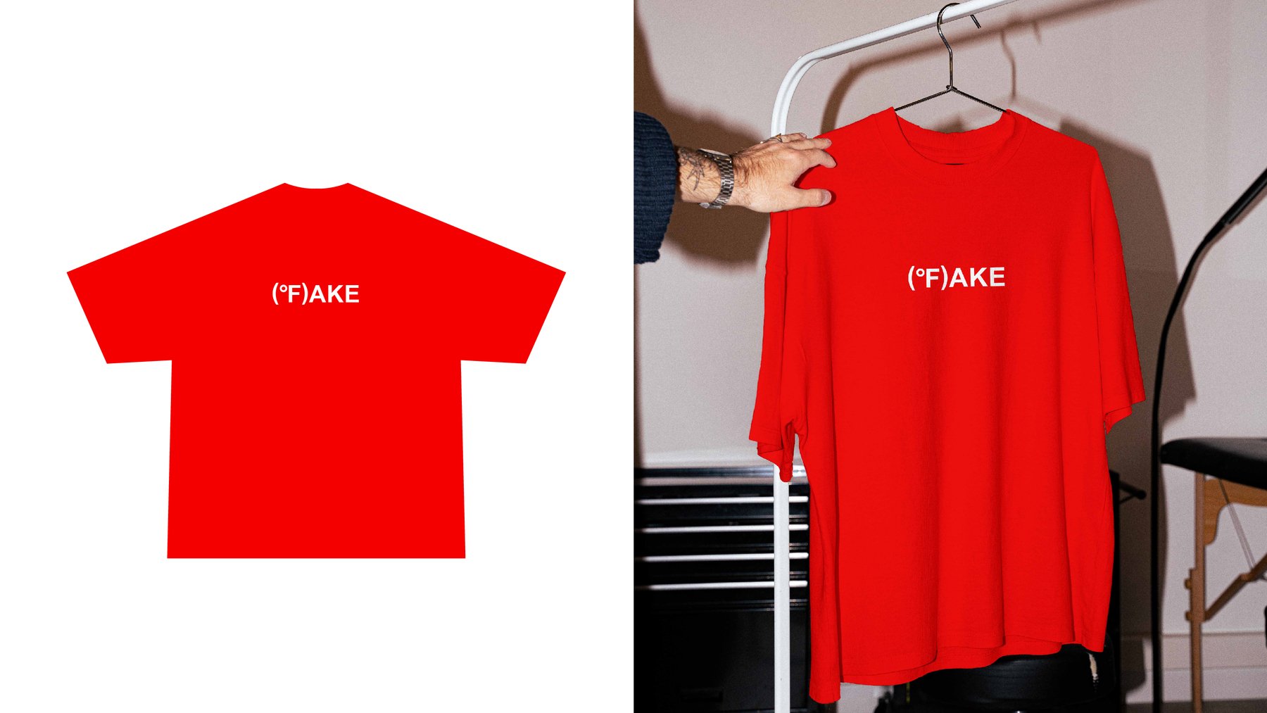
The exhibition challenges the official narrative on global warming, exposes contradictions in the data, and highlights the political and economic interests driving climate hysteria.
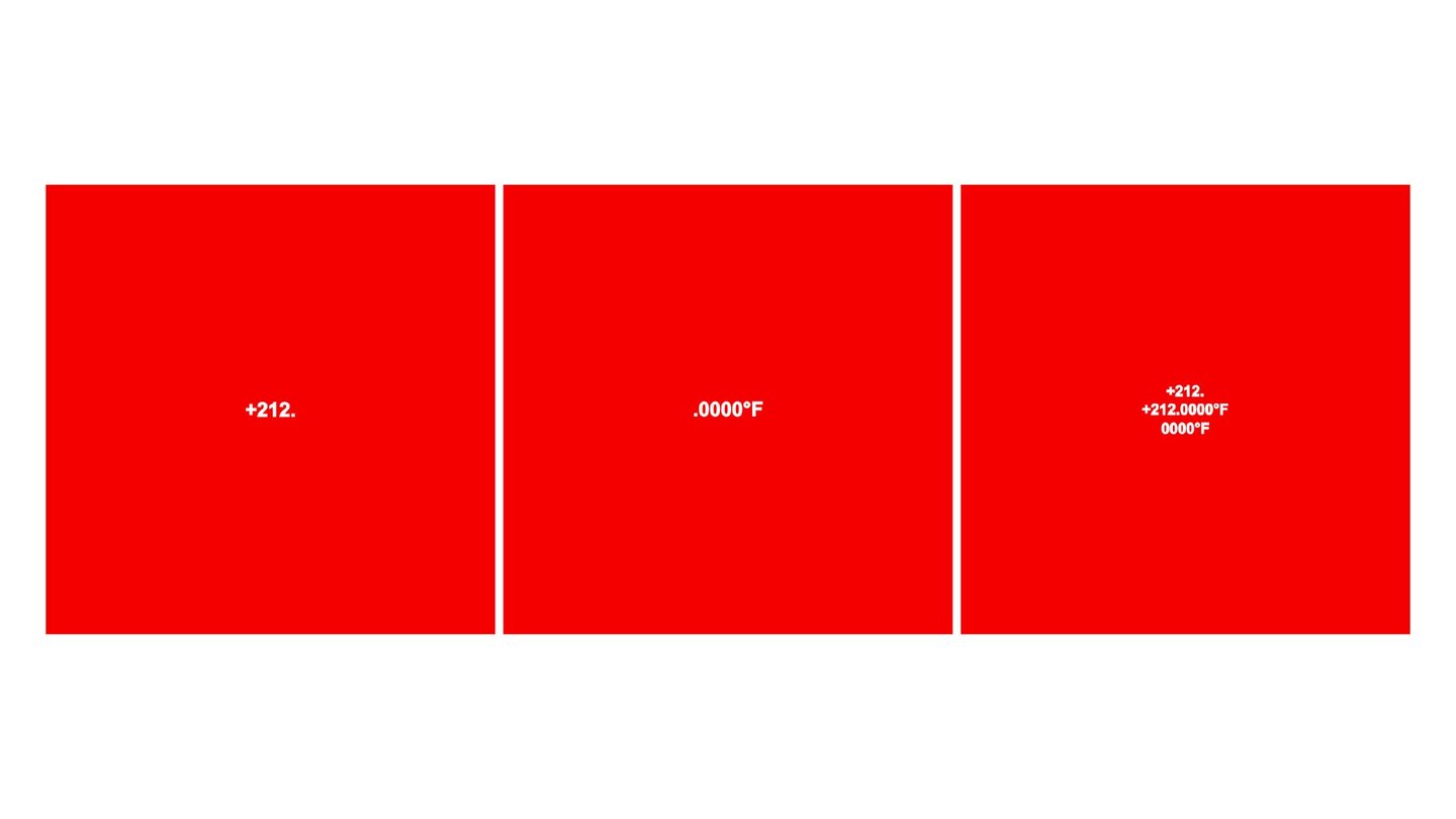
212°F = 100°C (the boiling point of water) — an allusion to data that has been artificially «heated up.» Four zeros serve as a symbol of pseudoscience; while genuine science allows for margins of error, this presentation creates the illusion of absolute truth. °F stands for degrees Fahrenheit. The color red signifies danger and the urgency of the issue.

CASE STUDY 02 // BRAND MERCHANDISE & PACKAGING
The brand creates jewelry from recycled plastic salvaged from the ocean. The entire visual identity and logo are rooted in marine coordinates—the precise locations where the plastic was recovered. Below, I present the merchandise and packaging I designed for this project.
CASE STUDY 03 // POSTERS