Original size 1920x1010
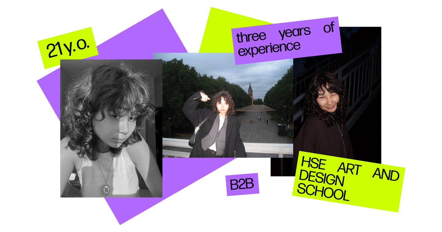
My name is Elina, and I design identities for static and motion projects
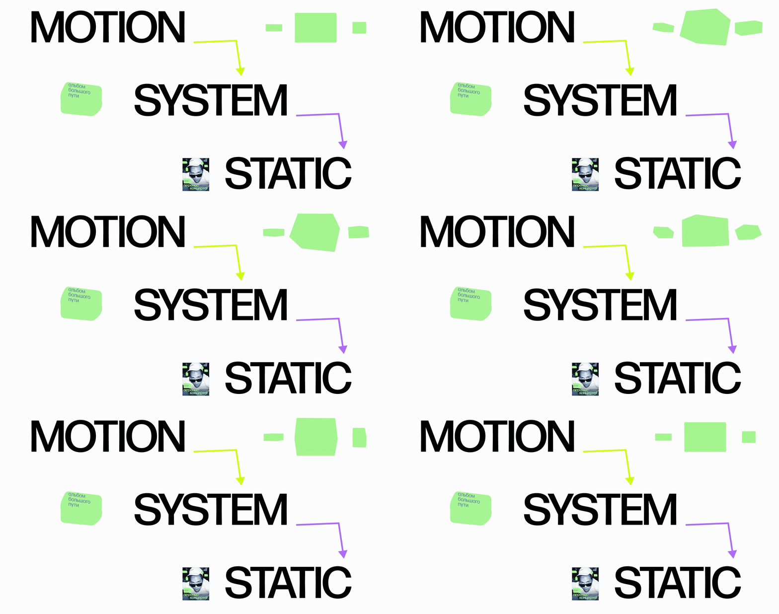
I transform brand briefs into visual systems that function across various formats—from static layouts to motion. My approach evolves depending on the project: sometimes motion emerges from a graphic system, and at other times, motion serves as the initial concept.
(1) KOALA MEDIA
Original size 1920x1010
Loading...
THE CHALLENGE
Developing a brand identity and motion system for a contemporary hip-hop media platform. KOALA integrates news, analysis, educational content, and entertainment into one media platform.
The identity needed to organize diverse content types into a cohesive system, maintain recognizability across all formats, and adapt to the fast pace of digital publishing.


Original size 1920x1080
THE APPROACH
I used motion to define the system.
Because KOALA operates through a continuous flow of changing content, I developed the identity through movement first. Motion established the rules for pace, transitions, scale, and composition before those principles were translated into static formats.
Original size 1920x1010
Original size 1920x1080
DESIGNED TO SCALE
The identity was developed as a set of reusable principles rather than a collection of individual layouts.This allows the visual language to extend across social media, animated posts, intros, and other editorial formats while remaining recognizable as KOALA.
Original size 1920x1033
Original size 1920x1080
(2) VASILYOK — URBAN SPACE
Original size 1920x1010
Original size 1920x1130
THE CHALLENGE
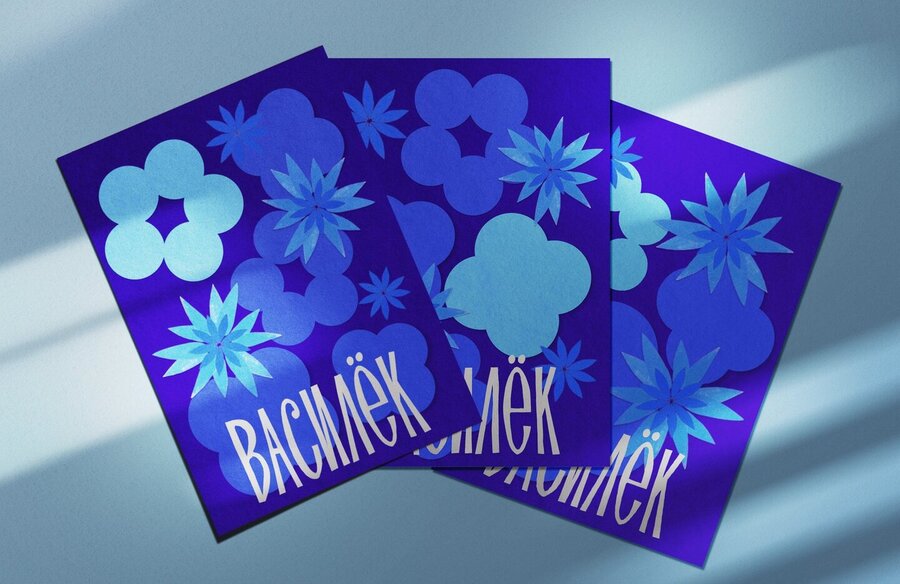
A visual identity for a community garden in Totma.
Vasilyok brings together local residents, producers, and cultural initiatives in a former kindergarten. The identity needed to communicate the character of an open, local, and community-driven space—without feeling institutional or overly polished.


Original size 1600x835
A FLEXIBLE VISUAL LANGUAGE
I constructed the identity using discrete paper-cut elements that can be combined and rearranged across various applications. This approach allows for variation without sacrificing recognition—the compositions can shift while the core material, shapes, and visual character remain consistent.


1/2

(3) FAREWELL MY CONCUBINE
Original size 1920x1010
Loading...
THE CHALLENGE
Create an analogue title sequence for *Farewell My Concubine* and develop a visual identity that could extend the film beyond the screen.
The challenge was to find a visual language rooted in the film’s cultural context and make it work across both the title and brand communication.
Original size 1500x800