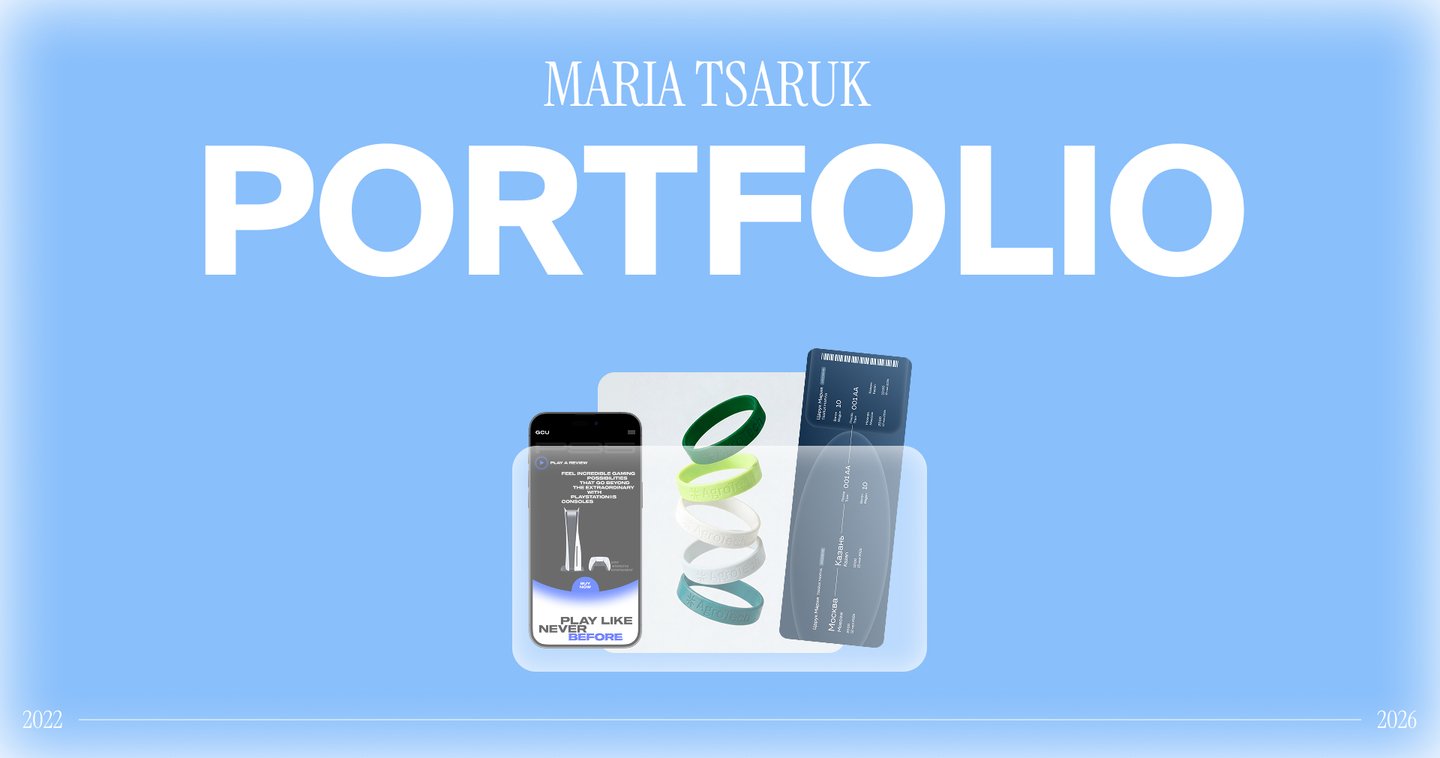

I’m Masha—a brand and digital designer who creates visual systems for brands and digital products. I work on brand identities, promotional materials, websites, and user interfaces. I am skilled at structuring information, developing designs within a cohesive system, and taking into account business objectives, the target audience, and the specific medium.
Service Design, UI/UX
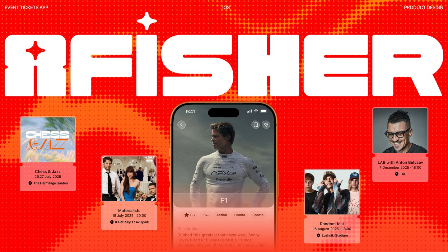
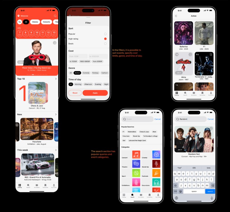
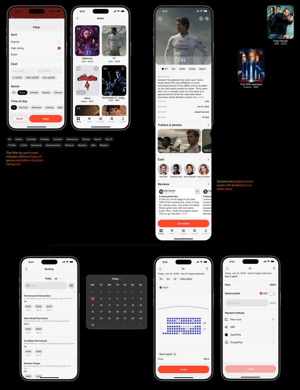
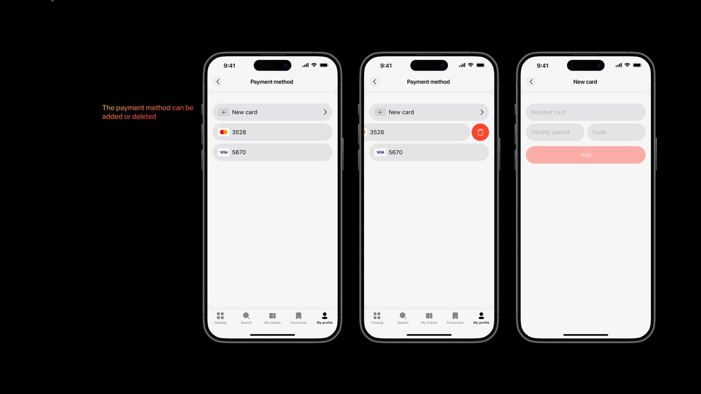
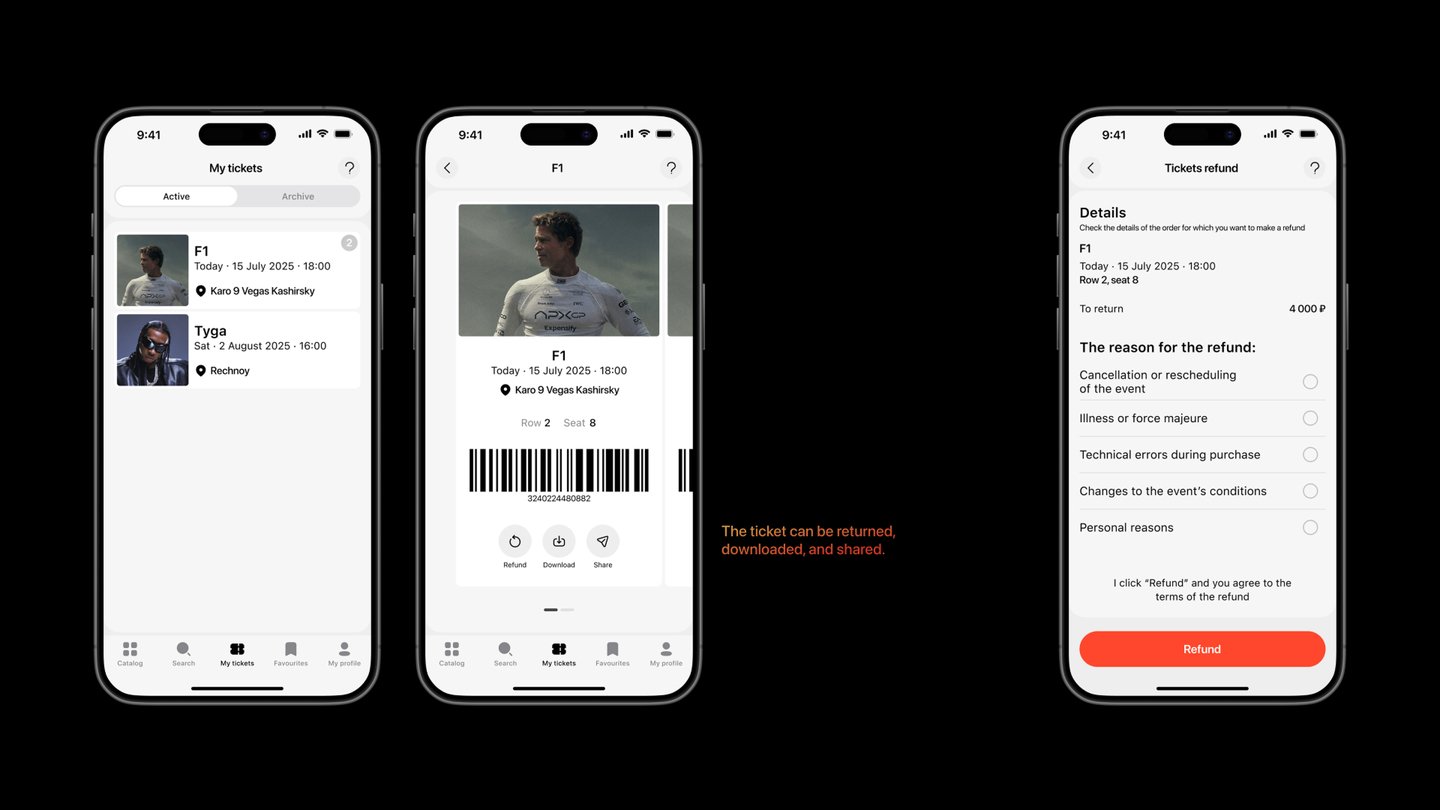
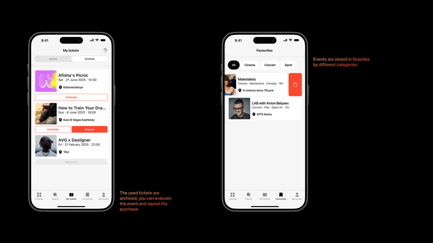
About the projectAfisher is an aggregator for all national events. It enables users to purchase tickets for cultural events, allowing them to easily search by city, event category, date, and time of day (morning, afternoon, evening, night). The application features a modern, minimalistic interface that makes it highly convenient for users of any background.TaskTo develop a national event aggregator where users can select a city to see what events are taking place and where, as well as purchase tickets online.SolutionWe created a single, intuitive, and visually engaging platform that allows people to easily discover interesting events in their city and effortlessly buy tickets for them.
Branding, Contest
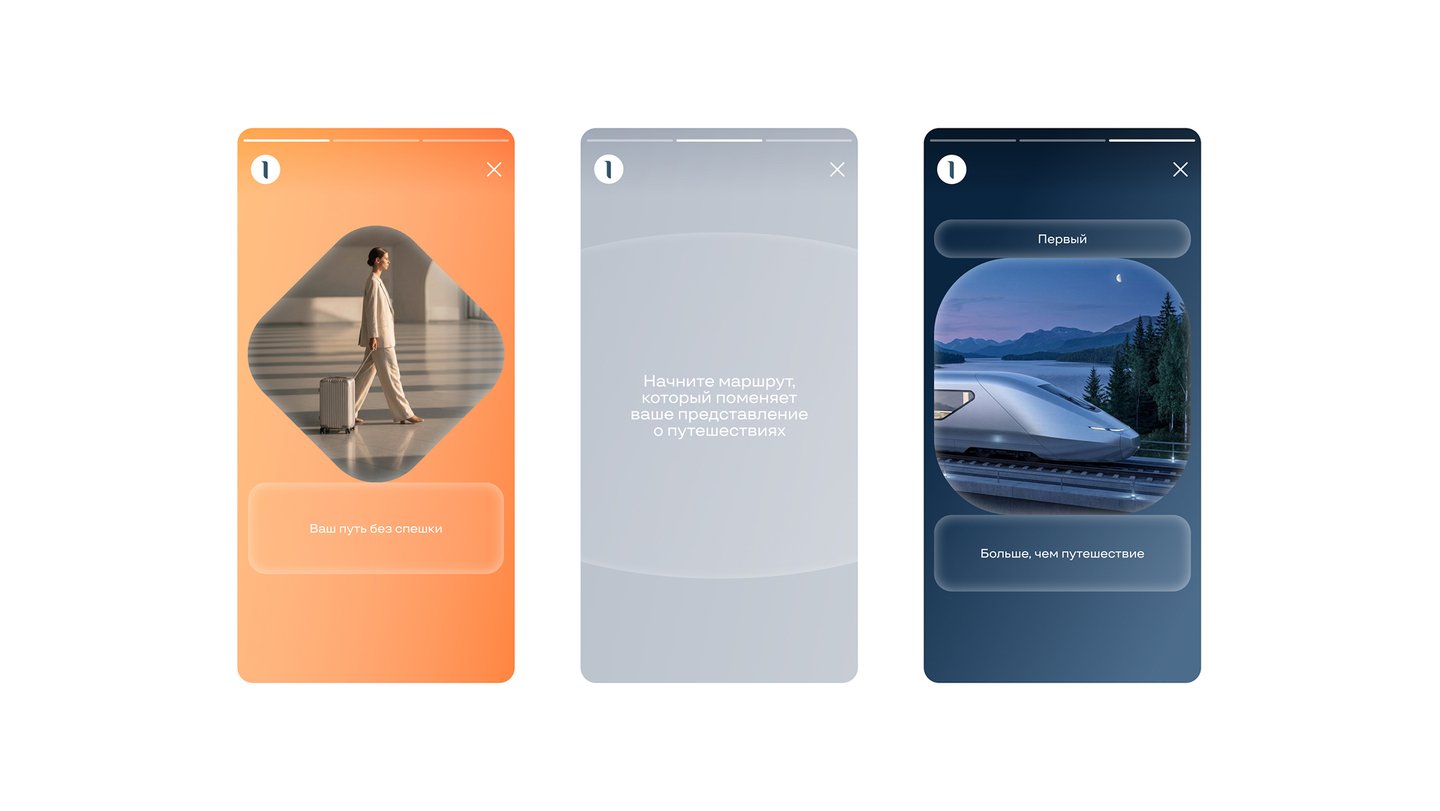
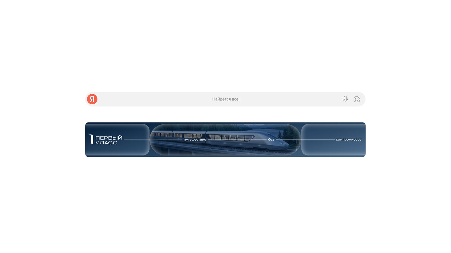
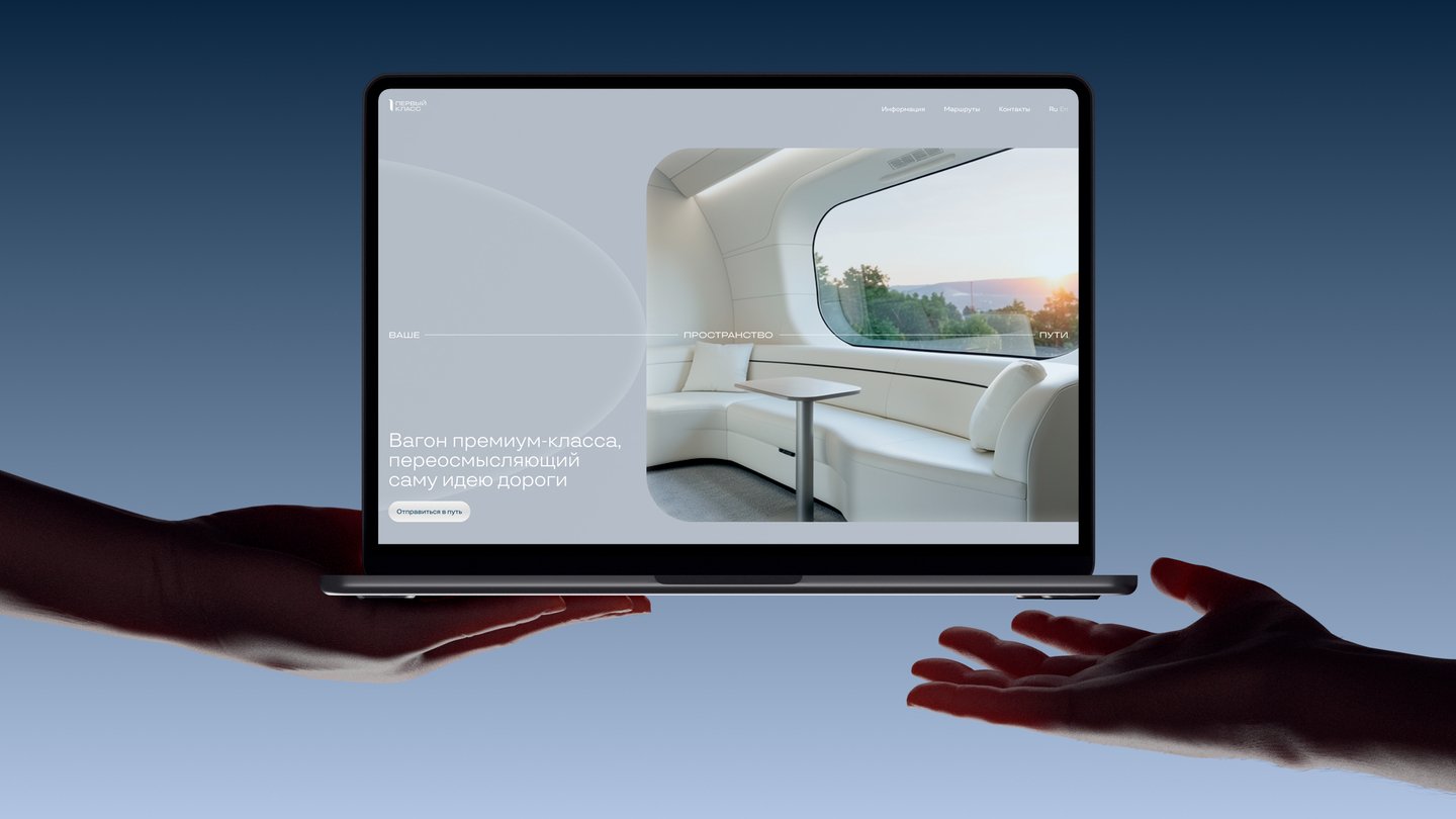
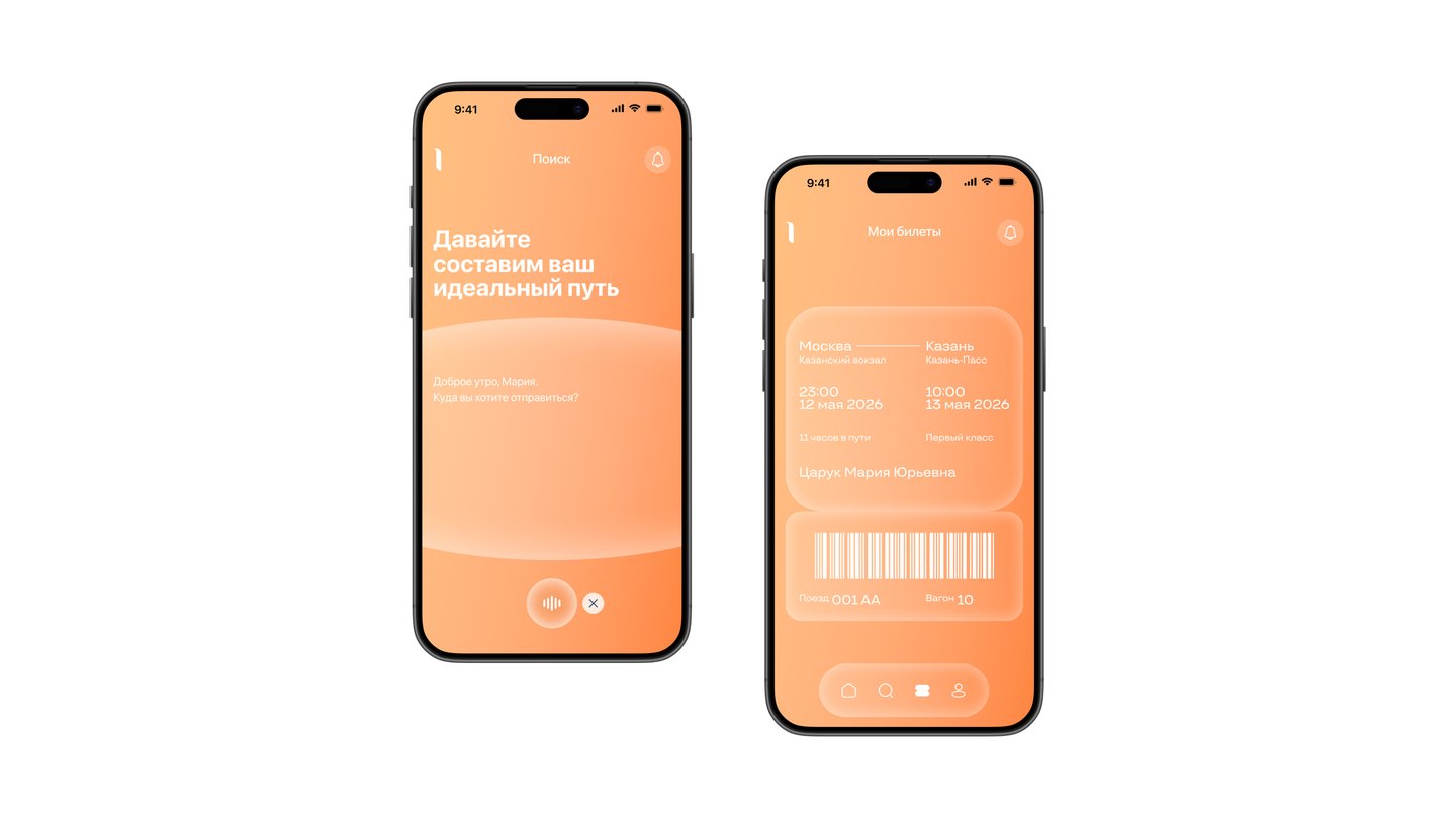
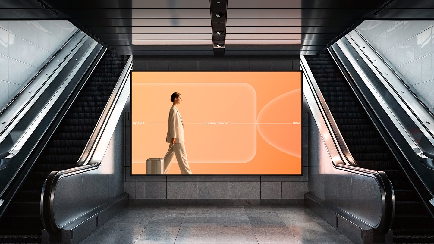
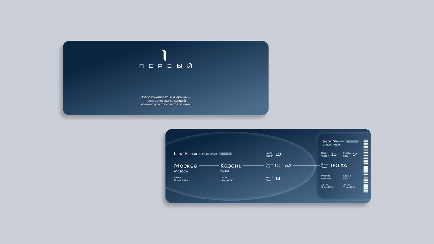
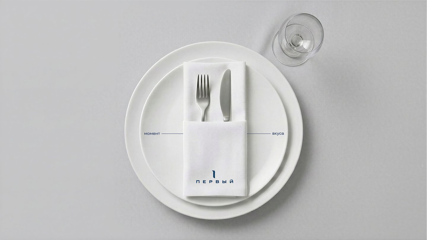
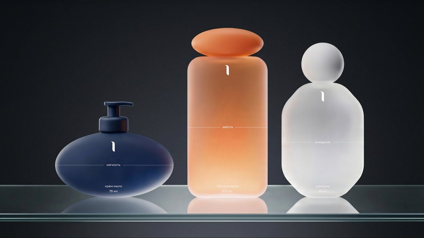
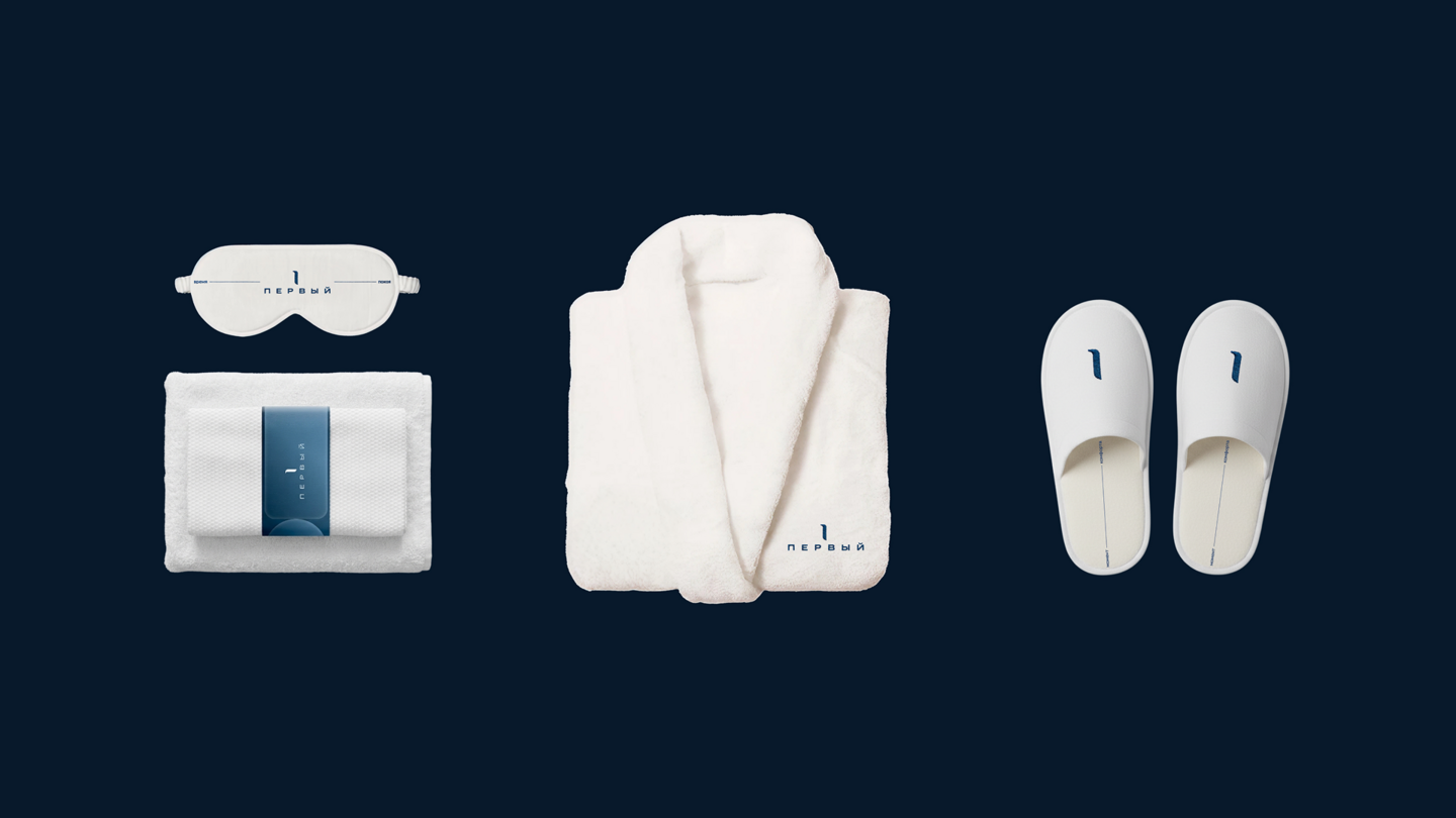
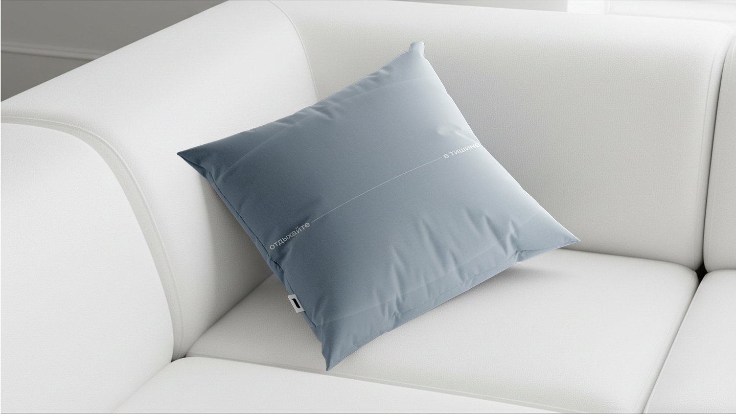
About the ProjectThis project focused on developing the brand identity, logo, and visual system for the new «Pervy» line of premium special rail cars.TaskThe goal was to conceptualize the train as a self-contained space of luxury and experience—more than just a means of transportation, but a journey that signifies status. The proposal was to draw inspiration from the philosophy of legendary trains like the Orient Express, reinterpreting it within a contemporary context. A cohesive identity was required to reflect the comfort, exclusivity, and aesthetics of slow, mindful travel.ConceptThe visual concept is based on the soft, capsule-like forms, and the typography utilizes wide spacing to evoke a sense of mindfulness, privacy, control, and slowness. For the same reason, the primary logo version features wide kerning in the name.SolutionThe project resulted in a comprehensive brand system for «Pervy, ” reimagining the train as a space for mindful travel. The brand identity is built on the principles of minimalism, tranquility, and restraint. A minimalist logo, carefully crafted typography, and a calm color palette create a sense of privacy and status.
Agrotech Brand Media
Branding, Media
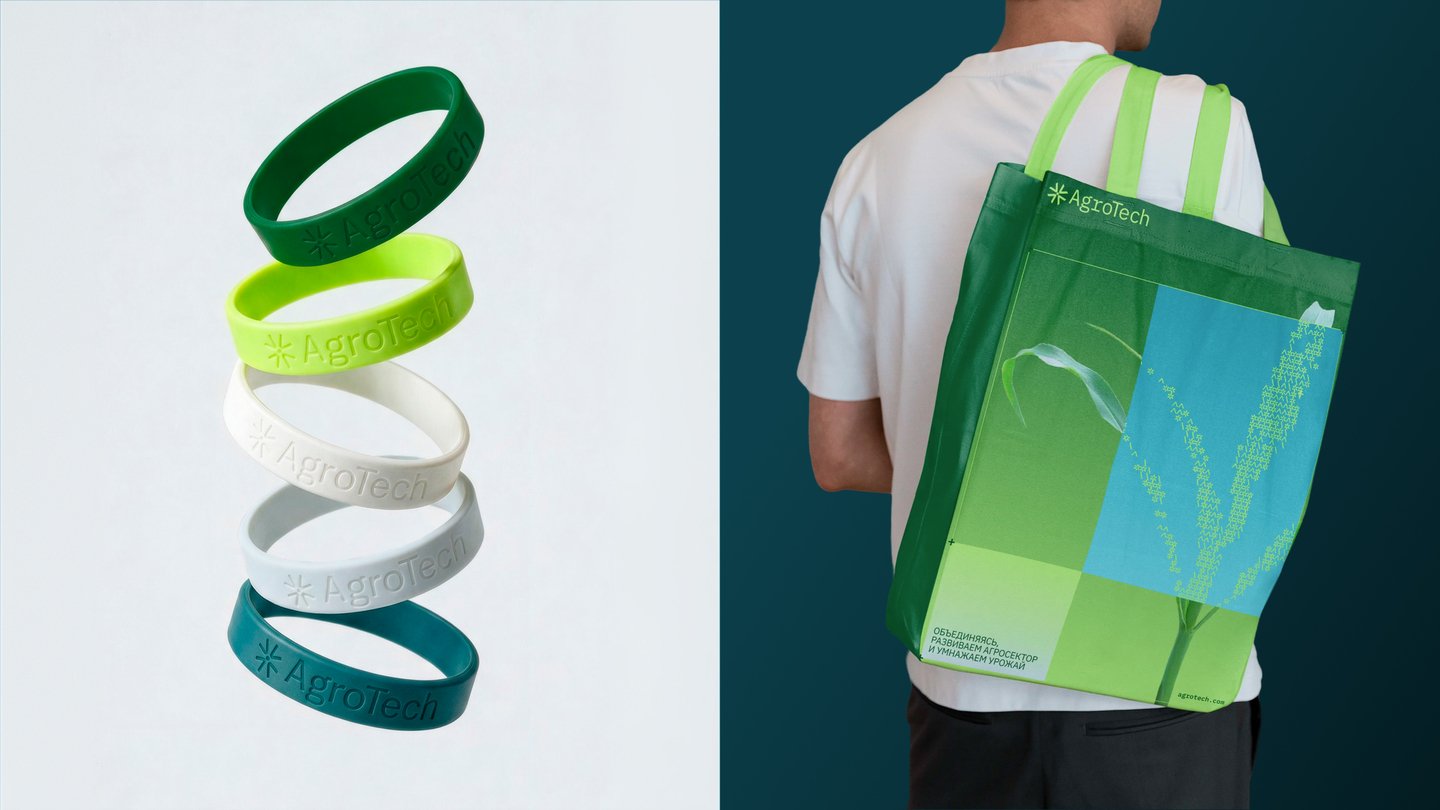
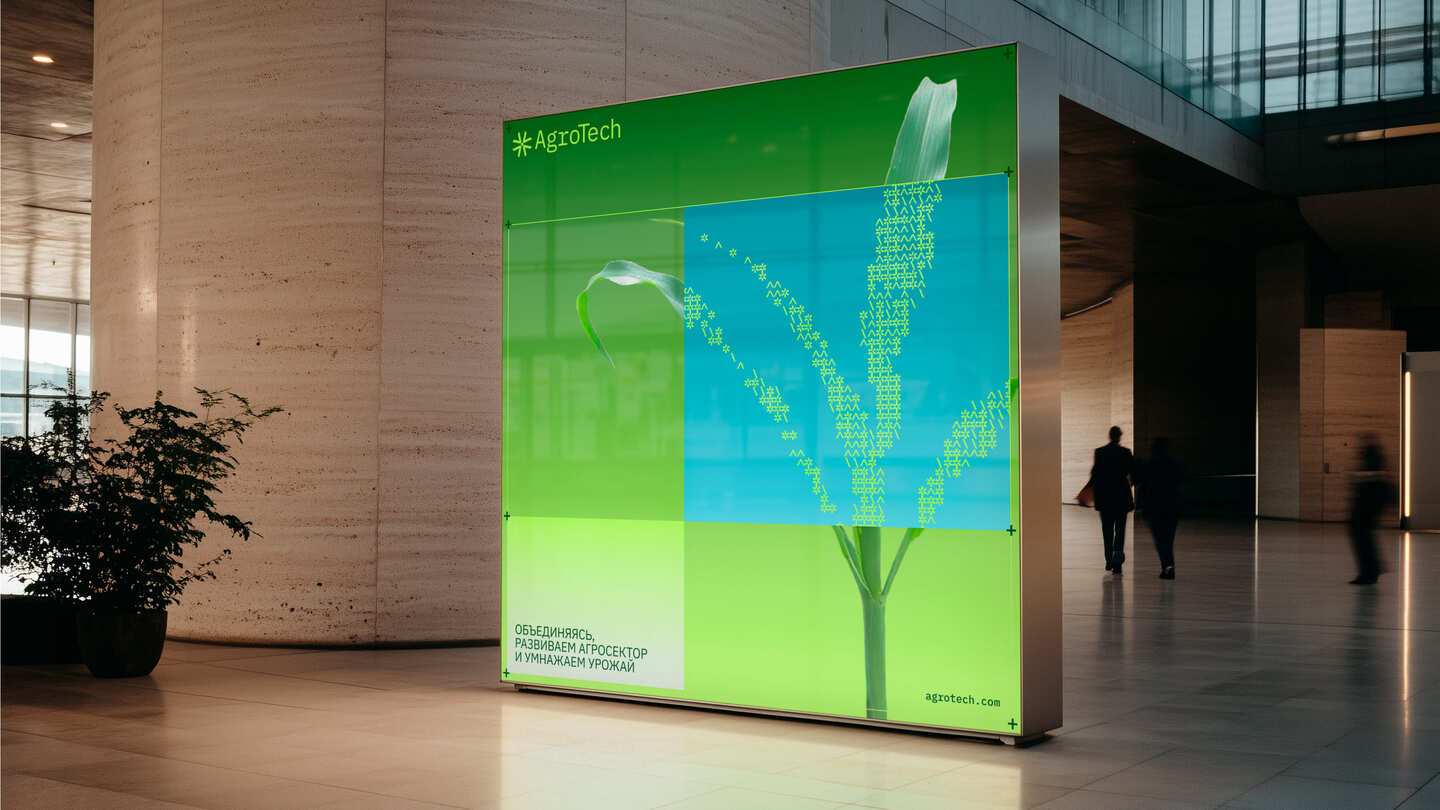
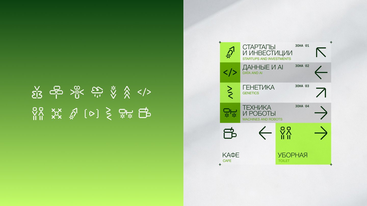
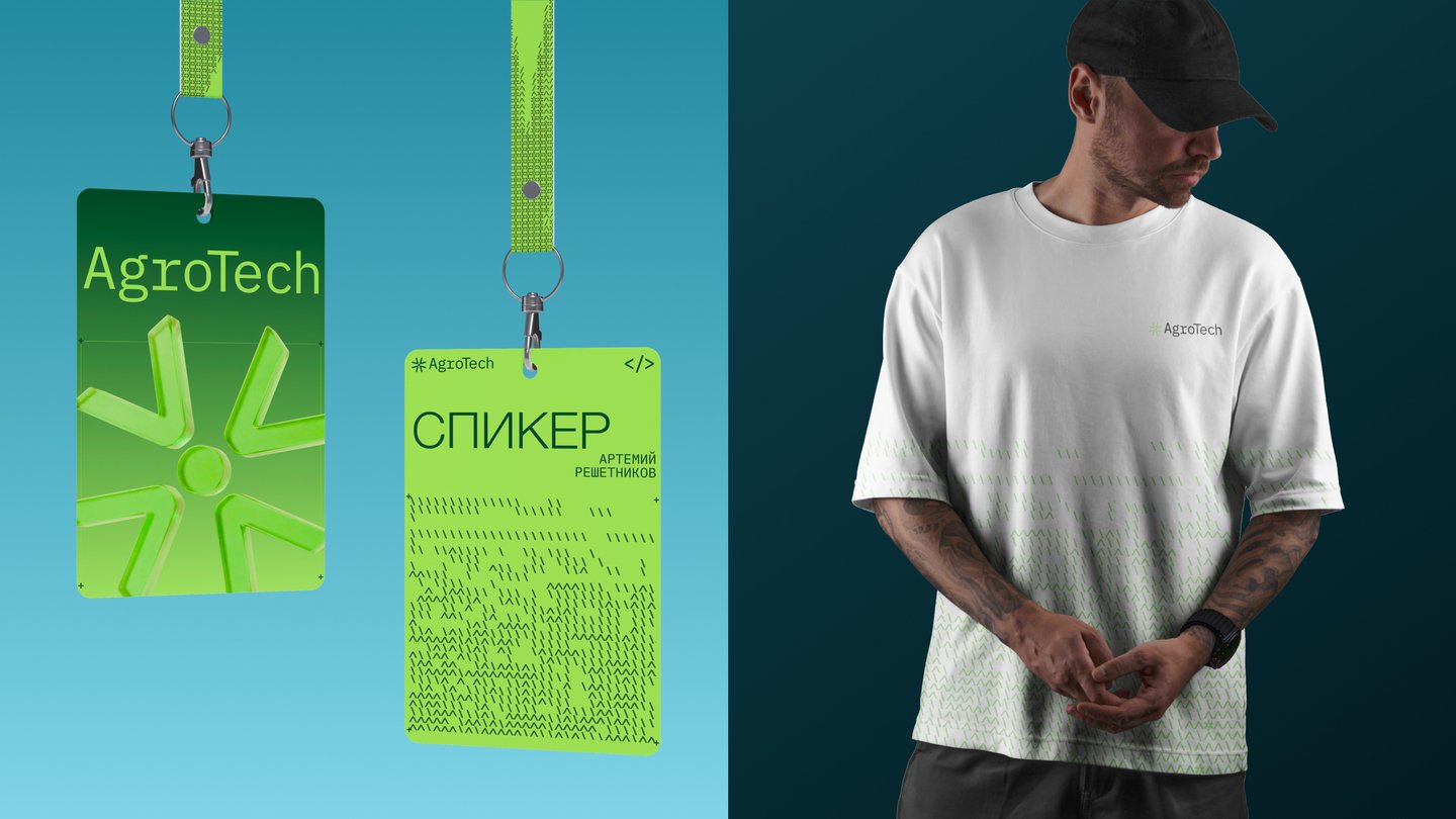
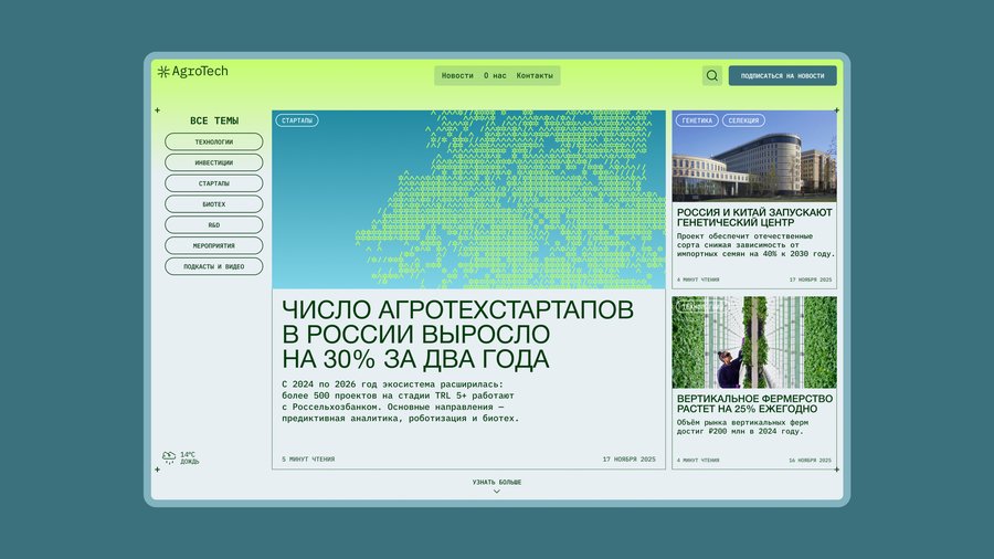
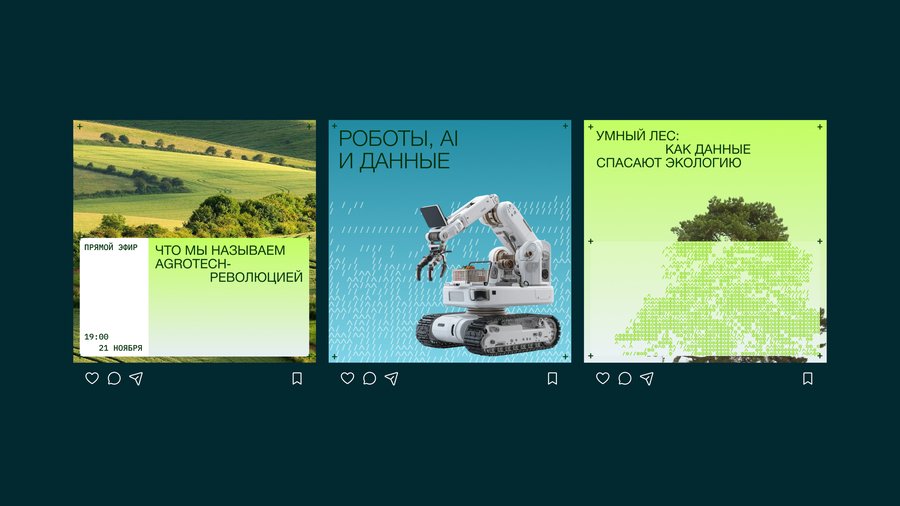
About the ProjectAgrotech is a B2B media brand in the agrotechnology sector. The organization creates unique content, hosts offline and online events, covers industry innovations across the internet and social media, and organizes trade shows. Key topics include agricultural drones, genetic engineering, vertical farms, biotechnology, smart farming, IoT, and Big Data.ConceptThe design was based on the idea of converging nature, technology, and code.TaskWe needed to build a recognizable, modern, and authoritative media brand that would stand apart from traditional agricultural portals and clearly position itself for a B2B audience.Solution A modern visual and communication system has been created at the intersection of agriculture and technology. Through a recognizable brand identity, clear explanations of complex topics, and an emphasis on business value, AgroTech is positioned as an expert media outlet for those implementing innovations in the agricultural industry.
Website Design, UI/UX
About the ProjectGCU is a New York-based retailer specializing in video game consoles, video games, and accessories. It blends an online format with traditional in-store purchases: customers can order goods by country or visit a physical location to inspect items before buying. I utilized a vibrant visual aesthetic and dynamic design that captures the atmosphere of the game world. I selected stylish fonts and color combinations to emphasize key information.Task The previous version failed to capture the spirit of game culture and the store’s unique style. The design suffered from washed-out visuals, lackluster typography, a monotonous block layout, and a total absence of interactivity, which diminished user engagement.SolutionI implemented a vibrant visual aesthetic and dynamic design that reflects the atmosphere of the game world. I chose stylish fonts and color combinations to make the essential information pop.