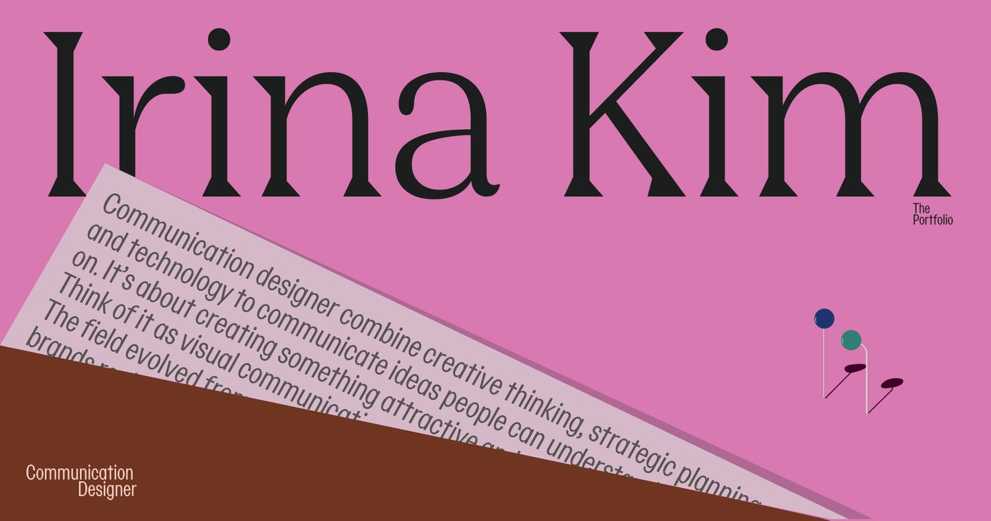

My name is Irina Kim, and I’m a communication designer who primarily works with brand identity.
I am interested in developing ideas that can serve as the foundation for a visual identity. My process usually begins with thorough research—exploring the project’s context, history, and defining characteristics. I use these discoveries to develop a visual language that connects the core concept with its graphic expression.
This portfolio showcases projects that reflect my design approach—from the initial research and concept development through to the final visual identity.
My Design Approach
→Exploration. I begin by thoroughly investigating the project—its background, purpose, target audience, and the specific details that set it apart from others.→Concepting. Based on my findings, I define the visual direction and determine how the core idea can be translated through graphic design.→Design. I explore typography, color, shape, and composition, experimenting with various combinations until all the elements achieve synergy.→Application. I develop the chosen direction into a cohesive visual identity and adapt it across diverse formats and contexts.For me, the design process is fundamentally about making intentional choices. Every single element must have a purpose and contribute meaningfully to the overall concept. This ensures the final identity feels consistent while retaining the necessary flexibility across various applications.
For me, the design process is about making deliberate choices. Every element must have a reason for being there and contribute to the overall concept. This allows the final identity to feel consistent while remaining flexible across various applications.
01. Usolye — a salt brand from the Russian North
The Problem
How can a traditional product tell the story of its origin through contemporary visual identity?
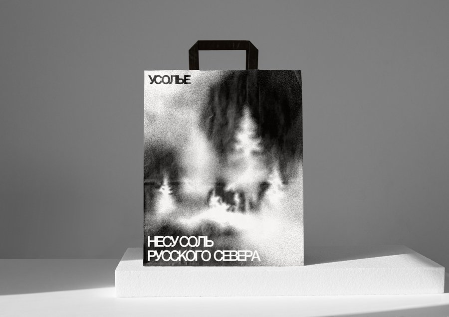
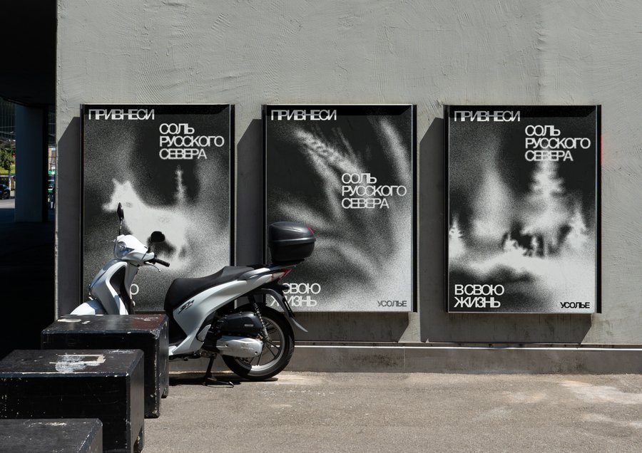
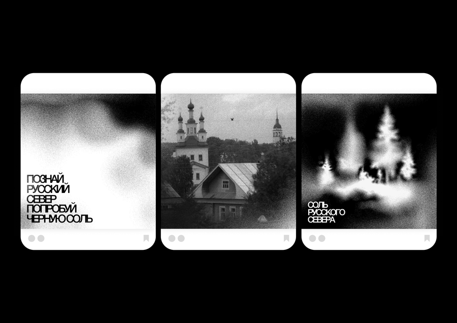
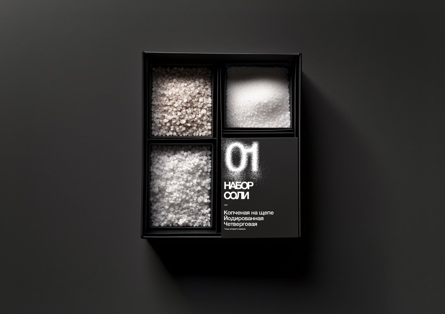
Usolye is a salt brand from Totma that introduces the Russian North through its culinary traditions. The region has a long history of salt production, closely connected to its cultural heritage and local identity. The challenge was to communicate this background in a way that feels relevant to a contemporary audience.The goal was to create an identity that goes beyond packaging a product, using the visual qualities of salt to connect the brand with the place it comes from.The Concept
Turning the traces of salt production into a visual language of the Russian North.
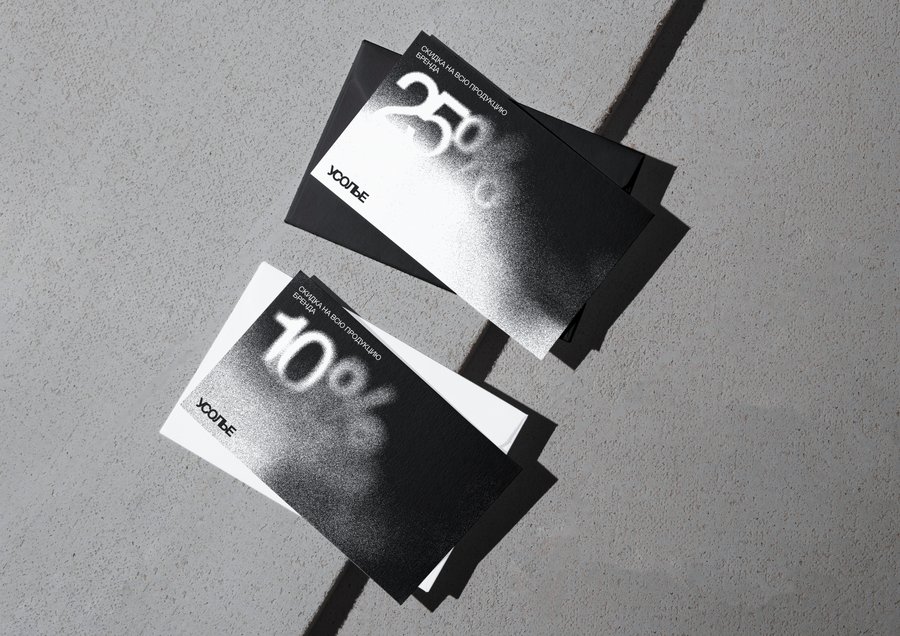
The concept is built around the process of boiling brine to extract salt. As the water evaporates, salt leaves behind distinctive marks and crystalline formations. These natural traces become the basis of the visual identity, transformed into graphic elements that evoke the landscapes, patterns, and cultural heritage of the Russian North.
By translating a traditional production process into contemporary graphic design, the identity connects the product to its origins. Salt becomes more than an ingredient—it becomes a way to explore the history and character of the region.
The Result
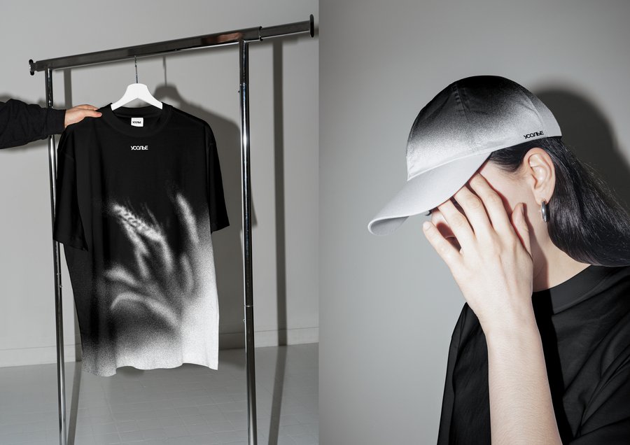
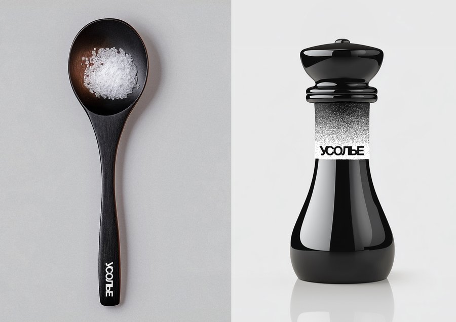
The final identity translates the salt-making process into a graphic system inspired by the natural traces of salt and the cultural character of the Russian North. The visual elements connect the product to its place of origin, creating a consistent identity across different brand applications.The project explores how the history and material qualities of a traditional product can become the foundation for contemporary visual communication.
The project received 2nd place at HSE Creative Open and a Silver award at the Sreda Festival.
02. hibi — Kintsugi Restoration Studio
The Problem
How can a visual identity communicate the philosophy of finding beauty in imperfection?
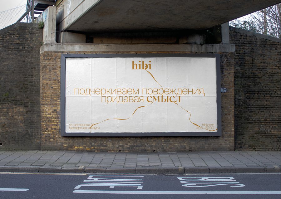
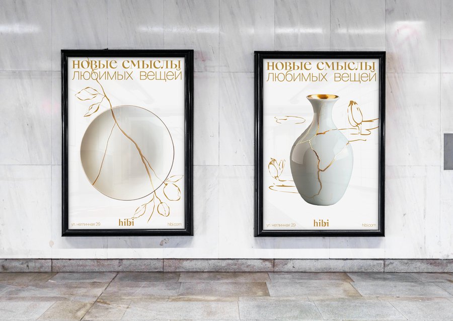
hibi is a studio that restores broken ceramics using the traditional Japanese technique of kintsugi, where cracks are repaired with lacquer and highlighted with gold. Beyond the craft itself, kintsugi represents a different perspective on damage—rather than hiding it, the technique incorporates it into an object’s history.The challenge was to express this philosophy through a visual identity without relying solely on familiar Japanese aesthetics or literal images of broken ceramics.The Concept
Finding Beauty in the Traces of Imperfection
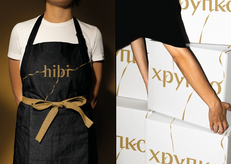
The concept draws on the philosophy of Kintsugi, where cracks are not concealed but become an essential part of an object’s appearance. The visual language explores the relationship between fragility and strength, damage and renewal, and the unique character that emerges through repair.Rather than treating imperfections as flaws, the identity presents them as meaningful details that give each object its individuality. This idea shapes the visual approach, connecting the physical process of restoration with a broader reflection on how we perceive imperfection in everyday life.The Result
The resulting identity translates the philosophy of kintsugi into a visual system for hibi. It reflects the studio’s approach to restoration, emphasizing individuality, the traces of repair, and the beauty of objects transformed by time.
The project explores how a traditional craft and its underlying philosophy can inform a contemporary brand identity, forging a connection between the restoration process and the studio’s core values.