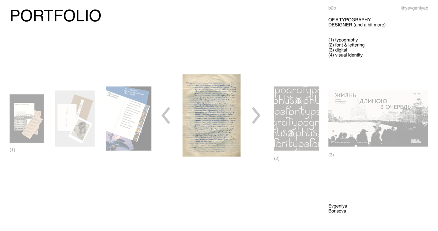
Selected Works by Evgeniya Borisova
Typography · Font · Digital · Visual Identity

Hello! I’m a graphic designer specializing in typography and editorial design. I focus on narratives that explore human experience, cultural context, and the quiet details of daily life. I enjoy turning abstract concepts into tangible objects—books, printed materials, and products. To me, design is about giving meaning a clear, physical form, not just making things look attractive.While books are my primary passion, my ability to organize heavy material and build a clear structure translates perfectly to brand identity and digital products. The medium changes, but the core logic remains the same.Tools: Adobe Creative Cloud, Figma, FontLab, Blender
I collaborate with art directors and creative teams who need a full-fledged partner, not just an executor. If you’re looking for a modern, conceptual approach—one free from dry academicism and superficial trends—I can help translate your complex ideas into a clear, compelling visual language that truly resonates with your target audience.
Meaning first, aesthetics second.
Design doesn’t start with a layout; it starts with understanding. My goal is to be your partner for the full cycle, from deep research to the final visual system.
01. Understand & Research
I dive into the story, its cultural context, and the intended audience. I need to feel the material before I can design it.
02. Find the Idea & Structure
I look for visual connections and build a clear, conceptual narrative. No empty metaphors—just a strong idea that works.
03. Bring it to Life
I develop the concept through typography, layout, and structure. Whether it’s a book or a brand identity, the system must be functional, cohesive, and emotionally resonant.
(01) TYPOGRAPHY
Punched Cards: Between Human and Machine
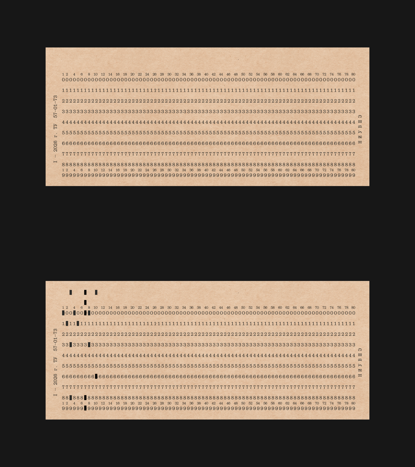
Typography · Calendar · Font Specimen · Print
The Problem Monospaced fonts are historically linked to machines, code, and the stark aesthetics of typewriters and early computers. The task was to introduce Even Mono—a typeface that merges a strict technical rhythm with the elegance of a classical serif. The challenge was to avoid the appearance of a dry, technical manual and instead reveal the human dimension within a machine-born typeface.
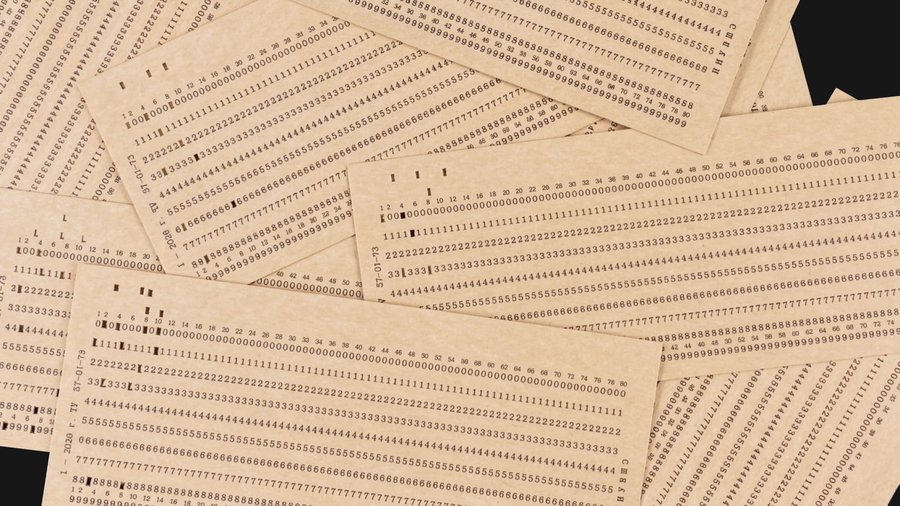
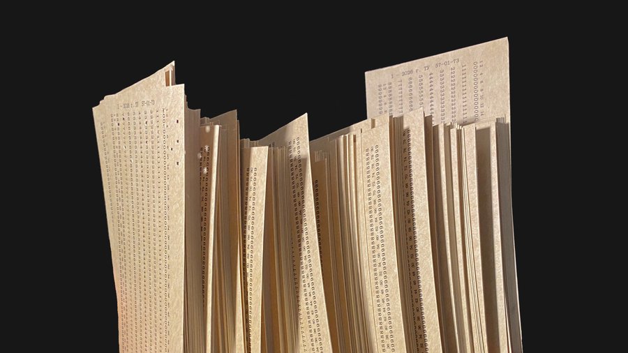
The Idea The concept is drawn from the punch card—an artifact that mirrors the transition from paper data carriers to electronics. It represents the precise intersection where human labor meets machine processing. Much like a punch card, Even Mono balances technical precision with warm, humanistic proportions.
The Solution A calendar specimen comprised of 365 physical punch cards. The project also includes a user manual and a custom coding system based on the IBM/360 standard, adapted for Cyrillic. The design emphasizes the font’s technical details—such as compensating serifs and an extended glyph set. Users interact with the format, transforming data reading into a tactile experience. Strict grids and tables ensure the information remains clear and readable.
Soviet Animation 1970–1990
The Gosteleradiofond Collection
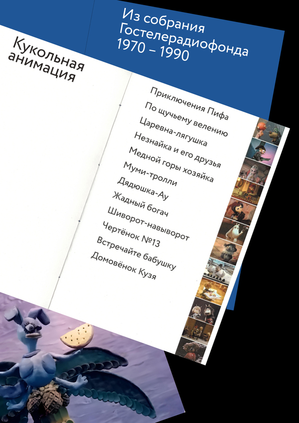
Editorial Design · Cultural Heritage · Book Layout
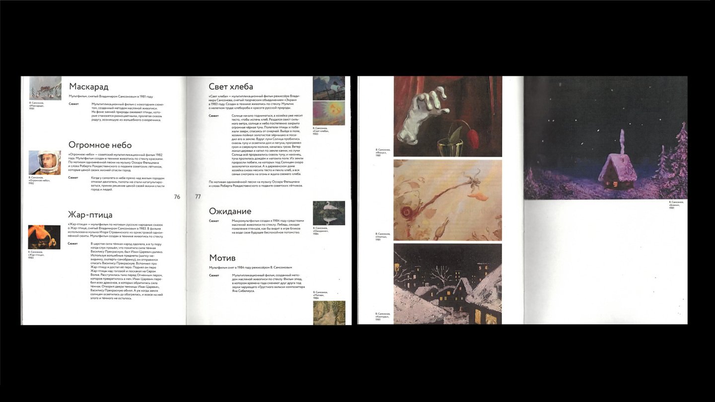
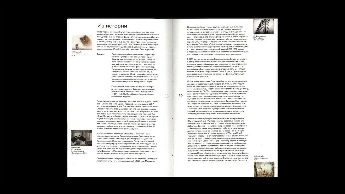
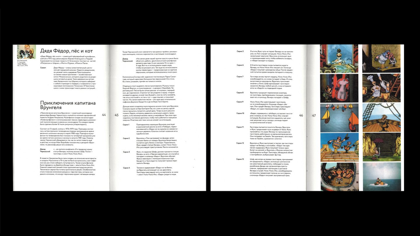
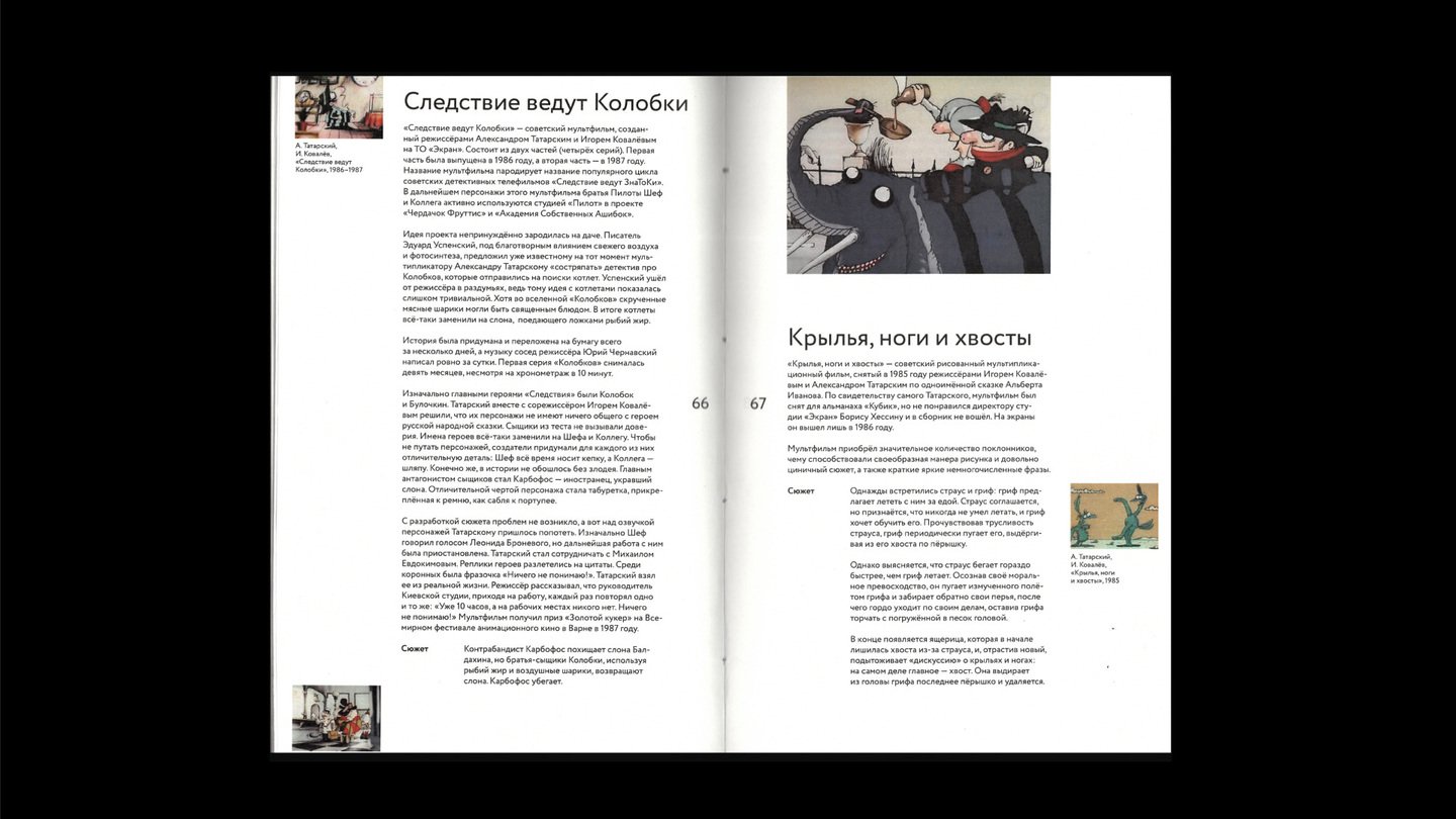
The Problem Soviet animation from the 1970s and 1990s constitutes an important piece of cultural heritage, yet many of these films remain forgotten or unknown to contemporary audiences. The challenge was to create a book that highlights these works, evokes nostalgia, and showcases the diversity of their artistic techniques.
The Idea Rather than presenting a simple chronological listing, the book is organized into five chapters, categorized by physical animation techniques: puppet, clay, cutout, drawn, and glass painting. Each chapter details a specific method and features examples from the archival films. This framework allows the reader to look «behind the scenes» of Soviet animation, transforming the collection into a tactile and resonant experience.
The Solution The book format is based on the standard 3:4 film frame ratio. The main grid mimics a 35 mm film strip, with sequential animation frames placed along the outer edges of the pages. To evoke the cinematic experience, the main text is centered like movie credits, while technical information is organized in a clear tabular layout for easy reading.
Stolen Memory
Catalog for the Arolsen Archives Exhibition
Editorial Design · Exhibition Catalog · Cultural Heritage
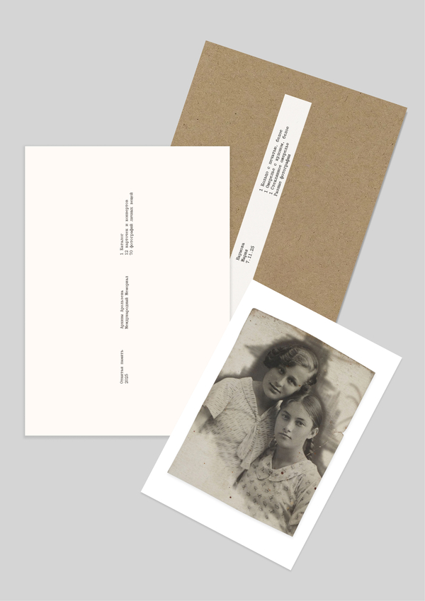
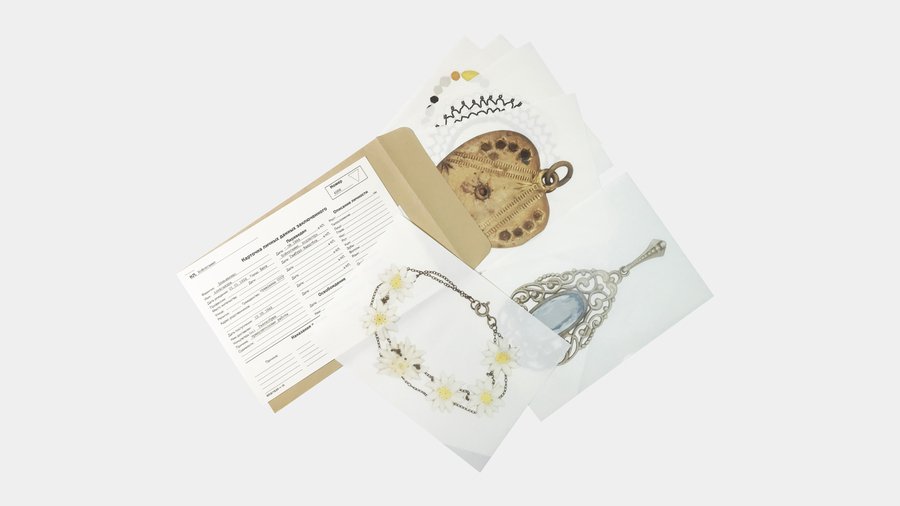
The Problem During World War II, millions of Soviet citizens were forced into labor in Nazi Germany. Upon registration, all personal belongings—photos, letters, and jewelry—were confiscated to strip people of their past and reduce them to nameless units. The exhibition and catalog present the stories of twelve Soviet prisoners and a campaign to locate their descendants. The primary objective is to return these personal artifacts to their families.
The Idea I intentionally deviated from the standard museum «display window» format. The goal was to convey a sense of archaism, the passage of time, and to bring the viewer closer to the feeling of fragile human life, rather than merely presenting historical facts. The exhibition space itself was chosen to reflect this character.
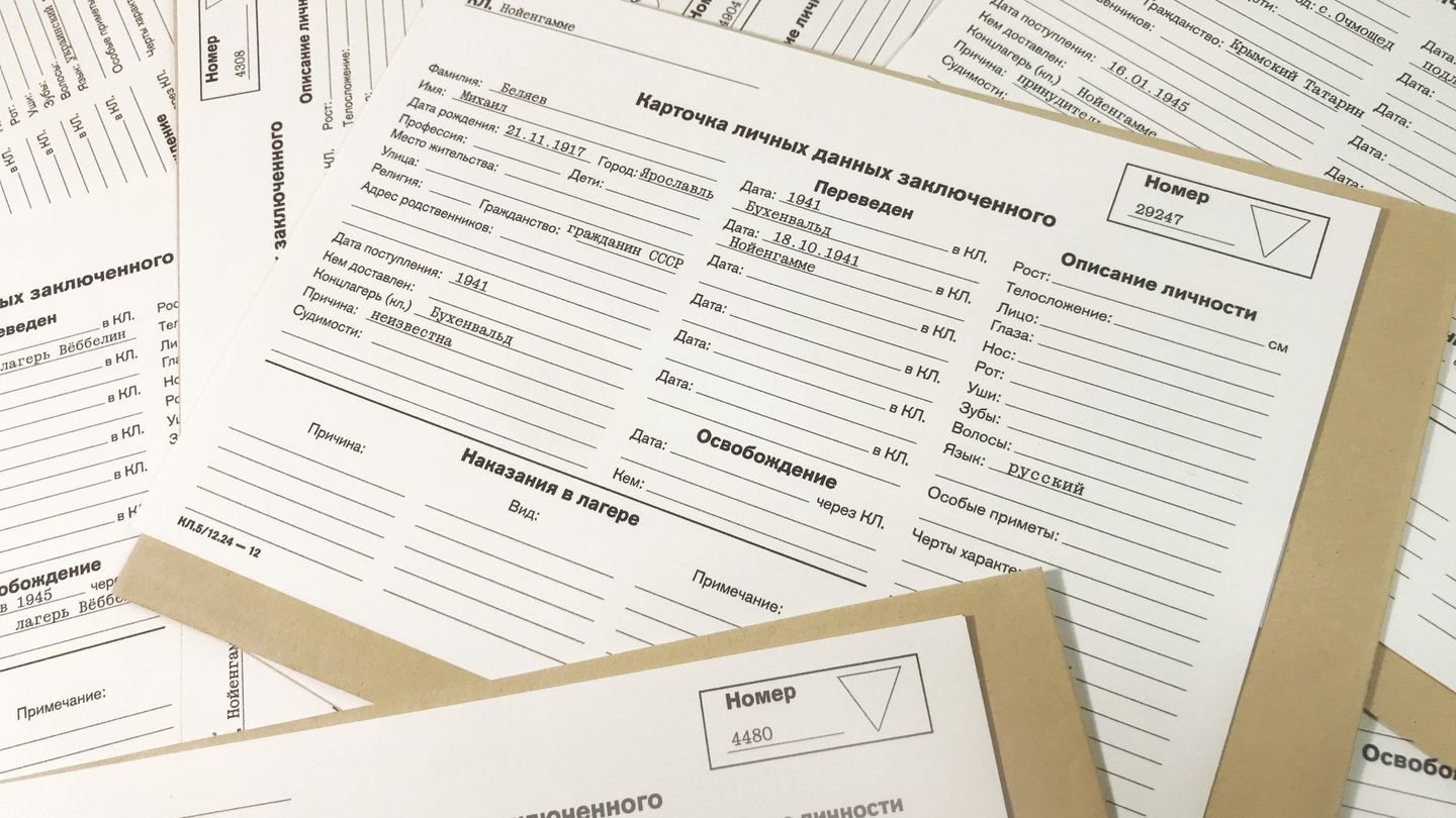
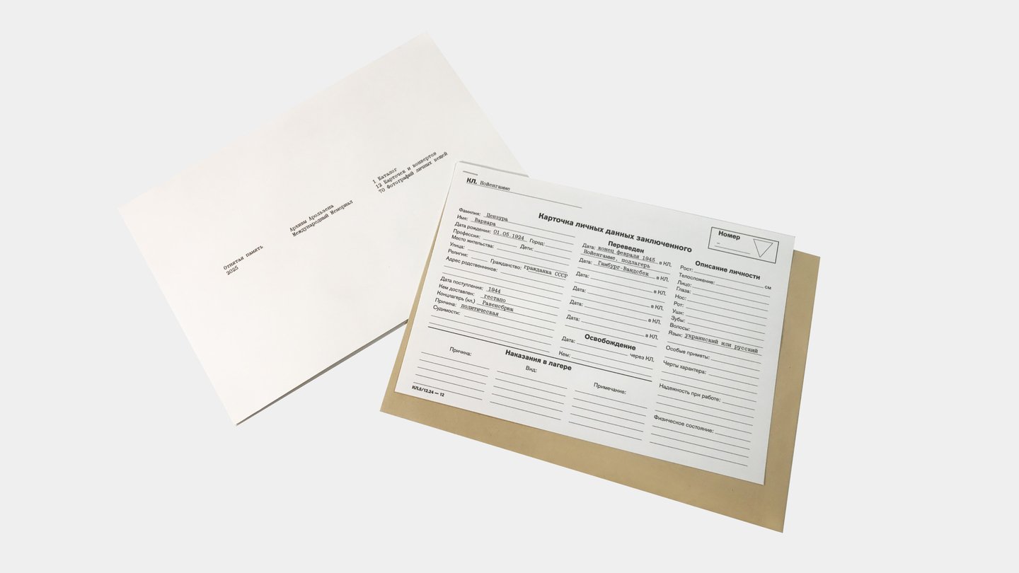
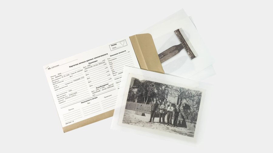
The Solution The edition includes a catalog, a personal card, and an envelope containing an artifact. The layout is based on the logic of a registration card: one main column for essential information and three columns at the bottom for additional details.
Through the Pacific Book design for the Kon-Tiki expeditions
Editorial Design · Book Layout · Visual Storytelling
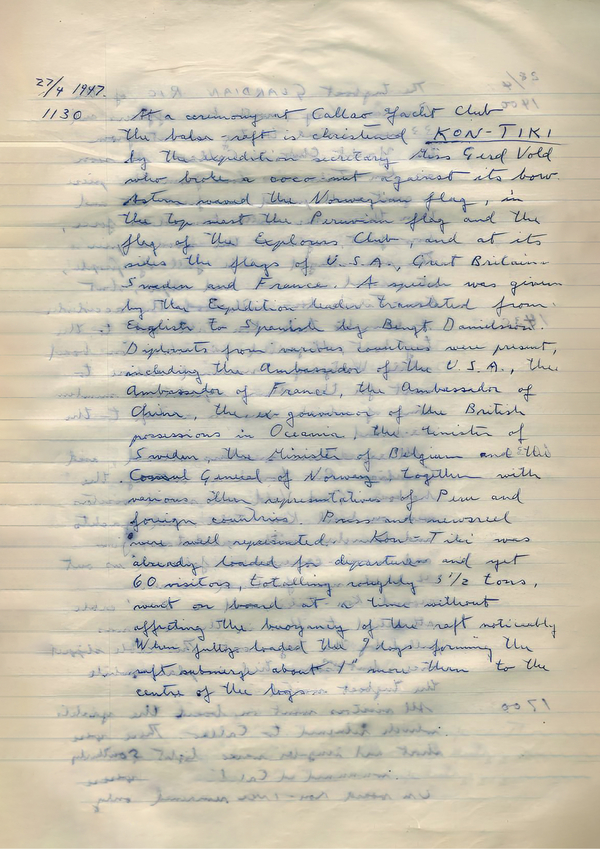
The Problem The book explores the mystery of Polynesia’s settlement. In 1947, Thor Heyerdahl crossed the ocean on a balsa raft (Kon-Tiki) to prove a migration theory. Almost 70 years later, Torgeir Higraff repeated the journey (Kon-Tiki II) as a scientific mission to study climate change and plastic pollution. The challenge was to connect these two expeditions across time without making the book a dry geographical report or simply a heroic adventure story.
The Idea The main goal was to demonstrate that even in extreme survival conditions, there is room for ordinary human life—such as sharing chocolate or drying clothes. Rather than focusing solely on the grand scale of the ocean, the book highlights the everyday reality of the crews. It merges the documentary history of the first voyage with the modern scientific data of the second, striking a balance between the romantic past and the analytical present.