Good design looks different—
Great design makes a difference.
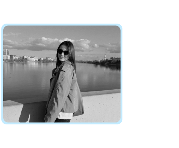
Hi, I’m Elmira!I’m a graphic designer who works with brands, identities, and visual communication.I believe that strong design starts with understanding what makes a brand unique. I enjoy exploring unexpected ideas, experimenting with typography and visual forms, and finding creative solutions to communication challenges.My goal is to create identities that are visually distinctive, thoughtfully designed, and effective in the real world.
MY APPROACH: Creative thinking. Clear purpose. Distinctive results.
01 / UNDERSTANDI explore the brand’s goals, audience, and context to identify the challenges and opportunities inherent in the project.02 / EXPERIMENTI search for unexpected connections, explore visual directions, and develop a concept that imbues the design with its own distinct character.03 / TRANSFORMI translate the concept into a flexible visual system that communicates clearly and performs effectively across diverse formats.
CASE 01 — OKROSHKA FEST
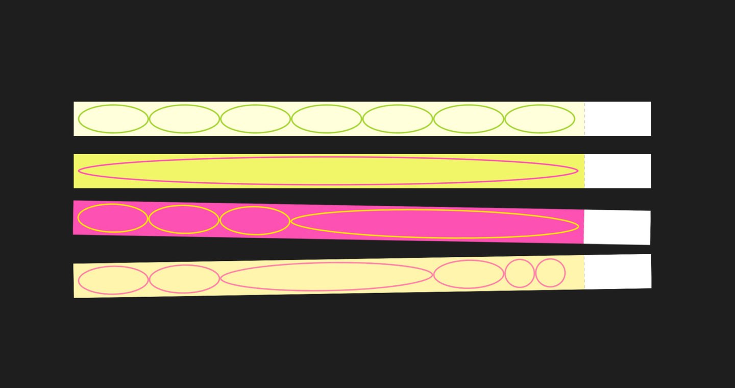
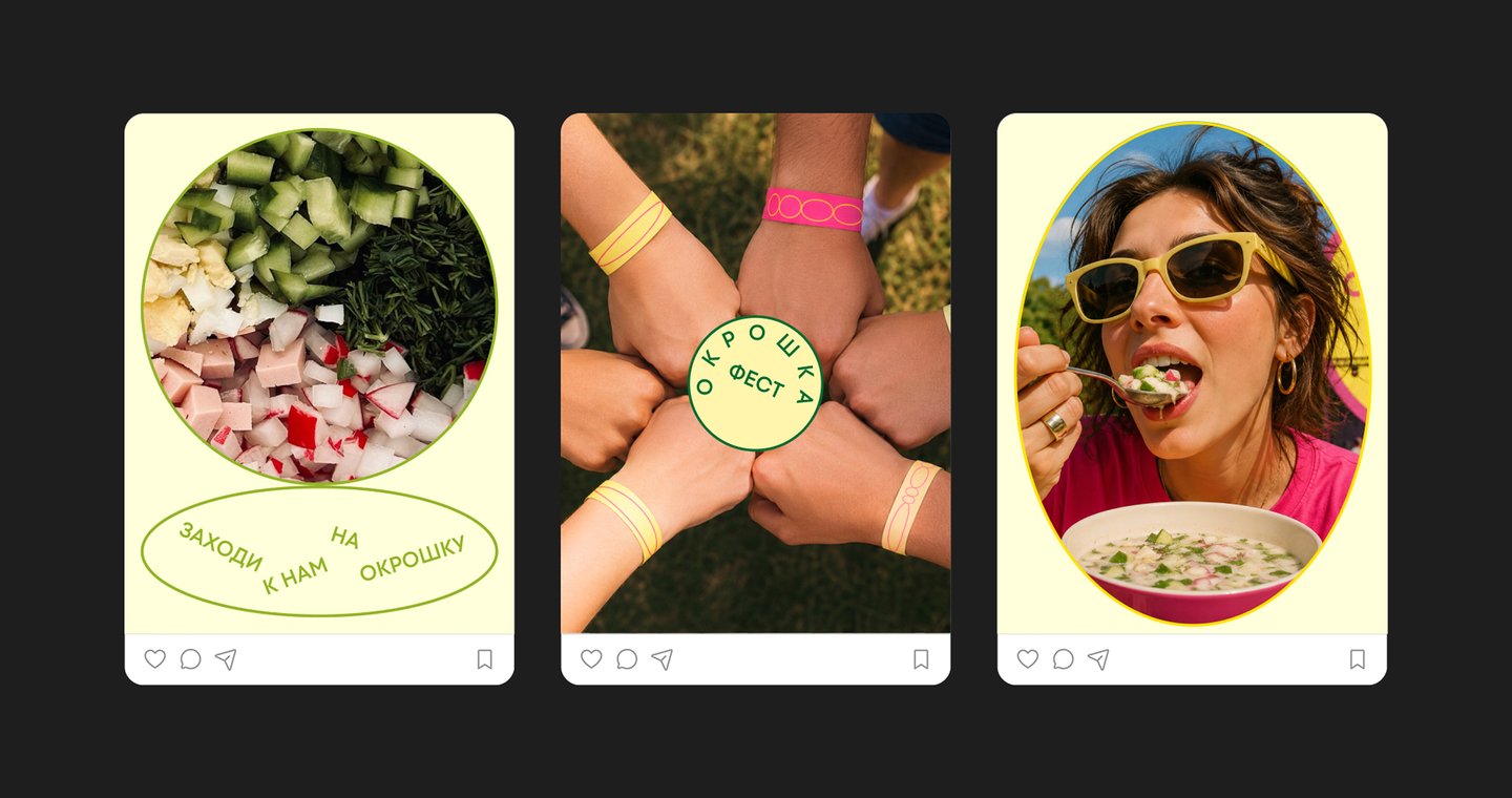
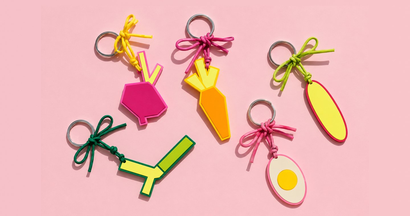
CONTEXT & CHALLENGEOkroshka Fest is a food festival dedicated to one of the most recognizable dishes of Russian summer cuisine. The challenge was to develop a bold and memorable visual identity that captures the playful atmosphere of the event and works across all festival materials.CONCEPTThe identity transforms the familiar shape of a plate into a flexible graphic element. Bright colors, oval compositions, and expressive typography create a playful visual language inspired by summer, food, and shared experiences.
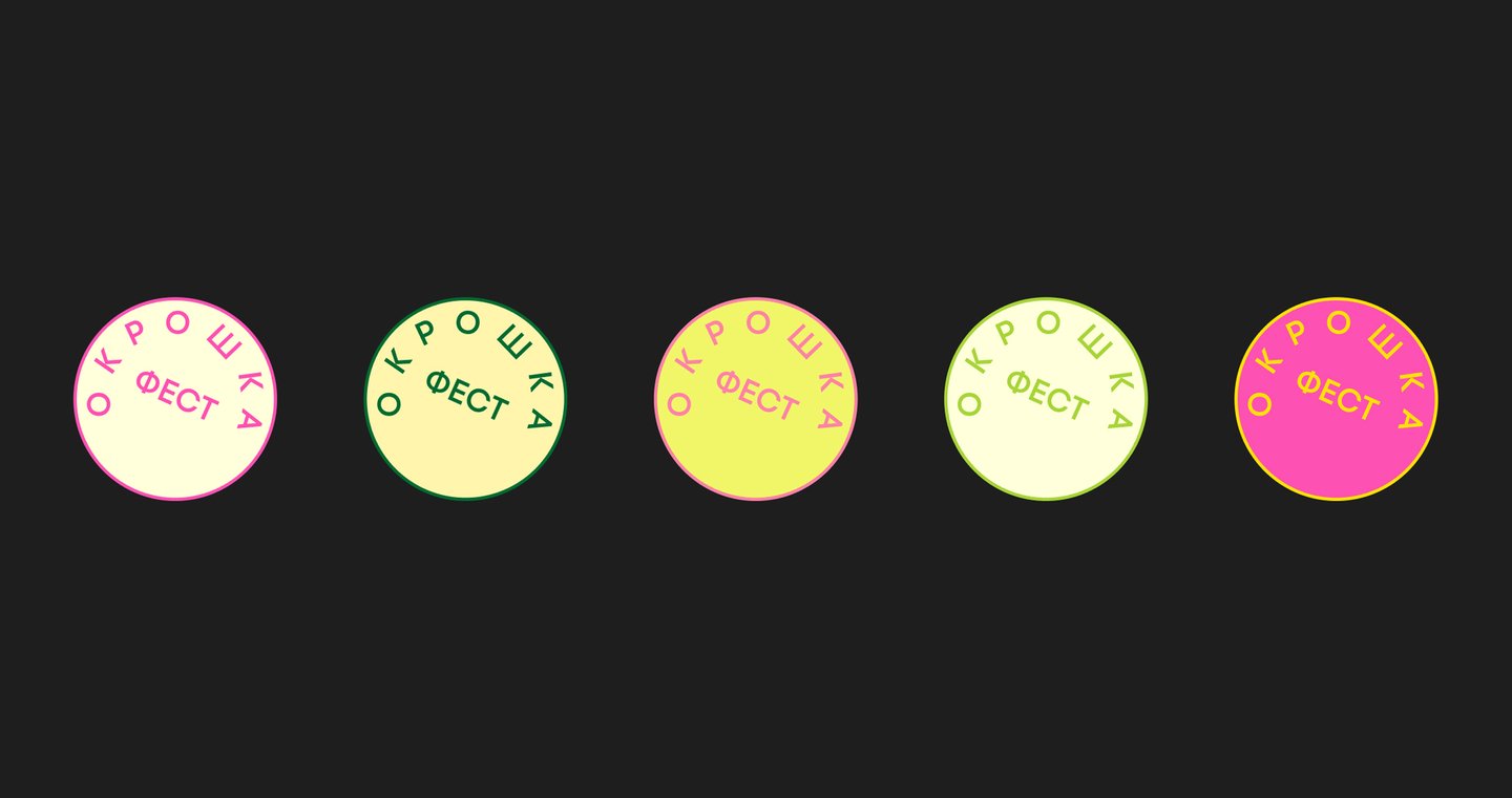
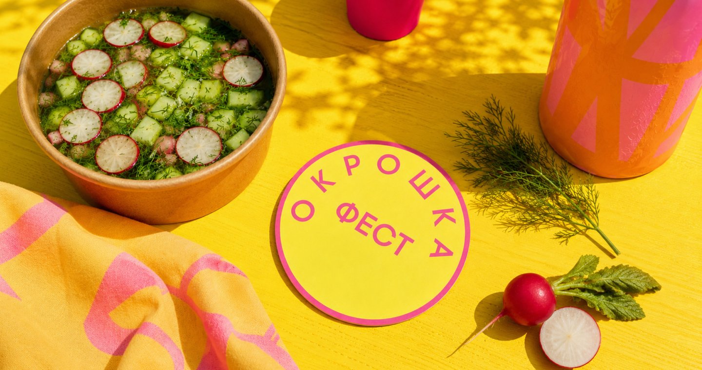
APPLICATIONS & OUTCOMEThe visual system extends across printed materials, tickets, accessories, and festival merchandise. Its adaptable graphic elements create a consistent identity while allowing each application to have its own composition.
CASE 02 — MON
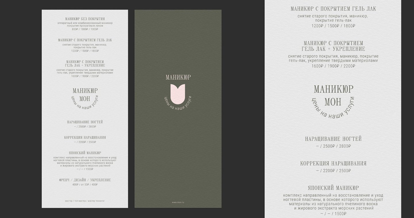
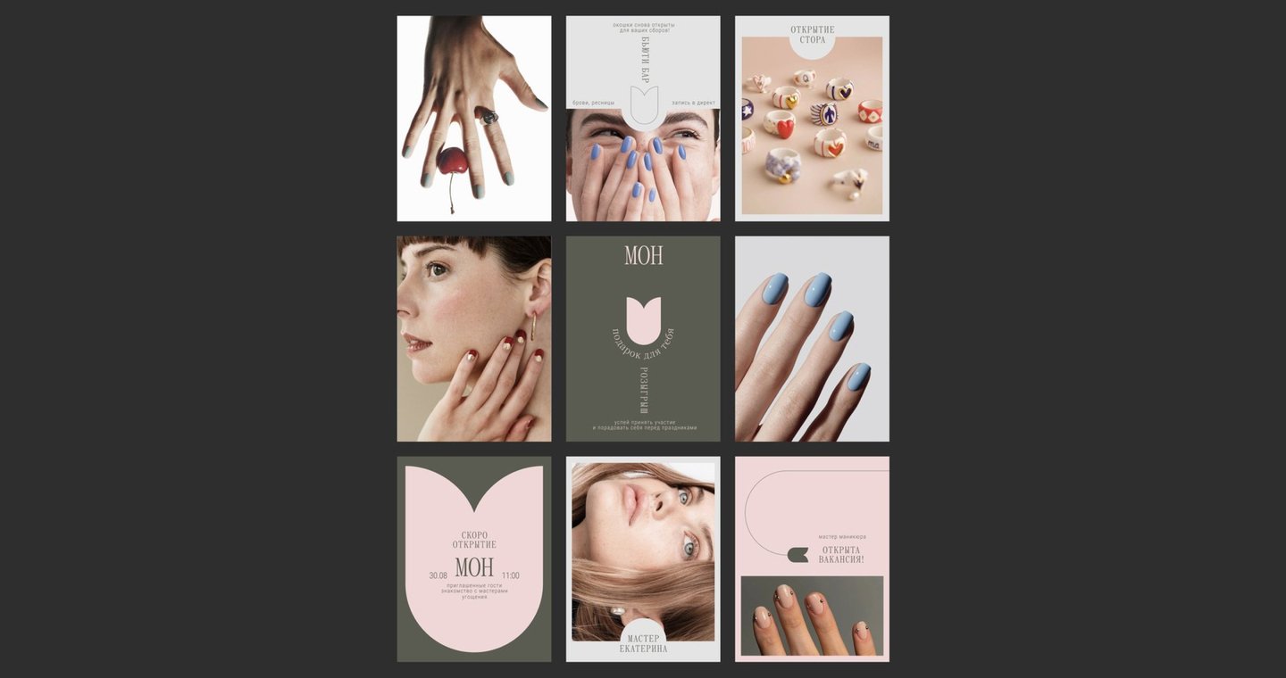
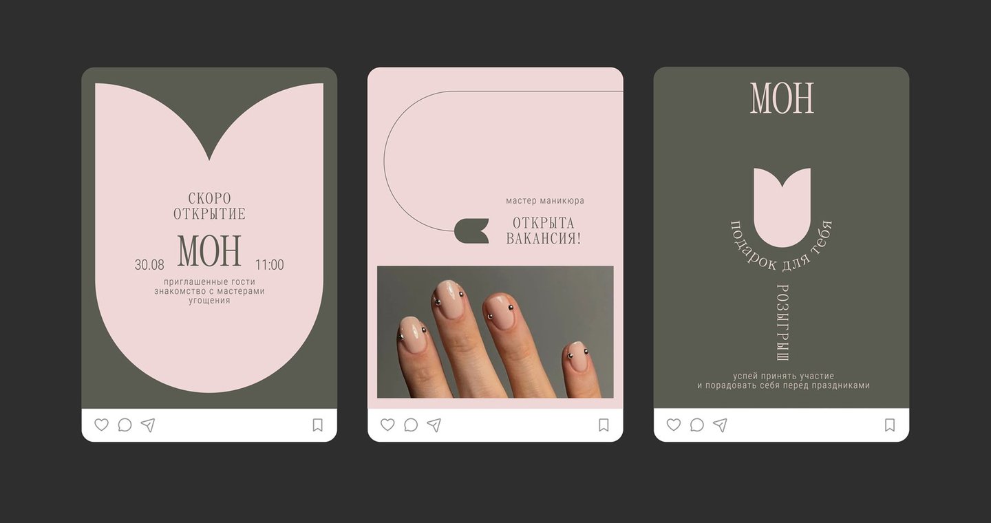
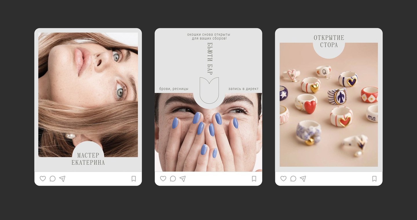
CONTEXT & CHALLENGEMON is a beauty salon centered on personal care and providing a comfortable, unhurried experience. The challenge was to develop a visual identity that communicates a sense of calm, individuality, and meticulous attention to detail.CONCEPTThe identity is built around the idea of taking time for oneself. Delicate typography, restrained color palettes, and subtle floral motifs create a visual language that feels personal and understated.
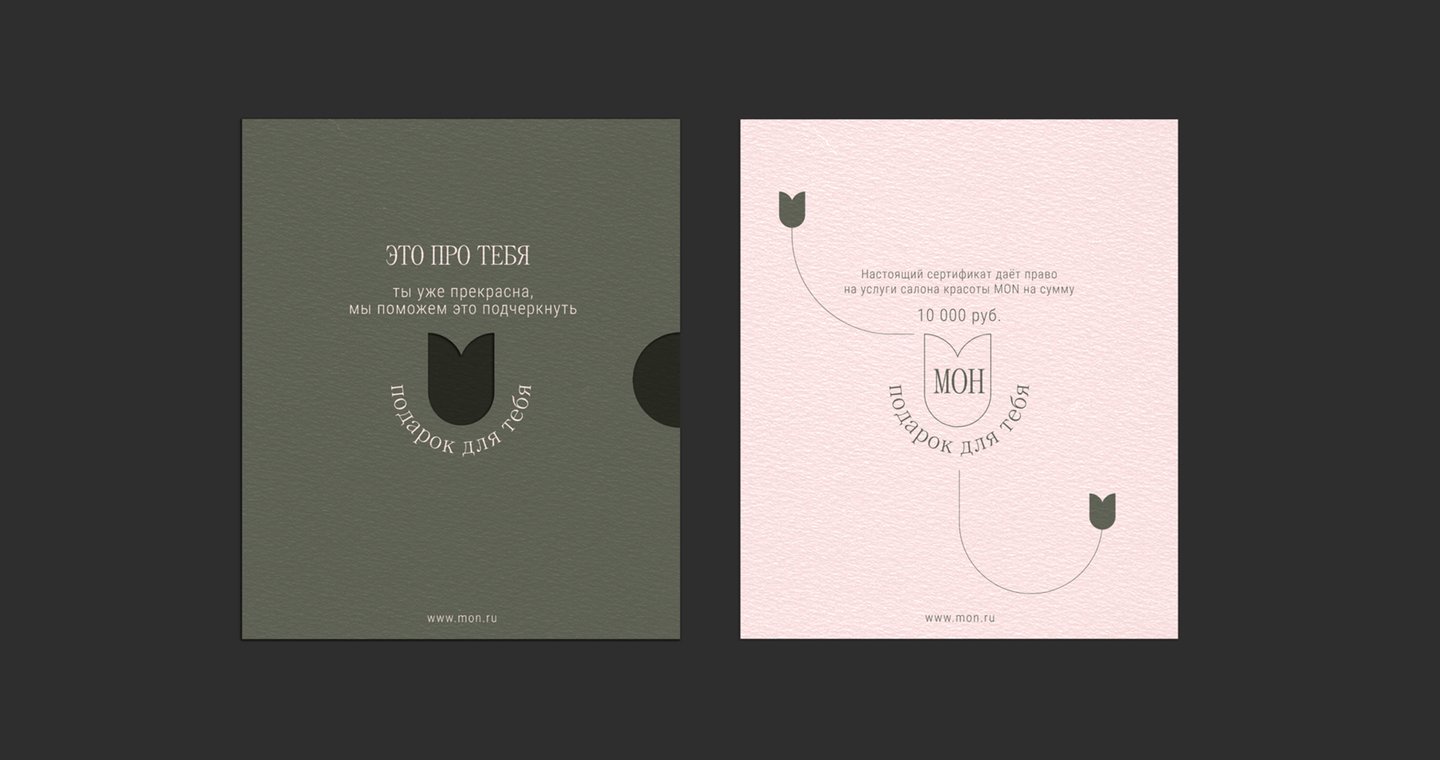
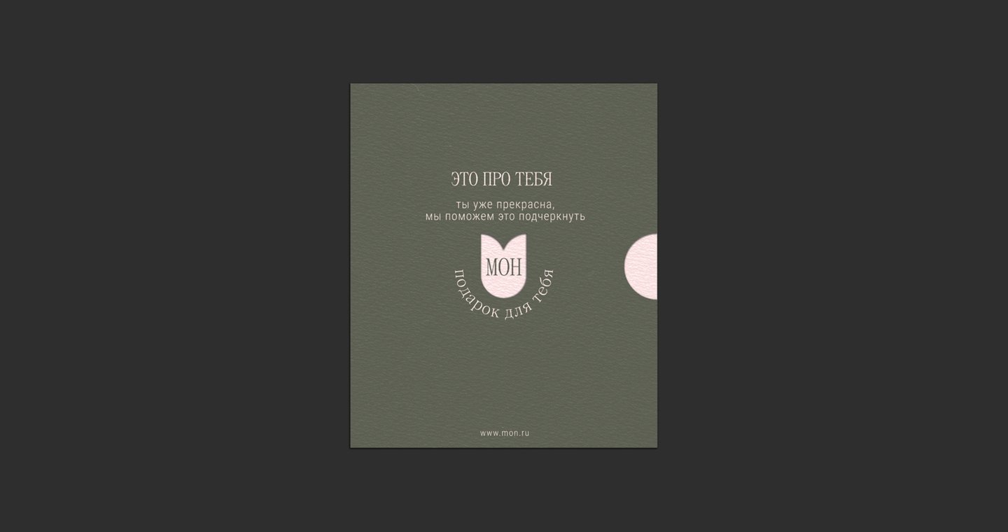
APPLICATIONS & OUTCOMEThe identity was developed across signage, printed materials, service cards, and social media. Together, these elements establish a consistent visual atmosphere that supports the salon’s positioning and customer experience.
CASE 03 — LOVA CATERING
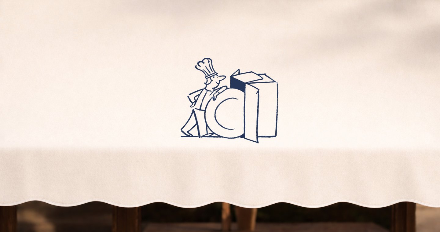
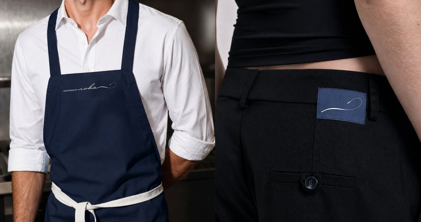
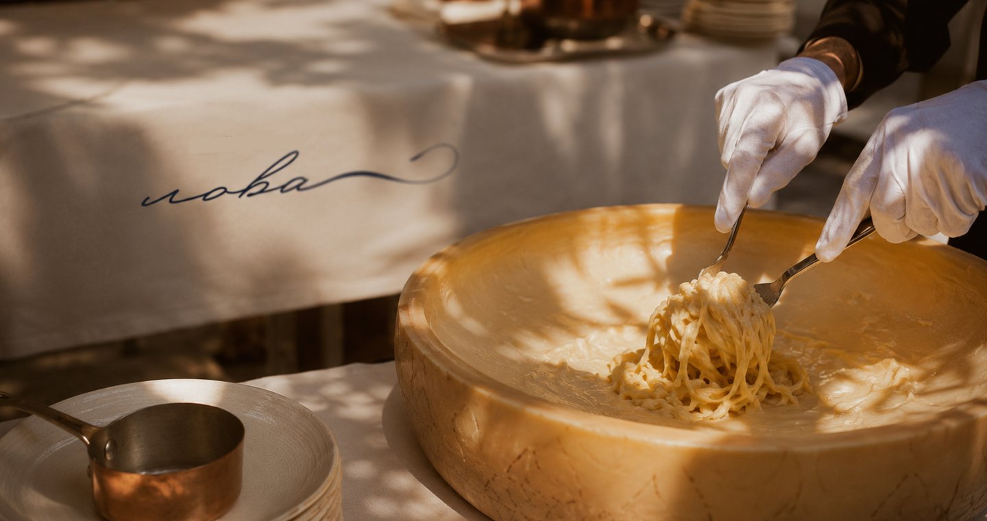
CONTEXT & CHALLENGELova is a catering brand that delivers thoughtful food and service for various occasions. The objective was to create a visual identity that communicates warmth, professionalism, and meticulous attention to every event’s details.CONCEPTThe concept draws inspiration from the idea that care is expressed through small gestures. Flowing handwritten typography introduces a personal touch, while a restrained color palette and clean typography balance warmth with elegance.
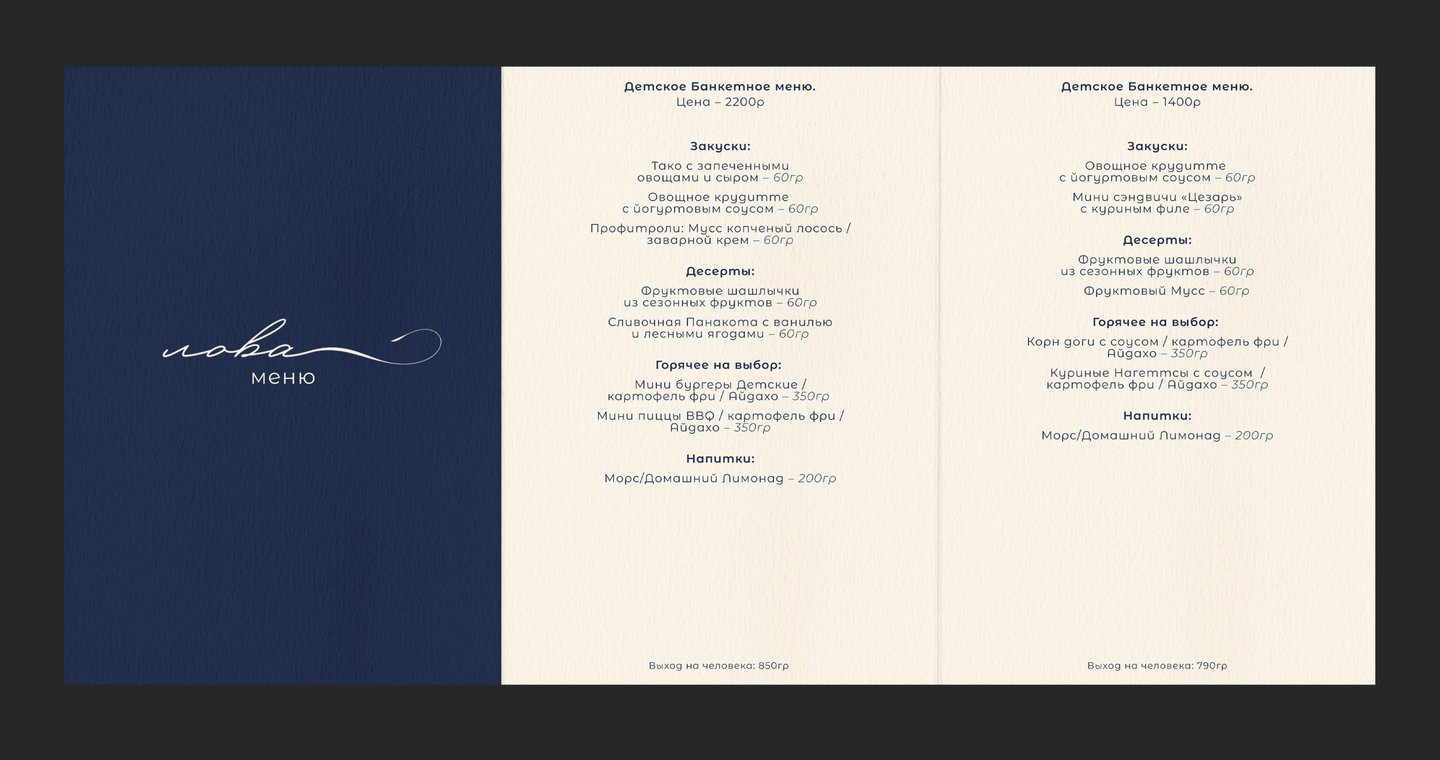
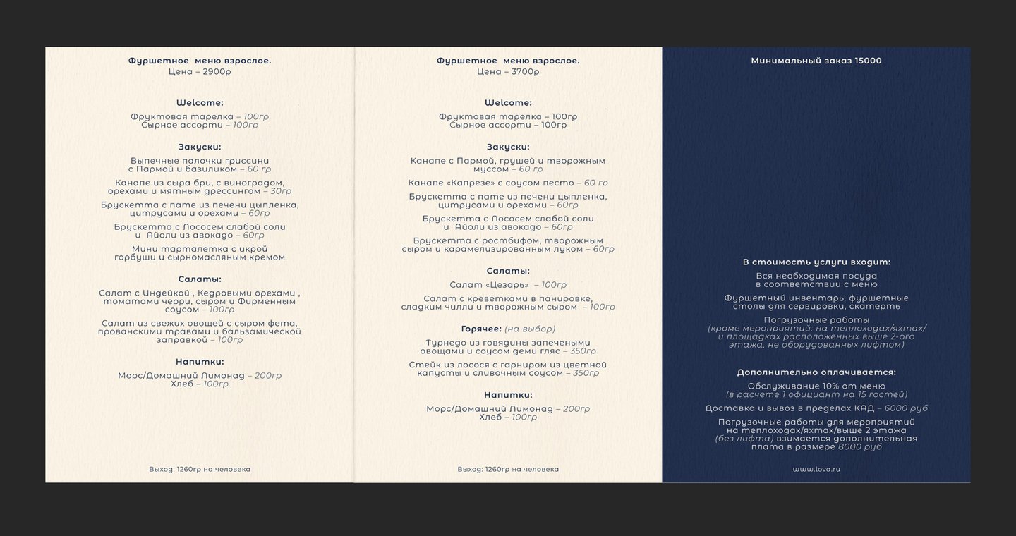
APPLICATIONS & OUTCOMEThe visual identity was applied to menus, staff uniforms, printed materials, and outdoor communications. The result is a cohesive system that maintains a recognizable brand character across various customer touchpoints.
CASE 04 — EIDOS
CONTEXT & CHALLENGEEidos is a marketing agency working with businesses in European markets. The project focused on rethinking its visual communication to establish a clearer, more consistent, and professional brand presence.CONCEPTThe visual direction combines structured editorial layouts with expressive typography and a restrained color palette. Geometric elements and carefully selected imagery create a flexible system that communicates expertise while maintaining a distinctive character.