designing the rhythm of reading
I give narratives a second life through my independent interpretations, crafting a typographic form that invites readers to engage with the text not just on a narrative level, but through a deeper, non-verbal visual experience. I am eager to collaborate on socially engaged and culturally relevant publishing projects with independent cultural institutions and publishing houses.

Hello, I’m Valentina! Book & Communication DesignerI direct books as complete visual experiences, shaping complex content into thoughtful structures through typography, rhythm, and layout. I’m interested in independent publishing, cultural research, and socially engaged projects. A 4th-year design student at HSE, based in Saint Petersburg, open to collaborations with independent publishers and cultural institutions.Experience 1. «Light Night Gatchina» (2024) Layout of labels for exhibits and art objects 2. «Russian Creativity Week» (2025) Developing place branding for a cultural institution, and creating typographic posters for events 3. «Wind Force» (2026–present) Website layout, creative development, storytellingEducation Higher School of Economics «Communication Design» Bachelor’s degree program (2027)Skills Hard skills Adobe InDesign Adobe Illustrator Adobe Photoshop Adobe Lightroom Figma Tilda HTML Ai Soft skills Responsibility Time Management Communication Skills Teamwork Creativity Visual Literacy (well-developed visual sense) Working with SourcesAchievements DAFES finalist (2025) Participant in the «Pereplet» («Binding») and «Everything, Everywhere, All at Once» book exhibitions (2026)Contact Information inst: @val062k tg: @BalyaKlimova personal email: vallaklimova062@gmail.com corporate email: vaalklimova@edu.hse.ru
cases
[1] The play «Forget Herostratus!» (2026) — experimental typography
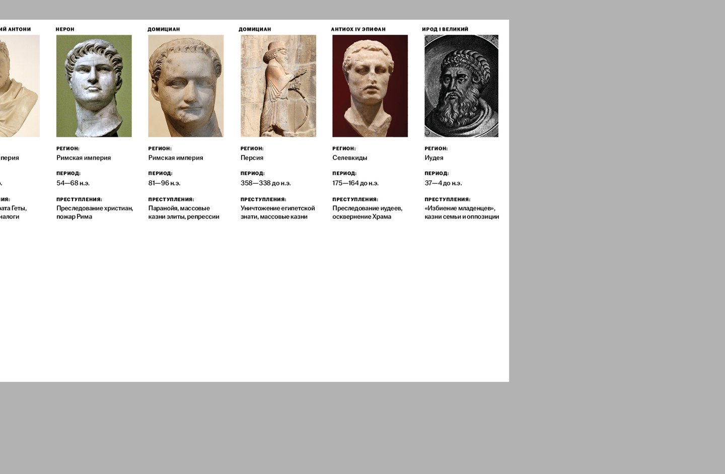
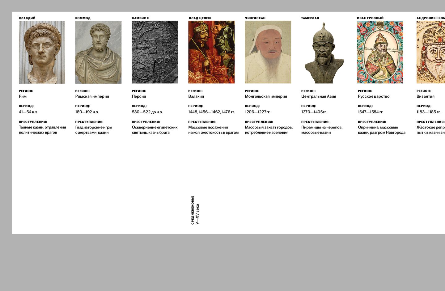
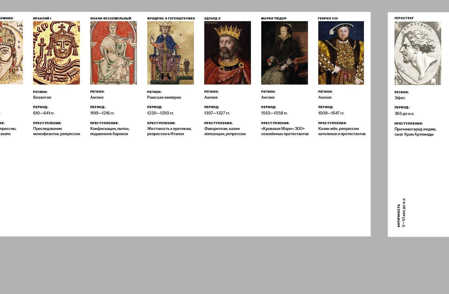
task: Enhance the plot with experimental typography. solution: Partition the play into two levels of perception—superficial and deep—separated by a double-directional line. Supplement the play’s text with a critical article and a list of «Herostatrates"—those powerful individuals who have harmed society.
Concept Plot «…Forget Herostrat!» is Gregory Gorin’s tragicomedy about a vain merchant from Ephesus who burned the Temple of Artemis for glory in the 4th century BC. The plot centers on a trial: Herostrath attempts to immortalize his name by manipulating society, while Judge Cleon tries to condemn him but falls into the trap of becoming a notorious figure for his own actions.Two Levels of Perception — The conflict between good and evil—one of the foundations that conveys myths and stories that have become nearly mythical over centuries. This involves a clash of polar characters—the archon Cleon and Herostrath—who cause people suffering. — A critique of the distribution of power, and more broadly, of those in positions of authority. This includes the methods by which they attain power and their relationship with the populace. The scope of the crimes.First Level of Perception In the play, characters with distinctly characteristic traits are given specific typographical details, depending on their stance and level of influence. Thus, the play coalesces in a thoroughly organic manner, emphasizing character traits and creating a unique, dynamic visual structure of conflict. Furthermore, as the play progresses, hints emerge toward the second level of perception—Herostrat’s likeness is equated with historical personalities, evolving from a minimal presence at the beginning to a more numerous representation by the end.Second Level of Perception The name «Herostrat» becomes de-personalized. The narrative is cyclical; the events of the play have been repeated countless times throughout world history—dictators, brigands, cruel, and unprincipled individuals can be found in history textbooks thousands of times, dating back to 365 BC, and continuing through 1972 and current events. The book contains figures that are recognizable, though not entirely Herostrat-like, but they appear at the conclusion of the gallery.
In the process of working on the project, and following the concept of duality in the work, the task was solved by separating two types of text—each meant to be clearly readable regardless of the page orientation. Therefore, two columns with generous spacing were introduced into the critical article, which lay horizontally in the book, to maintain readability. The main text, however, presented no readability issues in its current format.
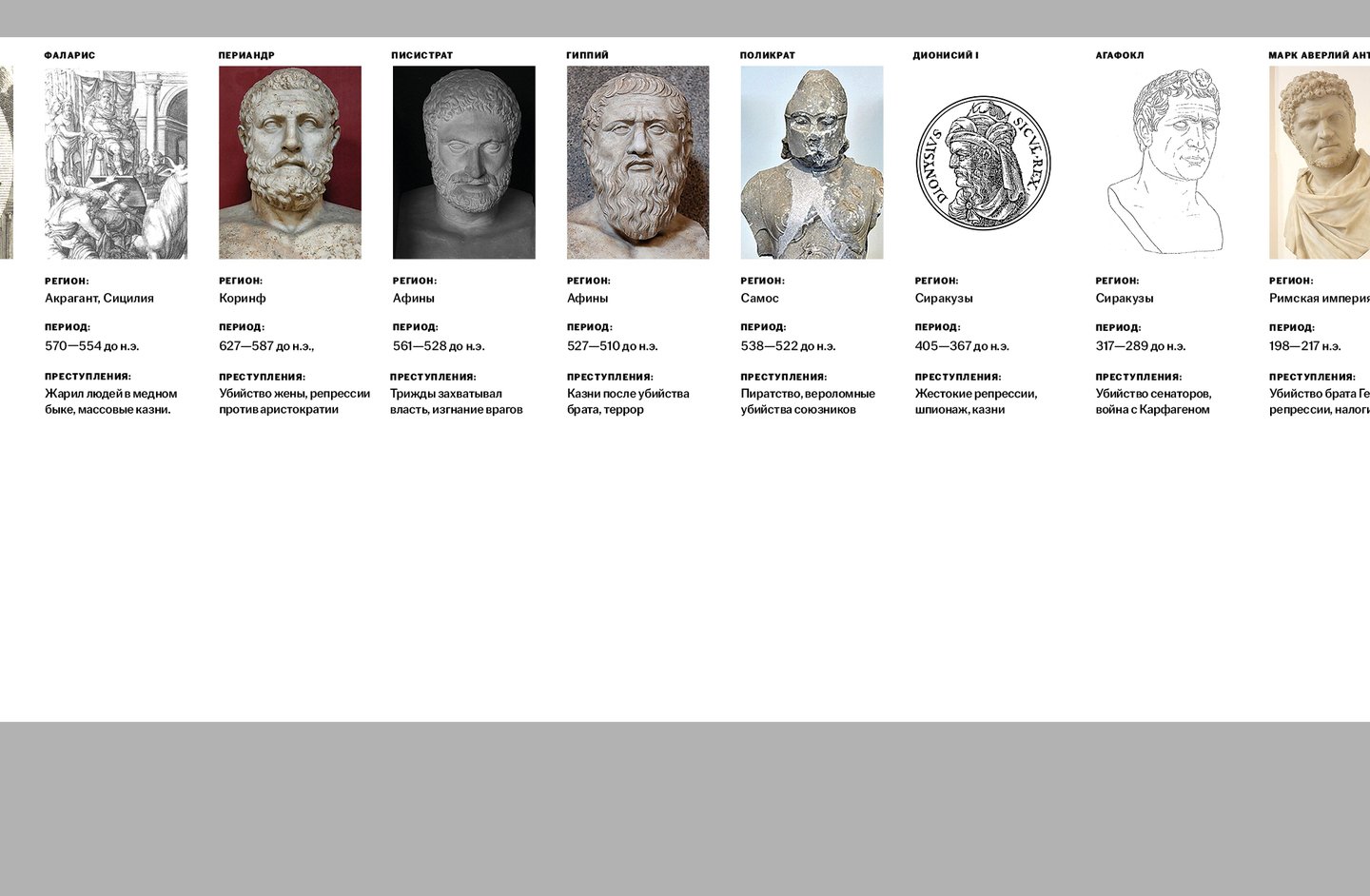
view the entire project
[2] Exhibition catalog «Kharms. Life Is No Magic Trick» (2025) — catalog


task: To develop a catalog for the exhibition «Kharms: Life Out of Focus» at the Anna Akhmatova Museum. solution: Since the exhibition presented the life and work of Daniil Kharms and the OBERIU poets without focusing on the brutality they ultimately faced, the catalog was designed to reflect a light, non-oppressive perspective on their lives. It features the exhibition’s exhibits, accompanied by the full, verbatim texts from the exhibition’s guided tours. The publication also includes archival manuscripts that were on display.
Concept: The exhibition is dedicated to the early 20th-century Russian poet Daniil Kharms and his associates—the poets of the OBERIU group. The catalog features the exhibition’s featured items, curatorial commentary, a guide to the exhibition space, and the OBERIU manifesto. The publication is further enriched by the inclusion of archival manuscripts by Daniil Kharms. To evoke the radical spirit of the OBERIU poets, the catalog utilizes narrow margins and imagery related to the execution of their «elimination» (or «knock-out») tasks. Furthermore, the use of slanted text for quotes and headings helps convey Kharms’s rebellious spirit against the stark, gray reality of the early 20th century.
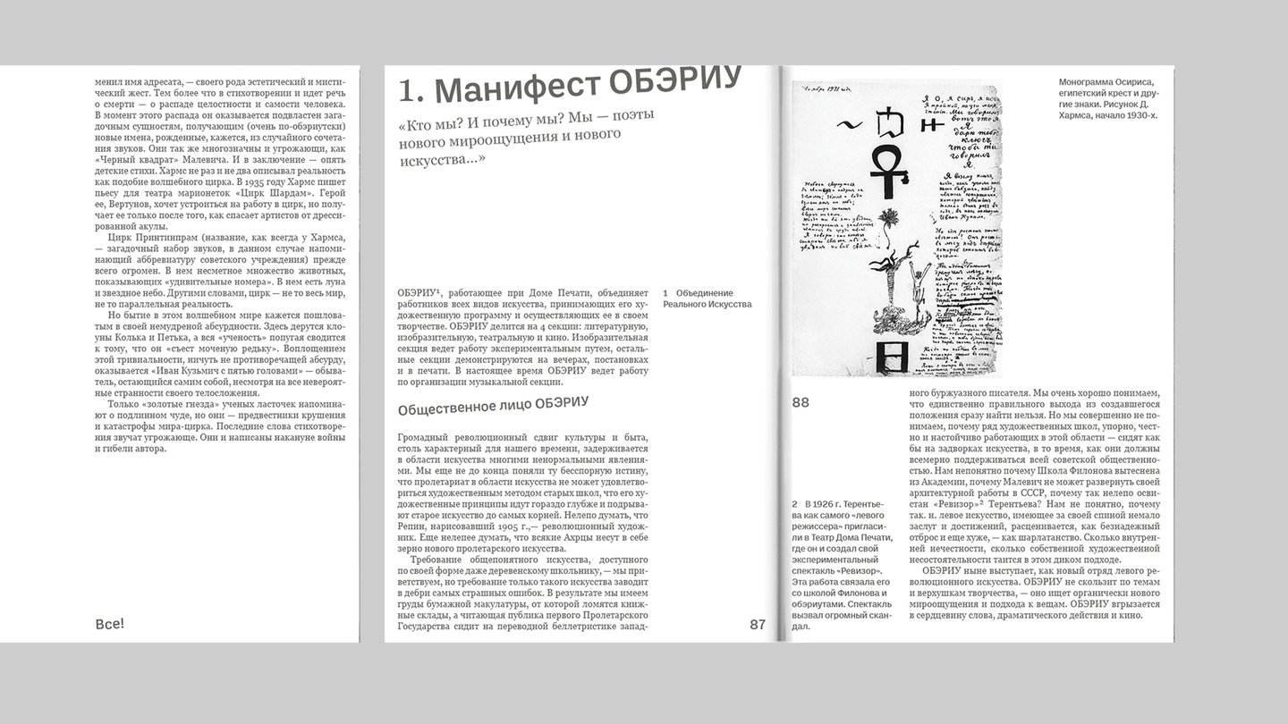
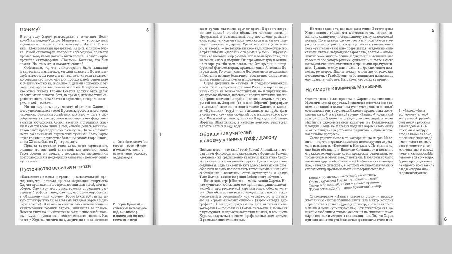
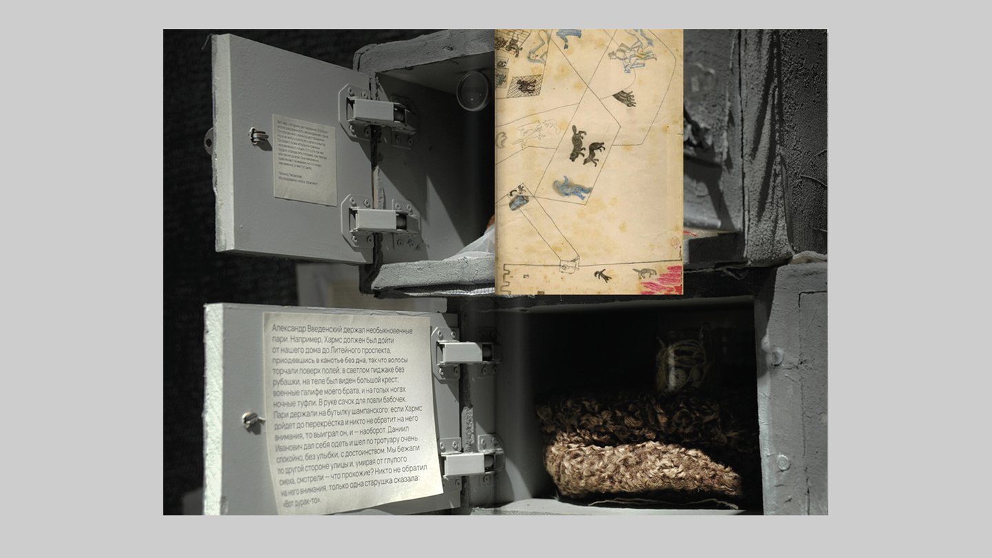
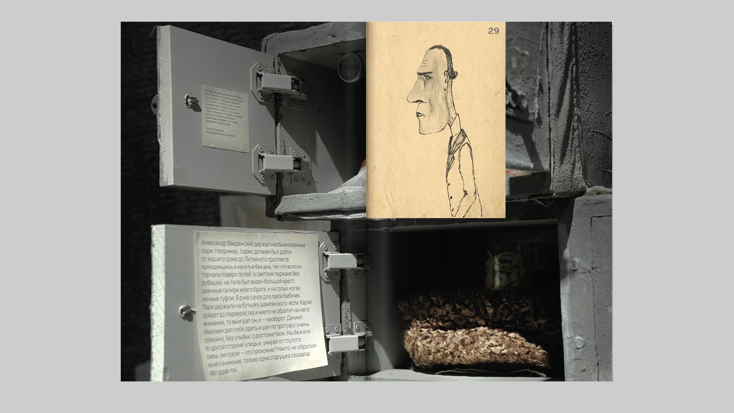
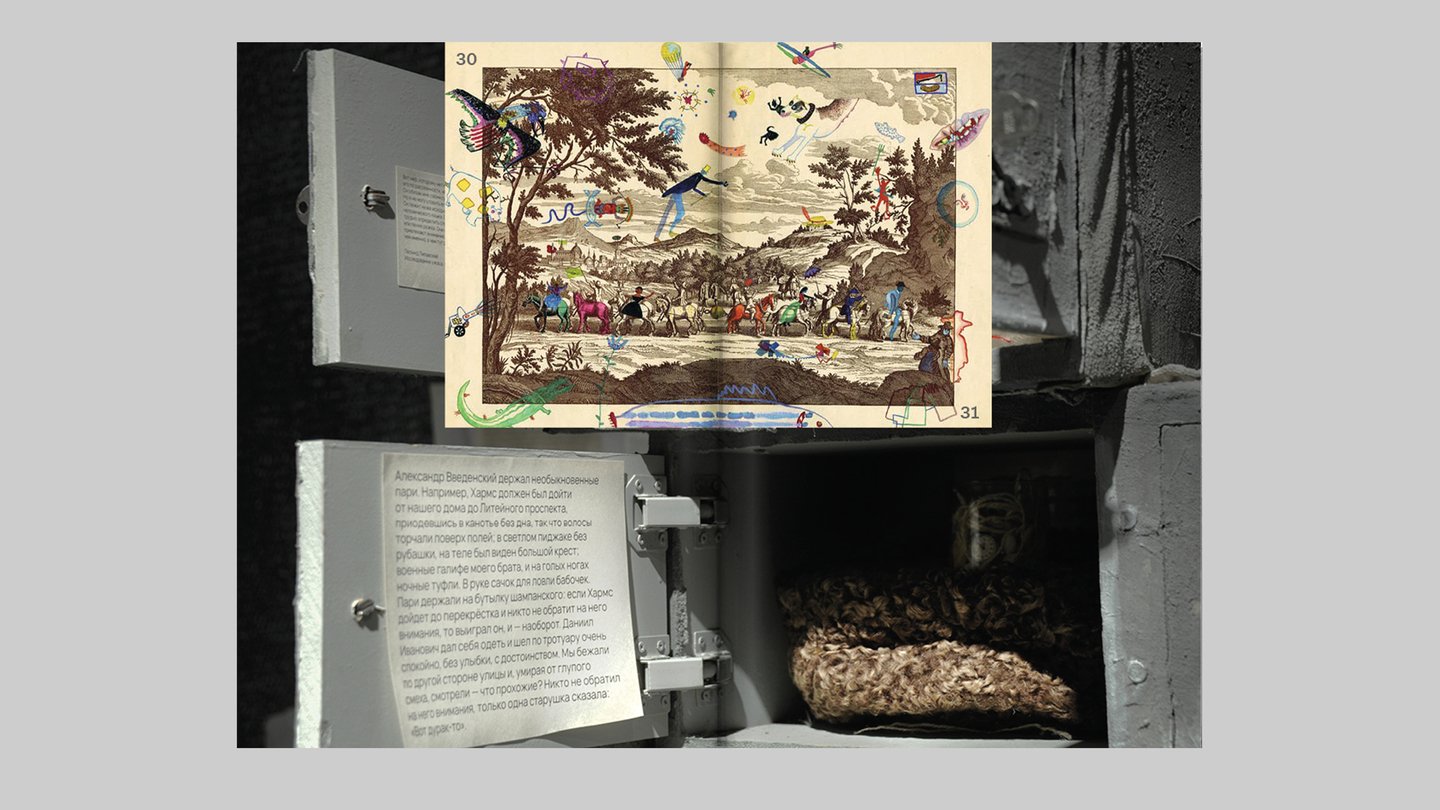
The catalog also includes a collection of the poems mentioned throughout the text.
view the entire project
[3] The complexly structured book «Gesture» (2026) — A social publication