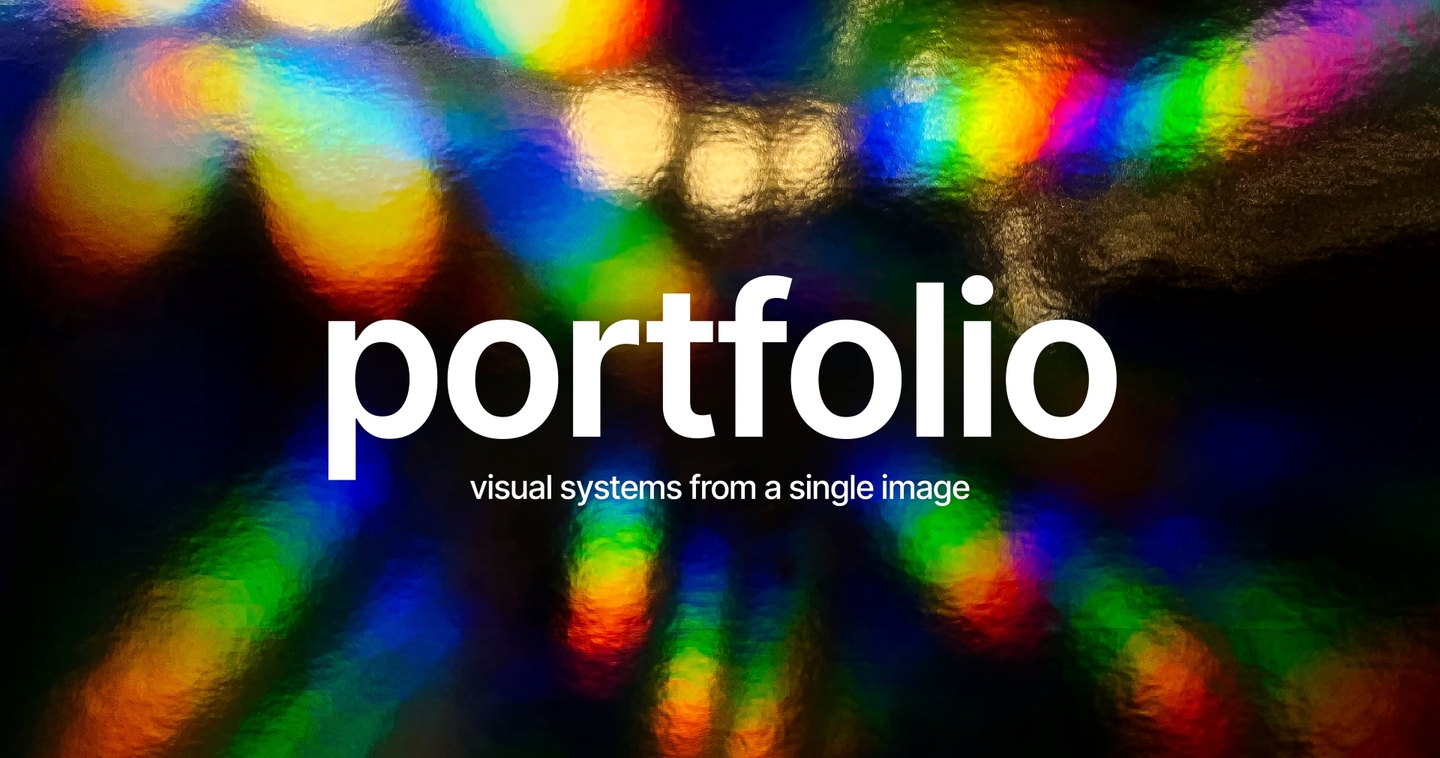
Part 1 — Method
Portfolio — graphic design, branding, print
I find the image that reveals a project, and build it into a system
From logo and custom typography to packaging and objects. The image originates from the subject itself: a spiral for immersive theater, a shoreline for skincare.
A beautiful image is not a brand. Most visuals are assembled from fortunate accidents—striking, but they crumble the moment you need to build a system.
The problem I solve
Studios and small brands can easily create one strong cover. What’s hard is establishing a consistent language across everything—from logo and typography to packaging, merchandise, and spatial design.
I don’t work with isolated images; I work with a core principle. First, I find a single image that precisely encapsulates the subject, then I test it across every application, retaining only what survives as a cohesive system.
One image, grown into a system. The subject’s essence $\rightarrow$ the form that carries it $\rightarrow$ a language that works everywhere.
How It Works
The image is not invented for aesthetics—it is drawn directly from the subject matter itself. This is why it reads as recognizable rather than literal: it depicts nothing specific and leaves space for narrative.
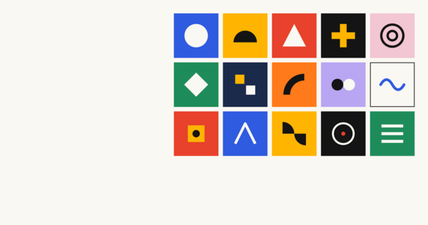
From this point, the image becomes a construction kit. One form establishes the type, the color, the rhythm, and the modularity—and runs through the entire project without requiring separate decisions.
Part 2 — Work
Case 01 — Branding + Custom Type
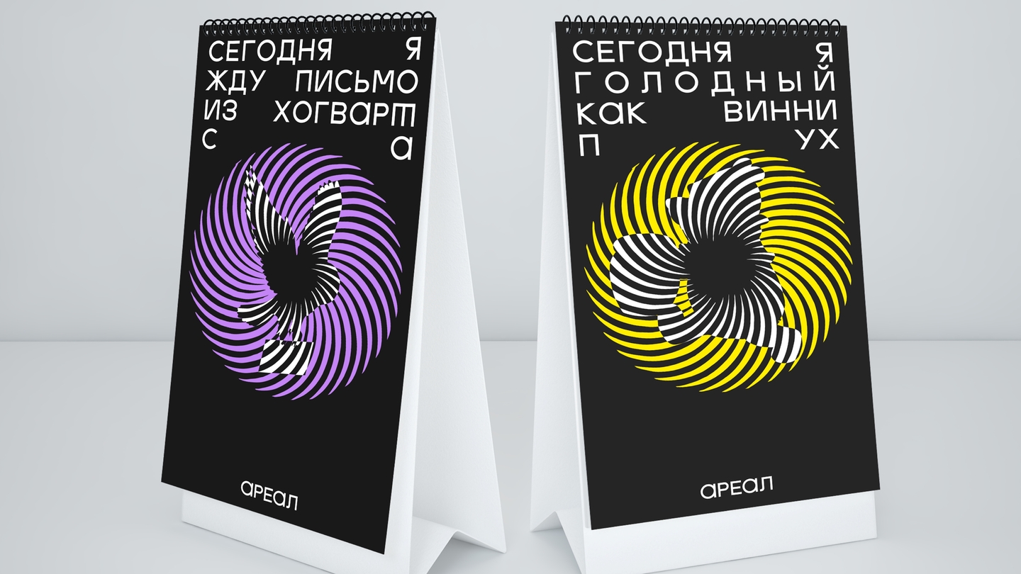
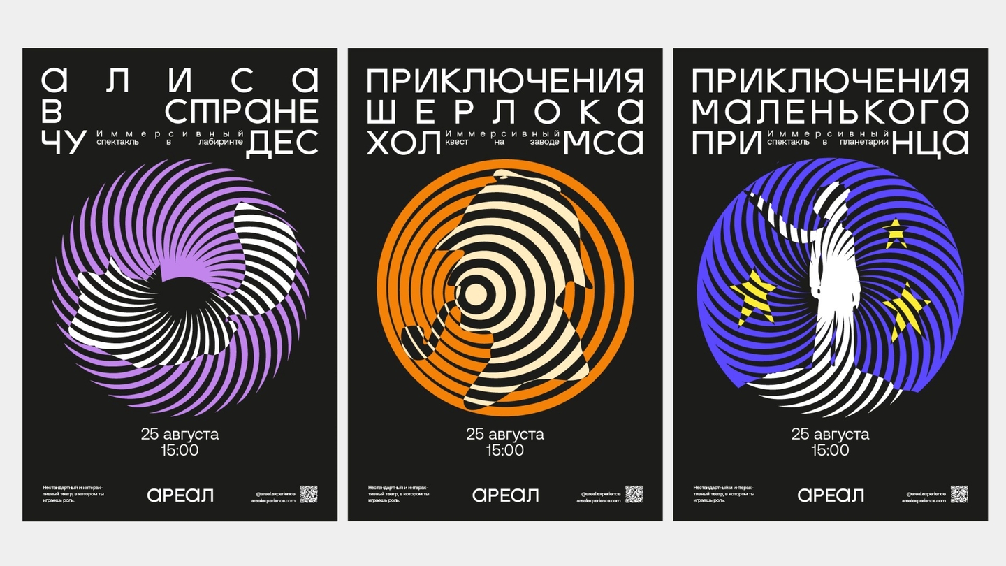
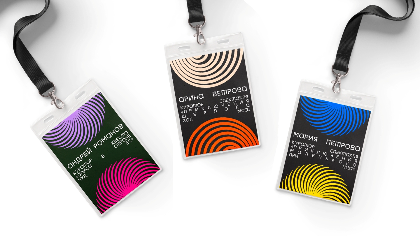
AREAL
Visual identity for an immersive theatre · student project
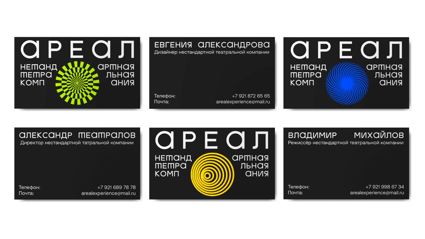
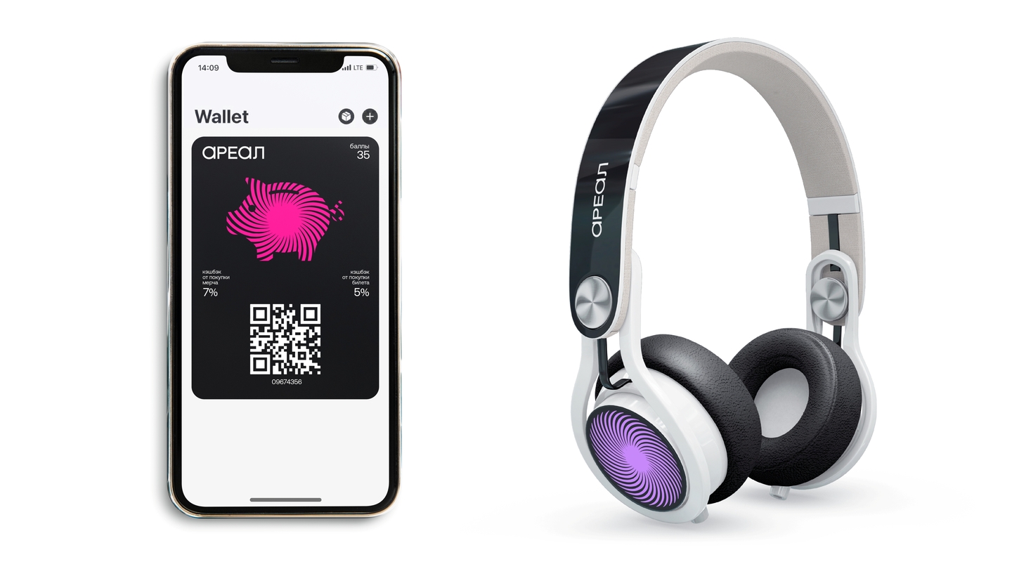
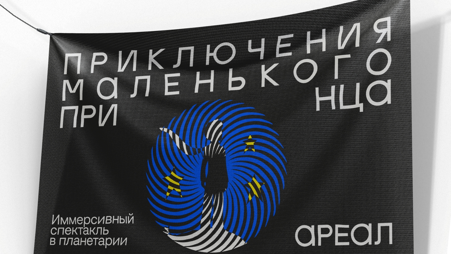
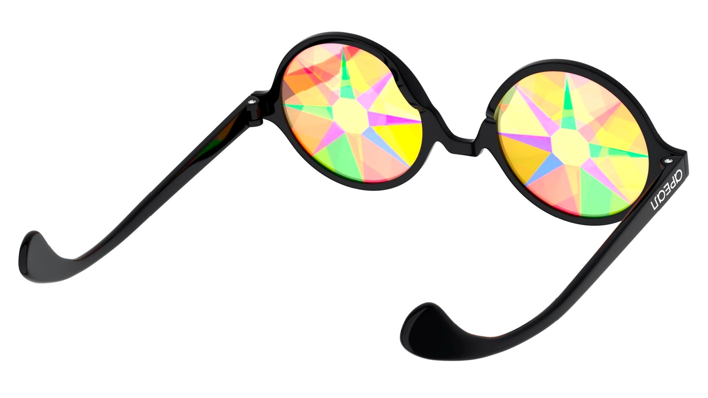
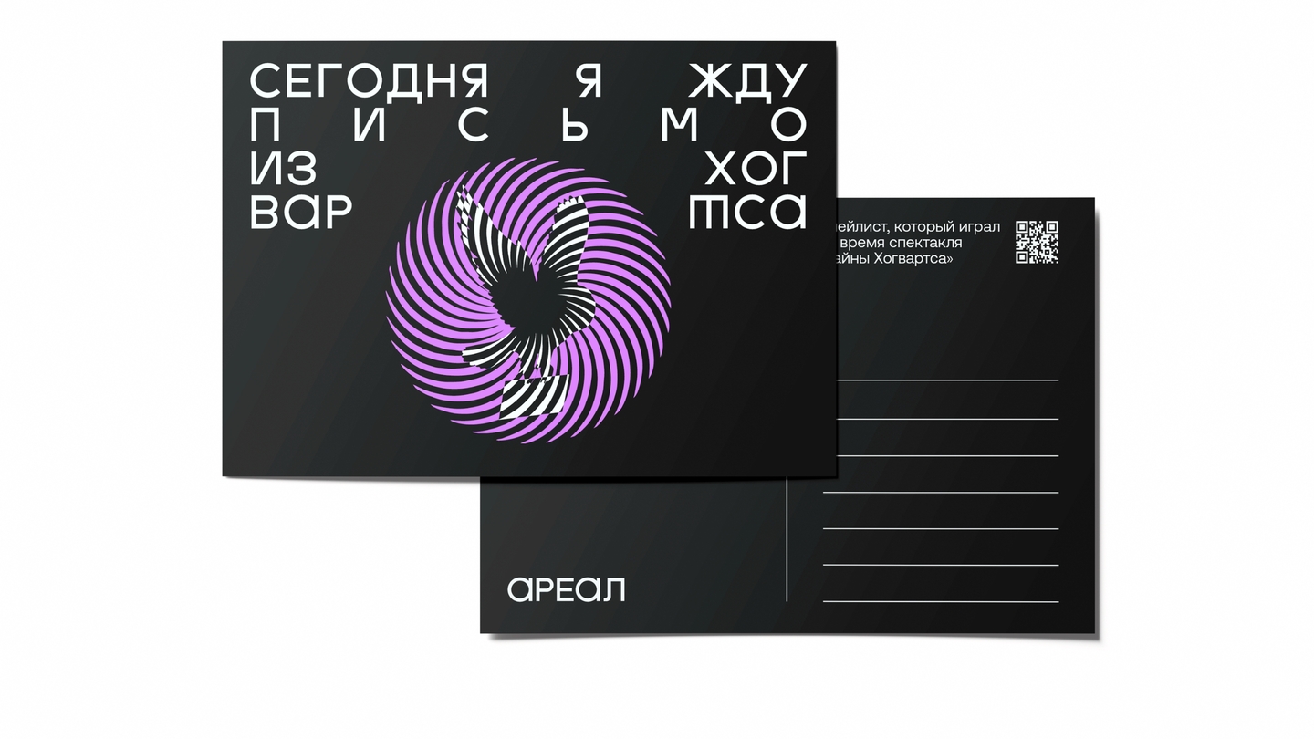
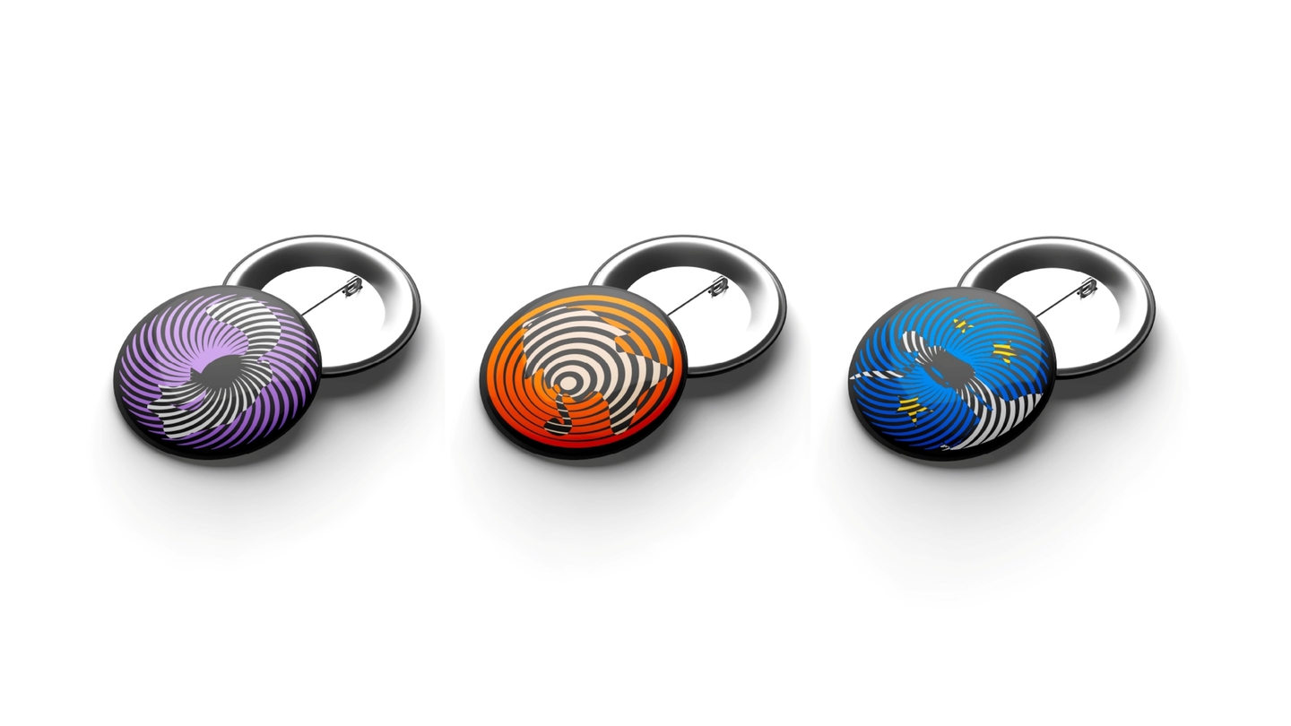
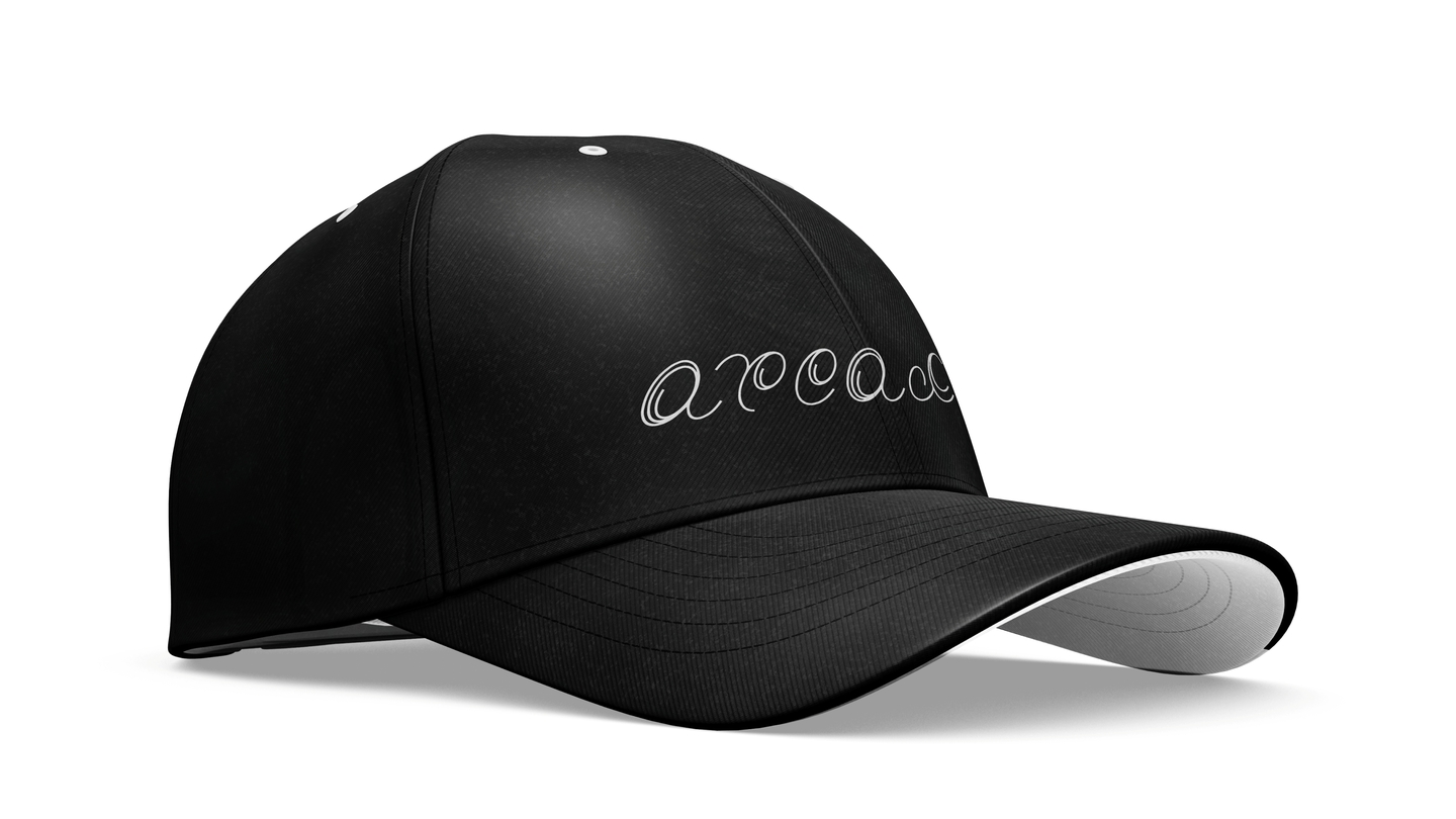
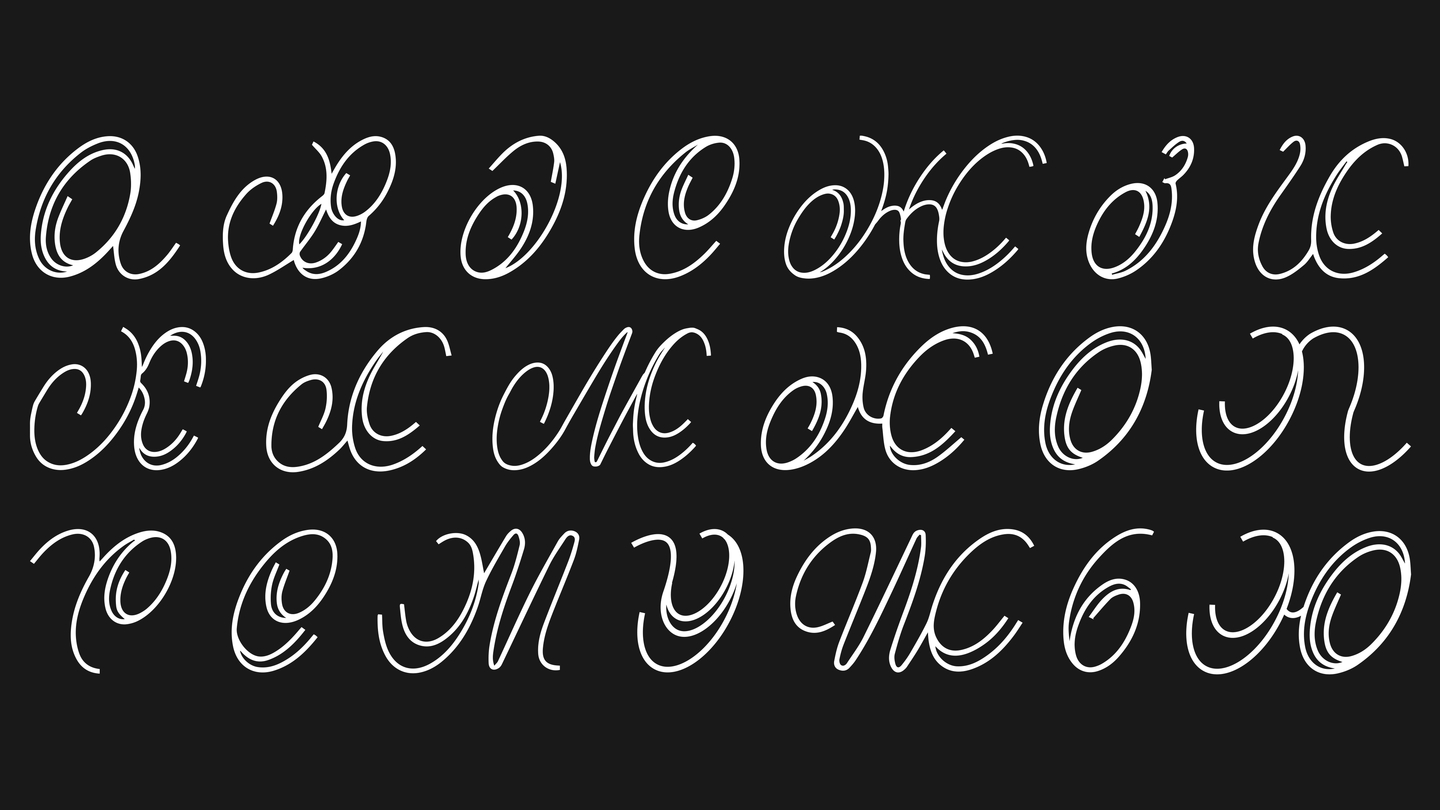
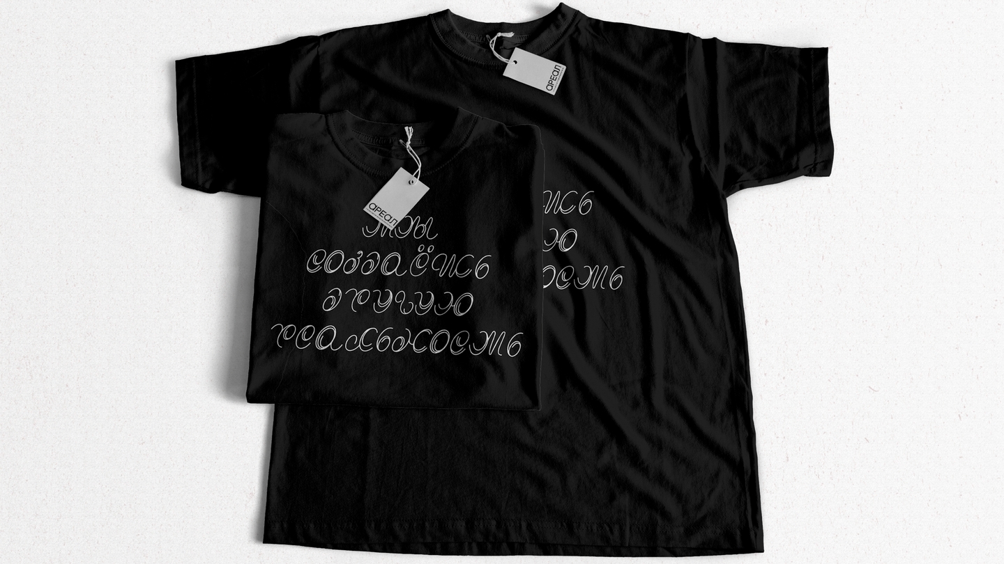
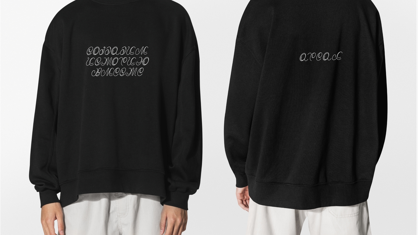
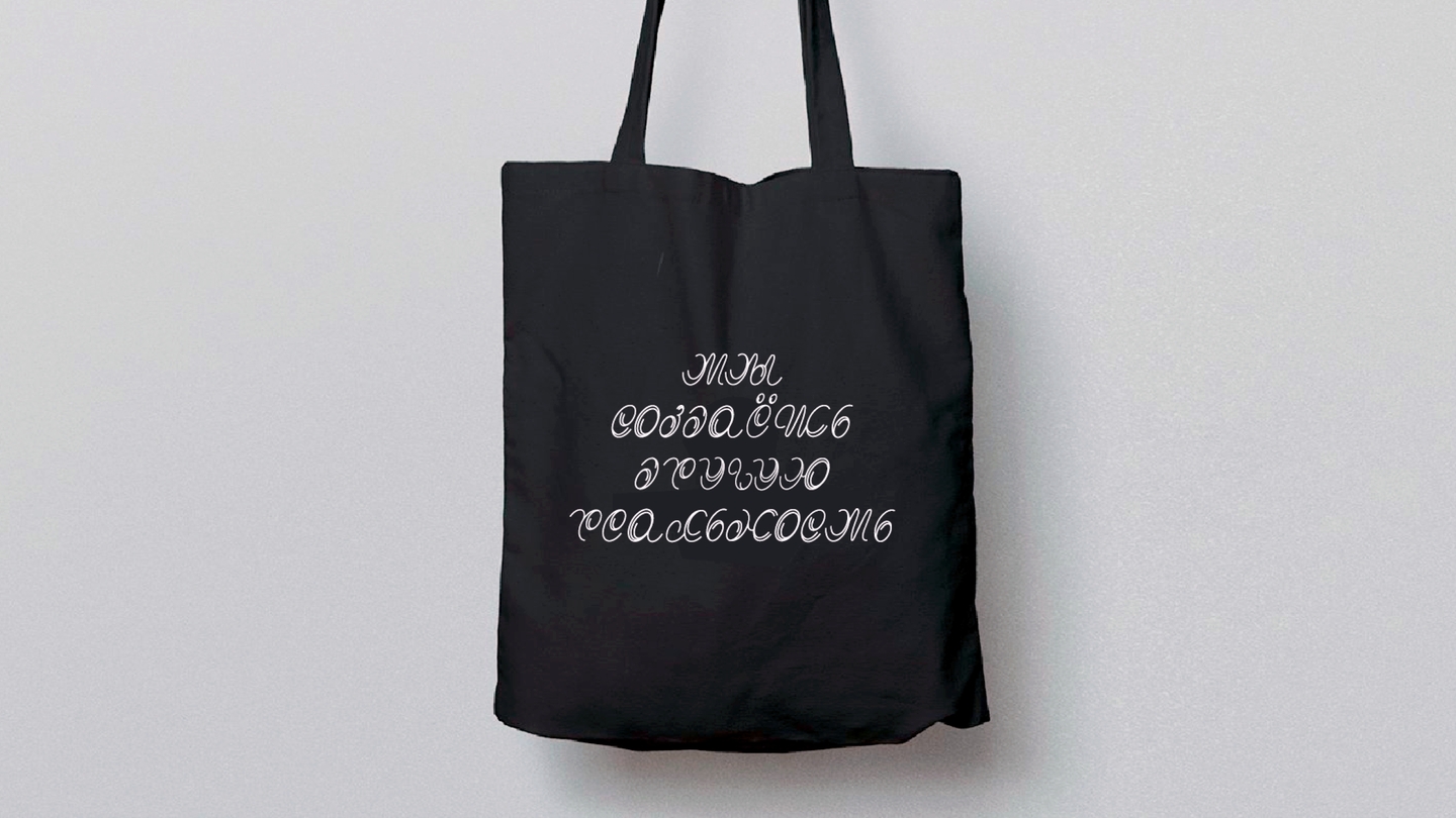
EssenceA theater where the audience becomes the hero: show, game, and quest merge into a single story.ImageSpiraling circles—a hypnotic shape from which the characters emerge. The spiral serves as a metaphor for full immersion.SystemOne unifying motif runs through everything: posters, business cards, headphones, flags, a flip mood calendar, and a custom typeface where the same motion lives within the letters.
Case 02 — Packaging + 3D
Ho’ola
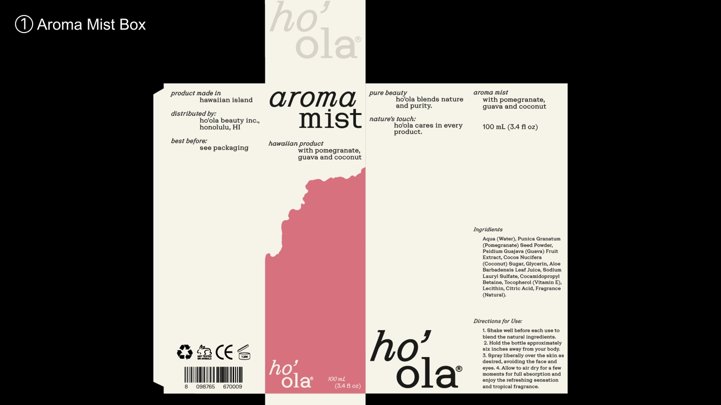
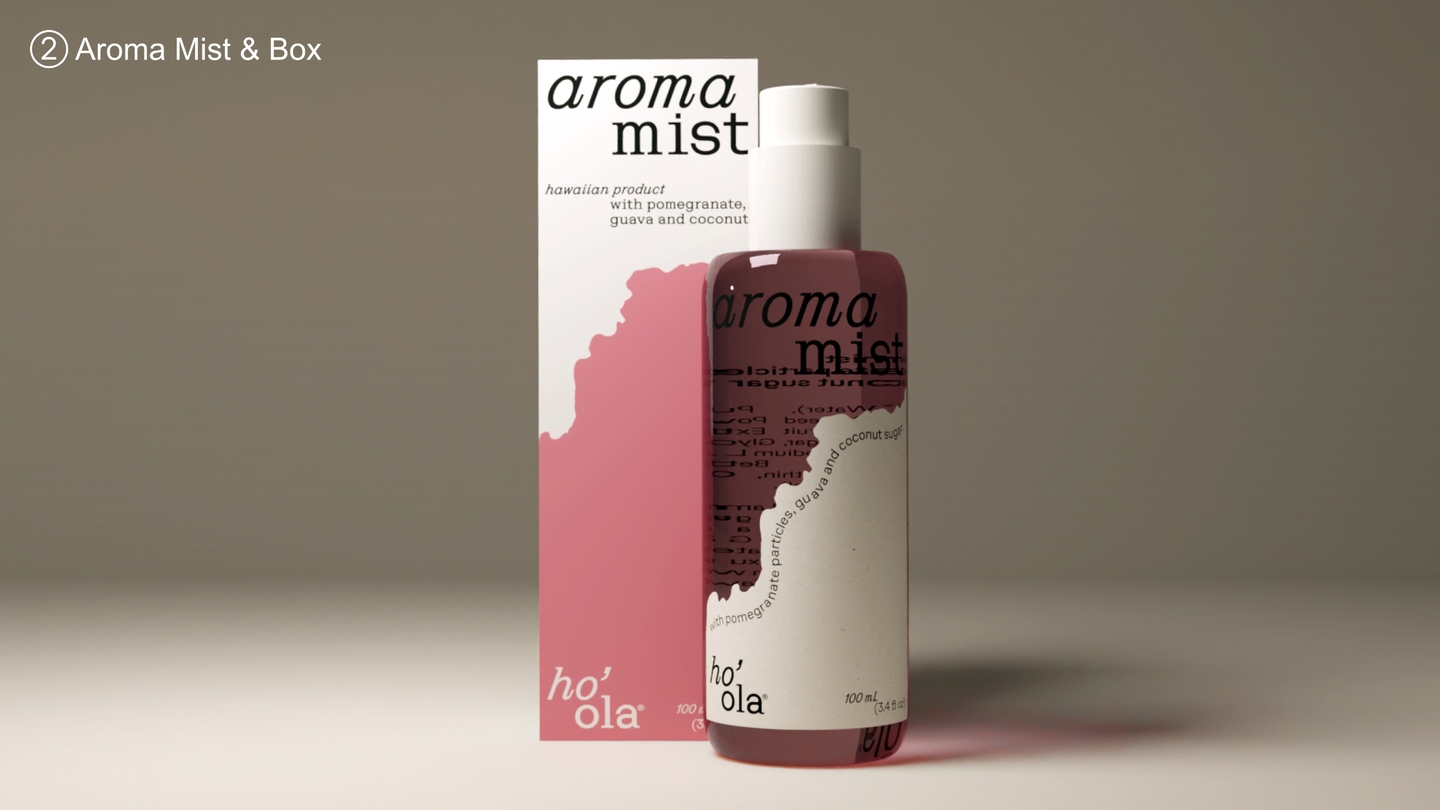
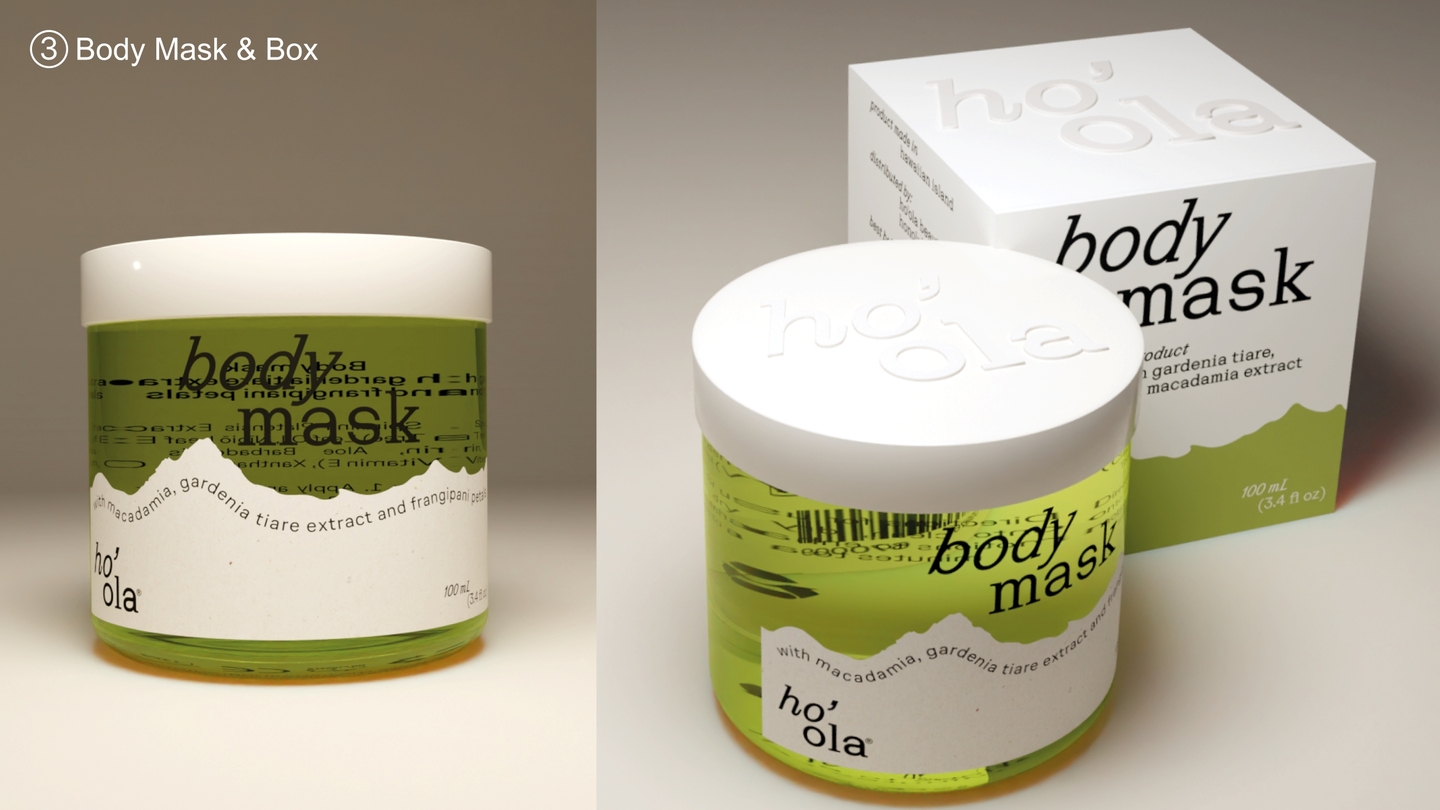
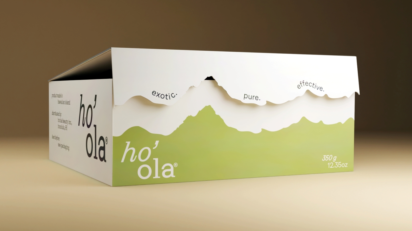
Skincare packaging · concept · Blender visualization
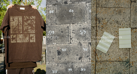
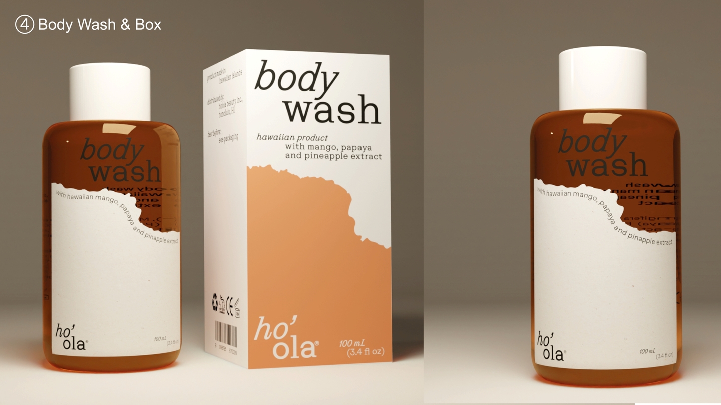
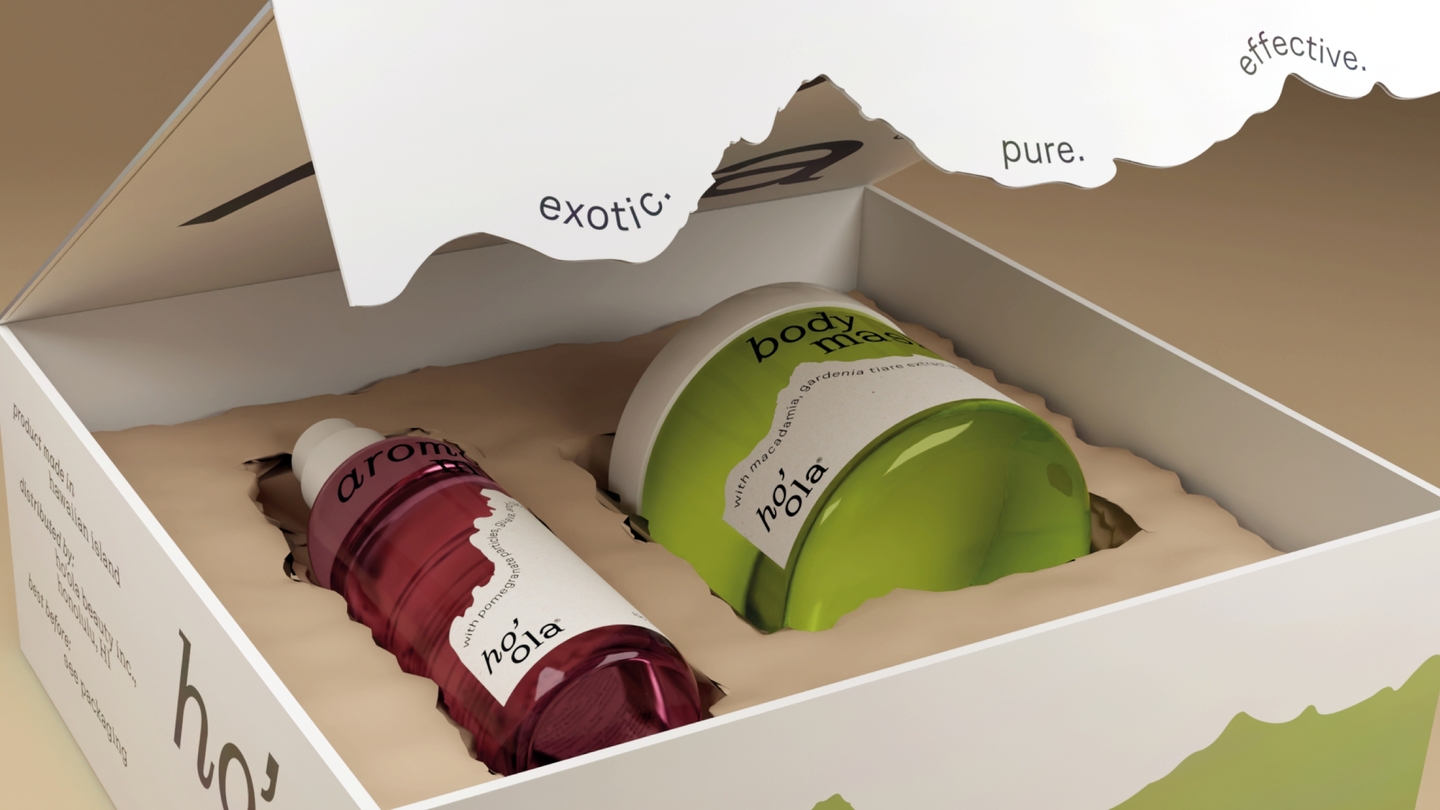
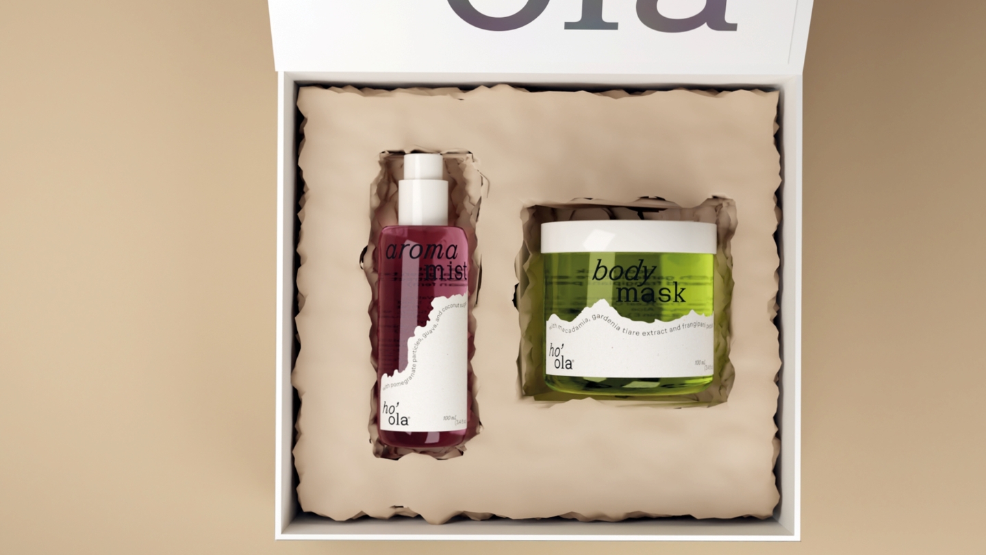
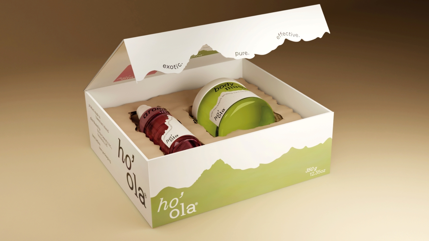
EssenceHawaiian skincare is built on a single idea: the separation mirroring the islands' own landscapes.ImageA sticker shaped like a sandy shore divides each package into «water» and «land"—representing the calm transition from ocean to warm sand.SystemOne cohesive design scales across the entire product line: aroma mist, body mask, shower gel, and gift box. Colored glass conveys freshness; the typography is given space to breathe.
Case 03 — Concept + Photography + Design
Lights of Sevkabel
2026 Calendar · Student Brief, HSE University × Sevkabel Port
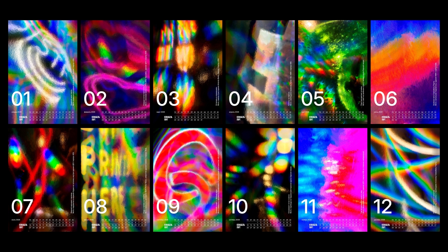
EssenceA calendar for a waterfront cultural space in Saint Petersburg. A story about light that connects space, people, and time.ImageFound light: a camera and a sheet of holographic paper. Nothing was staged—light revealed itself on staircases, in lettering, underfoot.SystemFrom those accidental reflections, a color arc of the year emerges—from the cold tones of January to the warm glow of December.
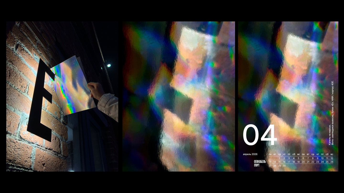
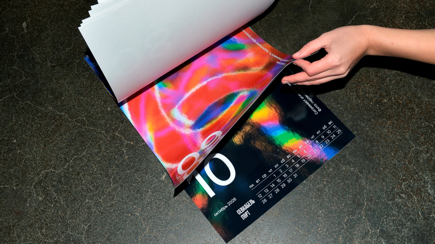
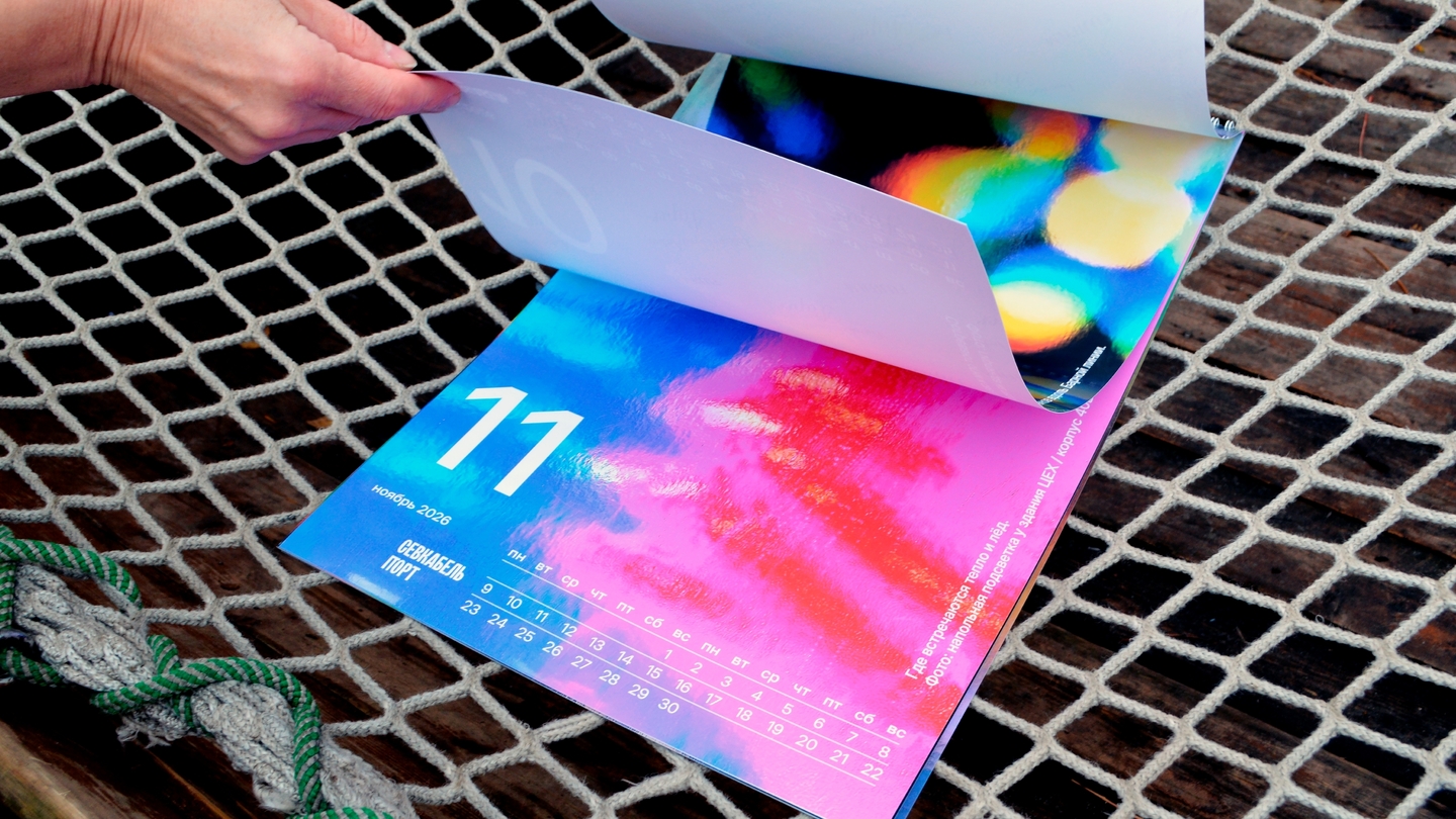
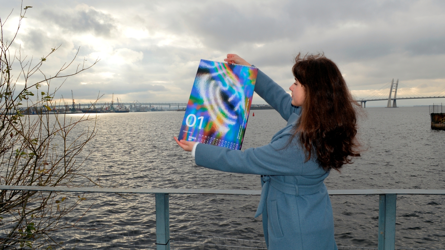
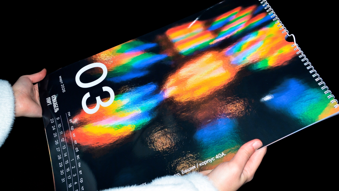
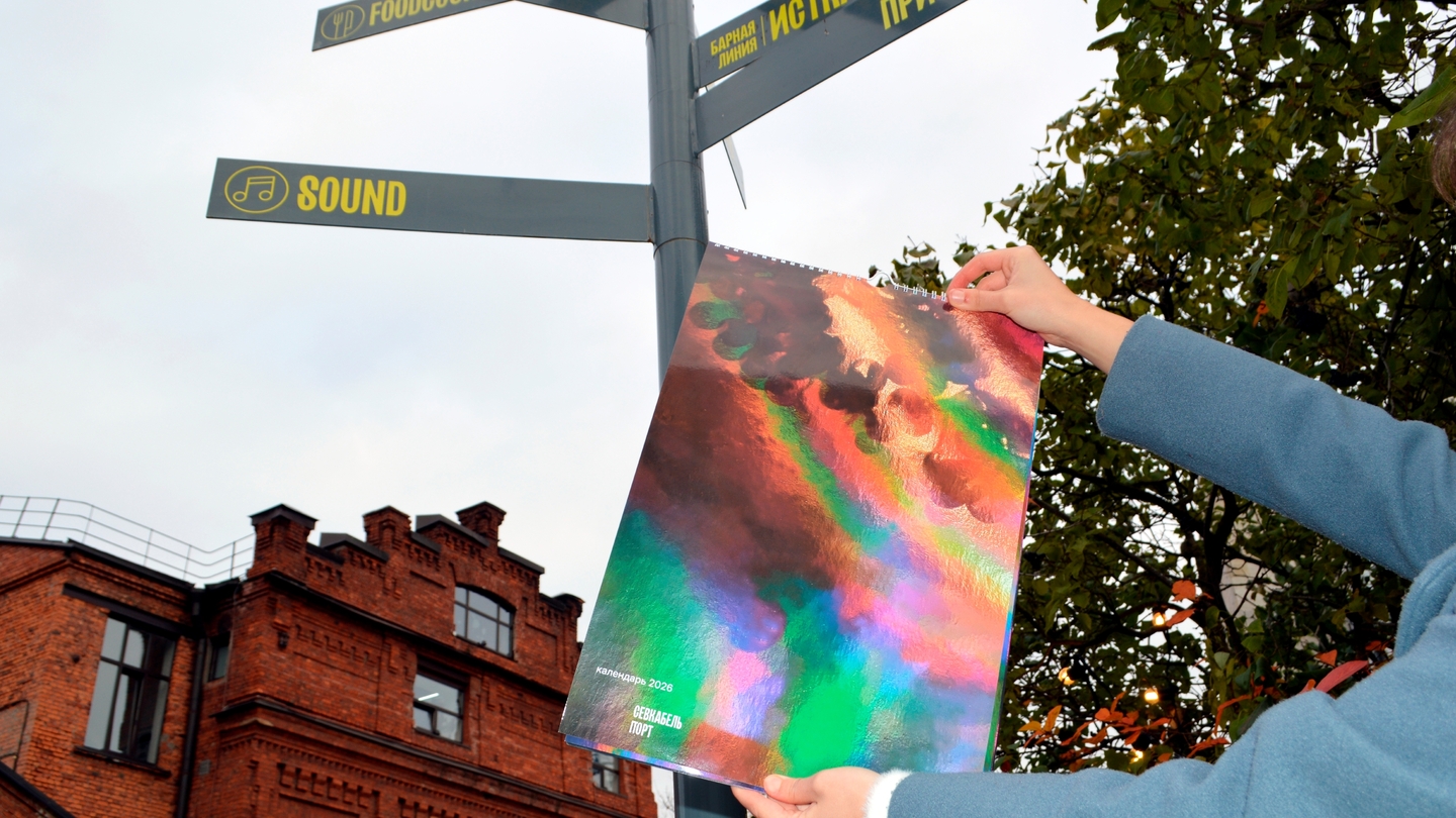
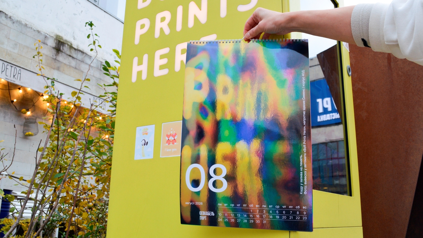
How I take a project through: image $\rightarrow$ system $\rightarrow$ applications. Every step is checked against whether the language holds as a whole.
More Than One Genre
Beyond branding, the same approach applies to illustration, print, product, and motion design.
A postcard series where handcrafted items become animated characters. Album illustrations built from paper collage. Children’s furniture designed around a single clover geometry. A short AI film—from concept and sketches to final animation.
Different media, one unified way of thinking: find the image and push it through its entire realization.
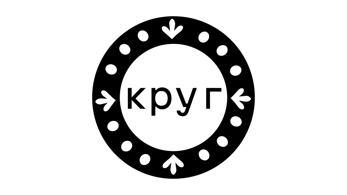
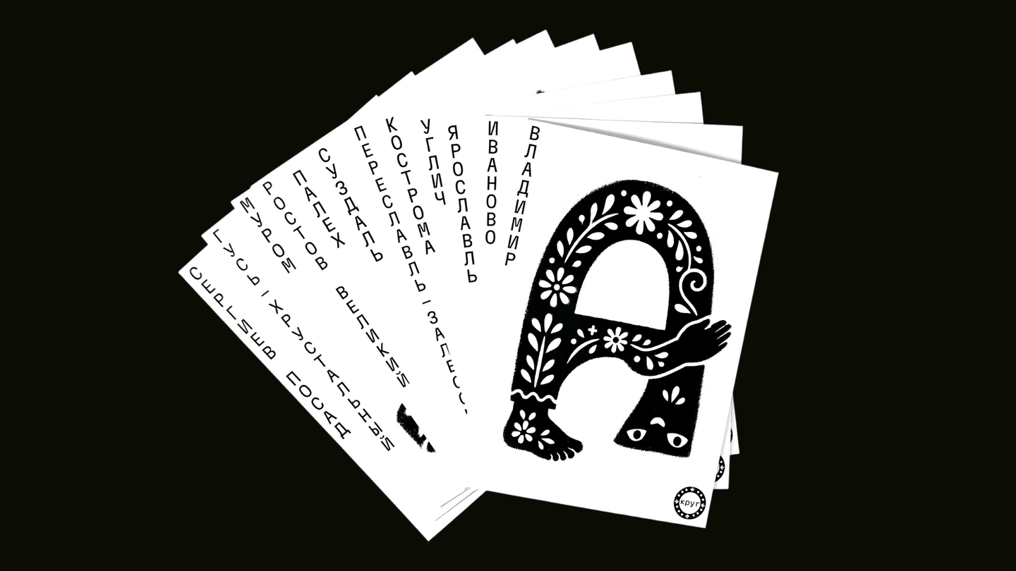
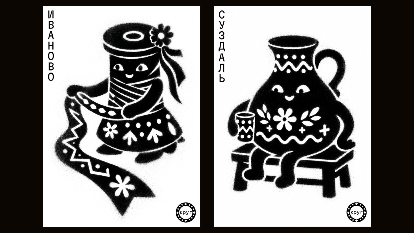
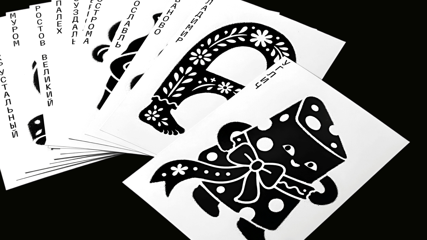
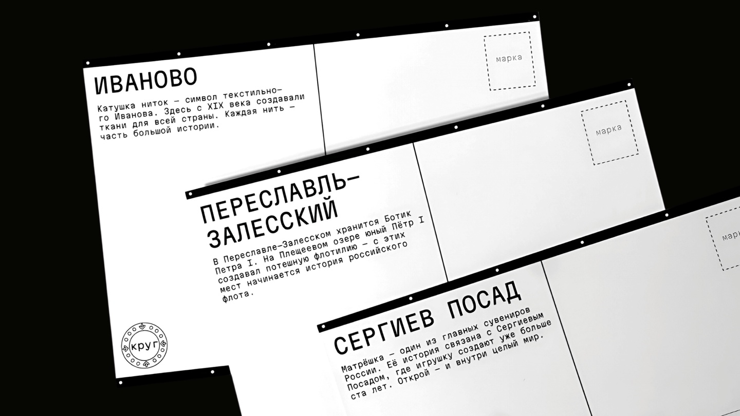
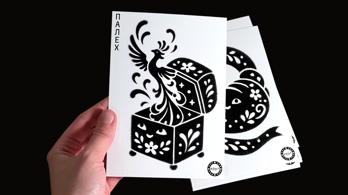
Krug — a postcard series where old-town crafts come alive as characters
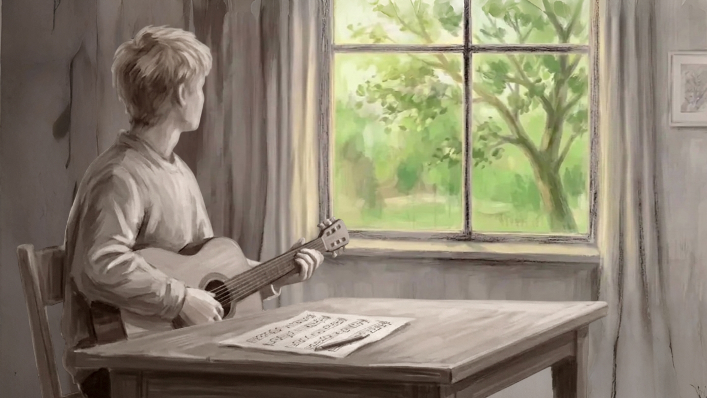
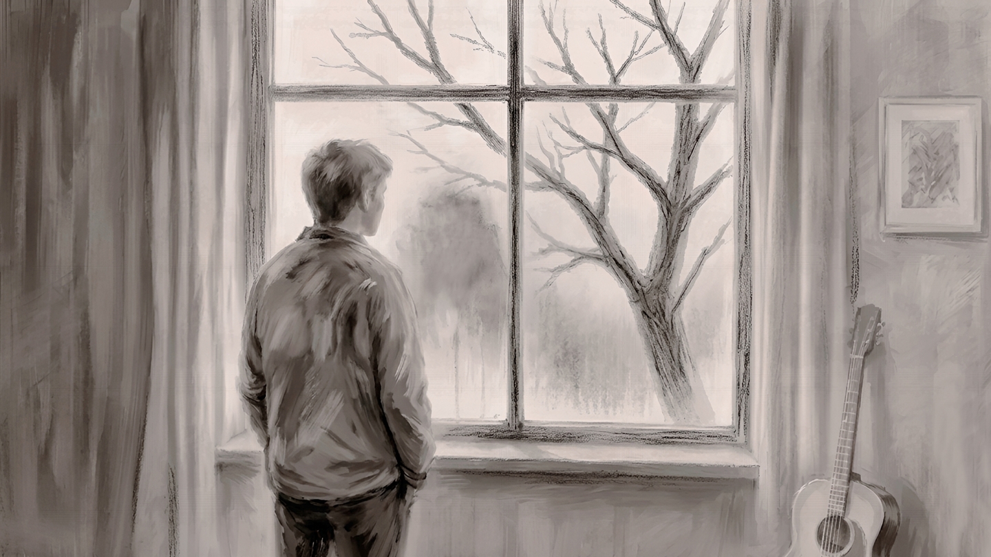
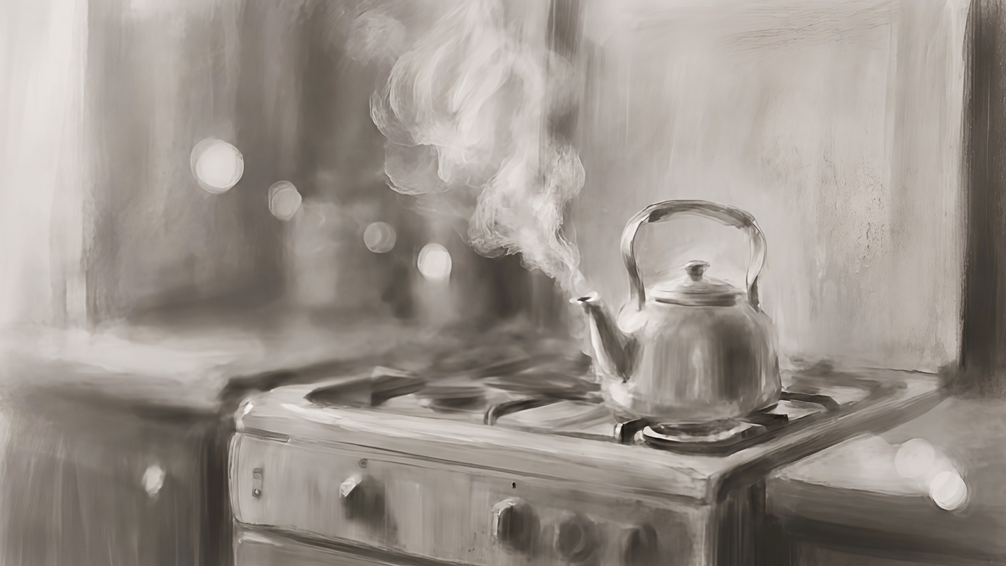
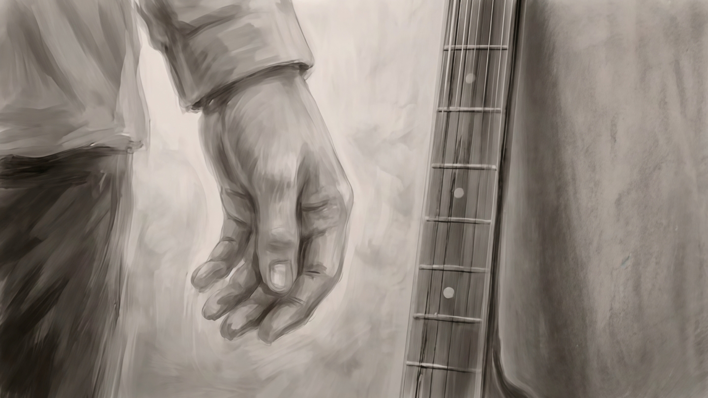
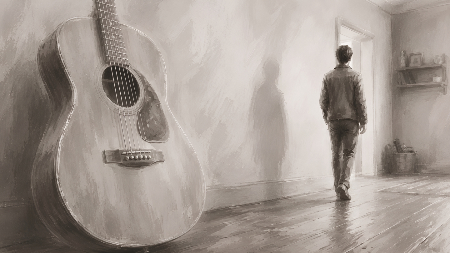
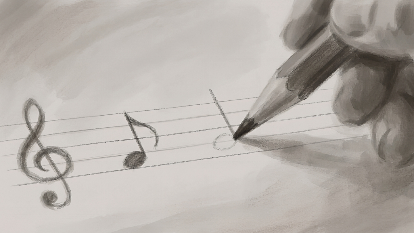
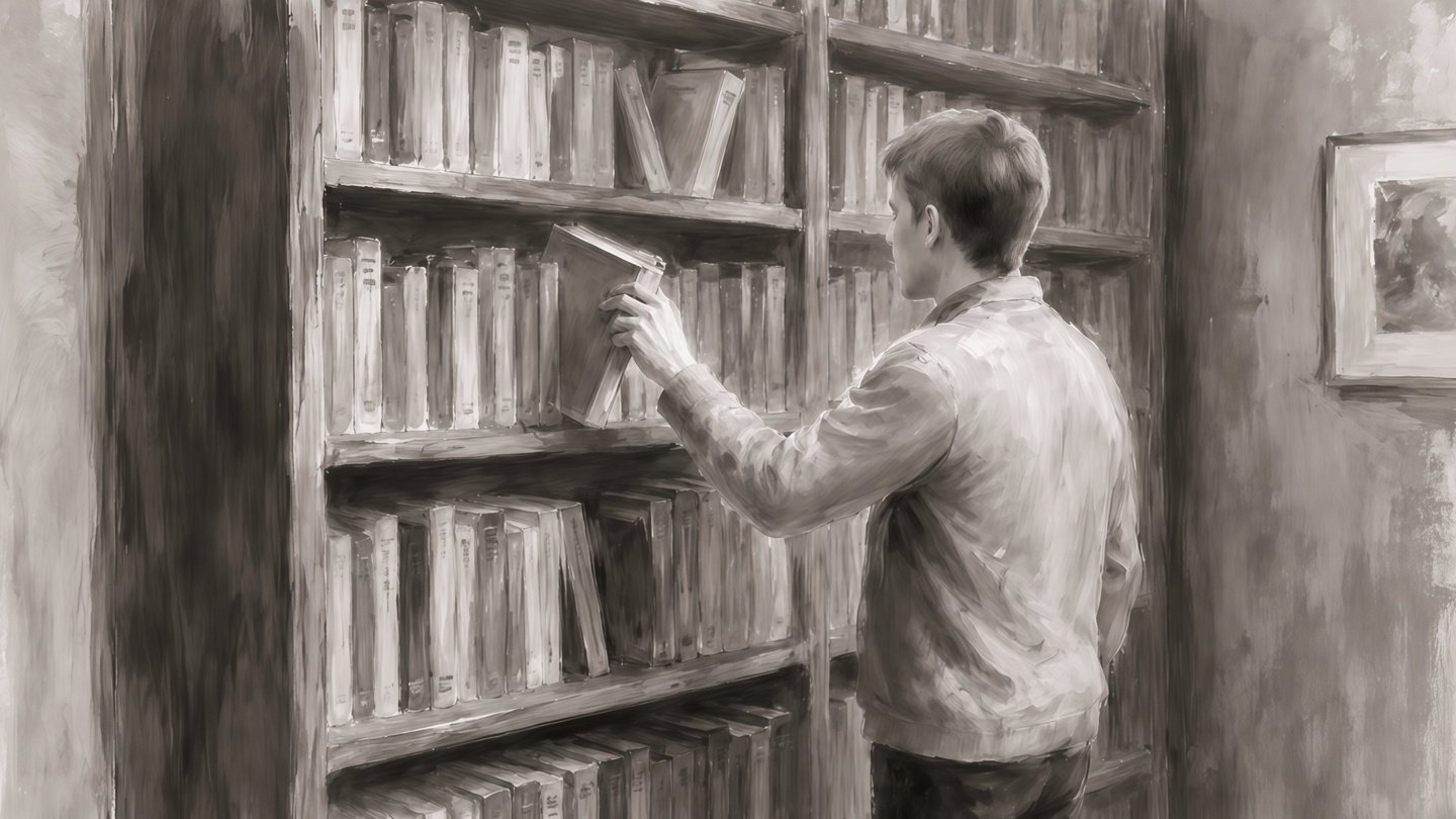
While He Was Waiting — a charcoal short film brought to life with AI
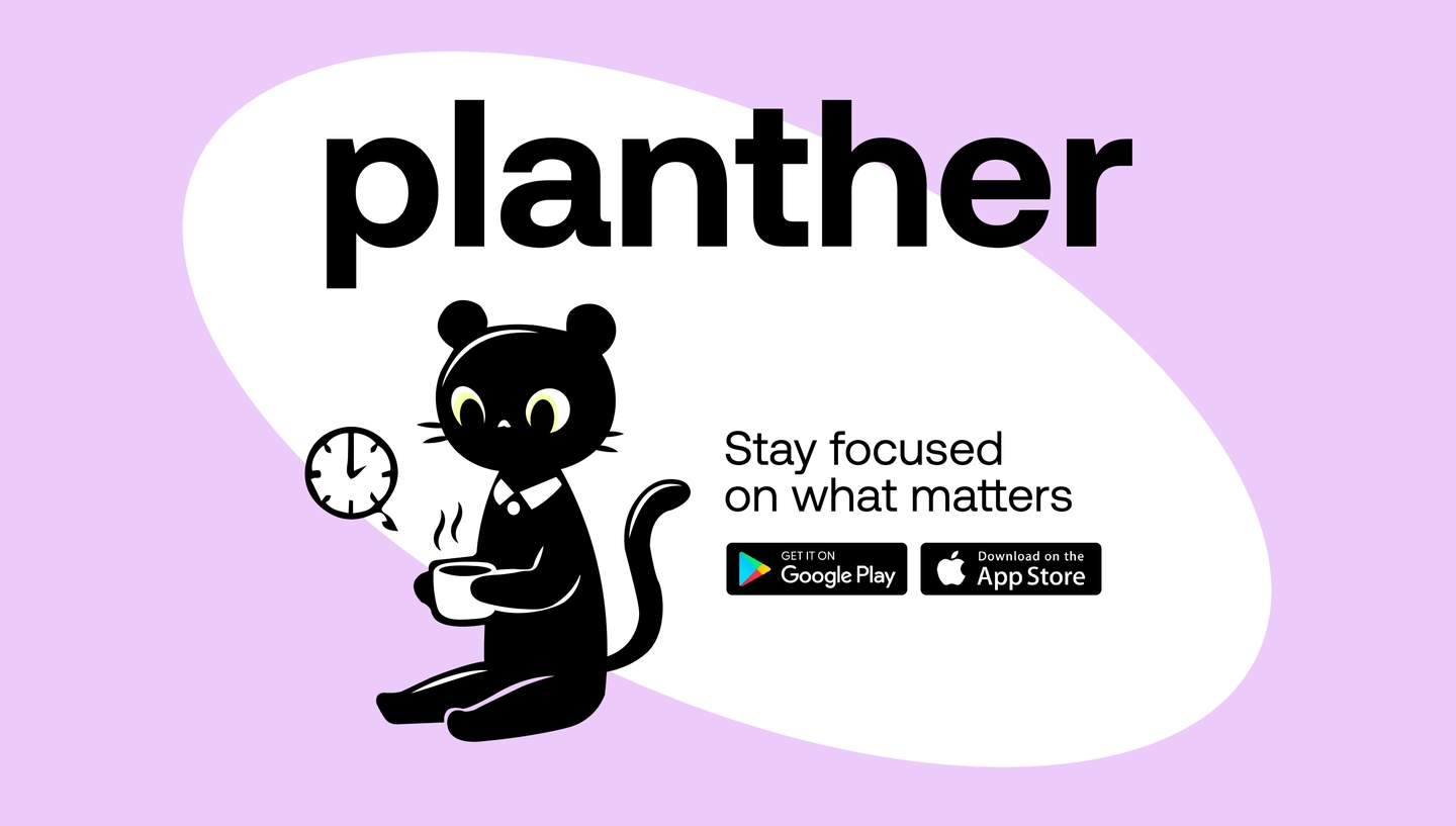
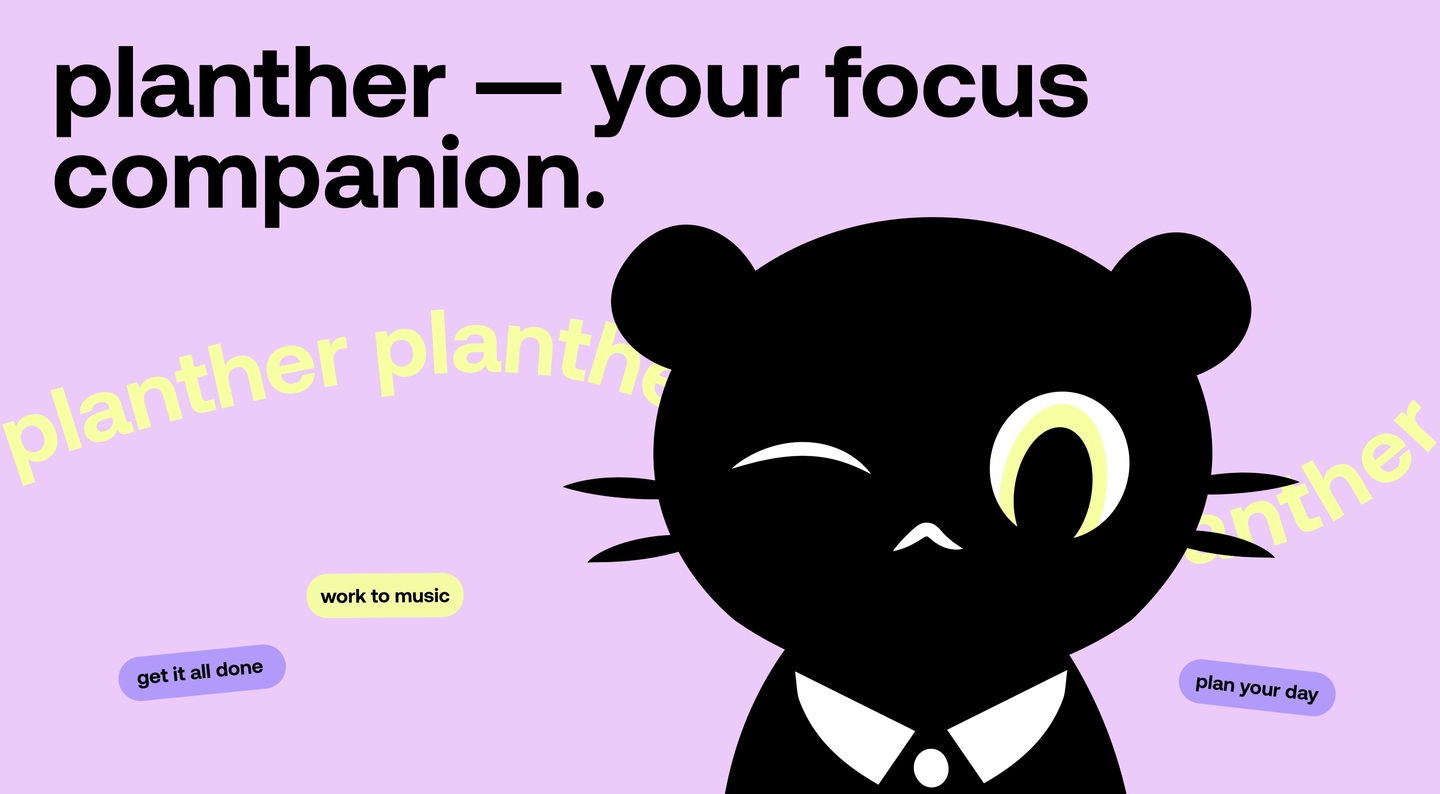
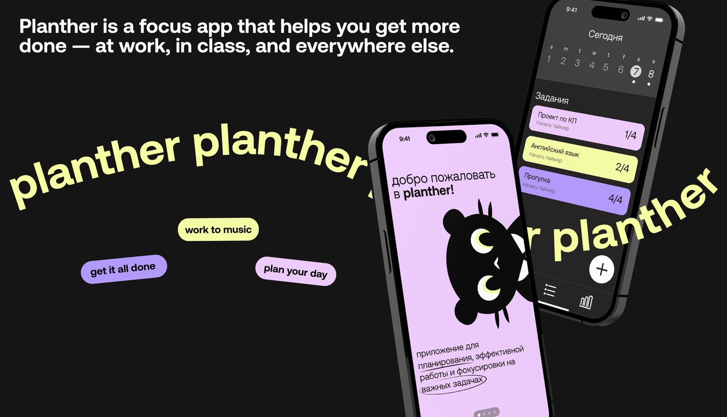
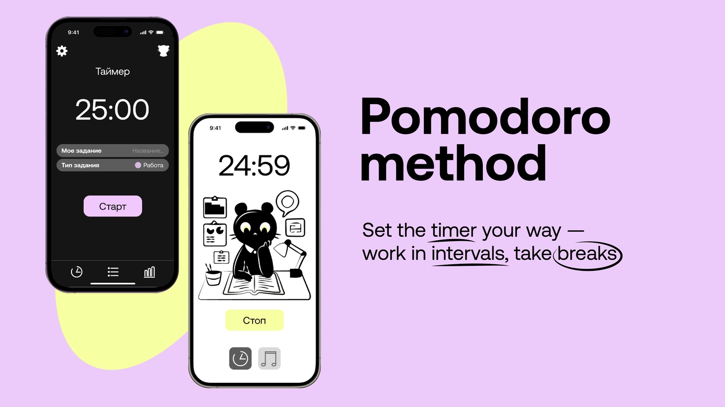
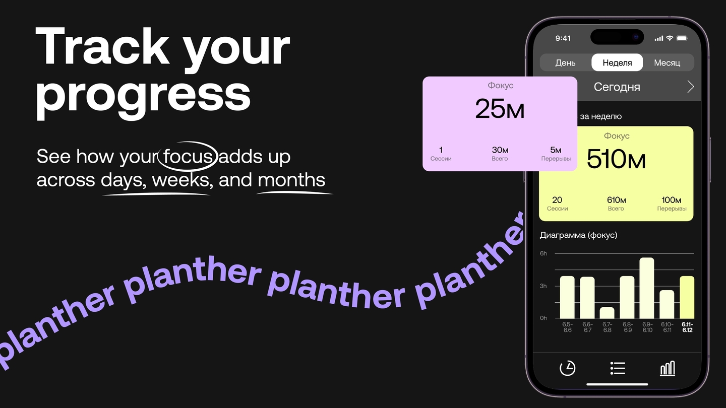
Planther — a focus app with a character