Why me?
Hello, my name is Lena, and I am a skilled graphic designer who builds and maintains visual identities for companies, startups, and growing businesses. » I help brands become recognizable and consistent across digital, print, and physical media. » I work with both tech-driven teams (online education, fintech, e-commerce) and traditional businesses (FMCG/consumer goods, food service/HoReCa, retail, services). Let me introduce you to my work philosophy and walk you through some of my projects:
How I work:
My design philosophy is rooted in creating thoughtful, compelling, and unconventional solutions. I embrace a bold, clear, and empathetic approach, always keeping the end-user in mind. What inspires and motivates me most is working in a collaborative team environment with creatively-driven and energetic people.
To bring these ideas to life, I rely on a diverse set of hard skills, including:
» Design & Media: typography, desktop publishing, infographics, font design, illustration, and 3D.
» Digital & Strategy: UI/UX design, user research, and competitor analysis.
» Physical: print design and packaging design.
Beyond my technical abilities, my soft skills are what keep projects moving smoothly. I am confident in my organizational abilities, strong teamwork, and strict adherence to deadlines and time management. I am also a highly agile learner, bringing open-mindedness and initiative to every aspect of my work.
01. Dr. Merz
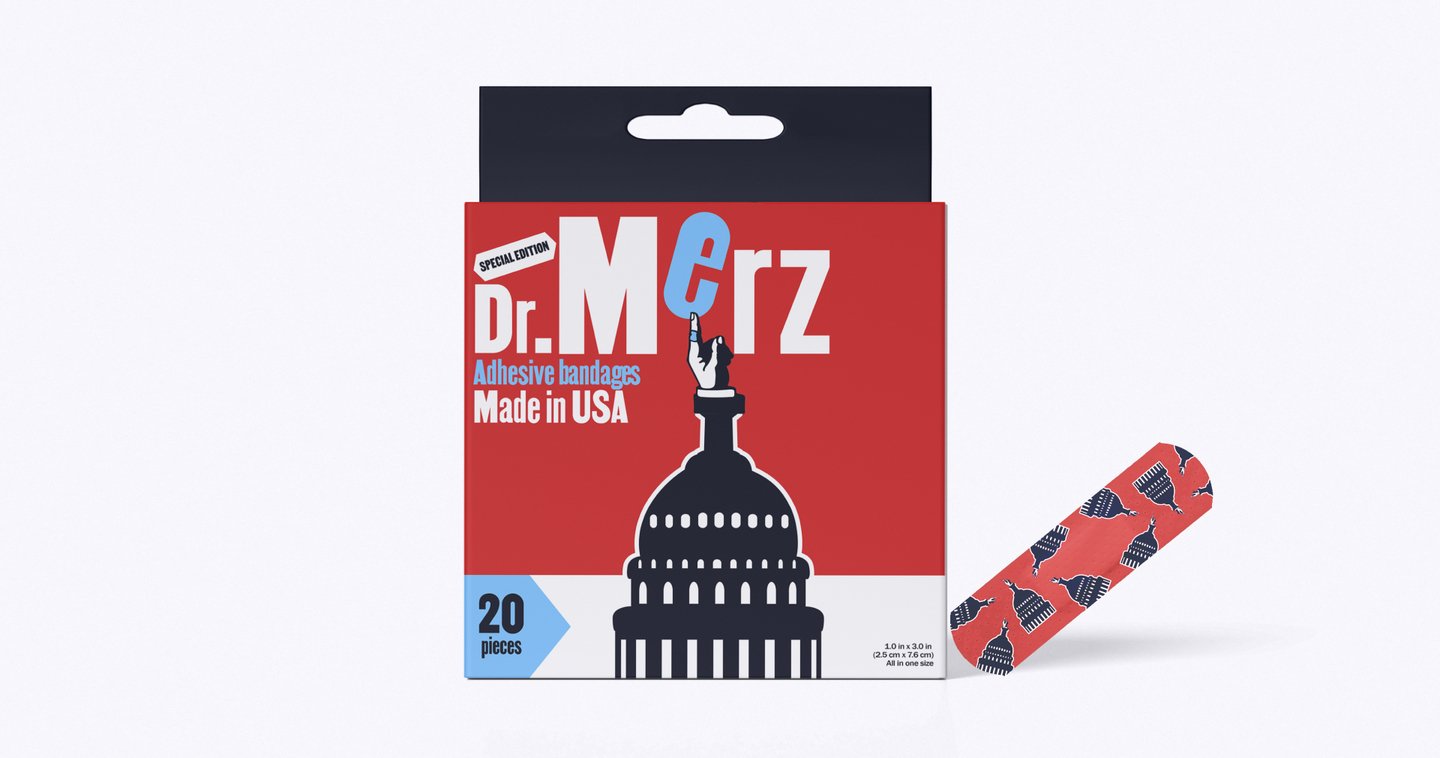
» Fields: brand identity and packaging design.Defining the character and essence of the brand’s product: a brand of reliable and durable American adhesive bandages. It gives the customer a feeling of «time-tested reliability, ” „like in the good old days.“
Heal fast. Just as time goes by
Adhesive bandages that inspire confidence. Fast healing, dense, and reliable material. The brand’s mission is to ensure that people around the world can use a quality product to heal wounds, cuts, and calluses.
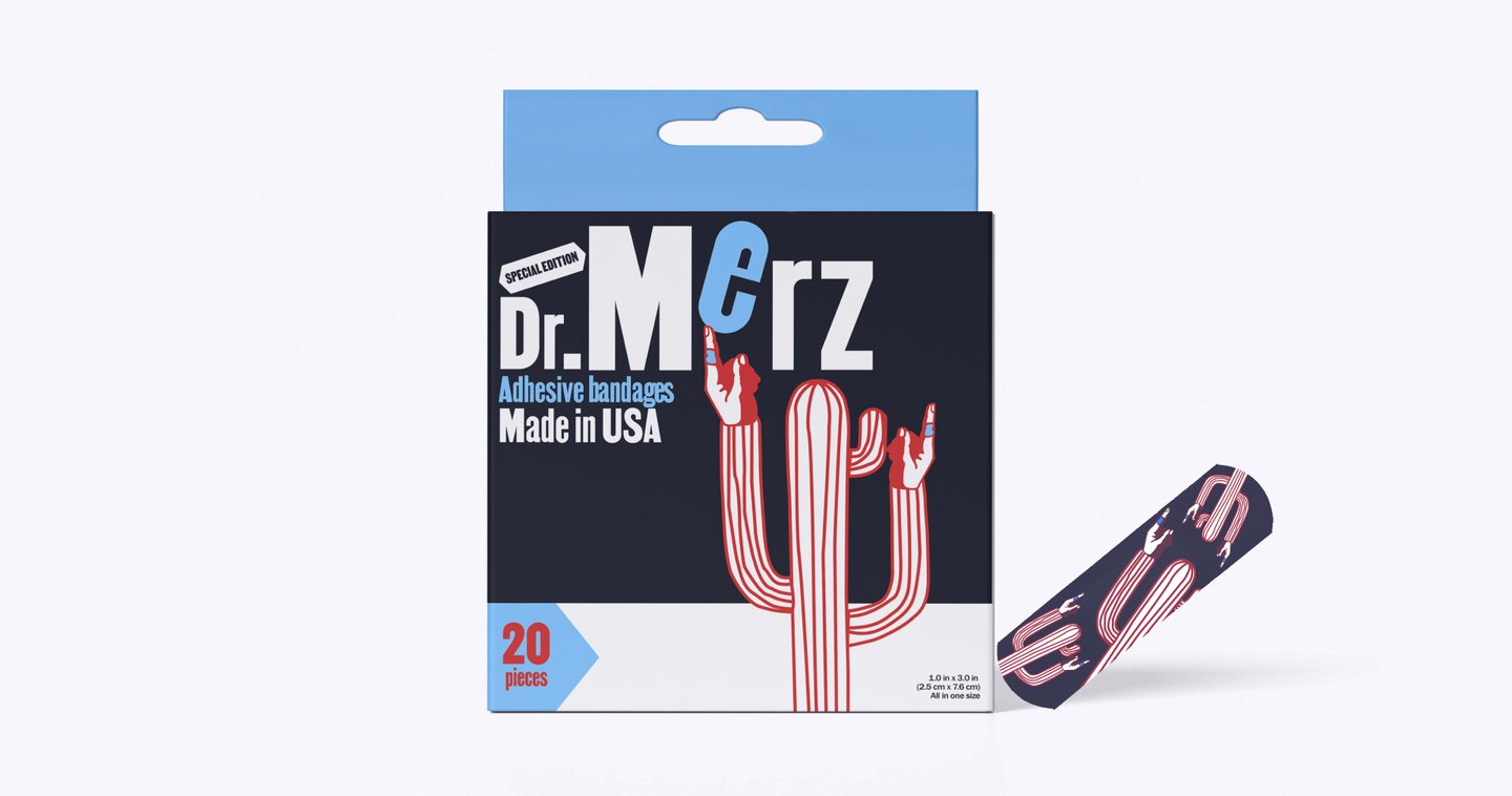
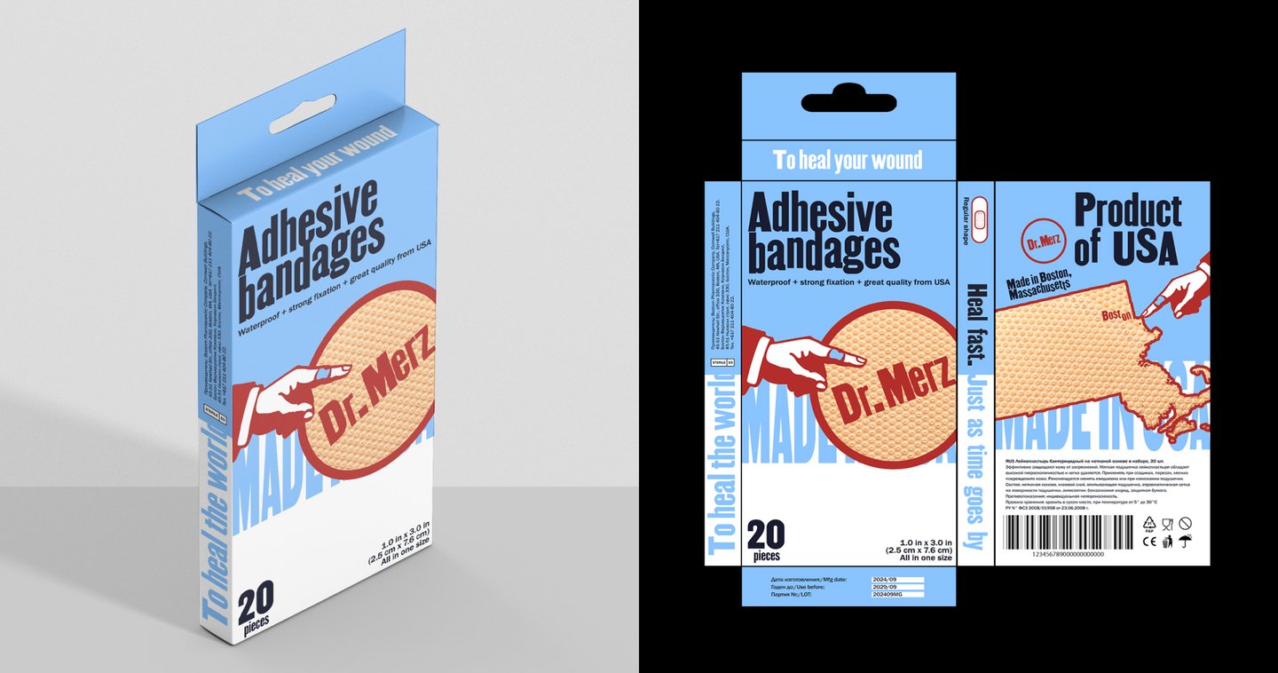
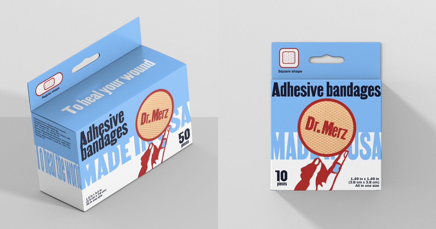
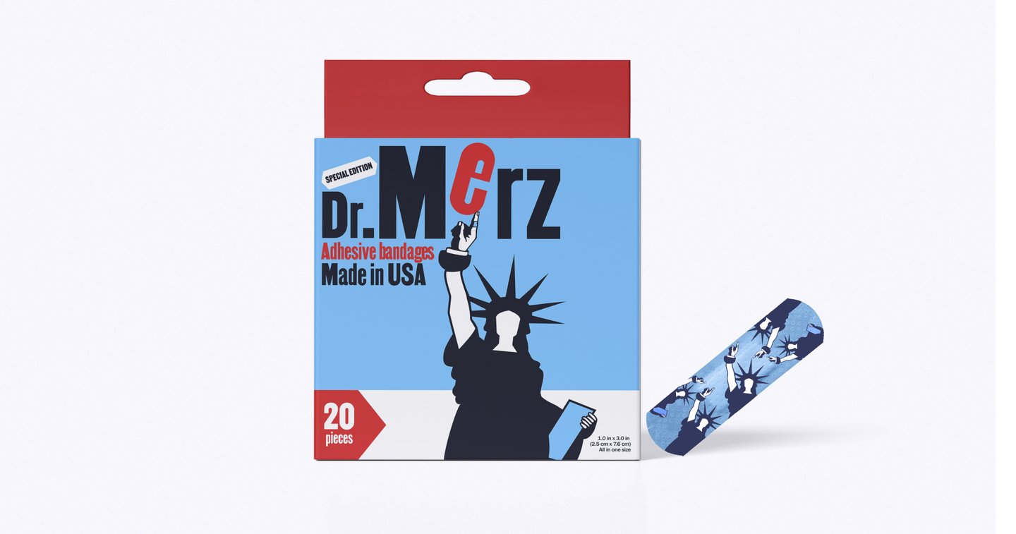
To achieve the desired aesthetic, I merged the look of vintage American packaging with contemporary relevance. They needed a recognizable identity that would stand out on the shelf. This is why the chosen color palette partially replicates the colors of the American flag.
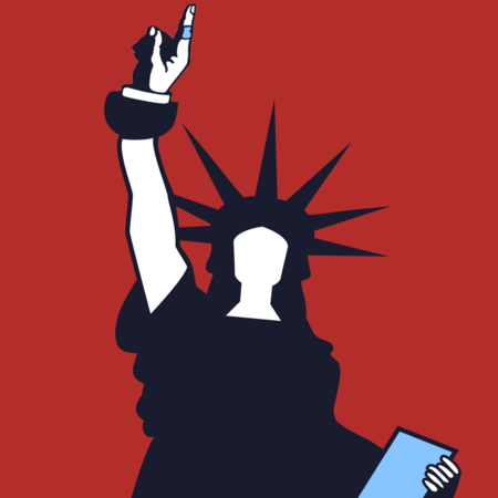

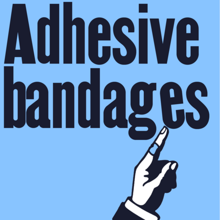
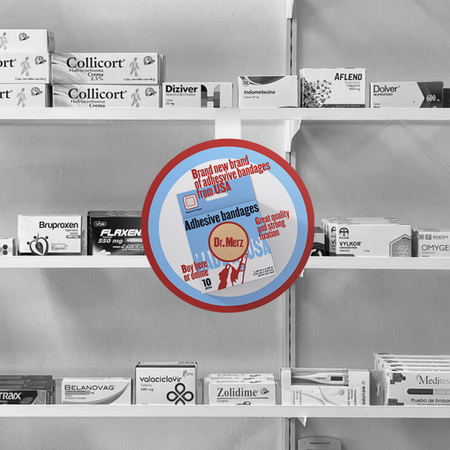
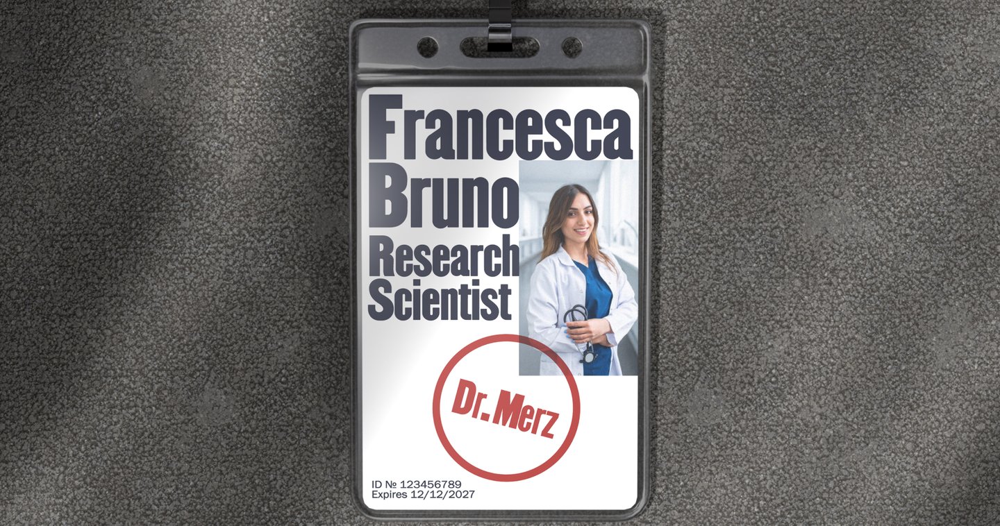
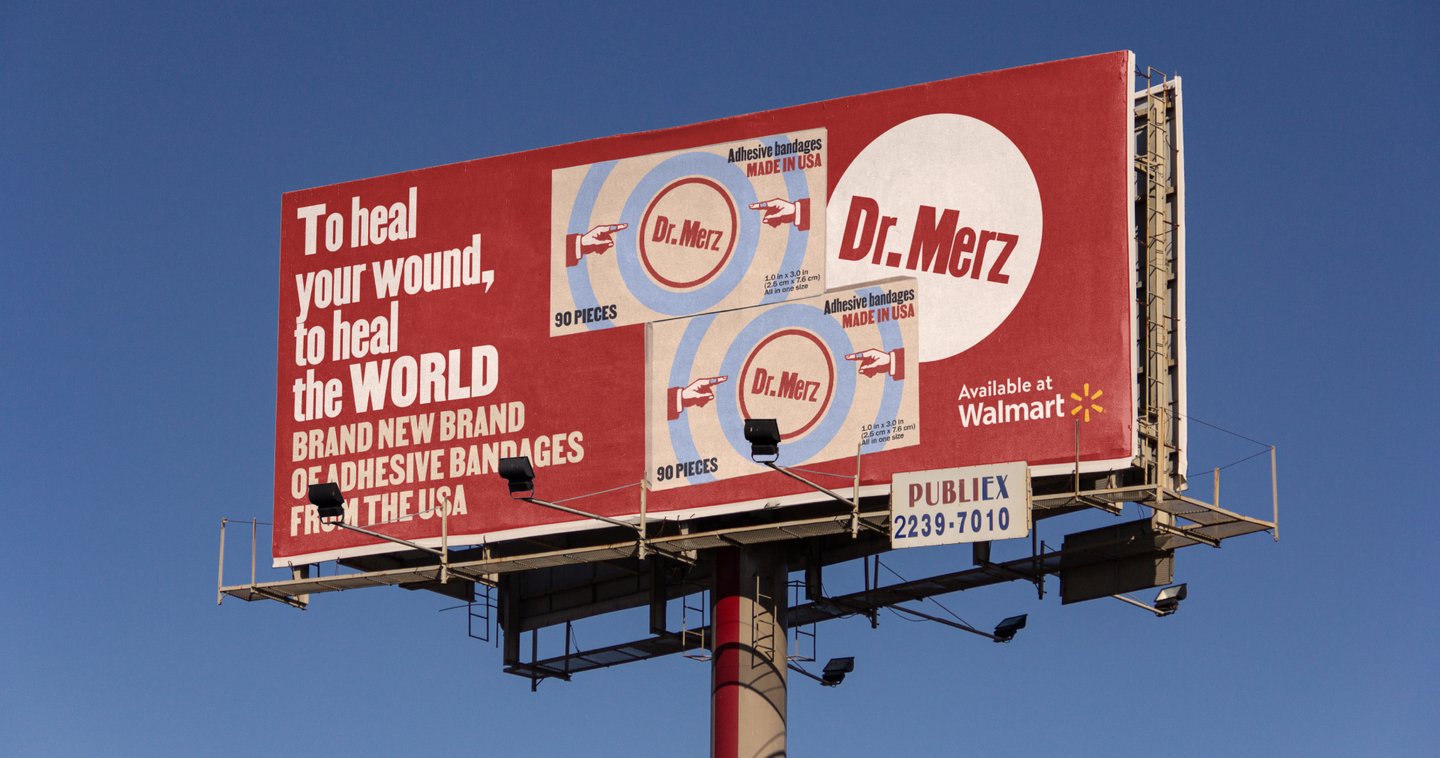
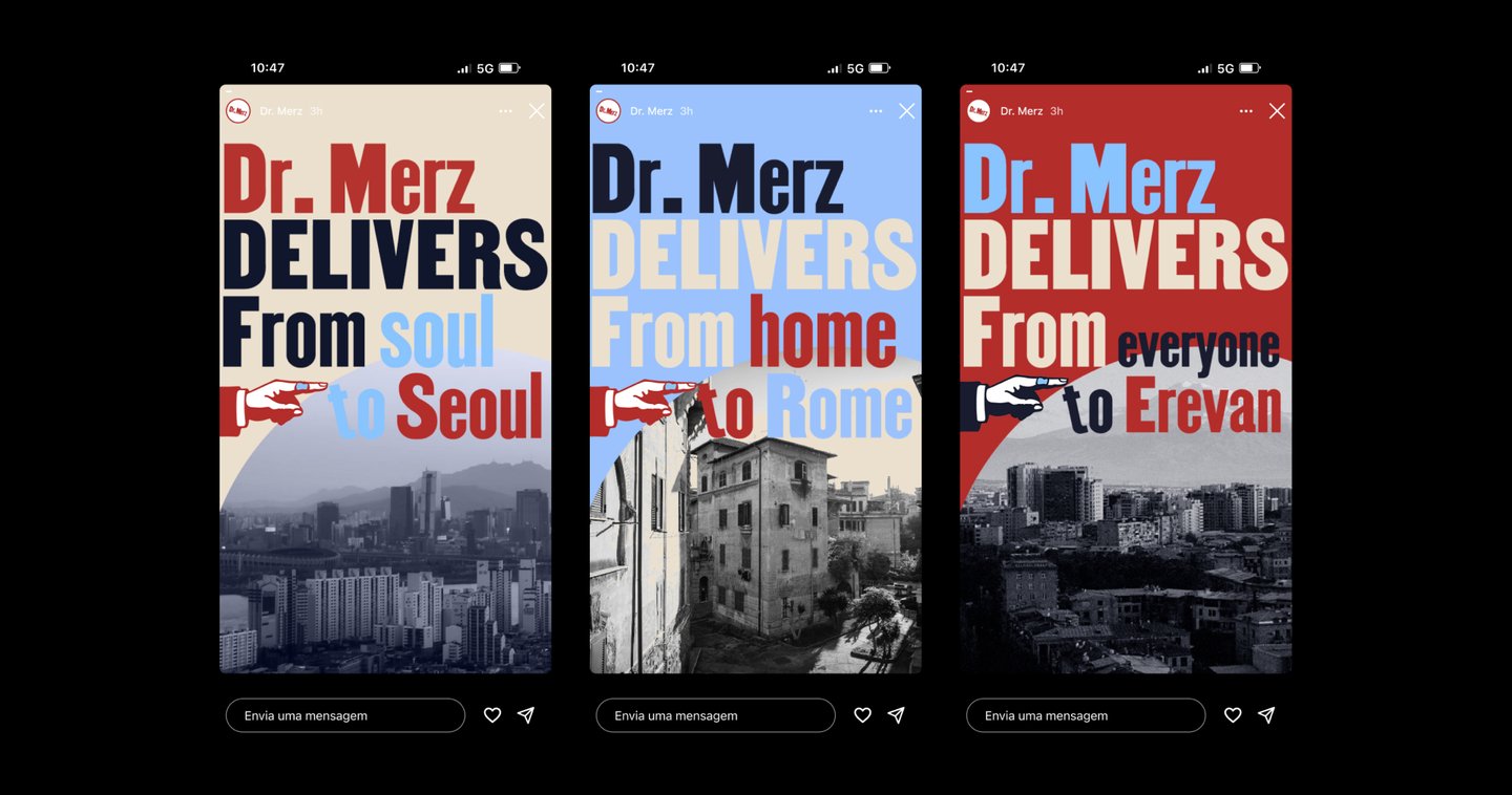
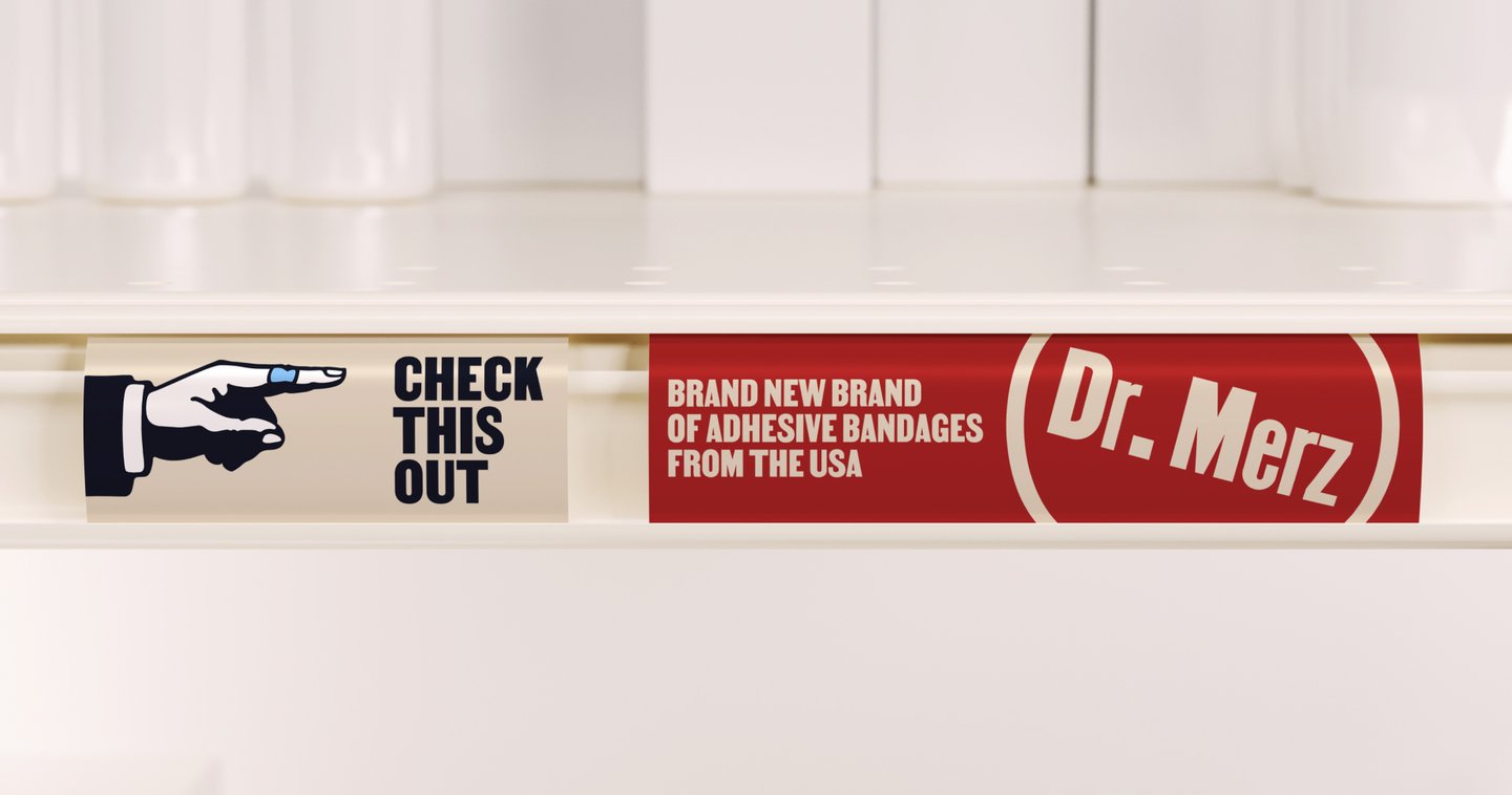
As a next step, I developed a series of packaging designs: a basic edition line, featuring different shapes and sizes of adhesive bandages, and a special edition line, with eye-catching prints referencing American visual motifs on the bandages. The packaging builds upon an already recognizable visual style while remaining self-ironic and highly appealing on the shelf.
02. Ordinary Wonder
» Fields: brand identity and navigation systems.At the Ordinary wonder rehabilitation center, burnt-out prodigies find the missing pieces of themselves like puzzle pieces and uncover new strengths they didn’t know they possessed. Therapy, career counseling, mentorship, and physical practices come together to turn ordinary wonder into reality.
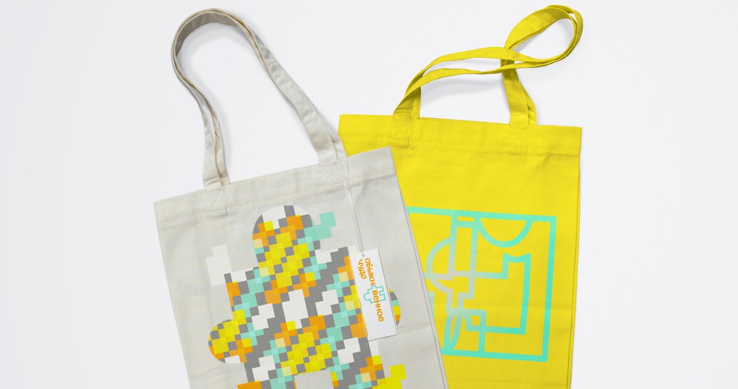
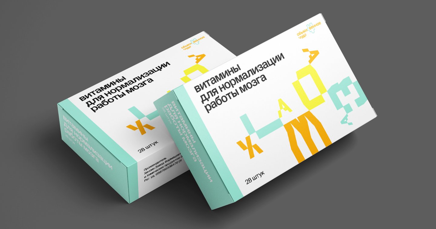
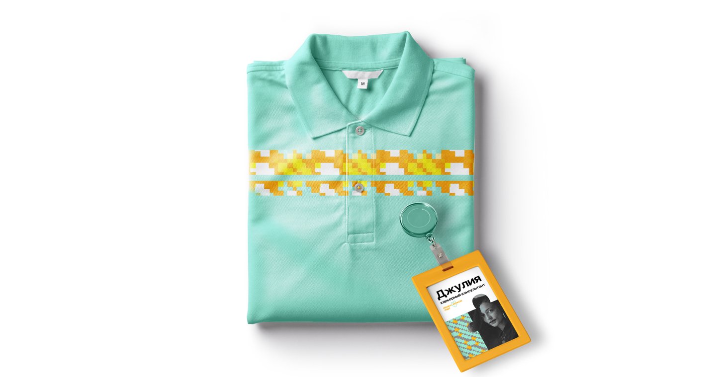
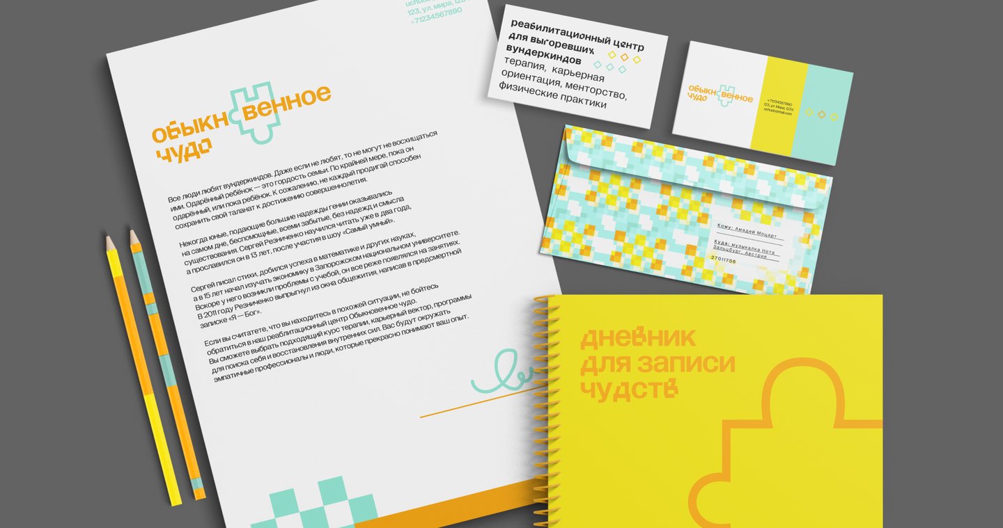
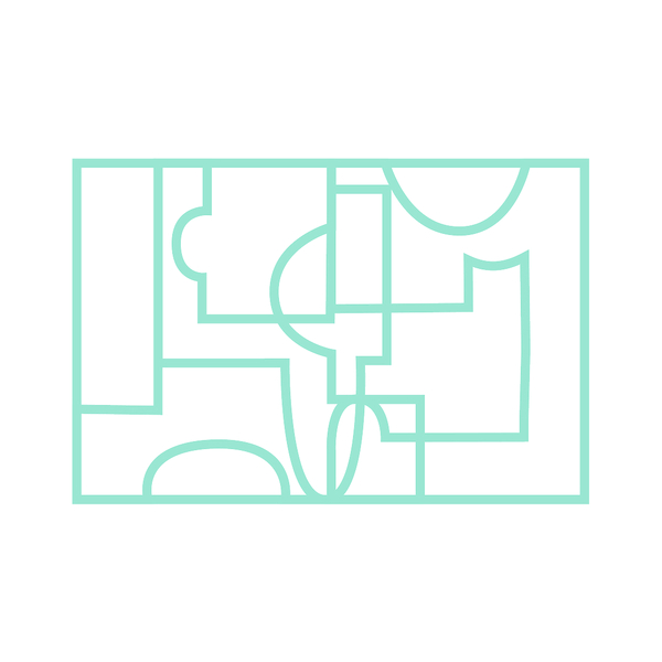
That is precisely why I selected puzzles as the primary visual metaphor for the project. They are incorporated into patterns, function as complete graphic codes, and appear in the typography. To capture the center’s therapeutic yet optimistic nature, I chose a bright and sunny color palette.
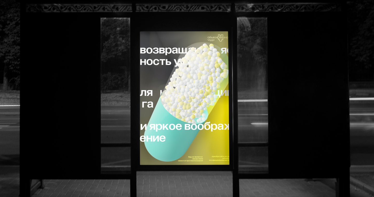
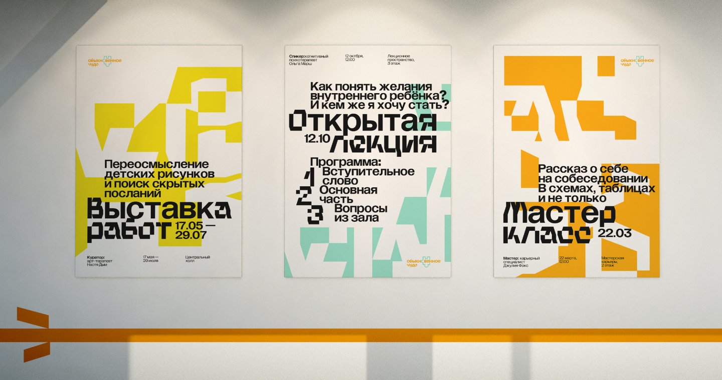
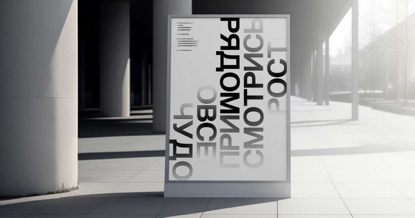
I also developed a comprehensive wayfinding and signage system for all interior spaces, continuing the puzzle presence in the center’s visual identity.
03. Strekoza
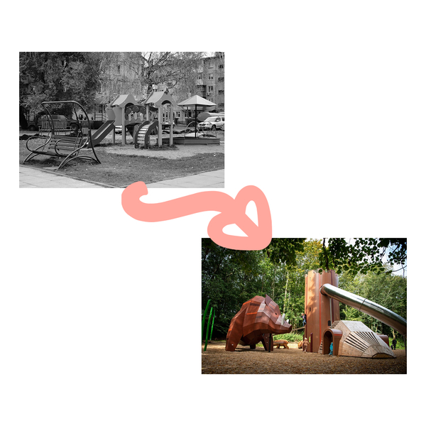
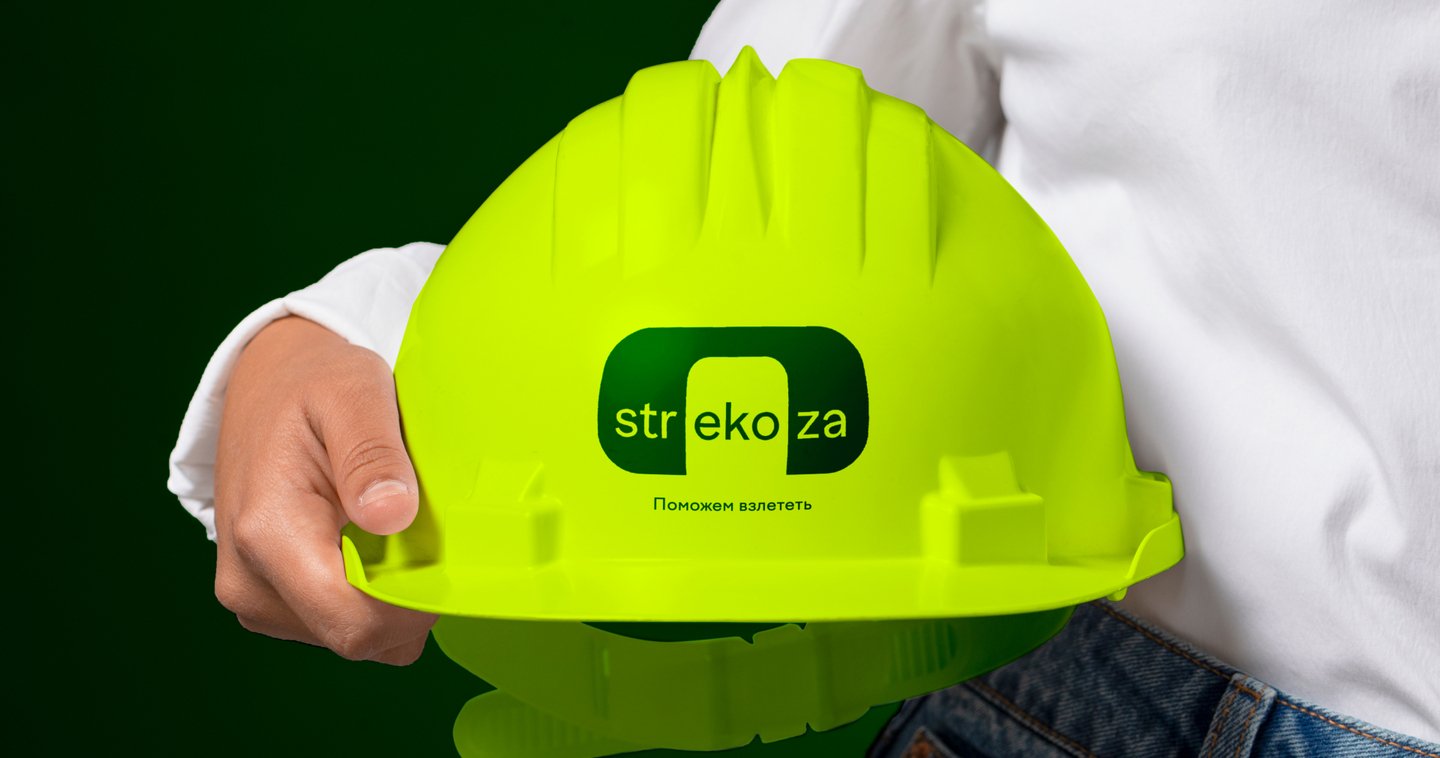
» Fields: brand identity.The playground market is saturated with commercial manufacturers fulfilling massive corporate and government contracts. As a result, you see the exact same playgrounds replicated across different cities and counties—they lack distinct character.This client is different. They adopt a highly regional and individualized approach, finding innovative solutions for every specific case with a strong emphasis on materials. Their mission is to study local climates, landscapes, and cultures, utilizing eco-friendly materials native to the area. They aim to tell stories through design and help kids unplug from their phones by developing their imagination, motor skills, and physical strength.
Taking all of these brand values into account, I developed three completely different concepts for this project. Ultimately, my research journey led me to these three territories:
“ First, a concept focused on combining various materials, high-tech solutions, and sustainability.
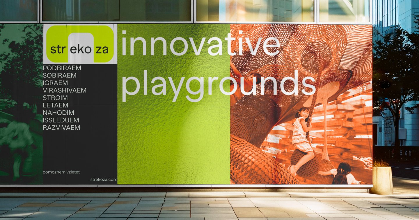
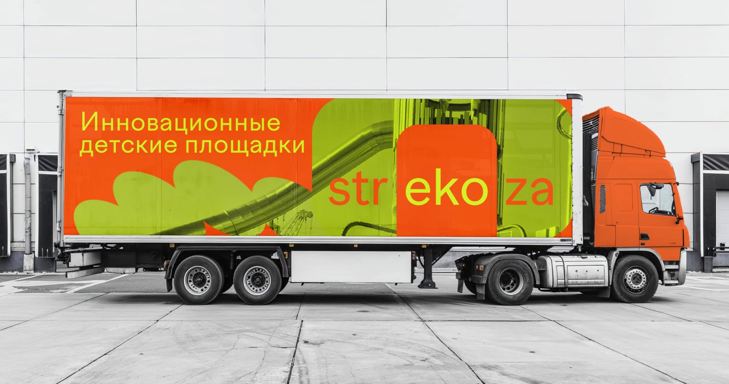
» Second, a concept where the playground resembles a bright dragonfly wing, utilizing mosaic patterns and striking colors.