ABOUT ME
My name is Kamila, and I am a graphic designer specializing in brand identity and visual communication.
I believe that good design extends beyond mere aesthetics. It is about crafting meaningful visual identities that authentically reflect a brand’s personality, values, and narrative. My approach integrates thorough research, rigorous conceptual thinking, and meticulous attention to detail to develop cohesive and distinctive visual solutions.
This portfolio showcases a selection of my projects, illustrating my creative process—from initial idea exploration and concept development to the construction of complete visual identities.
MY APPROACH
Discover
I begin by exploring the brand—its values, audience, and personality. Understanding the context allows me to identify what makes each project unique.Define
I translate research and insights into a clear creative concept, which forms the foundation of the visual identity.Create
I experiment with typography, color, composition, and graphic elements to develop a distinctive and cohesive visual language.Deliver
I bring the concept to life across various applications, creating a flexible and consistent identity that performs effectively in real-world contexts.For me, design is a balance between creativity and purpose. Every visual decision must support the idea behind the brand and contribute to its unique character.ALISA — Charity Foundation Rebranding
Concept
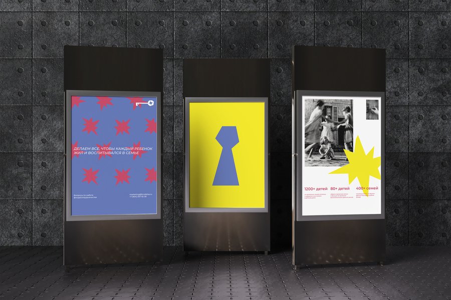
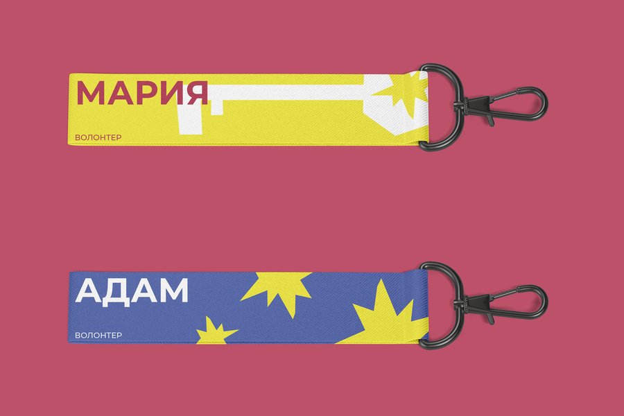
Alisa is a charity foundation supporting vulnerable children and families. The rebranding is built around the metaphor of a key to a real wonderland—a world where every child can find love, care, and safety.Design Solution
The visual identity combines a bright, vibrant color palette, friendly typography, and a key with a star symbolizing hope and new opportunities. Together, these elements create an optimistic and recognizable identity that reflects the foundation’s mission.
IN BLOOM
Concept
In Bloom is a series of product photographs inspired by floral aesthetics. The concept explores how botanical elements can visually express a product’s character and fragrance notes.OSMOTIC FONT
Challenge
To create an experimental typeface inspired by organic forms, moving beyond traditional geometric structures while maintaining a recognizable visual system.Concept
Osmotic is inspired by ink stains, bubbles, and fluid structures that continuously shift, merge, and adapt. The concept explores the relationship between typography and organic movement.Design Solution
The typeface is constructed around soft, irregular shapes, eschewing straight lines, sharp angles, and rigid symmetry. Variations in stroke thickness and proportions grant each character a distinctive form while maintaining a cohesive visual language.
Outcome
The result is an expressive experimental typeface that combines organic aesthetics with a consistent set of design principles.GLOWKEEPER
Concept
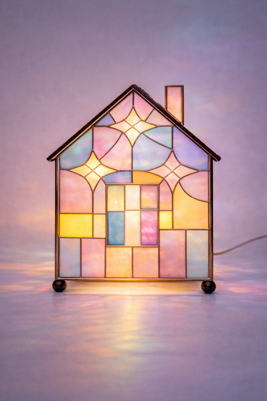
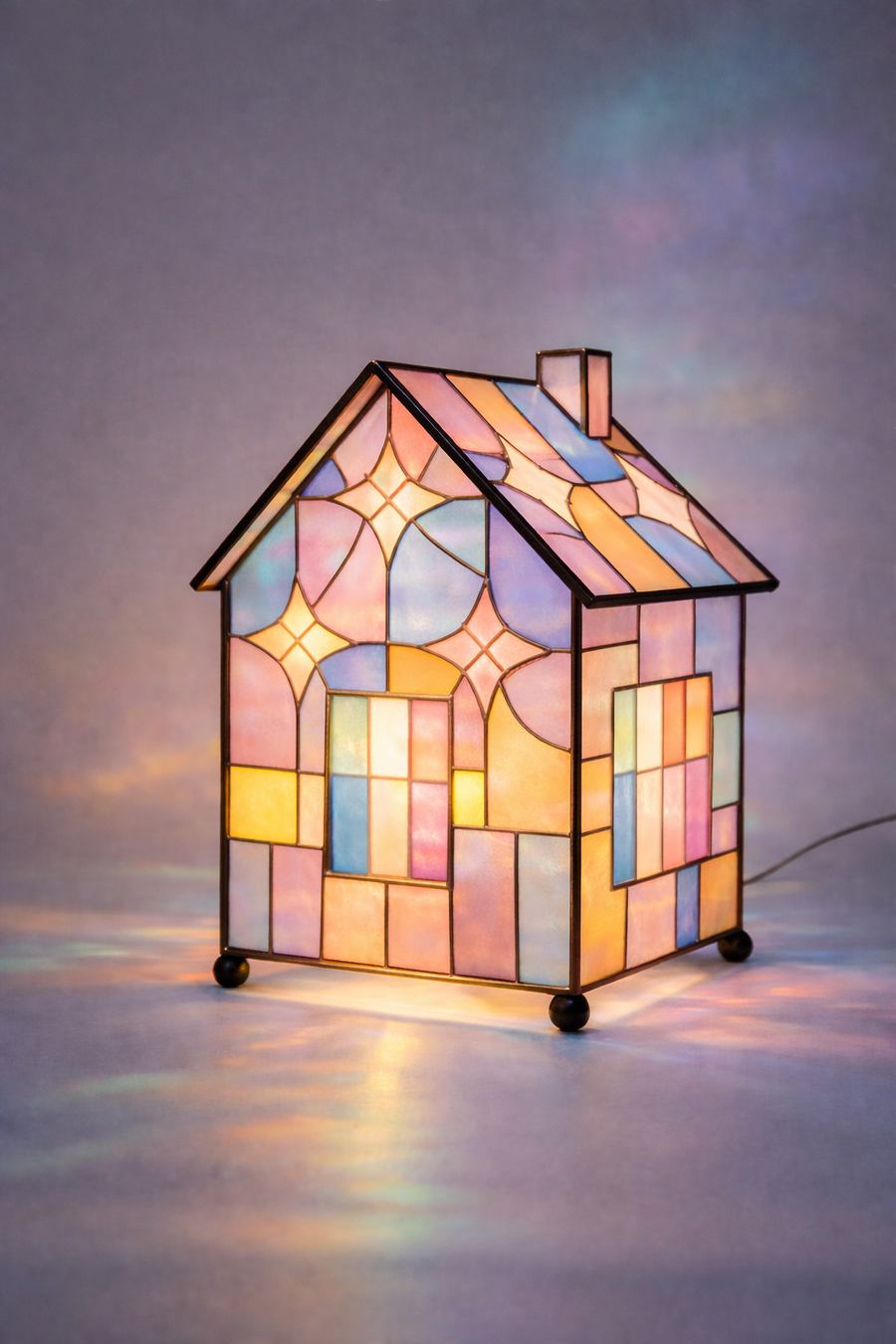
Glowkeeper is a decorative house-shaped lamp inspired by the feeling of home, warmth, and tranquility. Textured stained glass transforms light into soft, ever-changing reflections.
Design Solution
The design merges a simple architectural silhouette with expressive glass textures, creating a unique lighting object that infuses interior spaces with comfort and atmosphere.