From «something like this, but not this» to a visual identity
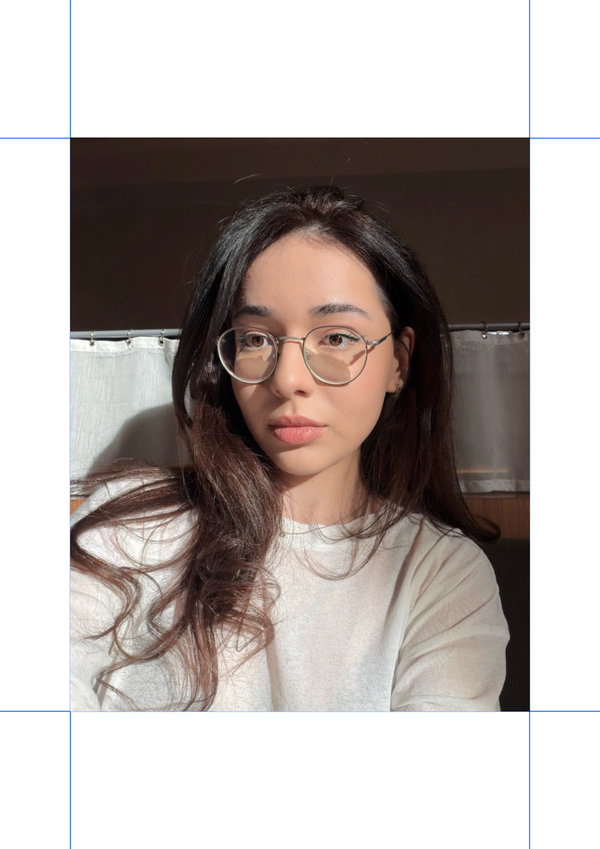
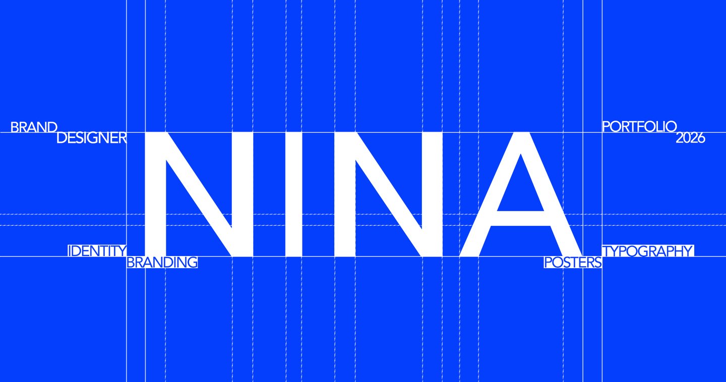
I’m Nina, graphic designer: identity, branding, posters, and typography.I don’t adhere to a set style that I stamp onto every project. I start with the brief, and the project’s logic determines its final look. Layout is my favorite part. Yes, I can spend two hours selecting a typeface and I’m not even sorry. I work directly with clients, so you always know exactly where we are in the process and what comes next.Have an idea that’s still a little rough around the edges? Bring it to me as is. I’ll help you structure it and transform it into a design that finally looks like what you envisioned.
My approach
01 | ASK What should this design accomplish, and for whom? I begin with the task, not the style.02 | SKETCH I seek the logic of this specific project and test ideas quickly, before anything is polished.03 | BUILD The idea becomes a system: identity, typography, layout—whatever the project requires.04 | REFINE Spacing, typography, details.05 | HAND OVER Final, ready-to-use files.
Case | 01
«KinoKavkaz»
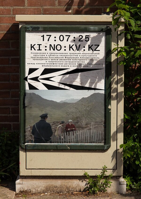
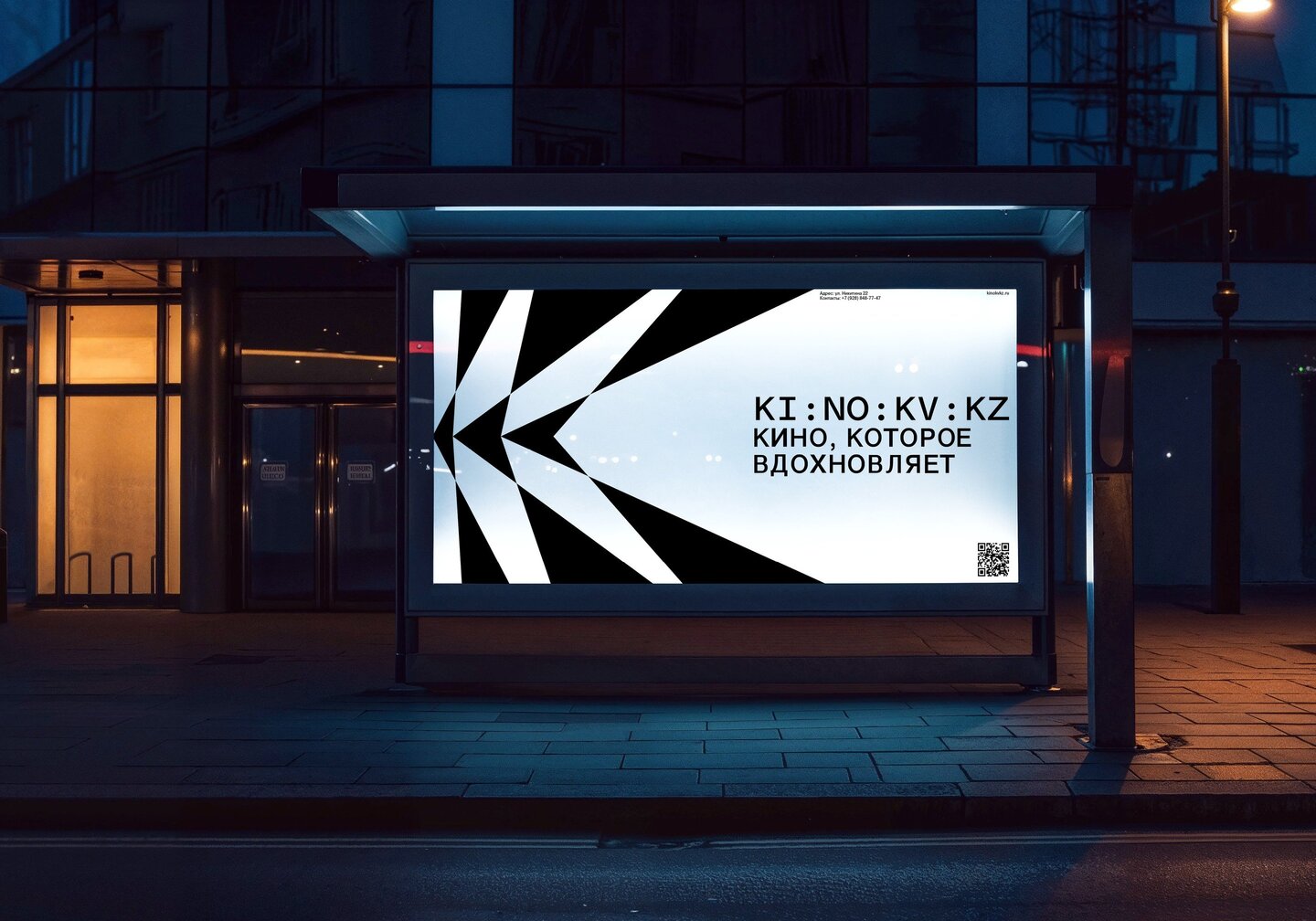
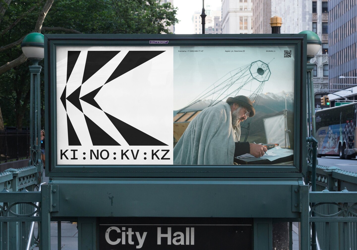
Film festival rebrandingTask «KinoKavkaz» is a film festival with an outdated visual style. The challenge was to reimagine it and create a contemporary identity.Solution One letter, two images: mountains and light. The identity is built around the letter «K.» It represents the festival’s name and embodies the spirit of the Caucasus. Its form recalls the region’s mountains, while the logo’s lines echo the beams of spotlights.
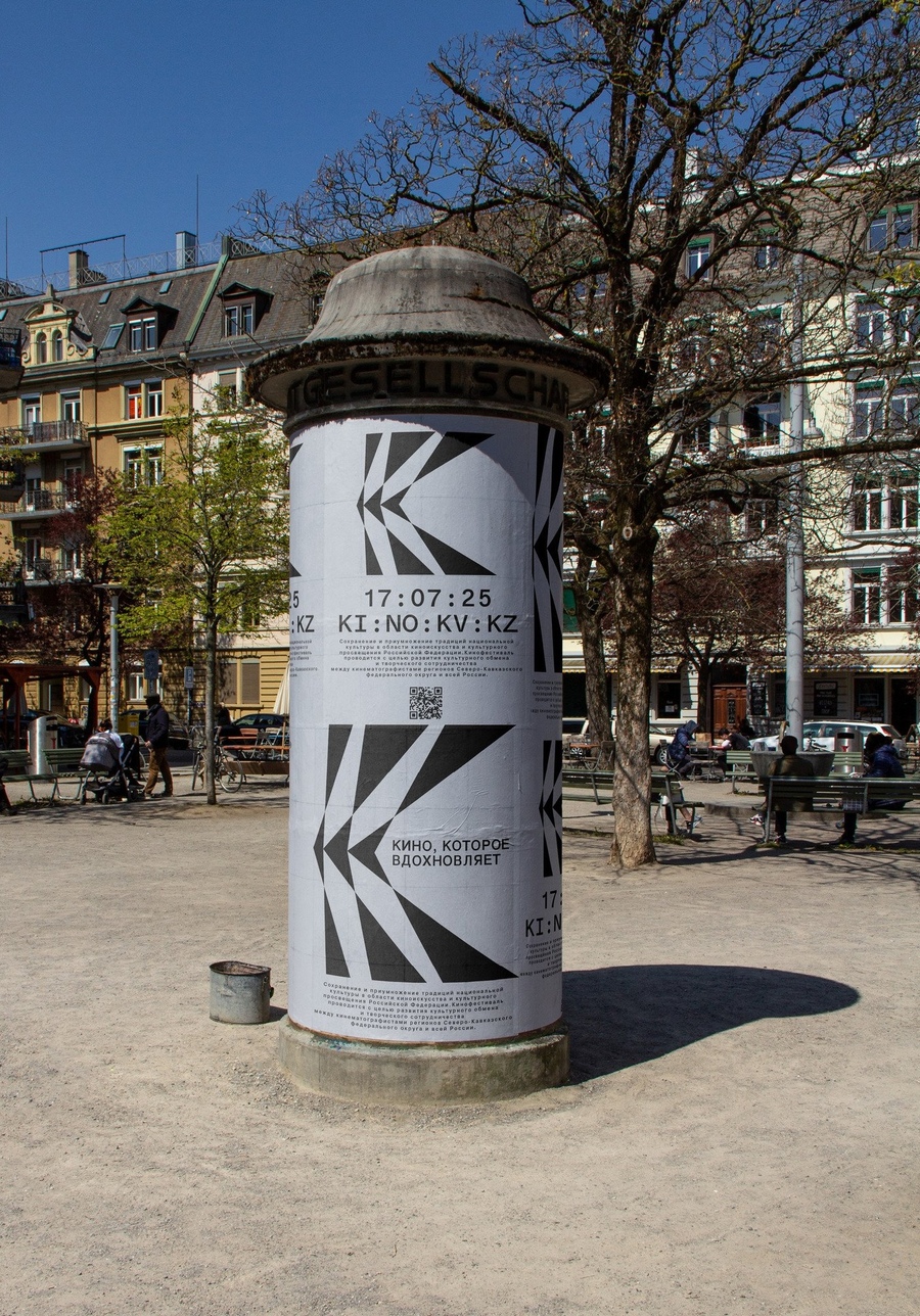
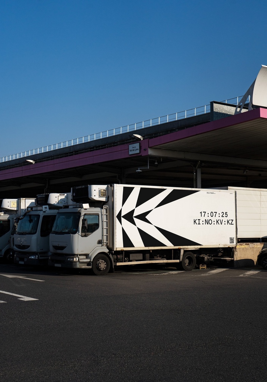
Result The new identity works across print, the street, and the screen. Compared to the old style, it feels fresh and contemporary.
Case | 02
«Botanical Greenhouses»
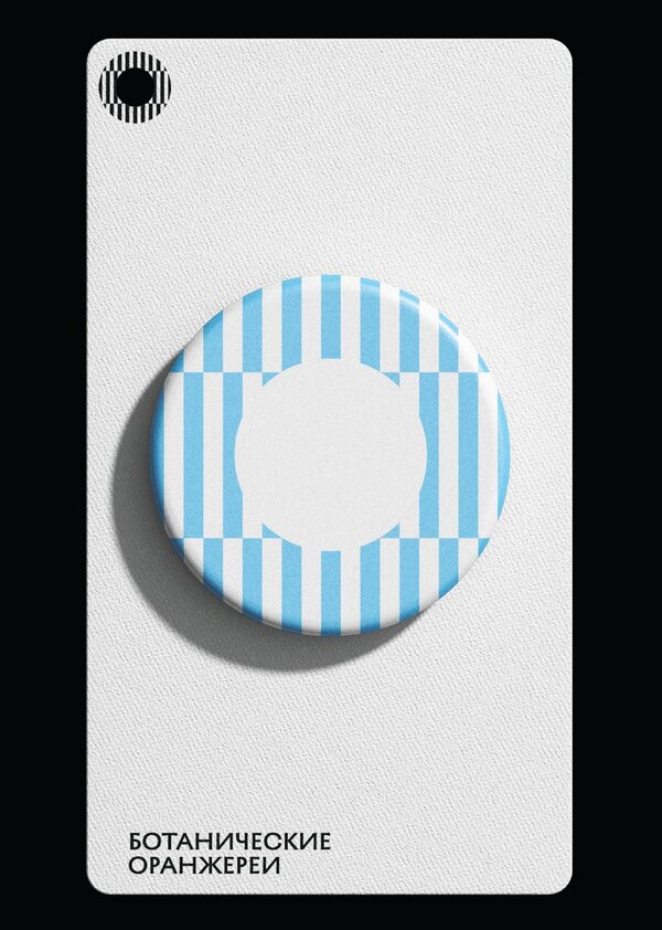
BrandingTask The botanical greenhouses at the Arkhangelskoe estate were housed in a building with a strong architectural presence, yet lacked its own visual identity. The challenge was to develop a complete brand identity system for the venue.Solution The concept emerges directly from the architecture itself—specifically, the window grilles. Their geometry lends the identity a graphic, disciplined character.
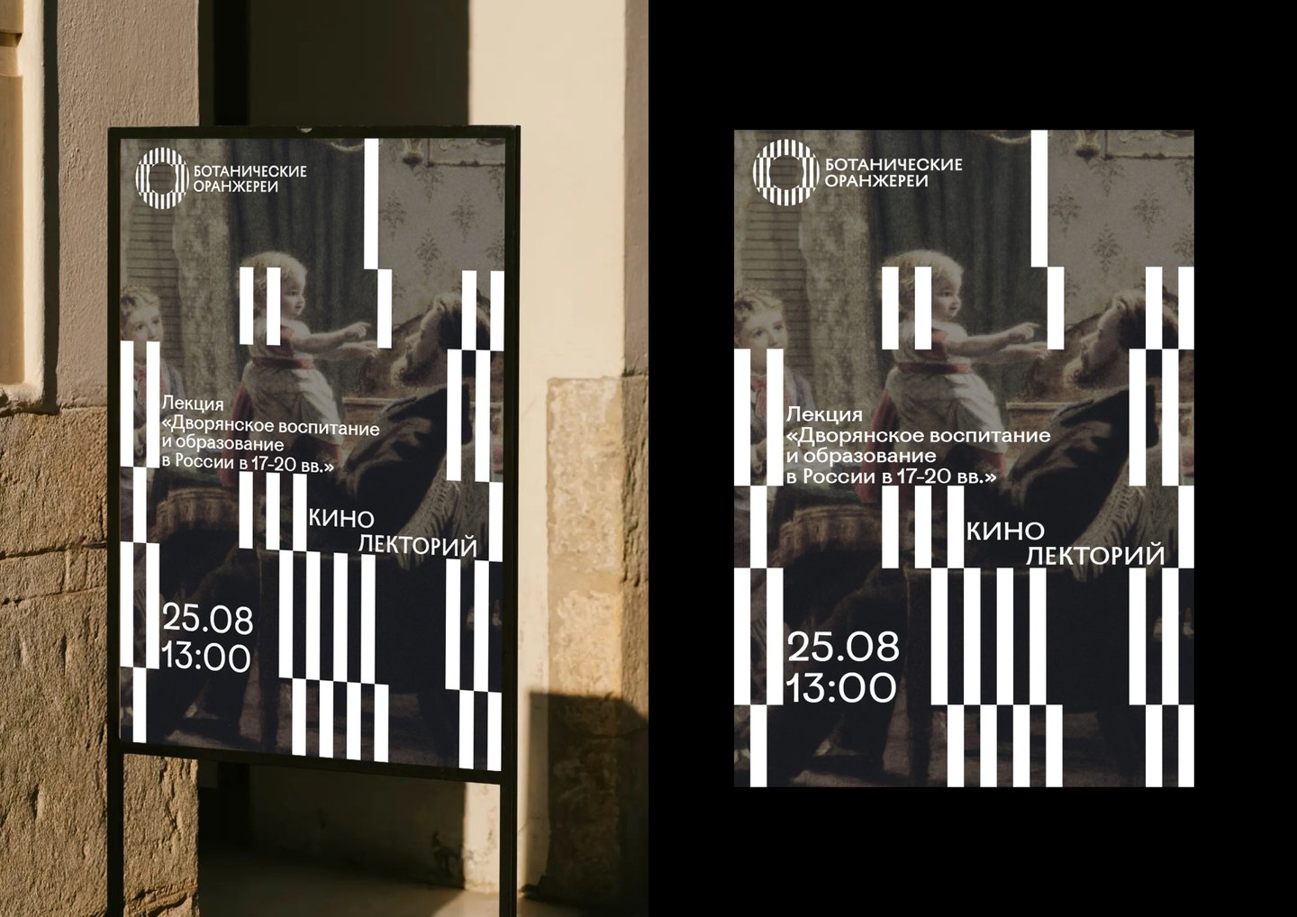
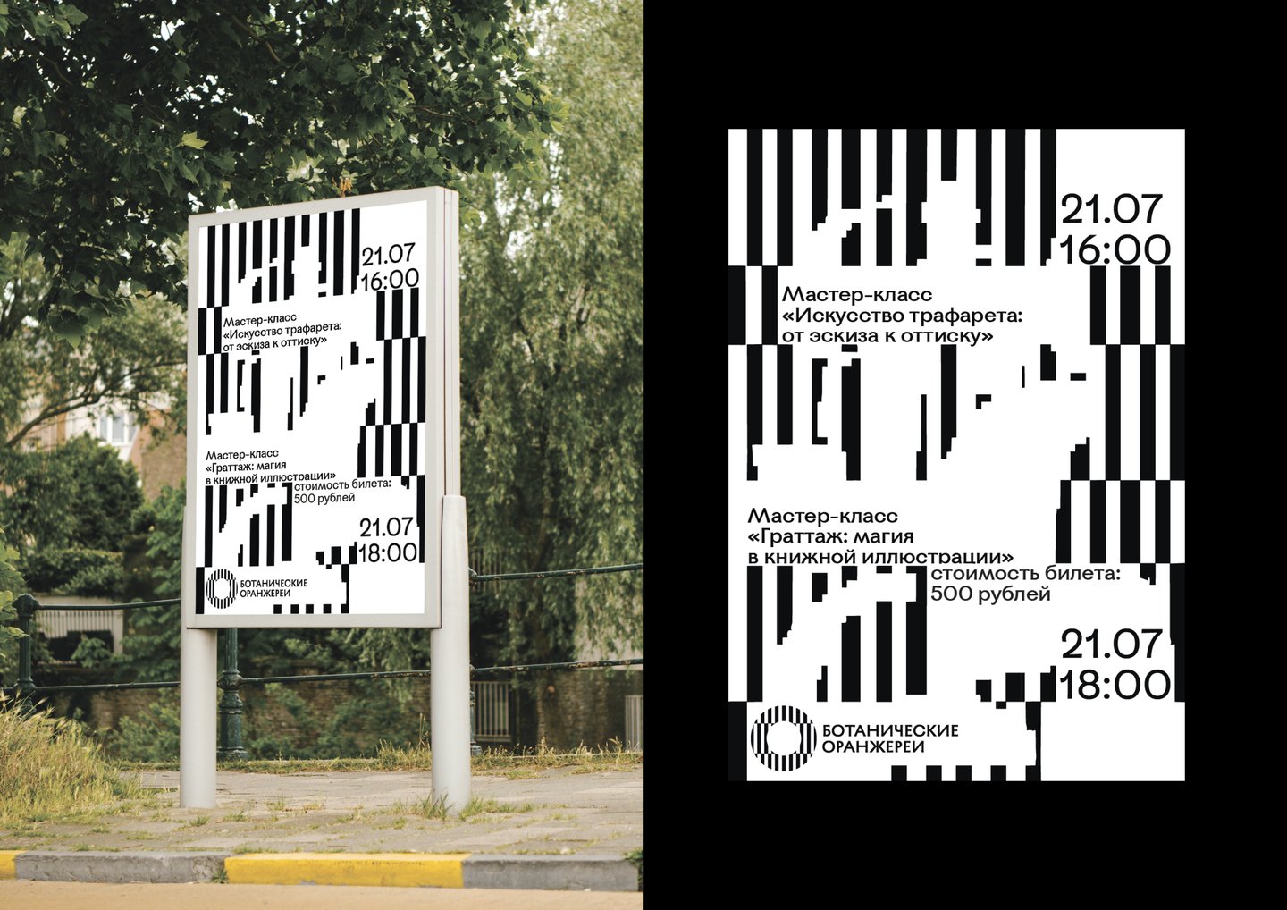
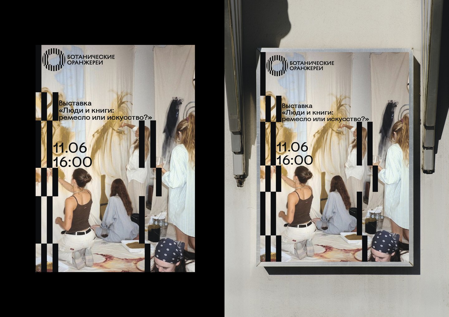
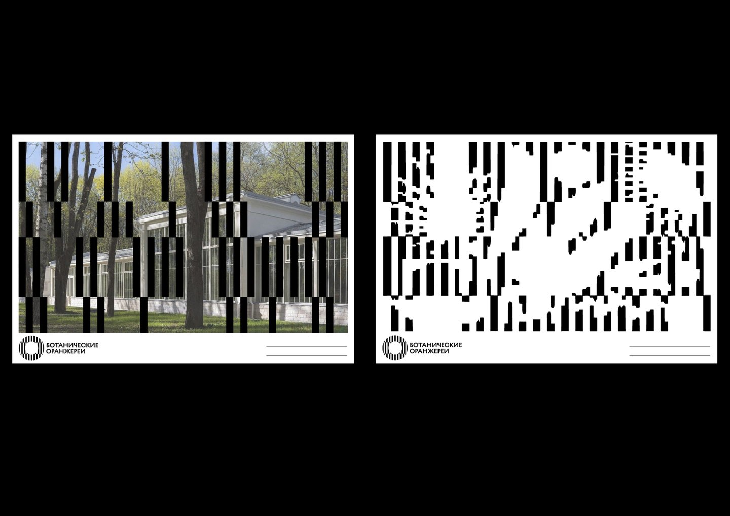
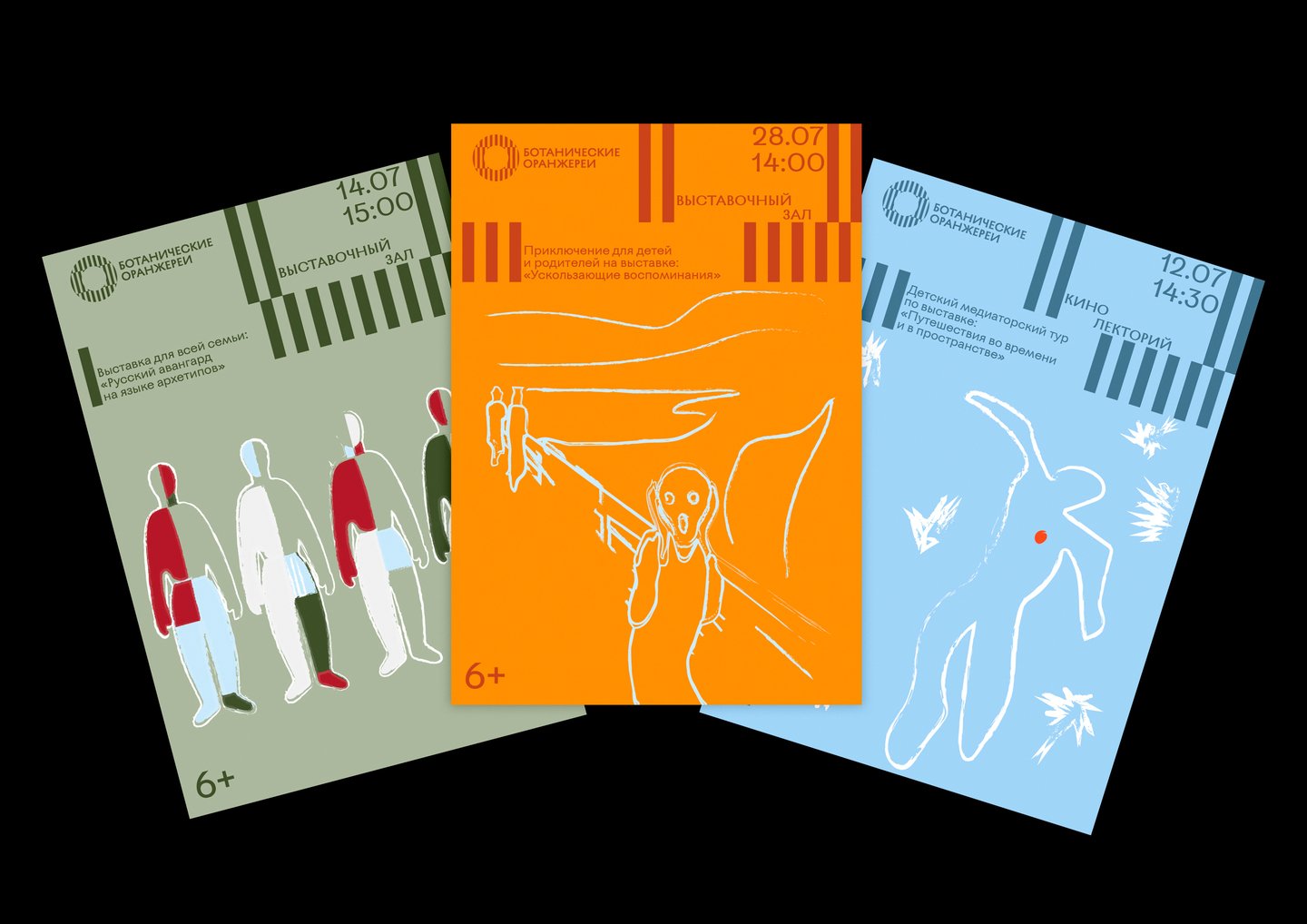
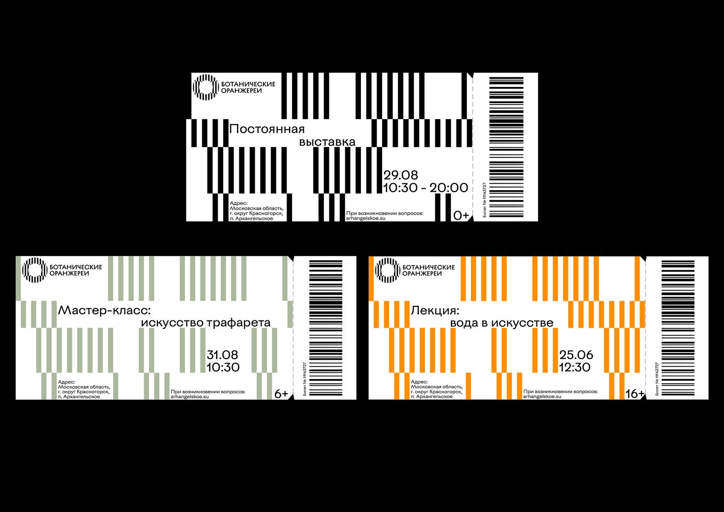
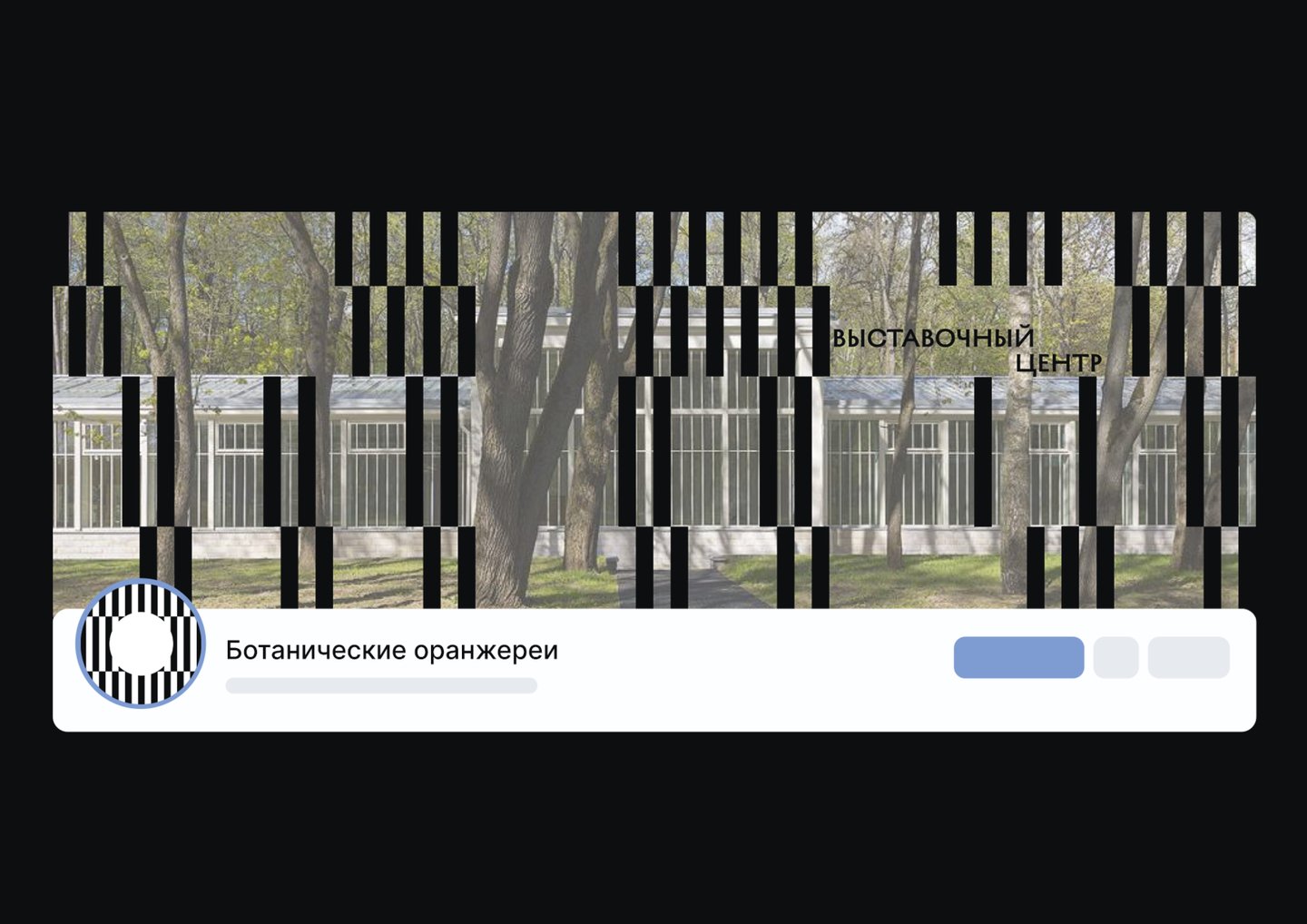
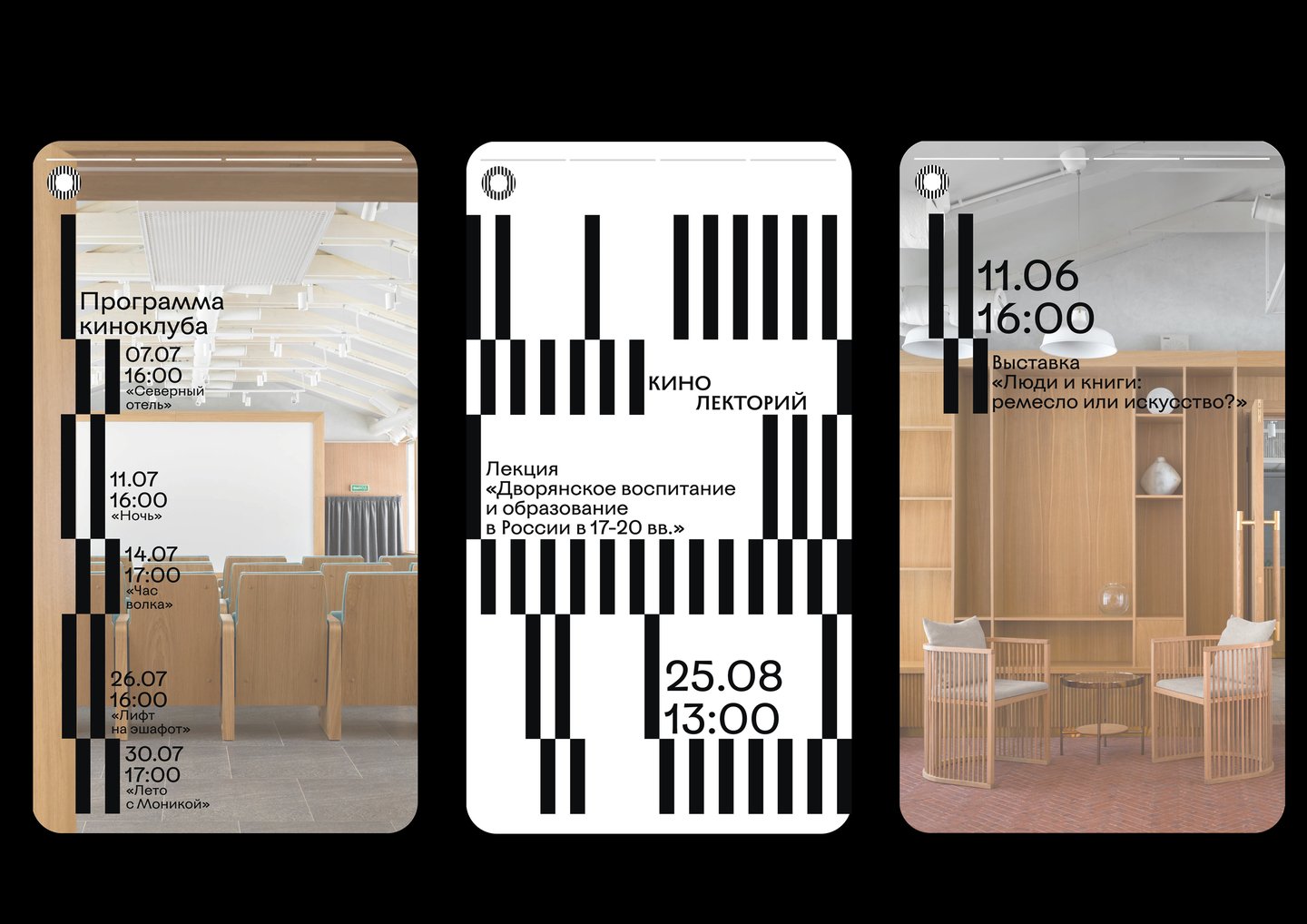
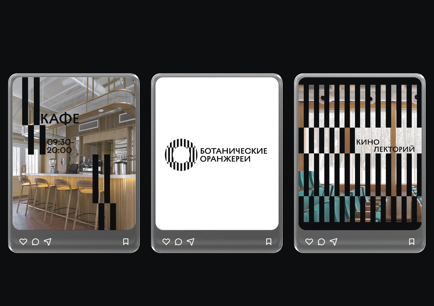
Result A cohesive identity system, developed for print, space, and digital applications. The project placed in the top 3 of a competition.
Case | 03
«Architecture of the Caucasus: A Visual Chronicle of the Past»
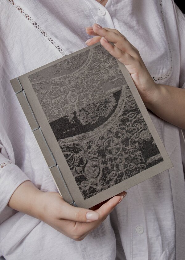
Visual Research and Book DesignTask To deconstruct the visual language of ancient North Caucasus structures—to take it apart and make sense of it.Concept Architecture as a chronicle of time, etched into the mountain landscape. In the North Caucasus, architecture transcends mere physical form. Ancient buildings served not only practical and defensive purposes but also embodied the philosophy of survival, the traditions, and the sacred meanings of the region’s peoples.Solution The layout conveys the aesthetic of the concept through typography, grid structure, and binding.
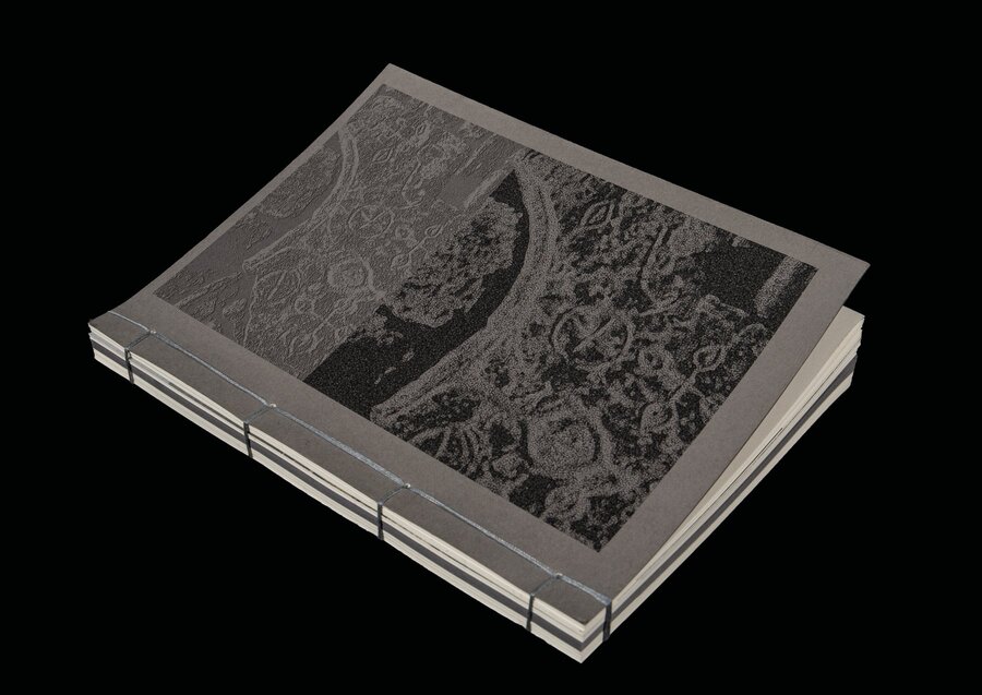
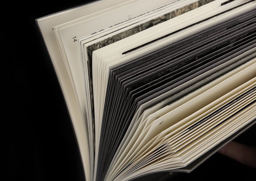
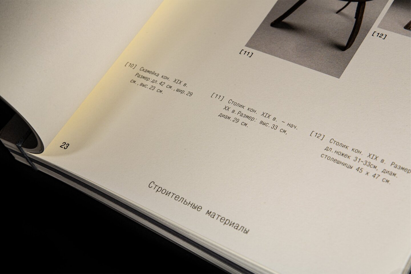
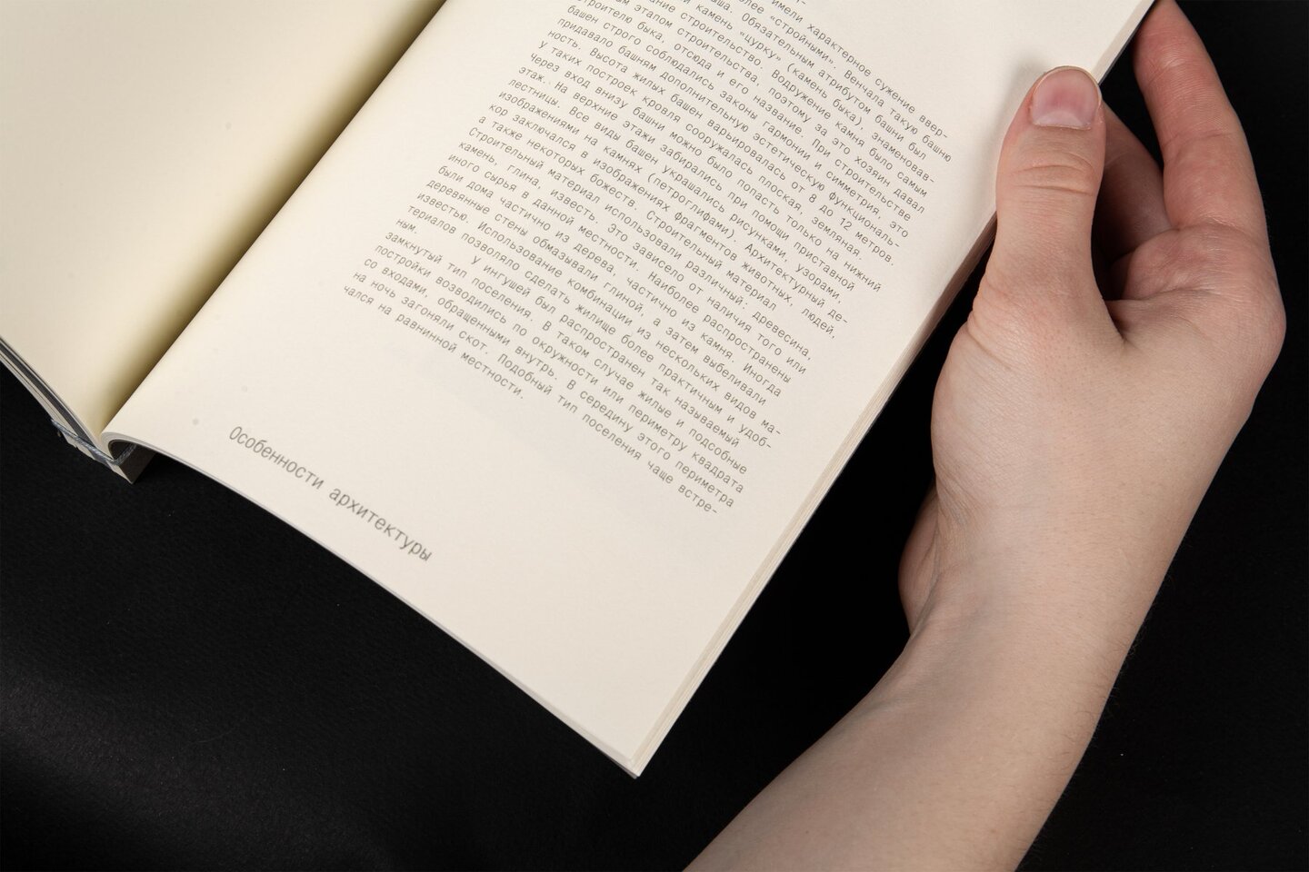
Result Everything came together as a cohesive whole that embodies the subject of the book.
Case | 04
Posters
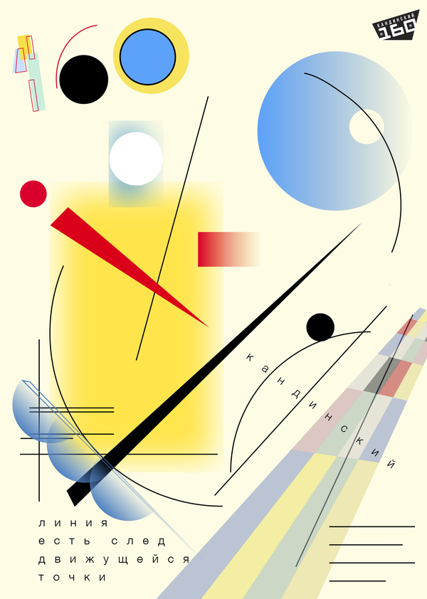
Different briefs, different solutionsProject A collection of posters created for various competitions and assignments: music events, festivals, film screenings, and more. Each project had its own specific brief, target audience, and set of requirements. The core challenge was determining the optimal approach for each one.Execution Every poster was designed to meet the unique demands of its brief, with an approach tailored individually to the theme.