Your users are 19. Do they actually listen to you?
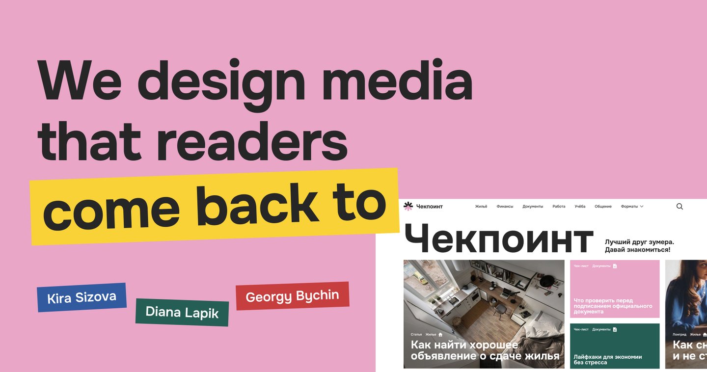
We are Kira Sizova, Diana Lapik, and Georgy Bychin—a team of three covering research, design, and code. We help companies build digital products and brands that young people actually use: from the first interview to a working website.
Gen Z skips anything that sounds like a lecture
Young people don’t read bureaucratic guides. They ask friends, parents, and ChatGPT. If a product sounds like a bank form, it loses them in seconds. Here is how we solved this for one media product.
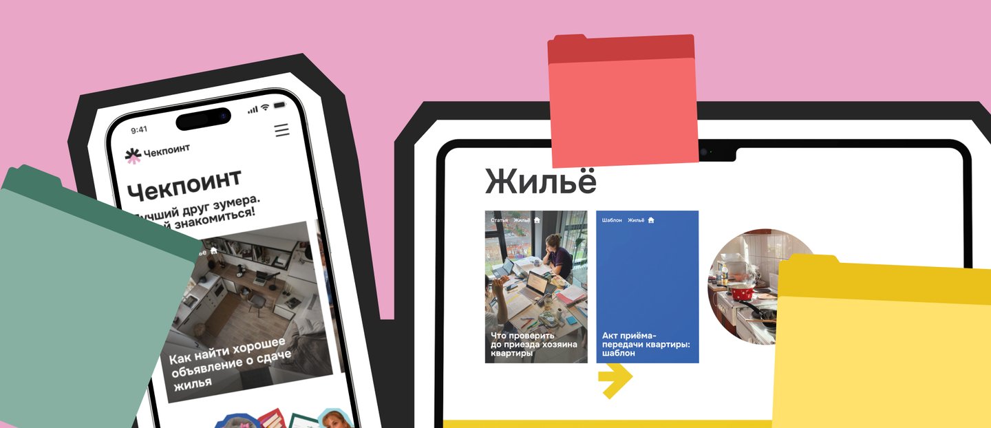
Problem: Adult life comes without instructions
Renting an apartment, paying bills, taxes, landing a first job—school doesn’t teach these things, and the internet is either too academic or too superficial. The idea stemmed from our own experience: we kept running into basic adult tasks without knowing where to begin.
Research: we started with people, not pictures
First, we studied the topic: what young people actually search for when facing adult tasks.
Five in-depth interviews revealed three core needs
Young people want their challenges to feel normalized, not shameful. They seek clear guidance from the outside. They feel most lost when it comes to financial questions. They tend to act only when a problem arises, so they look for the quickest solutions.
Our research foundation: pitch and brief, mission and values, audience analysis, and the cultural context of growing up.
«Adult life feels like a slimy creature that gets inside you”— interview respondent
Each finding translated into a design decision. People want to organize things quickly—so we introduced checklists, templates, and difficulty indicators. Tedious tasks are deferred—so we incorporated a reading-time filter and clearly defined topics. Context dictates depth—so we mixed short posts with in-depth long reads.
Idea: not a teacher, but an older friend
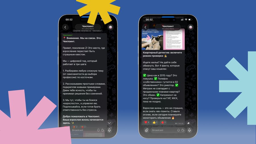
Checkpoint speaks like a peer—casual, slightly ironic, and never judgmental. Its archetypes are the Sage and the Caregiver. Every topic is framed as «situation → solution»: a short guide, a step-by-step plan, or a checklist.
Identity: a save point, not a lecture
Full logo and short mark: a crossroads with an arrow pointing forward.
Research: We started with people, not pictures
Six sections—housing, finances, documents, work, study, and social life—each assigned its own color. Typeface: Onest.
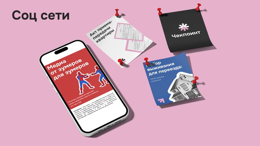
Feels like social media, not a textbook
UX: every feature
started as an insight
Information architecture: from the homepage to sections, formats, and articles.
Wireframes for six key pages: home, section, article, checklist, template, and about.
UI kit: typography, buttons, tags, cards, and navigation in one system.