Hi!
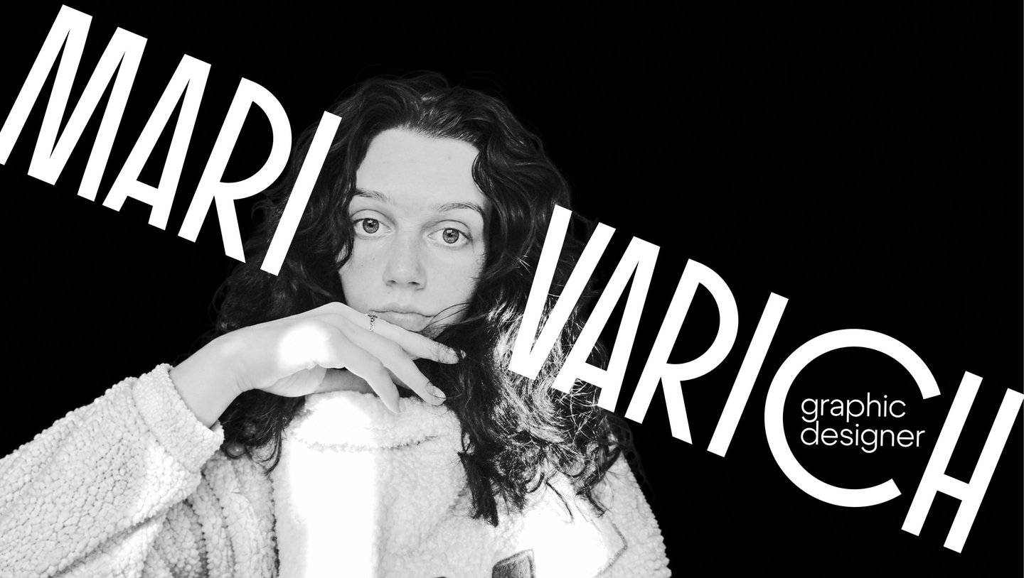
My name is Mari Varich
I am a graphic designer with a Bachelor’s degree in Communication Design from the HSE Art and Design School.
I am drawn to bold, unconventional ideas, so I look for what makes each project special: the product, the story, the people, the details. I find unexpected connections and translate them into visual solutions—from brand identities to original graphics.

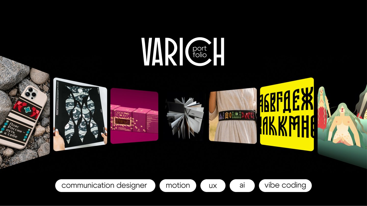
My portfolio features projects across a range of formats—from visual identity and packaging to apps and animation.
During my studies, I focused primarily on visual identity and branding while also gaining experience in other areas of design.


Alga is a local pasta brand from the Solovetsky Islands, made with the islands' seaweed.
For Alga, I developed packaging built around the concept: «Cooking is an art.»
Color palettes inspired by seaweed set these products apart, while original illustrations showcase their ingredients and pasta shapes.
A transparent window transforms the product into an image while displaying the contents. A cohesive visual system adapts across various box formats, ensuring brand recognition and intuitive information navigation.


Alga — a pasta brand made with seaweed from the Solovetsky Islands
The concept of visual identity merges the cultural heritage of the Solovetsky Islands with a contemporary interpretation of a familiar product. This dialogue is expressed through the contrast between a serif and a sans-serif typeface: the former evokes history, while the latter highlights the brand’s modern character. A continuous line resembling a strand of pasta connects them, transforming the link between past and future into a distinctive graphic element.
The black-and-white palette ensures the typography maintains a consistent identity across different formats. The combination of formal type and a playful line makes the communication feel less rigid and gives the brand its own visual language.


I developed a rebrand for Russia’s Golden Ring based on the metaphor of a belt connecting eight cities and their traditions. Each city received its own symbol and color, which were integrated with the logos and pictograms into a flexible visual identity system.
A signature belt line ties the graphics together into decorative patterns and connects all brand applications. The system preserves each city’s individuality, makes the route recognizable, and allows the identity to adapt to different contexts.