Graphic Design / Visual Communication

I’m Yaroslava Kudryashova, and I’m interested in visual communication, typography, and visual identity. I am currently studying Fashion Industry Branding at the HSE Art and Design School.
I enjoy exploring how colors, shapes, and graphic elements can coalesce to communicate ideas and forge a distinctive visual language.My design approach blends creative experimentation with a meticulous attention to composition, detail, and concept. I have a particular interest in developing visual identities and applying them across various formats—from posters and print collateral to broader brand touchpoints.My role is to transform ideas into cohesive visual projects—from concept development to execution.
The Challenge
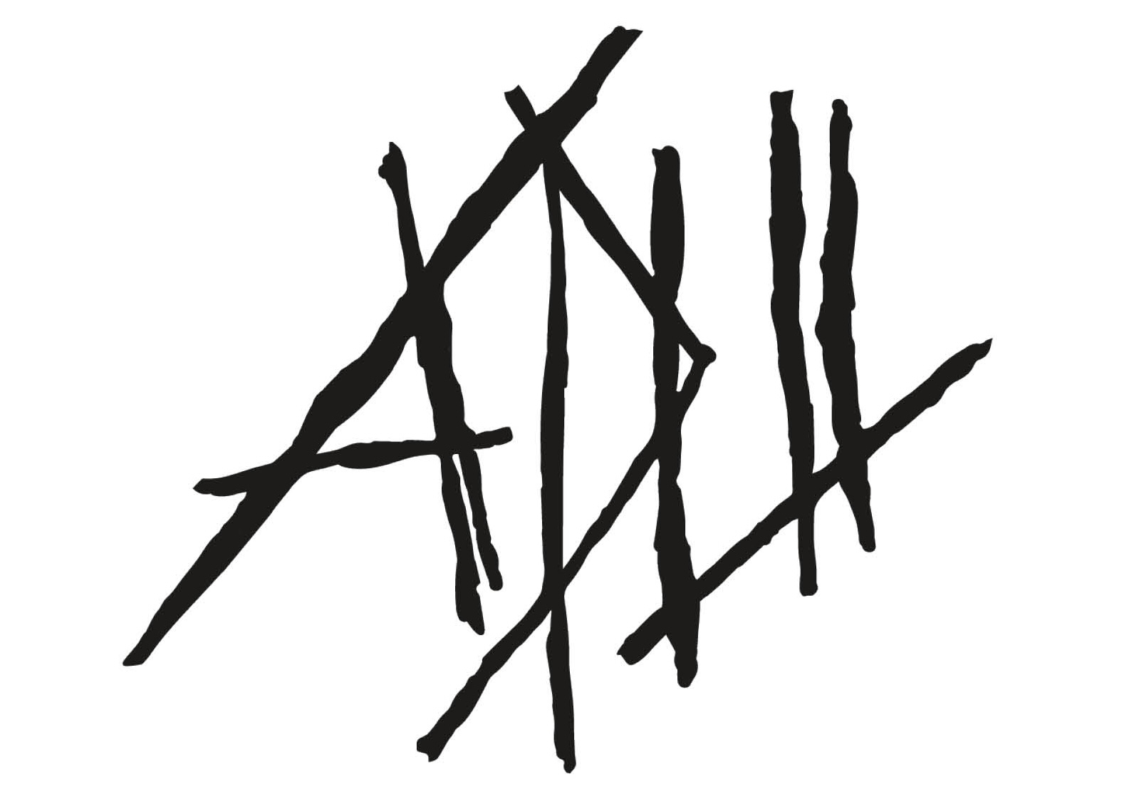
The main challenge was creating visual communication materials for «ARSH» that could serve diverse purposes while maintaining a connection to the atelier’s identity. The project included posters for two separate events, in addition to business cards, postcards, and other branded collateral. Each format demanded a distinct approach to composition and communication. My goal was to explore how typography, color, imagery, and graphic elements could generate distinctive designs while contributing to a cohesive visual presence.
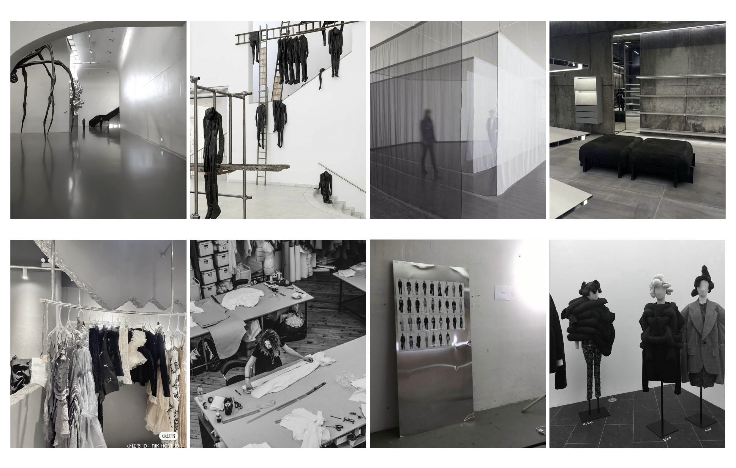
Visual description of a space
MY APPROACH
I approached the project through experimentation with typography, composition, color, and graphic forms.
Rather than using one identical layout for every piece, I explored different visual directions based on the purpose and theme of each design.
This approach allowed me to develop individual compositions while considering how the materials relate to the atelier as a whole.
The project combines conceptual exploration with practical graphic design across multiple formats.
Poster Series 01
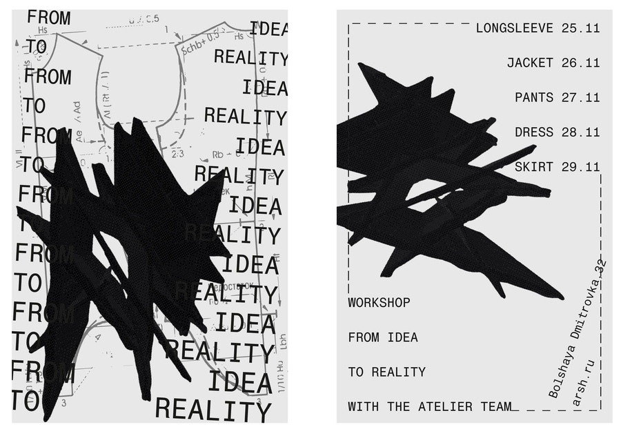
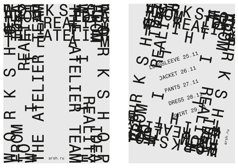
FROM IDEA TO REALITY
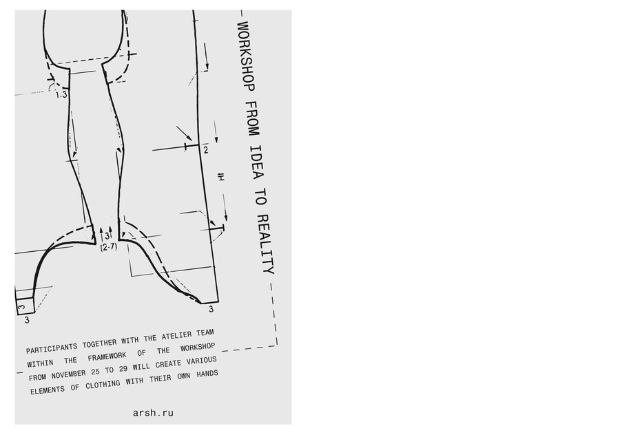
The first poster series explores the journey from an initial idea to its physical realization.
Inspired by fashion, garment construction, and the creative process, the designs combine experimental typography, clothing silhouettes, and contrasting graphic elements.
The compositions create a dynamic visual rhythm, reflecting the transformation of an idea into a tangible result.
The series establishes a distinctive visual direction for the event while communicating its creative theme.
Poster Series 02
TRANSPARENCY
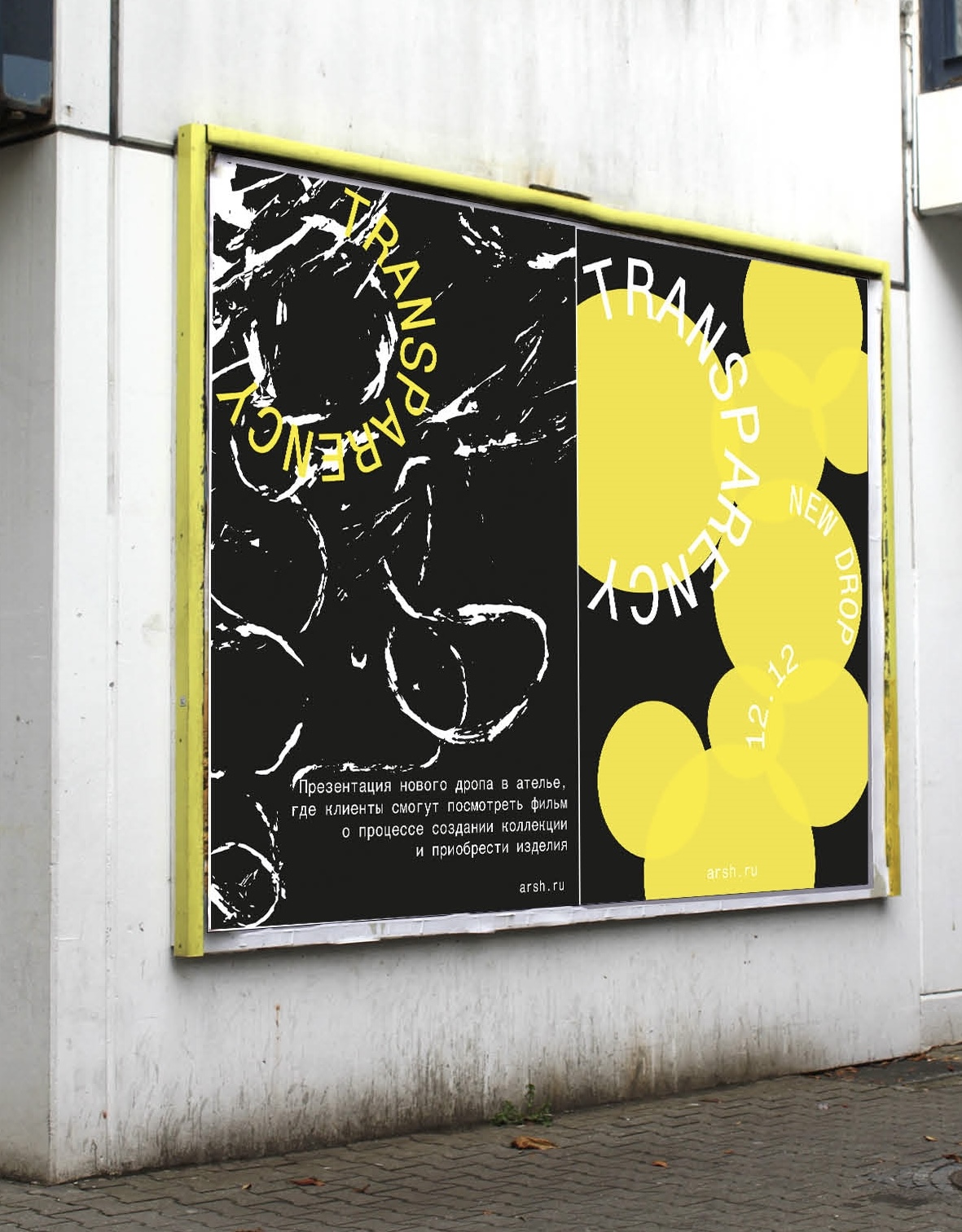
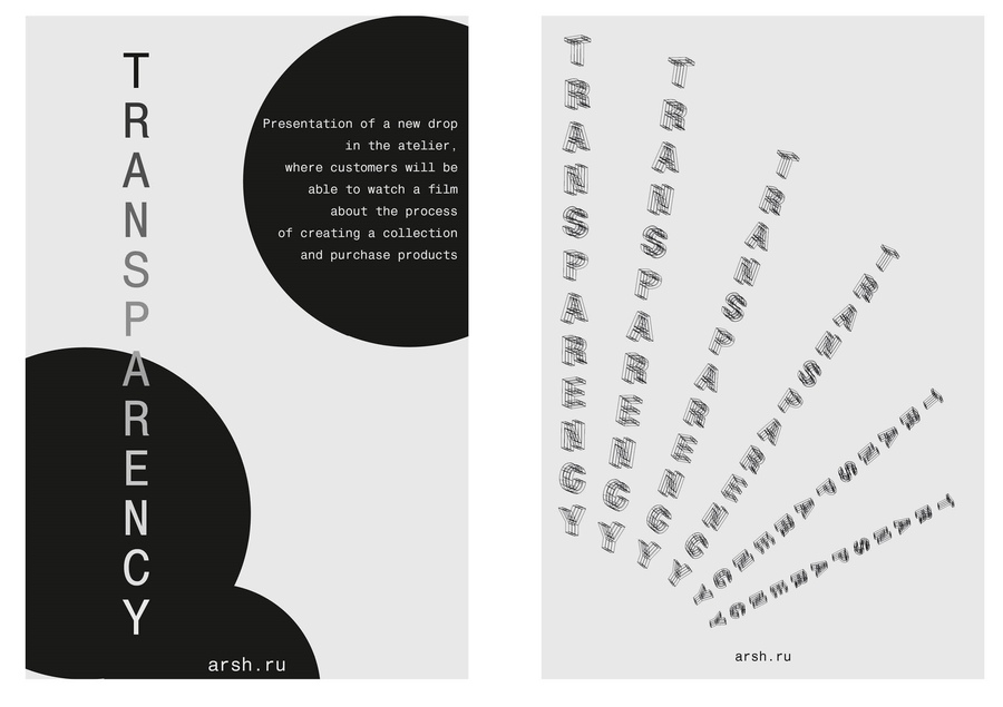
The second poster series explores transparency through overlapping shapes, contrasting colors, and experimental typography.
Bright yellow forms, monochromatic compositions, and layered graphic elements create visual depth and movement.
Each poster interprets the theme through a different composition while maintaining a connection to the overall concept of the series.
The result is a varied set of visual interpretations developed for a separate event.
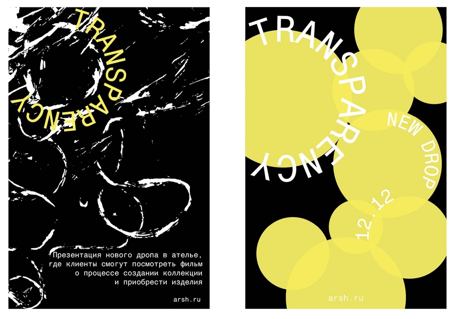
The entire poster series
OTHER BRAND APPLICATIONS
Beyond the poster series, the project includes a variety of branded materials, such as business cards, postcards, and other printed applications developed for «ARSH.»
Each piece adapts the visual identity to a different format while maintaining a connection to the overall visual concept.
Together, these materials demonstrate how graphic design can create a consistent brand presence across different touchpoints.
Garment Cover
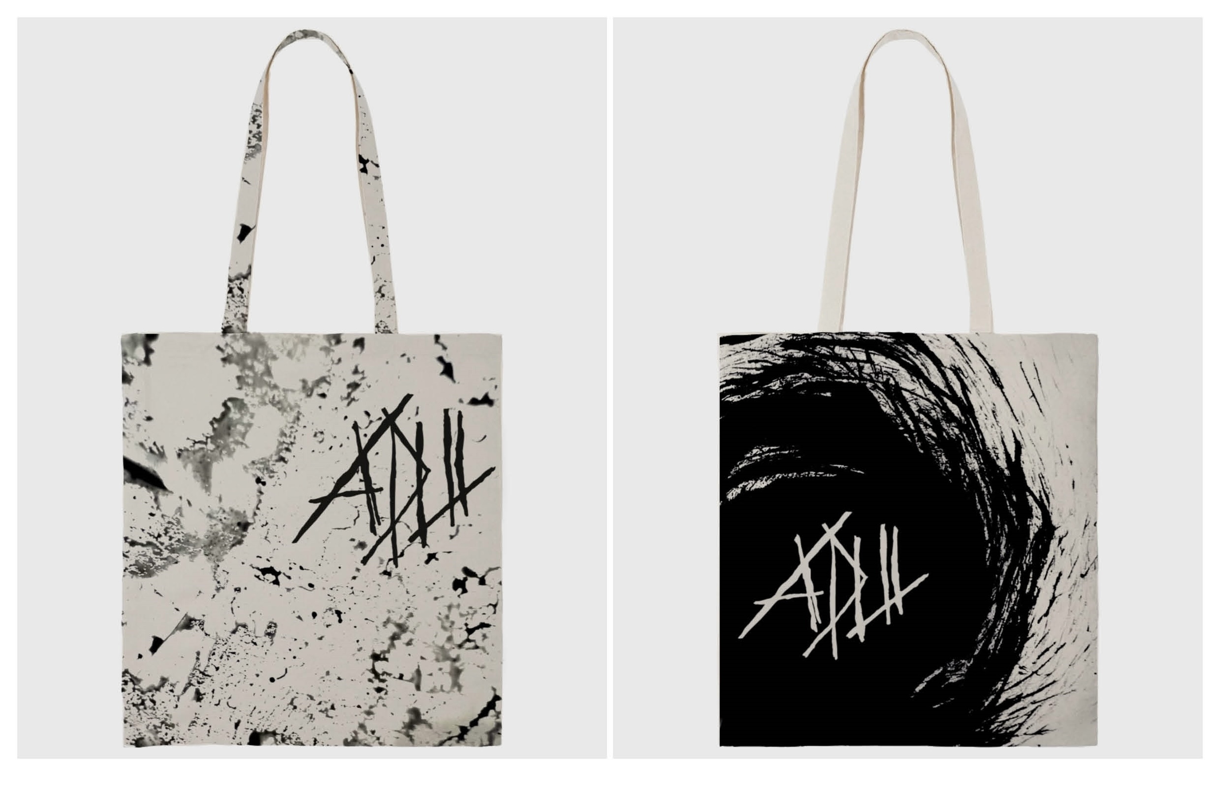
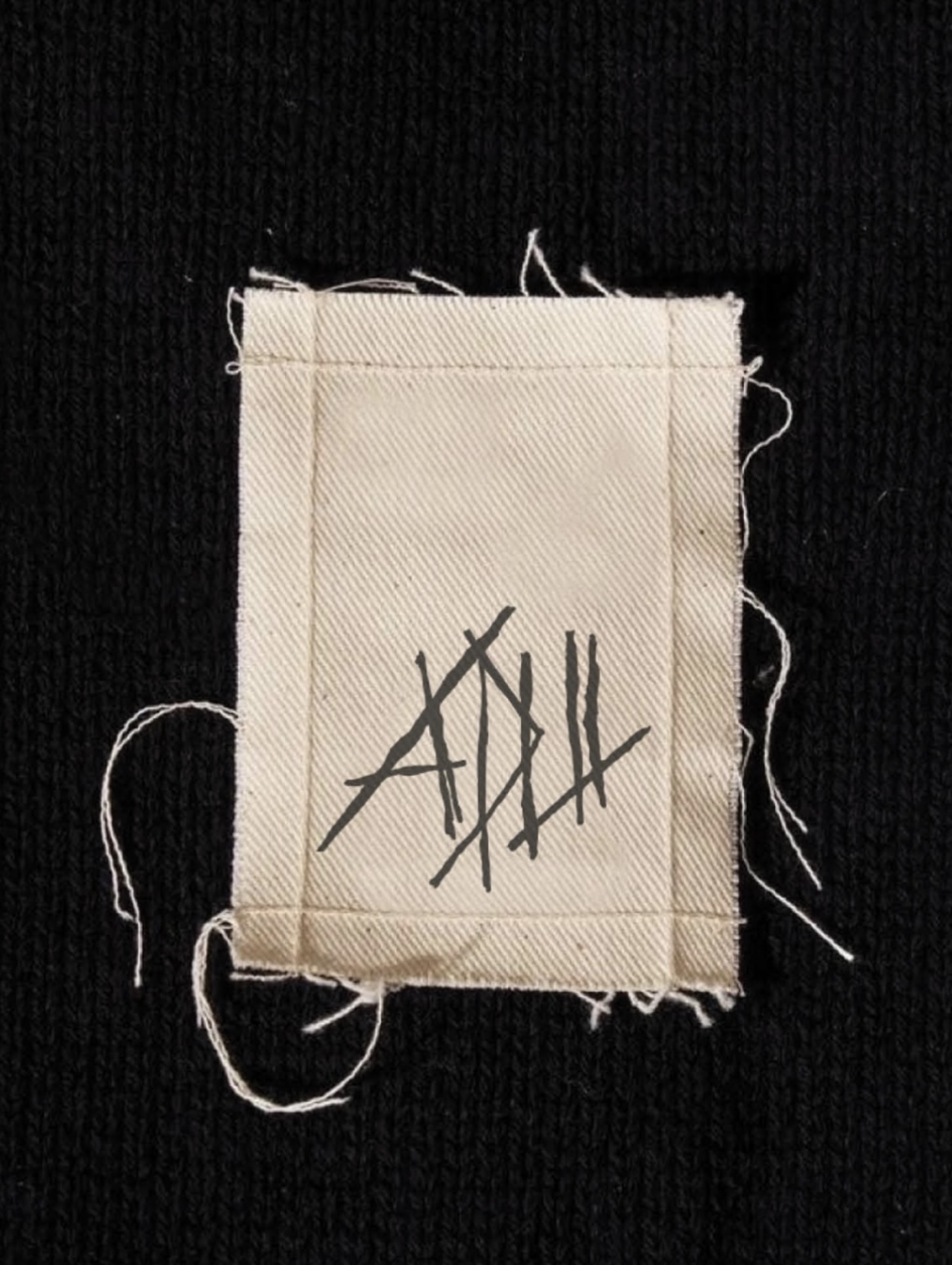
Tote bags and a tag
Carpet
THE FINAL OUTCOME
The project compiles a collection of visual communication materials for «ARSH,» including two poster series designed for separate events, business cards, postcards, and other branded applications.
The two poster series showcase distinct approaches to visual storytelling, while the supplementary materials broaden the project’s scope across multiple formats.
Through this work, I investigated how graphic design can communicate diverse ideas, adapt to various objectives, and contribute to a brand’s visual identity.
LET’S CREATE SOMETHING MEANINGFUL.
I create visual communication materials that help ideas take shape through graphic design.
I am open to creative collaborations, freelance opportunities, and new projects.