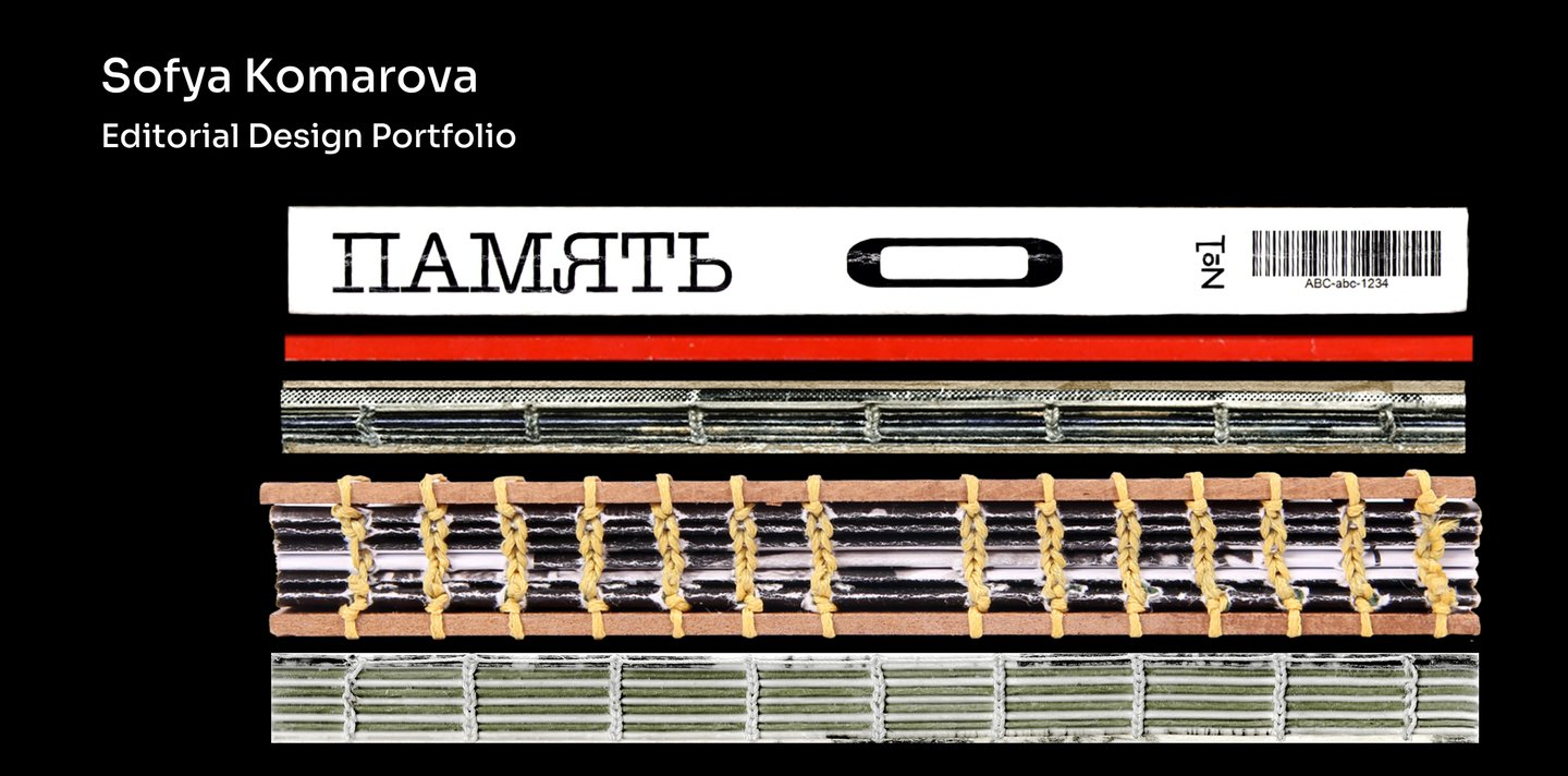
Hi, I’m Sonya — an editorial designer specializing in books and multi-page publications.
I work with typography, layout, and visual storytelling, creating everything from structured editorial systems to experimental publications.
I design publications that balance structure and experimentation. My approach involves adapting typography, composition, and visual language to suit the content and objectives of each project.Through books, magazines, and zines, I showcase my ability to work across various editorial formats—from precise, systematic layouts to expressive, experimental solutions.My goal is to establish myself as a versatile editorial designer and attract new commissions and creative collaborations.
My Approach
I believe that good editorial design begins with understanding the content, not by adhering to a particular visual style.
My approach combines systematic thinking with creative experimentation. I develop visual solutions that respond to each project’s purpose—ranging from precise typographic systems to expressive, unconventional layouts.
I pay close attention to both the overarching concept and the smallest details, ensuring that every design decision contributes to a coherent reading experience.
What I Bring
Systematic Thinking
Information hierarchy, modular grids, typography, and navigationCreative Flexibility
Adapting visual language to different formats, content, and project objectivesProduction Awareness
Image preparation, detailed layouts, prepress, and physical prototypingPortfolio Narrative
The portfolio is organized into three publishing formats: books, magazines, and zines, presenting six editorial design projects.
The narrative moves from structured layouts to more experimental visual approaches, demonstrating the range of my design practice. Simultaneously, each medium offers its own spectrum of possibilities—from systematic typography to expressive, unconventional compositions.
This structure emphasizes my ability to adapt the visual language to the content and objectives of each project, rather than adhering to a fixed style.
Case Study Structure
Each project follows a consistent narrative structure, guiding the viewer from the initial brief to the final publication.The presentation begins with a strong visual introduction, followed by the project’s objectives, concept, and design system. Editorial spreads and selected details then demonstrate how the proposed solutions function in practice.This approach reveals not only the final outcome but also the reasoning behind the design decisions, emphasizing the relationship between the project’s objectives, visual language, and execution.
BOOKS
«Subject as Currency»
The Brief
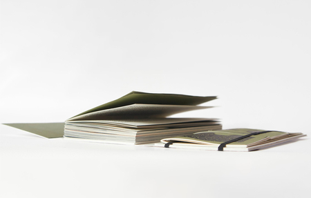
The project explores the history of barter and objects used as currency, examining how everyday items acquired economic value and shaped trade. The challenge was to tell the story of money through objects, historical examples, and their changing significance across cultures.The Concept
The concept reflects the evolution of money through the physical form of the publication. A main narrative book is accompanied by three smaller gallery books dedicated to objects used as currency. References to banknotes, bank cards, and historical materials connect the design with the subject of exchange.Design System
The main book’s proportions reference a one-dollar banknote, while the smaller gallery books use a separate format. A six-column grid and Oceanic Text typography establish a consistent editorial hierarchy. A muted green palette, cotton cover, and references to a bank card’s magnetic stripe extend the monetary concept into the publication’s material design.The Outcome
The result is a multi-part publication consisting of one main book and three gallery books. Its format, typography, materials, and construction translate the history of exchange into a cohesive editorial system, connecting the content with the physical experience of reading.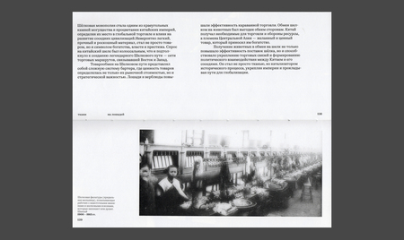
Photobook from Brother to Brother
The Brief
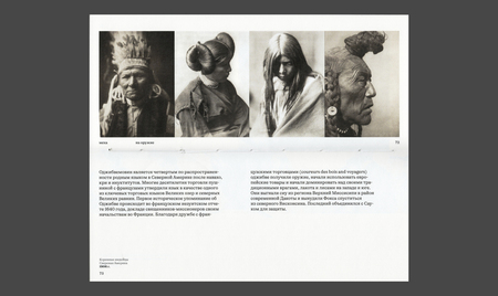
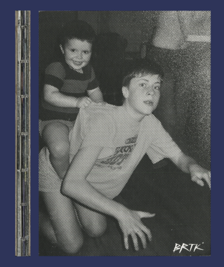
The task was to create a personal travel photobook as a gift from one brother to another. The client provided bold, experimental references alongside a collection of expressive travel photographs. The main challenge was to combine the desired visual style with the photographs' own character without overwhelming them with graphic elements.The Concept
The concept was built around two contrasting approaches to editorial design. The book was divided into an expressive, zine-inspired section featuring experimental compositions and a minimalist photobook section where the images take center stage. This contrast allows visual experimentation and photography to coexist without competing for attention.Design System
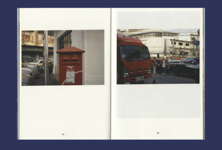
The design system follows the book’s two-part structure. The experimental section utilizes expressive layouts and digitally processed images, while the photographic section relies on restrained composition and minimal graphic intervention. The contrast between these approaches creates a visual rhythm while preserving the integrity of the photographic material.Application / Work Process
The process included collecting photographs, discussing the visual direction and emotional tone with the client, developing moodboards and references, and planning the content sequence. Image editing in Photoshop and Illustrator was followed by layout development, prepress preparation, physical prototyping, and postal delivery.The Outcome
The result is a two-part photobook balancing the client’s experimental vision with the visual independence of the photographs. By combining expressive editorial design with minimalist layouts, the publication creates a cohesive yet contrasting reading experience, fulfilling the client’s expectations while allowing the images to speak for themselves.Full project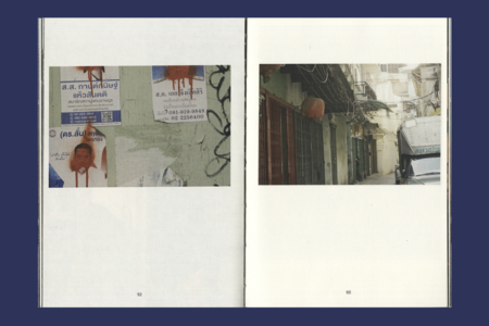
MAGAZINES
0
The Brief
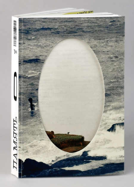
The task was to create a magazine exploring liminality—the uncertain state between «not yet» and «already.» The challenge was to translate this abstract concept into an engaging editorial experience, encouraging readers to reflect on personal, cultural, and social transitions without offering fixed interpretations.The Concept
The concept is based on two mirrored perspectives—“Not Yet» and «Already.» The magazine can be read from either side, with both halves sharing three sections: Knowledge, Culture, and People. They meet at a central zero, symbolizing a moment of transition, uncertainty, and reconsideration.Design System
The editorial system combines a mirrored structure with flexible layouts and a consistent typographic hierarchy. Circe is used for body text and navigation, while Ray Typewriter creates expressive headlines and quotations. Contrasting type scales, modular columns, and varied image placement establish visual rhythm while maintaining consistency throughout the magazine.Application
The layout adapts to different types of content, from research-based articles and cultural references to personal interviews. Each section maintains its own visual character through variations in composition, typography, and image scale, while the shared editorial system connects the two halves into a unified publication.The Outcome
The result is a two-sided magazine that transforms the concept of liminality into a physical reading experience. Its mirrored structure allows readers to explore the same themes from opposing perspectives, while the central zero becomes a space for reflection, connecting experimental editorial design with the publication’s philosophical concept.Full project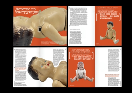
Vision