Form is a consequence, not a starting point
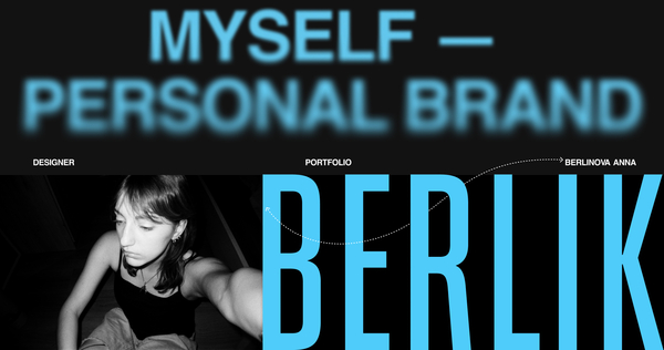
I’m Darya Denisova, a communication designer. I work with books, objects, and digital products. I see design as a search for the inner logic of things. I don’t start with a style or a mood board—I start with the subject, its content, and the function it needs to perform. The form comes last, as a consequence of that research. This portfolio is for brands, studios, and product teams who need design that works, not just design that looks good. Every visual decision here has a reason.
Zero random elements
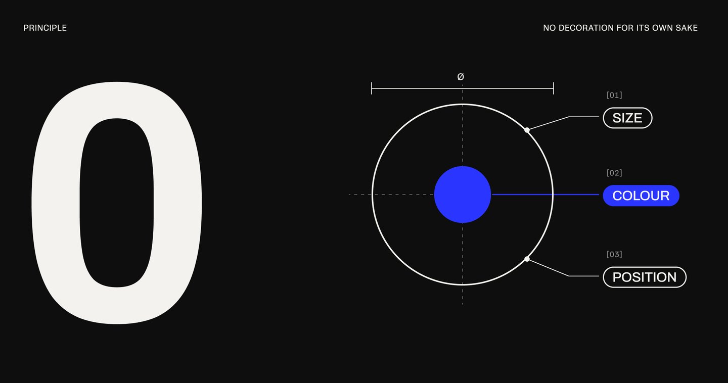
Every element in a layout has to answer one question: why is it here? Size sets the hierarchy—what you see first and what comes next. Color gives a signal—it marks, warns, or connects. Position builds the reading order. If an element can’t answer, it goes. Decoration for its own sake adds noise and steals attention from the idea—so removing it is part of the design.
How a Form is Born
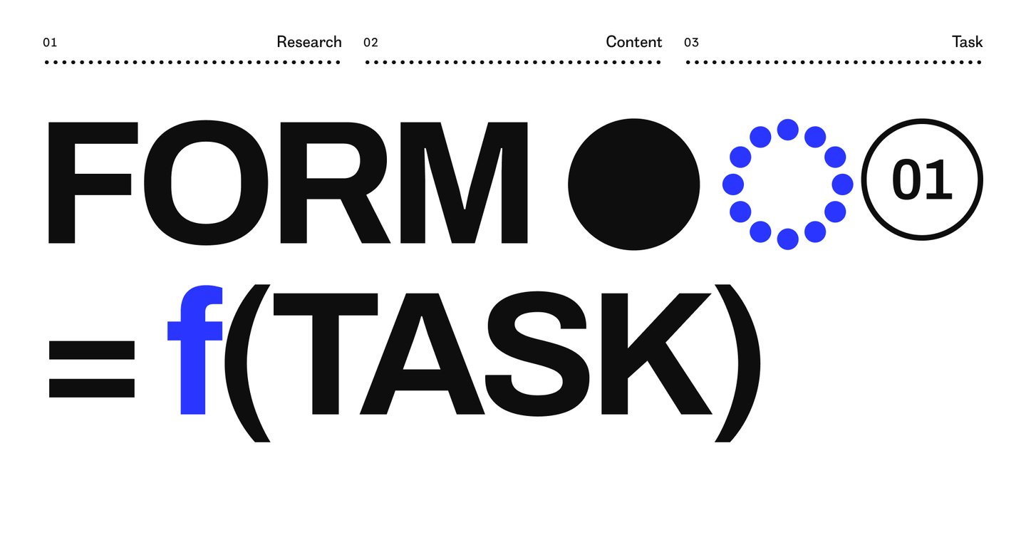
I follow the same four steps for every project—be it a book, an object, or an interface. 01 Research. I study the subject, its history, and its context before I draw anything. 02 Content. I determine the single idea the object needs to convey. 03 Task. I define what the object must do for the person who uses it. 04 Form. Only now does it take shape—the visual solution is the culmination of the first three. Below are four projects of different kinds. Each one is presented using the same structure—problem, idea, solution, result—and each illustrates where its form originated.
Case 01 — an exhibition catalogue for David Lynch
Problem. An exhibition catalogue usually functions as an archive: a neat grid, works in sequence, captions placed underneath. For David Lynch’s show, «Big Bongo Night, ” at Pace Gallery, this approach would miss the point—his paintings, sculptures, and films share a singular mood: anxiety hidden beneath the surface of the ordinary.
Idea. Let the reader feel the mood through the layout itself, not through added decoration.
Solution. An unstable composition. Running heads shift from spread to spread, paragraphs begin with wide indents, and the text never rests precisely where you anticipate it. The grid is present—but it keeps slipping, much like the ordinary scenes in Lynch’s work.
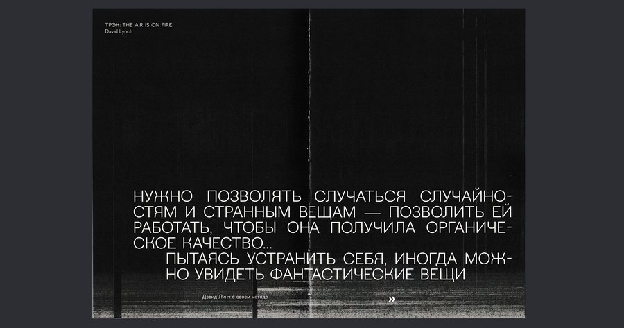
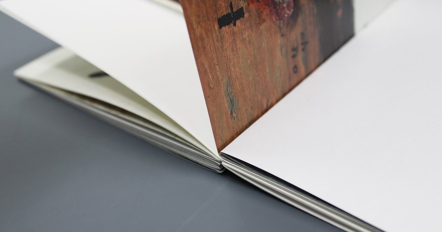
Result. The catalog conveys its mood through typography and composition alone. No ornaments, no special effects—the anxiety arises from the book’s structure.
Case 02 — Girka, Ceramic Amulets for Everyday Life
Problem. People seek personal artifacts—objects that soothe, protect, and connect them to their heritage. Most «ethnic» accessories answer with mere ornament: they mimic the aesthetics of the past and ultimately devolve into costume.
Idea. Research showed that in Old Rus', a button was not merely a fastener—it held a sacred, protective function. It is the function, not the ornament, that is worth reviving.
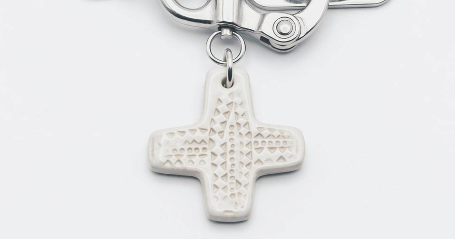
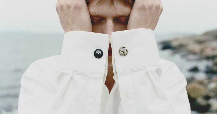
Solution. A series of ceramic charms where the meaning dictates the placement: a collar charm guards your voice and thoughts, cufflinks protect your hands, and a key charm safeguards your belongings. Simple forms, natural ceramic, one gesture each. The concept and visuals were developed with AI tools.
Result. An old function transformed into an everyday accessory—not a costume. Every object has a reason for being exactly where it is on the body.
Case 03 — TOOL, where navigation is a shape