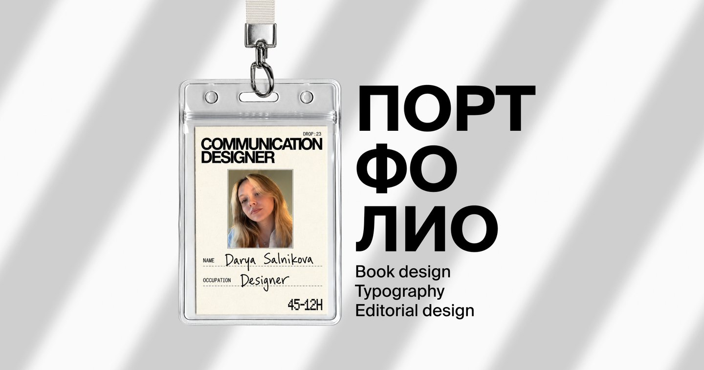
I make type tell stories

Hi, I’m Darya Salnikova
I am a graphic designer focusing on books, typography, and editorial design. I am interested in how text can shape the rhythm of reading, guide attention, and become part of the story itself.I love unconventional ideas, visual experiments, and projects that result in something memorable.I am not afraid to experiment—I pick up new things quickly, and I strive to create projects people will want to share.01 / BOOK DESIGN
THE NEW WAVE: A PORTRAIT OF YOUTH
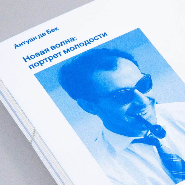
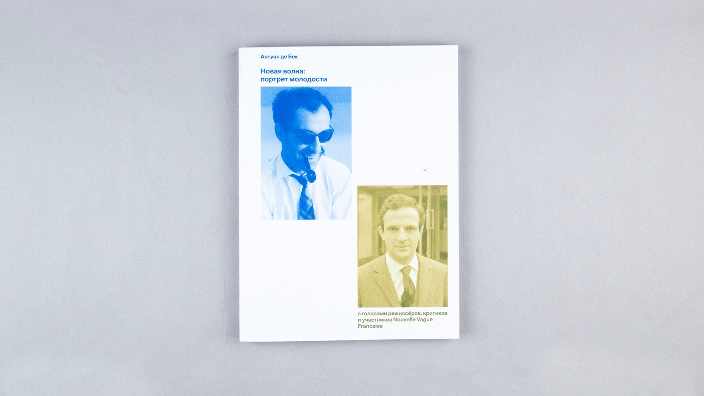
Antoine de Beck’s study on the birth of the French Nouvelle Vague. The book chronicles how, in the late 1950s, young critics and directors revolutionized the language of cinema, discarded studio conventions, and established a freer, more personal, and more modern aesthetic.
The new edition is structured around two parallel lines of reading. The first is Antoine de Beck’s main text, which establishes the historical, cultural, and analytical context of the New Wave. The second consists of interviews with directors, critics, and movement participants, allowing us to view the Nouvelle Vague not only from a researcher’s perspective but also from within the cinematic environment itself.
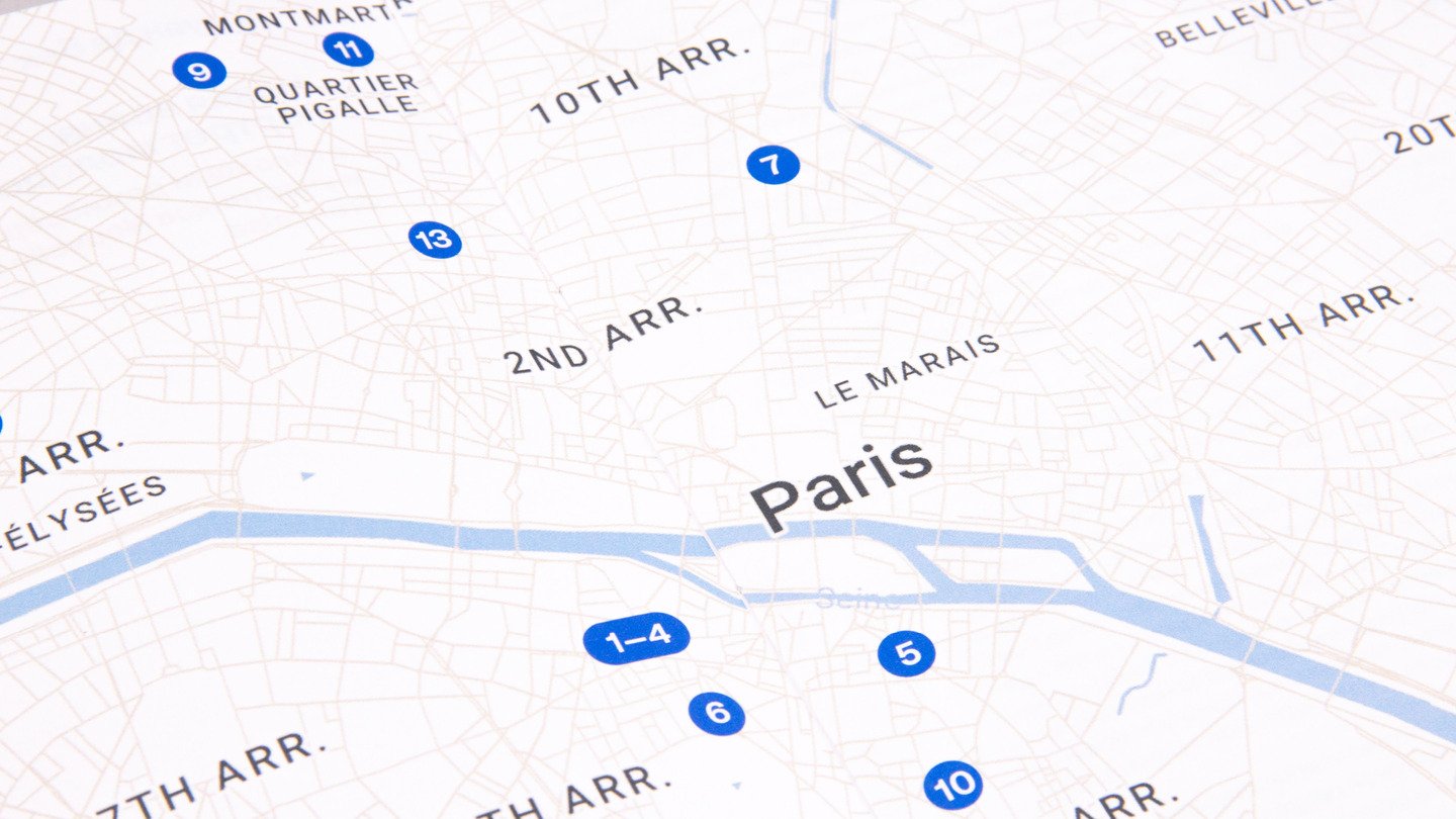
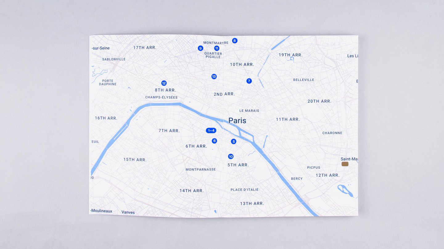
A map guide to Paris in the 1950s and 1960s adds another dimension to the publication, connecting the history of the movement to the places where it unfolded.
I designed two parallel reading paths that allow these perspectives to coexist within a single publication.
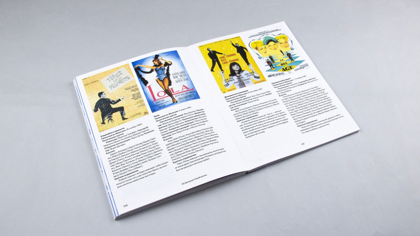
The main text of the book is formatted in blue, and the interview in brown. The page numbers and headers are asymmetrical—the blue elements correspond to the blue text, and the brown elements to the brown text.
The interview begins at the point the character is mentioned in the main text and may span several chapters of the book.
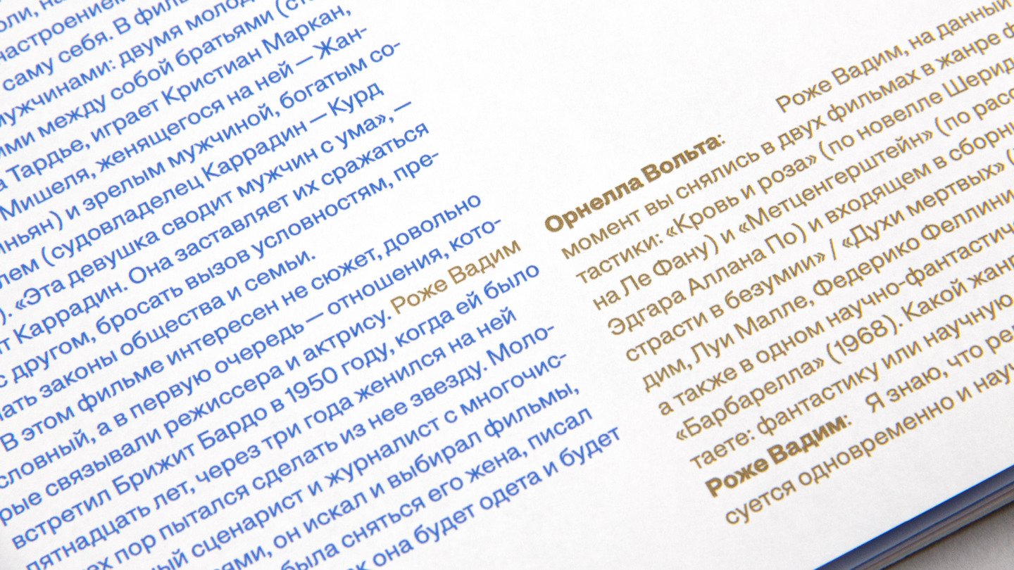
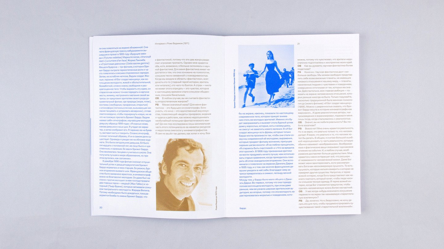
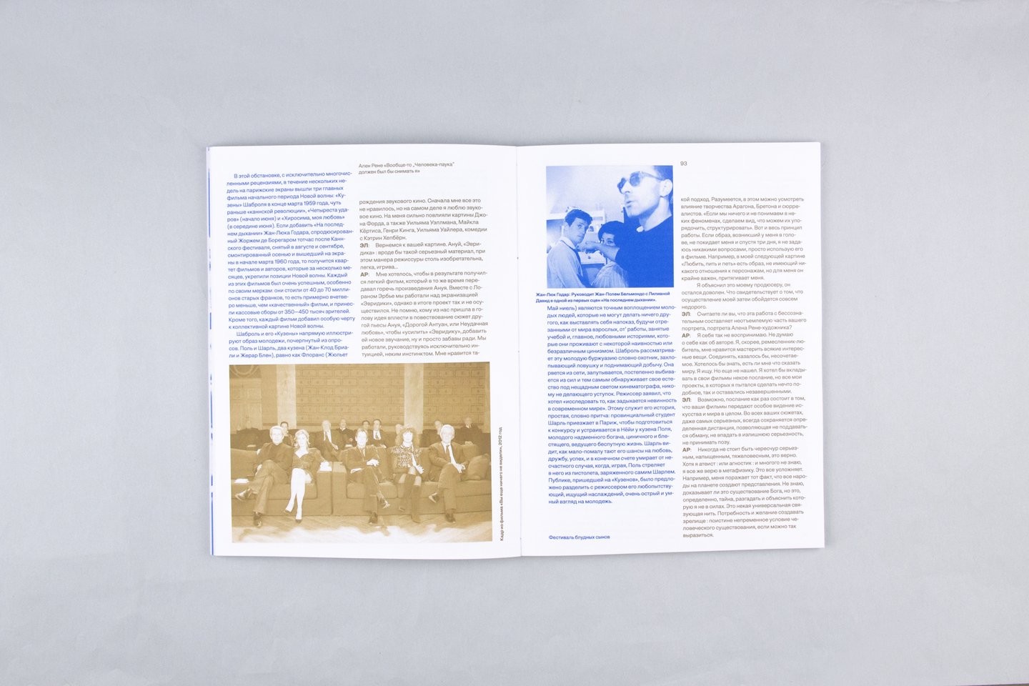
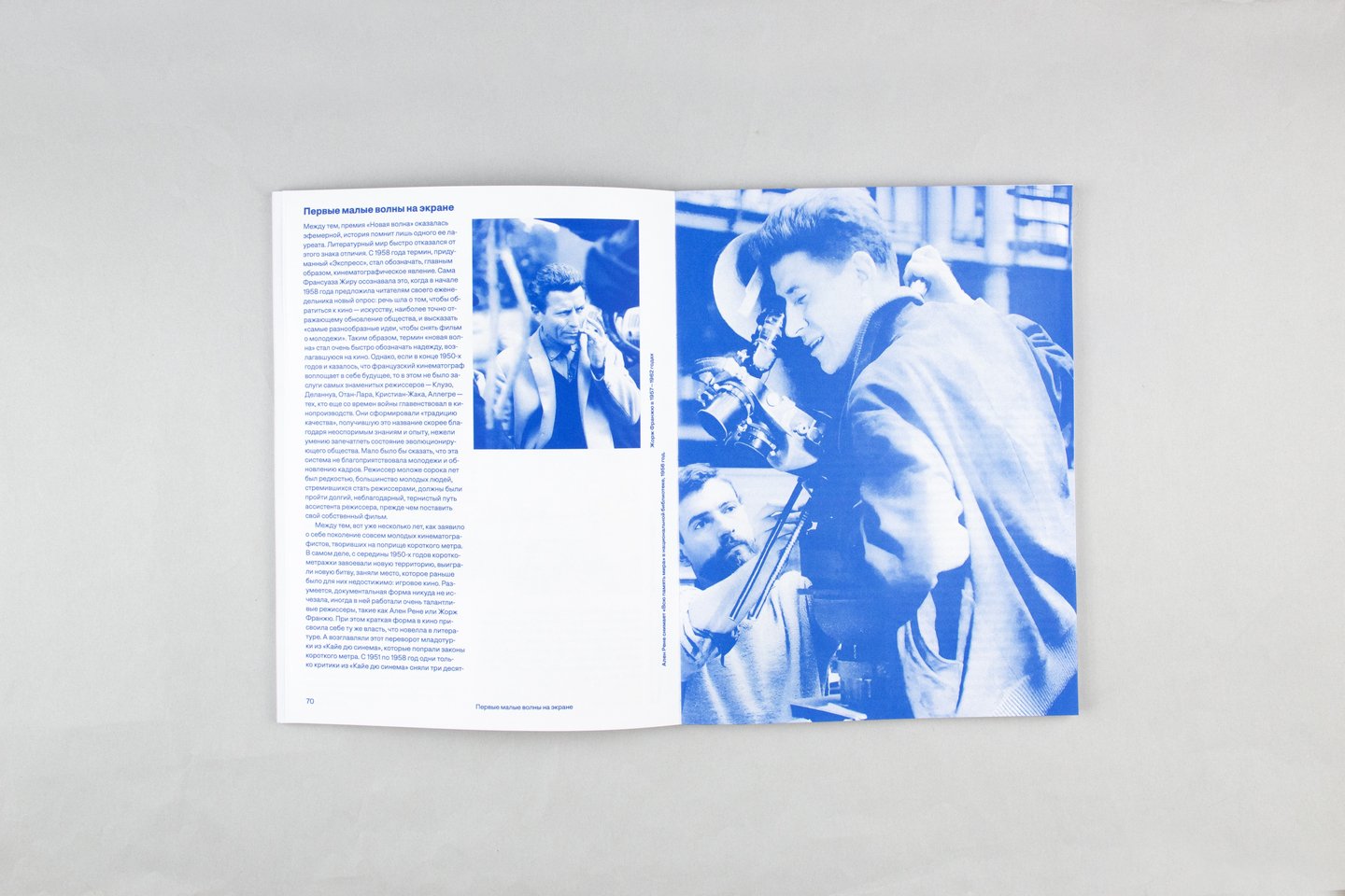
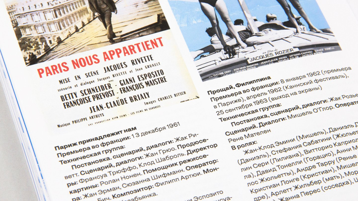
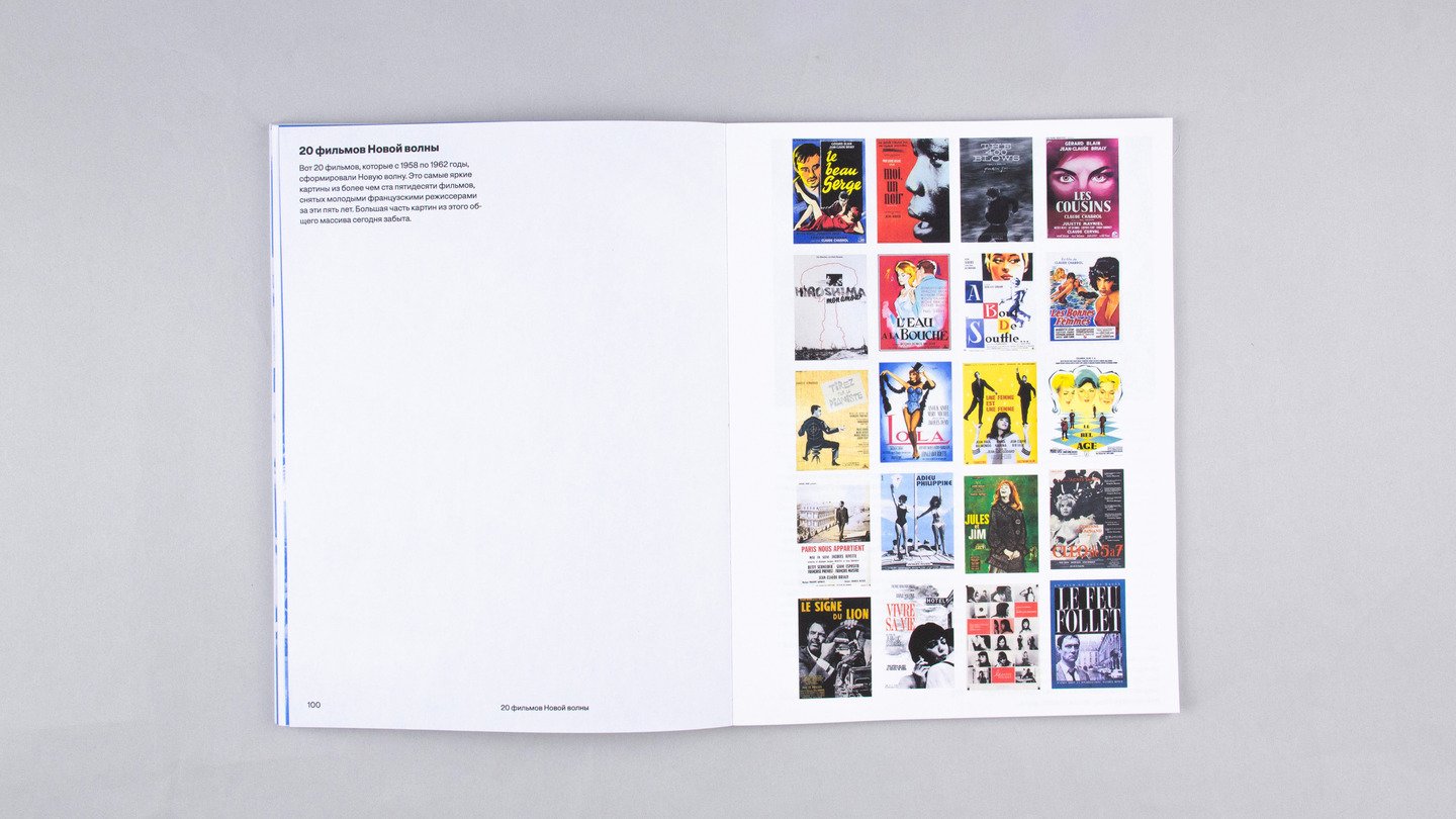
The book features a chapter where the text color is deliberately switched to black to draw attention to the posters for iconic New Wave films.
02 / BOOK DESIGN
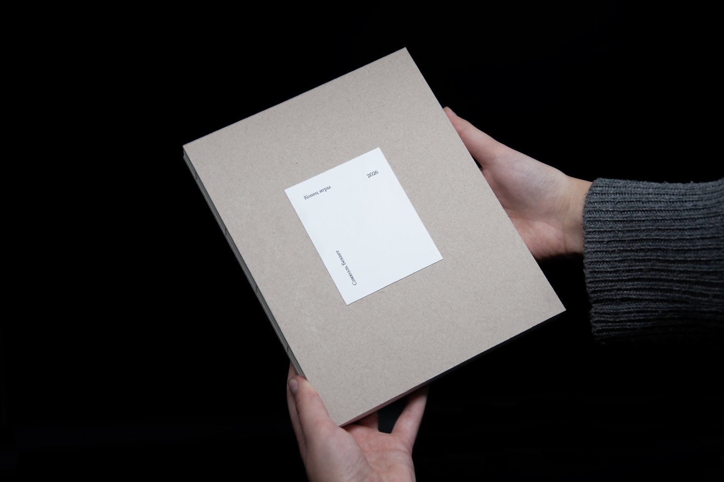
ENDGAME
«Endgame» is an absurdist, tragicomic one-act play by Samuel Beckett, written in French.
The play features a blind, paralyzed, domineering elderly man, his aging parents, and an idle, exhausted companion, all confined to an abandoned basement room in a post-apocalyptic wasteland, awaiting some indefinite «end» for each of them.
The bulk of the play consists of brief dialogues among the characters, reminiscent of a bawdy revue.
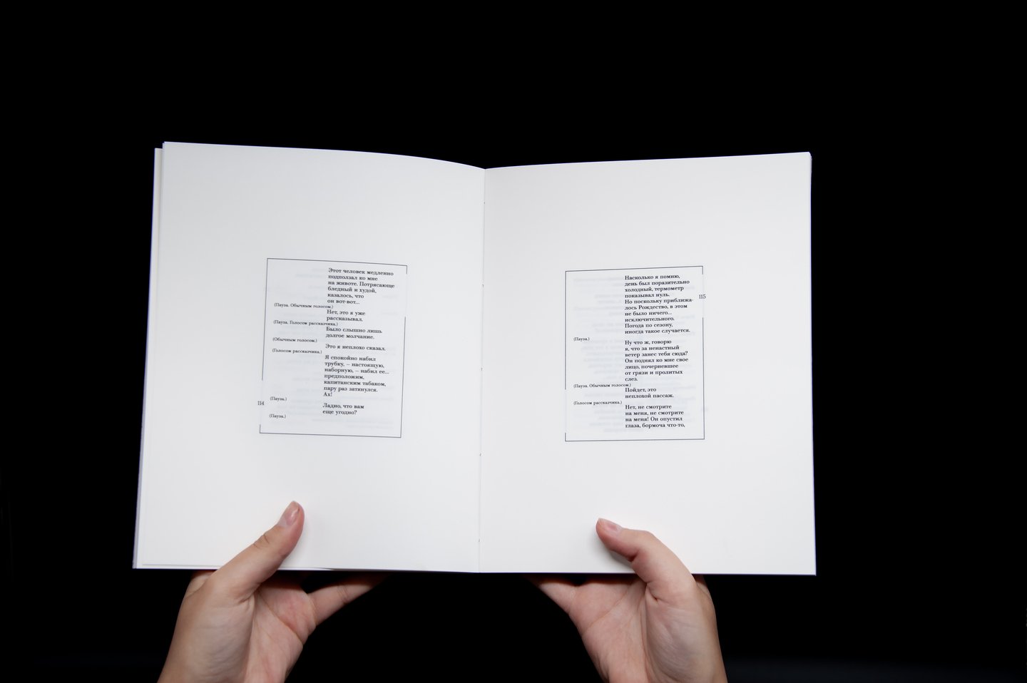
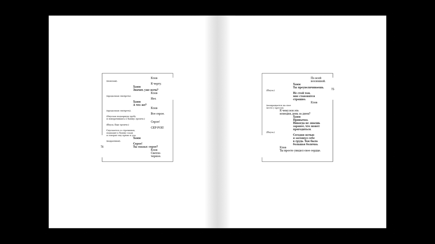
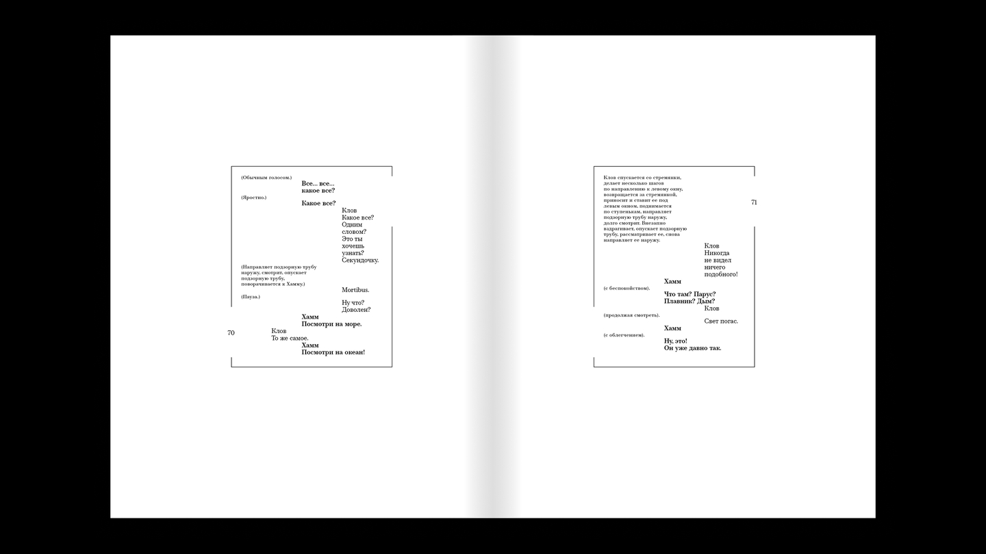
Layout Principles
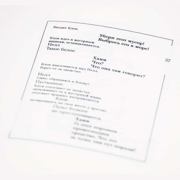
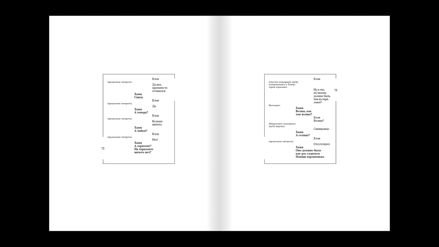
The placement of each character is reflected in the layout. Hamm’s default position is the center of the room—his lines will thus be centered on the page. As he moves, his lines will move with him.
The same principle applies to Clov, though he moves far more frequently throughout the play, giving his movements a more dynamic quality.
Nagg’s and Nell’s lines will be positioned statically at the edges of the page.
The play also conveys a sense of tension through the characters’ restraint, which is why the leading has been intentionally reduced.
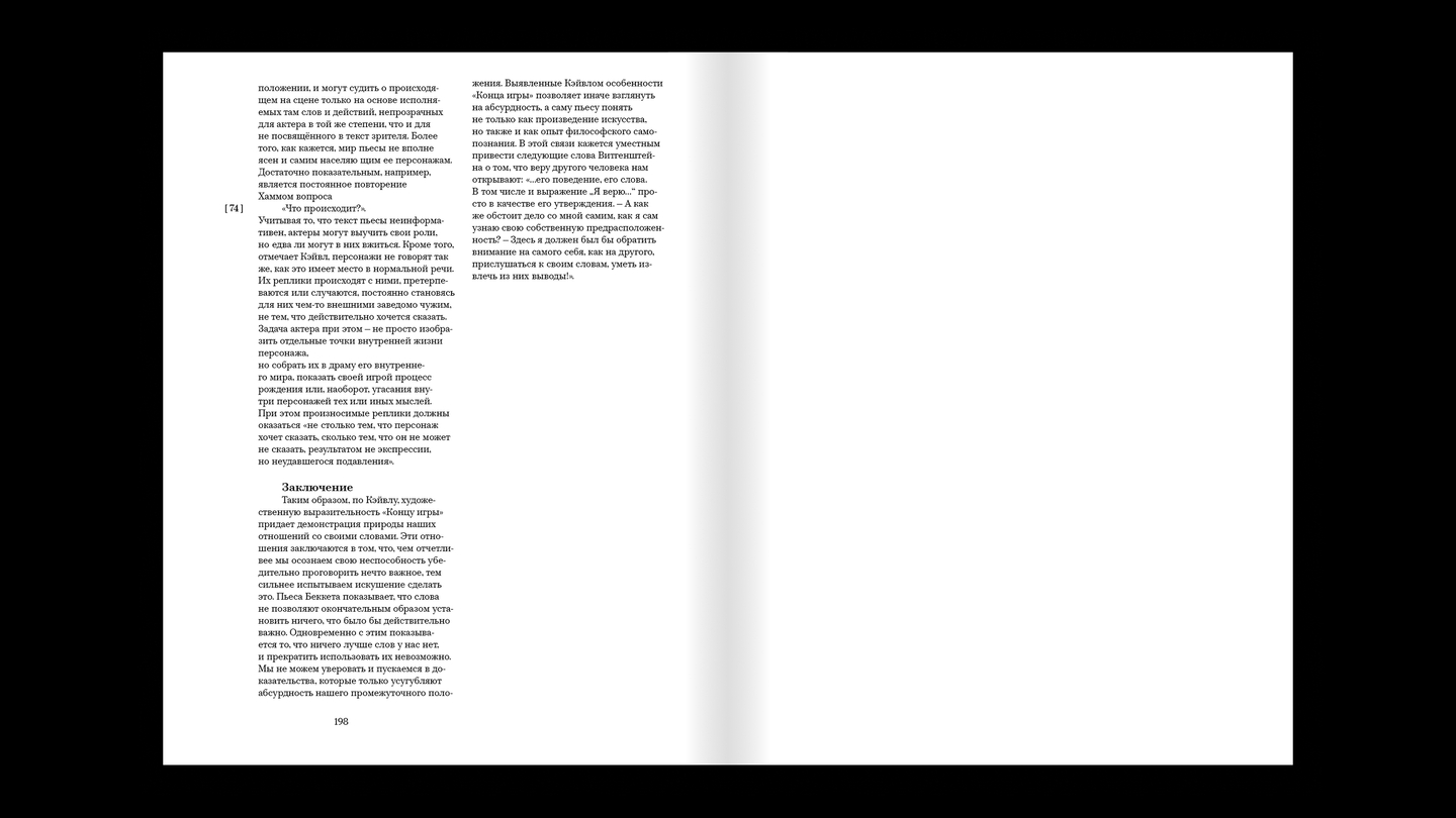
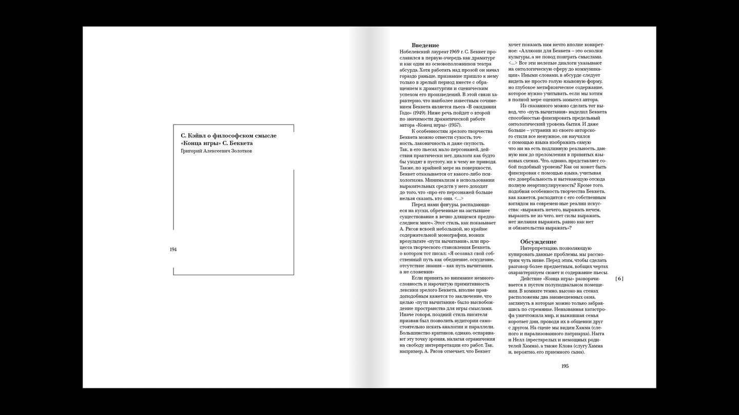
The action unfolds in a small, vacant semi-basement room within a post-apocalyptic wasteland, featuring only two windows. This setting dictates the generous margins and the frame around the text area. Both windows are also indicated on the border surrounding the type area—the characters interact with them in some capacity throughout the piece.
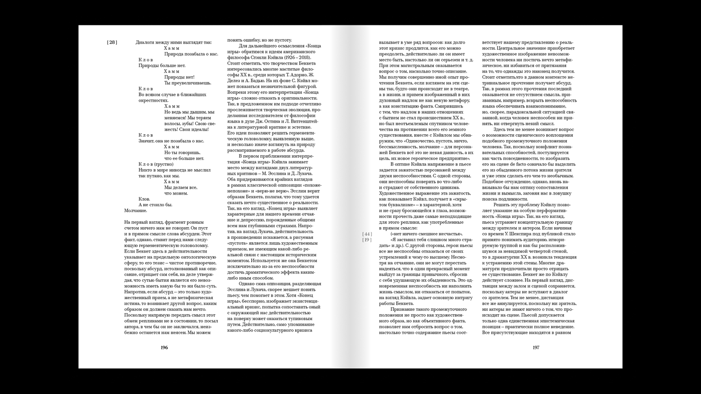
Following the main text, there are two reviews that help to better understand the play’s concept. They are also necessary to fully illustrate the dimensions of the typesetting area. The play transitions from a single column to a two-column format; the column numbers on the vertical axes drop down, and all white space is filled with text.
03 / EXHIBITION CATALOGUE
AWAKENING
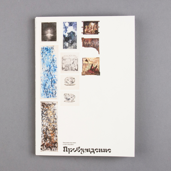
From October 30, 2025, to January 20, 2026, the «Awakening» exhibition is being held at the «JOY GALLERY.»
The exhibition’s visual narrative is structured according to the morphology of a Russian folk tale. The catalogue reflects the viewer’s journey from darkness to light, conveying the narrative’s linear structure.