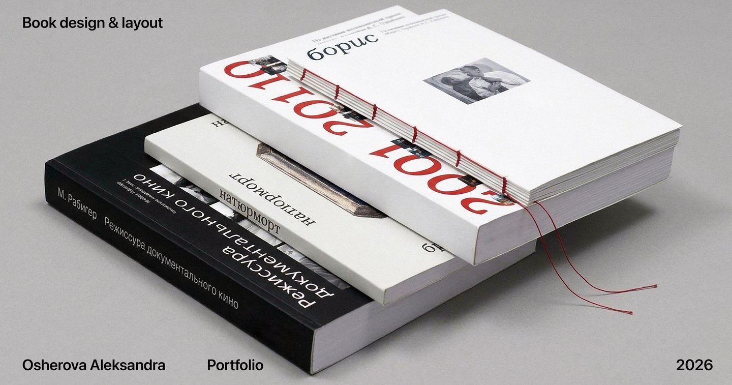
About Me
Hi! My name is Aleksandra. I am a book designer specializing in typesetting and creating book layouts.
I have experience across every stage of book production, from initial concept to final print. In my student projects, I have also taken on the roles of editor and compiler. I develop the concept for each book and translate it into a layout, selecting typefaces and establishing a typographic style. I pay close attention to typographic conventions, prepare images for print, select paper stocks, liaise with printers, and have hands-on experience with bookbinding.
I am looking to work with independent publishers specializing in non-fiction on art, culture, and history.
Here are some of my projects
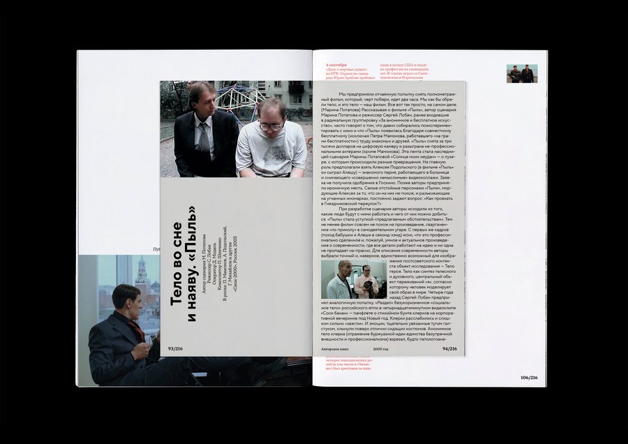
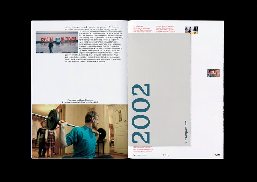
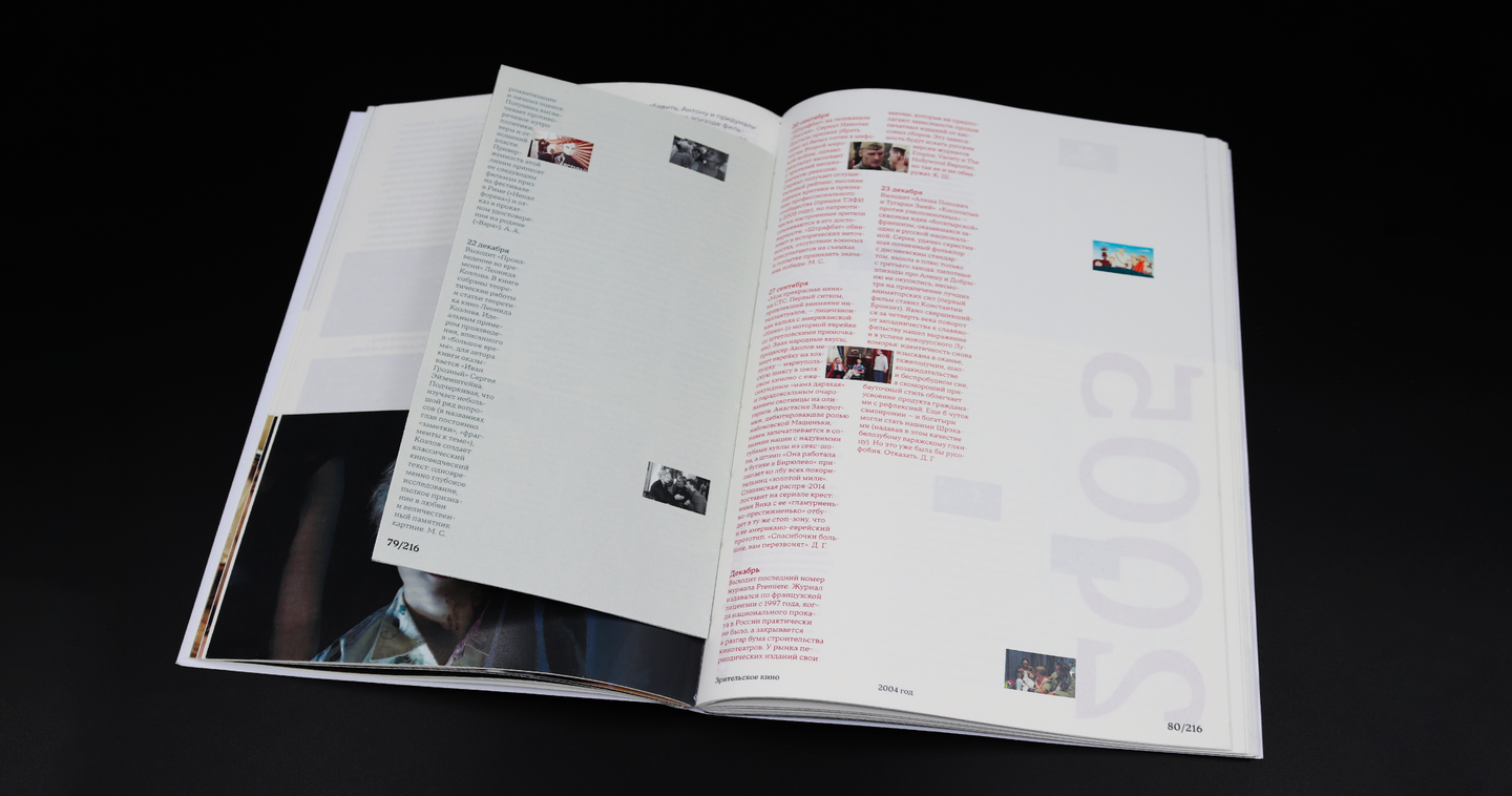
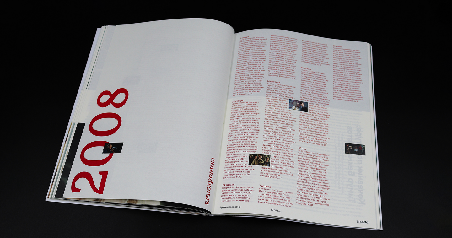
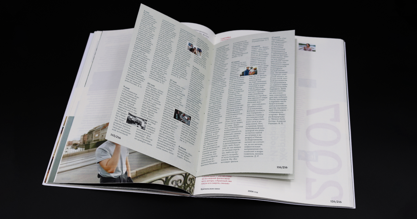
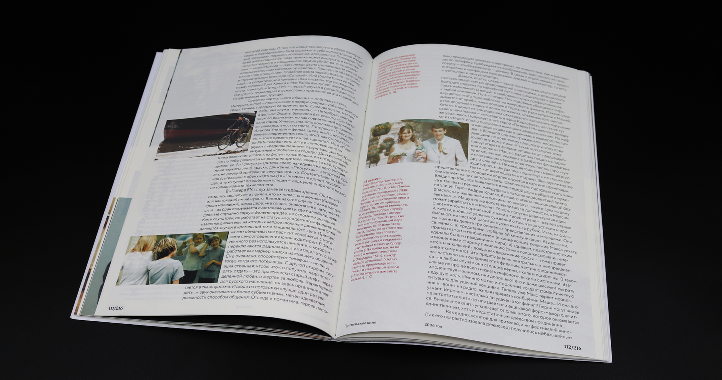
Russian Cinema of the 2000s: Comfort and Crisis
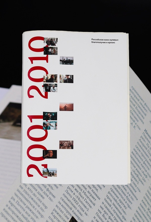
The book explores Russian cinema of the 2000s through the contrast between mainstream films, which offer a feel-good, vivid, and nostalgic image of the decade, and auteur cinema, which examines loneliness and existential crisis while reflecting on the crisis of national identity in the aftermath of the Soviet Union’s collapse.
The chapters are organized by year and combine film-related articles from Sean’s Magazine, offering an overview of each period with articles focusing on individual films and directors.
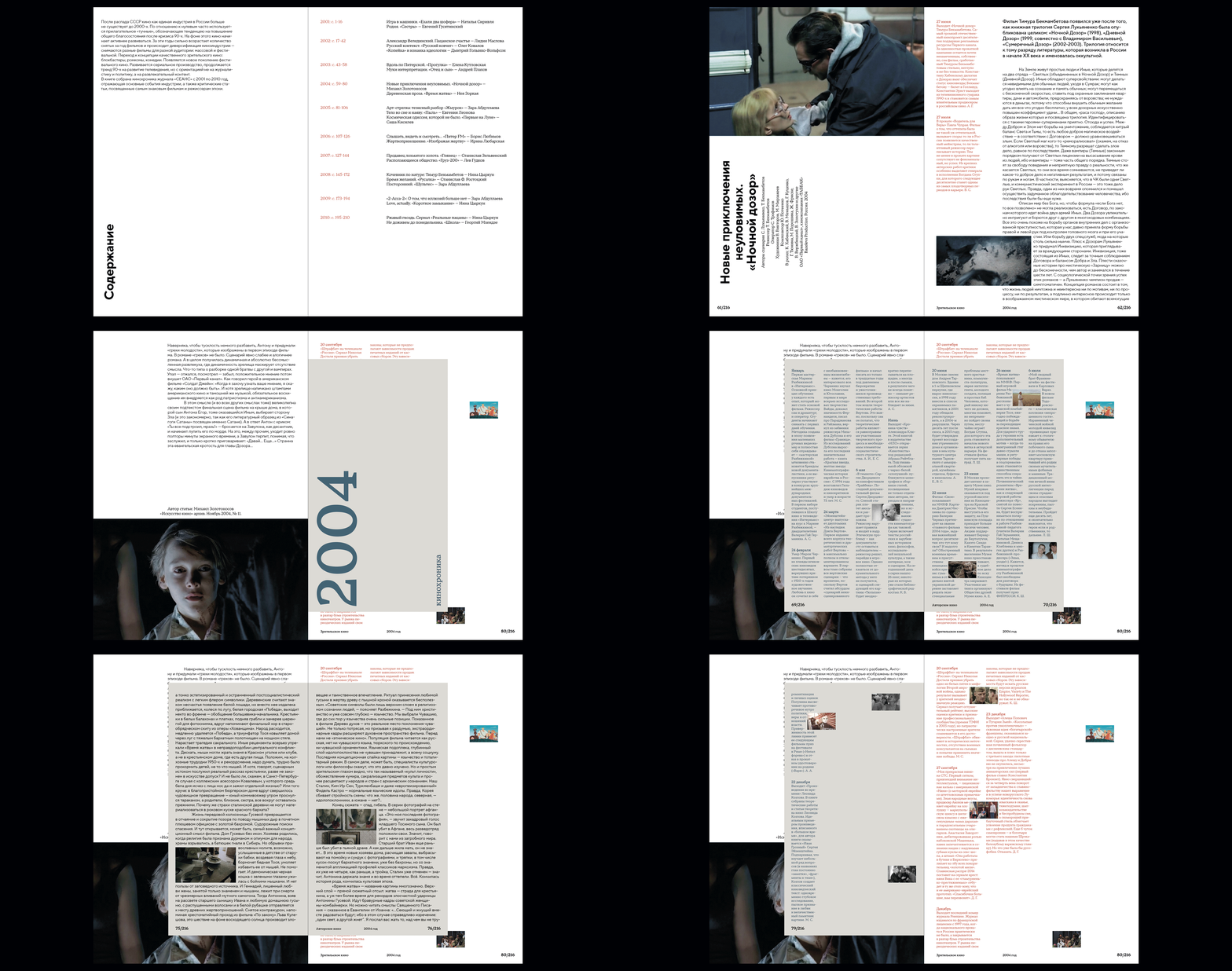
The contrast between outward prosperity and inner crisis shapes the book’s structure: mainstream and auteur cinema coexist, but are presented in different formats. While developing the book’s format, I created a small prototype to test how the pages would be assembled after printing, and then designed the layout accordingly.
The chronicle is distinguished by its type style and color. TT Norms Pro is used for article layouts, while TT Norms Pro Serif is used for the chronicle, footnotes, and running headers.
Joseph Brodsky. Still Life: Exhibition Catalogue
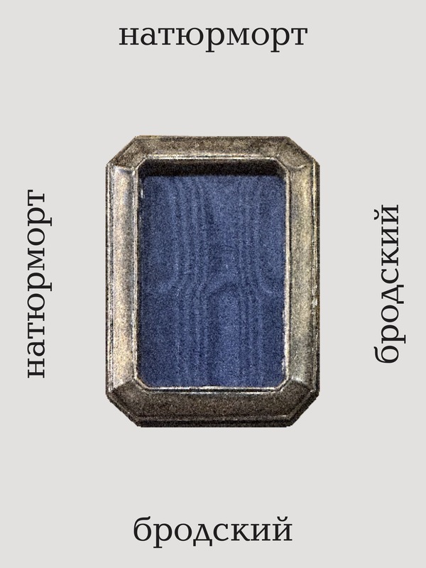
The exhibition Nature Morte at the Fountain House is an installation dedicated to Joseph Brodsky. Named after his poem of the same title, it brings together the poet’s personal belongings, offering insight into his life and work.
This book is a catalogue of the exhibition, featuring photographs of the objects on display, stories behind selected pieces, and the poem itself, which runs throughout the book.
The objects are arranged on a rectangular platform, with larger pieces of furniture defining the installation’s overall form and smaller objects displayed on plinths of varying heights at its center. The structure and format of the exhibition determine the structure of the catalog.
The curator’s narrative is divided into sections defined not by thematic content or chronology, but by the physical layout of the exhibition space. These sections also form the basis for the book’s structure.
«It is one large still life composed of many smaller ones, but you must identify these smaller still lifes yourself as your eye picks them out.»
(Pavel Kotlyar)
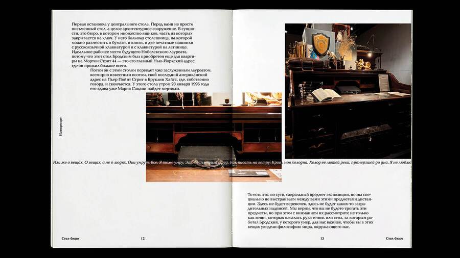
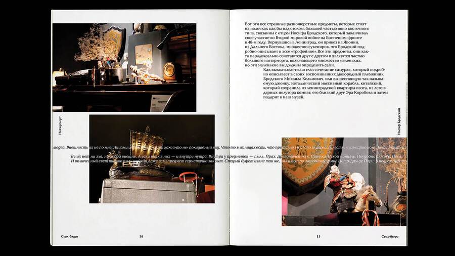
Each new section opens with an overview of the objects it contains, presenting the larger still life composed of many smaller ones. The narrative then zooms in, moving from the whole to its individual parts.The typeface chosen for the book, Baltica, evokes the period.
Boris. A Script by Dmitry Krymov
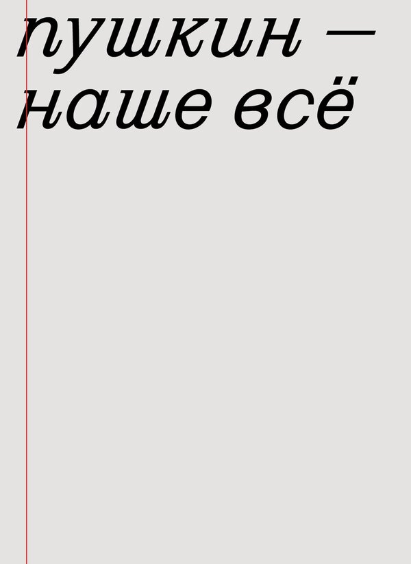
Boris is a postmodern theatre production by Dmitry Krymov that reinterprets Alexander Pushkin’s historical drama Boris Godunov.Krymov’s scripts are works in progress—drafts of a future performance that continue to evolve throughout the staging process. This process-oriented approach is also reflected in the narrative: the events of the original play are framed as a concert, and the actors address both the audience and the sound engineers.
The stages of the process become overlapping, interacting layers. Each is connected to the others, transforming out of what preceded it.