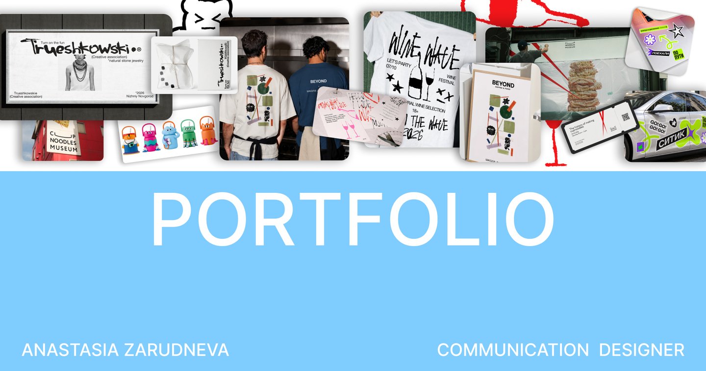

I’m Anastasia Zarudneva. I’m a brand and communication designer.
I am a 4th Year Student in Communication Design at the HSE Art and Design School. In parallel with my studies, I have gained professional experience working directly with clients on various design projects. I am adept at handling tasks within established project frameworks, and I can also develop entirely new solutions for clients and brands from the ground up. I enjoy uncovering interesting and unexpected ideas for my work, using typography, color, and composition to create comprehensive and high-quality projects.How do I work?
RESEARCH → CONCEPT → DEVELOPMENT → IMPLEMENTATION
First, I study the project, the task, and its unique features, then I analyze the target audience and competitors. Next, I look for a metaphor that will aid in concept development, formulate the main idea, and determine how it can be visually expressed. Following that, I work with graphic elements, typography, color, and composition. I create initial sketches and test how these elements function together. Finally, I assemble all the elements into a cohesive system and evaluate how it performs across different communication channels.
MY PROJECTS↘︎↘︎↘︎↘︎↘︎↘︎↘︎↘︎↘︎↘︎↘︎↘︎
BRANDING
[1]
[1] TRUESHKOWSKI
Task: A natural stone jewelry brand wanted to emphasize its rebellious nature visually and differentiate itself from competitors.Solution: I developed a bold identity that highlights the brand’s character. It is based on contrasting combinations and provocative imagery designed to immediately capture attention.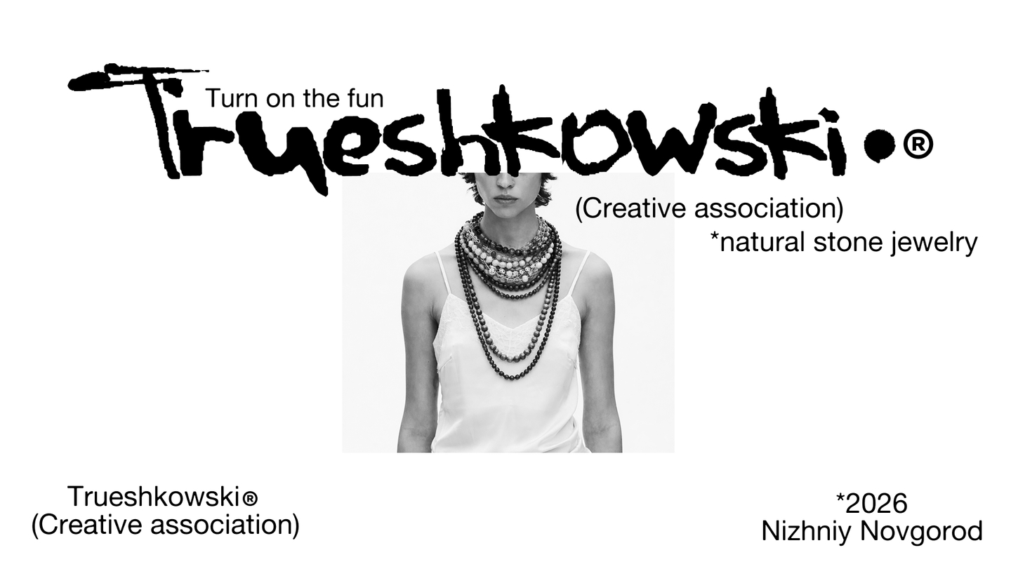
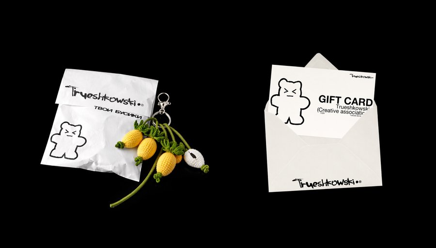
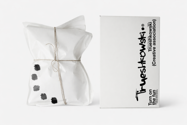
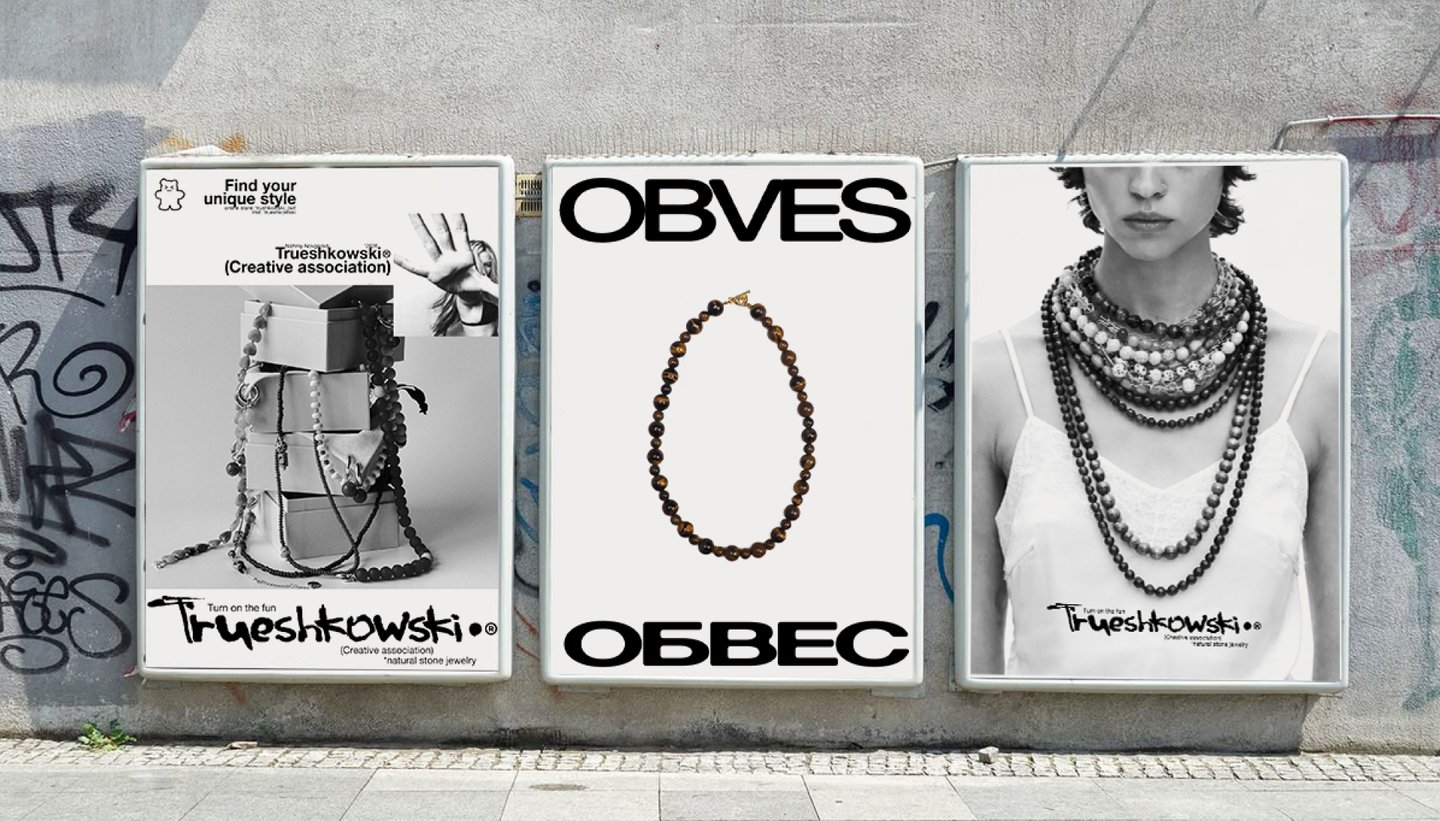
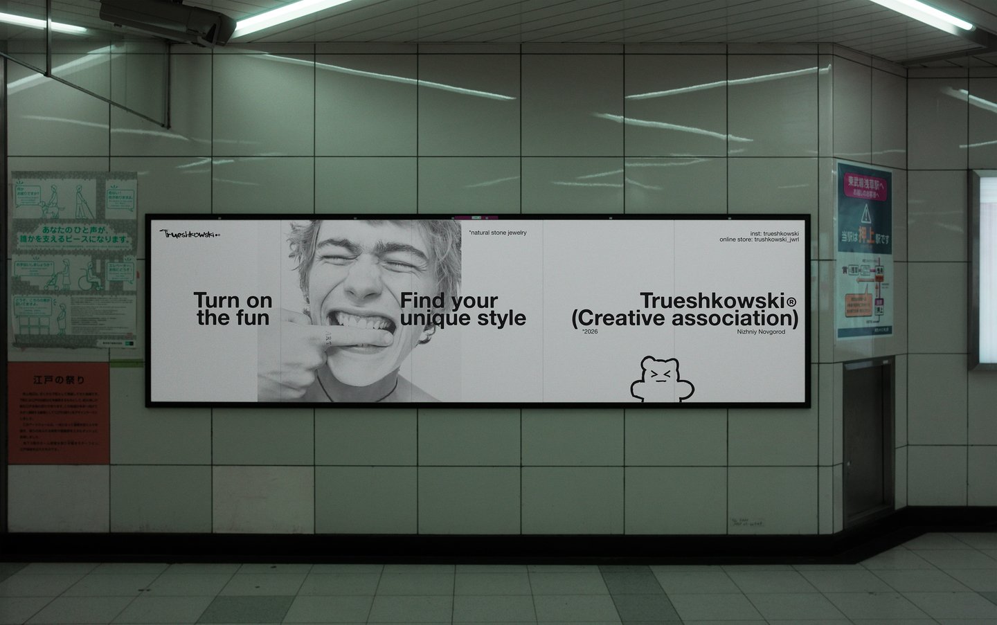
[2]
[2] BEYOND ✕ HSE
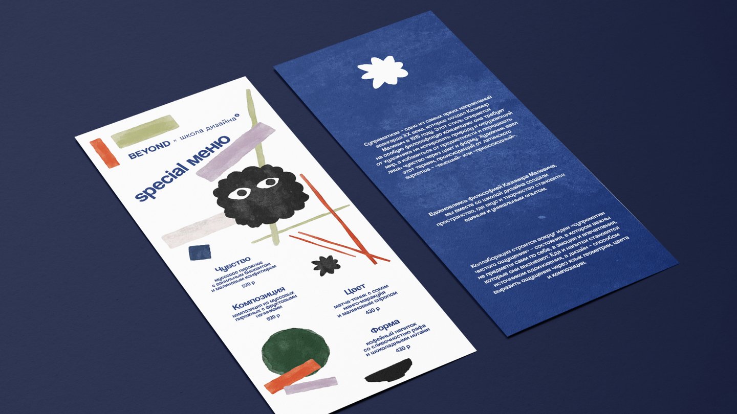
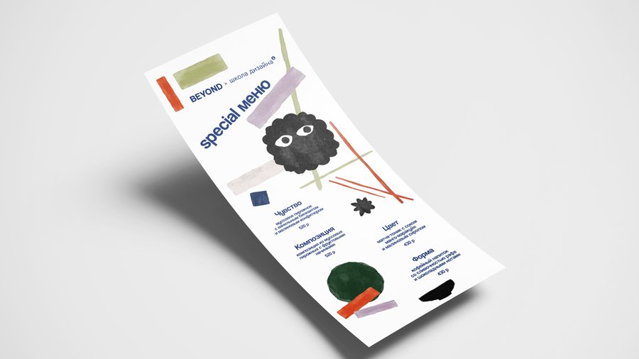
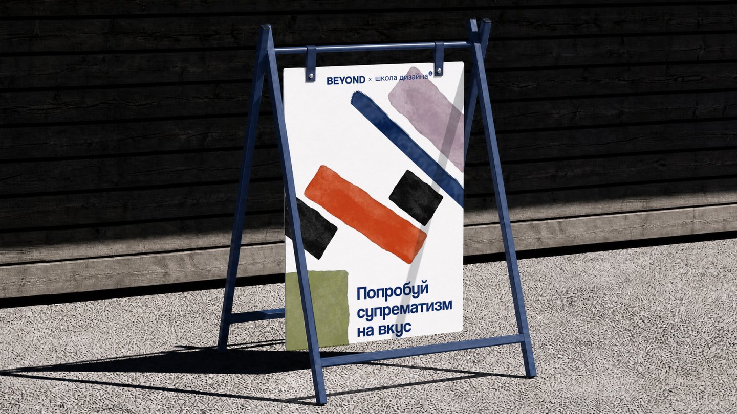
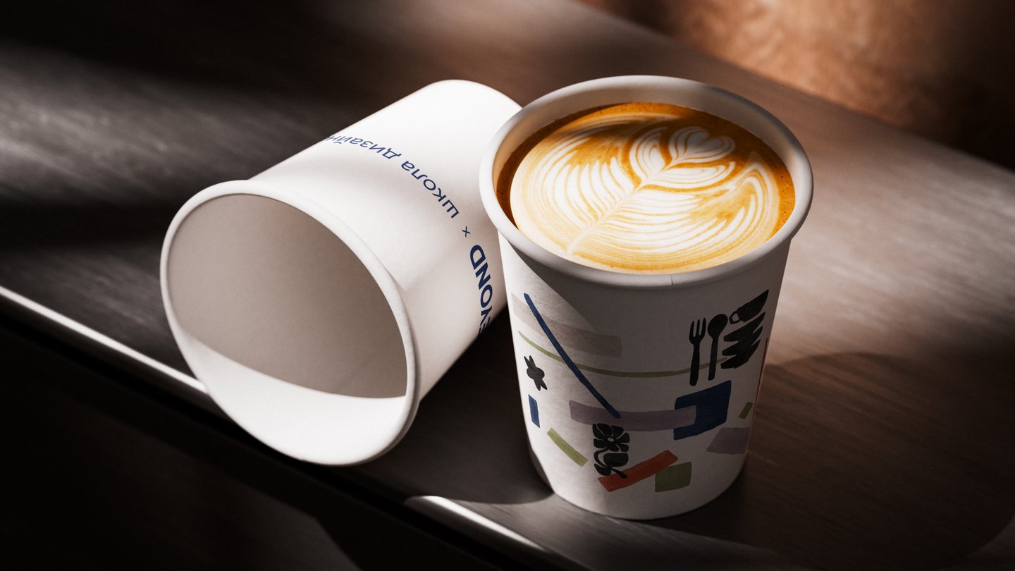
Task: To develop the concept for a special menu (3–5 items), its design, and all related materials. The collaborative concept must be creative yet remain within the brand’s framework, understandable to the target audience, and reflect the values of the design school, the institution’s philosophy, and the aesthetics of the target audience.
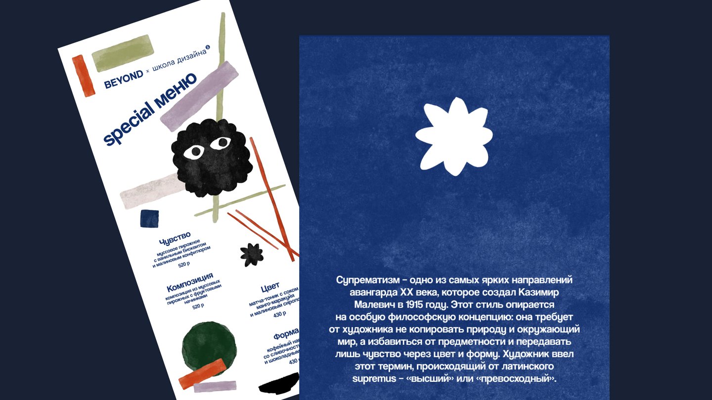
Solution: The visual style is rooted in the concept of Suprematism, one of the most striking avant-garde trends of the 20th century, pioneered by Kazimir Malevich. In this style, form, color, and composition serve as the primary means of expression. The word «Suprematism» derives from the Latin supremus—meaning «supreme» or «excellent.»
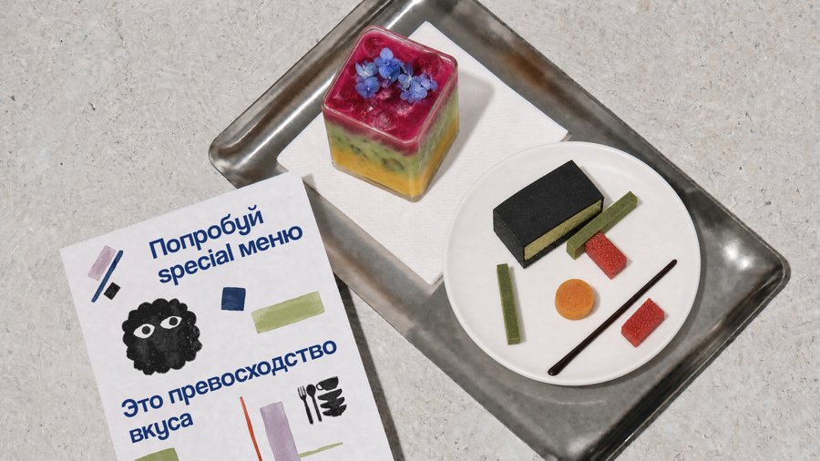
The collaboration is built around the idea of the «supremacy of pure sensation"—a state where the importance lies not in the objects themselves, but in the emotions and impressions they evoke. Food and beverages become a source of inspiration, and design becomes a means of expressing feeling through the language of geometry, color, and composition.
The project illustrates how design and culinary arts converge to create a singular experience.
[3]
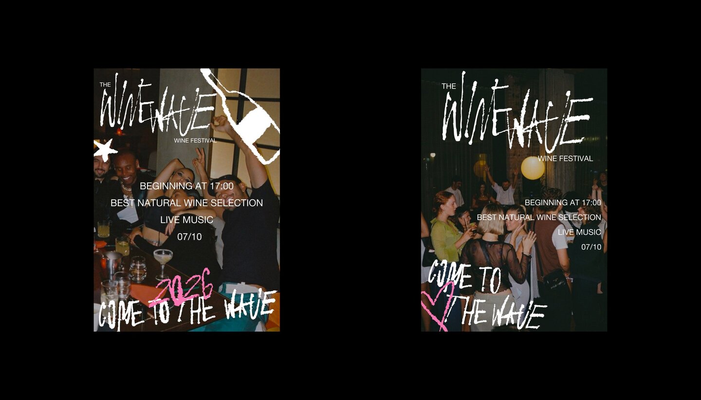
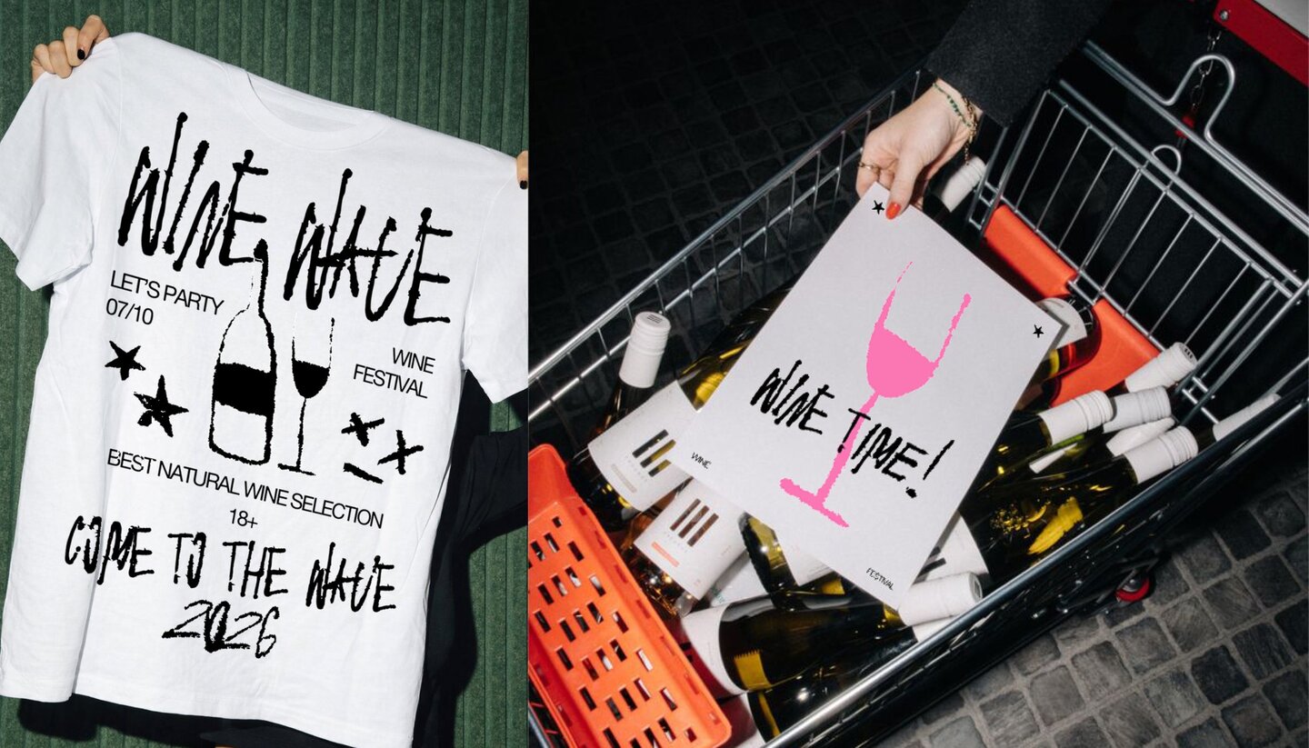
[3] WINE WAVE
Task: To design your own accidental font and subsequently develop a cultural institution and branding based on it.Solution: I created a handwritten font and decided to apply it to the branding for a youth wine festival. Using a vibrant and lively typeface, I managed to create an engaging identity that conveys a modern, festive, and youthful atmosphere.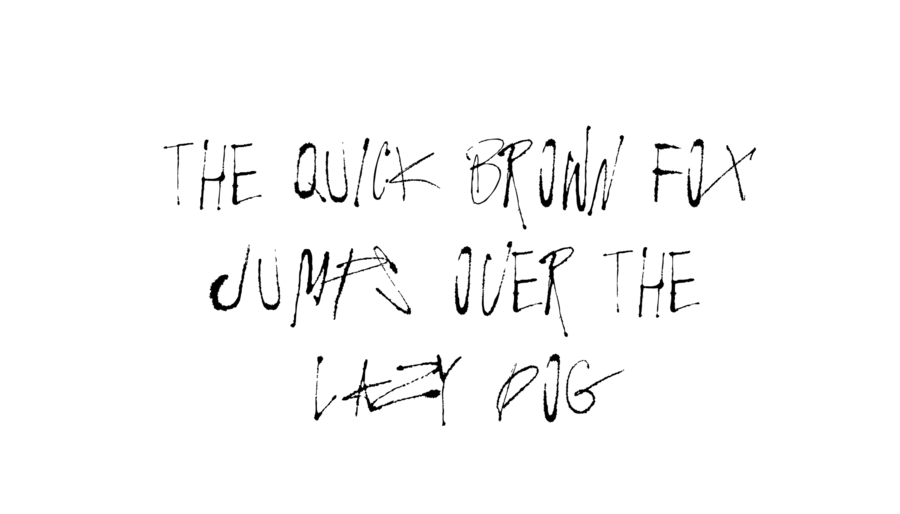
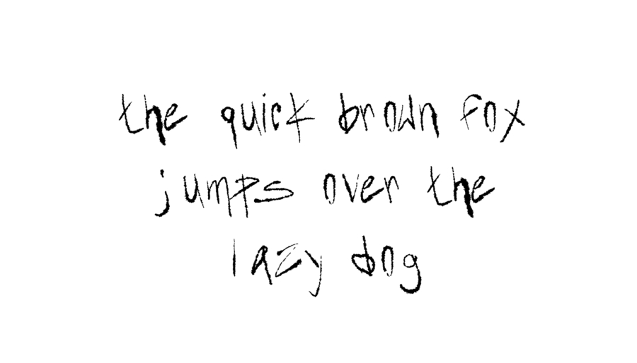
The font was created in Cyrillic and Latin scripts, featuring two typeface options in each language.