Every great identity starts with an idea
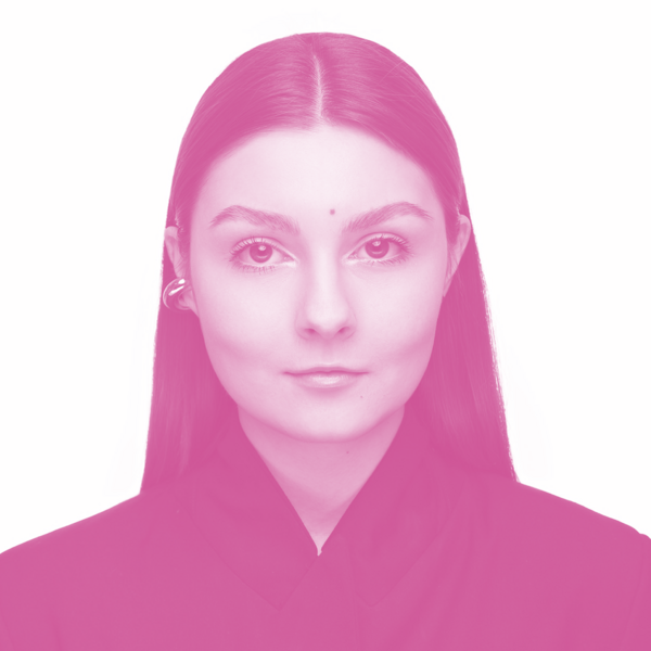
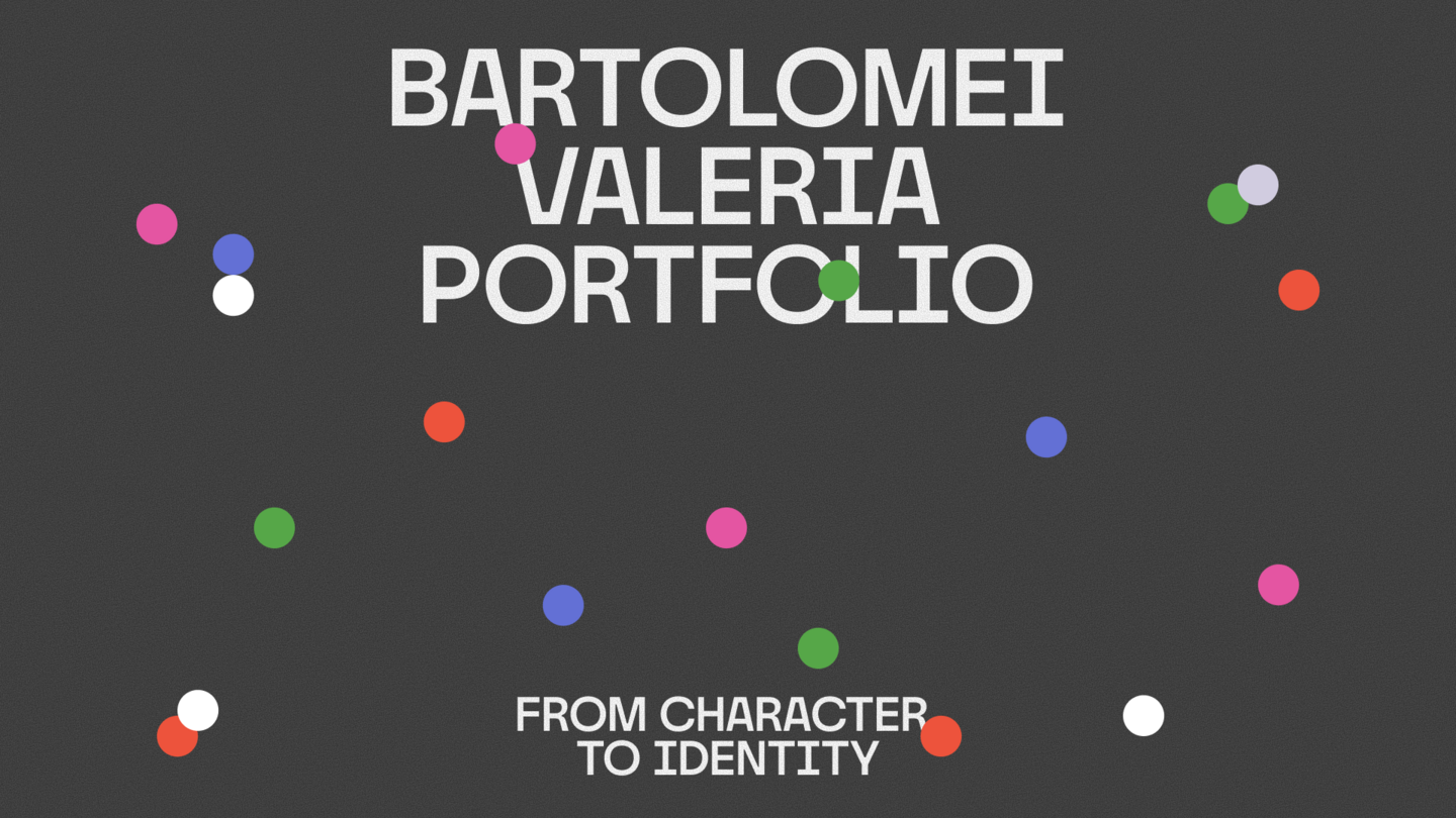
Hi, I’m Lera!I’m an independent brand designer, and my favorite part of the creative process is generating ideas and finding ways to bring them to life.I enjoy exploring unexpected connections and transforming simple observations into visual concepts.For me, branding begins with a strong idea—it’s what gives a project its character and unifies every element into a single visual identity.
My Approach
From Concept to Visual Identity
01 / UNDERSTANDI explore the brand, its audience, and what makes it unique.02 / CONCEPTUALIZEI search for an idea that captures the brand’s essence and can form the basis of its visual identity.03 / CREATEI translate the concept into a visual system, integrating typography, color, and graphics into one cohesive identity.
case 1
Pranna
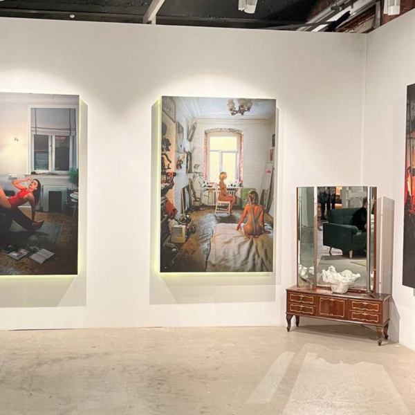
Context & Challenge Pranna is a creative bureau that brings together diverse people, ideas, and artistic disciplines. The challenge was to develop a flexible visual identity that unites all creative units within a single system while allowing each to retain its unique character.ConceptThe concept is rooted in the idea of connection. Circles form the foundation of the visual language. They connect, overlap, and merge into new shapes, symbolizing the relationships between people, ideas, and creative disciplines. Color introduces another layer of individuality. Each creative unit is assigned its own color, representing its distinct character and energy.
Applications & Outcome The identity merges a flexible graphic system with a distinctive color palette, allowing it to adapt across various formats and applications. The result is a cohesive visual language that unites the bureau’s creative units while preserving their individual identities.
case 2
Dikari
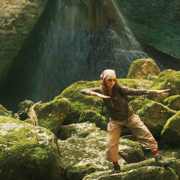
Context & Challenge Dikari is a hiking club founded by Ulyana and Egor, bringing people together through outdoor adventures and shared experiences. Previously, the club was closely associated with Ulyana’s personal blog. The challenge was to create an independent, recognizable brand identity that could help Dikari reach a wider audience.Concept Freedom brings people together.The concept is built around the idea of connection. Circles form the foundation of the visual language. They connect, overlap, and merge into new shapes, reflecting the relationships between people, ideas, and creative disciplines. Color adds another layer of individuality. Each creative unit has its own color, representing its unique character and energy.
Applications & Outcome The visual identity extends across social media, photography, illustrations, and branded materials. I also developed a consistent approach to visual content, focusing on authentic emotion, movement, and real moments captured during hiking trips. The result is a recognizable and flexible identity that communicates the club’s values of freedom, simplicity, courage, and community.
case 2
SQWOZ BAB
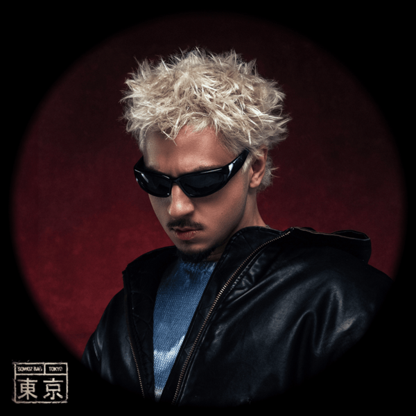
Context & Challenge SQWOZ BAB is a rap artist known for his ironic personality, exaggerated humor, and references to everyday life and popular culture. The challenge was to create a series of concert posters that captures his distinctive character without relying on obvious imagery, while connecting all the posters through a consistent graphic concept.Concept The concept is inspired by Russian TV guides and magazines from the 1990s and 2000s. Dense typography, halftone textures, and visual noise recreate the aesthetics of mass print culture. This familiar visual language is reinterpreted through bold compositions and a risograph-inspired style, reflecting the artist’s humor, irony, and unconventional personality.
Applications & Outcome The concept was developed into a series of concert posters connected by a shared graphic language. The result is an expressive visual series that reimagines traditional concert advertising through nostalgic cultural references and experimental typography.