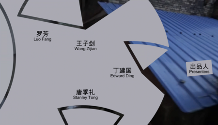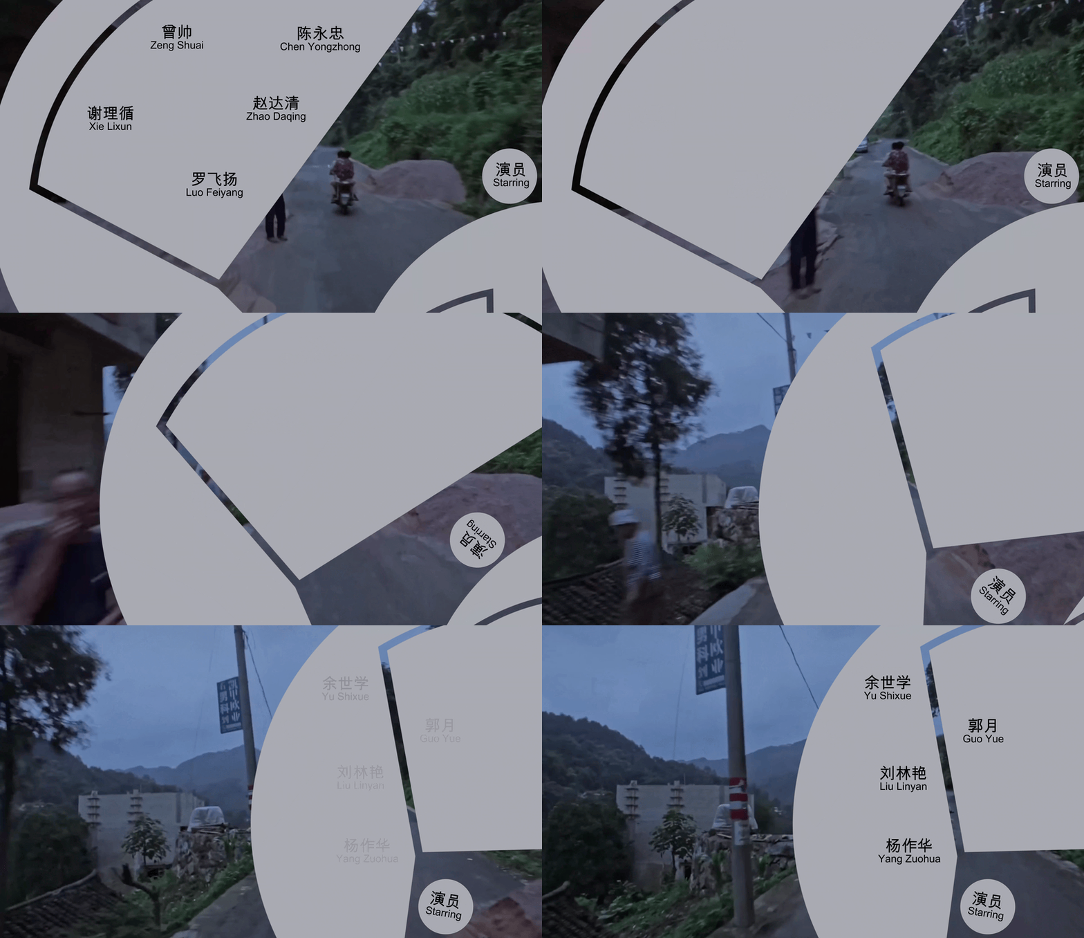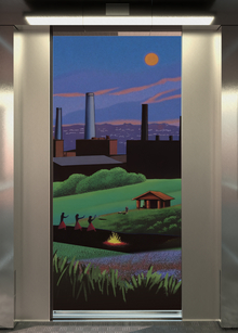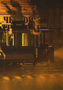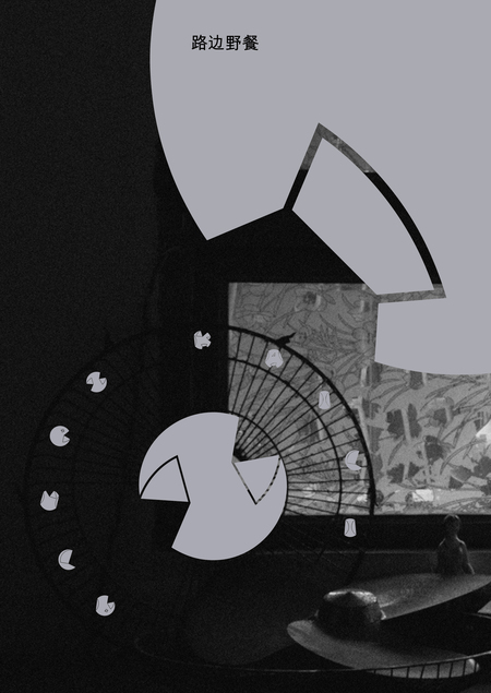
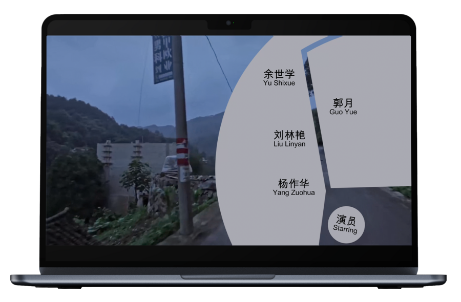
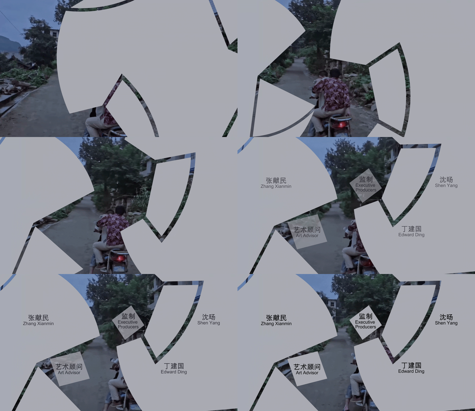
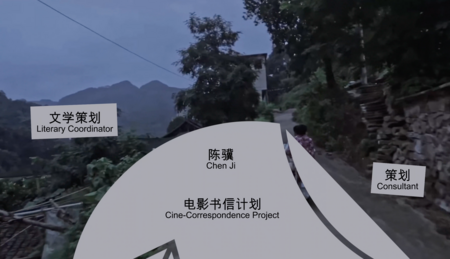
The title concept employs a metaphor: the letters symbolize the physical decay of a conserved past and the breakthrough of perception into the fluid space of Danyaima. The text itself does not appear smoothly; rather, it physically drops, moves, and transforms into active graphic elements: the letters intrude into the frame, overlay the image, and fragment it, creating a disorienting, unstable space that visually underscores existential wandering and the fluidity of reality.
чем обоснован выбор шрифтa? Canned
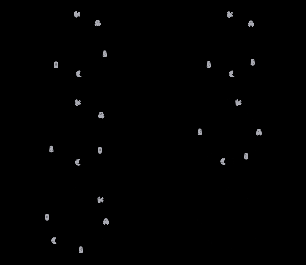
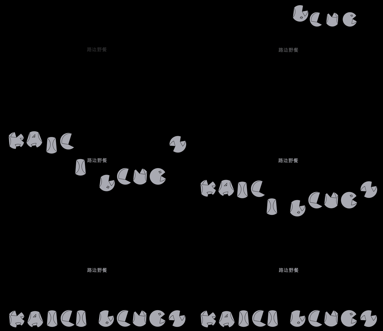
Canned. 1) derived from a circle—a reference to clocks; (2) inspired by the process of canning food—a metaphor for the preservation of the past and the opening of perception and consciousness in the city of Danmaai; (3) its versatility as a graphic element.
чем обоснован выбор шрифта? Arial
The selection of the maximally neutral typeface, Arial, is justified by the desire to emphasize Buddhist emptiness (śūnyatā). In this case, the text serves as a utilitarian form, devoid of pathos.