About Me
I am a fourth-year Communication Design student at HSE University, with a particular interest in branding and visual identity.
I enjoy exploring ideas, finding meaning in ordinary things, and turning observations into visual concepts. I pay close attention to details, especially typography, and like experimenting with unexpected design solutions.
For me, design is a way to give ideas a clear and expressive visual form.
My Projects
My main areas of interest are branding, visual identity, typography, poster design, and editorial design.
I am currently interning at the HSE Design Laboratory. My experience includes designing a catalog of Igor Gurovich’s tapestries, creating social media graphics and presentations, and developing merchandise concepts for the HSE Art and Design School and its Kids School program.
This experience has helped me develop a meticulous approach to production, manage deadlines, and work across different design formats.
#1 JOYSO
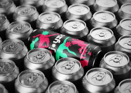
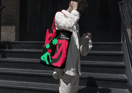
Soju Brand Identity · Packaging DesignContext Joyso is a conceptual soju brand inspired by the atmosphere of parties and nights out with friends. The brand positions soju as part of a lively social experience, associated with fun and relaxation.Challenge The goal was to create a bold and memorable visual identity that would reflect the brand’s playful character. The design needed to stand out on packaging while remaining recognizable across various formats.03. Concept The concept is based on the expression «to have your mind blown.» I translated this idea into human silhouettes with exaggerated, fluid poses and colorful explosions replacing their heads. The imagery captures the feeling of excitement and immersing oneself in the moment.Development I developed a graphic system centered on expressive silhouettes, vivid colors, and bold typography. The contrast between the human figures and the explosive shapes creates a strong sense of movement and visual energy.Result The final identity merges illustration, typography, and color into a cohesive visual language. It is applied to soju packaging and promotional materials, giving Joyso a distinctive and playful appearance.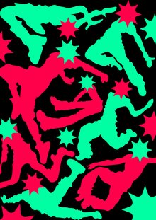
#02 Generous Books
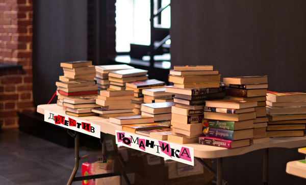
Charity Book Fair · Visual Identity · TypographyContext Generous Books is an annual charity book fair organized by the Independent Women’s Crisis Center. The event gathers books donated by publishers and individuals. Proceeds from the fair support women affected by domestic violence.Challenge The goal was to create a distinctive visual identity that reflected the diverse range of books featured at the fair. The design needed to convey the event’s inviting nature while remaining versatile enough for various promotional materials.Concept The concept is inspired by bookshelves and the diversity of literary genres. I envisioned the letters of the event’s name as pieces cut from the pages of different books. Each letter represents a separate book, with its typeface and color suggesting a particular genre.Development I combined contrasting typefaces, incorporating serif, sans-serif, and handwritten styles. The letters are arranged at varying heights, mimicking books lined up on a shelf. Their varied shapes and colors create a playful composition, while keeping typography central to the identity.Result The final identity transforms the event’s name into its primary graphic element. The typographic system establishes a recognizable visual language that captures the breadth of the books and imbues the charity fair with a lively, approachable character.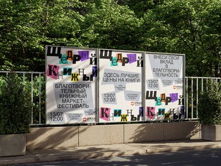
#03 DAFES Typography
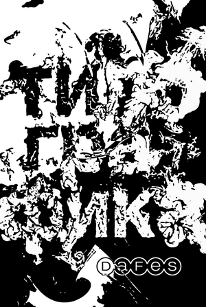
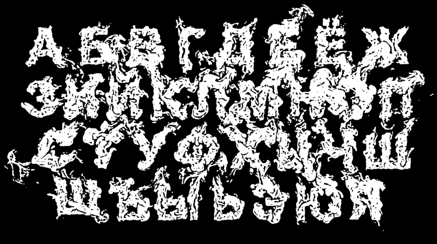
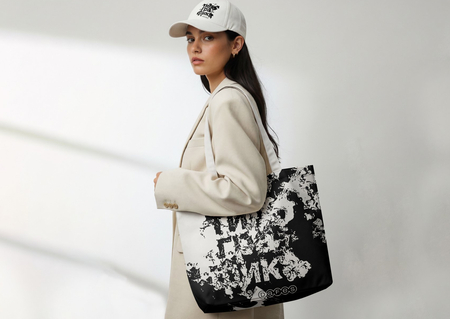
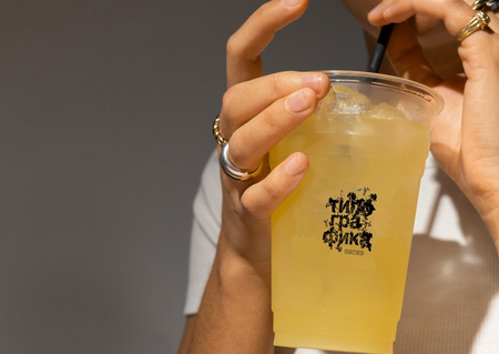
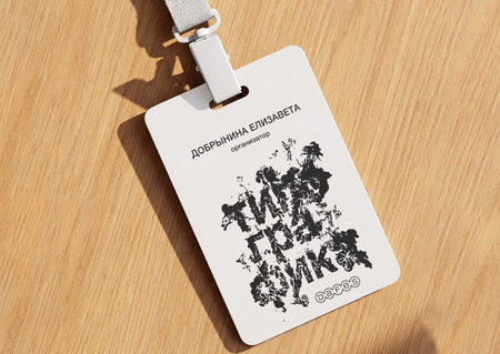
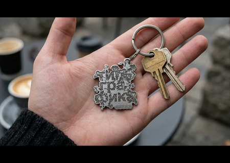
Festival Visual Identity · Experimental Typography · Graphic DesignContext DAFES Typography is a festival dedicated to typography, poster art, and graphic design. The event explores the role of letterforms in contemporary visual culture and brings together diverse approaches to typographic expression.Challenge The task was to develop a visual identity for the festival where typography served as the central element. I aimed to move beyond conventional letterforms and explore how type itself could transform into an expressive graphic image.Concept The concept draws inspiration from letterforms that evoke clouds, smoke, and explosions. Their soft, expanding shapes create an unconventional contrast with the familiar structure of the alphabet. Typography functions as both a means of communication and an independent visual element.Development I explored the interplay between recognizable letters and abstract forms. The resulting typography merges a sense of volume and movement with the inherent structure of written language. These letterforms became the foundation of the festival’s visual identity.Result The final design is a typography-led visual system constructed around expressive letterforms. It presents an experimental approach to festival identity, positioning the type itself as the primary graphic feature.