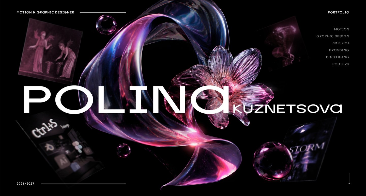
ABOUT ME
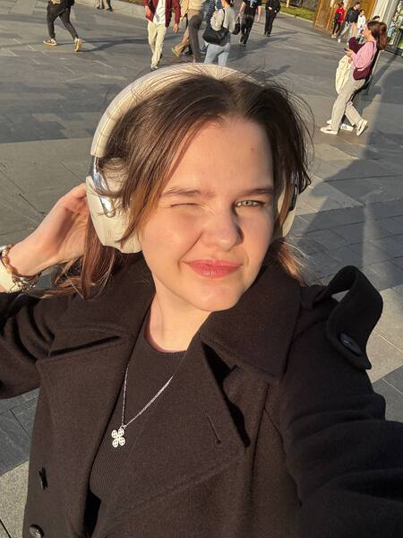
I’m Polina — a motion and graphic designer experienced in commercial and cultural projects.
I have collaborated with commercial brands, musicians, and cultural institutions, and my poster designs have been featured in exhibitions.I am open to new opportunities and collaborations. [Email] p.k.kuznetsova77@gmail.com [Tg] @nlp_oiaSHOWREEL
Includes projects: Dotla Logo Animation, BLACKPINK Title Sequence, STORM Visual Identity, ODORUM Explainer Animation, Papa Johns Ads, Ctrl+Sleep Unity Game, etc.
PROJECTS ↓
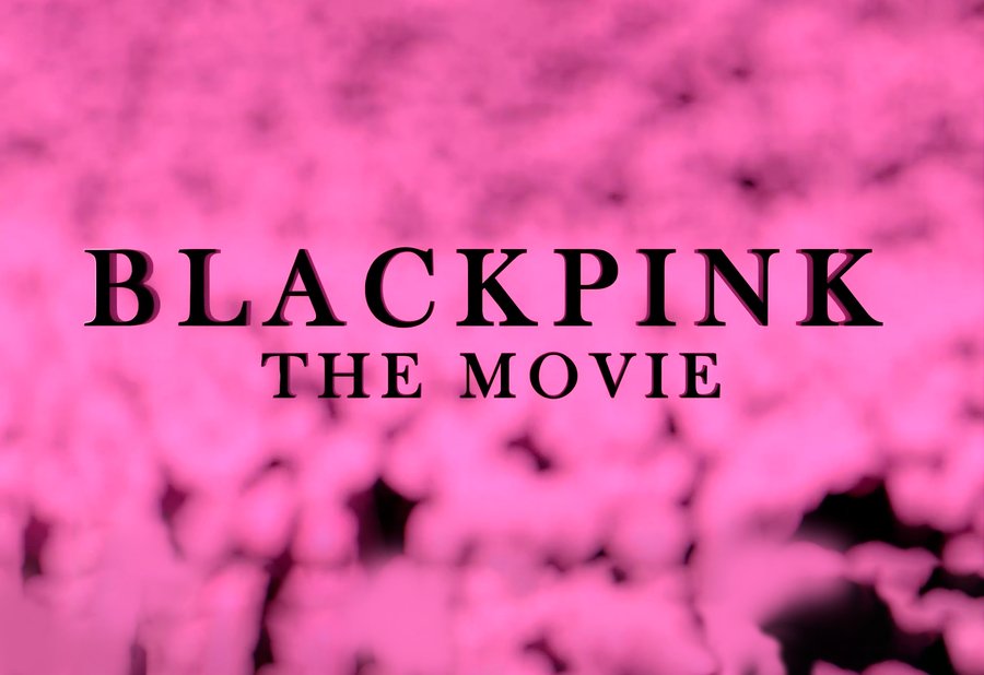
BLACKPINK: The Movie
Alternative Title Sequence
3D · Typography · Title Sequence · Merchandise
The challenge was to create an alternative title sequence that captures the energy of BLACKPINK and the atmosphere of the film, while building a distinctive visual concept around its musical identity.
Key Visual Decisions
Elegance & intensity
Sharp serif typography and a black-and-pink palette balance feminine elegance with the group’s bold energy.
4 members, 4 symbols
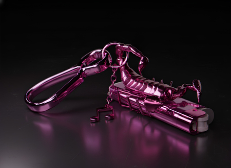
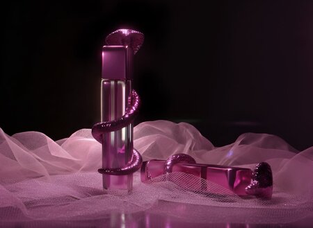
Four microphones and four poisonous animals represent the members—combining recognizable stage props with a darker, unexpected visual metaphor.
From stage to audience
The sequence transitions from backstage preparations to a pink ocean of lightsticks, connecting the performers with their audience.
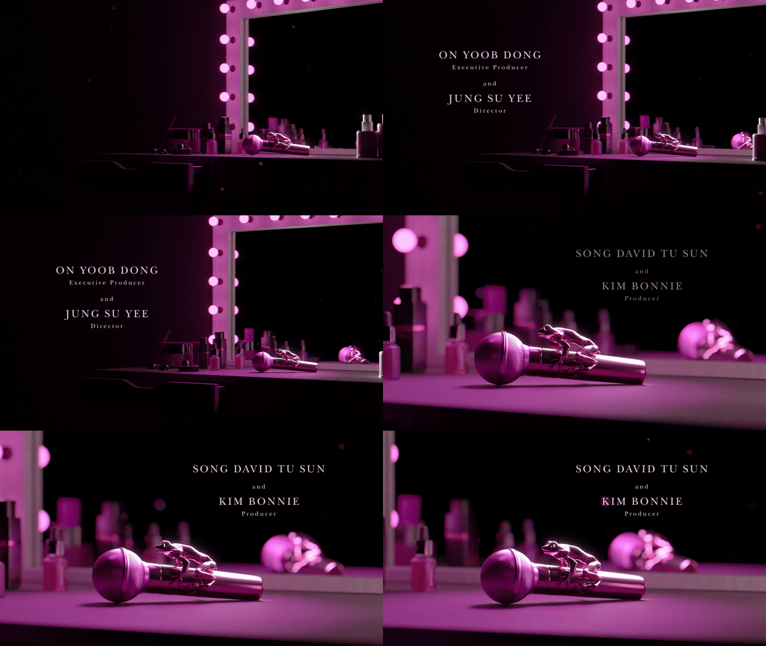
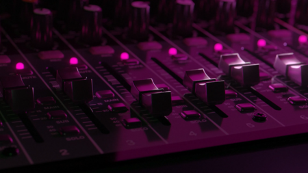
The concept establishes a distinctive visual identity for the film, helping it stand out through a consistent combination of typography, color, and imagery. Extending the concept to posters and merchandise creates a unified promotional system with the potential to strengthen recognition and support merchandise sales.
PAPA JOHNS ↓
Animated Advertising Banners
Commercial Animation · Social Media · 2D Animation
Papa Johns needed promotional materials to draw attention to its St. Petersburg locations and drive visits during a local advertising campaign. The assignment was to develop animated banners and a vertical promotional video that clearly communicated the offer across various formats.
According to the manager’s feedback, the campaign yielded positive results: impressions rose, and restaurant foot traffic increased on days when the animated banners were displayed near the locations. The animation supported a local advertising campaign by combining product-focused visuals with clear promotional messaging.
ODORUM ↓
Explainer Animation
Historical Reconstruction · 2D Animation · Teamwork
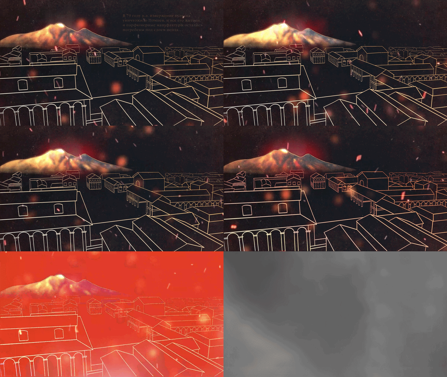
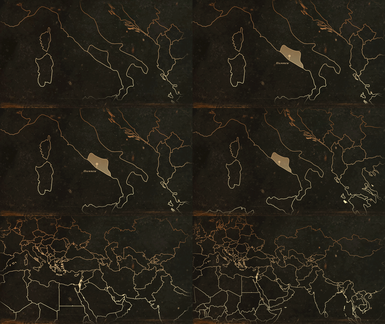
ODORUM, a museum of perfumery, needed an accessible way to explain the complex process of essential oil production in Ancient Rome to exhibition visitors. The challenge was to combine historical accuracy with clear visual storytelling, utilizing reconstructed Pompeian frescoes, infographics, and animation.
STORM ↓
Visual Identity & Art Direction
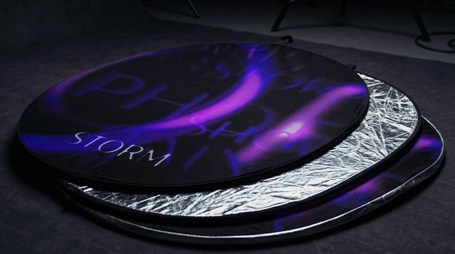
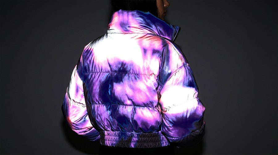
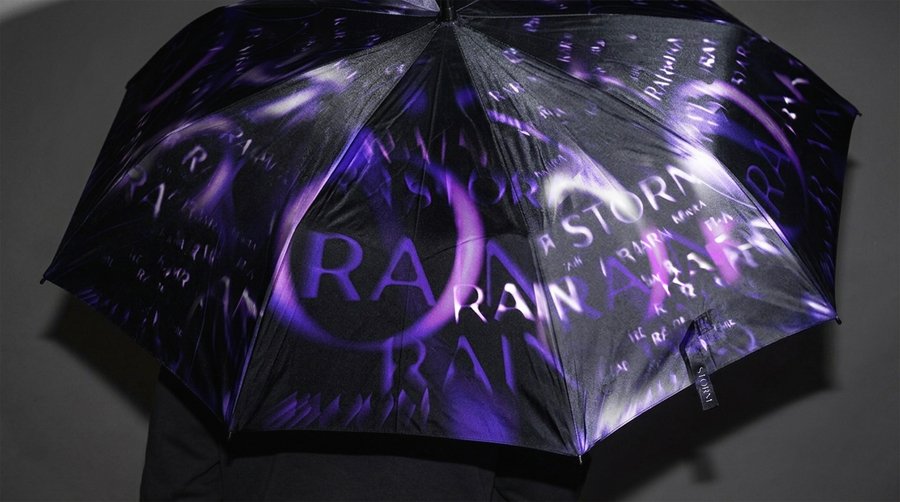
Identity · Merchandise · Sound DesignSTORM is a fashion media brand concept built around the contrast between fast-fashion minimalism and the unpredictable energy of a storm. The challenge was to develop a motion identity that integrates movement into the wider visual system, creating a consistent brand language across static and animated applications.
DOTLA↓
Stage Logo Animation
Stage Design · 3D · Music band
Following a name change, the Russian band Drug Flash needed a stage visual to introduce its new identity to concert audiences. The challenge was to transform the transition from the old name to the new one into a clear, attention-grabbing moment through a black-and-white looping animation.