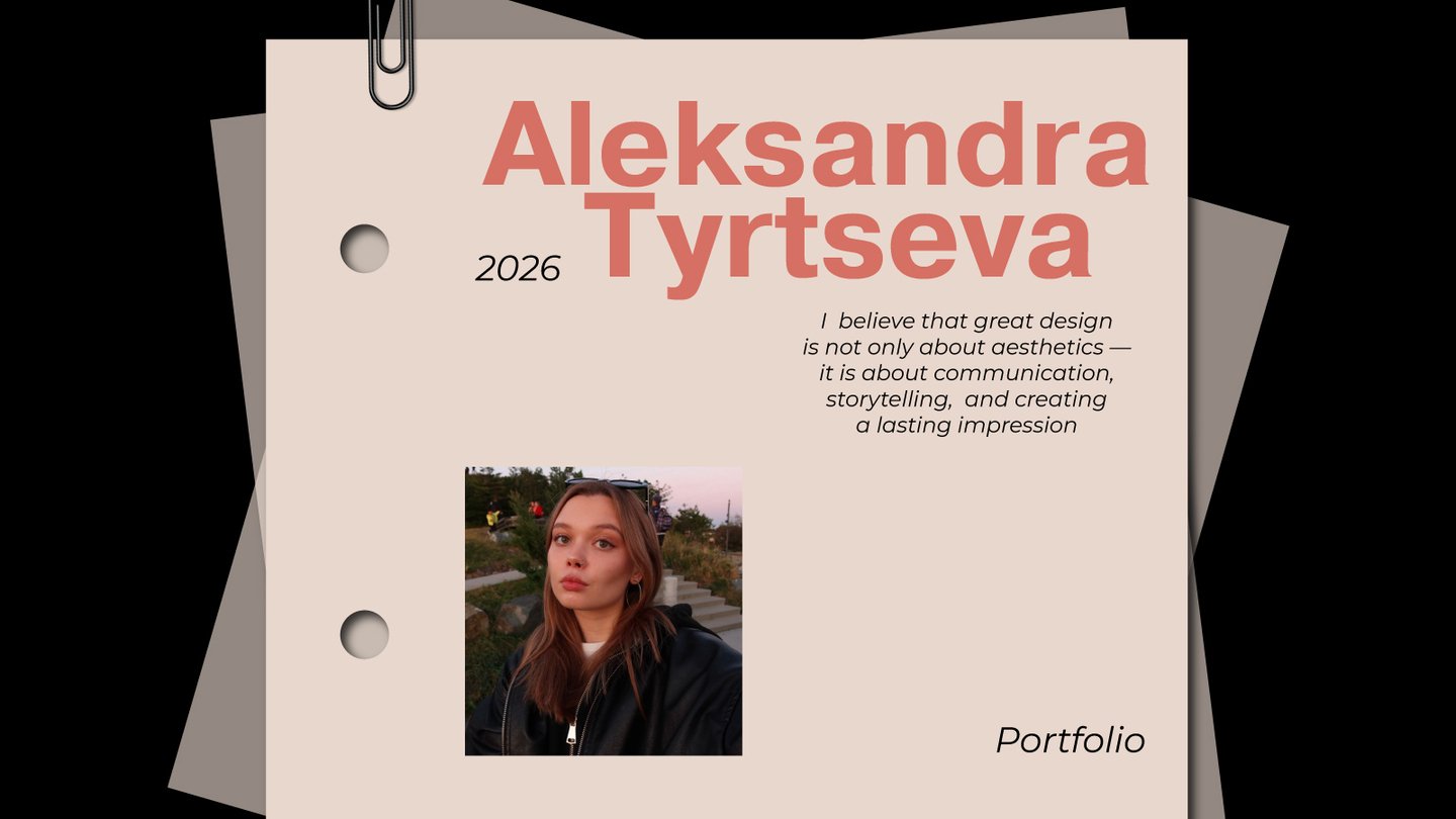
I translate meaning into visual identity
I am a graphic and brand designer focused on translating meaning into visual form.I believe that good design begins with an idea, not just aesthetics. I explore the core character of each brand and translate its values into a distinctive visual language. Through branding, packaging, and typography, I create thoughtful visual experiences where every detail serves a purpose. My goal is to make brands not only recognizable, but meaningful and memorable.Explore my work and see how meaning takes shape.
Case 1 / Time of Dawn — Charity flea market
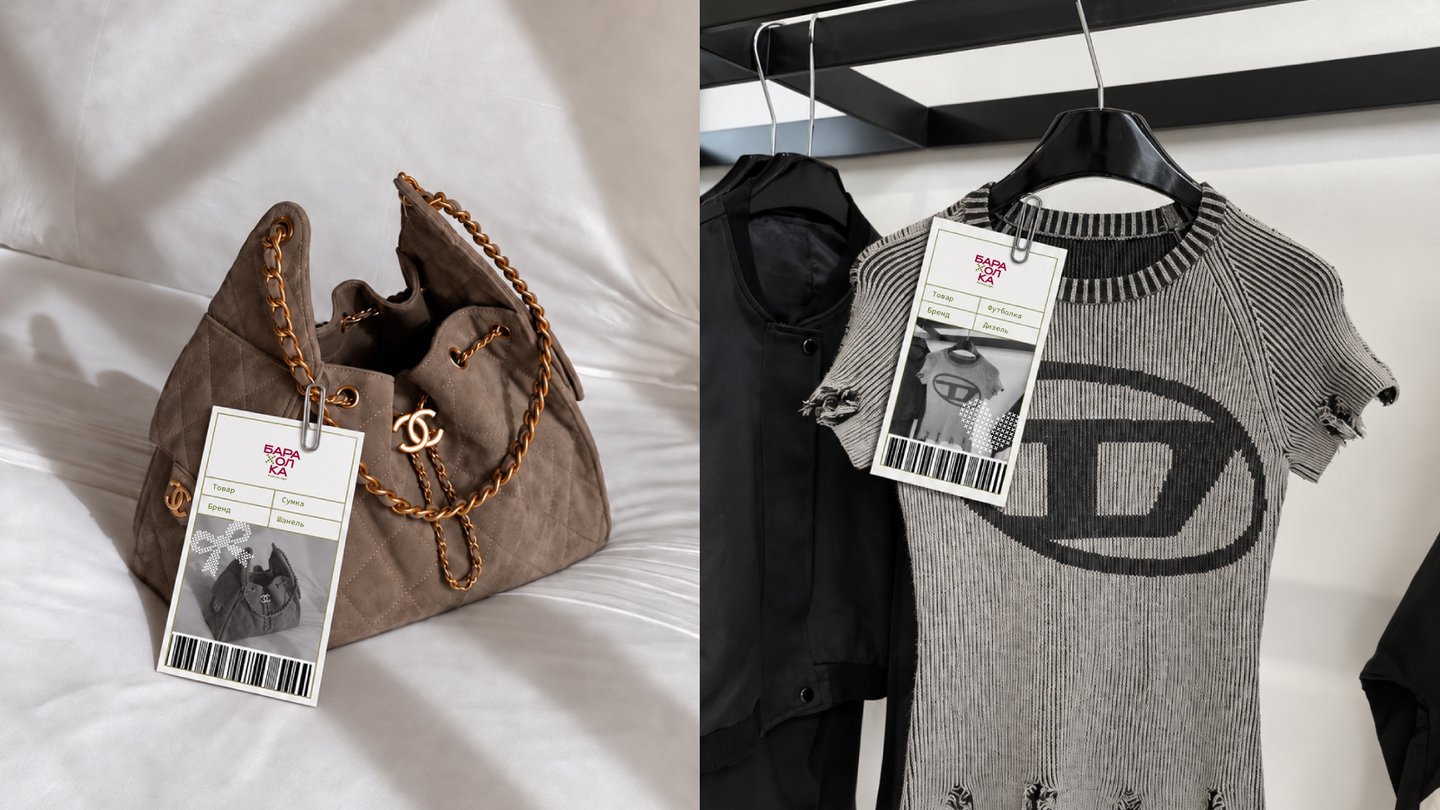
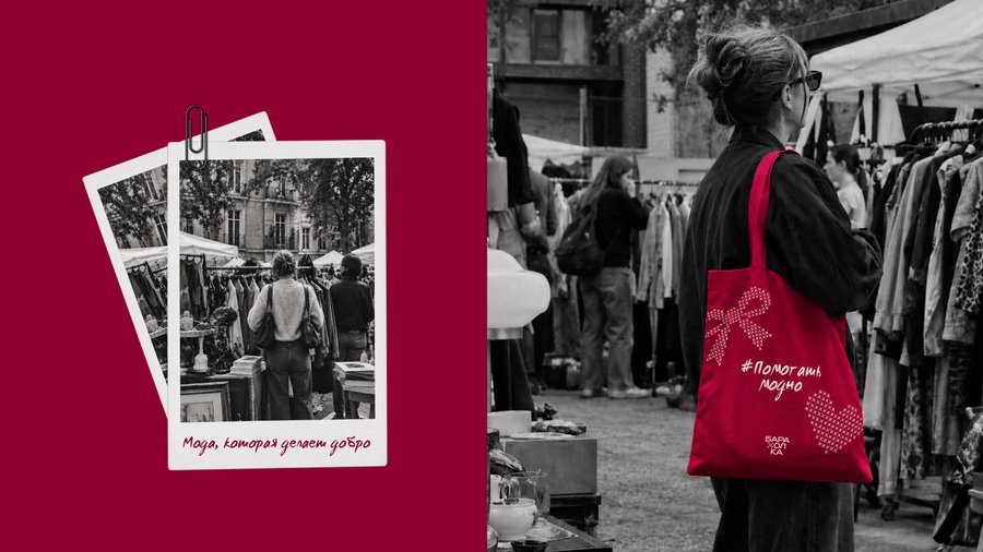
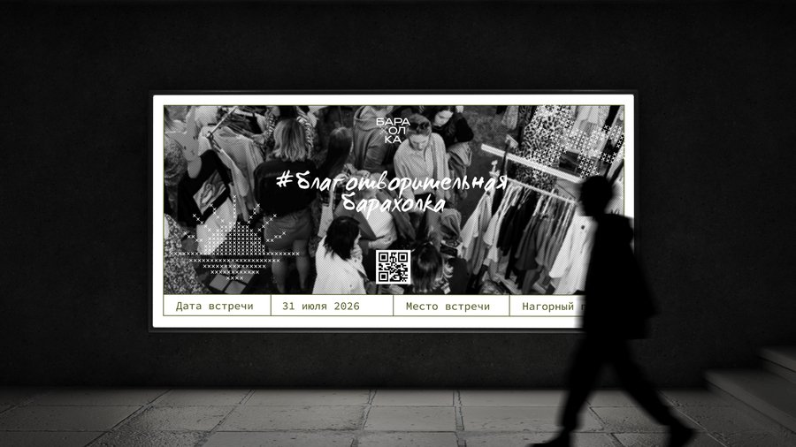
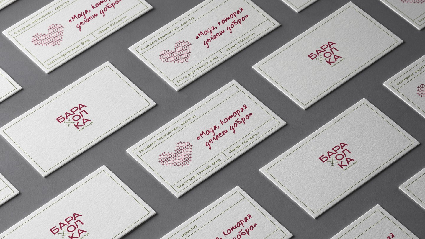
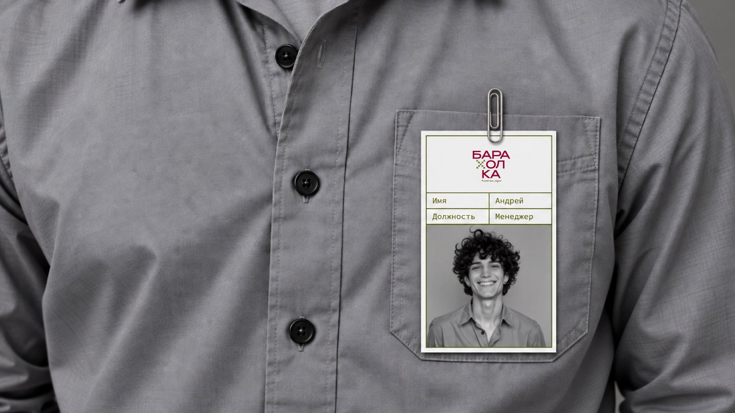
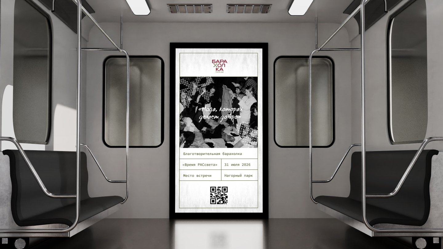
A charity fashion market hosted by the Vremya RASsveta Foundation, uniting fashion, conscious consumption, and social impact. Held twice a year, the event showcases clothing from local, premium, and mass-market brands, with all proceeds benefiting children with autism spectrum disorder (ASD).
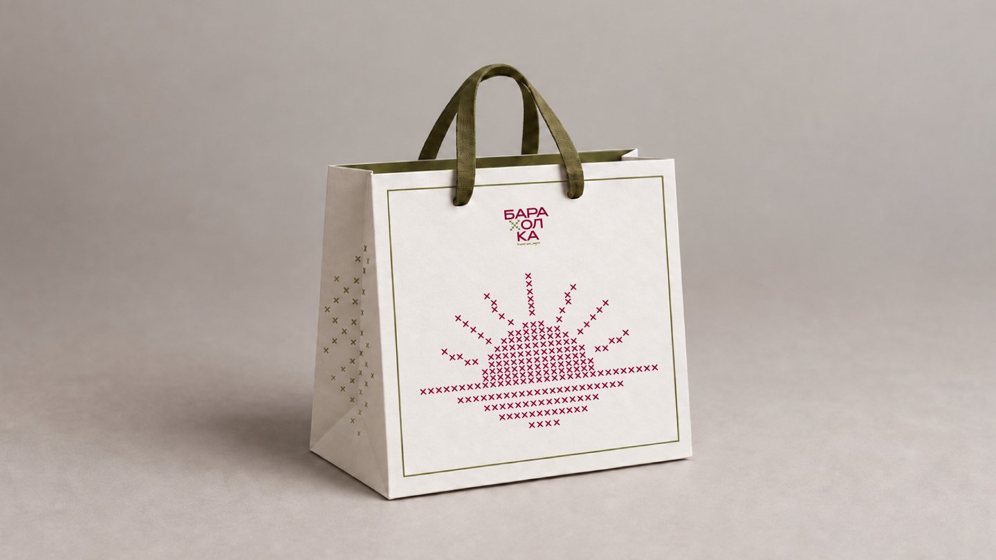
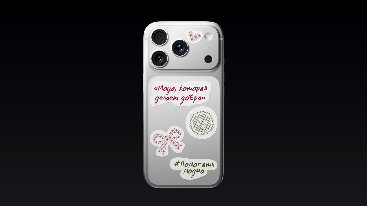
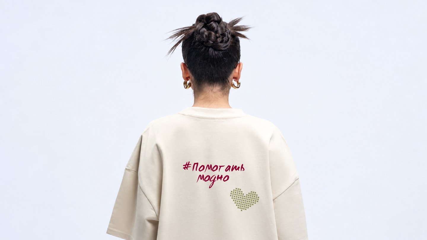
The visual identity connects fashion with a meaningful cause. Cross-stitch patterns form recognizable, fashion-inspired symbols, reflecting the idea of giving clothing a second life. A structured modular grid brings geometry and consistency to the visual language.
Case 2 / TRUESHKOWSKI — Jewelry Brand
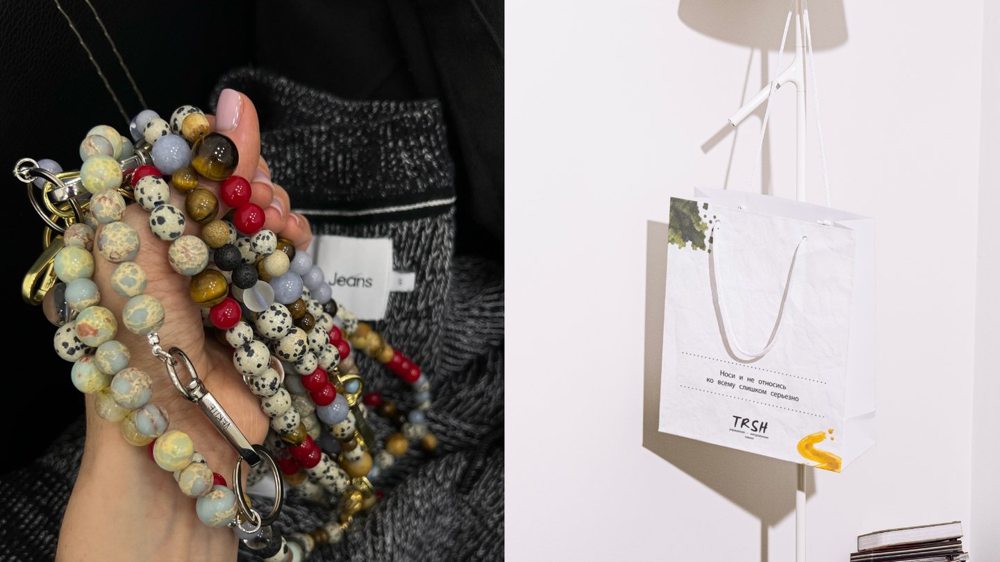
An independent jewelry brand that transforms everyday life into a playful experience through natural stone accessories. Blending traditional craftsmanship, contemporary art, and street culture, the brand challenges trends with irony, boldness, and attention to detail. Each piece is handcrafted with a focus on texture, color, and form, becoming more than just an accessory. It is a personal statement, created for those who aren’t afraid to stand out and see jewelry as an extension of their personality, mood, and individuality.
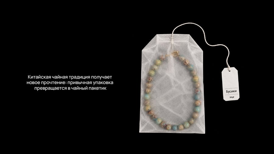
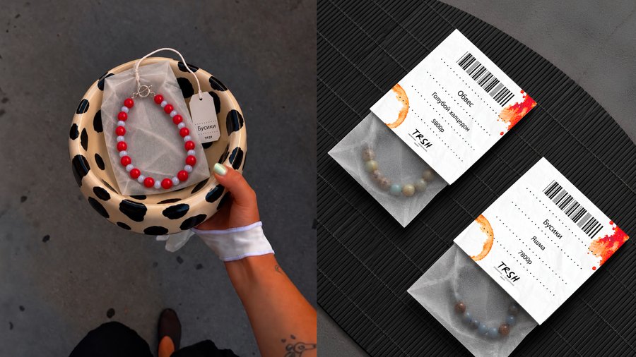
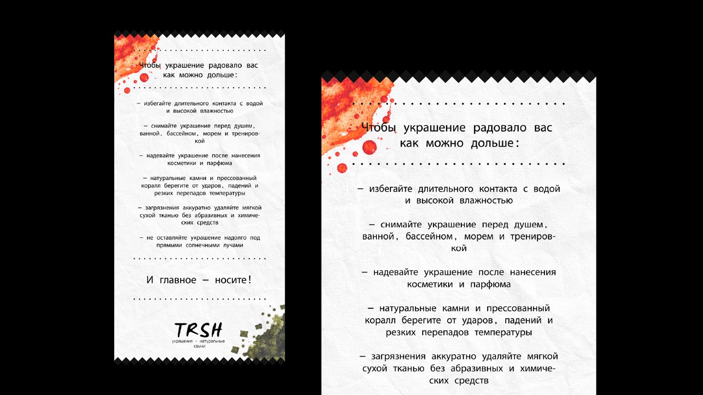
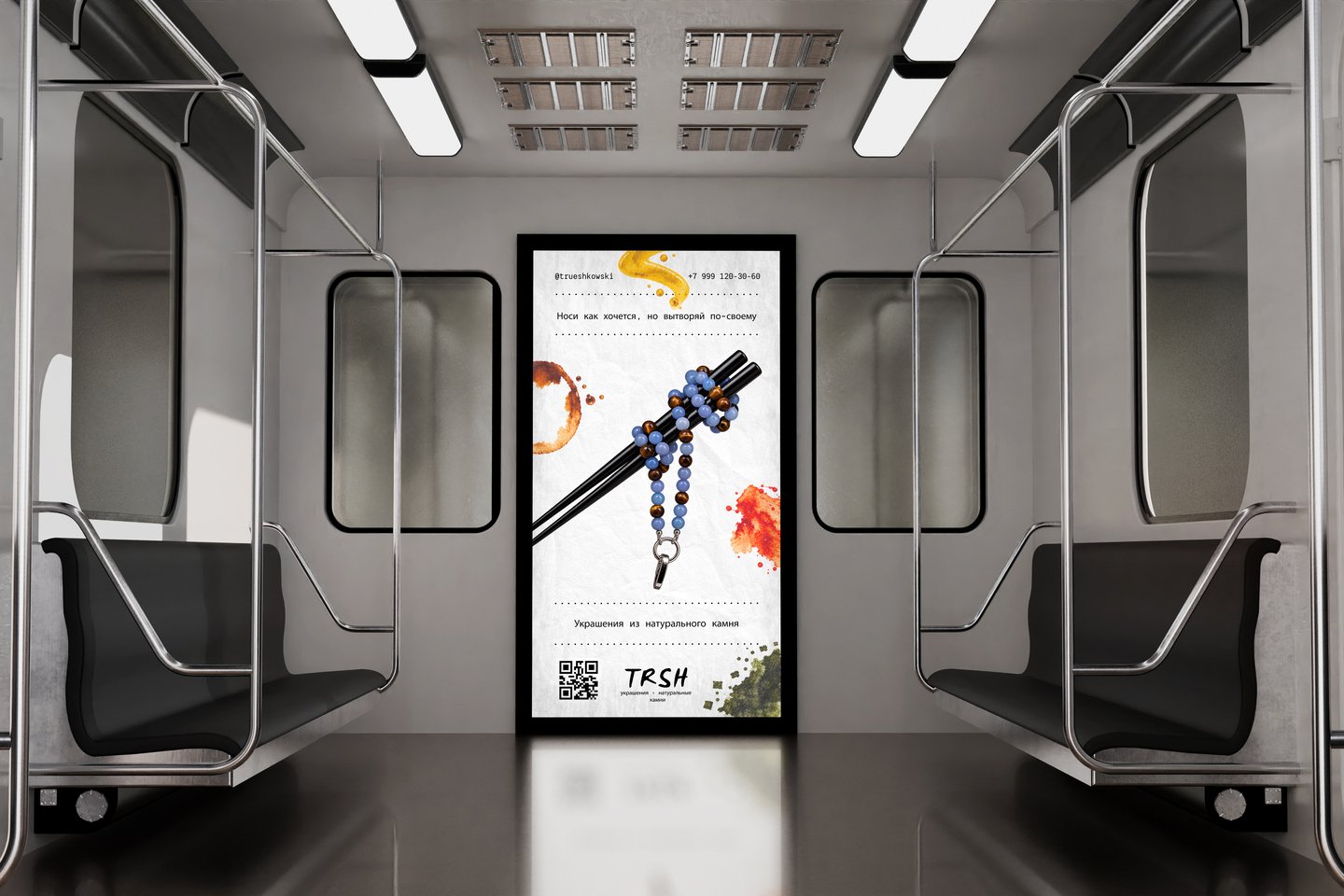
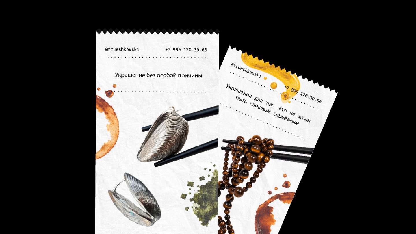
Natural stone is as organic as food. Its textures and colors invite you to look closer, explore, and indulge. The visual concept blends the raw beauty of natural stones, the aesthetics of Asian street food, and elements of Chinese culture. Chopsticks, sauce stains, tea bags used as packaging, and restaurant receipts transformed into typographic grids become key elements of the brand’s playful and unconventional visual language.
Case 3 / SOLIOLI — Botanical Cosmetics Brand
An independent botanical skincare brand rooted in craftsmanship, scientific research, and the atmosphere of the forest. Created for people who feel connected to nature but value proven skincare effectiveness, the brand merges artisanal production with science—the forest and the laboratory, local roots and a spirit of exploration. Unlike mass-produced natural cosmetics, the brand maintains a personal approach, with its founder directly involved in both product development and communication, while production remains small-scale and workshop-based.
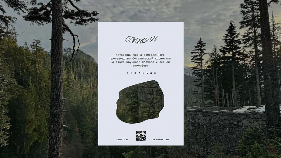
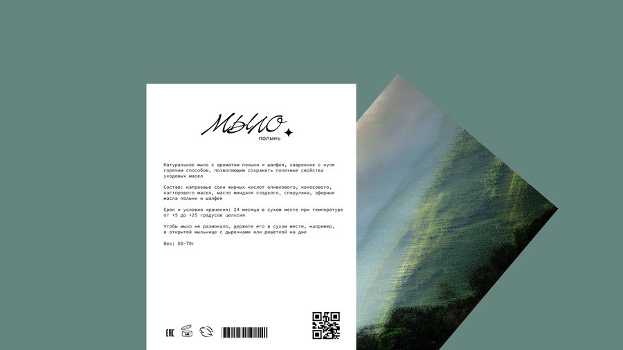
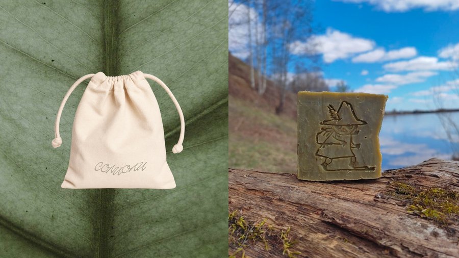
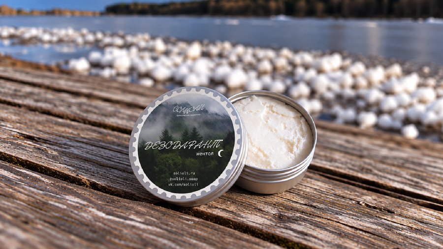
The visual identity draws inspiration from a journey through northern landscapes, viewed through a personal, slightly fairytale-like lens. Soft, pastel-hued scenery evokes sketches and travel memories, while a structured grid and monospaced typography balance organic forms with scientific precision. Graphic symbols resemble map markers, and labels—inspired by collectible stamps—transform each product into a travel artifact. A hand-lettered logo and tactile materials suggest a sense of craftsmanship, playful naivety, and natural imperfection. Collectively, these elements establish a visual language centered on four key themes: nature, travel, craftsmanship, and exploration.
Case 4 / Beyond the Line — A Festival of Women’s Achievements
The achievements and contributions of remarkable women are often overlooked or underappreciated. To bring greater visibility to their stories, celebrate their impact, and inspire others, the project proposes an annual festival dedicated to recognizing women’s achievements across various fields.
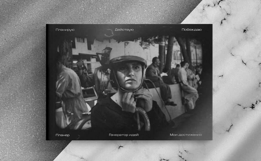
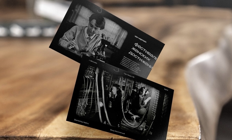
The visual identity draws inspiration from experimental analog photography and film manipulation from before the digital era. Scratches, erasures, and physical damage to photographic film become key graphic techniques, transforming images through intentional imperfections. These interventions create a bold, expressive visual language that challenges traditional ways of seeing and reflects the festival’s mission to bring overlooked women and their stories into focus.