About Me

My name is Olga Sarunova. I’m a brand and communication designer completing my degree in Communication Design at the HSE Art and Design School.
I’m interested in working with founders of independent brands and teams behind cultural projects to create visual identities that express what makes them distinctive.
My Projects
This collection showcases five student projects that explore branding and cultural communication. It provided me the freedom to experiment, discover unexpected connections, and pursue ideas beyond the limitations of commercial briefs.Each project tackles a distinct subject and responds to its unique creative challenge. Collectively, they reflect my approach to transforming research and visual experimentation into distinct identities, each possessing its own character, concept, and visual language.
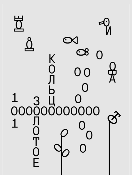
1 // The Golden Ring: New Meanings in Familiar Forms
The ChallengeThe task was to develop a visual identity for a humorous, potentially viral campaign that reimagines the cities of Russia’s Golden Ring. Drawing on unexpected insights gathered from open sources with the assistance of AI, the concept contrasts the cities’ official image with the authentic realities of daily life—a reality they rarely broadcast publicly.The ApproachThe project’s visual concept centers on the letter «O, ” which resembles a ring and transforms into unique visual representations for each city.The IdentityFor the visual identity, I chose neutral tones and simple shapes to preserve the lighthearted and playful nature of the concept.

2 // Turbrand Gus-Khrustalny
The Challenge
The task was to create a tourism identity for the city of Gus-Khrustalny.
The Approach
I researched the city’s history and its defining characteristics.
The Identity
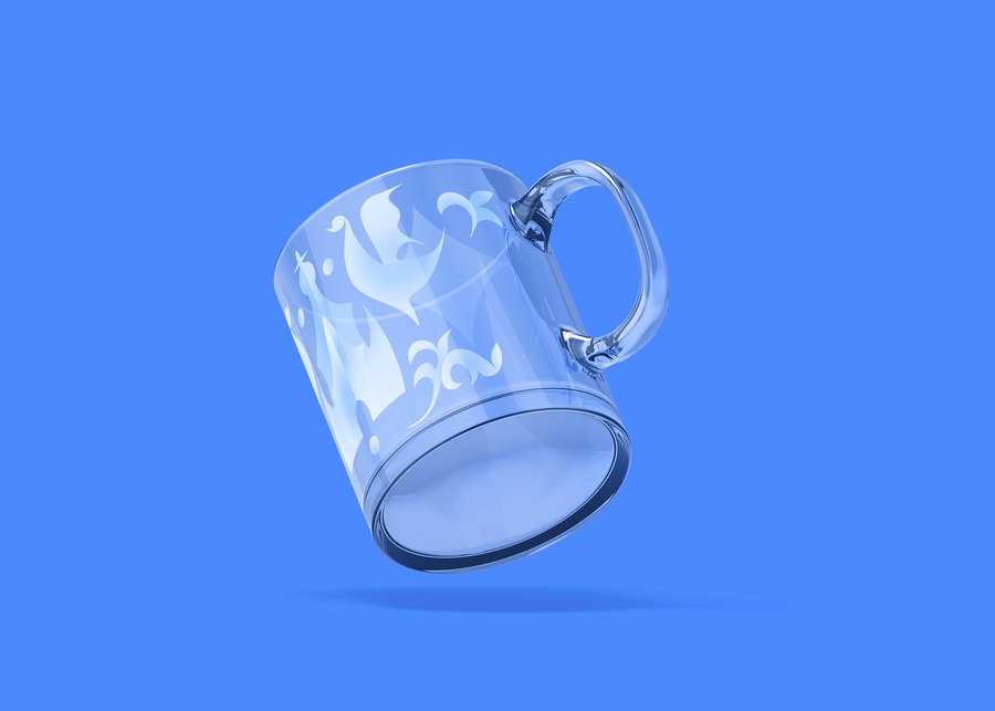
The concept is rooted in the diamond-engraving technique used for crystal. The pictograms incorporate the city’s natural and architectural features.

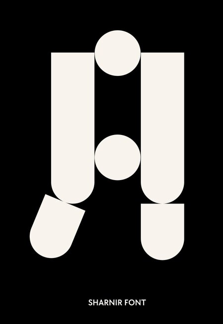
3 // SHARNIR font
The Challenge
The task was to design a display typeface for an exhibition featuring ball-jointed dolls.
The Approach
For my typeface design, I decided to study the mechanics of doll joints and use them to create modules for constructing the letters.
The Identity
The letters are composed of modules connected by integrated hinges, offering flexibility—you can arrange the letter components as you wish.
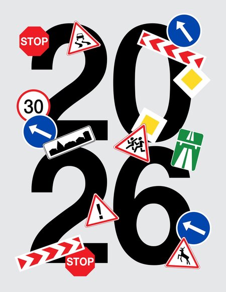
4 // Road Sign Calendar
The ChallengeCreation of a conceptual 2026 calendarThe ApproachI decided to adopt a travel theme, using recognizable road-related iconography and the poetics of seasonal moods as a foundation.The IdentityThe posters function as a full-fledged calendar and an art object for urban spaces.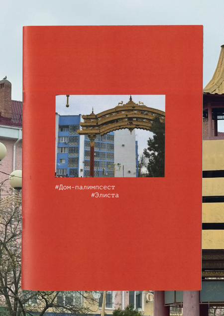
5 // House-palimpsest. Elista
The Challenge
Creation of a conceptual visual research.
The Approach
This book emerged from a long-term observation of the urban environment of Elista.
The Identity
In the process of documenting the city through photography, my focus was not on individual architectural structures or monuments, but rather on recurring visual motifs that subtly bind the city together into a unified cultural space.
My Approach