Every business dreams of being loved You have a great product. You care. You work hard.
But love doesn’t happen to the invisible Your clients just don’t see you yet.Every love story needs someone who believes in it
Hi, I’m Anastasiia, a brand identity designer.
My international experience in Shanghai taught me to think beyond design—integrating brand, marketing, and business.
I help businesses and their clients meet and fall in love.
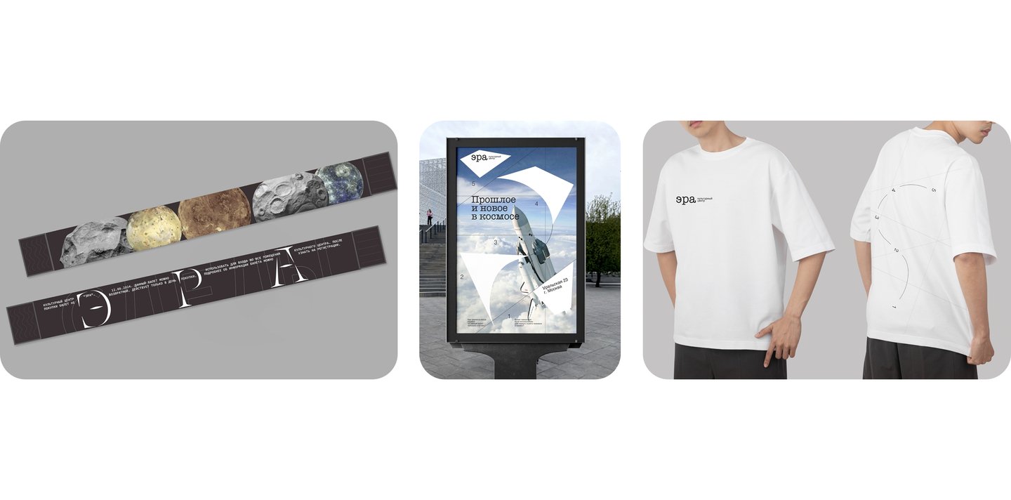
Want the whole city to recognize you? A big event deserves love at first sight.
Shanghai Light FestivalOnce a year, Shanghai transforms into a city of light. The festival required a new visual identity—one that would be memorable and usable by the team year after year.
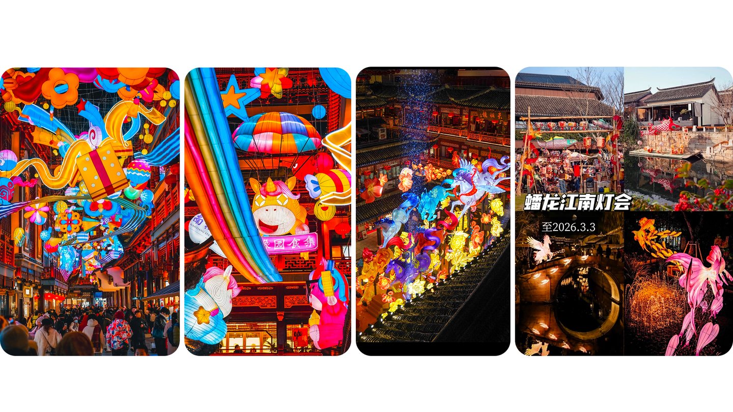
Light is a language I focused on the lantern: a traditional object reimagined for a futuristic city. Each lantern became a small glowing world, where ancient alleyways meet neon skylines.The different lantern shapes became the core of the style. Lines separate colors and reveal the form, broken lines turn it into 3D, and type plays with color and light.
The result is a flexible system: five lantern shapes, four colors, and five touchpoints. Each year introduces a new lantern—yet the festival remains instantly recognizable to everyone.
Does your brand still captivate your clients? If the spark is gone, it’s time for a fresh look.
Arkhyz SpacePeople love Arkhyz Space. They come to see the legendary BTA telescope and gaze at the stars. However, the brand looked outdated and failed to convey how special this place truly is.
Keep the stars, refresh the look The history here is too valuable to lose. So the new identity retains the spirit of the telescope and the brightness of the stars, updated for a modern form. The logo is built from the telescope’s silhouette, the color palette is inspired by the night sky, and bright accents function like stars.
The result is a brand that feels fresh yet remains rooted in its context—and is easily scalable to new projects, events, and merchandise.
Great idea, but the visuals just don’t click?
Let’s turn your concept into a cohesive brand.
XILOThe client came with a strong concept for ski backpacks, but no visual identity to match it. The task was to create a logo that would grow organically out of the product.
A logo built like a backpack I studied the construction of the backpack: its structure, straps, and lines. The logo reflects this construction, so every detail of the sign echoes the product itself.In 2027, this logo will appear on every backpack in the collection.
MILIMILI brings together traditional pasta from different regions of Russia. The brand supports local producers and showcases the uniqueness of each region through something as simple as pasta.Every region has its own taste. The brand is built on three values: tradition, quality, and innovation. The identity connects them—respect for regional heritage, presented in a modern and clean way.
The result is one recognizable brand with a unique face for every region—a system that grows with every new pasta variety.
Want an app that stands out in the market? Original design that clients choose and keep using.
BUK
People starting out in beauty and fashion face the same problem: they can’t find a team. Everyone seems more experienced. «What will they say if I message them?» Fear and uncertainty stop them before they even begin.