
Secrets — a festival of outdoor games in nature. We take familiar yard games into the forest to view the surrounding world again as a space for play.
The key technique in identity design is overlaying colors. Graphical elements create new forms where they intersect.
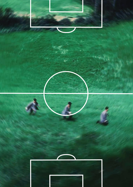
The playground layout becomes an independent element and integrates freely into the surrounding environment.
The venue for the «Sekretiki» festival is Meshchorsk Park

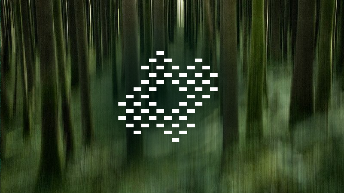
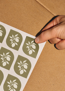
Festival logo. It functions as a counter-form to the photography and as a standalone mark.
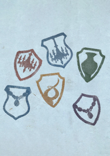
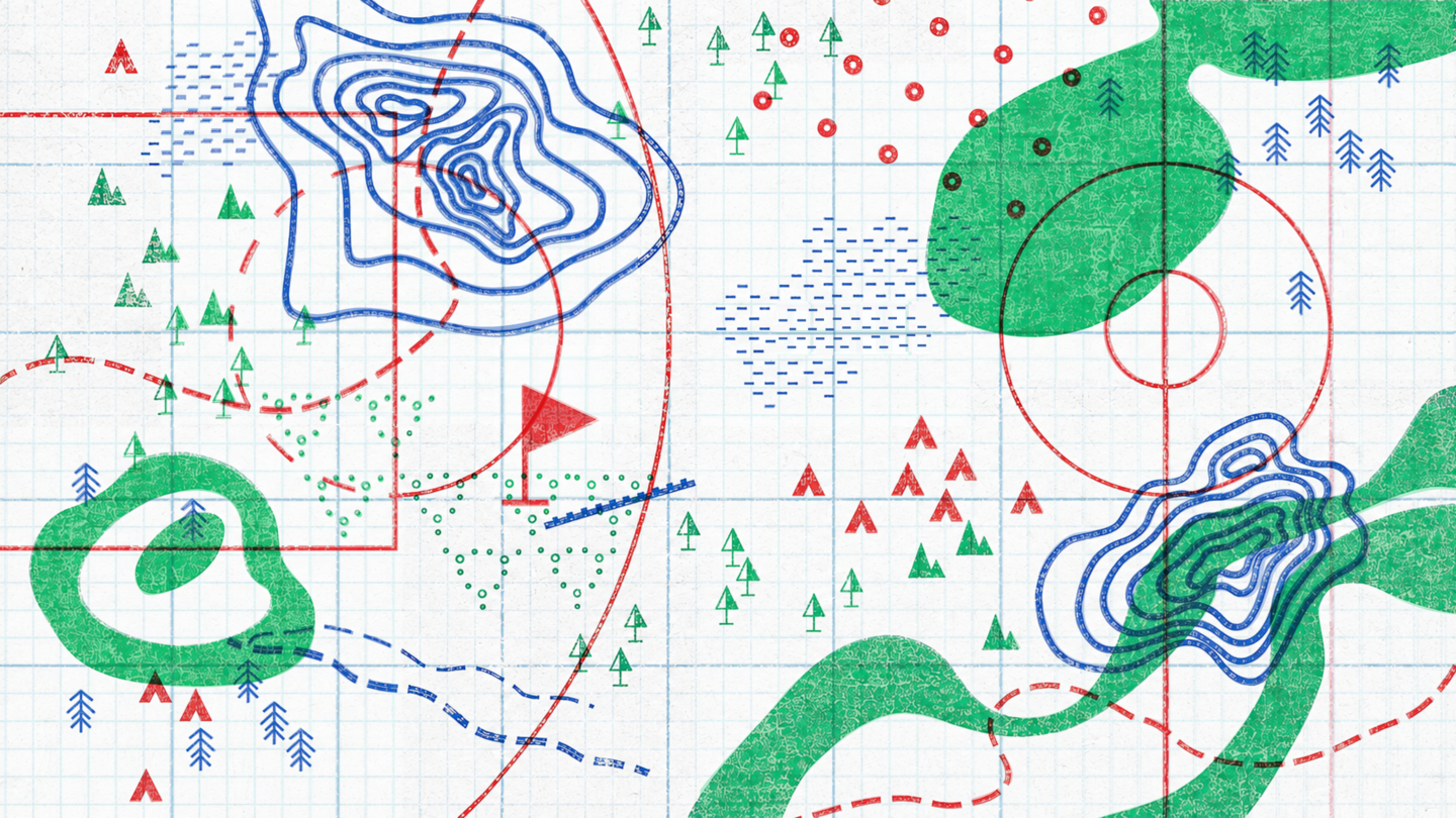
Posters. The «Secrets» system is integrated into the cartographic system. Topographic signs, colored with the signature palette, become the foundation of the visual communication.
The festival looks back at the experience of childhood and addresses the question: what kind of space is needed for a person never to stop playing?
Festival map. Green: designation of «field» zones—open space for lawn games. Blue: natural topography—trees, water bodies, and hills. Red: important navigational information—games and locations.
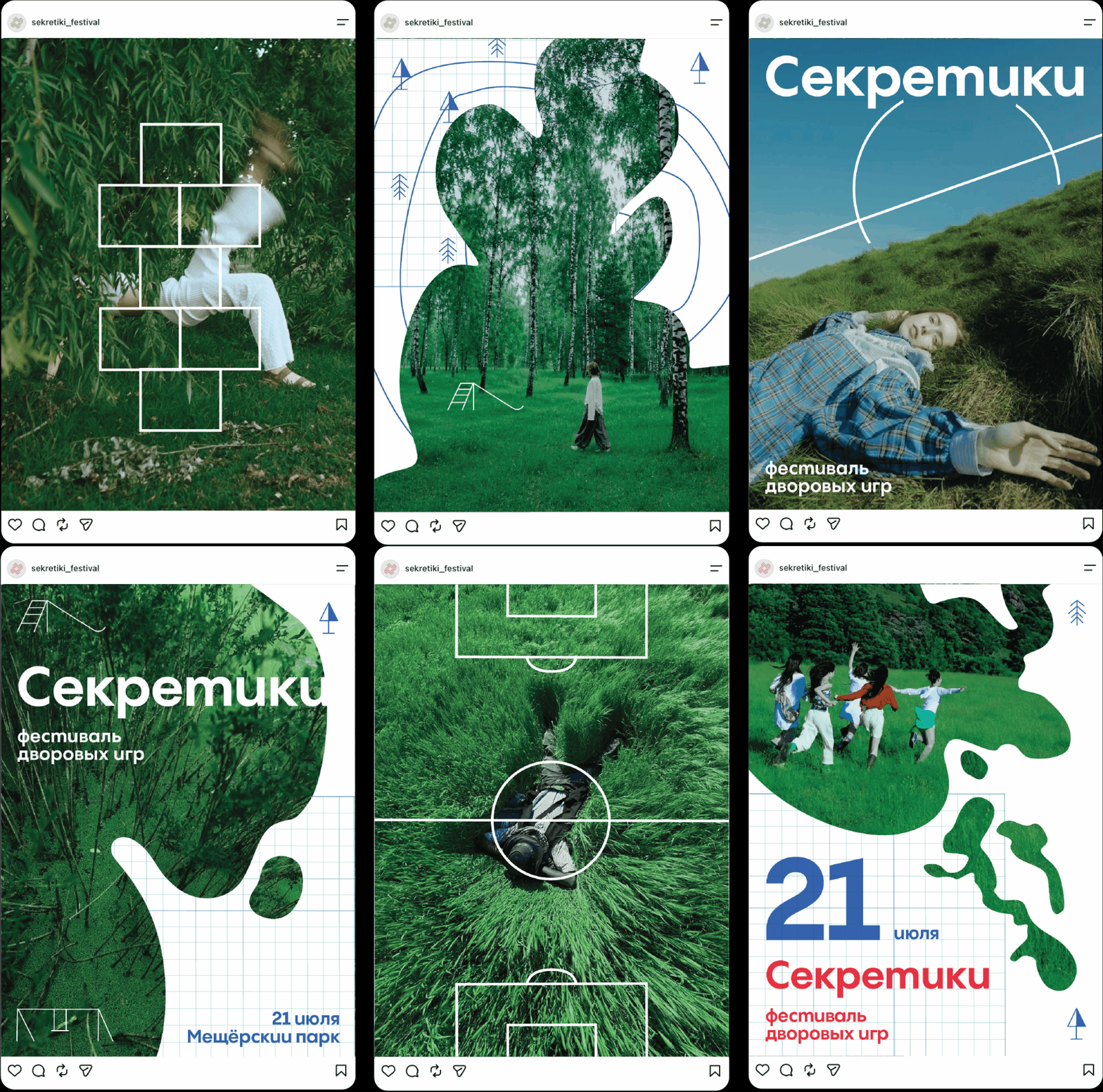
Post Carousel
In design, one photograph featuring an object in motion or an unusual pose/angle is used. The goal is to create a memorable image in the viewer’s mind that will become associated with the brand.
TOPOS — a distinctive Cyrillic typeface used in the brand identity. It is inspired by topographic symbols representing natural features: mountains, bodies of water, trees, and so on.
Cyrillic Alphabet
Cossack Outlaws
In a secluded spot, dig a shallow pit, line the bottom with foil, bright wrappers, and fallen leaves. On top, arrange beads, flowers, and pebbles. Cover this installation with clear or colored glass and dust it with a thin layer of soil.