Original size 842x1126

Kona bistro — asian bistro on the Petrogradskaya side. In the kitchen, under the leadership of chef Ilya Bychkov (Four Seasons, Chang), Asian specialties are prepared in the author’s interpretation. For example, they serve rice and noodles with seafood, sushi and sashimi, and make Japanese sweets like mochi cakes with different fillings. The space at Kona Bistro is small and seats approximately 30 people. The design was developed by Andrey Perepechko, who worked on the design of Tiger Lily, Ronny, Coop Garage and other restaurants in St. Petersburg.

Original size 1688x1120

The shape of the logo is inspired by the architecture of the space, translated from Japanese kona means angle The visual aesthetic is inspired by contemporary Japanese photography. One of the key authors is Nobuyoshi Araki. (Arākii (アラーキー))

Original size 1688x1120
Original size 1684x1124

The visual aesthetic is inspired by contemporary Japanese photography. One of the key authors is Nobuyoshi Araki. (Arākii (アラーキー))

Arākii is one of the most controversial, complex and interesting photographers of our time. It is unusual even for its native Japan, not to mention the Western world. The main stereotype that accompanies all of his work is pornography and scandalousness, but Araki is much deeper than superficial shockingness. Because of his creativity, the photographer constantly receives fines and even ends up in police custody.

Original size 1684x1190
Original size 1684x1124
Original size 1684x1190
Original size 1684x1124
Original size 2828x3560
Original size 845x1080
Kona bistro. Branding
Софья Гриницына создала брендинг для Kona bistro — азиатского бистро на Петроградской стороне. Визуальный стиль проекта вдохновлён современной японской фотографией, включая работы Нобуёши Араки.
Project description created with AI
Project created at 10.02.2024
More projects in identity & branding
Дарья Степанова создала акцидентный шрифт "Plenka font", имитирующий магнитную кассетную ленту для выставки "Эра Walkman". Шрифт был разработан специально для экспозиции, посвящённой истории кассетных плееров и их влиянию на мир.
Маргарита Суворина создала бренд FORMY, который производит функциональные предметы интерьера из переработанных кофейных отходов и композитного материала. Айдентика бренда основана на контрформах и подчёркивает сочетание красоты и практичности в дизайне.
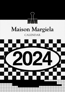
Дарья Рыжакова создала календарь Maison Margiela, посвящённый 36-летию бренда. Календарь включает основные графические образы и идеи, разработанные с 1988 года.
Сергей Павлушин разработал айдентику для магазина спичек cerillas в Сан-Хуане. Проект связан с традиционной ночью костров и культурой города, отражённой в продукции магазина.
education.mediiia
A platform for professional growth in the creative industries. We bring together those who need new knowledge to start or develop a career, and those who are willing to use their knowledge to create and monetize original training courses.
all courses
about education
We use cookies to improve the operation of the website and to enhance its usability. More detailed information on the use of cookies can be fo...
Show more